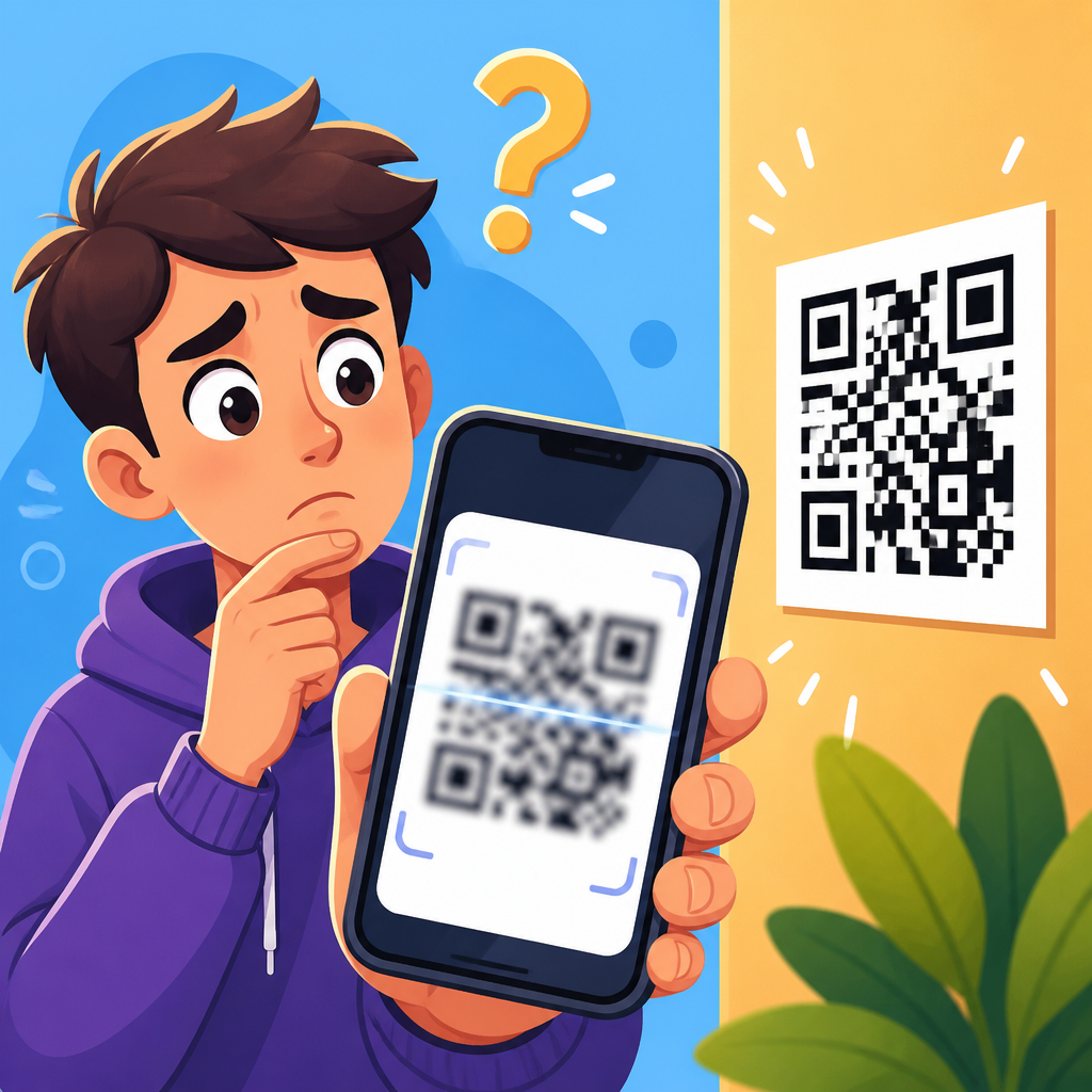
QR codes fail most often because the printed or displayed symbol is too small for the camera, too dense for the viewing distance, or too damaged for the scanner to resolve. If you have ever asked, “Why is my QR code too small to scan?” the practical answer is simple: the code’s modules, quiet zone, contrast, and placement must work together so a phone camera can separate the pattern from its background. When any one of those elements is wrong, the user sees a blurry square, a camera that hunts for focus, or a scan that opens the wrong destination. This topic matters because a broken QR code interrupts payments, packaging, menus, signage, tickets, and product support at the exact moment a customer is trying to act.
A QR code is a two-dimensional barcode made of tiny black and white squares called modules. A scanner does not read it like plain text; it identifies finder patterns, alignment patterns, timing patterns, the quiet zone around the symbol, and then decodes the data with built-in error correction. Size alone is not the only variable, but it is the one that exposes every other mistake. A version 1 code with short data can scan at a much smaller physical size than a high-version code carrying a long URL, UTM parameters, or vCard details. In real projects, I have seen teams shrink a code to fit a label, then unknowingly increase density by embedding a long tracking link and a logo, creating a symbol that technically prints but rarely scans.
This article is the hub for understanding why QR codes don’t work and how to fix them. It explains the minimum size rules, how distance changes the requirement, why contrast and print quality matter, what happens when quiet zones are trimmed, and how design choices like inverted colors and overlaid logos affect reliability. It also covers digital display issues, environmental factors, testing methods, and when a dynamic QR code can solve density problems. If you manage packaging, retail displays, event materials, restaurant menus, direct mail, posters, or equipment labels, these fundamentals prevent costly reprints and poor user experience.
How small is too small for a QR code?
A QR code is too small to scan when the camera cannot clearly distinguish each module from the next at the expected scanning distance. A useful baseline is that the minimum scanning distance is roughly ten times the physical width of the code. A 2-centimeter QR code usually needs to be scanned from about 20 centimeters away, while a 10-centimeter code can be scanned from roughly 1 meter. That rule is not perfect, but it is reliable enough for planning signage, tabletop print, and packaging. If people will stand farther away, the code must be larger or less dense.
Physical size and data density are inseparable. A small QR code can still scan well if it contains very little data, because each module can be physically larger. Add a long destination URL, tracking parameters, Wi-Fi credentials, or contact information, and the generator creates more modules. At the same print size, those modules become smaller and harder for a camera sensor to resolve. This is why two codes printed at the same dimensions can perform very differently. One links to a short redirect domain and scans instantly; the other contains a long direct URL and fails under the same lighting and distance.
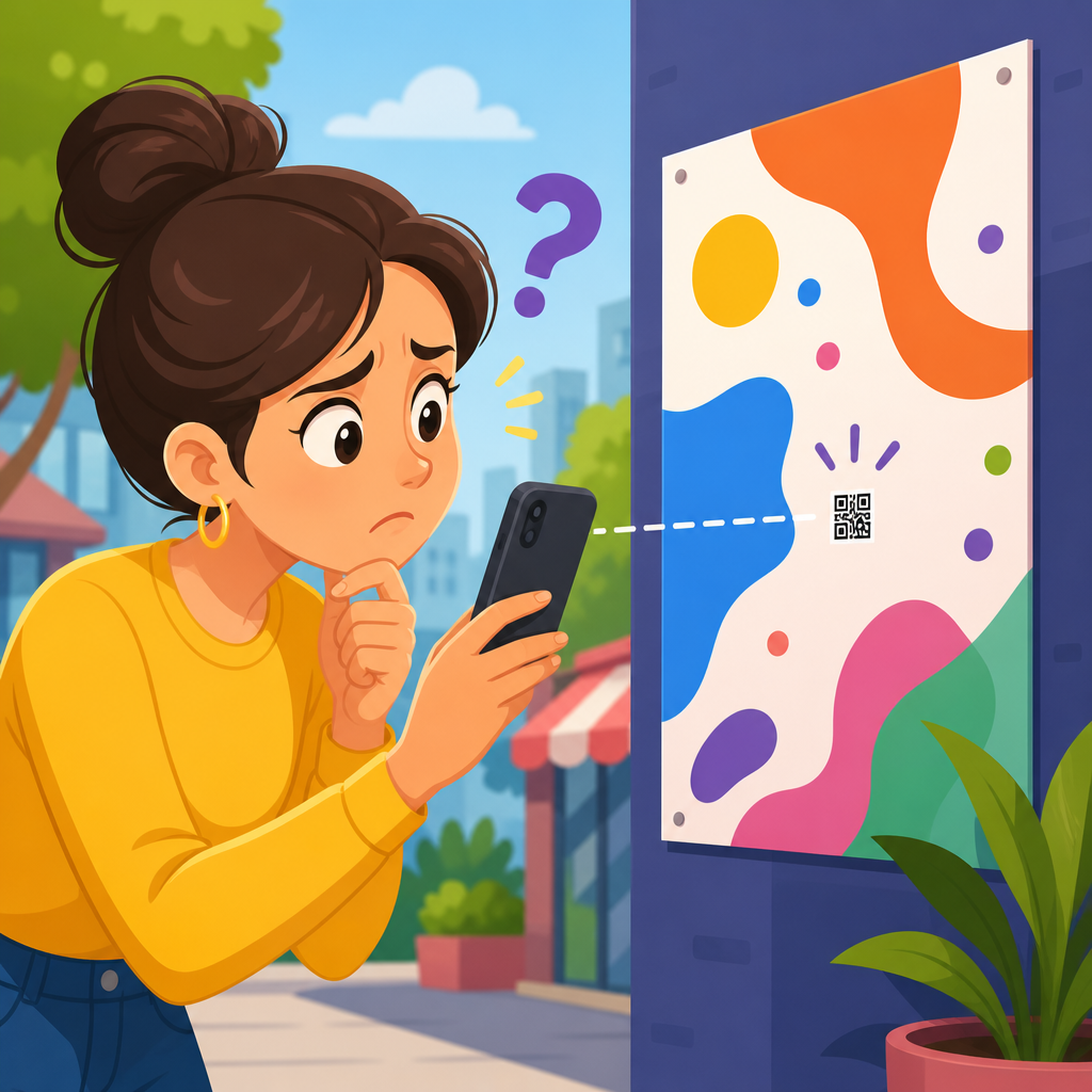
For many practical uses, a printed code below about 1.5 by 1.5 centimeters becomes risky unless the content is very short and the user scans at close range with a good camera. On product packaging, 2 by 2 centimeters is a safer floor. On posters, flyers in shop windows, and countertop displays, larger is better because users approach at variable angles and distances. On outdoor signs, vehicles, and billboards, sizing should be calculated from the real scan point, not guessed from the available space in the layout.
The technical reasons QR codes don’t work
Most scanning failures trace back to a short list of technical causes. The first is inadequate module size: the tiny squares are simply too fine for the phone camera and decoding software. The second is missing quiet zone, the required blank margin around the code. ISO/IEC 18004, the standard that defines QR Code symbology, specifies a quiet zone of four modules on all sides. If surrounding graphics, text, borders, or package folds crowd that space, many scanners struggle to detect the code boundaries.
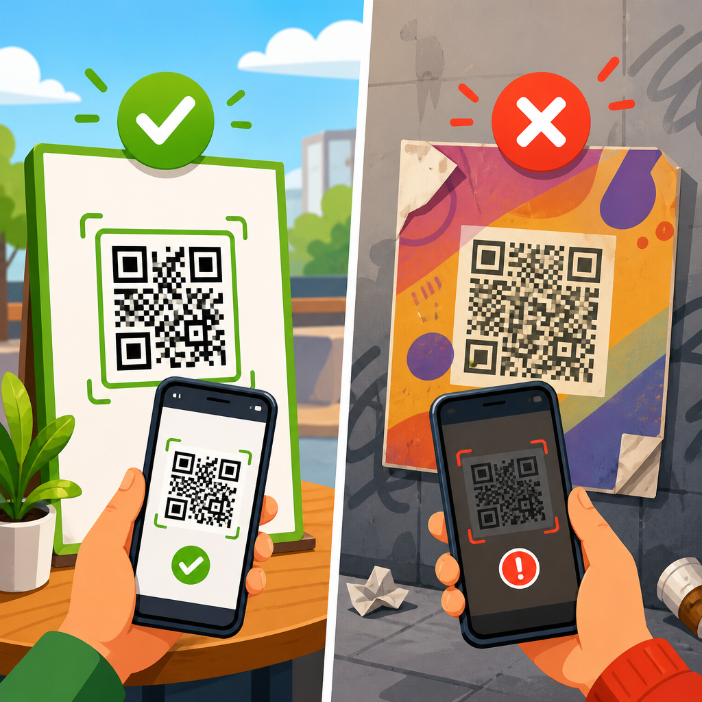
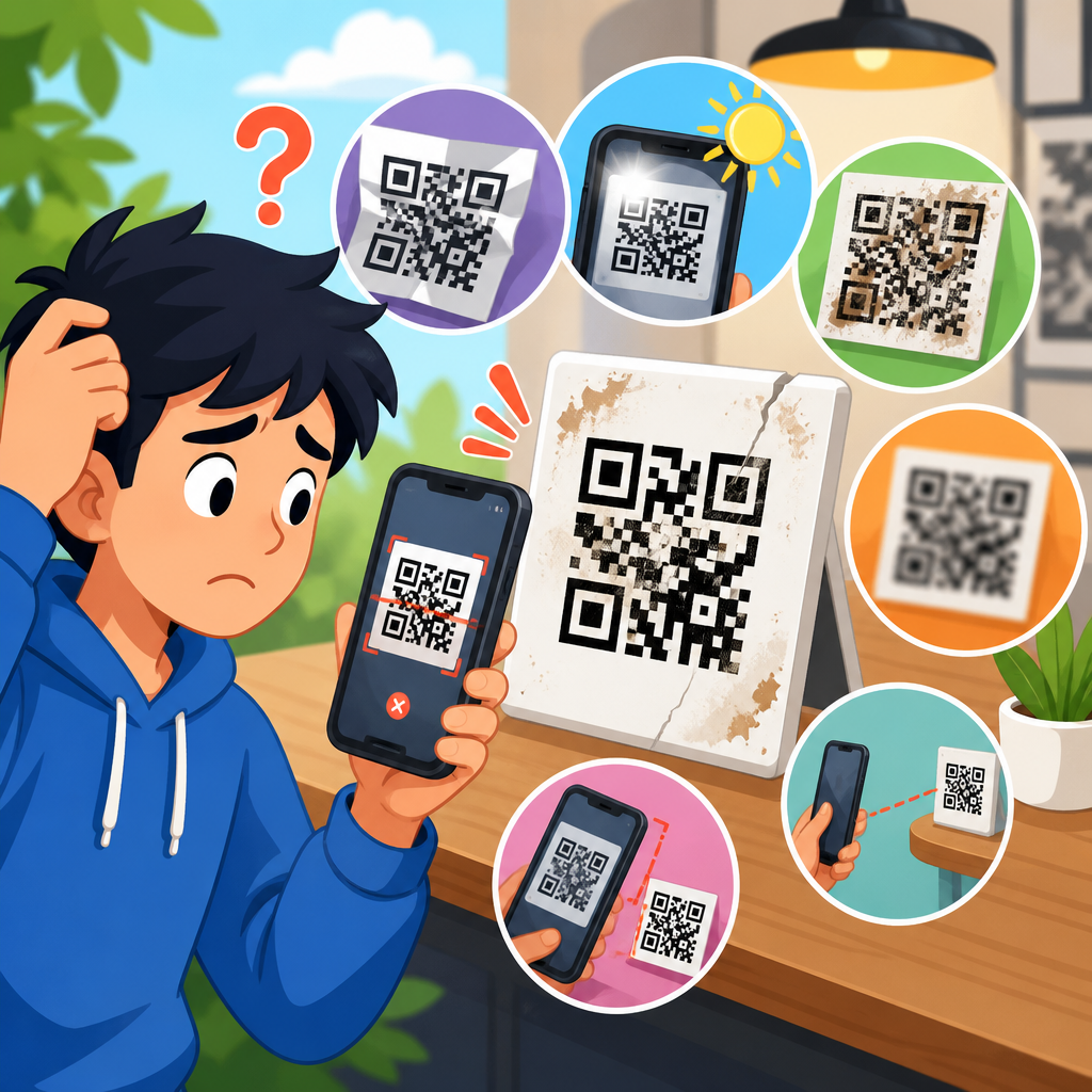
The third cause is poor contrast. Dark modules on a light background are still the safest option because many scanning algorithms expect that pattern. Light gray on white, metallic inks, glossy varnish, transparent overlays, and patterned backgrounds reduce separability. The fourth cause is print or display degradation. Dot gain on porous packaging, low-resolution thermal printing, motion blur on screens, cracked phone displays, moiré from photographing another screen, and reflections from lamination all interfere with decoding. The fifth cause is overdesign: logos that cover too much data, rounded modules that become blobs at small sizes, decorative frames that mimic finder patterns, or color inversions that some older apps mishandle.
There are also destination issues. Sometimes the code scans, but users think it failed because the URL is broken, the landing page returns a 404, the page loads too slowly on mobile data, or the app required to handle the content is missing. In support work, this distinction matters. A code can be visually perfect and still create a bad scan experience if the destination is not mobile-friendly or if the link was printed with a typo. Troubleshooting should therefore separate symbol readability from destination behavior.
Common failure points in print, packaging, and signage
Print production introduces problems that are easy to miss on screen. On corrugated boxes and textured labels, ink spread can close gaps between modules, effectively shrinking the white spaces the scanner needs. On flexible packaging, creases and seams bend the symbol and break alignment. On cylindrical surfaces such as bottles or cans, a code placed over a tight curve may distort enough that entry-level camera apps fail, especially if the code is already dense. I usually move the code to the flattest available panel and increase size before trying more exotic fixes.
Signage has a different set of risks. Teams often place a QR code where it looks balanced in the artwork rather than where it can be approached safely and scanned at the intended distance. A code on a storefront window may reflect daylight or traffic. A poster in a transit station may be too high, forcing users to scan at a steep angle. A code on a restaurant table tent may be physically large enough, but if the matte stock is replaced with glossy lamination, overhead lighting can make half the symbol unreadable. In each case, the design file looked correct, but the installed environment changed the scanning conditions.
| Use case | Safer starting size | Main risk | Best fix |
|---|---|---|---|
| Product label | 2 x 2 cm | Dense data on small space | Use a short dynamic URL and preserve quiet zone |
| Table tent or menu | 2.5 x 2.5 cm | Glare and spills | Choose matte finish and high contrast |
| Flyer or brochure | 2.5 to 3 cm | Crowded layout trims margin | Keep 4-module quiet zone clear |
| Poster | 5 cm and up | Viewed from too far away | Size for real scan distance, not page layout |
| Window sign | 6 cm and up | Reflections and backlighting | Test at different times of day |
| Equipment label | 2.5 x 2.5 cm | Abrasion and dirt | Increase error correction and use durable stock |
Why data length, error correction, and logos change scannability
Every QR code balances capacity against readability. More data means a higher symbol version and a denser grid. Error correction adds resilience by allowing some damage or obstruction, but it also increases complexity. QR codes support four common error correction levels: L, M, Q, and H. Higher levels recover more lost data, which helps when a logo covers the center or the code may be scratched. The tradeoff is that higher correction often creates more modules, making a small printed code harder to scan. There is no universally “best” setting; the right choice depends on size, environment, and whether you are covering part of the code with branding.
Long URLs are one of the most avoidable causes of dense, fragile codes. Instead of encoding a full campaign URL with many parameters, use a short redirect on your own domain or a dynamic QR code platform. Dynamic codes point to a short URL that redirects server-side, which reduces the encoded data and allows you to update the destination later without reprinting. This is especially useful in packaging, field service labels, and retail displays where replacing printed material is expensive. The short link does not just add flexibility; it directly improves scan performance by reducing symbol complexity.
Logos deserve special caution. A small centered logo can work if the code is large enough, error correction is appropriate, and testing confirms reliability across devices. Problems start when the logo displaces too much data or when brand teams also customize module shapes, add gradients, and tighten spacing in the same design. Those changes compound. In practice, if a campaign depends on broad compatibility, a plain high-contrast code beats a heavily stylized one almost every time.
Screen, camera, and environmental issues people overlook
Not all failures come from the printed symbol. Sometimes the scanning device is the bottleneck. Older phones have weaker autofocus, lower sensor resolution, less effective low-light performance, and slower decoding. A code that scans instantly on a recent flagship device may fail on a budget phone in dim light. Camera app behavior also varies. Native camera apps on iOS and Android are generally strong, but some third-party scanners are less tolerant of low contrast, reflections, or nonstandard styling.
Digital display adds another layer. A QR code shown on a screen can suffer from low brightness, screen protectors, cracked glass, PWM flicker effects in photographs, or moiré when one screen photographs another. If the display is part of a kiosk, POS terminal, or event check-in flow, anti-glare settings, brightness controls, and refresh behavior should be tested under real use conditions. I have seen self-service kiosks fail simply because the QR code was rendered too small within a busy interface and the brightness was reduced to save power.
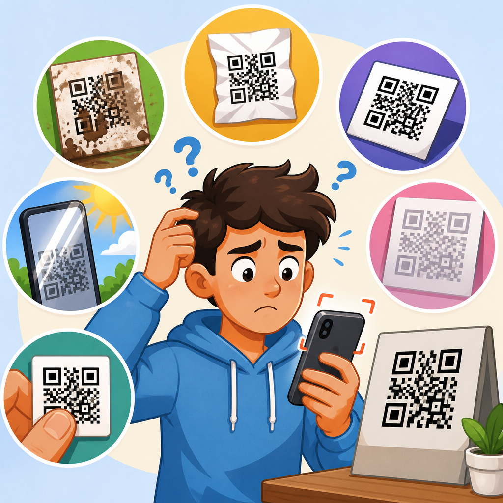
Environment matters as much as design. Direct sun can wash out screens and create hard reflections on laminated print. Low light increases motion blur as users move their phones closer and the camera lengthens exposure. Dirty surfaces, smudges, scratched acrylic covers, or condensation on refrigerated packaging can all block successful scans. When troubleshooting recurring failures, inspect the actual use location instead of relying on a digital proof. The site often reveals the true cause within minutes.
How to fix a QR code that is too small to scan
Start by reducing encoded data. Replace long destination links with a short dynamic URL, remove unnecessary parameters, and avoid embedding full contact cards when a landing page can host that information more effectively. Next, increase the physical size of the code and protect the quiet zone. Do not measure only the black square; include the required blank margin around it. If the code must remain small, simplify the design rather than adding visual effects.
Then improve contrast and production quality. Use black or very dark modules on a white or very light matte background. Export vector artwork such as SVG, EPS, or PDF for print whenever possible so edges stay sharp. For raster output, maintain adequate resolution and avoid scaling screenshots in layout software. On packaging, request print proofs on the final substrate because absorbency and texture can change module edges. On screens, enlarge the code, increase brightness, and place it away from cluttered interface elements.
Finally, test like a user, not like a designer. Scan with multiple phones, at the real viewing distance, in the actual environment, using the native camera app first. Test portrait and landscape orientation, different times of day for reflective surfaces, and common damaged states such as minor creases or smudges. If a QR code is business-critical, make successful scanning part of sign-off before production. That discipline prevents expensive support tickets, reprints, and lost conversions.
When to create separate troubleshooting articles from this hub
This hub covers the full question of why QR codes don’t work, but some problems deserve their own deeper guides. If your readers regularly ask about minimum QR code size, quiet zone requirements, logo safety, glossy print glare, URL length, or dynamic versus static QR codes, those should become dedicated support articles linked from this page. The same is true for use-case guides such as QR codes on packaging, menus, posters, event tickets, and equipment labels, because each environment creates different failure modes and testing methods.
A strong support structure also separates scan failure from destination failure. Create one article for “QR code scans but won’t open,” another for “QR code opens the wrong page,” and another for “QR code works on iPhone but not Android.” That structure helps users self-diagnose quickly and supports clean internal linking across the wider QR Code Troubleshooting & Support topic. As the hub, this page should define the major causes, explain the core mechanics, and point readers toward the precise fix they need next.
A QR code that is too small to scan is usually not just a sizing mistake; it is a signal that module size, quiet zone, data density, contrast, environment, and destination quality were not planned together. The most reliable codes are simple, high contrast, adequately sized, and tested in the exact conditions where people will use them. Short dynamic URLs reduce density, preserved margins improve detection, matte production reduces glare, and realistic testing catches the failures that design mockups hide.
The main benefit of getting QR code size right is not technical neatness. It is fewer failed interactions at the moment a customer wants to buy, sign in, learn, redeem, or get support. That translates into better conversions, lower support volume, and fewer costly reprints. Whether you publish QR codes on labels, menus, mailers, kiosks, packaging, or large-format signs, treat scannability as a production requirement rather than a decorative afterthought.
Use this hub as your starting point for diagnosing why QR codes don’t work, then review your size, data length, print method, and testing process one by one. If a code matters to revenue or service, run a real-world scan test before it ships. That single step solves most QR code problems before your users ever see them.
Frequently Asked Questions
Why is my QR code too small to scan even though it looks clear to the eye?
A QR code can look sharp to you and still be too small for a phone camera to read reliably. Human vision and camera sensors do not interpret detail the same way. A scanner has to distinguish the tiny square modules inside the code, detect the empty quiet zone around it, and separate dark areas from light ones without motion blur, glare, or digital noise. If the code is physically too small, those modules blend together when viewed from a normal scanning distance, so the camera sees a fuzzy block instead of a readable pattern.
In practical terms, scan performance depends on module size, not just the overall width and height of the symbol. A simple QR code with little data can remain readable at a smaller size because it contains fewer modules. A dense QR code that stores a long URL, tracking parameters, or extra content needs more modules packed into the same area, which makes each square smaller and harder to resolve. That is why two codes printed at the same dimensions can behave very differently.
The viewing distance matters too. If people are expected to scan from arm’s length, a small code may work. If they are scanning a poster, sign, product display, or presentation slide from several feet away, the same code becomes too dense relative to the distance. A useful rule is to increase the printed size as the intended scanning distance increases, and to avoid shrinking the code just to fit a tight layout. If users have to move unusually close, tilt their phones, or wait for focus to lock, the code is effectively too small for real-world use.
What size should a QR code be to scan reliably on phones?
There is no single universal size, because the right dimensions depend on how much data the QR code contains, how far away people will scan it, and whether it appears in print or on a screen. That said, a common starting point for close-range print use is at least around 2 x 2 cm, or roughly 0.8 x 0.8 inches, for a simple code. For more dependable results across a wider range of phones and lighting conditions, going larger is usually the safer choice. If the code contains more data or will be scanned quickly in casual conditions, increasing the size improves reliability.
The more important measurement is the size of each module, the tiny square unit that makes up the symbol. As a code stores more information, it uses more modules. If you keep the overall printed size the same, each module becomes smaller. Small modules are harder for cameras to capture cleanly, especially on curved packaging, textured paper, glossy surfaces, or low-brightness displays. This is why reducing the amount of encoded data often helps just as much as enlarging the code itself.
Distance should guide your sizing decision. A small code on product packaging scanned from a few inches away can work well. A code on a tabletop sign may need to be larger. A QR code on a wall poster, window, menu board, or event banner should be much larger because users are not standing right on top of it. In general, if you expect someone to scan from farther away, enlarge the symbol substantially and test it with multiple phones under normal lighting. Real-world testing matters more than relying on a minimum dimension alone.
Does the amount of information in a QR code affect whether it is too small to scan?
Yes, absolutely. The amount of data inside the QR code has a direct impact on scan difficulty because it determines how dense the pattern becomes. A short, clean URL usually creates a simpler code with fewer modules. A long web address, especially one packed with query strings, campaign tags, redirects, or other parameters, produces a denser code with many more tiny squares. When that dense symbol is reduced to a small print size, the modules can become too fine for the camera to distinguish clearly.
This is one of the most overlooked reasons people ask why their QR code is too small to scan. They often focus on the outer dimensions without realizing the inner complexity has increased. Two-inch codes are not equal if one contains a short destination and the other contains a long block of data. The dense version may require a larger print size, better lighting, steadier framing, and newer phone hardware to scan consistently.
If you need better scan reliability, simplify the encoded content whenever possible. Use a shorter URL, remove unnecessary tracking parameters, or generate a dynamic QR code that points to a short redirect instead of embedding a long destination directly. This reduces module count and leaves more visual breathing room inside the symbol. The result is often easier to scan than simply trying to force a complicated code into a small space.
Can design issues like missing margins, low contrast, or damage make a QR code seem too small?
Yes. A QR code may be technically large enough, but poor design choices can make it behave as if it were too small. One of the most important elements is the quiet zone, the blank margin around the code. Scanners use that clear border to distinguish the symbol from nearby text, images, borders, and background patterns. If the quiet zone is cropped, reduced, or crowded by design elements, the camera has a harder time isolating the code, and scan performance drops sharply.
Contrast is another major factor. Dark modules on a light background are easiest to read. If the colors are too similar, if the background is busy, or if gradients and decorative effects interfere with the pattern, the camera struggles to separate the code from its surroundings. Glossy finishes, reflections, shadows, and backlit screens can reduce apparent contrast even when the artwork looks fine on a desktop monitor. In those situations, the problem may look like size, but the real issue is legibility.
Damage and distortion can have the same effect. A code printed across a fold, wrapped around a curve, placed on textured material, or partially obscured by scratches or smudges loses clean edges that scanners depend on. Even though QR codes include error correction, that protection has limits. If the modules are already small, any damage consumes the little margin for error that remains. This is why good QR code placement, sufficient quiet zone, strong contrast, and undistorted printing are just as important as overall size.
How can I fix a QR code that is too small or difficult to scan?
The most effective fix is usually to enlarge the QR code and reduce its data density at the same time. Start by increasing the physical size of the symbol so the modules become easier for cameras to resolve. If possible, shorten the encoded URL or switch to a dynamic QR code so the pattern contains fewer modules. Those two changes alone solve many scanning problems because they address both scale and complexity.
Next, make sure the code has a proper quiet zone and high contrast. Leave a clear blank margin around all four sides, and avoid surrounding the symbol with heavy graphics, borders, or text that crowds it. Use a dark foreground on a light background whenever possible. If the code appears on a screen, raise brightness and avoid placing it over animated, patterned, or low-contrast content. If it is printed, confirm the output is crisp and not softened by low-resolution export settings or poor print quality.
Placement also matters. Put the code where users can comfortably frame it without glare, extreme angles, or motion. Avoid tiny QR codes on reflective packaging, curved surfaces, or areas that crease easily. For posters, displays, and signage, size the code for the actual scan distance, not for how it looks in the layout file. Finally, test with several phones in ordinary conditions before publishing or printing at scale. If different users can scan it quickly without zooming, refocusing, or stepping unnaturally close, you have likely corrected the issue.