Adding a logo to a QR code sticker can improve brand recognition and trust, but only when the code is designed, tested, and printed with enough error correction, contrast, and quiet space to remain easy to scan. In practice, that means the right answer is not simply yes or no. It depends on sticker size, viewing distance, material, print method, lighting conditions, and where the code will be used. I have seen branded QR stickers outperform plain codes at retail counters because customers instantly recognized the business, and I have also seen logo-heavy stickers fail on packaging lines because the artwork crowded the finder patterns and reduced readability. If you are deciding whether to add a logo, you need to understand both the branding upside and the scanning risks.
A QR code sticker is a printed adhesive label that contains a Quick Response code, usually linking to a website, menu, payment page, app download, review form, or product information. The sticker itself is part of the design system. Material, adhesive, finish, shape, and placement all affect performance. Logo QR codes are QR codes with a brand mark or icon placed in the center or integrated into the module pattern. Modern generators can support this by raising the error correction level, but error correction is not a license to ignore basic scanability rules. A sticker that looks polished in a mockup can fail in the real world after lamination glare, curved application, abrasion, or low-ink thermal printing change the code’s readability.
This question matters because QR code sticker design sits at the intersection of branding, usability, and production. A sticker has to be attractive enough to invite scans, durable enough to survive its environment, and technically sound enough to work across different phones and camera apps. For businesses building a complete QR code design, printing, and materials strategy, this topic is central. Whether you print stickers for storefront windows, restaurant tables, warehouse bins, event badges, cosmetic packaging, or outdoor equipment, the decision to add a logo affects file setup, size requirements, print tolerances, and testing procedures. Done correctly, a logo can increase confidence and create a consistent branded experience. Done poorly, it turns a useful sticker into a friction point that costs scans and undermines trust.
When adding a logo helps a QR code sticker
A logo helps most when the audience needs a quick trust signal before scanning. People are more willing to scan a code if they can identify the brand behind it. On a product package, a recognizable mark can reassure shoppers that the code leads to the manufacturer rather than a random destination. On payment stickers, logos reduce hesitation because customers can confirm they are paying the right merchant. In hospitality, branded table stickers can reinforce that the code opens the venue’s own menu, loyalty program, or ordering flow. In my experience, this effect is strongest in busy environments where users make fast decisions and may ignore plain black-and-white codes that offer no immediate context.
Logos also help when multiple QR codes appear in the same space. Think of a trade show booth with codes for a product demo, technical datasheet, sales contact form, and giveaway entry. Distinct branding or icon treatment makes each sticker easier to identify at a glance, especially when paired with a short call to action such as “Scan for Specs” or “Register Warranty.” For internal operations, a logo can serve as a visual cue that separates customer-facing stickers from inventory or maintenance codes. The benefit is not the logo alone; it is the combination of branding, clear labeling, and thoughtful placement that reduces uncertainty and improves scan intent.
There is also a practical marketing advantage. Branded QR code stickers can look more intentional and premium, especially on packaging, displays, and fixed signage. A center logo can tie the code into the rest of the layout, making it feel like part of the design rather than an afterthought. This matters for premium retail, beauty, consumer electronics, and boutique food packaging, where visual consistency influences perceived quality. However, the logo should support the code, not dominate it. The best-performing examples usually use a small, high-contrast mark centered within a protected area, leaving the finder patterns, timing patterns, and quiet zone untouched.
When a logo hurts scan performance
A logo becomes a problem when it removes too much data area or forces design choices that reduce contrast and clarity. QR codes work because scanners identify the three large finder patterns, read the module grid, and reconstruct missing data through error correction. If the logo covers too many modules, especially in a small printed sticker, the scanner has less information to work with. This is why a code that scans on a monitor at 800 pixels wide may fail after being reduced to a 20 millimeter sticker. Print shrinkage, ink spread, dust, scratches, and camera angle all reduce tolerance. A centered logo that looks modest on screen can become oversized relative to the final print.
Color choices create another common failure. A brand team may want a light gray code on a pastel background or a glossy black sticker with a metallic logo, but low contrast is one of the fastest ways to reduce scan reliability. Most phones scan best when the code is dark on a light, matte surface. Inverted schemes can work, but they require more careful testing. Transparent stickers add complexity because the applied surface becomes the background. A transparent logo QR sticker on tinted glass may scan differently in daylight than at night. Laminates and varnishes can introduce glare that obscures modules, and textured materials can break clean edges that scanners rely on.
Placement errors matter just as much as artwork. I have audited failed QR sticker programs where the logo was acceptable, but the sticker was wrapped over a bottle seam, placed too close to package folds, or printed on brushed metal stock that reflected overhead lighting. On curved surfaces, modules distort. On flexible pouches, wrinkles interrupt the grid. On outdoor bins, fading and dirt accumulate. These environmental variables mean a logo reduces your margin for error. If the sticker environment is already difficult, keeping the QR code simpler often delivers better results than forcing a branded treatment into a hostile production context.
Technical design rules for logo QR code stickers
If you add a logo, use a dynamic or static QR generator that lets you control error correction and export vector files such as SVG, EPS, or print-ready PDF. For branded stickers, I generally recommend error correction level H, which can restore a larger portion of obscured data than lower settings. Even so, the practical safe area for a logo is limited. A common working range is roughly 10 to 20 percent of the code area, depending on data density and final print size. Shorter URLs or dynamic redirects produce less dense codes, creating more room for branding. Long URLs, UTM-heavy parameters, or encoded vCards create denser grids and leave less safe space for a logo.
Quiet space is nonnegotiable. A QR code needs a clear margin around all four sides, typically at least four modules wide. This empty border helps scanners separate the code from nearby graphics and background noise. Many scan failures blamed on logos are actually quiet-zone violations caused by tight layouts, decorative frames, or sticker die cuts. Keep the finder patterns untouched and visually prominent. Avoid stylizing them beyond recognition. Rounded modules, gradient fills, and embedded graphics can work in moderation, but each customization increases risk. For stickers, production reliability should outweigh novelty, especially if the code drives payment, support, authentication, or compliance information.
Print resolution and physical size are equally important. A code used on a shelf talker can be larger and more forgiving than one on a lip balm label. As a rule, the smaller the sticker, the simpler the code should be. Vector artwork prevents soft edges during scaling. If raster files are necessary, use sufficiently high resolution for the final print process. Inkjet, laser, flexographic, digital label presses, and thermal transfer each produce different edge characteristics. Test the exact substrate, adhesive, and finish you plan to use, because the same design can behave differently on matte paper, white polypropylene, clear BOPP, or polyester with overlaminate.
| Design factor | Best practice | Why it matters |
|---|---|---|
| Logo size | Keep it modest and centered | Preserves enough data modules for reliable decoding |
| Error correction | Use high correction for branded codes | Improves tolerance for covered or damaged areas |
| Contrast | Dark code on light matte background | Helps phone cameras detect modules quickly |
| Quiet zone | Maintain a clear border on all sides | Prevents nearby graphics from interfering with scans |
| File format | Prefer SVG or print-ready PDF | Maintains sharp edges at any print size |
| Testing | Test on final material and placement | Real conditions reveal failures mockups miss |
Sticker materials, finishes, and placement decisions
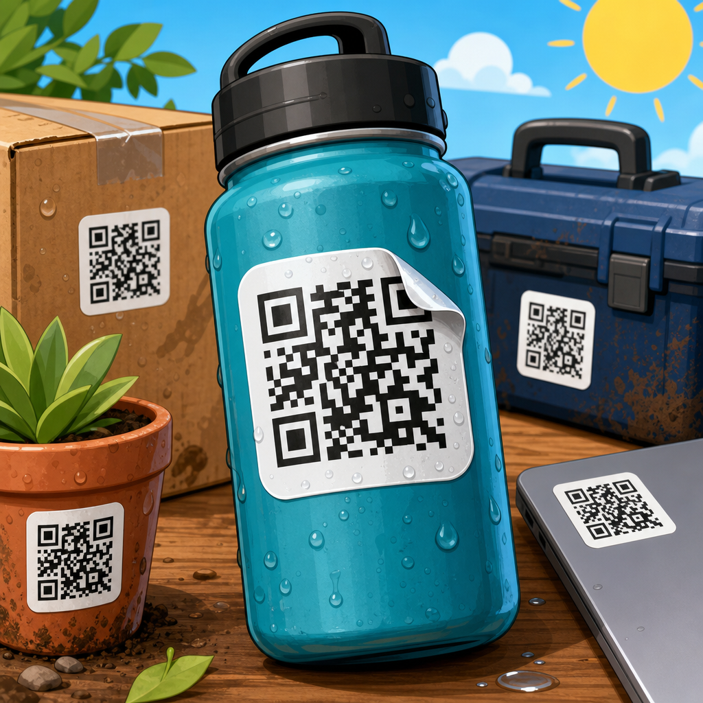
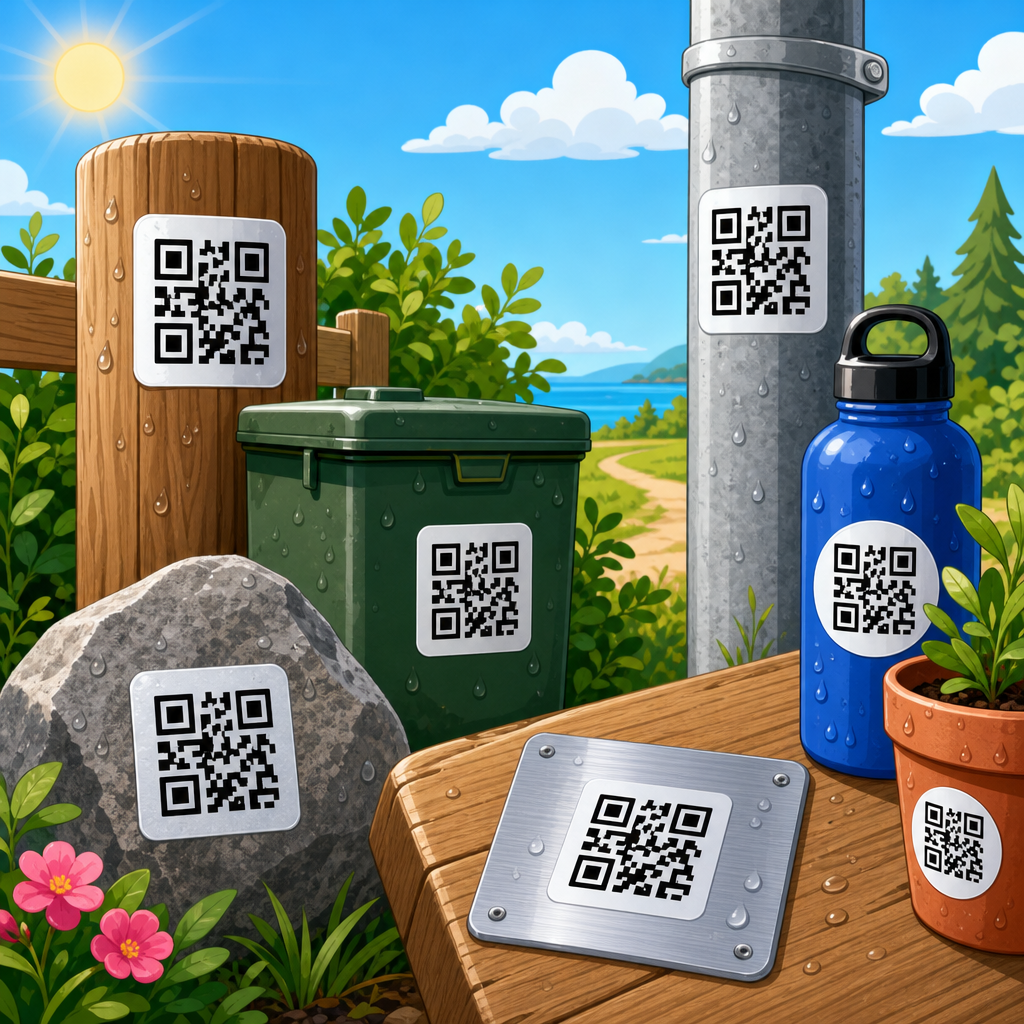
QR code sticker design is not only about the code image. Material selection directly affects scan consistency, durability, and perceived quality. Paper labels can work well indoors for short-term campaigns, shipping inserts, and event use, but they scuff easily and absorb moisture. Polypropylene and polyester are stronger choices for products, refrigerated items, bathrooms, kitchens, and outdoor applications. Clear stickers can create a sleek look on glass or packaging, yet they require careful contrast management because the applied surface shows through. White ink layers may be needed behind the code on transparent films to preserve readability. This is one of the most overlooked production details in branded sticker programs.
Finish choice should support scanning first and aesthetics second. Matte lamination usually performs better than gloss because it reduces reflected light. Gloss can still work on large, high-contrast stickers, but it raises the risk of glare under retail and restaurant lighting. Soft-touch coatings look premium, though they can slightly mute contrast if the print is not dense enough. For heavy-use environments such as gym equipment, factory floors, or reusable containers, add abrasion resistance and chemical resistance to the specification. If the sticker will be cleaned frequently, verify that solvents or disinfectants will not degrade the print or adhesive. The more demanding the environment, the more conservative the QR customization should be.
Placement determines whether people can comfortably scan the sticker. Put the code where a user can see it squarely, hold a phone at a natural distance, and avoid blocking it with hands, shelving, seams, or package closures. For table tents and countertop displays, the sticker should face the user directly and remain stable. On cylindrical packaging, a small code near the flattest panel usually scans better than one wrapped around a tight curve. For vehicles and windows, account for reflections, weather exposure, and the fact that users often scan from awkward angles. A good rule is simple: if placement adds friction, reduce visual complexity and increase physical size.
Use cases: when to choose logo versus plain QR stickers
In retail packaging, a logo is usually worth considering because brand identity influences trust and the sticker often supports product storytelling, authentication, or loyalty. A skincare brand linking to ingredient sourcing pages can benefit from a subtle logo in the center of the code, provided the label remains high contrast and large enough to scan. In restaurants, logo QR stickers on tables, takeout bags, and windows often perform well because customers expect branded menus and ordering links. Here, pairing the code with a clear action such as “Scan to View Menu” usually matters more than decorative styling. The logo should confirm the destination, not replace explanatory text.
For industrial, warehousing, and asset-tracking applications, plain QR stickers are usually the better choice. These environments prioritize speed, error reduction, and durability over aesthetics. Maintenance technicians scanning equipment tags do not need a brand moment; they need a code that works instantly under poor lighting, through scratched covers, or at slight angles. The same applies to lab samples, inventory bins, and logistics labels. A minimal design with oversized modules, strong contrast, and robust substrate specifications will outperform a branded treatment almost every time. If branding is necessary, place the logo beside the code rather than inside it.
For events, education, real estate, and service businesses, the answer depends on context. A real estate sign can benefit from a brokerage logo because it builds legitimacy from the street, but the code must be large enough for distance scanning. An event badge may need a plain code if fast check-in matters more than appearance. A salon review sticker near the register may convert better with a logo because customers recognize the business instantly. In each case, decide based on the primary job of the sticker. If the job is trust and engagement, branding helps. If the job is speed and reliability in demanding conditions, simpler usually wins.
How to test a logo QR code sticker before full production
Always test a branded QR sticker in the exact conditions where it will be used. Start with multiple logo sizes and at least one plain control version. Print prototypes on the actual material, with the same finish and adhesive stack, at final size. Scan them using iPhone and Android devices, older phones as well as current models, and both native camera apps and common third-party scanners. Test under bright, dim, and angled lighting. If the sticker will be on glass, test it on the actual glass. If it will wrap a bottle, apply it to the actual bottle diameter. Mockups and desktop proofs are not enough.
Measure performance, not just pass or fail. Track first-attempt scan rate, average time to scan, and failures by device or condition. A sticker that eventually scans after three tries is not good enough for payments, fast service, or high-traffic retail. Check how the code behaves after abrasion, moisture, heat, cleaning, or UV exposure if those conditions are relevant. If you use a dynamic QR platform, verify the redirect is fast and the landing page is mobile-friendly. Slow destination pages can make users think the sticker failed even when the scan succeeded. The full experience starts with print design but ends with the page that opens.
The best workflow is iterative. Begin with a conservative design, test, then add branding carefully rather than starting with maximum decoration and working backward. Keep records of version numbers, export settings, material specs, printer profiles, and scan results. Over time, this creates an internal standard for QR code sticker design that your team and print vendors can repeat confidently. If you are building a broader QR code design, printing, and materials library, this page should anchor that process: define the environment, choose the substrate, size the code for the distance, decide whether a logo adds enough value, and validate every assumption with real scans. If you are unsure, use a small logo or place the logo next to the code, then test both options and choose the one that delivers the highest reliable scan rate.
So, should you add a logo to a QR code sticker? Yes, when the sticker is customer-facing, trust matters, and you can protect scanability with proper size, contrast, quiet space, error correction, and real-world testing. No, when the sticker is tiny, mission critical, exposed to harsh conditions, or used in operational workflows where speed matters more than branding. The strongest QR code sticker design balances identity and function instead of sacrificing one for the other. Treat the logo as a supporting element, not the main feature. Choose materials and finishes that reduce glare and wear, place the sticker where users can scan comfortably, and test on the final substrate before you approve a print run. If you are building out your QR Code Sticker Design resources, use these guidelines as the hub standard, then apply them to every related decision from size and shape to lamination, adhesive, and placement. Start with readability, add branding with restraint, and let scan performance decide.
Frequently Asked Questions
Should you add a logo to a QR code sticker?
Yes, in many cases adding a logo to a QR code sticker is a smart choice, but only if the code is still easy to scan. A logo can improve brand recognition, make the sticker look more professional, and increase trust because people are often more willing to scan a code when they can immediately see who it belongs to. That is especially useful in retail, events, packaging, and point-of-sale environments where customers make quick decisions and may ignore a plain, generic-looking code.
That said, the best answer is not a simple yes or no. A logo takes up space inside the QR code, and that can reduce scannability if the design is not handled carefully. Whether a branded sticker works well depends on practical details such as sticker size, viewing distance, printing method, surface material, lighting conditions, and how the code will actually be used. A large code on a clean matte label may scan perfectly with a centered logo, while a tiny glossy sticker placed under bright overhead lighting may struggle. In other words, adding a logo is usually worth considering, but only when the final code is designed with enough error correction, strong contrast, proper quiet space, and real-world testing before printing in quantity.
Does adding a logo make a QR code harder to scan?
It can, yes. A QR code works because scanners read a structured pattern of dark and light modules. When you place a logo in the center, you are covering part of that data pattern. QR codes do include built-in error correction, which allows some damage or obstruction without breaking the code, but that protection has limits. If the logo is too large, if the contrast is weak, or if other design changes are made at the same time, scan performance can drop quickly.
The key is balance. A modest logo placed in the center of the code is often completely fine when the code uses a higher error correction level and is printed at an adequate size. Problems usually happen when businesses try to do too much at once: shrinking the sticker, stylizing the modules, using low-contrast brand colors, removing quiet space, and then adding a large logo on top of it all. A well-designed branded code can scan just as smoothly as a plain one, but only because the design choices support readability rather than fight against it. The safest approach is to generate the code with appropriate error correction, keep the logo relatively small, preserve clear margins around the code, and test it on multiple phones before approving production.
What design rules matter most when putting a logo on a QR code sticker?
The most important rules are error correction, contrast, quiet space, and size. Error correction gives the code some tolerance for obstruction, which is what allows a logo to be added in the first place. Contrast is critical because scanners need to clearly distinguish the dark modules from the lighter background. In most cases, dark-on-light remains the most reliable option. Quiet space, the empty margin around the QR code, is equally important because it helps scanning software recognize where the code begins and ends. If that border is cramped by text, graphics, or the edge of the sticker, performance suffers. Size matters because even a perfectly designed code can fail if it is simply too small for the intended viewing distance and camera quality.
Beyond those fundamentals, material and print quality also play major roles. Glossy finishes can create glare that interferes with scans. Low-resolution printing can soften edges and blur module boundaries. Curved, textured, or flexible surfaces may distort the code. If the sticker will be used outdoors or in harsh environments, fading, scratches, and dirt can reduce readability over time. This is why professional QR sticker design is not just about making the code look attractive. It is about designing for the real conditions in which people will scan it. If the logo, color palette, shape customization, and print finish all support scannability, branding can be a real asset. If they compete with readability, the code becomes less effective no matter how good it looks.
How big should a logo be inside a QR code sticker?
There is no universal perfect size, but the logo should generally remain a small part of the overall code area. The goal is to make the brand visible without blocking too much of the encoded pattern. In practical terms, a modest centered logo often works best because it is noticeable while still leaving the surrounding data intact. As the overall QR code gets smaller, the logo usually needs to get smaller too. A logo size that works in a large poster code may be far too aggressive for a compact product label or countertop sticker.
The right size also depends on how far away people will scan from and what kind of devices they are likely to use. If the sticker is scanned from close range with modern smartphones, you have more flexibility than if it needs to work quickly across a counter, through a window, or in dim lighting. The safest method is not to rely on theory alone. Create a branded version, print it at actual size, and test it under realistic conditions. Try multiple phones, both iPhone and Android, and check performance from the expected distance and angle. If the code requires users to adjust their phone repeatedly before it scans, the logo is probably too large or the overall design needs refinement.
When is it better to skip the logo on a QR code sticker?
It is usually better to skip the logo when scan reliability matters more than visual branding, or when the physical constraints are too tight to support customization safely. For example, if the sticker must be very small, if it will be placed on reflective or uneven material, if the print method is low quality, or if the environment has challenging lighting, a plain high-contrast QR code may outperform a branded one. The same is true when the code will be used in industrial, medical, warehouse, or operational settings where speed and consistency matter more than appearance. In those cases, every design choice should prioritize function first.
You may also want to avoid adding a logo if the brand is already obvious from surrounding packaging, signage, or placement. A QR sticker on a clearly labeled product box or in a branded store display may not need the extra visual cue. Sometimes a simple call to action next to the code, such as “Scan for menu,” “Register product,” or “Get setup instructions,” does more to improve response than a logo inside the code itself. If branding adds confidence without hurting performance, it is valuable. If it adds risk without improving the user experience, it is better left out. The strongest strategy is always to judge the logo by one standard: does it help people scan more often and more easily in the real world?