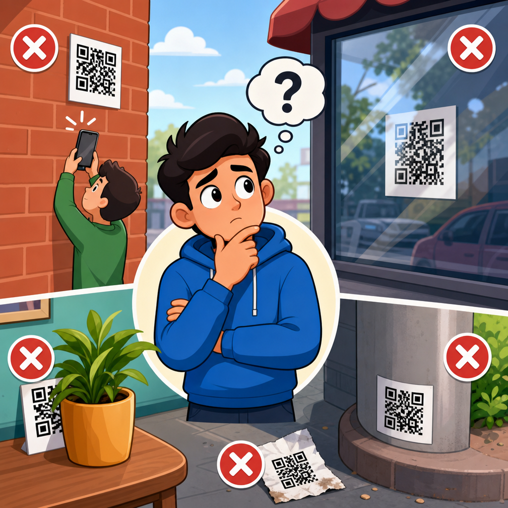
QR code placement can determine whether a code becomes a seamless bridge to digital content or a dead graphic that people ignore, misread, or simply cannot access. Placement means the exact physical or on-screen location of a QR code, the surrounding environment, the viewing distance, the lighting conditions, the angle of approach, and the relationship between the code and its call to action. In print, packaging, signage, product labels, menus, direct mail, and display screens, those factors affect scan speed more than many teams expect. I have seen beautifully designed campaigns underperform because the code sat on a reflective surface, too close to a fold, too high on a poster, or where mobile reception was weak. Avoiding placement mistakes matters because every failed scan increases friction, reduces conversions, and wastes media spend. Strong placement supports usability, accessibility, and measurement. It also protects brand credibility: when people struggle to scan a code, they usually blame the business, not the technology. This hub article explains the most common QR code placement mistakes to avoid, why they happen, and how to choose better locations across common formats.
A QR code works by encoding data in a matrix of dark and light modules that a smartphone camera must detect, frame, and decode. For that to happen reliably, the code needs adequate size, contrast, quiet zone, and enough time for the user to notice it, position the camera, and act on the result. Placement is the practical layer that connects those technical requirements to real behavior. A code on a bus shelter may be technically perfect but useless if commuters cannot stop long enough to scan it safely. A restaurant table tent may scan poorly if glare from overhead lighting obscures the modules. A product package may pass internal tests on a flat mockup but fail after it is wrapped around a curved bottle. Good QR code placement therefore combines design principles, printing realities, environmental factors, and human ergonomics. As the hub page for QR code placement, this article covers scan distance, height, angle, materials, indoor and outdoor conditions, packaging constraints, compliance and accessibility issues, testing methods, and how placement decisions affect campaign performance.
Why QR Code Placement Fails in the Real World
The most common placement errors come from designing for the artwork instead of the scanning moment. Teams often choose a location because it looks balanced on a layout, fits leftover white space, or avoids changing other elements. In practice, users approach a code from a specific direction, hold a phone at a certain distance, and need enough space to steady the camera. If that physical interaction is awkward, scan rates drop immediately. I routinely see failures on storefront windows where people must scan through reflections, on shelf wobblers placed below knee height, and on event signage mounted where crowds block the line of sight. None of those are graphic design problems; they are placement problems.
Another frequent issue is assuming all environments are equal. A QR code placement strategy for direct mail does not transfer to a construction sign, a pharmacy label, or an airport display. Different surfaces, lighting levels, weather exposure, user dwell time, and network conditions change the odds of a successful scan. That is why the best placement decisions start with a simple question: where will the user stand, what will they be doing, and how many seconds will they realistically give you? Once that context is clear, technical decisions become more obvious.
Choosing the Right Height, Distance, and Angle
The ideal QR code placement puts the code within a comfortable visual field and at a scanable distance for an average smartphone camera. For posters, menus, point-of-sale displays, and indoor signs, chest to eye level usually performs best because users can frame the code without crouching, stretching, or tilting their phone sharply. On large-format signs viewed from farther away, the code must be physically larger and placed where people can pause safely. A practical rule many printers use is a minimum scan distance ratio of about ten to one: for every inch of code width, allow roughly ten inches of scanning distance. That is a starting point, not a guarantee, but it helps prevent tiny codes on large displays.
Angle matters almost as much as size. QR codes scan fastest when the camera faces them close to perpendicular. Placing codes on floors, steeply angled surfaces, vehicle panels, curved packaging, or the underside of shelves forces perspective distortion and increases decoding errors. Modern phones can compensate for some skew, but performance drops when lighting is poor or the code is partly obstructed. If a code must sit on an angled or curved surface, increase the physical size, preserve a generous quiet zone, and test with multiple devices from realistic user positions.
Surface, Material, and Print Placement Problems
Many QR code placement mistakes begin after design approval, when the code is applied to a real material. Gloss lamination, metallic inks, embossed finishes, textured paper, corrugated cardboard, shrink sleeves, and transparent labels can all interfere with readability if the code is placed without considering the final substrate. On glossy packaging, overhead retail lighting can create specular glare that washes out dark modules. On flexible pouches, seams and wrinkles can distort the pattern. On cartons, edges and folds can cut through the quiet zone or finder patterns. The placement lesson is simple: keep the code on the flattest, least reflective, least distorted area available.
For print production, avoid placing a QR code too close to trim lines, perforations, folds, zipper seals, bottle shoulders, or hang holes. Leave buffer space around the code beyond the required quiet zone so finishing variations do not invade the scan area. On labels, place the code where automated applicators will not stretch it. On apparel tags and textured stock, increase contrast and module size to compensate for material noise. Placement must account for manufacturing tolerances, not just ideal artwork files.
Context-Specific Placement for Common Use Cases
Different applications require different QR code placement logic. On restaurant menus, codes should sit where diners naturally pause, usually near category headers, table tents, or the front cover, not buried beside tiny legal copy. On product packaging, the best location is often near usage instructions, ingredients, or warranty details, where consumers already look for information. On direct mail, placing the code near the main offer and above the fold usually outperforms codes hidden near the address block or in cluttered corners. On trade show booths, codes should be reachable without stepping into traffic flow or blocking other visitors.
For outdoor posters and transit ads, safety is a nonnegotiable placement factor. Never position a code where a person would need to stand in a roadway, at the base of stairs, or in a fast-moving crowd to scan. For storefront windows, test at different times of day to see how reflections affect readability. For digital screens, avoid corners where display bezels, moire patterns, or animation transitions can interfere. In every case, place the code where intent and attention already exist instead of trying to force a scanning action in a low-attention zone.
| Use case | Common placement mistake | Better placement choice |
|---|---|---|
| Product packaging | On a curve, seam, or glossy shoulder | Flat side panel with matte finish and buffer space |
| Poster or flyer | Too low, too small, or near visual clutter | Chest-height area near headline and clear call to action |
| Table tent or menu | Beside dense text or under glare | Top half, isolated from clutter, tested under venue lighting |
| Storefront window | Facing strong exterior reflections | Interior sign panel angled away from glare |
| Event signage | Where crowds block access | Queue-side placement with room to stop and scan |
Environmental Factors: Lighting, Motion, and Connectivity
Even a well-sized code can fail if the environment works against the camera. Low light reduces contrast. Strong backlighting silhouettes the code. Direct sunlight creates glare on laminated surfaces and can overexpose glossy prints. Motion also matters. Codes on moving vehicles, escalator panels, revolving doors, or areas where users are walking quickly tend to produce poor scan rates because people cannot stabilize their phones long enough. If users are in motion, the placement is probably wrong unless the code is exceptionally large and the context allows safe stopping.
Connectivity is often overlooked during placement planning. A QR code may scan correctly but still feel broken if the landing page loads slowly or not at all in that location. I have seen underground venues, parking garages, stadium concourses, and rural roadside signs where code scans were technically successful but abandoned because cellular reception was weak. If network quality is uncertain, place codes in areas with better signal, use lightweight landing pages, and consider offering short fallback text URLs where appropriate. Placement includes the digital after-scan experience, not only the camera interaction.
Accessibility, Compliance, and User Trust
Good QR code placement should serve more than the average user with a modern phone and full mobility. If a code is mounted too high for wheelchair users, too low for people with limited bending ability, or in a crowded passage where stopping is difficult, the experience becomes exclusionary. Accessibility also improves overall performance because easier placement helps everyone. Provide a clear text label explaining what the scan does, such as “Scan to download the assembly guide” or “Scan for allergen information.” Ambiguous codes generate hesitation, while clear instructions increase trust and scan intent.
In regulated sectors such as healthcare, pharmaceuticals, food, and industrial labeling, placement can affect compliance. Codes should not obscure mandatory information, lot details, expiration dates, hazard symbols, or directions for use. In many workflows, inspectors and operators need both the printed information and the code visible at the same time. That requirement changes placement choices. The safest approach is to treat the code as a functional element with operational constraints, not a decorative add-on.
Testing and Measuring Placement Before Full Rollout
The fastest way to avoid QR code placement mistakes is to test in the actual environment before committing to a production run. Desk reviews and digital mockups are not enough. Print prototypes at final size, apply them to the real material, place them at intended height, and test with different smartphones, camera apps, and lighting conditions. Include older devices because they often expose marginal placement issues first. Scan from realistic distances and approach angles, not the ideal position chosen by the design team. Document failures and adjust one variable at a time.
Measurement should continue after launch. Dynamic QR platforms and analytics tools can show scan volume by time, location, and campaign asset, revealing which placements perform best. Compare scan-through rates between packaging panels, poster versions, and in-store sign positions. If one store format consistently underperforms, inspect reflections, height, and traffic flow before changing the creative. Good placement decisions become repeatable when they are tied to data. That is how a hub-level QR code placement strategy supports related work on design, printing, materials, and landing-page optimization.
QR code placement is the difference between a code that quietly converts and one that becomes a missed opportunity. The mistakes to avoid are consistent: placing codes on reflective, curved, obstructed, crowded, unsafe, or low-signal surfaces; mounting them too high, too low, or too far from the user; and ignoring how material, lighting, and movement affect the scan. The best placements are intentional. They respect the user’s line of sight, physical comfort, available time, and confidence about what happens next. They also respect production realities, from folds and seams to lamination and label application.
As the central guide to QR code placement within QR code design, printing, and materials, this article gives you the framework to evaluate any placement decision before it fails in market. Start with context, choose a flat and visible location, preserve size and contrast, test in real conditions, and measure performance after launch. If you are updating packaging, signage, menus, or direct mail, audit every existing code with these criteria and fix the weak placements first. Better placement leads to faster scans, higher engagement, and fewer wasted impressions.
Frequently Asked Questions
Why does QR code placement matter so much?
QR code placement directly affects whether people can notice the code, frame it properly with their phone, and complete the scan without frustration. A technically valid QR code can still fail in the real world if it is placed too high, too low, too far away, in poor lighting, on a curved surface, or in a visually cluttered area. Placement is not just about where the code sits on a page or object. It includes viewing distance, the user’s angle of approach, surrounding graphics, glare, motion, and whether the person has enough time and context to understand why they should scan it.
One of the most common mistakes is treating the QR code like a decorative element instead of a functional tool. If a code is tucked into a corner, printed over a busy background, or placed where people have to twist a package or crouch to reach it, scan rates drop quickly. Good placement reduces physical friction and cognitive friction at the same time. People should be able to spot the code, understand its purpose, and scan it comfortably in just a few seconds. That is why thoughtful placement often has a bigger impact on performance than minor design tweaks alone.
What are the biggest QR code placement mistakes in print materials and packaging?
In print and packaging, the biggest mistakes usually involve poor visibility, awkward scan angles, and surfaces that interfere with phone cameras. Placing a QR code near folds, seams, bottle curves, box edges, or crinkled packaging can distort the code and make scanning inconsistent. Another common issue is printing the code too small for the expected viewing distance. A code that works on a proof sheet may become difficult to scan on a retail shelf or poster if customers cannot get close enough to capture it clearly.
Other frequent errors include placing the code where glare from glossy coatings blocks camera recognition, surrounding it with dense text or graphics that reduce contrast, or putting it in a spot where a customer’s hand naturally covers it while holding the item. On product labels, placement near mandatory information can create visual competition, making the QR code easy to overlook. On menus, flyers, and direct mail pieces, placing it at the extreme bottom or in an area users may ignore can reduce engagement. The best practice is to place the code on a flat, well-lit, high-contrast area with enough quiet space around it and a clear call to action nearby, so users know exactly what they will get by scanning.
How do distance, height, and angle affect QR code scanability?
Distance, height, and angle are critical because they determine whether a phone camera can capture the full code quickly and sharply. If a QR code is mounted too high on a wall, too low near the floor, or too far from the expected scanning position, people may not be able to align their phones comfortably. This matters especially on posters, window signage, transit ads, trade show displays, and in-store signage, where users are often standing, walking, or scanning in a shared public space. If someone has to lean backward, step into traffic, block a walkway, or hold their phone at an awkward angle, many will give up before the scan succeeds.
The angle of the surface matters too. A code on a sharply tilted sign, reflective screen, or curved object can become harder for the camera to read because of distortion and glare. Placement should match natural user behavior. If people are approaching from straight ahead, the code should be positioned where it faces them directly and sits within a comfortable eye-to-chest-level scanning zone. If the code is intended to be scanned from a few feet away, it needs to be larger and positioned where users can pause safely. Effective placement accounts for the user’s real path, posture, and line of sight, not just the available empty space in the layout.
Where should you avoid placing a QR code on screens, signs, and public displays?
You should avoid placing QR codes in locations where motion, glare, timing, or environmental conditions make scanning unreliable. On digital screens, one major mistake is placing the code in a rotating carousel, short-duration ad, or video frame that disappears before users can open their camera app and complete the scan. Another issue is placing the code too close to the edge of the display, where cropping, viewing angle problems, or lower visual attention can reduce performance. On outdoor screens and signs, direct sunlight, reflections, weather exposure, and long viewing distances can make even a high-quality code difficult to use.
It is also unwise to place QR codes in physically unsafe or impractical locations, such as roadside billboards where drivers are expected to scan, behind glass with heavy reflections, near door handles or moving entryways, or in crowded areas where people cannot stop comfortably. In public environments, a code should be placed where users can pause, see it clearly, and scan without rushing or obstructing others. For digital displays, keep the code on screen long enough, make it large enough for the expected distance, and pair it with a visible instruction or reason to scan. A QR code should support action, not demand perfect timing or ideal conditions.
How can you tell if a QR code is placed correctly before publishing or printing?
The best way to verify placement is to test the QR code in the actual environment where people will use it, not just on a designer’s monitor or a printed proof held at arm’s length. Check it with multiple phones, camera apps, and lighting conditions. Test from the likely scanning distance and from the approach angle real users will have. If the code is on packaging, hold the product naturally and see whether your hand covers the code or bends the surface. If it is on signage, stand where customers will stand and assess whether the code is easy to notice, understand, and scan in a single attempt.
You should also evaluate the surrounding context. Is there enough contrast? Is there visual clutter competing for attention? Does glare appear under store lighting or sunlight? Is the call to action specific and placed close enough to the code to guide behavior? A strong test is whether a first-time user can spot the code, understand its value, and complete the scan without instructions. If they hesitate, reposition the code or simplify the area around it. Pre-launch testing catches placement problems that technical validation alone will miss, and it is often the difference between a QR code that performs consistently and one that becomes a dead graphic.


