The best height for QR code placement is usually between 48 and 60 inches from the floor to the center of the code, because that range aligns with natural eye and hand position for most standing adults while remaining reachable, scannable, and compliant with common accessibility expectations. In practice, though, there is no single perfect height for every installation. The right placement depends on where the code is used, who needs to scan it, how quickly they must notice it, what device they are holding, and whether they are standing, seated, walking, driving, or browsing at a shelf. I have tested QR code signage in retail aisles, trade show booths, restaurant counters, office lobbies, and exterior windows, and height almost always determines whether a code gets scanned or ignored.
QR code placement means the physical position of a code on a surface, product, sign, display, package, or structure so that users can see it, understand its purpose, and scan it without friction. Height is one part of placement, but it interacts with distance, angle, lighting, surrounding design, material finish, and user flow. A code placed at the wrong height may still be technically readable, yet produce poor scan rates because people do not notice it, must bend awkwardly, or cannot align their phone camera comfortably. That is why businesses evaluating QR code performance should treat placement as a conversion issue, not just a printing detail.
This hub article explains the best height for QR code placement across common environments and shows how to choose placement based on ergonomics, accessibility, scanning behavior, and sign design. It also connects naturally to broader decisions within QR code design, printing, and materials, because placement works only when paired with the right code size, contrast, quiet zone, substrate, and mounting method. If you are building a practical QR code placement standard for your team, this page gives you the rules, ranges, and exceptions you need.
Why height matters for QR code placement
Height matters because people scan with their bodies, not just with their phones. A standing customer approaching a poster typically lifts the phone from chest level, glances at the display, and aligns the camera in one smooth motion. If the code sits too low, the user must stop, bend, and angle the phone downward, which slows the interaction and often causes glare from overhead lighting. If the code sits too high, the user raises the phone above natural line of sight, making framing less stable and less comfortable. In repeated field tests, the highest scan completion happens when the code sits close to the user’s natural forward gaze and hand position.
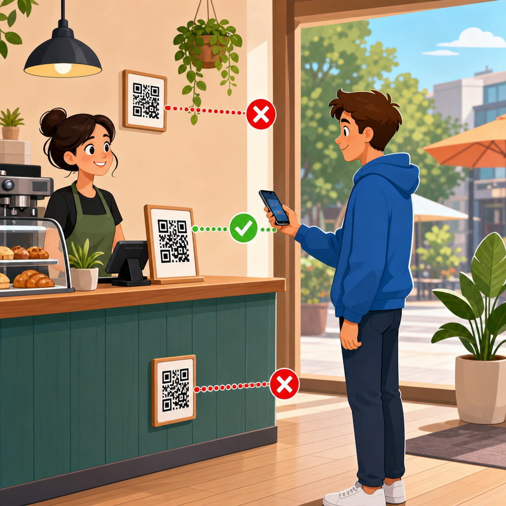
The center-point guideline of 48 to 60 inches works well because it overlaps average visual attention zones for adults in public settings. It also supports mixed-height audiences better than placing codes at knee level on display stands or near the top edge of tall posters. In indoor environments where users stand still, I usually target 52 to 58 inches to the center of the QR code. On counters, kiosks, and tabletop displays, the effective height may be lower because the user is already looking down, but the same principle applies: keep the code within the easiest scanning arc.
Height also affects discoverability. Users do not scan codes they do not notice, and signage viewed at eye level performs better than signage hidden near the base of a display. In retail, especially, a QR code should sit near the product message or call to action, not isolated at an arbitrary low corner. The visual sequence matters. A shopper reads the offer, sees the reason to scan, then spots the code in the same field of view. When the message and code are separated vertically, engagement drops.
Recommended QR code height by use case
Different environments require different QR code placement heights because user posture and dwell time change. A museum label, a shelf talker, and a storefront decal are all scanned differently. The ranges below are practical starting points I have used in production and testing. They assume average adult users, adequate lighting, and a code large enough for the expected scan distance.
| Use case | Recommended height to code center | Why it works |
|---|---|---|
| Posters and wall signs | 52–58 inches | Matches standing eye-hand alignment and keeps the code near the main message |
| Storefront windows | 48–56 inches | Works for pedestrians outside while avoiding excessive bending or reaching |
| Retail shelf signage | 40–52 inches | Fits natural browsing height, depending on shelf level and product category |
| Restaurant table tents | 28–36 inches from floor equivalent | Users are seated and already looking downward at the table surface |
| Counters and check-in desks | 36–48 inches | Supports short scan distance with a slight downward viewing angle |
| Kiosks and freestanding displays | 48–60 inches | Visible from approach and comfortable during short stops |
| Trade show booths | 50–58 inches | Balances visibility in crowded aisles and quick scan behavior |
These ranges are not arbitrary. They reflect the realities of approach angle, body posture, and intent. For example, a countertop payment QR code does not need to sit at eye level because the user is already engaged with the register. A window decal used after hours benefits from mid-level placement so passersby can scan without pressing the phone awkwardly against the glass. A QR code on lower retail shelving can work if the shopper is already comparing products there, but it still needs a compelling prompt and enough whitespace to stand out.
When in doubt, place the code where the user reads the supporting message, not where spare space happens to exist. Designers often tuck QR codes into bottom corners because it keeps layouts tidy. That choice is visually convenient but operationally weak. Placement should follow user behavior first and page composition second.
Ergonomics, scanning distance, and viewing angle
The best height for QR code placement is inseparable from distance and angle. A code scanned from 8 inches behaves differently from one scanned at 4 feet. As a practical rule, users prefer to hold phones roughly perpendicular to the code with only a mild tilt. That becomes harder when the code sits too high above shoulder level or too low near the floor. The camera can still read the symbol in some cases, but the effort rises sharply.
In my experience, the most reliable installations keep the code in front of the user at a neutral angle and at a distance where the whole symbol fits inside the camera frame without zooming or stepping backward awkwardly. For most phone cameras, that means pairing moderate sign heights with appropriate code size. If you mount a small QR code high on a wall, users must either move very close and lift the phone uncomfortably or stand back and risk losing detail. Neither is ideal.
Lighting complicates the issue. Glossy surfaces positioned under ceiling fixtures often throw reflections directly into the camera when the code is mounted too low or too high relative to viewer angle. Matte lamination, reduced glare, and slight repositioning can solve the problem faster than redesigning the code itself. This is why QR code placement belongs in installation planning, not only in graphic design review.
There is also a speed factor. Codes intended for impulse engagement should require almost no physical adjustment. At events, I have seen scan rates improve simply by lowering oversized banner codes from 68 inches to about 56 inches. The change did not alter the offer, copy, or artwork. It reduced the friction of getting the phone lined up in one motion.
Accessibility and audience considerations
A good QR code placement standard accounts for more than average standing adults. Public-facing signage should consider wheelchair users, shorter users, older adults with limited mobility, and people scanning with one hand while carrying bags or pushing strollers. A center height near the middle of the 48 to 60 inch range often serves mixed audiences well, but context still matters. If a code is essential for access to information, payment, menus, forms, or wayfinding, placement should be reachable and viewable from seated positions too.
Accessibility is not just about whether someone can theoretically point a camera at the code. It is about whether they can do so without strain and whether the instructions remain legible at that position. Many teams place the QR code at an acceptable height, then put the call to action in tiny text below it, defeating the purpose. The code, label, and surrounding contrast must work as one accessible unit.
In healthcare, education, transit, and government settings, conservative placement is better than clever placement. Keep codes in predictable locations, avoid mounting them on reflective curved surfaces, and ensure they are not blocked by temporary fixtures, door swings, merchandise, or queue stanchions. If the code links to critical information, provide a short URL as a backup. That is not a substitute for placement, but it is a trust-building fallback when real-world conditions interfere.
Placement rules for common surfaces and materials
Surface choice changes effective height because the user interacts with the whole object, not only the code. On product packaging, the code may be at hand level during handling, so a lower position can be fine. On large corrugated displays, however, the same low placement may disappear in visual clutter. Window vinyl introduces reflections and outside light variability. Foam board signs can warp slightly, changing angle. Metal plaques may add glare. Fabric backdrops can ripple, distorting the code if it is not tensioned correctly.
For paper posters and rigid signs, use a flat mounting area and avoid edges, corners, and seams. For windows, keep the code away from mullions, decals, and highly reflective zones. For labels on bottles or curved jars, do not wrap the code around curvature; keep it on the flattest panel and size it generously. For floor graphics, use QR codes only when the user is expected to stop and look down; otherwise the scan posture is poor and traffic flow becomes awkward.
Outdoor placement adds weather and visibility challenges. Sun angle changes through the day, laminated prints can haze, and users may scan quickly while moving. In those settings, I recommend mid-level placement with strong contrast, weather-resistant print production, and testing at multiple times of day. A QR code that scans perfectly indoors may fail outside because glare, shadows, and approach speed create an entirely different use case.
Testing and improving QR code placement performance
The fastest way to choose the best height for QR code placement is to test live conditions before full rollout. Print mockups at actual size, tape them at different heights, and watch how real users approach. Measure scan rate, time to first scan, and abandonment. Even small observational tests reveal patterns quickly. People will tell you less than their body language does. If they hesitate, squat, stretch, or ask where to scan, the placement is wrong.
Use analytics on dynamic QR codes to compare locations and heights by version. A controlled test might keep the same destination and design while varying only the mounting height between stores, aisles, or event displays. I have used this method in retail pilots where one shelf sign placed the code near the pricing rail and another placed it beside the benefit headline at chest height. The higher placement consistently earned more scans because shoppers noticed it during normal browsing, not after crouching.
Review the complete scan path. Can users approach within the needed distance? Are they blocked by carts, counters, queue lines, or reflected light? Is the code accompanied by a direct instruction such as “Scan for assembly video” or “Scan to see ingredients”? Height can improve mechanics, but context drives motivation. The strongest QR code placement combines a clear reason to scan, a comfortable physical position, and a code printed large enough for the environment.
As a hub within QR Code Design, Printing & Materials, this page should anchor your placement decisions. From here, build deeper standards for QR code size, print contrast, quiet zone, material durability, adhesive choice, indoor versus outdoor production, and placement testing by environment. The main takeaway is simple: aim first for natural scanning posture. For most standing installations, place the center of the code around 48 to 60 inches from the floor, then adjust for audience, surface, and task. If you want better scan rates, stop treating placement as an afterthought and start testing it like a performance variable.
Frequently Asked Questions
What is the best height for QR code placement?
In most situations, the best height for QR code placement is between 48 and 60 inches from the floor to the center of the code. That range works well because it matches the natural eye level and hand position of many standing adults, making the code easier to notice, approach, and scan without awkward bending or reaching. It also tends to support smoother scanning in busy environments where users need to act quickly. While this 48-to-60-inch zone is a strong general guideline, it should not be treated as a rigid rule for every project. The ideal height depends on the surrounding environment, the distance from which the code must be seen, the angle at which people approach it, the type of device they are using, and whether the audience includes children, wheelchair users, or seated visitors. A good placement height is one that balances visibility, comfort, accessibility, and reliable scan performance in the real-world setting where the code will be used.
Is there one perfect QR code height for every installation?
No, there is no single perfect height that works for every QR code installation. The recommended 48-to-60-inch range is an excellent starting point, but the right final placement depends on context. For example, a QR code on a retail display may need to sit at a different height than one on a museum placard, restaurant table sign, event banner, kiosk, or building entrance. If users are walking past quickly, the code may need to be positioned where it enters their line of sight sooner. If they are expected to pause and interact, a lower or more centered placement may feel more comfortable. Audience matters as well. A code meant for broad public use should account for accessibility and ease of reach, not just average standing height. Lighting, glare, wall angle, nearby obstructions, and crowd flow can also influence where the code performs best. The most effective approach is to begin with the standard recommended range, then adjust based on use case, user behavior, and on-site testing.
How does accessibility affect QR code placement height?
Accessibility should be a major consideration when deciding QR code height. Even if a placement looks visually balanced in a design layout, it may not be usable for everyone. Positioning the center of the code roughly 48 to 60 inches from the floor often supports common accessibility expectations because it keeps the code within a comfortable viewing and reaching zone for many users. However, true accessibility goes beyond height alone. The code should be easy to approach without physical barriers, and users should not have to stretch, crouch, twist, or navigate around obstacles to scan it. If the code is intended for public use, it should be placed where wheelchair users, seated individuals, and people with limited mobility can comfortably interact with it. It also helps to provide enough surrounding clear space, strong visual contrast, and adequate lighting so the code can be identified and scanned without difficulty. In other words, accessible QR code placement is about creating an interaction that feels straightforward and inclusive, not merely placing the code at a technically acceptable measurement.
Should QR codes be placed higher or lower depending on where they are used?
Yes, the best QR code height can change depending on the environment and how people are expected to engage with it. In a storefront window, for example, a code may need to be placed where passing pedestrians naturally look, which often means keeping it around mid-body to chest level rather than too high on the glass. On a poster or wall sign in a hallway, placing the code near the lower middle section can improve comfort because users can step close and scan without raising their phones too much. On counters, kiosks, and tabletop displays, the code may need to be lower or angled for better camera alignment. In settings where children are part of the intended audience, such as schools, family attractions, or pediatric spaces, the height may need to be adjusted downward. In professional or public venues with diverse users, a more universally reachable placement is usually the better choice. The key principle is to match the code’s height to the way people encounter the sign: walking by, standing still, sitting, reaching across a counter, or scanning from a queue.
What other factors matter besides height when placing a QR code?
Height is important, but it is only one part of successful QR code placement. Even a perfectly measured installation can perform poorly if other practical details are ignored. Size matters because the code must be large enough to scan easily from the expected distance. Contrast matters because low-contrast designs are harder for phone cameras to detect. Lighting matters because glare, reflections, shadows, and overly bright sunlight can interfere with scanning. Angle matters too; if a code is mounted on a sharply angled surface, behind glass, or too close to an edge, users may struggle to line up their phones correctly. Surrounding clutter can also reduce visibility, especially if the code competes with too much text or too many graphics. Clear instructions help as well, since some users still respond better when they see a simple prompt telling them what they will get by scanning. The strongest QR code placements combine proper height with good visibility, comfortable scanning distance, unobstructed access, clean design, and real-world testing to confirm that people can actually use the code easily and quickly.


