Distance affects QR code scanning more than most teams expect, and it is the single factor I check first when a code performs well in one location but fails in another. In practical terms, scanning distance is the space between the camera lens and the printed or displayed QR code at the moment a user tries to scan it. QR code placement is the broader discipline of choosing where, how high, how large, and at what angle a code appears so that real people can notice it, approach it, and scan it without friction. For marketers, packaging teams, sign installers, and operations managers, this matters because a technically correct QR code can still underperform when distance, viewing angle, glare, and movement are not planned together.
In day-to-day projects, I see the same pattern repeatedly: a code is generated properly, tested at a desk, then deployed on a poster, shelf tag, product box, window cling, menu board, trade show wall, or warehouse label. Once the code leaves the controlled office environment, scan rate drops. The reason is rarely mysterious. A smartphone camera needs enough on-screen pixel detail to resolve the code’s modules, detect finder patterns, correct perspective, and decode data under ambient lighting. If the code is too small for the intended viewing distance, or placed where users cannot comfortably approach it, scan attempts increase while successful scans decrease. That gap is expensive because every failed attempt weakens campaign attribution, wastes foot traffic, and erodes user trust.
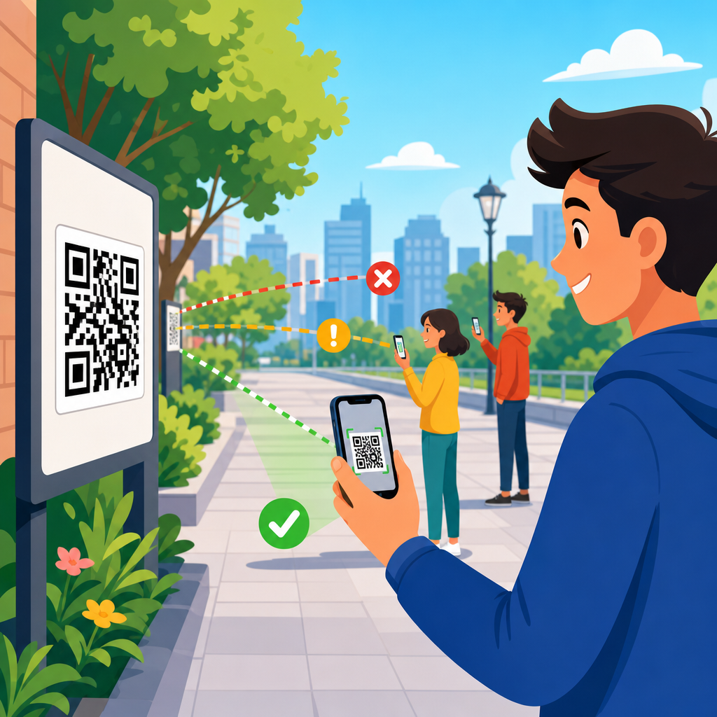
The core rule is simple: as scanning distance increases, QR code size must also increase. That relationship sounds obvious, yet placement decisions often ignore context. A code on product packaging may be scanned from 8 to 16 inches away in a shopper’s hands. A restaurant table tent may be scanned from 12 to 24 inches. A lobby sign might be scanned from 3 to 6 feet. A billboard near a road presents an entirely different scenario, where vehicle speed, camera autofocus limits, and safety concerns make QR use questionable even if the code is physically large. Understanding distance means understanding user behavior, optical constraints, and the environment where the scan happens.
This article explains how distance affects QR code scanning and why QR code placement should be treated as a design and operations problem, not just a graphic one. It also serves as the central guide for this subtopic within QR Code Design, Printing & Materials, connecting the ideas that shape size, location, materials, lighting, and testing. If you need a practical answer to “How far away can someone scan this code?” the right response is always conditional: it depends on code size, data density, print quality, contrast, quiet zone, angle, lighting, camera quality, and whether the user is stationary. The sections below break those factors into decisions you can apply before printing or publishing anything.
Why scanning distance changes performance
A QR code is made of tiny square modules arranged in a grid. A camera must capture enough sharp information to distinguish those modules from each other and from the background. As distance increases, each module occupies fewer pixels in the camera image. Once modules become too small relative to the camera sensor, focus quality, and motion blur, decoding becomes unreliable. This is why the same code that scans instantly from a hand-held flyer can fail on a wall sign viewed from several feet away. The issue is not the destination URL. It is image resolution at the point of capture.
Distance also changes user posture and device angle. At close range, people align their phone parallel to the code and can make small adjustments. At medium range, especially above eye level or below waist level, perspective distortion increases. If the code is behind glass, mounted on a curved surface, or lit unevenly, the camera has to solve multiple problems at once. In field testing, I have seen a code decode perfectly at four feet when mounted matte on foam board, then struggle at the same size and distance when applied to a glossy acrylic panel under overhead spotlights. Placement is therefore inseparable from materials and lighting.
Another practical issue is dwell time. People will tolerate only a short delay before abandoning a scan. On packaging, they may reposition the box. On a retail display, they may step closer once. On a station platform or busy corridor, they often will not. Increased distance reduces the apparent size of the code and usually increases the time needed for autofocus and decoding. If the environment is crowded, users may not have space to approach. Effective QR code placement anticipates the maximum likely scanning distance and designs for success at that distance, not just at ideal range.
How to match QR code size to viewing distance
The most useful planning principle is that minimum QR code size should scale with expected scanning distance. A common rule of thumb used by print teams is a roughly 10:1 relationship, meaning the code’s width should be about one-tenth of the scanning distance. It is not a universal law, but it is a reliable starting point for placement decisions. A 1-inch code may work around 10 inches away. A 2-inch code suits about 20 inches. A 6-inch code is more realistic for scans around 5 feet. Then refine based on data density, error correction level, print sharpness, and the quality of the target audience’s phones.
Dense codes need more size because the modules are smaller. A short URL encoded with a dynamic QR platform such as Bitly, QR Code Generator Pro, or Beaconstac generally produces a less dense pattern than a long static URL full of parameters. That difference matters at distance. If two signs are both 3 inches wide but one contains a compact redirect and the other encodes a long vCard or Wi-Fi payload, the simpler code will usually scan more easily from farther away. When possible, reduce complexity before increasing physical size, because larger signs cost more and may still fail if the module pattern is too dense for the environment.
| Typical use case | Likely scan distance | Practical code size | Placement note |
|---|---|---|---|
| Product packaging | 8–16 inches | 0.8–1.5 inches | Keep away from folds, seams, and reflective laminate |
| Table tents and menus | 12–24 inches | 1.25–2 inches | Place near natural hand position and avoid glossy stock |
| Posters and wall signs | 2–6 feet | 3–7 inches | Mount at chest to eye level with strong contrast |
| Storefront windows | 2–5 feet | 3–6 inches | Account for glare, backlighting, and reflections |
| Trade show graphics | 3–8 feet | 4–10 inches | Provide clear approach space and a verbal CTA |
These ranges are intentionally conservative. Modern flagship phones can outperform them under ideal conditions, but placement should be designed for ordinary phones, average lighting, and impatient users. If your campaign depends on scans from several feet away, print a larger code than the minimum, simplify encoded data, and preserve a clean quiet zone around all four sides. Standards guidance from ISO/IEC 18004 and practical verifier workflows from print quality tools such as Axicon and REA VeriCube support the same conclusion: decoding reliability improves when symbol structure is easy for the camera to resolve.
Placement factors that work with distance, not against it
Good QR code placement starts with the user’s line of sight. Chest to eye level is usually the strongest zone for medium-distance scans because it minimizes awkward wrist angles and perspective distortion. Codes placed too high require users to tilt both head and phone, often causing glare and focus problems. Codes placed too low force people to crouch and can reduce accessibility. On packaging, the equivalent principle is simple visibility: place the code on a flat panel that users naturally hold upright, not across a corner, gusset, or tear strip. If distance is already challenging, poor placement compounds the problem immediately.
Angle matters because smartphone decoders can correct some perspective distortion, but not unlimited distortion. A QR code placed perpendicular to the likely viewing path scans better than one mounted at a steep slant. This is especially important on windows, hanging signs, and curved displays. I generally avoid placing primary codes on cylindrical bottles or heavily curved pouches unless the code is enlarged and tested after final production. Curvature changes the apparent geometry of modules, and at greater distance the camera has fewer pixels available to compensate. A flat, matte application gives the best odds.
Lighting is another placement variable that directly influences distance tolerance. In bright, diffuse light, a camera can use faster shutter speeds and lower ISO, reducing blur and noise. In dim interiors, scanning range effectively shrinks. Glossy finishes, laminated posters, and glass storefronts can create specular highlights that wash out finder patterns. If a code must be behind glass, tilt the fixture slightly or change surrounding lighting to reduce reflections. Contrast should remain high, ideally dark modules on a light, non-patterned background. Reversed light-on-dark codes can work, but they leave less margin for long-distance scans and should be tested aggressively.
Surrounding clutter also affects scan behavior. A code buried among dense text, competing icons, and patterned graphics takes longer to identify visually, even before the camera tries to decode it. Users need to notice the code, understand its purpose, and decide it is worth scanning. That is why a clear call to action placed adjacent to the code improves performance: “Scan for assembly instructions,” “Scan to see ingredients,” or “Scan to claim event check-in.” In placement terms, distance is not just optical. It includes the psychological distance between noticing a code and understanding why to use it.
Common placement scenarios and what works best
On consumer packaging, most scans happen at arm’s length. Here, a code can be relatively small, but the print environment is unforgiving. Flexographic printing, varnishes, embossing, and curved containers can degrade edges. I prefer placing packaging QR codes on the back or side panel with at least several millimeters of quiet zone, away from nutrition tables or ingredient blocks that visually crowd the symbol. If the package uses metallic ink or shrink wrap, increase size and test after conversion, not just from the original artwork file. The final package, not the design proof, determines usable scanning distance.
In restaurants and hospitality, QR codes are often scanned from seated positions. Menus, table tents, check presenters, and room collateral should be readable from 1 to 2 feet without requiring guests to lift the item into ideal light. Matte stock is usually better than high-gloss. If the code links to payments or ordering, speed matters because friction directly affects revenue. Keep the code close to the CTA and avoid placing it near folds or binding. For wall-mounted codes in lobbies or elevators, use larger sizes because people may first attempt to scan from several feet away while moving.
Retail and event environments introduce crowding and motion. A store sign may be visible from six feet, but fixtures or other shoppers may limit how close someone can get. Trade show codes often fail because they are mounted beautifully but too high on back walls, where attendees can see them yet cannot hold a phone steady long enough to decode. The best-performing event codes I have installed were positioned near demo counters or handout stations, around chest height, with enough open floor area for a brief stop. In transit settings, avoid placing codes where users must stand in unsafe paths or near moving traffic.
Large-format outdoor placement deserves caution. A QR code on a billboard or roadside sign may look clever, but practical scanning is constrained by distance, speed, and safety. Pedestrian plazas and queueing areas can support larger-format codes if people are stationary and have time to approach. Highways do not. If the intended user is moving quickly, use a short memorable URL instead. When outdoor scanning is appropriate, account for weathering, fading, surface texture, and changing sun angle over the day. A code that works at noon may become reflection-heavy at 5 p.m., cutting effective scan distance in half.
Testing methods, metrics, and hub topics to explore next
The most reliable way to validate QR code placement is field testing with the final asset, final materials, and representative phones. Start by defining intended scan distance, then test at that range and slightly beyond it. Use both iPhone and Android devices, because camera tuning differs across models. Measure first-attempt success rate, average time to scan, and the number of users who step closer before succeeding. If more than a small minority must reposition or approach, placement is not robust enough. Analytics from dynamic QR platforms will tell you total scans, but observational testing explains why users fail before a scan is recorded.
As the hub page for QR code placement, this article connects several closely related decisions. Size selection deserves its own deeper guide because module density, print process, and destination type all affect minimum dimensions. Height and angle deserve separate treatment because ergonomic access changes by venue. Surface and substrate matter because paper, plastic, corrugate, glass, metal, and fabric each introduce different risks. Lighting and contrast need their own checklist, especially for window graphics and glossy signage. Finally, scan testing should be documented like any quality-control workflow, with pass/fail criteria, device lists, and photos of the installed context.
The key takeaway is straightforward: QR code scanning distance is not an isolated technical limit but the outcome of placement, size, print quality, lighting, contrast, angle, and user behavior working together. When you choose QR code placement based on real scanning distance rather than available empty space, performance improves immediately. Start every project by asking where the user will stand, how quickly they will move, what phone they are likely to use, and how much time they will tolerate. Then size and place the code for that reality, test it in the field, and refine before full rollout. If you are building or auditing a QR program, use this hub as your starting point and review each placement variable systematically.
Frequently Asked Questions
Why does distance have such a big impact on QR code scanning?
Distance affects QR code scanning because a phone camera has to capture enough visual detail to clearly distinguish the code’s modules, quiet zone, and overall pattern before the scanning software can decode it. As the camera moves farther away, the QR code occupies fewer pixels in the image. That reduction in visible detail makes it harder for the device to identify the code accurately, especially if lighting is uneven, the surface is reflective, the code is angled, or the camera is slightly out of focus. In real-world environments, distance rarely acts alone. It combines with print size, mounting height, user movement, glare, and the quality of the phone camera.
This is why a QR code can work perfectly on a product label held in someone’s hand but fail when the exact same design is placed on a wall, window, poster, or sign several feet away. The code itself may be technically correct, but the viewing conditions are not. In practice, distance is often the first variable to check because it quickly explains why one placement succeeds and another does not. If users cannot comfortably approach the code or if the code is too small for the expected scanning range, performance drops fast. Good QR code placement starts with understanding the real scanning distance users will have, then sizing and positioning the code to match that behavior.
How large should a QR code be for the distance people will scan from?
The most useful way to think about QR code size is to start with expected scanning distance, not with a fixed default dimension. A code meant to be scanned from a few inches away can be relatively small, while a code intended for a poster, sign, storefront, menu board, or event display usually needs to be much larger. If people must stand back to scan, the code must grow proportionally so the camera can still capture enough detail. Teams often make the mistake of choosing a size based on available layout space instead of user behavior, and that is where performance problems begin.
A practical guideline many professionals use is roughly 1 inch of QR code size for every 10 inches of scanning distance, though this should be treated as a starting point rather than an absolute rule. Dense codes with lots of data, codes printed on challenging surfaces, or placements with poor lighting may need to be larger. Simpler codes, especially dynamic QR codes that use short URLs, are often easier to scan because they contain less visual complexity. The safest approach is to estimate the farthest realistic scanning distance, size the code for that condition, and then test it on multiple phones. When in doubt, make the code larger, simplify the encoded data, and preserve generous white space around it. Those three decisions solve a surprising number of scanning issues.
Can QR code placement matter as much as the code design itself?
Yes, absolutely. QR code placement is often just as important as the design of the code itself because scanning is a physical interaction, not just a graphic one. A perfectly generated QR code can still fail if it is mounted too high, placed at an awkward angle, positioned behind reflective glass, installed where foot traffic cannot pause, or located where users cannot get close enough to scan. Placement determines whether people can notice the code, approach it naturally, hold their phone steady, and frame it in the camera without strain. If any of those steps are difficult, scan rates decline even when the code is technically correct.
Good placement considers height, approach path, line of sight, surrounding clutter, and likely user posture. For example, a code on a tabletop may work well for seated users but poorly for people walking by. A code on a tall retail sign may look prominent but be too far away for practical scanning. A code near a checkout lane may be visible yet unusable if people are moving too quickly to stop. The strongest placements let users scan at a comfortable distance, with minimal glare, at a near-front-facing angle, and without blocking others. In other words, effective placement turns a QR code from a decorative element into a usable tool. That is why scanning performance should always be evaluated in the actual environment, not just on a designer’s screen or a printed proof held at arm’s length.
What are the most common signs that distance is the reason a QR code is failing?
There are several clear indicators that distance is the underlying problem. One of the most common is inconsistency across locations: the same QR code works in one setting but not in another. If users can scan it easily when they move close, but struggle when standing at the natural viewing position, the code is almost certainly too small for the actual scanning range. Another sign is when people have to zoom in, step far forward, tilt their phone repeatedly, or try multiple times before a scan succeeds. Those behaviors usually mean the camera is not receiving enough clean visual information from where the user is expected to stand.
You may also notice that newer phones scan the code more reliably than older devices. While camera quality plays a role, that gap often points back to marginal sizing or excessive distance. If the code is only barely scannable under ideal conditions, stronger cameras may rescue it while average devices fail. Another warning sign is when the code performs well in mockups, print tests, or close-up reviews but underperforms in the field. That usually happens because the real environment introduces stand-off distance, awkward approach angles, motion, and lighting issues that were not considered during design. When diagnosing poor QR performance, start by asking a simple question: from how far away are people actually trying to scan this? That answer often reveals the fix faster than redesigning the artwork.
What can I do to improve QR code scanning when distance is part of the problem?
The most effective fix is usually to increase the physical size of the QR code so it matches the true scanning distance. If users are standing farther away than expected, a larger code gives the camera more detail to work with and improves recognition speed. Beyond size, simplify the QR code whenever possible by using a short destination URL or a dynamic QR code platform, which can reduce visual density. Make sure the code has a strong contrast difference between foreground and background, and preserve a clean quiet zone around the edges so scanners can isolate the symbol. These design improvements help, but they work best when paired with realistic placement.
Placement adjustments can be just as important as resizing. Move the code lower or closer to eye level if users currently have to tilt their phones upward. Avoid glossy, curved, or reflective surfaces that interfere with camera capture. Reposition the code so people can pause naturally without obstructing traffic, and make sure the viewing angle is as direct as possible. If the environment limits how large the code can be, reduce the scanning distance by placing the code where users naturally come closer. Finally, test the finished setup in the actual location using multiple phone models and lighting conditions. Real-world testing is what confirms whether the code is truly easy to scan, not merely technically valid. When distance is treated as a primary design input instead of an afterthought, QR code performance becomes far more predictable and reliable.


