Indoor vs outdoor QR code placement strategies determine whether a code is scanned effortlessly or ignored. Placement is not just about where a sticker, sign, label, or placard physically sits. It includes viewing distance, lighting, mounting height, print substrate, contrast, weather exposure, foot traffic, camera angle, and the user’s intent at the moment they see the code. In practice, I have seen beautifully designed QR campaigns fail because the code was placed behind reflective glass, too high on a wall, or on a sun-faded outdoor panel where smartphone cameras could not lock focus fast enough.
QR code placement matters because scanning is a physical behavior before it becomes a digital action. A person notices the code, decides whether it is worth scanning, aligns a phone, and expects a page to load quickly. Any friction in that sequence lowers scan rate. Indoors, the main challenges are glare from polished surfaces, crowded visual environments, weak call-to-action language, and awkward placement near checkout counters or displays. Outdoors, the variables expand: weather, UV degradation, dirt, vandalism, moving pedestrians, vehicle speed, and changing daylight all affect performance.
For brands managing QR code design, printing, and materials, placement is the operational layer that connects the printed object to measurable results. A code printed at the correct size on durable material can still underperform if mounted at the wrong angle or in a low-attention zone. Conversely, a modest print can outperform expectations when the placement matches user behavior. That is why QR code placement should be treated as a planning discipline, not an afterthought delegated to installation teams after the creative work is finished.
This hub article covers QR code placement comprehensively, with a focus on the practical differences between indoor and outdoor environments. It explains how to choose locations, account for line of sight, set appropriate scan distance, reduce friction, and match materials to conditions. It also serves as a central guide for related topics under QR Code Design, Printing & Materials, including QR code size, contrast, substrate selection, lamination, mounting methods, and testing workflows. If a team needs a reliable framework for deciding where a code should live and why, this article provides it.
What QR Code Placement Means in Real Use
QR code placement is the intentional positioning of a scannable code so a user can notice it, understand its purpose, and scan it successfully with minimal effort. Good placement aligns three factors: visibility, accessibility, and context. Visibility means the code is easy to see from the expected approach path. Accessibility means a user can physically reach the right distance and angle to scan. Context means the placement matches the task the person is trying to complete, such as paying, checking product details, joining Wi-Fi, viewing a menu, or registering at an event.
In field audits, I usually start with one question: where is the user when the code first enters their field of view? That answer changes everything. A diner seated at a table has time, stable posture, and close viewing distance. A commuter passing a station poster has seconds of attention and may be moving fast. Placement must respond to that reality. Codes designed for dwell environments can be smaller, denser, and paired with more explanatory copy. Codes designed for drive-by or walk-by settings need bigger symbols, cleaner layouts, and fewer competing elements nearby.
Placement also interacts with scanning technology. Modern phone cameras are better than they were five years ago, but they still struggle with tiny modules, extreme angles, glare, and low contrast. Error correction helps when part of the code is damaged, yet it is not a cure for poor installation. The practical rule is simple: if people have to reposition themselves, shade the code with their hand, or take multiple attempts, the placement is wrong.
Indoor QR Code Placement Strategies
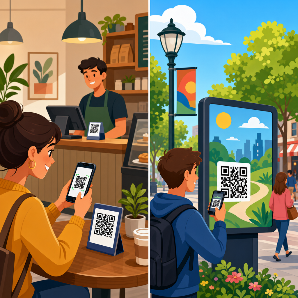
Indoor QR code placement usually benefits from controlled conditions, but those conditions are often less ideal than marketers assume. Retail stores have mixed lighting and reflective fixtures. Offices have security glass and narrow corridors. Restaurants have low evening light and tables cluttered with condiments. Museums and events have queues that compress personal space. The advantage indoors is that teams can usually manage distance, surface choice, and mounting stability more precisely than outside.
The best indoor placements are near a natural pause point. Examples include restaurant tables for digital menus, shelf talkers for product specifications, reception desks for check-in, packaging inserts for onboarding, and point-of-sale displays for loyalty signups. Users are already stopped or slowing down, which raises scan success. Mounting height should support a neutral wrist angle; for standing adults, chest to eye level often works well, while seated environments should place codes within easy tabletop or near-table sightlines. Codes near floors, above head height, or around tight corners consistently underperform.
Lighting is the biggest hidden indoor issue. Overhead LEDs create hotspots on glossy laminated prints, especially when the code is mounted vertically. Matte finishes usually scan better than high-gloss surfaces because they reduce specular reflection. If a code must sit behind acrylic or glass, test it under the exact lighting used during operating hours. I have seen codes pass office tests in the morning and fail in the evening when directional lights produce glare bands across the finder patterns. Indoors, substrate and placement angle are often as important as code design itself.
Indoor environments also allow tighter integration with signage systems. A QR code beside a concise action phrase such as “View installation guide” or “Check ingredient details” outperforms a standalone code because users understand the value before scanning. The placement should preserve visual hierarchy: the code must be noticeable without competing with critical wayfinding text, pricing, or compliance labels. On packaging, a side panel can be better than the back if the product is normally displayed facing forward on a shelf and shoppers can access that side while browsing.
Outdoor QR Code Placement Strategies
Outdoor QR code placement requires a different standard because conditions change hourly and often unpredictably. Sunlight, rain, wind, dust, and temperature swings affect both the printed code and the scanning experience. Placement outdoors must account for exposure and movement. A code on a bus shelter, storefront window, campus sign, trade show exterior panel, or real estate board may be seen under direct sun at noon, in shadow at dusk, or in rain with water droplets distorting the print surface.
The first principle outdoors is to increase forgiveness. Use larger codes, simpler surrounding layouts, and more durable materials than an equivalent indoor application. A poster that scans at one meter indoors may need a substantially larger code outdoors because users stand farther away, approach at wider angles, and have less time. For stationary pedestrian traffic, place codes where a person can step aside without blocking others. For roadside or parking-lot contexts, do not expect detailed interactions from moving vehicles; position the code only where people can safely stop.
Material choice is inseparable from placement outside. UV-resistant inks, weatherproof vinyl, powder-coated metal signs, and anti-graffiti laminates extend usability. If the code is mounted on corrugated surfaces, brick, mesh, or curved poles, module distortion can impair recognition. Flat, rigid mounting surfaces are consistently better. Contrast also fades outdoors; black-on-white remains the most reliable option, especially under variable lighting. Colored codes may be brand-aligned, but they need wider contrast margins and stronger testing. In my experience, conservative visual choices outdoors produce better long-term scan rates.
Maintenance matters more outside than most teams budget for. Dirt accumulation at curb level, sticker vandalism, edge peeling, and sun bleaching reduce readability gradually, so campaigns appear live while performance quietly collapses. Outdoor QR placements should be inspected on a schedule, not only when a campaign launches. A monthly visual review is a baseline for protected sites; high-traffic public installations may need weekly checks. If a location cannot be maintained, it is not a strong placement candidate regardless of footfall.
Key Differences Between Indoor and Outdoor Placement
The core difference between indoor and outdoor QR code placement is environmental control. Indoors, the installer can usually manage light, distance, and access. Outdoors, the strategy must absorb uncertainty. That changes decisions about size, mounting, materials, and expected scan behavior. The table below summarizes the most important differences that influence placement choices in real projects.
| Factor | Indoor placement | Outdoor placement |
|---|---|---|
| Lighting | More controllable but often affected by glare from LEDs, acrylic, or polished surfaces | Highly variable across sun, shade, dusk, and rain; glare and washout are common |
| Recommended size | Can be smaller when users are close and stationary | Usually larger to support greater distance and faster scanning |
| Material durability | Paper, card, foam board, acrylic, or indoor vinyl often sufficient | Requires UV resistance, water protection, rigid mounting, and stronger adhesives |
| User behavior | More likely to stop, read instructions, and retry a scan | Less patience; users are moving, distracted, or exposed to weather |
| Maintenance | Lower wear, easier replacement, fewer environmental contaminants | Regular inspection needed for fading, dirt, peeling, and vandalism |
These differences affect campaign planning from the start. If a team uses the same file, same size, and same finish for both environments, the outdoor execution usually suffers first. Indoor and outdoor QR code placement should therefore be specified separately in installation guides, vendor briefs, and quality assurance checklists.
Placement Rules That Improve Scan Rates
Several rules apply in both settings. First, preserve a clear quiet zone around the code. Many scan failures come from decorative borders, crowded text, or image elements touching the symbol. Second, match code size to expected scan distance. A common working rule is roughly one unit of code width for every ten units of scanning distance, then increase size when lighting or user motion is unfavorable. Third, keep the code within a comfortable camera angle. Extreme upward or downward positioning introduces perspective distortion and user fatigue.
Fourth, place the code where the promise is obvious. “Scan for warranty registration” will attract different users than “Scan to see assembly video.” Relevance drives scans more than novelty. Fifth, test with multiple devices, not just the latest flagship phone. Mid-range Android cameras, older iPhones, and cracked protective screen covers reveal real-world friction quickly. Sixth, avoid placing codes where wireless connectivity is weak unless the destination supports fast loading on cellular networks. A successful scan that opens a slow page still feels like a failed experience to the user.
Measurement should close the loop. Dynamic QR codes, UTM parameters, geotagged reporting, and placement-level naming conventions make it possible to compare performance across entrances, aisles, windows, tables, and exterior signs. That data often exposes assumptions. In one retail rollout, a window code got more impressions but fewer conversions than a shelf-edge code because shoppers scanning at the shelf were closer to purchase intent. Placement strategy is strongest when analytics, installation standards, and on-site observation inform each other.
Common Mistakes and How to Avoid Them
The most common placement mistake is treating the QR code as a decorative add-on instead of a functional interface. Teams often place it where there is visual space left over, not where scanning behavior makes sense. Other frequent errors include printing too small, using low contrast, mounting on curved or reflective surfaces, placing the code in direct sunlight without testing, and omitting a clear call to action. Outdoors, another major mistake is selecting a high-exposure site without planning maintenance or replacement cycles.
Avoid these problems by building a placement checklist before production. Confirm user distance, traffic speed, line of sight, mounting height, light conditions, substrate finish, connectivity, and the landing page purpose. Test the installed code from the actual approach path, not only from directly in front of it. If the code is meant to be scanned while standing in a queue, test it while people are present. If it is intended for a storefront, test in morning and afternoon light. Real placement performance is situational, and assumptions are expensive.
Conclusion
Indoor vs outdoor QR code placement strategies succeed when they respect how people move, pause, notice, and scan in specific environments. Indoor placements usually win through convenience, low friction, and contextual relevance at natural pause points. Outdoor placements win through durability, larger sizing, strong contrast, safe access, and maintenance discipline. In both cases, the best-performing QR code placement is not the most creative location. It is the location that makes scanning feel obvious, comfortable, and worthwhile.
As the hub for QR code placement within QR Code Design, Printing & Materials, this guide should inform every related decision: size, finish, substrate, installation method, and testing process. If you are planning a new deployment, audit your environment first, document user behavior, and test the code where it will actually live. That one step will improve scan rates more reliably than redesigning the symbol later.
Frequently Asked Questions
What is the biggest difference between indoor and outdoor QR code placement strategies?
The biggest difference is control. Indoor environments usually give you far more control over lighting, viewing distance, traffic flow, and the amount of time a person has to notice and scan the code. Outdoors, you are dealing with variables that change constantly: sun glare, shadows, weather, uneven surfaces, longer viewing distances, and people who may be walking or driving past instead of standing still. That means a QR code that performs well indoors can easily underperform outside if the placement strategy is not adjusted.
Indoors, placement can be more precise. You can often mount codes at a comfortable scanning height, use matte materials to reduce reflections, and place them near points of decision such as reception desks, product displays, checkout counters, menus, or event signage. Since the environment is more stable, you can often use smaller codes and expect reliable performance, provided contrast and scan distance are still appropriate. Indoor users are also more likely to be in an exploratory mindset, which means they may be willing to pause and engage.
Outdoors, codes generally need to work harder to earn attention and survive the environment. They often need to be larger, simpler, and printed on more durable substrates. Placement must account for weather exposure, sunlight direction, mounting stability, and the likelihood that users are viewing the code from farther away or at an angle. If people are moving quickly, the code must be easy to spot, easy to approach, and easy to scan without awkward positioning. In short, indoor strategy optimizes convenience and context, while outdoor strategy prioritizes visibility, durability, and resilience under imperfect scanning conditions.
How do viewing distance and mounting height affect QR code scan rates?
Viewing distance and mounting height are two of the most practical factors in QR code performance, and they are often overlooked in favor of design. A code may be technically correct yet still fail because it is too small for the distance at which people first notice it, or because it is mounted too high or too low for a comfortable scan. People do not usually make a special effort to scan a difficult code. If scanning feels inconvenient, they move on.
As a general rule, the farther away someone is when they encounter the code, the larger the code needs to be. This is especially important outdoors, on posters, storefront signage, transit placements, window graphics, trade show backdrops, and directional displays. If the first moment of awareness happens from several feet away, a small code may never even register as scannable. Indoors, where people are often closer to the sign, code size can be more modest, but the code still needs enough prominence to be recognized immediately.
Mounting height matters because smartphones need a reasonably direct camera angle. Codes placed too high force people to tilt their phones upward, which can introduce glare, distortion, and awkward posture. Codes placed too low may be missed entirely or require users to crouch. In most walk-up scenarios, chest-to-eye level is a strong starting range because it matches natural sightlines and makes scanning feel effortless. The ideal height also depends on context. A QR code on a tabletop menu can sit lower because the user is already seated or leaning in, while a wall-mounted placard in a hallway should align with the average standing user’s line of sight.
The best placements are the ones that match human behavior. Ask where the person will be standing, how fast they are moving, whether they can pause safely, and what angle they will hold their phone at. If you design for those real-world conditions instead of just the printed layout, scan rates usually improve significantly.
Why do lighting, glare, and contrast matter so much for indoor and outdoor QR codes?
QR codes rely on clean visual detection. Smartphone cameras and scanning software need enough contrast to distinguish the code’s modules clearly, and they need to do so under real environmental conditions, not just in a digital proof. That is why lighting, glare, and contrast have such a direct impact on whether a code scans instantly or frustrates the user.
Indoors, the common problems are reflective surfaces, uneven artificial lighting, and placement behind glass or glossy acrylic. A code may look sharp to the naked eye but become difficult to scan because overhead lights create hot spots or reflections across the surface. This is one of the most frequent reasons attractive campaigns underperform. If the code is mounted behind reflective glass, on shiny lamination, or under spotlights, camera detection can become inconsistent. Matte finishes and non-reflective materials usually perform better, especially in high-traffic commercial spaces.
Outdoors, glare becomes even more aggressive. Direct sunlight can wash out contrast, while shifting shadows can obscure parts of the code throughout the day. Weather also affects readability. Rain, dirt, fading, and surface wear can reduce clarity over time. This is why strong black-on-light contrast remains the safest option in most cases. Stylized color treatments can work, but only if they are tested under the exact lighting conditions users will encounter. A code that scans in the studio may fail on a bright sidewalk at noon.
Contrast is not just about aesthetics; it is about tolerance. High contrast gives the scanner more room for error when the user is at an angle, in motion, or dealing with poor light. For both indoor and outdoor placements, the practical approach is simple: use strong contrast, avoid reflective barriers, choose finishes that reduce glare, and test the code on multiple phones at the actual site during realistic times of day. Real-world lighting is often the difference between a successful placement and a missed interaction.
What materials and surfaces work best for outdoor QR code placement?
Outdoor QR code placement requires materials that protect both scanability and physical integrity. The right substrate is not only durable but also visually stable. A code that curls, fades, cracks, wrinkles, or becomes glossy in harsh light may still be present physically, yet functionally it has failed. Outdoors, the print material is part of the placement strategy, not just a production detail.
In many cases, durable vinyl, coated metal, weather-resistant plastic, rigid composite board, and properly sealed adhesive graphics are strong options. The exact choice depends on how long the code will remain in place, what kind of exposure it will face, and whether it is mounted temporarily or permanently. For short-term promotions, a high-quality weather-resistant decal may be enough. For long-term signage, rigid and UV-stable materials are usually more reliable. Matte finishes are generally preferred because they reduce reflection and improve camera readability in bright conditions.
Surface texture and stability also matter. A QR code should sit on a flat, undistorted area whenever possible. Curved surfaces, corrugated materials, rough masonry, and heavily textured backgrounds can interfere with the code’s geometry, especially when viewed from an angle. If the placement is on a window, remember that outdoor light can create intense reflections that make scanning difficult. In some cases, moving the code to an adjacent non-glass surface dramatically improves results.
Weather exposure should be planned for from the beginning. Heat can warp materials, moisture can loosen adhesives, and UV exposure can fade dark areas over time, lowering contrast. Dirt accumulation can also reduce readability. For important outdoor campaigns, it is wise to inspect placements periodically and replace codes that show wear. The best-performing outdoor QR installations are usually the ones designed with maintenance in mind, not just launch-day appearance.
Where should you place a QR code so people actually want to scan it?
The best placement is where intent and convenience meet. People scan QR codes when the next step feels useful, immediate, and easy. That means placement should align with what the user is already trying to do in that moment. A code near a product display works because the person wants more product information. A code on restaurant table signage works because the person is ready to view a menu, order, or pay. A code at a trailhead works because the visitor wants a map or local details. The physical location should support the user’s goal, not interrupt it.
Indoors, strong placements are often near decision points: entrances, checkout areas, waiting rooms, shelves, counters, table tents, event registration desks, and instructional signage. In these spaces, users are usually stationary or moving slowly, which gives them the time and physical comfort needed to scan. The code should be visible before the decision moment passes, and the call to action should clearly explain the benefit. People are much more likely to scan when they know what they will get, such as pricing, directions, setup instructions, a coupon, a review page, or a digital menu.
Outdoors, successful placements usually consider both approachability and safety. People need enough time and space to stop without feeling awkward or obstructing traffic. Sidewalk signs, storefront entry zones, outdoor kiosks, posters near queuing areas, park signage, and venue wayfinding points are often effective because they match moments when users naturally pause. By contrast, placements that are visible only from moving vehicles or across wide streets may generate awareness but not actual scans unless there is a nearby place to stop and interact comfortably.
The broader principle is that a QR code should feel like a helpful tool, not a hidden extra. Place it where the user already has a question, where they can physically scan with ease, and where the reward for scanning is clear and immediate. When those three conditions


