QR code placement determines whether a scan becomes a conversion or a missed opportunity. In campaigns I have audited across retail stores, trade show booths, direct mail, restaurant menus, and product packaging, placement consistently has more impact than teams expect. A perfectly branded code with dynamic tracking, error correction, and a strong landing page still underperforms when people cannot comfortably see it, trust it, or reach it at the right moment. Optimizing QR code placement means choosing the physical or digital position where a code is most visible, scannable, contextually relevant, and aligned with user intent. Conversions may be purchases, form fills, app downloads, menu views, registrations, review submissions, loyalty enrollments, or simply qualified traffic.
Placement matters because scanning is a physical behavior, not just a design choice. People need enough distance to frame the code, enough light to read it, enough time to act, and a reason to interrupt what they are doing. Camera autofocus, reflective materials, curved surfaces, crowd flow, shelf height, and screen glare all influence outcomes. So does message sequencing. A QR code near a call to action such as “Scan to compare sizes” performs differently from the same code placed near legal copy or at the bottom of a cluttered layout. Good placement reduces friction. It answers silent questions instantly: What is this for, can I trust it, can I scan it now, and what happens next?
This hub article explains how to optimize QR code placement for conversions across print, packaging, signage, out-of-home media, events, and digital displays. It covers line of sight, distance, size, material constraints, environmental testing, accessibility, analytics, and common mistakes. It also provides practical guidance for choosing the best location based on audience behavior and campaign goal. If you manage QR code design, printing, or production, placement should be treated as a conversion variable alongside copy, destination page, and measurement. When placement is planned deliberately, scan rates rise, abandonment falls, and the QR code becomes a reliable bridge between offline attention and online action.
Match placement to user intent and conversion timing
The best QR code placement starts with one question: what is the user trying to do at that exact moment? Placement works when it meets intent in context. On restaurant tables, people want fast access to menus, ordering, or payment. On product packaging, they may want instructions, authenticity verification, recipes, refill registration, or support. In retail aisles, they often want comparisons, reviews, coupons, or stock information. At events, they want schedules, maps, lead capture, speaker materials, or instant networking. The code should sit where the need naturally appears, not where there is simply leftover white space.
I have seen brands place QR codes on the back panel of packaging because compliance already crowded the front. That often lowers scans when the intended action is discovery or product education. If the code drives a how-to video for first-time use, side-panel or front-panel placement near the product benefit statement usually converts better. By contrast, warranty registration or regulatory documents can live on the back because those actions happen after purchase. Timing matters just as much as visibility. Put the code where the consumer is motivated to act, not just where the printer can fit it.
Context also determines how much explanatory text is needed. A code beside “Scan for assembly video” is self-explanatory. A code floating alone on a poster is ambiguous and therefore weaker. Strong placement bundles three elements tightly together: the code, a direct benefit-led call to action, and enough breathing room around the symbol to preserve scan accuracy. This combination improves both trust and usability, especially when users have only seconds to decide.
Use viewing distance, angle, and dwell time as placement rules
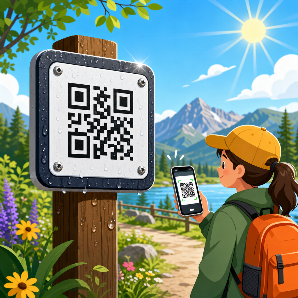
A practical way to optimize QR code placement is to design from viewing conditions backward. People scan from different distances depending on the medium. On business cards or product labels, the device may be 8 to 18 inches away. On tabletop displays and shelf talkers, perhaps 1 to 3 feet. On posters in lobbies, 3 to 6 feet. On transit shelters or store windows, farther still. As distance increases, the code must grow, contrast must remain strong, and the user must have enough dwell time to stop and scan safely.
A common production guideline is roughly one inch of QR code size for every ten inches of scanning distance, though camera quality and contrast can extend that range. In practice, I treat that as a starting point rather than a guarantee. Low light, glossy lamination, tinted glass, and motion all demand larger symbols. Angle matters too. A code placed low on a freestanding sign may be technically visible but hard to scan because users must crouch and tilt their phones sharply. Codes work best when presented close to natural eye and hand position.
Dwell time is the hidden variable. A code on an escalator banner or moving vehicle may attract attention but deliver poor conversion because users cannot safely frame the symbol. The same artwork on a queue barrier, checkout counter, or waiting-room display can perform well because people are stationary. Good placement respects the physical moment. If the environment does not give people time to scan, the code should shift to a location with a pause built in.
| Placement environment | Typical viewing distance | Recommended placement approach | Conversion note |
|---|---|---|---|
| Product packaging | 8–24 inches | Front or side panel near product benefit or usage step | Best for education, verification, recipes, registration |
| Table tents and menus | 12–36 inches | Center field, upright, glare-controlled finish | Works when action is immediate and obvious |
| Posters and in-store signage | 3–6 feet | Eye-level zone with strong CTA and clear quiet space | Requires larger code and uncluttered design |
| Window graphics | 2–8 feet | Avoid reflections, keep inside natural stopping areas | High visibility, but glare often suppresses scans |
| Billboards and transit wraps | Far and often moving | Use only where pedestrians can stop nearby | Awareness may rise, direct scans usually lag |
Choose high-visibility zones without disrupting the design hierarchy
High visibility does not mean placing the QR code everywhere or making it the largest object on the page. It means assigning it a clear position within the design hierarchy so the eye finds it after the headline and before the user’s attention fades. On posters, the most reliable zone is often the middle third to lower-middle area, where people can spot the call to action and comfortably raise a phone without blocking their own view. On packaging, the best zone depends on the job to be done. For try-me messaging, proximity to the product claim wins. For support content, proximity to the instruction panel wins.
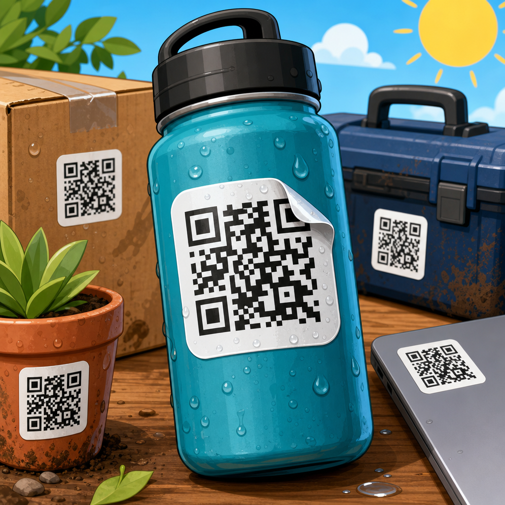
Placement should also account for hand use and obstruction. On hanging retail tags, I prefer the code away from punch holes, folds, and pegs because store fixtures often block part of the design. On cylindrical packaging, I avoid placing the code across a curve that distorts the finder patterns. On pouches, gussets and seals can wrinkle over time, so the flattest stable panel is safer. On corrugated shipping boxes, seams and tape lines are obvious no-go zones. A technically printed code that becomes partially hidden in real-world handling is a failed placement decision.
Design hierarchy matters because people need a reason to scan. If the code competes with too many badges, offers, logos, or legal elements, it becomes visual noise. I advise teams to reserve a dedicated scan zone: code, short CTA, brief outcome statement, and sufficient quiet space. That zone should feel intentional. When it does, trust increases, and trust is a conversion lever in every QR experience.
Account for materials, lighting, and production constraints
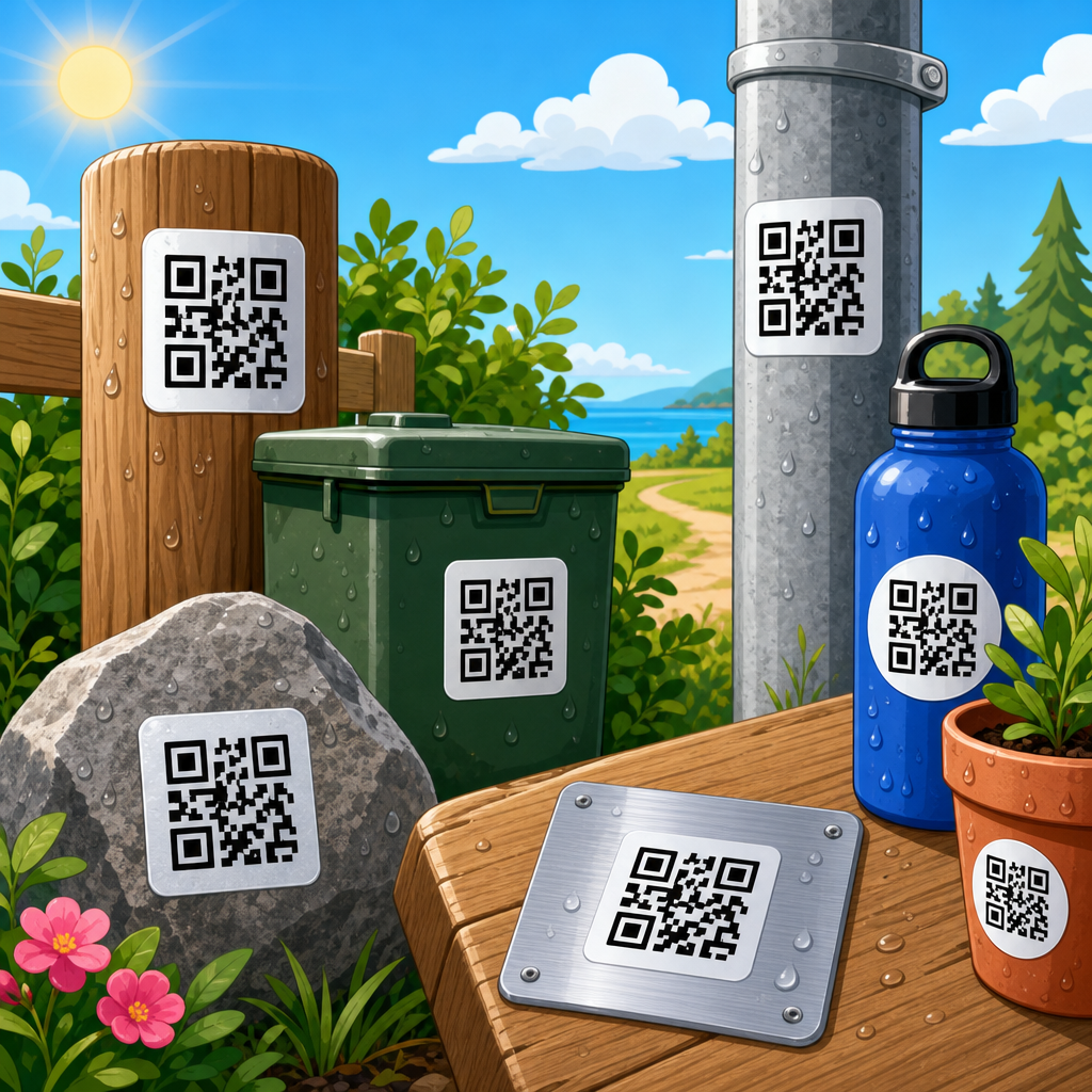
Placement decisions must survive production. Matte substrates typically scan more reliably than glossy ones because they reduce specular reflection. Clear labels over dark products can look elegant but often lower contrast and hurt camera detection. Metallic inks, foils, embossing, and textured stocks introduce risk even when the proof looks sharp. If a code is printed on glass, acrylic, or polished laminate, test under the exact lighting conditions users will encounter. Overhead LEDs, daylight through storefront windows, refrigerated case lighting, and phone screen reflections all change scan performance.
I have repeatedly found that window decals underperform not because the design is wrong but because the code sits where outdoor reflections are strongest. Moving the same code twelve inches lower or rotating it away from the sun path can materially improve scan rates. On menus protected by plastic sleeves, the issue is often glare from pendant lights. On trade show booths, spotlights can wash out a code near the edge of a glossy panel. Production teams should review placement with the printer, fabricator, and installer early, especially for large-format jobs.
Quiet zone integrity is another production issue. A QR code needs clean margin around it so scanners can distinguish the symbol from nearby graphics. That clear area should remain free of text, borders, folds, perforations, and busy photography. If finishing processes may shift trim slightly, add margin beyond the minimum. Placement near die cuts or label edges is risky because even minor tolerance variation can clip the code or its quiet zone. Reliable conversion starts before the press runs.
Optimize placement by channel: packaging, print, signage, and events
Each channel has recurring placement patterns that work. On consumer packaging, front-of-pack placement is best when the code supports comparison, social proof, or a promotional offer during shopping. Side-panel placement is ideal for recipes, tutorials, sourcing stories, and care instructions used after purchase. Back-panel placement fits registration, manuals, compliance content, and longer-form brand storytelling. On direct mail, the strongest location is usually above the fold near the main offer, not buried near address blocks or disclaimers. Recipients sort mail quickly, so the code must support the first decision, not the last.
For in-store signage, place codes where shoppers naturally pause: endcaps, shelf talkers, fitting room mirrors, checkout counters, and pickup areas. Avoid floor decals unless the action is extremely simple and the store environment is open; many people hesitate to point a phone down in crowded spaces. For restaurants and hospitality, tabletop stands outperform wall placement for menu access because they are within reach and aligned with immediate intent. Counter signs work well for loyalty signup or payment because customers are already stationary.
At events, conversions improve when codes appear at transition points: registration desks, badge pickup, session entrances, booth counters, and exit areas. A code on a tall booth wall may gather awareness, but a duplicate code on the counter closes the action because attendees can scan while waiting. Placement should map to attendee flow. If the desired action is lead capture, put the code where conversation naturally ends. If it is agenda access, put it at decision points before movement begins.
Build trust and accessibility into the placement decision
People do not scan every visible code. They scan codes that look legitimate, useful, and safe. Trust signals should sit next to the code, not elsewhere on the asset. A recognizable brand name, a plain-language destination description, and a concise benefit statement all increase confidence. “Scan for installation guide” is stronger than “Scan me.” “Opens our secure payment page” is better than an unexplained code next to a credit card icon. On public signage, include a short URL or brand domain as a reassurance cue, especially where QR phishing concerns are high.
Accessibility also affects conversion. Codes should be placed where wheelchair users, shorter users, and people with limited reach can comfortably scan them. Excessively high wall placement excludes users. Tiny codes on low shelves exclude others. Color contrast matters for users in bright light and for older phone cameras. When the code delivers essential content such as menus, instructions, or forms, provide a fallback path like a short URL or NFC alternative. Good placement assumes varied abilities, not ideal conditions.
Language support belongs in the placement strategy too. In multilingual environments, pair the code with short labels in the main languages of the audience. In travel, healthcare, and public venues, this small change can raise completion substantially because it reduces hesitation before the scan. Accessibility is not separate from conversion optimization. It is one of its strongest drivers.
Measure scans, compare locations, and refine continuously
The fastest way to improve QR code placement is to test locations with trackable codes. Use dynamic QR codes, UTM parameters, or platform analytics to separate scans by placement, creative variant, store, region, or event zone. In audits, I look beyond raw scan volume. A placement can generate many scans but weak conversions if curiosity is high and intent is low. Measure the full path: scans, page load rate, engagement, completion, and downstream revenue or lead quality. This reveals whether a location attracts the right users at the right moment.
Real-world testing should be practical and iterative. For packaging, compare side-panel versus back-panel placement across matched SKUs. For retail signage, test eye-level poster placement against counter placement in similar stores. For events, compare wall graphic codes with counter cards and badge inserts. Heatmaps, dwell observations, and staff feedback often explain the numbers. If shoppers say they noticed the code but could not scan because of glare, that is a placement issue, not a messaging issue.
Document findings in a repeatable checklist: intended action, audience state, viewing distance, line of sight, lighting, substrate, quiet zone, CTA clarity, and analytics setup. Over time, patterns become clear. Teams that treat QR code placement as an ongoing conversion program, not a one-time artwork decision, consistently outperform teams that focus only on code generation and landing page design.
QR code placement is the difference between passive visibility and measurable action. The strongest placements align with user intent, appear where people naturally pause, remain easy to scan under real lighting and material conditions, and sit next to a clear reason to act. Across packaging, print, signage, and events, the fundamentals stay consistent: match the code to the moment, respect distance and angle, protect contrast and quiet space, and test performance by location rather than assuming any visible code will work.
If you manage QR code design, printing, or campaign execution, treat placement as a conversion variable from the start. Review sightlines, handling, glare, crowd flow, and accessibility before artwork is approved. Give every code a defined job, a visible benefit-led call to action, and analytics that separate one placement from another. Small physical changes often produce outsized gains because they remove friction at the exact point of decision.
Use this page as your hub for QR Code Placement planning, then build supporting standards for size, materials, finishing, testing, and destination design. Start by auditing one live asset this week: identify the user’s intent, check whether the code is truly scannable in context, and compare its location against the principles above. Better placement leads to more scans, better scans lead to stronger user journeys, and stronger user journeys lead to higher conversions.
Frequently Asked Questions
What factors matter most when optimizing QR code placement for conversions?
The most important factors are visibility, accessibility, context, timing, and trust. A QR code can be technically perfect and still perform poorly if it is placed where people do not naturally look, cannot physically reach, or do not have enough time to scan. High-converting placement starts with line of sight. The code should appear where attention already exists, not where you hope people will notice it. In a retail store, that may be near a product decision point. At a trade show, it is often at eye level beside a simple offer. On packaging, it should be positioned where the customer can scan it without rotating the item awkwardly or covering the code with their hand.
Accessibility is just as important. People need enough distance to focus their camera, enough lighting to read the code, and enough physical space to stand still for a second or two. Context matters because scanning is a behavior tied to intent. If the code appears at the exact moment a person wants more information, a discount, a tutorial, or a next step, conversions rise. Timing also plays a major role. A code shown while someone is moving past quickly, waiting in line, or juggling other tasks will usually underperform a code shown during a more receptive moment.
Trust is the final conversion lever many teams underestimate. People are far more likely to scan when the code is clearly branded, placed beside a short explanation, and paired with a visible benefit such as “See ingredients,” “Get 15% off,” or “Watch setup instructions.” Good placement is not just about where the QR code sits on a surface. It is about whether the environment makes scanning feel obvious, easy, safe, and worth doing.
Where should a QR code be placed in physical marketing materials to get the best results?
The best placement depends on how and when the audience interacts with the material, but the general rule is to position the QR code near the decision moment and within a natural visual path. On posters, signs, and trade show graphics, placing the code at roughly chest to eye level typically performs better than placing it too low, too high, or buried in a corner. People should be able to notice it quickly and scan without crouching, stretching, or stepping into an awkward position. On direct mail, the code usually performs best when it is close to the main offer and call to action rather than isolated on the back with no supporting copy.
For restaurant menus, table tents, and countertop displays, convenience matters more than design symmetry. The code should be easy to scan from a seated or standing position with minimal glare and enough white space around it. On product packaging, high-performing placements usually sit on a flat, visible panel rather than on folds, seams, curves, or reflective surfaces. If the code supports post-purchase use, such as setup instructions or loyalty registration, place it where customers are likely to look immediately after opening or handling the product.
In retail environments, think beyond “where there is empty space” and focus on “where buying intent peaks.” Shelf talkers, end caps, fitting room signage, and product comparison areas can outperform generic entrance signage because they align with active consideration. The strongest placements reduce friction and align with customer behavior in that setting. When the code is placed where people already pause, compare, decide, or seek reassurance, conversions tend to improve substantially.
How does QR code size and scanning distance affect placement performance?
Size and distance directly affect scan success, and poor planning here is one of the most common reasons placements underperform. A QR code must be large enough to scan comfortably from the expected viewing distance. If people are walking past a sign several feet away, a small code will force them to step closer, stop unexpectedly, or give up entirely. If the code is on a table tent or package in someone’s hand, a smaller size may work, but it still needs to be large enough for quick camera recognition and clear printing.
A useful practical guideline is to match the code size to the environment rather than relying on a single standard dimension. Codes on product packaging, business cards, and brochures can be relatively compact because users hold the item close. Codes on wall signage, storefront windows, and event banners need to be larger because the scan begins from farther away. Placement must also account for movement. If people are walking, driving, or standing in a crowd, the effective time available to notice and scan the code is reduced, which means the code often needs to be larger and supported by a stronger call to action.
Performance also depends on print quality, contrast, and surface conditions. A well-sized code can still fail if it is printed on glossy material with glare, wrapped around a curved bottle, or placed in dim lighting. The best approach is to test the actual code in the real environment, from the real viewing distance, using multiple phones. If scanning requires more than a second or two of camera alignment under normal conditions, placement or size likely needs improvement.
What are the biggest QR code placement mistakes that hurt conversions?
The most damaging mistake is placing the code where people cannot comfortably scan it. That includes areas that are too high, too low, too far away, blocked by fixtures, or visible only at awkward angles. Another common mistake is treating the QR code as a decorative design element instead of a functional conversion tool. Teams often tuck it into a crowded layout, reduce its size to preserve aesthetics, or place it on reflective, curved, or dark surfaces that make scanning unreliable. When visual design priorities overpower usability, conversion rates usually suffer.
A second major mistake is separating the QR code from its value proposition. If people see a code but do not immediately understand why they should scan it, many will ignore it. Placement works best when the code sits beside a clear and specific prompt. Vague labels like “Scan me” are weaker than direct benefit-led copy such as “Scan to view the demo,” “Scan for today’s coupon,” or “Scan to reorder.” Another mistake is placing codes in high-traffic environments where people are moving too fast to stop safely or comfortably, such as narrow aisles, congested entrances, or areas without enough space to stand and scan.
Brands also lose conversions when they ignore the post-scan experience during placement planning. For example, a code may be positioned in a basement retail area with poor connectivity, or in a bright outdoor setting where users struggle to complete a form on their screens. Finally, many marketers fail to test placement variants. They assume one location is good enough, even though moving the code just a few inches, changing the height, adding directional cues, or placing it closer to the decision point can produce significantly better results. Optimization comes from observing user behavior, not guessing.
How can you test and improve QR code placement to increase conversions over time?
The most effective way to improve QR code placement is to treat it as a conversion variable and test it systematically. Start by defining what success means: total scans, scan-to-landing-page views, completed purchases, form fills, coupon redemptions, app downloads, or another downstream action. Then compare placements in real-world conditions. For example, test eye-level versus waist-level signage, product-front versus side-panel packaging, or a QR code near the headline versus near the footer of a mail piece. Even small placement changes can produce large differences in scan volume and conversion quality.
Use dynamic QR codes and analytics so you can measure performance by location, asset type, campaign version, or store environment. If possible, segment by context. A code that performs well in a quiet retail aisle may behave very differently at a busy event booth. Pair performance data with observational insights. Watch how people approach the sign, where they stand, whether they hesitate, whether glare affects scanning, and whether they notice the code before or after reading the surrounding message. This combination of quantitative and qualitative feedback gives a much clearer picture than scan counts alone.
Improvement usually comes from removing friction. Increase size if people struggle to scan from the expected distance. Move the code closer to the offer if people notice it too late. Add white space, simplify nearby design elements, improve lighting, reduce reflections, and strengthen the call to action. Most importantly, test the complete experience from first glance to final conversion. The best placement is not simply the one that gets the most scans. It is the one that attracts the right users at the right moment and leads them smoothly to the intended action.