Innovative QR code designs for marketing turn a utilitarian square into a brand touchpoint, a measurable conversion tool, and a bridge between physical media and digital experiences. A QR code, or Quick Response code, is a two-dimensional barcode that stores information such as URLs, contact details, payment data, or app deep links. In marketing, the code matters only if people notice it, trust it, and feel motivated to scan. That is why design is not decoration. It directly affects scan rate, campaign attribution, and customer experience.
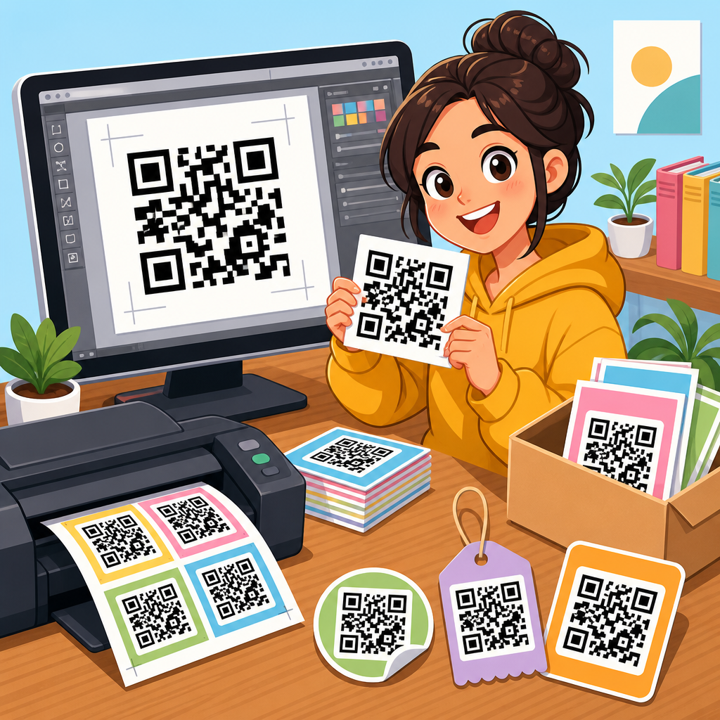
I have worked on QR campaigns for retail displays, trade show booths, restaurant menus, direct mail, packaging inserts, and outdoor signage, and the same lesson appears every time: ugly but functional codes can work, yet well-designed codes with clear intent usually perform better. The difference is rarely artistic taste alone. It comes from aligning brand identity, placement, call to action, destination page, and technical readability. Marketers often focus on generating the code and forget the surrounding system. A design example is useful only if it shows why the code earned attention and how it remained easy for smartphone cameras to interpret under real conditions.
This hub article covers QR code design examples across major marketing use cases, explains the rules that protect scanability, and shows how to evaluate options without sacrificing performance. If you manage packaging, print ads, event marketing, menus, real estate signs, or product education, this guide will help you build QR code designs that look distinctive and still scan fast. It also serves as a foundation for related resources in the broader QR Code Resources, Templates & Tools library, where teams can go deeper into templates, generators, testing workflows, and campaign reporting.
What makes a QR code design effective
An effective QR code design does three jobs at once. First, it remains technically readable. Second, it signals legitimacy and relevance. Third, it gives the user a clear reward for scanning. The best examples succeed because they respect all three. A highly stylized code that fails under low light, curved packaging, or glare is not innovative; it is expensive clutter. A plain black-and-white code can outperform a beautiful one if the surrounding message is stronger. In practice, winning designs combine contrast, enough quiet zone, and a direct call to action such as “Scan for 15% off,” “See the assembly video,” or “Check live inventory.”
Readability depends on established QR code structure. The three corner finder patterns must stay recognizable, data modules need sufficient contrast with the background, and the quiet zone around the code should usually be at least four modules wide. Error correction helps when logos or stylistic edits cover part of the pattern, but it is not a license to over-design. I recommend dynamic QR codes for marketing because they allow destination changes, UTM tagging, and scan analytics without reprinting creative. This is especially valuable for evergreen assets like packaging or in-store signage, where campaign URLs may change while the printed code stays in market.
Core design rules before you customize
Before looking at visual examples, it is important to understand the nonnegotiables. Use high contrast, ideally dark foreground on a light background. Reverse-out codes can work, but only after device testing across iPhone and Android cameras. Keep the code large enough for viewing distance. On a flyer held in hand, 0.8 to 1 inch may scan fine; on a poster viewed from several feet away, a much larger code is necessary. Avoid placing codes over busy textures, metallic foils, or folds. If print finishing is involved, matte coatings are safer than glossy lamination because glare interferes with detection.
The destination matters as much as the symbol. If the scan opens a non-mobile page, asks for unnecessary form fields, or loads slowly, the design has already failed. Every QR code example should be judged as an experience chain: visual prompt, scan action, landing page relevance, and measurable conversion. Good campaign teams test codes with multiple devices, on different networks, at realistic viewing angles, and in varied lighting. They also include a short backup URL for accessibility and trust. That single line can recover conversions when a camera is damaged, a code is partially blocked, or a user prefers typing.
QR code design examples by marketing use case
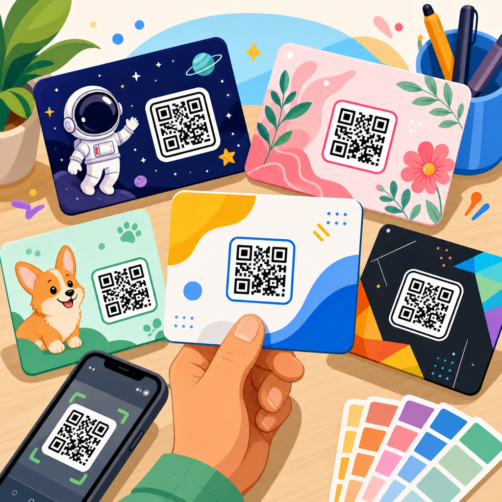
The strongest QR code design examples are tied to context. On product packaging, a subtle brand-color code with a small centered logo works well when paired with utility messaging: recipes, setup guides, authenticity checks, refill subscriptions, or loyalty enrollment. On a coffee bag, for example, a code can lead to farm origin stories and brewing instructions. The design should feel premium but still contrast sharply with the package material. I have seen kraft paper pouches reduce scan reliability when designers used low-contrast brown-on-tan modules; switching to black on cream solved the issue immediately.
In retail signage, bigger is usually better. Endcaps, shelf talkers, and window clings benefit from bold frames around the QR code and benefit-led text. A cosmetics brand might use “Scan to shade match” with a code integrated into a mirror graphic. A furniture store can use “View this sofa in your room” to launch an AR experience. Event marketing rewards speed and clarity. Booth graphics, badges, and session signage should use plain, high-contrast codes with a very obvious next step: book a demo, download slides, join a giveaway, or connect on LinkedIn. At crowded events, attendees scan while walking, so visual simplicity beats ornamental detail.
Restaurants, hospitality, and real estate each create distinct design opportunities. Menus can use branded frames and table-specific dynamic codes to track scans by location or shift. Hotels often place codes in rooms for spa booking, late checkout, or local recommendations, and these work best when the visual style matches the property’s wayfinding system. In real estate, yard signs need large-format codes, minimal styling, and mobile-first listing pages with compressed images and tap-to-call buttons. Direct mail is another high-value category. A postcard with a personalized landing page, tracked through a dynamic code, can connect offline households to online offers while preserving clean creative.
| Use case | Best design approach | Main user incentive | Common mistake |
|---|---|---|---|
| Packaging | Brand colors, small logo, strong contrast, matte finish | How-to content, loyalty, authenticity, reorders | Low contrast on textured materials |
| Retail signage | Large code, framed CTA, short supporting copy | Offers, reviews, product comparison, AR preview | Code too small for viewing distance |
| Events | Simple high-contrast layout, minimal decoration | Lead capture, schedule, demo booking, downloads | Over-stylized modules that slow scanning |
| Restaurants | Table-specific dynamic codes, durable print, clear labeling | Menus, ordering, feedback, loyalty | Sending guests to PDF files not optimized for mobile |
| Real estate | Extra-large code, high contrast, weather-resistant material | Property tour, listing details, agent contact | Heavy image pages that load slowly on mobile data |
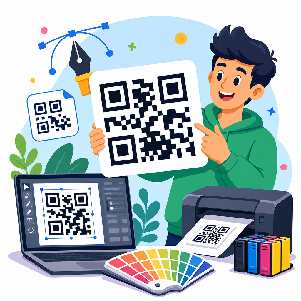
Creative customization that preserves scanability
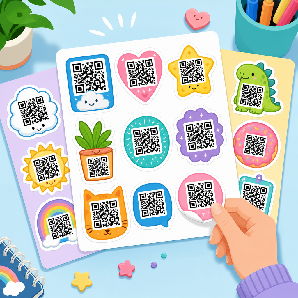
Customization should start with safe variables. Color is the simplest lever. Brand-aligned dark blue, green, or burgundy codes often scan as reliably as black if the background is light enough. Frames and callout shapes add visibility without touching the matrix itself. Logos can be placed in the center, but keep them proportionate and use higher error correction levels thoughtfully. Rounded modules, gradient accents, and branded corner eyes can work, though I advise testing each treatment on older phones, not just current flagship devices. In my experience, gradients fail most often when they reduce contrast at the edges of the code.
Some of the most effective examples are not the most visually complex. A skincare brand can place a clean QR code inside a circular “Scan for your routine” badge and outperform a heavily illustrated alternative because intent is instantly clear. A B2B software company can add a logo and a subtle border to a code on booth graphics, then use a dedicated landing page with one form field and a calendar embed. The design supports the offer rather than competing with it. This is the central principle of QR code design examples worth replicating: style should guide the eye and build trust, not make the code harder to interpret.
Placement, calls to action, and landing page alignment
Where a QR code sits on the page or object influences results as much as the code style. Users need physical room to scan. Do not place codes too close to edges, curves, seams, or transparent surfaces. On packaging, areas near nutrition panels or instruction blocks often perform well because people already look there. On posters, mid-to-lower sections can be easier to scan than top corners. For vehicle wraps and billboards, think carefully before using QR at all; if the audience is moving, the scan window is tiny and safety concerns are real. Use QR where attention can pause.
The call to action should answer the user’s first question: why should I scan this right now? Generic labels like “Scan me” are weak because they hide the payoff. Specific labels increase intent and reduce hesitation. Examples that consistently test well include “Scan to watch the 30-second demo,” “Scan for instant warranty registration,” and “Scan to unlock today’s menu specials.” Then the landing page must deliver exactly that promise, above the fold, on mobile, fast. I typically treat QR landing pages as campaign microsurfaces: minimal navigation, compressed assets, obvious next step, and analytics configured before launch through GA4, UTM parameters, and platform dashboards.
Measurement, testing, and iteration for better performance
The practical value of dynamic QR codes is measurement. Marketers can track total scans, unique scans, time of day, device type, approximate location, and downstream conversions when analytics are set up correctly. This makes QR code design examples more than inspiration; they become testable hypotheses. If one retail sign uses a framed code with “Find your shade” and another uses a plain code with “See all colors,” scan rate differences can reveal whether incentive framing or visual treatment is driving behavior. The same applies to direct mail, where personalized URLs and segmented codes can show which audience, offer, and creative combination produced the best response.
Testing should happen in stages. First, validate pure scanability: multiple phones, distances, and lighting conditions. Second, test environmental durability: smudges, reflections, folds, curved containers, and weather if the code is outdoors. Third, optimize conversion after the scan. Heatmaps, session recordings, and A/B tests on mobile landing pages often uncover bigger gains than code redesign alone. I have seen campaigns improve more from replacing a cluttered form with a one-tap coupon reveal than from any visual code change. The lesson is simple: QR design is part of performance marketing. The strongest teams treat the code, context, and destination as one system.
Building a scalable QR code design library
As a hub topic inside QR Code Resources, Templates & Tools, QR Code Design Examples should help teams move from one-off experiments to repeatable standards. Create a design library with approved colors, minimum sizes, logo usage rules, CTA patterns, landing page templates, and testing checklists. Tools such as Bitly, QR Code Generator Pro, Flowcode, Beaconstac, and Canva can support creation, management, and version control, but governance matters more than software. Name every asset consistently, document where each code is deployed, and maintain ownership so old destinations do not break when campaigns end or staff changes.
A scalable library should also map examples to business goals. Include packaging examples for education and reorders, event examples for lead capture, menu examples for ordering and feedback, and real estate examples for tours and calls. Over time, your team builds internal benchmarks for scan rate, click-through rate, and conversion by placement type. That is how innovative QR code designs for marketing stop being novelty pieces and become reliable growth assets. Start with one high-intent use case, test rigorously, and expand your library with examples your audience has already proven they will scan.
Frequently Asked Questions
1. Why does QR code design matter so much in marketing?
QR code design matters because a marketing QR code has to do more than function technically. It has to earn attention, communicate trust, and give people a reason to scan in the middle of a busy visual environment. A plain black-and-white code may work, but if it blends into packaging, posters, direct mail, retail displays, or event signage, many people will simply ignore it. Strong design turns the QR code from a passive utility into an active brand touchpoint that feels intentional and relevant to the campaign.
From a performance perspective, design influences scan rate, user confidence, and conversions. People are more likely to engage when the code is visually connected to the brand, clearly labeled, and paired with a compelling call to action such as “Scan to unlock 15% off,” “See the product in action,” or “Book instantly.” Good design also helps set expectations. If the surrounding creative makes the value obvious, users understand what they will get after scanning, which reduces hesitation and increases qualified traffic.
Just as importantly, innovative design helps bridge physical and digital experiences. A well-designed QR code can connect print ads to landing pages, product packaging to tutorials, menus to ordering systems, and in-store displays to loyalty programs or reviews. In that sense, QR code design is not decoration. It is part of conversion strategy. The most effective codes balance aesthetics, usability, brand consistency, and technical reliability so they look appealing while remaining easy to scan across devices and lighting conditions.
2. How can brands make QR codes look creative without hurting scanability?
The best approach is to customize with discipline. Brands can absolutely make QR codes more visually distinctive by adjusting colors, adding a logo in the center, shaping the frame, incorporating brand motifs, or placing the code inside a broader campaign layout. However, every creative decision should preserve the code’s core readability. A QR code still needs enough contrast, a clear quiet zone around the edges, and a pattern structure that smartphone cameras can recognize quickly.
In practice, that means keeping dark modules against a lighter background, avoiding low-contrast color combinations, and resisting the urge to over-style the code with heavy textures, gradients, or busy imagery. A logo can be placed in the center if the code has sufficient error correction, but it should not obscure too much of the data area. Rounded modules, custom corner markers, and branded frames can work well when generated through reliable tools that maintain standards rather than manually editing the code as a graphic after the fact.
Testing is what separates attractive QR design from effective QR design. Before launch, brands should test the code on multiple phones, under different lighting conditions, at various sizes, and from realistic scanning distances. They should also test it in context, such as on glossy packaging, curved bottles, window signage, or outdoor posters, where reflection, distortion, and motion can affect performance. A creative QR code is successful only if it scans quickly and consistently. Innovation should enhance usability, not compete with it.
3. What are the most effective ways to use innovative QR code designs in marketing campaigns?
Innovative QR code designs work best when they support a clear marketing objective rather than being added as a novelty. For lead generation, a branded QR code on brochures, trade show booths, or print ads can direct users to a landing page, gated content, or a booking form. For ecommerce, packaging inserts and product tags can link to tutorials, cross-sells, product registration, or limited-time offers. In retail environments, shelf talkers and end-cap displays can connect shoppers to reviews, size guides, loyalty rewards, or mobile checkout experiences.
They are also highly effective for experiential and omnichannel campaigns. Event marketers use QR codes on badges, displays, and signage to deliver schedules, maps, networking tools, and sponsor activations. Restaurants use them for menus, table ordering, and promotions. Real estate professionals use them on signs and flyers for virtual tours, listing details, and contact forms. Beauty, food, and consumer goods brands increasingly use visually customized QR codes on packaging to tell brand stories, verify authenticity, share ingredient sourcing, or launch augmented reality experiences.
The strongest campaigns align the QR code’s design, placement, and destination. If the campaign is premium, the QR presentation should feel premium. If the message is urgent, the call to action should be direct and benefit-led. Placement matters as much as appearance: the code should be easy to spot, easy to reach, and large enough to scan comfortably. Innovative design becomes truly effective when it is integrated into the user journey, supported by a persuasive offer, and measured against outcomes such as scans, clicks, time on page, purchases, sign-ups, or repeat engagement.
4. What are the biggest mistakes marketers make with QR code design?
One of the biggest mistakes is prioritizing appearance over function. Marketers sometimes use brand colors with insufficient contrast, place QR codes over complex backgrounds, shrink them too much, or add logos and visual effects that interfere with readability. Another common issue is forgetting the quiet zone, the blank margin around the code that helps scanning apps distinguish it from surrounding elements. Even a beautifully branded code can fail if the camera cannot identify it cleanly.
A second major mistake is weak messaging around the code. Many campaigns display a QR code with no explanation of what happens next, which creates uncertainty and lowers scan intent. People want to know why they should scan and what value they will receive. A code should be paired with a clear, specific prompt such as “Scan to watch the demo,” “Scan for same-day pricing,” or “Scan to join the rewards program.” Generic instructions like “Scan me” are far less effective because they do not communicate benefit.
Other frequent problems include sending users to a poor mobile experience, using static destinations when campaign flexibility is needed, placing the code where it is physically difficult to scan, and failing to track results. A QR code can generate interest, but if it leads to a slow page, irrelevant content, or a form that is hard to complete on a phone, conversions will suffer. Marketers also miss opportunities when they do not use dynamic QR codes, UTM parameters, or analytics integrations to measure performance and optimize creative, placement, and landing pages over time.
5. How should marketers measure the success of a QR code campaign?
Success should be measured beyond simple scan counts. While total scans are a useful starting point, they do not reveal the full effectiveness of the campaign. Marketers should look at unique scans, repeat scans, scan location, device type, time of day, and conversion behavior after the scan. These metrics help determine not just whether people noticed the QR code, but whether the audience was qualified and motivated to take meaningful action.
The most important performance indicators depend on campaign goals. If the purpose is awareness, engagement metrics such as unique visitors, time on page, video completions, or social follows may matter most. If the goal is lead generation, then form submissions, appointment bookings, downloads, or email sign-ups are stronger indicators. For sales campaigns, marketers should focus on cart additions, purchases, coupon redemptions, average order value, and return on ad spend. In physical environments, comparing scan activity across stores, displays, packaging variants, or print placements can reveal which creative and placement strategies drive better results.
To measure accurately, marketers should use dynamic QR codes, campaign-tagged URLs, dedicated landing pages, and analytics platforms that connect scans to downstream behavior. A/B testing can also be extremely valuable. Brands can compare different calls to action, placements, sizes, colors, incentive offers, or destination experiences to learn what improves scan rate and conversion rate. Over time, the best-performing QR code campaigns are treated like any other high-value marketing channel: tested, tracked, optimized, and aligned closely with customer intent and business outcomes.