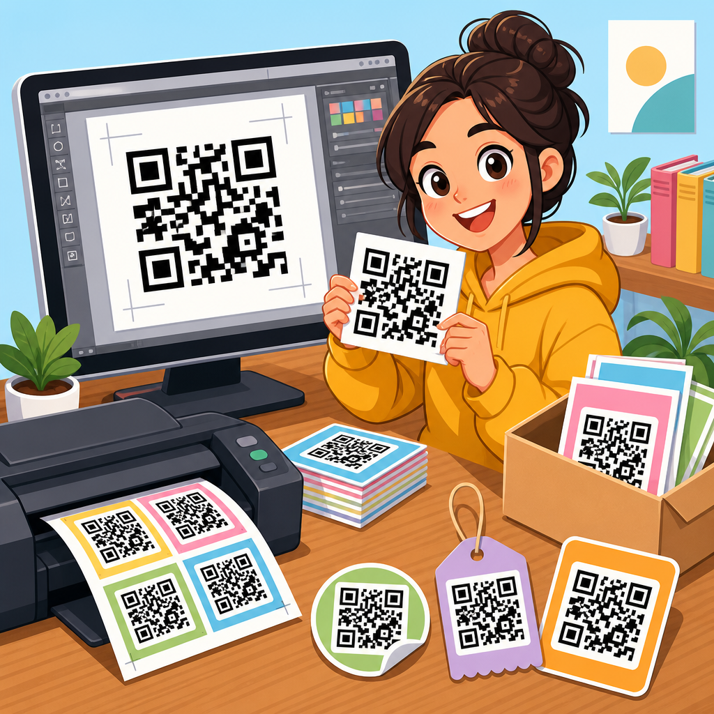
QR code vector files for printing are the foundation of sharp, reliable scannable graphics across packaging, signage, labels, brochures, menus, trade show materials, and large-format displays. A QR code is a two-dimensional matrix barcode that stores data such as a URL, vCard, app link, payment address, or product identifier. A vector file is artwork built from mathematical paths rather than fixed pixels, which means it can scale from a business card to a billboard without becoming blurry. For print production, that difference is decisive. Raster images like JPG or PNG can work for small digital use, but once a code is resized, placed in a layout, or sent through a commercial press workflow, low-resolution assets often fail in ways that are expensive to catch late.
In practice, I have seen otherwise well-designed campaigns undermined by one avoidable problem: the QR code asset was downloaded in the wrong format. A 300-pixel PNG stretched inside Adobe InDesign may still look acceptable on screen, yet print with softened module edges, altered contrast, or quiet-zone interference after export. When scanners read a code, they rely on high edge contrast, intact finder patterns, correct timing patterns, and adequate empty space around the symbol. Vector artwork protects those essentials because every module edge remains crisp at any size. That is why printers, prepress operators, and packaging teams routinely ask for EPS, SVG, PDF, or AI files instead of screenshots or web graphics.
This downloadable assets hub explains which vector formats to use, when to choose them, how to prepare them for commercial printing, and where common errors occur. It also connects the broader QR Code Resources, Templates & Tools library by framing the assets that designers, marketers, and production teams request most often: editable templates, brand-safe artwork, print-ready exports, and testing checklists. If you need a practical answer to “What file should I send to the printer?” the short version is simple: use a true vector QR code, preserve the quiet zone, keep contrast high, and test the final printed piece under realistic conditions before full production.
What makes a QR code vector file print-ready
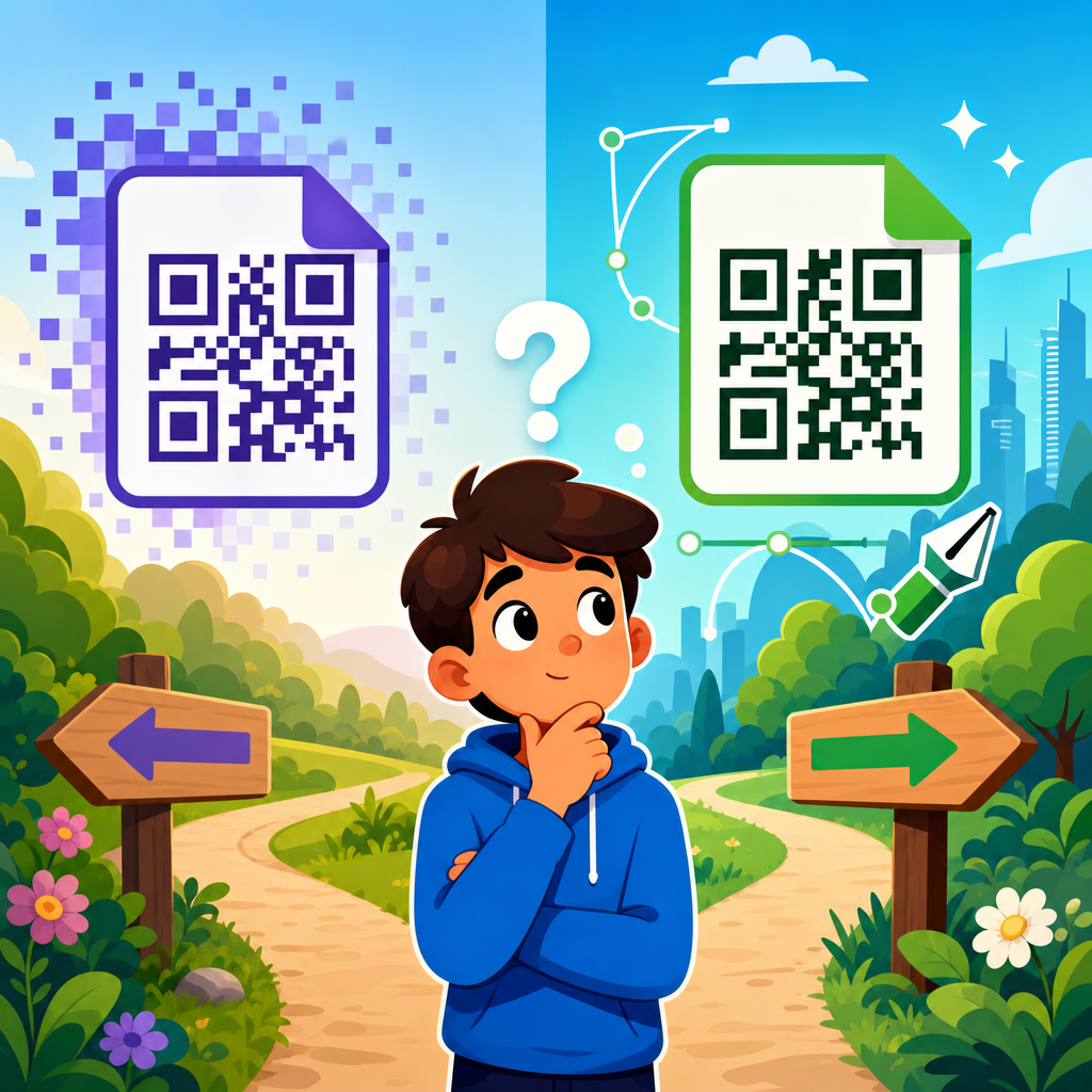
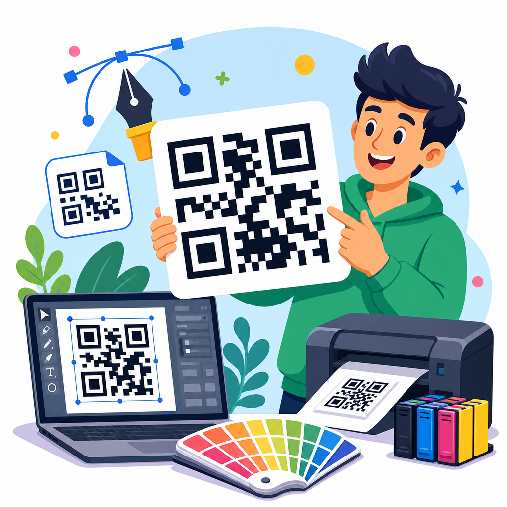
A print-ready QR code vector file contains the code as editable paths or vector shapes, not embedded low-resolution pixels. The most common formats are SVG for flexible design workflows, EPS for legacy print compatibility, and PDF for final delivery when the code is locked into approved artwork. AI can also be useful when a design team is working inside Adobe Illustrator, but printers generally prefer PDF/X exports for production because they preserve output intent, fonts, and placed graphics more predictably. The key requirement is that the code itself remains vector-based from creation through export.
Print readiness depends on more than file extension. A QR code must retain four functional elements: data modules, finder patterns, alignment patterns when present, and a quiet zone around the code. Industry guidance typically calls for a quiet zone of at least four modules on all sides. If a design places text, borders, dielines, or background graphics too close, scanners may misread the symbol even when the file is technically high resolution. I recommend treating the quiet zone as non-negotiable production space, not decorative margin. That single discipline prevents a large share of field failures.
Color also matters. The safest combination is a dark code on a light background, usually black on white. Reverse codes, gradients, metallic inks, translucent substrates, and overprint effects can work, but only after testing. In packaging, I have seen matte varnish reduce contrast enough to hurt scan performance under retail lighting, while uncoated kraft stock introduces visual noise that makes thin modules harder to distinguish. Print-ready means the code survives the actual substrate, ink set, finishing process, and viewing distance, not just a desktop proof.
Best downloadable asset formats for designers, marketers, and printers
Different teams need different downloadable assets, and a strong hub page should make those distinctions explicit. Designers usually want SVG because it scales cleanly and imports well into Figma, Illustrator, Sketch, and many web-oriented tools. Marketers often need PNG for presentations, landing pages, and email mockups, but that should be treated as a convenience export, not the master print file. Printers and prepress teams usually request PDF or EPS because those formats fit established workflows, RIP software, and archived production systems.
| Format | Best use | Strengths | Watch-outs |
|---|---|---|---|
| SVG | Editable master asset | Scales infinitely, easy to brand, lightweight | Can be altered accidentally if grouped poorly |
| EPS | Legacy print workflows | Widely accepted by printers | Older format, less convenient for modern collaboration |
| Final print delivery | Stable output, strong prepress compatibility | Must confirm the code remains vector after export | |
| AI | Illustrator editing | Flexible for internal design teams | Not always preferred as final vendor handoff |
| PNG | Digital previews and web use | Simple to share and place | Not ideal for resizing in print layouts |
| JPG | Quick reference only | Universally viewable | Compression artifacts can break edges |
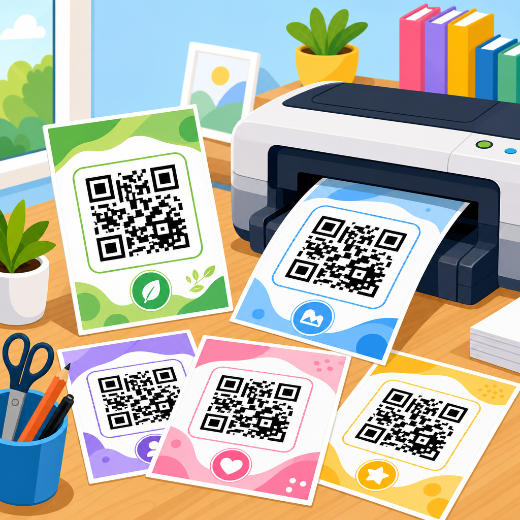
For a downloadable assets hub, the smartest structure is to provide the same QR code in multiple formats, clearly labeled by use case. Include the destination URL or payload, color version, date created, and whether the code is static or dynamic. Dynamic codes are especially valuable in print because the destination can be updated without reprinting the piece, although the redirect service must remain active. Static codes are simpler and independent of a platform, but the encoded destination is permanent. Teams choosing assets should know that distinction before a file enters production.
Templates add another layer of usefulness. In my own workflows, the most helpful downloadable template sets include minimum-size guidance, bleed-safe placement examples, packaging panel layouts, shelf wobblers, tabletop signs, window decals, and event badges. A good hub page is not just a file dump. It explains which asset matches which printing scenario so that a marketer ordering postcards, a packaging engineer approving labels, and a retail designer producing a floor stand each get the right file the first time.
How to prepare vector QR codes for commercial print workflows
Preparing QR code vector files for commercial print starts with generating the code from a reliable source. Use a tool that exports true vector artwork and supports error correction settings, ideally with transparent documentation. Error correction levels L, M, Q, and H determine how much damage or obstruction the code can tolerate. Higher levels provide more resilience but create denser symbols, which can force a larger printed size for dependable scanning. For simple URL campaigns, I usually begin with level M or Q, then size the code based on scan distance, substrate, and expected environmental wear.
Once generated, place the vector file into the layout without rasterizing it. In Adobe Illustrator or InDesign, confirm that export settings do not downsample monochrome vector artwork into a flattened image. Use preflight tools before packaging files for the printer. Acrobat Pro’s Output Preview, InDesign Preflight, and RIP-side checks can reveal overprint mistakes, transparency flattening, and color conversion issues. If the code is black only, define whether it should print as 100K or a rich black equivalent. In most cases, a simple solid black is safest because registration drift across CMYK plates can soften module edges.
Size decisions should be practical, not arbitrary. A common rule of thumb is that scan distance should be roughly ten times the code width, but environment matters. A code on a medicine carton scanned at arm’s length can be smaller than a code on a poster viewed from several feet away. Tiny labels may require shortening the encoded URL through a redirect domain to reduce symbol density. Large-format graphics may need larger quiet zones because installers, laminates, and mounting hardware can visually crowd the code. Production teams should always print physical proofs at final size, then test with both iPhone and Android devices under expected lighting.
Finishing processes deserve special attention. Lamination can introduce glare, embossing can distort modules, foil can produce specular reflection, and varnish can lower perceived contrast. Curved surfaces such as bottles add another challenge because they warp the code shape from certain angles. For cylindrical packaging, place the QR code where the surface is flattest and avoid wrapping it across a seam. These are ordinary print realities, but they are often missed when downloadable assets are treated as generic graphics instead of functional data carriers.
Common printing mistakes that make QR codes fail
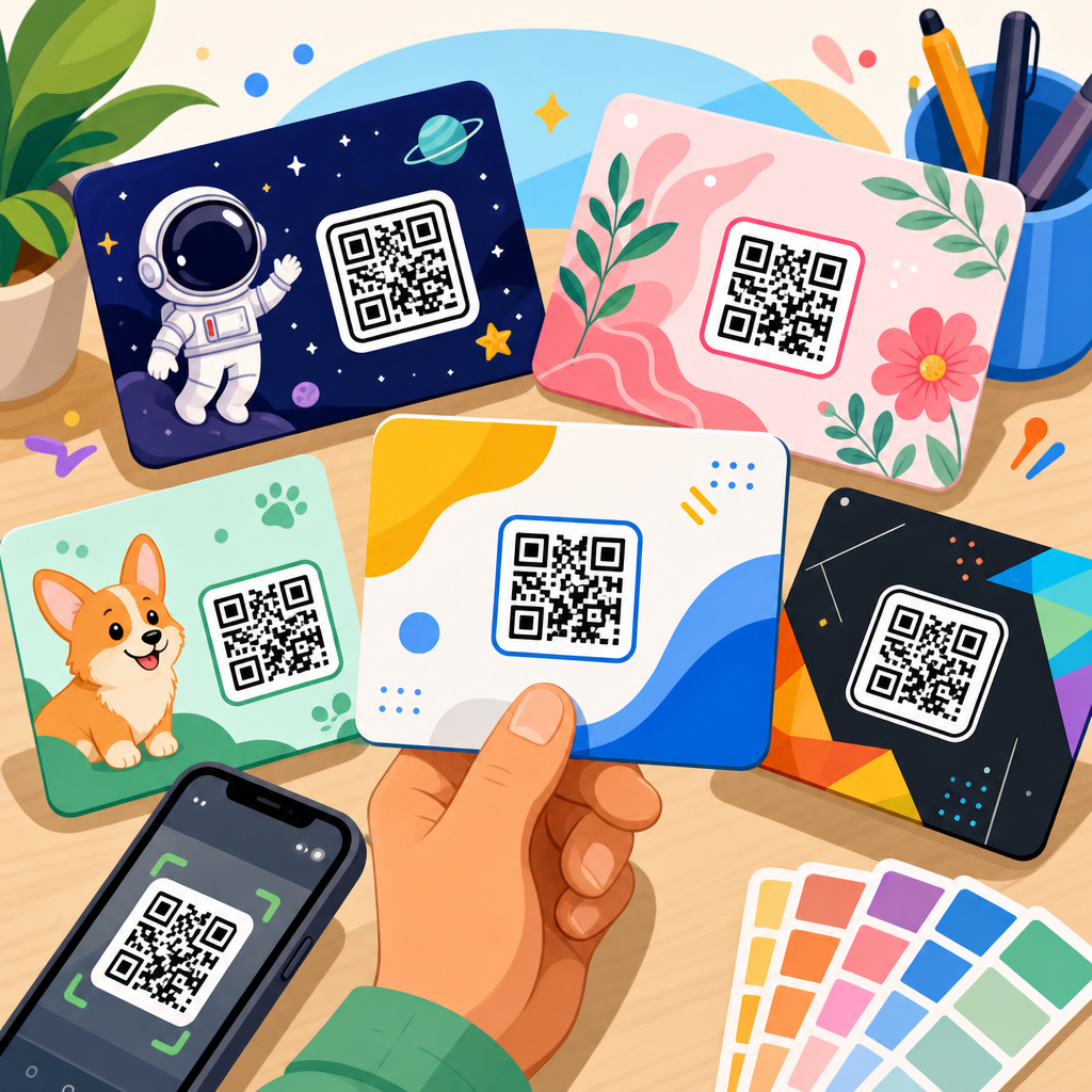
The most common mistake is using a raster screenshot as the source asset. A code copied from a website, pasted into a document, and enlarged for print may already contain anti-aliasing and compression artifacts before the designer starts editing. Another frequent problem is decorative customization that goes too far. Rounded modules, logo knockouts, gradient fills, and patterned backgrounds can still scan, but every change reduces tolerance. If a brand team wants a stylized code, the downloadable assets set should include both a conservative production-safe version and a more expressive marketing version, each tested separately.
Poor contrast is another failure point. Light gray on white, pastel on kraft paper, dark green on black, or metallic silver on reflective stock may look premium but scan inconsistently. Mobile camera software is better than it was five years ago, yet it still performs best when the code stands apart clearly from the background. In retail environments, reflective overhead lighting and motion make borderline designs worse. The answer is not guesswork. It is controlled testing on the final stock with the actual finishing stack.
Quiet zone violations are just as damaging. I regularly see frames, speech bubbles, discount bursts, and social icons pushed tight against the code because there was “just enough room.” There was not. The quiet zone is part of the functional symbol. Trimming errors can also intrude into that space, especially on small labels or folded cartons where dielines shift slightly in production. Build in margin beyond the minimum whenever possible. Finally, do not assume one successful office scan proves readiness. A code should be tested by multiple devices, multiple users, and multiple distances before approval.
Building a useful downloadable assets hub for QR code resources
As a sub-pillar under QR Code Resources, Templates & Tools, this hub should guide users to the exact asset they need while establishing consistent standards across the library. The most useful downloadable assets hubs organize files by output: print-ready vector masters, web-ready raster exports, editable design templates, signage mockups, label layouts, packaging placements, and validation checklists. Every asset should have a plain-language description stating file type, dimensions, intended use, color mode, and whether the code is static or dynamic.
Metadata improves adoption. Name files clearly, for example: product-qr-vector-black-svg, product-qr-print-pdf, menu-qr-a4-poster-template, or event-badge-qr-bleed-safe-ai. Include a simple readme or on-page note that explains minimum print size, quiet zone requirements, recommended contrast, and testing expectations. If the library includes multiple campaign codes, attach destination logs and expiration notes so outdated URLs do not remain in circulation. For teams managing many assets, a digital asset management system such as Bynder, Brandfolder, or Frontify can prevent duplicate downloads and outdated file use.
A strong hub also supports internal linking naturally by connecting related resources: QR code size charts, dynamic versus static code guides, print testing checklists, packaging compliance articles, and editable template collections. That structure helps users solve the next problem before it causes production delays. The real value of downloadable assets is not convenience alone. It is reduction of risk. When the right vector file, template, and instructions are bundled together, campaigns launch faster, printers ask fewer clarification questions, and scan performance improves in the field.
QR code vector files for printing are not a minor technical preference; they are the standard that keeps printed QR campaigns sharp, scalable, and scannable. The core principles are straightforward: start with a true vector master, choose the right export format for the team using it, preserve the quiet zone, maintain strong contrast, and test on the final substrate at final size. When those steps are handled early, designers protect visual quality, printers avoid prepress surprises, and marketers get a code that works where it matters most: in a customer’s hand, on a shelf, or across a room.
For a downloadable assets hub, comprehensiveness matters. Users need more than a single SVG download. They need a reliable system that includes print-ready PDFs, editable vectors, practical templates, naming standards, and usage guidance tied to real production scenarios. They also need clarity about dynamic versus static codes, finishing risks, and minimum size decisions. That is what turns a QR code resource page into a true operational tool instead of a gallery of files.
If you are building or updating your QR Code Resources, Templates & Tools library, audit every downloadable asset now. Replace stretched PNGs, document approved vector masters, add print notes, and test the final output before the next job goes to press. A small asset upgrade today prevents expensive reprints tomorrow.
Frequently Asked Questions
What is a QR code vector file, and why is it important for printing?
A QR code vector file is a version of a QR code created with mathematical paths instead of pixels. Unlike raster image formats such as JPG or PNG, a vector file can be enlarged or reduced dramatically without losing edge sharpness. That matters in print because QR codes depend on clean, high-contrast shapes for reliable scanning. If the edges of the modules, quiet zone, or finder patterns become soft, distorted, or pixelated, scan performance can drop quickly.
For printing applications, vector artwork is the best starting point because it gives designers and print providers flexibility. The same QR code can be used on a product label, brochure, poster, menu, trade show banner, or large-format sign without needing to rebuild the artwork for each size. This helps maintain consistency across campaigns and reduces the risk of quality problems caused by resizing a low-resolution image. In short, a QR code vector file supports both visual quality and functional reliability, which is exactly what you want when the code is meant to drive traffic, payments, downloads, registrations, or product interactions.
Which vector file formats are best for printing QR codes?
The most common vector formats for printed QR codes are SVG, EPS, AI, and PDF. Each can work well, but the best choice depends on your workflow, printer requirements, and design software. SVG is widely used for web and design compatibility, and it is especially useful when you want an editable, scalable master file. EPS remains a common format in traditional print workflows because many commercial printers and legacy layout systems support it reliably. AI files are ideal when the QR code is being managed inside Adobe Illustrator and needs to remain fully editable. PDF is often the safest delivery format for final production because it preserves vector data well and is widely accepted by professional printers.
The key is not just the extension, but whether the file actually contains true vector paths. Some files may be saved as PDF or EPS but still contain only an embedded raster image. That can create confusion and produce poor results at larger sizes. A good practice is to verify that the QR code remains crisp when zoomed in significantly inside your design software. If you can see sharp geometric paths rather than fuzzy pixels, you are likely working with a true vector file. When preparing for production, always confirm the preferred format with your printer so the QR code enters their workflow without conversion issues.
Why are vector QR codes better than PNG or JPG files for packaging, signage, and large-format displays?
Vector QR codes are generally better for print because they preserve precision at any scale. A PNG or JPG may look acceptable on a screen or in a small print piece, but those formats are resolution-dependent. If you enlarge them beyond their intended size, the edges can become jagged or blurry. QR codes are not decorative graphics alone; they are functional symbols that scanners must interpret quickly. Even minor degradation can affect readability, especially when the code appears on textured packaging, glossy materials, curved labels, window graphics, or outdoor signage viewed under inconsistent lighting.
For packaging, labels, and point-of-sale materials, vector files also support cleaner integration with branding and production processes. Designers can adjust size, placement, and color while keeping the code technically intact. For large-format displays such as wall graphics, banners, and trade show backdrops, vector artwork is especially important because viewing distance and print enlargement magnify defects in low-resolution images. A vector QR code ensures the final output remains crisp, professional, and easier to scan. While high-resolution raster files can sometimes work for small uses, vector files are the more dependable and future-proof option for serious print applications.
How should a QR code vector file be prepared to ensure it scans well after printing?
Successful print performance depends on more than just using a vector format. The QR code should be generated correctly, sized appropriately for its scanning distance, and placed with a proper quiet zone, which is the blank space around the code that scanners rely on to detect its boundaries. High contrast is also essential. In most cases, a dark code on a light background performs best. Reversing the colors, adding gradients, using busy backgrounds, or placing the code over photography can reduce scan reliability unless testing confirms it still works consistently.
It is also important to avoid distortions during layout. Stretching the QR code horizontally or vertically, applying excessive effects, clipping critical areas, or modifying module shapes too aggressively can compromise readability. If branding elements such as logos or custom styling are added, the code should still maintain enough error correction and visual clarity to scan under real-world conditions. Before sending a file to press, test the code from printed proofs at actual size, using multiple smartphones and lighting conditions. This step is especially important for menus, labels, product packaging, and signage, where users may scan at different angles and distances. A technically clean vector file is the right foundation, but real-world testing is what confirms print readiness.
Can a vector QR code be customized with colors, logos, or branding and still remain scannable?
Yes, a vector QR code can often be customized successfully, but customization should be approached carefully. Vector artwork makes customization easier because the code can be edited precisely without degrading quality. Brands commonly adapt QR codes to match campaign aesthetics by changing colors, embedding a logo in the center, rounding module corners, or integrating the code into package and menu designs. These changes can improve visual appeal and brand recognition, but they must not interfere with core scanning structure.
The safest approach is to preserve strong contrast, maintain the quiet zone, and avoid altering the finder patterns and alignment elements in ways that confuse scanning apps. If a logo is placed inside the code, it should be sized conservatively and supported by appropriate error correction during code generation. Color choices should also be practical; for example, dark navy on white may work well, while pale gray on beige may not. Metallic inks, varnishes, textured substrates, and transparent materials can further affect readability even when the digital artwork looks correct. Because of these production variables, every customized vector QR code should be tested on physical proofs before full print runs. Custom branding is absolutely possible, but performance must stay ahead of style.