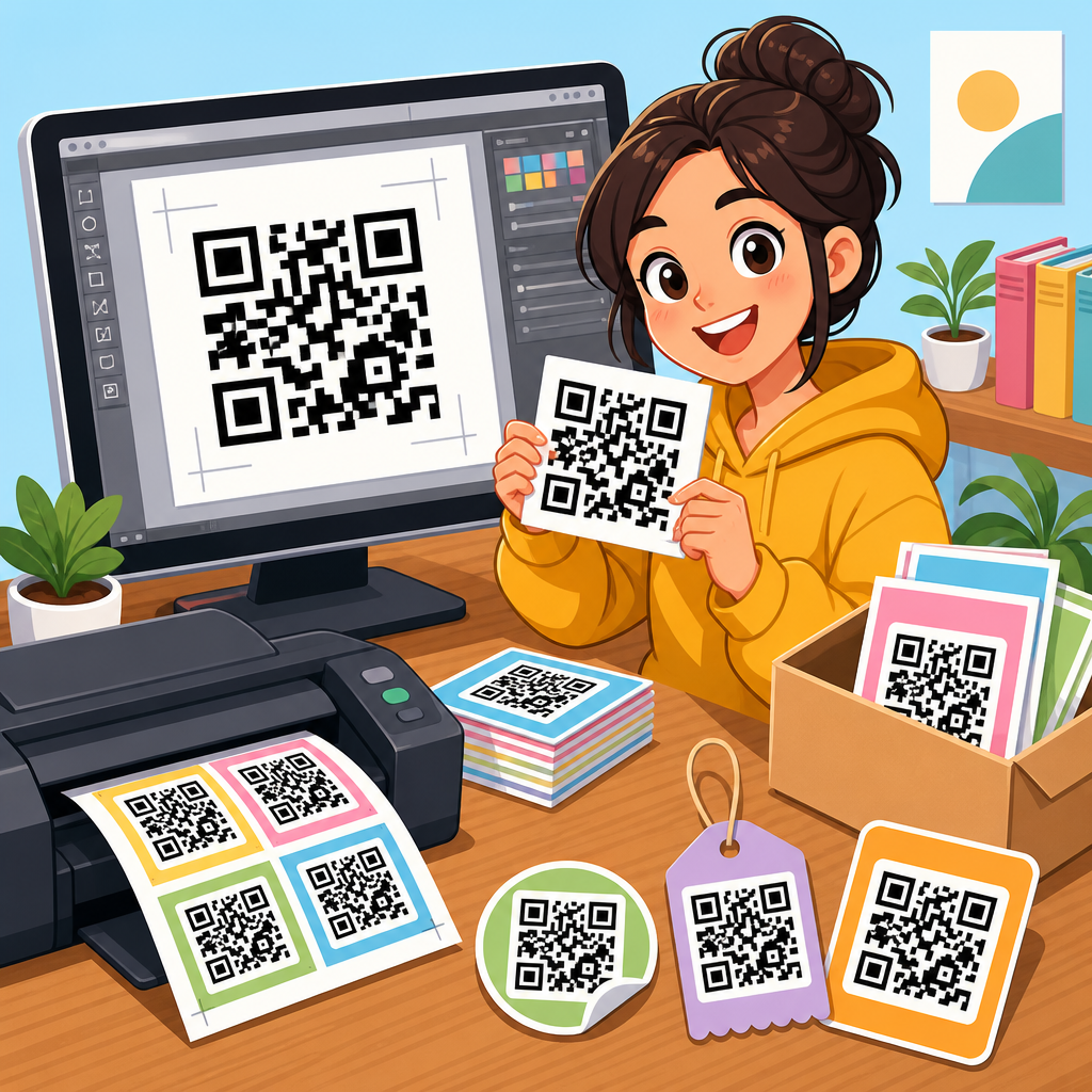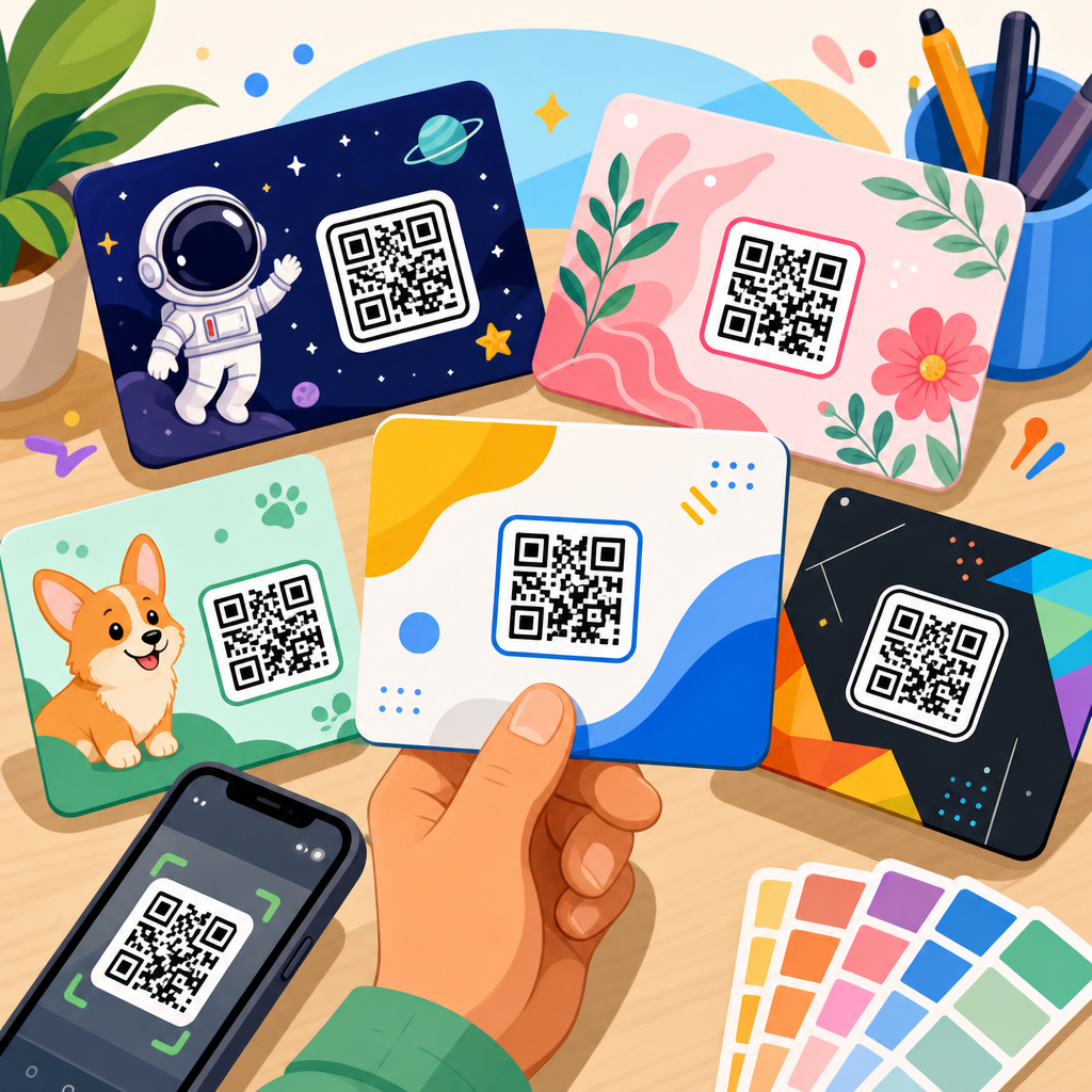
QR code branding has moved far beyond the black-and-white square once used mainly for inventory labels. Today, leading brands treat the QR code as a visible brand asset, not a technical afterthought. In this hub article on QR code design examples, I will break down how top companies use branded QR codes to drive scans, reinforce identity, and connect offline attention to digital action. A branded QR code is a scannable code customized with colors, logos, frames, calls to action, landing page alignment, and campaign-specific design choices. The goal is simple: make the code look trustworthy, recognizable, and worth scanning without compromising readability.
This matters because QR performance is heavily influenced by context and design. In my work reviewing campaigns across packaging, retail displays, direct mail, events, and out-of-home ads, the strongest results rarely come from generic codes dropped into a layout at the last minute. They come from systems thinking. The code matches the campaign objective, the audience understands what happens after the scan, and the visual treatment supports rather than fights the brand. Smartphone adoption, native camera scanning, and the growth of mobile commerce have made QR interactions routine, but routine does not mean automatic. People still decide in a split second whether a code looks legitimate, useful, and easy to scan.
For marketers building a QR code resources, templates and tools library, design examples are especially valuable because they show how principles translate into practice. Good QR code design balances aesthetics and function. Key terms matter here. Error correction refers to the built-in redundancy that helps a code remain readable when part of it is covered, stylized, or slightly damaged. Quiet zone means the blank margin around the code that scanners need to detect its boundaries. Dynamic QR codes use a short redirect URL, allowing destination updates and scan tracking after print. Static QR codes encode the final destination directly and cannot be edited later. Frame text is the short instruction around the code, such as “Scan to order” or “Scan for sizing.”
The best QR code branding examples from top companies combine these fundamentals with disciplined creative choices. They do not rely on decoration alone. They use contrast, shape, placement, and message hierarchy to reduce friction. They also connect the design of the code to what users see after the scan, whether that is a product page, loyalty sign-up, app download, menu, how-to video, or payment flow. This article serves as a hub for QR code design examples by showing what works, why it works, and how to apply those lessons to your own campaigns across industries and channels.
What top companies get right about branded QR code design
Top companies start with scan reliability, then layer branding carefully. That order matters. A QR code that looks beautiful but fails under mixed lighting, low-end cameras, glossy packaging, or distance-based scanning is a bad asset. Brands that scale QR successfully usually follow a repeatable checklist: sufficient contrast, tested error correction level, preserved finder patterns, clear quiet zone, and minimum size based on expected viewing distance. A common field rule is roughly one inch square for close-range use, then larger formats for posters, shelf talkers, and billboards.
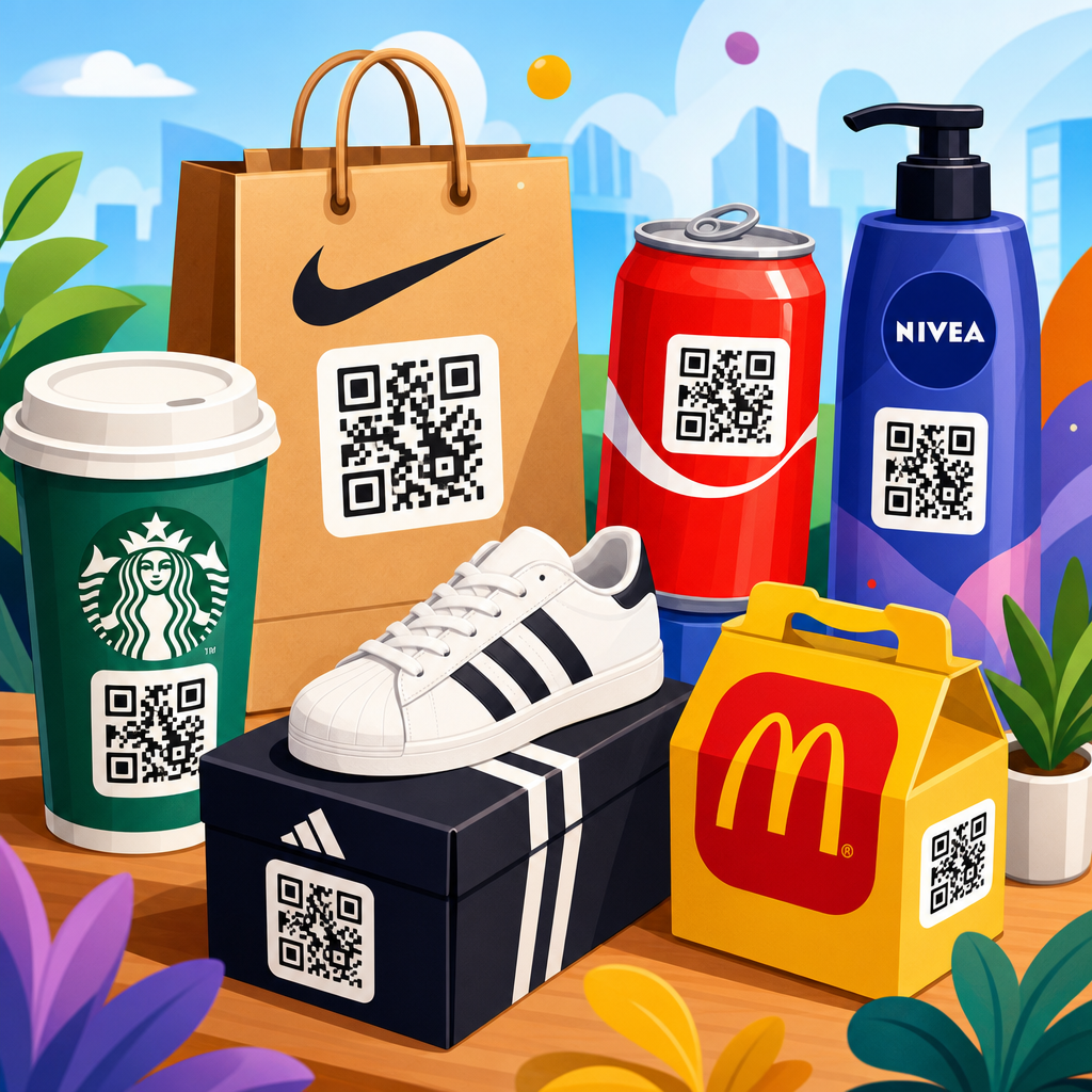
They also understand that a QR code is part of a conversion path, not a decoration. Starbucks, for example, has long tied scannable experiences to loyalty, payment, and in-store convenience. The visual consistency of the app, mobile payment screens, and promotional signage reduces hesitation because users recognize the ecosystem instantly. In retail, Walmart and Target often pair QR functionality with utility, such as product details, app-based features, or omnichannel fulfillment. The lesson is direct: a branded QR code performs best when it signals a familiar next step.
Another pattern is explicit instruction. High-performing examples tell users why to scan. “Scan to see ingredients,” “Scan to unlock rewards,” and “Scan to watch setup” outperform unlabeled codes because they answer the first user question immediately. This is one reason branded frames are so effective. The code itself gains context, and the brand can reinforce tone of voice at the same time.
QR code branding examples from food, beverage, and packaging leaders
Food and beverage brands have become some of the best practitioners of QR code design because packaging space is limited and consumer attention is short. Coca-Cola has used QR activations on cans, bottles, and promotional packaging to connect physical products with sweepstakes, music, and personalized digital experiences. The codes typically preserve strong contrast while integrating red brand fields, concise CTA copy, and destination pages that feel unmistakably Coca-Cola. The branding is not only on the code. It is in the full journey.
Nestlé and PepsiCo brands often use QR codes for transparency and post-purchase education. On-pack QR codes can direct users to ingredient sourcing, nutrition details, recycling guidance, or recipes. This is where design examples matter: the best executions separate regulatory information from interactive value. A code placed near a recipe image with “Scan for meal ideas” carries a stronger behavioral cue than a code buried in legal copy. Heinz, for instance, has used packaging and connected campaigns to make the scan feel additive rather than administrative.
In beauty and consumer packaged goods, L’Oréal and Unilever brands have pushed QR codes into tutorial and product education roles. A skincare package with a clearly framed code that says “Scan for routine steps” does more than provide a link. It reduces support burden, improves product understanding, and opens a measurable owned-media channel after purchase. I have seen this work especially well when the landing page is mobile-first, fast, and tightly matched to the package promise.
| Company | Common QR Code Use | Branding Approach | Why It Works |
|---|---|---|---|
| Coca-Cola | Promotions, music, personalized experiences | Strong color fields, campaign CTA, consistent landing pages | High recognition and clear reward for scanning |
| Starbucks | Loyalty, payment, app engagement | Integrated app ecosystem and trusted visual identity | Users understand the next step immediately |
| Nike | Product storytelling, launches, in-store engagement | Minimalist layouts with product-led context | Code supports premium design without distraction |
| Sephora | Tutorials, product education, virtual try-on paths | Beauty-focused messaging and polished mobile pages | Utility is obvious and relevant at point of consideration |
| Amazon | Returns, logistics, store interactions | Functional, familiar interface conventions | Speed and trust drive repeated scanning behavior |
Retail and apparel examples: turning store traffic into digital engagement
Retailers use QR code branding to bridge shelf, fitting room, storefront, and app. Nike is a strong example because its best QR implementations are restrained. Rather than over-styling the code, Nike often places it within clean layouts tied to a product drop, athlete story, or member experience. The brand confidence comes from composition, typography, and destination quality, not excessive manipulation of the code matrix. That is an important lesson for premium brands: subtle branding often converts better than novelty styling.
Sephora and Ulta show another effective pattern: QR codes tied to education at the moment of uncertainty. A shopper comparing skincare or foundation shades needs confidence. A code that opens reviews, tutorials, ingredient explainers, or shade-matching tools serves a practical need. The design example here is not just the code color or embedded logo. It is placement near the decision point and a promise that matches shopper intent.
Fashion brands also use QR codes on tags and in-store signage to extend the fitting room. Zara, H&M, and other global retailers have experimented with app-led store experiences, product lookup, styling content, and omnichannel services. The strongest examples avoid generic “learn more” labels. They specify value: “Scan for sizes in stock” or “Scan to see outfit ideas.” Clear value propositions consistently outperform vague prompts.
Hospitality, restaurants, and service brands: utility drives repeat scans
Hospitality made QR code use mainstream during the menu digitization wave, but leading brands quickly moved beyond basic menus. Starbucks, Marriott, and major restaurant groups use scannable touchpoints for ordering, loyalty enrollment, room information, event check-in, and service recovery. In these environments, branded QR codes must work under pressure: glare on tabletop tents, dim restaurant lighting, hurried guests, and inconsistent connectivity. That is why the best service brands prioritize large code size, strong contrast, and straightforward CTA language.
Restaurant examples are instructive because users are often scanning from seated positions with one hand while talking or multitasking. A code integrated into a busy menu design can fail even if technically valid. The better approach is obvious separation, a calm background, and a direct action like “Scan to order and earn points.” When brands align the mobile destination with the visual language of the menu and store environment, trust rises quickly. Repeat behavior follows because the scan feels familiar.
Hotels use QR codes for practical guest tasks such as spa booking, local recommendations, digital compendiums, and contactless requests. Branding matters here because guest confidence matters. A generic code on a room card can look suspicious. A framed, hotel-branded code with a named action and clear support path feels legitimate and useful.
What makes a QR code design example effective
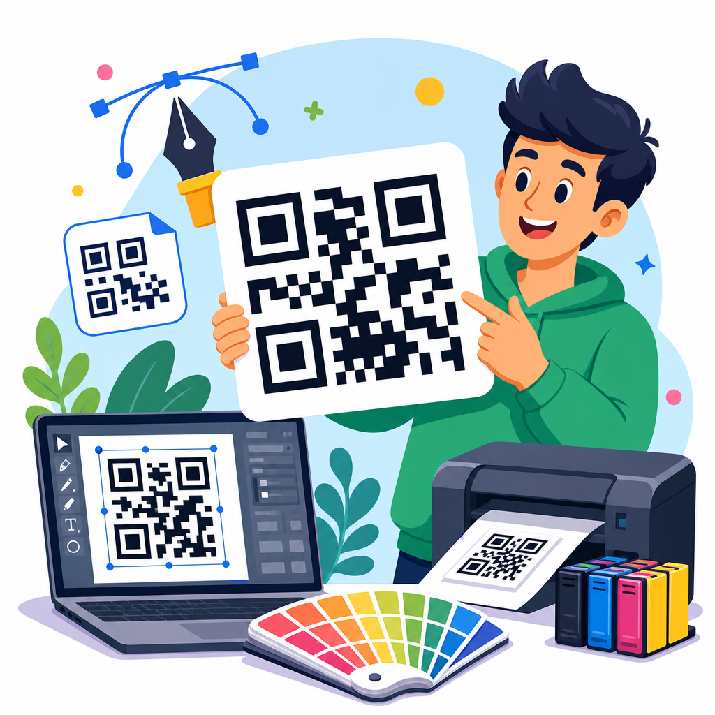
Across top company campaigns, a few rules show up again and again. First, contrast beats creativity. Dark code on light background remains the safest standard. Second, logos should occupy limited central space and be supported by appropriate error correction, usually level Q or H when stylization increases. Third, custom shapes can work, but finder patterns and module structure must remain scanner-friendly. Fourth, the quiet zone is non-negotiable. Remove it, and performance drops fast.
Fifth, the CTA should answer “why scan now?” Sixth, placement should match intent. On packaging, position near usage moments or product benefits. In retail, place near the decision point. In out-of-home, keep copy short and destination fast. Seventh, test across devices and environments. I routinely check iPhone and Android native cameras, older devices, social camera overlays, print samples, matte and gloss finishes, and weak signal conditions. Surprises usually come from real-world context, not from the generator preview.
Finally, dynamic QR codes are generally the better choice for campaigns because they allow tracking, redirection, and optimization after launch. UTM tagging, analytics integration, and A/B testing of landing pages turn the code from a static artifact into a measurable media asset.
How to build your own branded QR code system
If this article is your hub for QR code design examples, the practical takeaway is to create a repeatable design system rather than isolated codes. Start with approved brand colors that preserve contrast. Define logo usage rules, including maximum size and exclusion zones. Create frame templates by use case: packaging, direct mail, retail signage, event badges, and tabletop displays. Standardize CTA language based on intent, such as buy, learn, verify, register, watch, or redeem.
Next, map each QR code to a mobile landing page pattern. A product education code should not open a cluttered homepage. A loyalty code should land in a low-friction enrollment or sign-in flow. A support code should deep-link to the exact article, video, or troubleshooting screen promised on the asset. This alignment is where many campaigns fail. The design attracts the scan, but the destination wastes it.
Use reliable tools that support customization, analytics, and export control. Teams commonly evaluate generators and platforms based on SVG and EPS export, dynamic redirects, password protection, scan analytics, bulk creation, API access, and first-party domain support. For enterprise governance, naming conventions and expiration policies matter too. When dozens of departments create codes independently, brand consistency and destination hygiene deteriorate fast.
Build a test protocol before publishing. Verify scan speed at intended distance, under indoor and outdoor lighting, on printed proofs, and through any protective material such as plastic wrap or glass. Check that the page loads quickly and that the call to action on the page matches the promise on the code. Then document results so future campaigns improve instead of repeating mistakes.
Common mistakes brands should avoid
The most common branding mistake is overdesign. Gradients, low-contrast palettes, crowded logo treatments, and decorative backgrounds can make a code harder to detect. Another mistake is hiding the code in the corner without explanation. If the scan matters, make it visible and tell people what they get. A third problem is linking to generic homepages. That wastes intent and reduces trust.
Brands also underestimate operational risk. Static codes printed at scale can become liabilities when URLs change. Short-lived campaign pages create dead ends. Redirect chains slow mobile load time. Privacy and consent issues can arise if scan tracking is not disclosed appropriately in certain regions. The strongest brands plan for maintenance, analytics, and governance from the beginning, not after distribution.
QR code branding examples from top companies show a consistent truth: the highest-performing codes are not the most decorative, but the most intentional. They protect scanability, communicate value clearly, and deliver a destination that feels perfectly aligned with the surrounding brand experience. Whether the use case is packaging, retail, hospitality, events, or direct mail, the same principles apply. Strong contrast, preserved structure, clear CTA language, strategic placement, and mobile-first landing pages create better outcomes than visual novelty alone.
As the hub for QR code design examples within a broader QR code resources, templates and tools library, this page should help you evaluate campaigns with sharper standards. Look at what companies like Coca-Cola, Starbucks, Nike, Sephora, and Amazon do well: they make the next step obvious, they keep the user promise tight, and they treat the code as part of a system. That systems approach improves trust, scan rate, and conversion quality.
If you are creating your own branded QR codes, start with one use case, define your design rules, test in real conditions, and measure performance after launch. Then expand with templates and governance so every new code strengthens the brand instead of fragmenting it. Scanability first, branding second, experience always.
Frequently Asked Questions
1. What is a branded QR code, and how is it different from a standard QR code?
A branded QR code is a QR code that has been intentionally customized to reflect a company’s visual identity while still remaining fully scannable. Unlike a standard QR code, which is usually a plain black-and-white square with no visual context, a branded QR code may include custom colors, a logo in the center, a shaped frame, a short call to action, or a design treatment that aligns with the brand’s packaging, signage, ads, or in-store displays. The goal is not just to make the code look better, but to make it feel like a natural part of the customer experience rather than a generic technical element.
Top companies use branded QR codes because they understand that trust and recognition matter. When a customer sees a code that clearly matches the brand they already know, they are more likely to believe it is legitimate and worth scanning. That matters in a world where consumers are more cautious about unknown links and digital security. A well-designed branded QR code also helps the code stand out in a crowded environment, whether it appears on product packaging, direct mail, retail displays, event signage, or outdoor advertising.
In practical terms, the difference comes down to strategy. A standard QR code simply functions as a scannable link. A branded QR code functions as both a link and a marketing asset. It can reinforce brand identity, increase scan confidence, support campaign goals, and improve conversion by making the next step more obvious. That is why so many leading companies now treat QR code design as part of brand design, not as an afterthought added at the end of a campaign.
2. Why do top companies invest in branded QR codes instead of using plain black-and-white versions?
Top companies invest in branded QR codes because every customer touchpoint contributes to how the brand is perceived, and QR codes are no exception. A plain QR code may work technically, but it often misses an opportunity to attract attention, build familiarity, and guide action. When a brand customizes a QR code to match its visual identity, it transforms a functional tool into a recognizable, trust-building part of the campaign. That can make a meaningful difference in scan rate, especially when consumers only have a few seconds to notice and act.
Another major reason is consistency. Strong brands work hard to maintain a cohesive look and feel across packaging, print, digital ads, retail environments, and experiential marketing. A generic QR code can look disconnected from that effort. By contrast, a branded QR code can include the same color palette, typography cues, logo placement, and message framing used across the rest of the campaign. This visual alignment makes the experience feel intentional and polished, which often increases engagement.
There is also a performance advantage. Branded QR codes are often paired with clearer calls to action such as “Scan to shop,” “Scan for the menu,” “Scan to unlock rewards,” or “Scan to watch the story.” Top companies know that design and messaging work together. The code itself gets attention, while the call to action tells the customer exactly why scanning is worth their time. In many cases, that combination leads to better response than a plain code placed without context.
Finally, leading brands invest in branded QR codes because they support measurement and campaign optimization. Most serious QR code campaigns use dynamic destinations, meaning the scan can be tracked, updated, or segmented by location, product, or campaign. When the code is treated as a branded asset, it is more likely to be deployed strategically, connected to a relevant landing page, and measured against real marketing objectives. That is a much more valuable use of QR technology than simply dropping a generic code into a layout and hoping people scan it.
3. What are some common ways major brands use branded QR codes in real campaigns?
Major brands use branded QR codes in a wide range of campaigns because they are highly flexible and create a direct bridge between physical attention and digital action. One of the most common use cases is product packaging. Brands place QR codes on boxes, labels, bottles, or wrappers to connect shoppers to product details, authenticity verification, tutorials, recipes, sustainability information, loyalty programs, or limited-time promotions. In this context, branding the QR code helps it feel like a native part of the package rather than a random add-on.
Retail and in-store experiences are another major category. Companies often use branded QR codes on shelf talkers, endcaps, window displays, and point-of-sale materials to help customers browse extended inventory, access reviews, claim offers, join membership programs, or make purchases when stock is limited in-store. In these settings, branded design matters because customers are making fast decisions. A code that looks professional, intentional, and clearly connected to the retailer is more likely to earn a scan.
Top companies also use branded QR codes in out-of-home advertising, direct mail, events, and experiential marketing. A QR code on a poster, billboard, event booth, or mailer can lead to a landing page, app download, contest entry, product demo, or store locator. Here, the brand treatment is especially important because the audience may be encountering the code from a distance or in a high-distraction environment. Frames, contrast, and strong calls to action help the code stand out and explain its value immediately.
Another common application is customer support and post-purchase engagement. Brands add QR codes to receipts, instruction manuals, thank-you cards, inserts, or service documentation so customers can quickly access setup guides, FAQs, warranty registration, reorder pages, or support channels. This extends the brand relationship after the sale and can reduce friction in the ownership experience. The best examples show that QR codes are not only acquisition tools; they can also improve retention, satisfaction, and repeat engagement when used thoughtfully.
4. What design elements make a branded QR code effective without hurting scannability?
The best branded QR codes balance visual customization with technical reliability. That balance starts with contrast. Even when a company uses brand colors, the code still needs enough contrast between the foreground and background for smartphone cameras to read it quickly. Dark-on-light combinations typically perform better than light-on-light or overly decorative treatments. Top brands may stylize the code, but they avoid sacrificing readability just to make it look more creative.
Logo placement is another important element. Many branded QR codes include a logo in the center, which can work well if the logo does not cover too much of the data area. QR codes have built-in error correction, which allows for some customization, but there are still limits. Experienced brands and designers know that the logo must be sized carefully and tested across multiple devices, lighting conditions, and scan distances. A logo should enhance recognition, not interfere with function.
Frames and calls to action are often what make a branded QR code truly effective. A frame can visually separate the code from a busy background and make it more noticeable in a layout. A short prompt such as “Scan to explore,” “Scan to order,” or “Scan to get the offer” gives users a clear reason to engage. This is especially important because many people will not scan a code unless the benefit is immediately obvious. Top companies understand that a QR code should not leave the next step to guesswork.
Size, placement, and destination quality matter just as much as appearance. Even a beautifully branded QR code will underperform if it is too small, placed in a hard-to-reach location, or linked to a weak mobile landing page. Leading brands test their codes in real-world conditions and make sure the destination experience is fast, mobile-friendly, and aligned with the promise made next to the scan. In other words, effective QR code branding is not only about the code itself. It is about designing the entire scan journey from first glance to final action.
5. How can a business apply lessons from top QR code branding examples to its own marketing?
The first lesson businesses can take from top companies is that QR codes should be planned strategically, not added at the last minute. Before creating the code, define the exact purpose: is the goal to drive sales, collect leads, promote app downloads, share product information, increase loyalty signups, or improve customer support? The most effective branded QR codes are built around a single clear objective. Once that objective is defined, the design, placement, and landing page can all be aligned to support it.
The second lesson is to treat the QR code as part of the brand system. That means using brand colors carefully, incorporating a logo when appropriate, and adding a frame or call to action that matches the campaign tone. Businesses should not copy design trends blindly. Instead, they should focus on making the code recognizable, trustworthy, and easy to understand. A branded QR code should look like it belongs in the rest of the brand experience, whether it appears on packaging, print materials, storefront signage, or event collateral.
Another key takeaway is to prioritize usability. Top examples work because they are easy to scan and lead to something genuinely useful. Businesses should test QR codes on different phone models, at different sizes, and in different lighting conditions before launching them widely. They should also make sure the landing page is mobile-optimized, loads quickly, and delivers exactly what the user expects. If the code promises a coupon, product demo, exclusive content, or loyalty reward, the destination should fulfill that promise immediately.
Finally