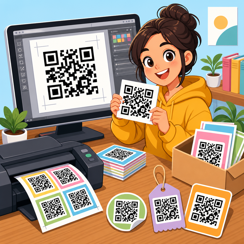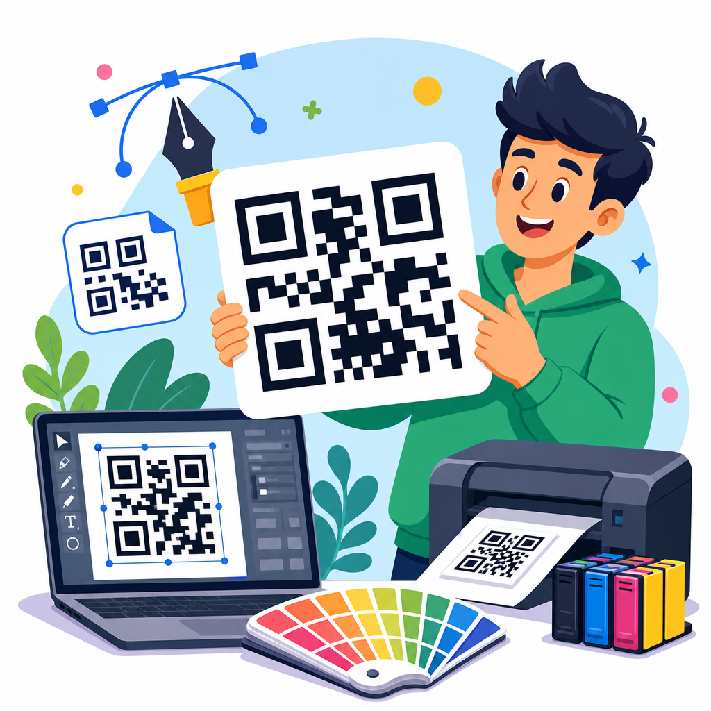
QR code menu design examples show how restaurants turn a simple square code into a practical ordering tool, a brand touchpoint, and a measurable part of service operations. A QR code menu is a scannable code that opens a digital menu on a guest’s phone, usually through a mobile web page, PDF, ordering platform, or point-of-sale integration. In daily restaurant work, I have seen the difference between a code that merely functions and a code that improves table turns, average order value, and guest confidence. Good design matters because people decide within seconds whether to scan, trust, and use what is in front of them.
For restaurant owners, cafe managers, hotel operators, food truck teams, and bar staff, the topic matters for three reasons. First, the menu is one of the highest-impact sales assets in hospitality. Second, a poor QR code experience creates friction at the exact moment a customer is ready to order. Third, digital menus are no longer a temporary workaround; they are part of standard service design. The best examples combine visibility, clear instructions, fast mobile loading, readable menu structure, and branding that supports the dining experience rather than distracting from it.
When people search for QR code menu design examples, they usually want practical models they can copy. They want to know what makes one code card effective and another ignored. They ask where the code should appear, how large it should be, whether color is safe, what call to action to use, and how the landing page should look after the scan. Those are the right questions. A QR code menu succeeds only when physical design and digital design work together as one flow, from table to screen to order confirmation.
This hub article covers the core examples, patterns, and standards that apply across restaurants and hospitality venues. It explains what strong QR code menu design looks like, compares common approaches, and shows how to evaluate examples before printing thousands of table tents or stickers. It also acts as a starting point for deeper content across QR code resources, templates, and tools, so teams can move from inspiration to a system they can deploy consistently across locations.
What makes a QR code menu design example effective
An effective QR code menu design example answers three customer questions immediately: What is this, what happens if I scan it, and can I trust it? The physical piece should say “View menu,” “Order and pay,” or another direct instruction. The code should be large enough to scan at normal seating distance, typically at least 1.2 inches square on table collateral and larger for wall signs or entry displays. Contrast should be strong, with a dark foreground on a light background. Quiet zones, the blank space around the code, must be preserved or scan reliability drops fast.
The destination matters just as much as the printed code. If the scan opens a slow PDF, a desktop page squeezed onto a phone, or a menu buried under pop-ups, the design has failed. The strongest examples open to a mobile-optimized page in one tap, show the venue name clearly, load in under three seconds on cellular data, and present categories in a simple hierarchy. In restaurants I have audited, bounce rates rise sharply when the first screen forces pinching, sign-in, app download, or unnecessary redirects.
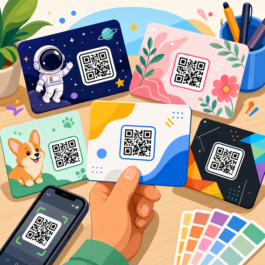
Brand alignment is the third factor. A polished steakhouse should not use a clip-art table tent with generic wording, while a beach cafe can lean into color and illustration without losing clarity. The code itself can be customized with a logo or brand color, but customization should never reduce error correction margins or scanning reliability. In practice, testability beats aesthetics every time. I recommend printing prototypes, scanning them with older Android phones and current iPhones, and checking performance under daylight, warm indoor lighting, and glare.
QR code menu design examples by venue type
Different venues need different QR code menu design examples because service style changes user intent. In a quick-service restaurant, guests want speed and a clear path to browse, customize, and pay. The best examples use counter signs, pickup shelf stickers, and window decals with direct language such as “Scan to order ahead” or “View combo menu.” In a full-service restaurant, the code often supports table browsing before staff interaction, so the design can include brief notes on specials, allergens, or wine pairings while keeping the scan action obvious.
Cafes benefit from compact countertop displays where customers stand close to the code. Here, menu examples often work best with a simple hero image, one line of instruction, and a menu page that emphasizes drinks, modifiers, and seasonal items. Bars usually need low-light-friendly execution: higher contrast print, matte lamination to reduce reflections, and shorter page layouts that let customers reach cocktails, beer, and tabs quickly. Hotels use QR code menus in room service cards, poolside signage, and lobby lounges, where multilingual support and service-hour clarity become essential design elements.
Food trucks and pop-ups face a different problem: distance and movement. Guests may scan while standing in line outdoors, so examples for these venues should prioritize larger codes, stronger contrast, and an ordering page with compressed images for weak mobile connections. Fine dining venues often use discreet QR placement to preserve atmosphere, but discreet cannot mean hidden. Some of the strongest examples I have seen place the code inside the menu cover or on a small premium card with language like “Browse tasting notes and reserve pairings,” giving digital utility without replacing the tactile brand experience.
Physical layout examples that improve scan rates
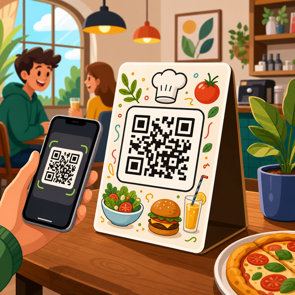
Physical placement drives usage more than many teams expect. Table tents remain the most common format because they are upright, visible, and easy to update if the destination URL stays the same through a dynamic code platform. Flat stickers on tables can work, but they often suffer from glare, spills, and wear. Check presenters are useful for post-meal actions such as pay-at-table, loyalty enrollment, or review requests, but they are weaker for primary menu discovery because they arrive late in the guest journey.
Single-sided cards are effective when space is limited. Double-sided cards are better when a venue wants one side for the menu and the other for promotions, Wi-Fi details, or allergen information. Window decals work well for after-hours browsing and order-ahead flows, especially in bakeries and takeaway shops. Countertop acrylic holders are durable and easy to clean, but they must be sized so the code is not distorted by curved inserts or hidden by condensation. In every case, the code should sit where a phone camera can frame it without awkward angles.
| Format | Best use case | Main advantage | Main risk |
|---|---|---|---|
| Table tent | Full-service dining | High visibility at seat level | Can clutter small tables |
| Table sticker | Casual dining | Low cost and fixed placement | Glare, wear, sanitation issues |
| Counter display | Cafes and quick service | Strong scan proximity | Competes with impulse signage |
| Window decal | Order ahead and walk-up traffic | Captures passersby | Lighting can reduce readability |
| Check presenter | Pay-at-table workflows | Supports payment conversion | Too late for menu discovery |
Copy placement is also part of physical design. The strongest examples put the call to action above or below the code, not wrapped around it. Fonts should be legible from seated distance; decorative scripts usually fail here. If you include a logo, keep it secondary to the instruction. One practical standard I use is the three-second rule: if a first-time guest cannot understand the purpose, identify the code, and scan comfortably within three seconds, the layout needs revision.
Digital menu page design examples after the scan
The landing page is where QR code menu design examples either convert or collapse. The best first screen confirms the guest is in the right place with the restaurant name, logo, and a short descriptor such as dine-in, takeaway, or room service. From there, category navigation should be obvious. Common successful patterns include sticky category tabs, a short jump menu, and cards that show item name, price, and one useful descriptor before the guest taps for details. Guests should not have to scroll through twenty cocktails before finding starters.
Readable typography matters more on a menu than on a marketing page because people compare items quickly. Body text should generally sit around 16 pixels or higher on mobile, with enough line spacing to separate dish descriptions. Prices should align consistently so scanning the list feels natural. If a venue uses photos, they should support selection, not dominate the page. On slower connections, too many images delay the experience and reduce orders. Some of the highest-performing mobile menus I have reviewed use selective imagery only for signature dishes and seasonal promotions.
Strong examples also handle operational details clearly. Mark allergens with recognizable labels, note unavailable items in real time when possible, and distinguish between dine-in pricing, takeaway pricing, or service charges if they differ. If ordering is enabled, the path from item selection to cart to payment should be short and predictable. Integration with systems like Square, Toast, Clover, or Lightspeed can reduce manual errors, but the interface still needs customer-friendly labeling. Technology does not excuse confusing menu architecture.
Branding, accessibility, and trust signals
Branding in QR code menu design should support recognition without compromising utility. Using brand colors is fine if contrast remains high. Dark green on beige may look elegant in print proofs but fail under low light. A centered logo inside the QR code can work when generated with appropriate error correction, yet oversized logos often break scanning. Rounded modules and custom shapes may be visually distinctive, but they require real-world testing across camera quality levels. Restaurants should choose reliability first, then refine style within that boundary.
Accessibility is not optional. Menus should be readable by people with limited vision, limited dexterity, or older devices. That means sufficient color contrast, text that can resize, buttons large enough for thumb use, and plain language labels. If a PDF is necessary, it should be tagged properly and exported at readable resolution, although a responsive web menu is usually a better accessibility choice. Multilingual examples should use clear language switching near the top of the page rather than burying it in a footer.
Trust signals are especially important because many diners still hesitate before scanning unknown codes. Include the restaurant name next to the code, use secure HTTPS destinations, and avoid link shorteners that hide the final domain. If payment is enabled, show recognizable card icons, wallet options, and concise privacy or support information. In hotel and travel environments, where scam awareness is higher, branded print quality itself becomes a trust factor. Cheap paper, inconsistent logos, or mismatched domains can suppress scan rates even when the technology works.
Common mistakes in QR code menu design examples
The most common mistake is treating the QR code as the design instead of part of a service journey. Teams spend time recoloring the code but ignore the fact that the destination opens to a nonmobile PDF. Another mistake is undersizing the code. What scans on a desktop printer test sheet from six inches away may fail on a glossy table sticker viewed at an angle. Low contrast, missing quiet zones, and printing over textured backgrounds are all routine causes of scan failure.
I also see restaurants overload the surrounding sign with too much information. If every promotion, loyalty offer, social handle, and legal disclaimer is placed around the code, the user no longer knows the primary action. Another frequent issue is lack of maintenance. A QR menu is not “set and forget.” Menus change, seasonal items end, prices update, and broken redirects appear after platform migrations. Dynamic QR code tools can help because they let teams update destinations without reprinting assets, but they still require governance and testing.
Finally, many venues skip analytics. Without tracking, they cannot tell whether a weak result comes from poor placement, weak call to action, slow page speed, or pricing friction. Platforms such as Bitly, Beaconstac, QR Code Generator Pro, and analytics tied to Google Analytics or built-in ordering dashboards can show scan counts, time patterns, device mix, and conversion drop-off. Data turns design examples from inspiration into repeatable operating decisions.
How to evaluate and adapt examples for your restaurant
The best way to use QR code menu design examples is to evaluate them against your specific service model. Start with the guest journey. Ask when people need the menu, what they are trying to do, and what constraints exist in the space. A brunch cafe with queues needs speed at the entrance and counter. A bistro needs calm browsing at the table. A resort needs room service navigation, language support, and upsells that respect guest expectations. The same code card will not fit all three.
Next, prototype cheaply and test ruthlessly. Print two or three versions with different calls to action, code sizes, and placements. Run them for a week, compare scan counts and order conversions, and ask staff what guests found confusing. Check loading speed with PageSpeed Insights or Lighthouse, test responsiveness on multiple screen sizes, and verify that menu edits can be made without technical bottlenecks. If a manager cannot update an item outage in minutes, the system is too fragile for live hospitality operations.
Use examples as patterns, not templates to copy blindly. The strongest hub strategy is to collect proven designs for table tents, stickers, hotel cards, window signage, and mobile menu layouts, then adapt them to your brand and workflow. Keep the essentials consistent: clear instruction, strong contrast, reliable scanning, fast mobile delivery, and trustworthy branding. If you are building or refreshing your QR menu system, start with one high-traffic touchpoint, measure the results, and improve from there. Good QR code menu design removes friction, supports staff, and helps guests order with confidence.
Frequently Asked Questions
What makes a good QR code menu design example stand out from a basic one?
A strong QR code menu design does more than give guests a way to view items on their phones. The best examples combine scannability, clear branding, intuitive navigation, and operational usefulness. In practice, that means the code is easy to find, large enough to scan quickly, placed where guests naturally look, and paired with a short call to action such as “Scan to view menu” or “Scan to order.” Good design examples also reflect the restaurant’s identity through color, typography, photography, and tone without making the code harder to read.
What separates a high-performing design from a basic one is how well it supports the guest journey. A simple QR code that opens a PDF may function, but a better example opens a mobile-friendly menu with categories, modifiers, allergen notes, upsell prompts, and direct ordering options. That reduces friction, helps guests make decisions faster, and can increase average order value. In real restaurant operations, the most effective designs are not just visually polished; they are built to improve table flow, reduce staff interruptions for routine questions, and create a more consistent experience from the first scan to payment.
Where should restaurants place QR code menus for the best guest response?
The most effective placement depends on the service model, but the core principle is visibility at decision points. Good examples include QR codes on table tents, checks, host stands, waiting areas, bar tops, takeout packaging, window signage, and printed menus. At full-service restaurants, placing the code directly on the table allows guests to scan as soon as they sit down, which can speed up browsing and shorten the time before first order contact. In quick-service or fast-casual settings, QR codes near the ordering line, self-service kiosks, or front door can help customers preview options before they reach the register.
Placement should also support behavior, not just decoration. A beautifully branded code that sits in a low-traffic corner or competes with clutter will underperform. The best design examples use a clear frame, enough white space, strong contrast, and concise instructions. It is also smart to offer the code in more than one touchpoint so guests are not forced to search for it. When restaurants test placements and track scan rates, they often find that small operational changes, such as moving the code closer to the place where guests make choices, can meaningfully improve engagement and reduce delays in ordering.
Should a QR code menu link to a PDF or a mobile-optimized digital menu?
In most cases, a mobile-optimized digital menu is the better design choice. PDFs are familiar and easy to produce, but they often create a poor phone experience. Guests may need to zoom in, scroll awkwardly, and hunt for categories or prices. That extra friction slows decision-making and can lead to abandonment, especially during busy service periods when diners want speed and convenience. A mobile web menu or ordering interface is usually easier to navigate because it can organize sections clearly, load faster, support search, and display items in a format designed for smaller screens.
From an operations perspective, mobile-friendly menus also offer better flexibility and reporting. Restaurants can update pricing, remove sold-out items, promote specials, and add modifiers without re-exporting static files. If the menu is tied to an ordering platform or point-of-sale system, it can also support direct ordering, payment, and analytics such as scan volume, click-through behavior, and item popularity. PDF menus still have a place in some settings, especially when speed of setup matters, but the strongest QR code menu design examples usually prioritize responsive digital experiences because they are easier for guests to use and more useful for the business to manage.
How can QR code menu design improve restaurant branding and guest experience at the same time?
The best examples treat the QR code menu as an extension of the restaurant’s brand rather than a separate technical tool. That starts with visual consistency. The landing page, menu layout, icons, colors, copy style, and product photos should feel like the same brand guests see in the dining room, on social media, and on the website. When done well, the QR menu becomes a branded touchpoint that reinforces quality and professionalism instead of feeling generic or improvised.
At the same time, guest experience should remain the priority. Overdesign can hurt usability if contrast is poor, buttons are small, or custom code styling makes scanning unreliable. Strong design examples balance personality with clarity. They use easy-to-read text, clean category organization, concise descriptions, dietary labels, and a smooth path to ordering. Some of the most effective menus also include thoughtful service details such as pairing suggestions, popular items, chef recommendations, and multilingual support. These elements make the menu feel helpful and intentional, which can increase guest confidence, support upselling naturally, and create a more polished overall impression of the restaurant.
What should restaurants measure to know whether a QR code menu design is actually working?
Restaurants should evaluate QR code menus using both guest-facing and operational metrics. The obvious starting point is scan rate: how many guests actually use the code. From there, it is useful to track menu views, time on menu, category clicks, add-on selections, conversion to order, and completion rate if ordering is enabled. These numbers help show whether the design is attracting attention and whether the digital experience is easy enough to use. If many guests scan but few continue, the issue may be poor loading speed, confusing navigation, weak item presentation, or a mismatch between placement and guest intent.
Operationally, the most valuable measures are often table turn time, labor efficiency, average order value, and frequency of staff interruptions for routine menu questions. A well-designed QR menu can shorten browsing time, highlight modifiers and upgrades, and reduce back-and-forth on availability or dietary details. Restaurants should also compare performance across placements, formats, and designs through simple testing. For example, changing the call to action, adjusting the landing page, or replacing a PDF with a mobile menu can produce measurable differences. The strongest QR code menu design examples are successful not only because they look modern, but because they can be tracked, improved, and tied directly to better service outcomes.