QR code stickers work only when people can scan them quickly, confidently, and under everyday conditions. In practice, the difference between a high-performing sticker and a frustrating one usually comes down to design choices that seem small: contrast, quiet zone, print method, adhesive, surface finish, placement height, and destination setup. When I audit underperforming campaigns, I rarely find a problem with the QR format itself. I find preventable sticker design errors. If you want to make QR code stickers more scannable, you need to treat the sticker as a complete system made of code generation, visual design, materials, printing, placement, and testing.
A QR code sticker is a printed label that contains a matrix barcode intended to be scanned by a smartphone or industrial reader. Scannability means the code can be detected and decoded fast, across different devices, lighting conditions, distances, and user behaviors. This matters because sticker-based QR campaigns often fail in the real world, not on a designer’s screen. A code that scans in the office may break on a curved bottle, glare under retail lighting, smear in a warehouse, or look too decorative for a camera to recognize. Better scannability improves conversion, reduces user hesitation, and protects print spend.
As the central guide for QR Code Sticker Design, this article explains the decisions that have the biggest effect on scan performance. It covers sticker size, contrast, error correction, material selection, finish, placement, testing, and common failure patterns. It also points naturally to related work in printing methods, substrate selection, lamination, outdoor durability, and campaign tracking. If your goal is to create QR code stickers that scan reliably on packaging, windows, mailers, equipment, or event materials, the principles below will give you a practical standard to design against.
Start with a technically sound QR code
The first rule is simple: sticker design cannot rescue a bad source code. Generate the QR code from a reputable tool that supports static and dynamic destinations, SVG or EPS export, and configurable error correction. I typically use vector output for print because raster files can soften module edges when resized or compressed. Clean edges matter. Cameras are looking for square modules, finder patterns, and timing patterns; fuzzy boundaries reduce decoding speed.
Choose the lowest complexity that fits the data. A QR code that only needs to open a short URL should not contain a long tracking string directly in the symbol. Use a short redirect URL or dynamic QR platform so the printed pattern stays simpler. Simpler codes have fewer, larger modules, and larger modules are easier to scan when the sticker is small, viewed at an angle, or printed on textured material. This is one of the highest-leverage fixes I make for crowded designs.
Error correction also affects scannability. QR codes support four standard levels: L, M, Q, and H. Higher levels allow more damage or obstruction, but they also increase symbol density. For stickers, I usually recommend M or Q unless there is a specific reason to expect abrasion, partial obstruction, or decorative logo cut-ins. H is useful on rugged asset labels or consumer packaging where wear is likely, but it can make a small sticker too dense. The right choice balances resilience with module size.
Use size, contrast, and quiet zone as nonnegotiables
If you ask what makes QR code stickers more scannable faster than any other factor, the answer is adequate size paired with high contrast and a proper quiet zone. The quiet zone is the empty margin around the code. Without it, scanners struggle to distinguish the symbol from surrounding graphics, text, or package patterns. The standard recommendation is a margin at least four modules wide on all sides. In production, I often give it more than that because trims, lamination shifts, and placement on busy artwork can erode the margin.
Size should be determined by expected scan distance and camera quality. A useful rule is that scanning distance should be roughly ten times the code width, though device variability means you should test beyond that. For close-range consumer use, 0.8 to 1.2 inches can work for simple codes on high-quality print. For posters, storefronts, warehouse bins, or equipment labels viewed from farther away, go larger. Tiny stickers are one of the most common causes of low scan rates because modern phone cameras are good, but not magical.
Contrast should be dark code on a light background. Black on white remains the safest combination because it performs well across iPhone and Android cameras, low light, and older scanning software. Dark blue on white can also work, but pastel colors, metallic inks, translucent substrates, and low-contrast brand palettes often create intermittent failures. I have seen elegant beige-on-cream codes pass desktop tests and then fail under store lighting. If scan performance is the priority, visual subtlety must yield to optical clarity.
| Design factor | Best practice | Why it improves scannability |
|---|---|---|
| Code size | Match size to distance; avoid undersized stickers | Larger modules are easier for cameras to detect and decode |
| Contrast | Use dark modules on a light matte background | High luminance contrast helps recognition in varied lighting |
| Quiet zone | Keep at least four modules of clear space around the code | Separates the symbol from nearby graphics and trim edges |
| Error correction | Use M or Q in most sticker applications | Balances damage tolerance against symbol density |
| Print format | Export vector files for production | Preserves sharp module edges at any output size |
Choose sticker materials and finishes that support the camera
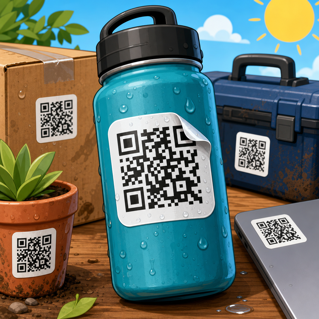
Material choice has a direct optical effect. Paper labels can work well for indoor, short-term use because they print sharply and remain cost-effective, but they are vulnerable to moisture, tearing, and abrasion. Polypropylene and vinyl are better for durability, cold-chain environments, cleaning exposure, and outdoor use. Polyester is common for industrial asset labels because it offers dimensional stability and strong chemical resistance. The substrate should fit the environment, but it also needs to hold print integrity over time so the code stays crisp.
Finish matters as much as substrate. Gloss coatings can look vibrant, yet they create specular glare that blinds phone cameras at certain angles. Matte or satin finishes generally scan better because they diffuse light. I have replaced glossy retail shelf stickers with matte laminated versions and seen immediate improvement in scan consistency under overhead LEDs. That result is common. If you need gloss for branding, test the exact lighting conditions in which customers will scan.
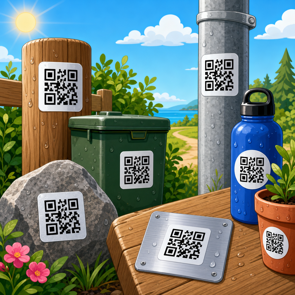
Adhesive and application surface also influence performance. A strong permanent adhesive is useful for equipment, bins, and public signage, while removable adhesive suits short campaigns and temporary wayfinding. But even the best adhesive cannot compensate for a poor surface. Applying a QR code sticker across seams, rivets, corrugation valleys, heavily curved containers, or heavily textured walls can distort the symbol. Distortion changes module geometry and creates shadows. Whenever possible, place the sticker on a flat, smooth area with enough surrounding visual calm to preserve the quiet zone.
Design for human behavior, not just scanner capability
A highly scannable QR code sticker is not only machine-readable; it is also easy for a person to notice, trust, and use. Users need a reason to scan. Add a clear call to action near the sticker, such as “Scan for setup guide,” “Scan to see menu,” or “Scan for warranty registration.” Generic codes without context are ignored, especially in public settings where people are cautious about unknown links. A short label reduces hesitation and improves scan intent.
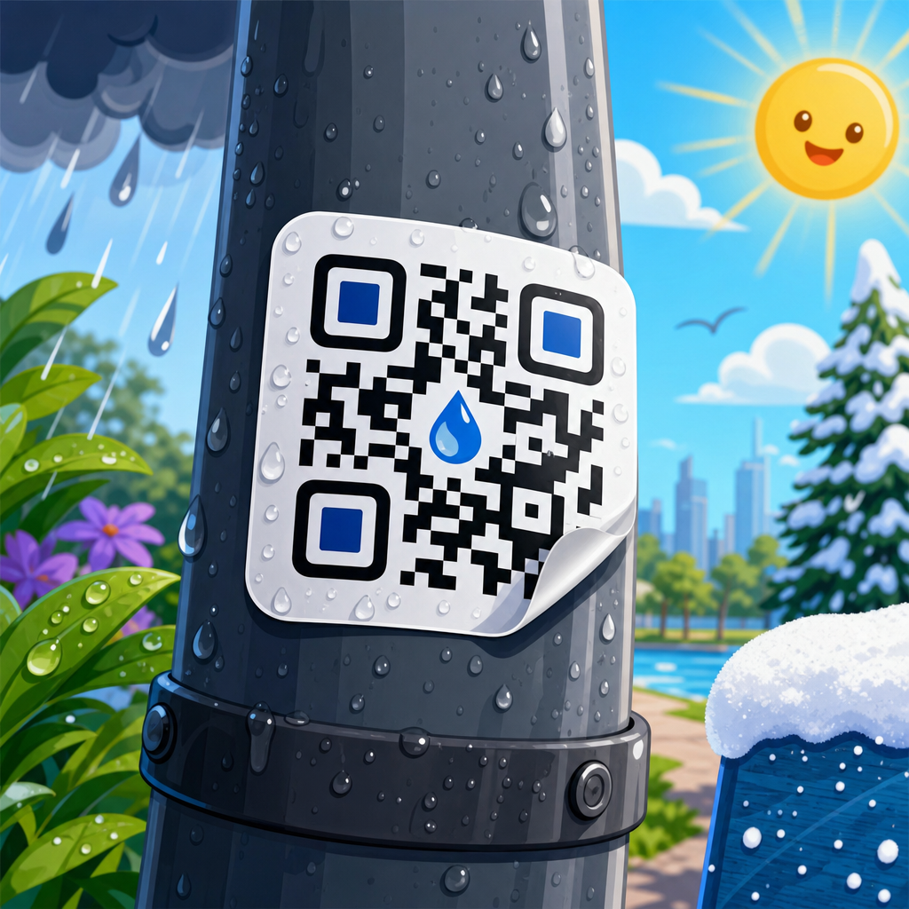
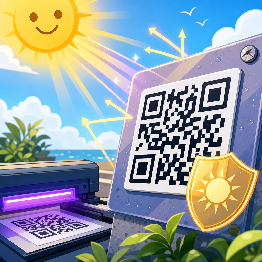
Placement height and angle are practical design decisions. For handheld scanning, chest to eye level usually performs better than floor-level or overhead placement because it aligns with natural phone handling. On product packaging, avoid corners, folds, and areas likely to be covered by price labels or fingers. On windows, account for reflections and changing daylight. On vehicles or outdoor equipment, remember that dirt, water spots, and sun fade are operational realities, not edge cases.
Branding should support, not compete with, the code. Custom colors, logo insertions, rounded modules, and decorative frames can work, but every customization adds risk. If you style the code, preserve the three finder patterns, maintain strong contrast, and keep enough untouched data area for the error correction level you selected. I advise clients to test branded and unbranded versions side by side on multiple phones before approving print. In many cases, a simpler code wins decisively.
Optimize print production and installation quality
Print quality can make or break scannability even when the file is correct. Ink spread, low toner density, misregistration, and coarse screens can deform module shapes. Thermal transfer is dependable for many industrial labels because it creates durable, high-contrast marks, while digital presses are flexible for short runs and variable data. Flexographic printing is cost-efficient at volume but requires careful plate control to keep small QR modules from filling in. The production method should match code size and material.
Resolution and proofing are not administrative details; they are performance controls. Request press proofs or production samples on the actual stock, with the intended finish, then test them in realistic conditions. Scan with current iPhone and Samsung devices, older Android models, and at least one generic camera app. Check performance under daylight, warm indoor light, cool retail LEDs, and low-light conditions. If the sticker will be used outdoors or in logistics, test after abrasion, moisture exposure, and temperature cycling.
Installation standards matter too. A perfectly printed sticker can fail if it is applied crooked across a curve, bubbled, wrinkled, or trimmed too close. Train installers to preserve the quiet zone, avoid stretching flexible films, and clean surfaces before application. For large deployments, build a placement guide that specifies location, height, orientation, and exclusion zones around the code. This reduces inconsistency across stores, sites, or packaging lines and makes future troubleshooting far easier.
Measure scan performance and fix the failures systematically
Scannability should be measured, not assumed. Dynamic QR codes are especially useful because they let you update the destination and monitor scan activity without reprinting the sticker. Track scans by location, campaign, material, and placement type. If one store, package format, or asset class underperforms, investigate the physical conditions before blaming audience interest. In real campaigns, lower scans often map directly to glare, poor placement, or undersized labels.
When diagnosing failures, start with a straightforward checklist. Is the destination URL fast and mobile-friendly? Is the code large enough for the expected distance? Is there enough contrast? Is the quiet zone intact after die-cutting and placement? Is gloss causing reflections? Is the surface curved or damaged? Has dirt, condensation, or abrasion obscured modules? This process quickly isolates most sticker design problems. It also prevents the common mistake of regenerating the code repeatedly when the real issue is print or placement.
As a hub for QR Code Sticker Design, the key takeaway is that better scannability comes from disciplined decisions across the entire workflow. Build a clean QR code, keep the data compact, size it for actual distance, protect the quiet zone, use dark-on-light contrast, choose matte-friendly durable materials, place the sticker where people can comfortably scan it, and test production samples in the real environment. Those steps consistently outperform clever styling or guesswork. If you are improving labels, packaging, signage, or asset tags, audit your current stickers against these standards and fix the weakest link first.
Frequently Asked Questions
What design factors have the biggest impact on whether a QR code sticker scans easily?
The biggest factors are contrast, size, quiet zone, print quality, and destination reliability. In most cases, a QR code sticker becomes hard to scan not because the code format is flawed, but because one or more of these basics were compromised during design or production. High contrast is essential: a dark code on a light background remains the safest choice because phone cameras detect it more quickly and more consistently across different lighting conditions. If the design uses low-contrast color combinations, metallic inks, gradients, or busy backgrounds, scanning reliability usually drops. Size matters too. A code that looks acceptable on screen may become difficult to scan once printed as a small sticker and placed in a real environment where people are moving, standing at different distances, or trying to scan quickly.
The quiet zone is another major factor that often gets overlooked. This is the clear margin around the QR code, and it should remain free of text, icons, borders, or background patterns. Without enough empty space, many devices struggle to detect the boundaries of the code. Print sharpness also plays a major role. Blurry edges, ink spread, poor material choice, or low-resolution printing can distort the modules in the code and make recognition slower. Finally, even a perfectly printed sticker can feel “unscannable” if the landing page loads slowly, redirects too many times, or opens a broken mobile experience. The best-performing QR stickers are not just visually clean; they are designed as complete scan experiences, from the printed square to the page that opens on the user’s phone.
How much contrast and empty space does a QR code sticker need?
As a rule, a QR code sticker should use strong visual contrast and a clearly defined quiet zone on all four sides. The safest setup is still a black or very dark code on a white or very light background. This combination gives camera software the best chance to identify the code instantly, even in imperfect conditions such as glare, shadows, worn surfaces, or older phone cameras. While brand colors can sometimes be incorporated, they should never reduce the distinction between the code and the background. Light gray on white, dark blue on black, or any combination with reflective or transparent materials may look stylish in a mockup, but they often create scanning friction in the real world.
For the quiet zone, the key principle is simple: the code needs breathing room. That blank border helps scanning software isolate the QR pattern from everything around it. If logos, decorative outlines, product text, textured backgrounds, or sticker cut lines come too close to the code, detection can fail or become inconsistent across devices. A common mistake is to shrink the margin in order to make the sticker more visually compact. That usually hurts performance. If the goal is scannability, preserve the clear space first and adjust the rest of the design around it. Think of the quiet zone as part of the code, not optional whitespace. In real-world use, that empty space often makes the difference between an instant scan and repeated failed attempts.
What print materials and finishes make QR code stickers easier to scan?
Materials and finishes matter more than many people expect because they directly affect clarity, durability, and glare. A crisp, high-resolution print on a stable material will outperform a cheaper option that bleeds, fades, wrinkles, or reflects too much light. Matte finishes are usually the safest choice for QR code stickers because they reduce glare from sunlight, indoor lighting, and camera flash. Glossy or laminated surfaces may look attractive, but they can create bright reflections that partially obscure the code when someone tries to scan it from an angle. That issue becomes even more noticeable on curved surfaces, windows, packaging, or environments with overhead lighting.
Adhesive quality also matters because poor adhesion leads to bubbles, curling edges, lifting corners, and distorted placement, all of which can interfere with scanning. If a sticker is going onto outdoor equipment, shipping materials, retail displays, or frequently handled packaging, choose a substrate and adhesive suited to that environment. A code that scans perfectly when newly printed may become unreliable after exposure to moisture, abrasion, heat, or cleaning products. Durable inks and weather-resistant materials are important when longevity is part of the campaign. The practical goal is to keep the code flat, readable, and high-contrast for as long as it is expected to be used. A technically correct QR code printed on the wrong material can still become a poor-performing sticker in everyday conditions.
Where should QR code stickers be placed for the best scan rate?
Placement has a direct effect on both scan success and scan volume. Even a well-designed sticker will underperform if it is positioned too high, too low, on a curve, behind glare, or in a spot where people cannot comfortably stop and aim a phone. In general, the best placement is at a natural viewing and scanning height, on a flat or nearly flat surface, with enough surrounding space for a user to notice it and approach it. If people need to crouch, stretch, twist their wrist, step into traffic, or block a doorway to scan, response rates usually drop. The same is true when the sticker is placed in dim lighting or on surfaces with heavy reflections.
Context is just as important as physical height. A QR code should appear where the user has both the motivation and the time to scan it. For example, a checkout counter, product display, tabletop, entry sign, or packaging panel often performs better than a random wall placement because it aligns with a moment of interest. It also helps to leave enough room around the sticker so users can frame the code without visual clutter. If the sticker is meant to be scanned from a distance, the code must be larger. If it is placed on moving objects, transparent surfaces, or heavily textured materials, testing becomes even more important. The strongest approach is to think like the person scanning: Can they see it quickly, reach it easily, understand why they should scan it, and complete the action without friction? If the answer is yes, placement is probably working in your favor.
How can I test a QR code sticker before printing a large batch?
The best way to test a QR code sticker is to simulate real-world conditions before committing to full production. Start by printing prototypes at actual size, on materials as close as possible to the final stock. Then test them with multiple phones, both newer and older devices, under different lighting conditions such as bright daylight, indoor overhead light, shade, and low light. Scan from the expected user distance and angle rather than only from ideal close-up positions. If the sticker will be applied to packaging, windows, walls, or equipment, place the sample on those actual surfaces and test there. This step often reveals practical issues that are invisible in digital proofs, such as glare, warping, contrast loss, or poor visibility from the intended approach path.
You should also test the destination experience, not just the code itself. Confirm that the link opens quickly, loads well on mobile, and takes users directly to the intended content without confusing redirects or unnecessary steps. If the sticker includes a call to action, evaluate whether that text is clear enough to motivate scanning. It is also smart to test after some wear: rub the sample, expose it to sunlight, apply it to a curved surface, or leave it in the environment where it will be used. A sticker that works perfectly on day one but degrades after a week is not truly optimized. Small pilot runs are often worth the effort because they can prevent large-scale reprints and campaign waste. In most underperforming QR sticker campaigns, the problems were discoverable before launch with just a bit of disciplined testing.