Choosing the best colors for QR code stickers is not just a design decision; it directly affects scan reliability, print durability, brand recognition, and campaign results. In practical production work, I have seen beautiful sticker designs fail in the field because contrast was too low, glossy lamination caused glare, or a brand team insisted on fashionable colors that cameras could not read consistently. A QR code sticker works only when three elements stay aligned: the code must be machine-readable, the sticker must be physically suited to its environment, and the color palette must support both scanning and brand goals.
QR code sticker design refers to the full process of shaping a scannable code for adhesive applications, including color selection, sizing, quiet zone protection, error correction, material choice, finish, and placement. The best colors for QR code stickers are usually dark foreground modules on a light, non-reflective background. Black on white remains the benchmark because it delivers the strongest luminance contrast for smartphone cameras and scanning apps. However, many other combinations can work well, including navy on white, dark green on cream, or deep burgundy on pale beige, provided the contrast stays high and the print remains crisp.
This topic matters because QR codes are now used on packaging, retail shelves, restaurant tables, event badges, direct mail, equipment labels, and product authentication stickers. In each setting, color influences not only whether the code scans, but also whether people notice it, trust it, and understand its purpose. A sticker that blends into dark packaging may be on-brand but invisible. A metallic foil sticker may look premium but produce glare under store lighting. A pastel-on-pastel code may match an aesthetic brief yet fail for users with older phones or damaged camera lenses. The most effective approach balances visual identity with the technical needs of image recognition.
As the hub page for QR Code Sticker Design within QR Code Design, Printing & Materials, this article explains the core principles that govern color performance, the safest and most flexible color combinations, common mistakes, printing considerations, testing methods, and when specialty treatments are worth the risk. If you are planning branded QR code labels, promotional stickers, packaging seals, or asset tags, this guide will help you choose colors that scan reliably in real conditions rather than only looking good on a mockup.
Why color matters in QR code sticker design
QR scanners do not interpret color the way designers do. They look for contrast patterns that define square modules, finder patterns, alignment patterns, and timing lines. Most smartphone cameras capture a color image, but the decoding software effectively depends on tonal separation. That means the key question is not whether two colors are different on a brand palette; it is whether they create enough light-dark distinction after printing, lighting, focus, motion, and compression affect the image. This is why black on white works so well: it maximizes contrast at every step.
On stickers, color choices are further complicated by substrate and finish. A matte polypropylene sticker diffuses light differently than glossy paper. Clear stickers applied to tinted glass inherit the background color behind them. Vinyl stickers used outdoors may fade under ultraviolet exposure, reducing contrast over time. I have also seen thermal transfer labels print dark navy correctly in one batch and slightly washed out in another, which changed scan performance even though the artwork file did not change. Good QR code sticker design accounts for these production realities early.
Color also shapes user behavior. A sticker that clearly frames the QR code with a clean, high-contrast background signals functionality. A code buried in a busy, low-contrast graphic can be mistaken for decoration. If you want scans, color must support discoverability and trust, not compete with it.
Best color combinations for reliable QR code stickers
The safest rule is simple: use a dark code on a light background. Black on white is the standard, but it is not the only effective option. Dark blue on white is widely used in retail packaging and trade show materials because it preserves brand personality while maintaining strong contrast. Dark green on off-white works well for natural products. Charcoal on light gray can scan reliably if the gray is very light and the charcoal prints solidly. Deep maroon on cream can also perform well when tested carefully.
What usually fails is the reverse logic: light foreground on dark background, especially when the code is small or placed in uncontrolled lighting. Some modern scanners can decode inverted QR codes, but reliability drops across devices, apps, and environmental conditions. If the sticker will be used in public, on packaging, or in any campaign where every scan matters, standard polarity is the better choice.
The combinations below summarize practical performance patterns I have seen in packaging, retail, logistics, and event printing.
| Color combination | Scan reliability | Best use case | Main caution |
|---|---|---|---|
| Black on white | Excellent | Universal default for any QR code sticker | Can look generic without branded framing |
| Navy on white | Excellent | Corporate branding, packaging, event materials | Avoid thin, under-inked digital print output |
| Dark green on cream | Very good | Organic, wellness, food packaging | Keep cream light enough for strong contrast |
| Charcoal on pale gray | Good to very good | Minimalist premium packaging | Test under low light before production |
| White on black | Variable | Controlled environments only | Lower compatibility across devices and apps |
| Metallic or neon pairings | Poor to variable | Rare specialty promotions | Glare, bleed, and weak tonal separation |
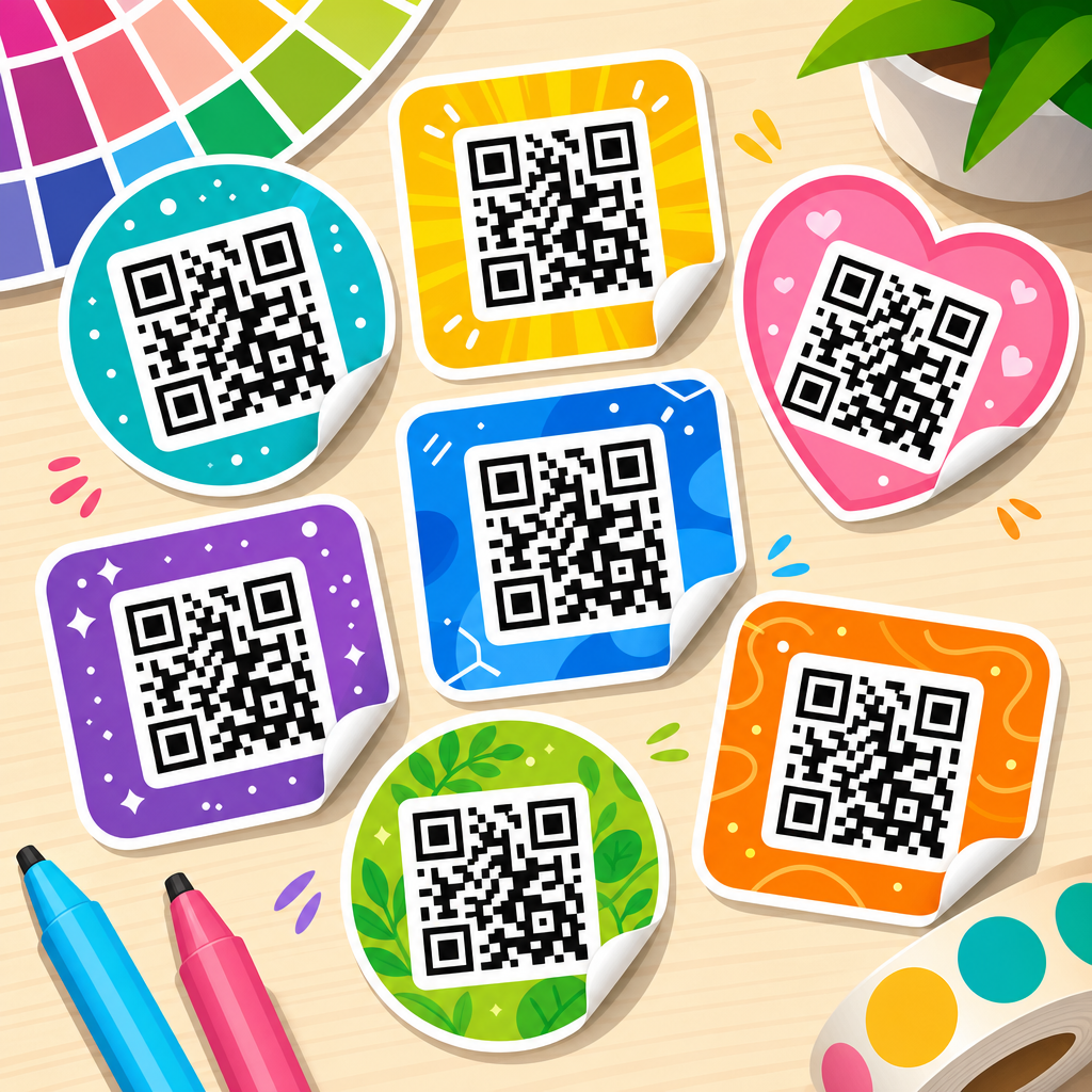
If brand colors are non-negotiable, use them around the code rather than inside it. A branded border, call-to-action label, or sticker shape can carry visual identity while the code itself remains technically safe. This approach usually outperforms heavily stylized codes in real campaigns.
How contrast, lighting, and print finish affect scanning
Contrast is the single most important factor in QR code sticker color selection. In practice, I evaluate contrast in three stages: on screen, on an actual printed sample, and in the real environment where the sticker will be scanned. A code that appears readable on a calibrated monitor can lose clarity once printed on textured stock or laminated with a reflective film. Phone cameras then add more variables, including autofocus behavior, exposure balancing, and motion blur.
Lighting matters because scanners need clean edge detection. Under bright direct light, glossy stickers can create specular highlights that wash out modules. Under dim conditions, low-contrast combinations become muddy. This is why matte finishes are generally better for QR code stickers, especially for restaurant tables, product packaging under store lights, and outdoor equipment labels. Matte coatings reduce glare and preserve edge definition. Satin finishes can work if contrast is strong. High-gloss finishes should be tested aggressively before approval.
Finish also changes perceived color density. Rich black printed on coated paper can look deeper than the same file on uncoated stock. Transparent inks on clear stickers may appear lighter after application. On metalized materials, reflected light can interfere with camera interpretation even when the printed color seems dark enough to the eye. For durable sticker campaigns, laminated vinyl with a matte overlaminate usually provides the best balance of weather resistance and scan reliability.
Environmental wear adds another layer. Sun fading, abrasion, cleaning chemicals, and condensation can all reduce contrast over time. For asset tracking or outdoor labels, choose pigment-stable inks and avoid subtle color pairings that depend on perfect conditions.
Branding without sacrificing function
Many teams want a QR code sticker that feels unmistakably branded. That is reasonable, but function has to come first. The most successful branded QR stickers I have produced follow a simple hierarchy: preserve a standard, high-contrast code core; use brand color in the surrounding label architecture; add a concise call to action; and keep the quiet zone clear. This creates a sticker that belongs to the brand while still scanning instantly.
The quiet zone is the blank margin around the QR code, typically at least four modules wide. Designers often invade this space with colored backgrounds, patterns, icons, or die-cut edges. That is a common failure point. If you need a shaped sticker, place the code on a stable light panel within the shape. If you want to use a colored background, maintain a solid light field behind the code and reserve gradients or illustrations for the outer areas.
Logos can be added in the center of a QR code if error correction is set appropriately, but this should be treated as an advanced customization, not a default. Higher error correction can preserve readability when part of the code is obscured, yet it also increases module density, which can make small stickers harder to scan. In other words, logo insertion trades one constraint for another. For small product labels, I usually recommend keeping the code plain and moving the logo above or below it.
Text matters too. “Scan for menu,” “Verify authenticity,” or “Watch setup video” improves scan rate because users understand the value immediately. Color supports this message when it draws attention to the action rather than blending everything into a single decorative block.
Common color mistakes to avoid on QR code stickers
The most frequent mistake is using insufficient contrast. Pastel foregrounds, mid-tone pairings, and trendy muted palettes are common causes of failure. A second mistake is relying on inversion, such as white modules on black, because it looks bold on a packaging mockup. It may scan sometimes, but “sometimes” is not acceptable for a customer-facing code.
Another mistake is combining multiple risky choices at once: a small code, glossy laminate, curved bottle placement, and low-contrast brand colors. Each variable increases the decoding burden. Together they create a fragile system. I have seen beverage labels with copper foil backgrounds and dark brown codes pass a studio test but fail on refrigerated shelves because condensation and curvature reduced clarity.
Gradients inside the code are another weak choice. Even when the darkest part scans, the lighter sections may break module consistency. The same applies to textured fills, drop shadows, distressed effects, or patterned backgrounds visible through clear sticker stock. QR code sticker design should favor crisp edges and uniform fills.
Finally, do not assume one successful test equals production readiness. Different phones use different camera pipelines and scanning libraries. Test across iPhone and Android devices, native camera apps, and at least one third-party scanner if the campaign is important.
Printing and material considerations for sticker performance
Color performance depends on printing method and material as much as artwork. Digital toner presses can produce sharp labels quickly, but dark solid areas may crack on some flexible stocks. Inkjet label systems handle short runs well, though ink density and water resistance vary. Thermal transfer is common for operational labels and can deliver excellent contrast, especially in black, but offers fewer aesthetic options. Flexographic and offset printing are strong choices for larger volumes when color management is controlled properly.
Material selection should match the environment. Paper stickers are cost-effective for indoor promotions and short-term use. Vinyl and polypropylene are better for moisture, abrasion, and outdoor exposure. Clear stickers can look refined on windows and bottles, but they are risky for QR codes unless a white ink underlay creates a stable light background. Without that underlay, the effective background becomes whatever surface sits behind the sticker, and scan reliability becomes unpredictable.
Adhesive choice also matters. If the sticker curls, wrinkles, or lifts, the code geometry distorts. On textured cardboard, low-tack adhesives may leave bubbles that interfere with scanning. For cold-chain packaging, freezer-grade adhesives are important because standard adhesives can fail at low temperatures, leading to warped codes and poor user experience.
Prepress proofing is the checkpoint that saves money. Request physical proofs on the actual stock, with the final finish, at the final size. Then test under expected lighting and viewing distance. That process catches most color-related failures before they become a production problem.
Best practices for testing QR code sticker colors before launch
Testing should be structured, not casual. Start by verifying the destination URL, dynamic code settings if used, and final exported artwork. Then print prototypes at actual size on actual material. Test in bright light, low light, and angled light. Scan from common user distances, not just from six inches away on a designer’s desk. If the sticker will be placed on curved packaging, apply it to the real container before testing.
I recommend checking at least five variables: first-scan success rate, average scan distance, scan speed, glare sensitivity, and tolerance to minor wear. If a sticker needs multiple attempts on common devices, the design should be revised. There is usually no business case for keeping a stylish color scheme that costs conversions.
Analytics close the loop after launch. Dynamic QR platforms such as Bitly, QR Code Generator, Beaconstac, and Flowcode can show scans by time, location, and device trends. If one printed batch underperforms in a certain channel, color or finish may be part of the cause. Treat QR code sticker design as a measurable system, not a static artwork file.
For most teams, the winning formula is straightforward: dark code, light matte background, adequate size, protected quiet zone, short clear CTA, and real-world testing. That combination consistently beats more decorative alternatives.
The best colors for QR code stickers are the ones people can scan instantly under normal conditions, not the ones that look most dramatic in a concept presentation. High contrast remains the governing principle, which is why black on white is still the safest choice and dark-on-light combinations outperform most stylized alternatives. When you add sticker-specific factors such as gloss, substrate, outdoor exposure, curvature, and adhesive performance, color becomes part of a broader QR code sticker design system rather than an isolated branding choice.
As the hub for QR Code Sticker Design, this guide points to the core decisions every project depends on: choose strong tonal separation, favor matte or low-glare finishes, keep the quiet zone clean, use branding around the code instead of inside it when possible, and test printed samples in realistic settings. Those steps reduce scan friction, protect campaign performance, and prevent expensive reprints.
If you are designing QR code labels for packaging, promotions, menus, events, or operations, start with a conservative color foundation and customize from there. Reliable scanning is the feature users notice first. Build your next QR code sticker around contrast, print quality, and field testing, and you will create something that looks professional and works every time.
Frequently Asked Questions
What color combination works best for QR code stickers?
The most reliable color combination for QR code stickers is still a dark code printed on a light background, with black on white remaining the industry standard for maximum scan reliability. That is not just tradition; it is because phone cameras and scanning software detect contrast first. A high-contrast pairing gives the scanner clear visual separation between the data modules and the background, which improves read speed and reduces scan failures in different lighting conditions. Dark navy, deep green, or dark charcoal on a white or very pale background can also work well, but the key requirement is strong contrast rather than a specific brand color.
In real-world use, the best-performing stickers are usually the ones that prioritize function over style. A design may look modern on screen, but if the code color and background are too close in tone, the QR code can become unreliable once printed, laminated, placed outdoors, or viewed through a scratched camera lens. For sticker production, it is safer to think in terms of scanability first: dark foreground, light background, clean edges, and a quiet zone around the code. If branding matters, it is usually smarter to introduce brand colors in the border, call-to-action text, or surrounding sticker design rather than inside the code itself.
Can you use branded or custom colors in a QR code sticker without hurting scan performance?
Yes, branded or custom colors can be used, but only if they preserve strong contrast and are tested after printing. This is where many QR code sticker projects go wrong. A color that appears bold on a monitor may print lighter than expected, and subtle brand palettes often do not create enough distinction between the QR pattern and the background. Cameras do not care whether a sticker matches a brand book perfectly; they care whether the code is clearly readable. If a company wants a customized look, the safest approach is to use a darker version of the brand color for the QR pattern and pair it with a very light, non-reflective background.
It is also important to remember that QR code readability depends on more than color alone. Print process, ink saturation, sticker material, surface finish, and viewing angle all affect results. A custom burgundy code on cream paper may scan well in the office but struggle outdoors under glare or in low light. That is why experienced producers always test physical samples with multiple phones before approving a final design. Brand consistency matters, but the QR code sticker still has a practical job: it must scan quickly and consistently in everyday conditions. If custom colors compromise that outcome, they are not the best colors for the application.
Are light colors or pastel shades a bad idea for QR code stickers?
In most cases, yes, light colors and pastel shades are risky choices for the actual QR code pattern. Pale blue, soft yellow, mint, blush, and similar tones usually do not provide enough visual density for scanners, especially once printed on stickers that may be exposed to dirt, fading, glare, or uneven surfaces. Even if a pastel QR code scans under ideal conditions, it often becomes less dependable in the field. That matters because QR code stickers are typically used in uncontrolled environments such as packaging, store windows, product labels, outdoor signage, and promotional handouts.
Pastels can still be used effectively in the overall sticker design, but they are better suited for background elements, borders, or decorative branding areas rather than the machine-readable code itself. If a soft visual style is important, a practical compromise is to keep the QR modules dark and place them on a pale background that complements the brand palette. This preserves the clean aesthetic while maintaining reliable scan performance. In production terms, the question is not whether a pastel design looks attractive; it is whether the sticker still works after printing, handling, and real-world use. For that reason, pastel-heavy QR code designs should be treated cautiously and validated through testing before deployment.
Does the finish of the sticker matter as much as the color?
Absolutely. Sticker finish can affect scan reliability almost as much as color choice, and sometimes more. A well-designed black-on-white QR code can still fail if it is covered with a glossy laminate that produces glare under store lighting, sunlight, or a phone flash. Reflection can wash out the code pattern and make it harder for cameras to distinguish the modules clearly. Matte or low-glare finishes are usually the safest option for QR code stickers because they reduce reflection and preserve contrast from more viewing angles.
Durability is another reason finish matters. Stickers used outdoors or in high-contact environments need protection from abrasion, moisture, UV exposure, and fading. If the finish causes the code to become harder to read over time, campaign performance suffers no matter how attractive the original design looked. The best results usually come from balancing three priorities: strong color contrast, a material appropriate for the surface and environment, and a finish that does not interfere with camera detection. In other words, the best colors for QR code stickers should never be chosen in isolation. They must be evaluated together with substrate, lamination, print method, and intended use conditions.
How can you test whether a QR code sticker color choice will scan reliably?
The most effective way to test QR code sticker colors is to evaluate printed samples, not just digital mockups. On-screen proofs can be misleading because screens are backlit and often make colors appear more distinct than they will look in ink. Once a QR code is printed on vinyl, paper, polyester, or another sticker material, the contrast can shift significantly. Start by printing test versions at the actual size you plan to use, with the exact colors, material, and finish intended for production. Then scan them using multiple smartphone models, both iPhone and Android, under different lighting conditions such as daylight, office lighting, low light, and angled glare.
It is also wise to test stickers after they are applied to their final surface, because texture, curvature, and background interference can influence scan behavior. Check scanning distance, scan speed, and first-attempt success rate rather than asking only whether the code can eventually be read. A good QR code sticker should scan quickly and consistently without users having to reposition their phones repeatedly. If one color variation performs noticeably better than another, choose performance over aesthetics. That is the practical standard professionals use. The best colors for QR code stickers are the ones that remain readable after printing, application, and everyday use, while still supporting the brand and the campaign objective.