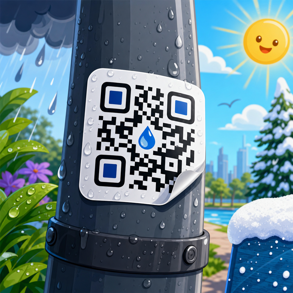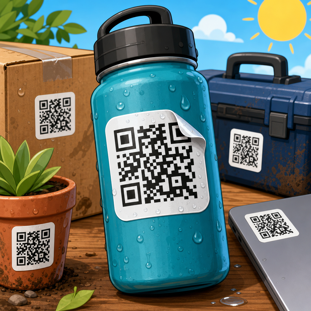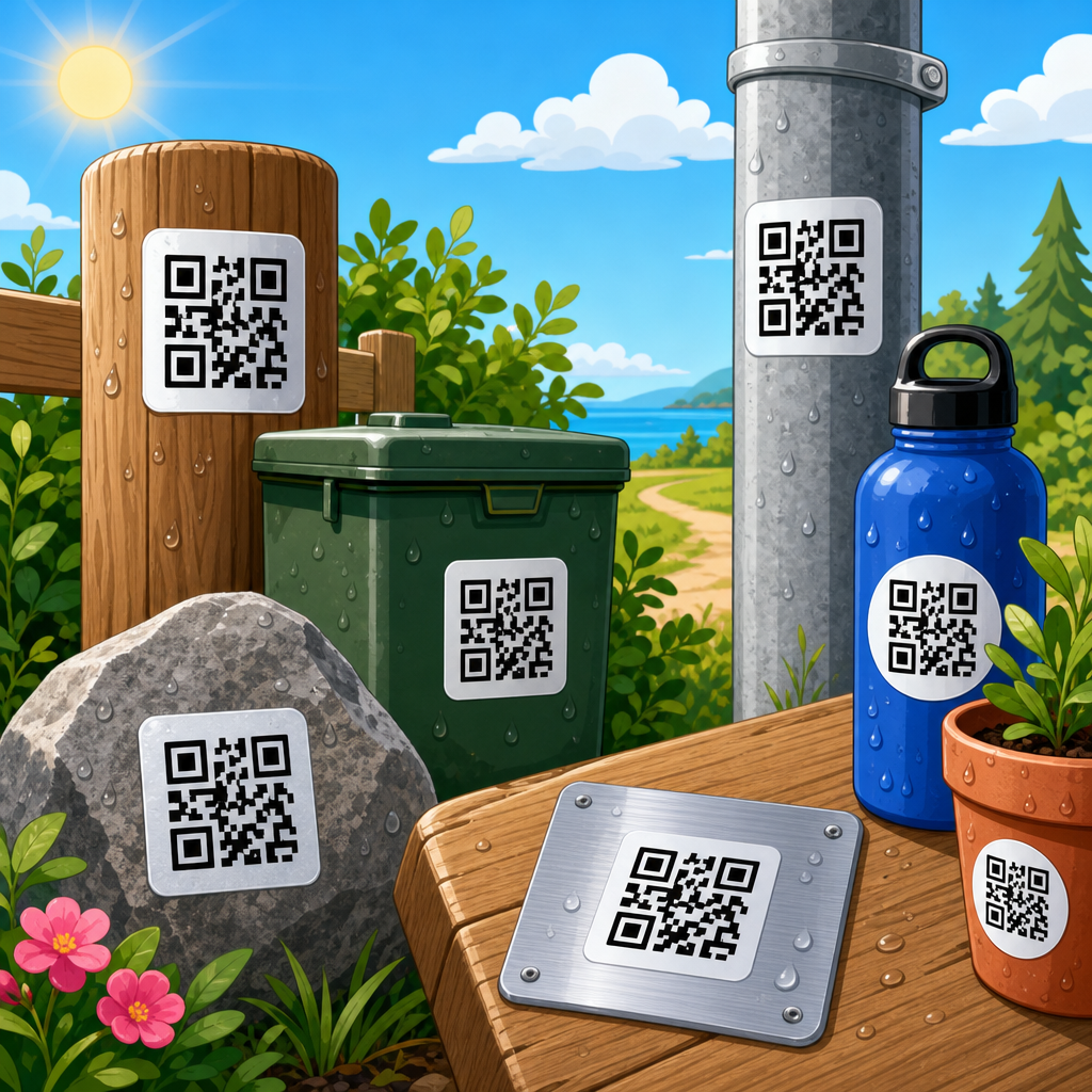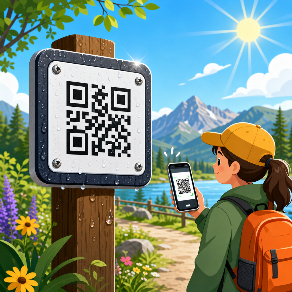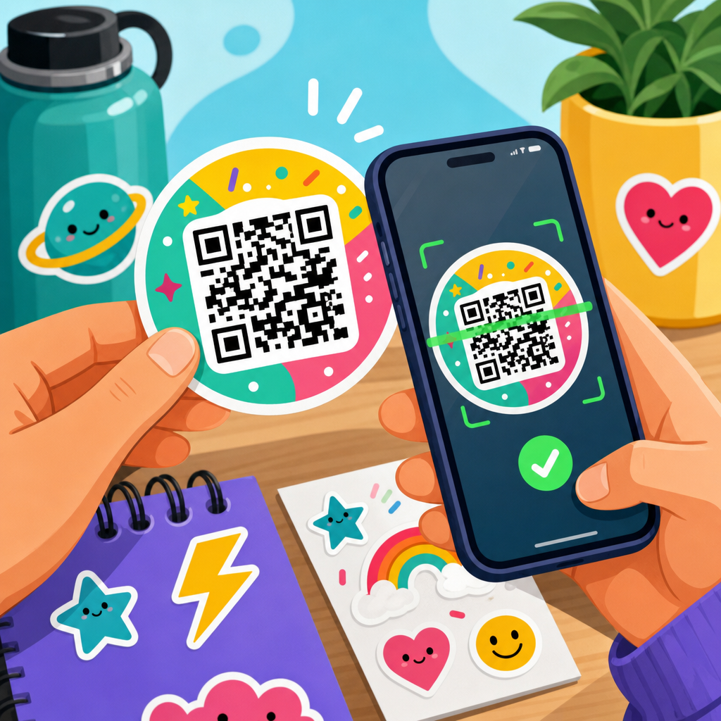
QR code sticker design looks simple until a code fails on a wet freezer door, a curved bottle, or a dimly lit warehouse shelf. A sticker that scans every time is not just a graphic asset. It is a physical interface between a camera, a printed symbol, a surface, and a real-world user in motion. When I design QR code stickers for packaging, retail displays, equipment labels, and event materials, I treat scan reliability as the primary success metric. Style matters, but readability under imperfect conditions matters more.
A QR code sticker is a printed adhesive label that contains a Quick Response code and the surrounding design elements that help a person notice it, trust it, and scan it. “Scans every time” does not mean mathematically perfect performance in every environment. It means the sticker delivers a consistently high first-scan success rate across realistic use conditions: different phones, lighting angles, print runs, placement surfaces, and user behavior. Achieving that result depends on module contrast, quiet zone protection, physical size, print resolution, substrate choice, finish, adhesive performance, and destination management.
This topic matters because a failed scan breaks the conversion path. On a product package, it can suppress registrations, reorder flows, and how-to content views. In a restaurant, it slows table turns. In industrial settings, it creates traceability gaps. In direct mail, it wastes postage. The hub topic of QR code sticker design sits inside the broader discipline of QR code design, printing, and materials because the sticker is where digital intent meets manufacturing reality. If the code is technically valid but physically compromised, the campaign still fails.
Good QR code sticker design also requires balancing branding with machine readability. Teams often ask whether they can add a logo, reverse the colors, die-cut the label, laminate the surface, or shrink the code to fit a tight package panel. The answer is usually yes, but only within tolerances. ISO/IEC 18004 defines the QR code symbology, and mobile scanning apps add their own practical limits. The best-performing stickers are designed from the scanner outward: start with decoding needs, then build the visual system around them. That approach produces stickers that look intentional, survive production, and work in the field.
Start with scan mechanics, not decoration
A phone camera does not read a QR code the way a person does. It detects finder patterns, samples module grids, corrects perspective, and decodes data from light and dark contrast. That means the first design priority is preserving a clean symbol with enough quiet zone, enough module size, and enough contrast to survive printing and viewing conditions. In plain terms, the black squares need to be clearly black relative to the background, the white space around the code must stay clear, and the code cannot be so small that camera software struggles to separate one square from the next.
Quiet zone is the empty margin around the QR code. Remove it, crowd it with copy, or let a die line cut into it, and scan rates drop quickly. I recommend at least four modules of clear space on all sides, then more if the sticker sits on a visually noisy background. Module size matters just as much. For close-range consumer use, a practical baseline is around 0.4 mm per module or larger, adjusted upward if users will scan from farther away or through protective coverings. A common field rule is a minimum scanning distance ratio of about ten to one, meaning a 25 mm code is comfortable at roughly 250 mm viewing distance.
Error correction helps, but it is not a license to overdesign. QR codes offer L, M, Q, and H levels, with higher levels recovering more damage while increasing code density. When a brand wants a center logo or expects scratches on outdoor stickers, I usually test Q or H. However, denser codes produce smaller modules at the same printed size, which can hurt readability more than the extra recovery helps. The right move is often shortening the URL with a dynamic QR platform, reducing encoded data, and then using moderate-to-high error correction rather than forcing a long raw link into a tiny label.
Choose the right size, shape, and data structure
Sticker dimensions should be driven by use distance, placement surface, and encoded content, not by leftover space in a layout. A QR code for tabletop ordering can often be smaller than a code on a storefront window because the expected scan distance is shorter. For product packaging, I usually establish target use cases first: in-hand scan, shelf scan, or scan from a poster display. Then I test the smallest size that consistently scans across iPhone and Android devices under average indoor light. That baseline becomes the minimum approved production size, not a suggestion for designers to revisit later.
Data structure influences design more than most teams realize. Static QR codes hardcode the final destination and are fine for permanent links that will not change. Dynamic QR codes point to a short redirect URL, allowing destination updates, scan analytics, UTM tagging, and version control without reprinting stickers. For a sub-pillar hub like QR code sticker design, dynamic codes are usually the correct recommendation because they support campaign management and future-proofing. They also reduce symbol complexity by encoding a shorter string, which improves scan reliability at smaller sizes and gives more room for branding without sacrificing performance.
Shape decisions should protect the symbol. Circular or custom die-cut stickers are popular, but the printed QR code itself should remain square. Putting a square code inside a round label is safe if the quiet zone remains intact. Cropping the symbol to mimic a shape is risky and usually unnecessary. Curved surfaces add another constraint. A code that scans perfectly on a flat pouch may fail when wrapped around a narrow bottle because the camera sees distorted geometry. On curved containers, increase code size, keep the symbol on the flattest panel available, and avoid placing it across seams, corners, embossing, or squeeze zones.
Use color, contrast, and branding without breaking readability
The highest-performing QR code sticker is still dark code on a light background. Black on white remains the benchmark because it maximizes luminance contrast for cameras in varied light. Brand colors can work, but they need testing based on actual print values, not screen appearance. A deep navy on pastel cream may scan well. A medium gray on kraft paper often does not. Metallic inks, gradients, and transparent effects create inconsistent reflectance that looks stylish in proofs and fails on real phones. If a scanner must guess where edges begin, first-scan success drops.
Logos and frames can improve trust and call attention to the code, especially when users are not sure what will happen after scanning. The key is restraint. Keep logos small and centered, preserve finder patterns, and raise error correction only after reducing data length where possible. Add a short call to action near the code, such as “Scan for setup guide” or “Scan to verify authenticity,” because intent clarity increases scans. In retail testing, codes with explicit value statements routinely outperform unlabeled codes. People scan when the benefit is specific, immediate, and credible.
Finishes affect optical behavior. Gloss lamination can introduce glare under overhead lighting, making modules harder to distinguish. Matte finishes usually scan more reliably because they reduce specular reflection. Soft-touch laminates can work well for premium packaging, but they must be tested for smudging and contrast loss. Transparent stickers deserve extra caution because the effective background becomes whatever surface sits behind them. If the substrate color changes from one application surface to another, code contrast changes too. For universal deployment, an opaque white underprint behind the code area is the safer engineering choice.
Match material and adhesive to the real environment
Sticker stock is not a cosmetic choice. It determines durability, print stability, and whether the label stays scanable for its full service life. Paper labels are economical and excellent for dry, short-term indoor use such as event badges, tabletop promos, and shipping inserts. Polypropylene and polyester films perform better for moisture, abrasion, and chemical exposure. In cold-chain, bathroom, kitchen, or outdoor applications, I favor synthetic facestocks with permanent adhesives because edge lift and fiber swelling destroy scan consistency faster than many teams expect. Material selection should be documented alongside design approvals, not handled as a late print-buy decision.
Adhesive choice matters because placement failure is scan failure. Permanent acrylic adhesives work across many packaging and equipment applications and generally resist temperature variation better than basic rubber systems. Removable adhesives fit temporary campaigns but can creep or lift on textured surfaces. For corrugate, low-surface-energy plastics, powder-coated metal, or refrigerated glass, ask the converter for surface-specific adhesive recommendations and test peel, shear, and aging. A beautiful QR code sticker that slides, wrinkles, or tunnels over 30 days is not a successful design. Reliability includes staying flat, legible, and attached.
| Use case | Recommended facestock | Finish | Adhesive note |
|---|---|---|---|
| Indoor packaging | Paper or polypropylene | Matte | Permanent acrylic for broad compatibility |
| Wet or refrigerated areas | Polypropylene or polyester | Matte or satin | Cold-temperature adhesive if applied in chill conditions |
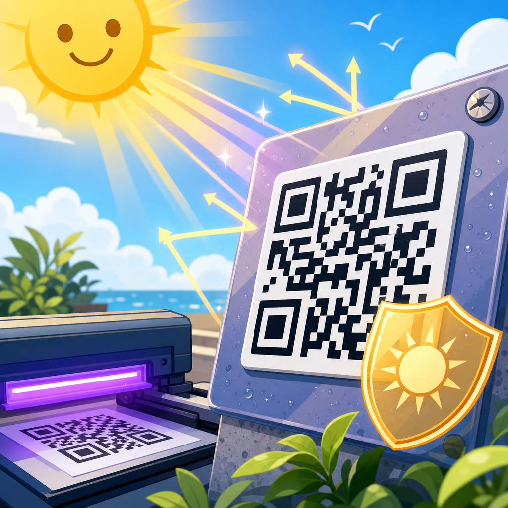
| Outdoor equipment labels | UV-stable polyester | Matte laminate | Weather-resistant permanent adhesive |
| Temporary promotions | Paper or removable film | Matte | Removable adhesive tested for residue and lift |
Print method should align with expected volume and tolerances. Digital presses are excellent for variable data and short runs, but toner spread, ink density, and substrate interaction still need verification. Flexographic printing is efficient at scale, though plate gain can close small modules if artwork is undersized. Thermal transfer labels are common in logistics and inventory settings; they can scan very well when ribbon and media are matched correctly, but low-grade direct thermal labels fade with heat and time. Whenever a code will be mission-critical, ask for press proofs on final material, not just PDF approvals.
Place the sticker where users can actually scan it
Placement has as much influence on scan rate as code design. A perfect symbol can underperform if it is hidden under a package fold, placed too low on a machine, or stuck where overhead glare hits hardest. For consumer packaging, keep the sticker on a stable, visible panel that a person can face toward their phone without twisting the product. For posters and signs, mount it between waist and chest height where framing is easy and crowds do not block access. For asset labels, orient the code consistently so technicians know where to look and can scan quickly during audits.
Environmental context changes user behavior. In a quiet living room, people will adjust angle and distance until a code resolves. In transit stations, trade show aisles, and factory floors, they will not. That is why I recommend designing for rushed conditions. Increase size, simplify surrounding graphics, and include enough whitespace that the code stands out immediately. If multiple codes appear on one surface, label them clearly and separate them physically to prevent camera confusion. A user should never wonder which code opens instructions, which code registers a warranty, and which code launches a payment flow.
Testing must happen in the field, not only at a desk. I run scan checks on at least several current iPhone and Android models, under bright light, low light, and angled light, with and without protective cases affecting grip distance. I also test after rubbing, bending, and exposure to common contaminants when relevant. Real surfaces change outcomes: brushed aluminum, kraft board, and shrink film each create different visual noise and reflectance. A QR code sticker design is approved only after production samples scan reliably in the environment where customers will encounter them.
Build this page into a complete sticker design hub
As the hub page for QR code sticker design, this article should connect readers to deeper guidance on size charts, material selection, adhesive types, print methods, lamination, die lines, curved-surface placement, dynamic QR management, and scan testing protocols. That structure helps readers move from general principles to implementation details. It also mirrors how real projects are executed: first define the scan objective, then choose code settings, then specify print and material details, then validate in production. A strong hub page does not try to replace every specialist article; it organizes the decision path clearly enough that teams avoid preventable errors.
The most important takeaway is straightforward. If you want a QR code sticker that scans every time, prioritize readability before decoration, choose a size that matches scan distance, protect the quiet zone, keep contrast high, shorten the encoded data, use materials suited to the environment, and test on final printed samples. Those are the levers that produce dependable scan performance. Branding can absolutely coexist with them, but only when design choices respect the way cameras decode symbols in the real world.
Use this hub as your starting point, then audit your current stickers against these standards. If a code is too small, glossy, crowded, low-contrast, or poorly placed, fix that before changing copy or campaign strategy. Reliable QR code sticker design increases scans, protects conversions, and reduces waste across packaging, retail, operations, and events. Start with one live sticker, test it under real conditions, document what works, and turn those findings into your production standard.
Frequently Asked Questions
1. What makes a QR code sticker scan reliably in real-world conditions?
A QR code sticker scans reliably when the design accounts for more than the code itself. In practice, scan performance depends on a combination of symbol quality, print quality, material choice, placement, lighting, and how fast or casually someone is trying to scan it. A code may work perfectly on a computer screen and still fail once it is printed too small, wrapped around a curved bottle, laminated with glare, or placed on a freezer door with condensation. That is why reliable QR sticker design starts with the assumption that users will scan in less-than-ideal conditions.
The first priority is contrast. In most cases, dark modules on a light background perform best because phone cameras and scanning apps detect that pattern more easily. The code should also preserve a clear quiet zone, which is the blank margin around the QR code. If text, graphics, borders, or die-cut edges crowd that area, detection can slow down or fail entirely. Size matters too. A tiny code on a shelf tag may technically contain the right data, but if the camera cannot resolve the individual squares quickly, users will struggle. As a rule, the scanning distance and environment should influence the printed size. The farther away the scan is expected to happen, the larger the code should be.
Material and finish are equally important. Glossy coatings can create reflections that wash out part of the symbol under store lighting or sunlight. Textured materials can distort edges. Flexible labels applied to curved surfaces can bend the grid enough to reduce readability. In cold, wet, or industrial settings, the adhesive and face stock need to hold their shape and legibility over time, not just on day one. If a sticker peels, wrinkles, fogs, or smudges, scan reliability drops fast.
Finally, the destination experience affects perceived scan success. Even a perfectly scannable sticker feels broken if it opens a slow page, a dead link, or content that is difficult to use on a mobile device. A QR code sticker that scans every time is really the result of system design: readable symbol, appropriate print spec, suitable substrate, smart placement, and a fast mobile landing page.
2. How large should a QR code sticker be for packaging, labels, and displays?
The right size depends on how far away people will scan it, how much data is encoded, and what kind of surface the sticker will be applied to. There is no one-size-fits-all dimension, but there is a practical design principle: the scanning experience should feel effortless from the expected distance and angle. For close-range use on product packaging, a smaller code may work well if the print is sharp and the surface is flat. For posters, retail displays, equipment labels, or event signage, the code usually needs to be larger because users are scanning while standing back, moving, or dealing with uneven lighting.
A common guideline is to increase the code size in proportion to the scanning distance. That principle matters more than memorizing a single minimum size. A code printed for a hand-held box can often be much smaller than one intended for a warehouse rack or trade show wall. However, small sizes become risky when the code includes too much data, because denser QR codes contain smaller individual modules. If the encoded URL is long or the code uses higher error correction with design customization, the printed squares can become so fine that they are harder to reproduce cleanly and harder for cameras to detect quickly.
Surface shape also changes the sizing decision. On curved containers like bottles, tubes, or cans, a code needs enough area to remain visually stable despite wrap distortion. If the code spans too much of the curve, the geometry can become harder to read. In those cases, a slightly larger code placed in the flattest available panel often performs better than a smaller code forced into a tight curved area. Similarly, for freezer products, outdoor labels, or industrial stickers, it is wise to size up because moisture, scratches, frost, or dirt can partially interfere with detection over time.
The best approach is to prototype and test at actual print size, on the actual material, in the actual use environment. Scan it with multiple phones, from expected distances, under bright light, dim light, and awkward angles. If users need to stop, reposition, or zoom in, the code is too small, too dense, or too poorly placed. In QR sticker design, comfortable scanning is the goal, not theoretical minimums.
3. Can I customize a QR code sticker with brand colors, logos, and shapes without hurting scanability?
Yes, but customization has to be handled carefully. Brand styling can make a QR code sticker feel intentional and polished, especially on packaging, retail displays, and event materials. The problem is that many decorative treatments reduce the visual clarity scanners depend on. A QR code is not just a graphic motif; it is a machine-readable symbol with specific structural requirements. Good customization enhances recognition without interfering with detection.
The safest place to start is color. You do not have to use plain black on white, but you do need strong contrast between the foreground modules and the background. Dark-on-light combinations are usually the most dependable. Light-on-dark designs can work in some situations, but they are generally less forgiving. Very low-contrast palettes, metallic inks, gradients, and patterned backgrounds often cause problems, especially in poor lighting or on reflective stock. If brand colors are important, choose a darker brand tone for the code and a clean, lighter field behind it.
Adding a logo in the center is possible if the code is generated with appropriate error correction and the logo does not cover too much of the symbol. Even then, restraint matters. Oversized logos, decorative frames that invade the quiet zone, rounded modules with weak contrast, or heavily stylized finder patterns can all reduce reliability. The more visual alterations you introduce, the more essential real-world testing becomes. A code that appears readable in design software may perform poorly once printed on textured paper, glossy film, or a curved label.
Shape and sticker format also matter. A custom die-cut sticker can be highly effective, but the cut line should not crowd the QR code itself. Preserve clear margins around the symbol so scanning apps can isolate it quickly. If you want branded supporting text like “Scan for instructions” or “View menu,” place it nearby in a way that helps the user without overlapping the code structure. The best branded QR sticker is one that looks distinctive at a glance and scans instantly on the first try. If design flair creates hesitation, the styling is too aggressive.
4. Where should a QR code sticker be placed to improve scan success on products, equipment, and displays?
Placement has a major impact on scan reliability because it determines whether users can physically see, frame, and access the code without friction. A technically perfect QR code will still underperform if it is hidden in a seam, wrapped around a sharp curve, mounted too low, placed under glare, or located where people have to twist the product unnaturally to scan it. Good placement begins by thinking about the user’s body position, camera angle, and environment at the moment of interaction.
On packaging, the ideal placement is usually on a relatively flat, visible panel that remains accessible on the shelf and after purchase. Avoid folds, corners, shrink seams, gussets, and highly curved areas unless testing proves they still scan easily. On bottles and cylindrical containers, place the code in the flattest label section possible and keep it away from areas likely to wrinkle during application. On equipment labels, make sure the code remains visible when the machine is installed and in use. A maintenance QR code is not helpful if it ends up behind a cable, near a hot surface, or in a spot a technician cannot safely reach with a phone.
For retail displays and event signage, height and line of sight matter a lot. If users are expected to scan while standing or walking, the code should sit within a comfortable viewing zone and face the direction of traffic. Harsh overhead lights, reflective acrylic covers, and window glare can all interfere with detection, so placement should be tested under actual lighting conditions. In warehouses or industrial settings, consider low-light conditions, dust, abrasion, and the possibility that people may scan from an angle or while moving. In those environments, larger codes with matte finishes and protected but unobstructed placement tend to work better.
Contextual cues also improve performance. When users understand why they should scan and what they will get, they engage more confidently and hold the camera more deliberately. Short instructions such as “Scan for setup guide” or “Scan to register warranty” reduce hesitation. In short, great QR sticker placement makes scanning feel natural, visible, and low-effort. The best location is not the one with empty design space; it is the one where the user can scan quickly in the real world.
5. How do I test a QR code sticker before mass printing to make sure it scans every time?
Testing should be treated as a required production step, not a final afterthought. The most common mistake is approving a QR code because it scans once from a digital proof on a phone or desktop monitor. That tells you almost nothing about how it will perform as a printed sticker in real conditions. To test properly, you need prototypes printed at actual size, on the actual or equivalent material, using the same print method or