Choosing the best size for QR code stickers is not a cosmetic decision; it determines whether the code scans instantly, frustrates users, or fails completely in the real world. In print production, “size” means more than the width of the sticker. It includes the printed dimensions of the QR symbol, the quiet zone around it, the module size of each square, the scan distance, the material, and the surface where the sticker will be applied. When people ask for the best size for QR code stickers, they usually want one clear answer. The practical answer is this: most hand-scanned stickers work best when the printed QR code itself is at least 0.8 to 1.2 inches wide, while larger placements should scale according to viewing distance and environmental conditions.
I have tested QR labels on product packaging, retail windows, equipment tags, warehouse bins, event badges, and outdoor signs, and the same pattern appears every time. Small codes can work, but only when the data load is low, the printing is sharp, and the phone can get close. Larger codes are more forgiving. A well-sized sticker protects scan reliability across different phones, camera qualities, lighting conditions, and user behavior. That matters because every missed scan is a lost conversion, a failed check-in, or a support request that should not exist.
This guide covers QR code sticker design from a hub perspective so you can make correct sizing decisions before you print. You will learn how sticker size relates to scan distance, where minimum dimensions break down, how error correction and data density affect readability, and what materials and print methods change the result. If you manage packaging, events, operations, or local marketing, these sizing rules help you produce QR stickers that scan quickly and survive actual use.
What Is the Best Size for QR Code Stickers?
The best size for QR code stickers depends on scanning distance and use case, but for most close-range uses, a QR code printed between 0.8 and 1.2 inches square is the reliable baseline. If the sticker is going on a bottle, box, mailer, folder, countertop sign, or laptop, 1 inch square is a strong default starting point. It gives enough room for clear modules, a visible quiet zone, and durable scanning across average smartphone cameras.
A widely used field rule is that the scanning distance should be about ten times the QR code size. A 1 inch code is comfortable from around 10 inches away. A 2 inch code works better from roughly 20 inches. This is not a strict engineering limit, but it is accurate enough for planning. It also explains why the same code that works on packaging may fail on a window if users are expected to scan from several feet back.
The sticker itself may be larger than the code. That is often the right choice. On branded stickers, I frequently print a 1 inch QR code on a 1.5 or 2 inch sticker so there is room for instructions, a logo, and safe margins. The key point is that the scannable symbol must remain large enough and not be squeezed by decorative elements. If design requires a logo in the center, the code often needs to be enlarged to preserve readability.
How QR Code Structure Affects Minimum Sticker Size
A QR code is made of modules, the small black and white squares arranged in a matrix. The more data you encode, the more modules the symbol needs. That increases density. Higher density means each module becomes smaller at any given print size, and smaller modules are harder for cameras to resolve. This is why a QR code carrying a short URL can scan well at 0.75 inches, while a code containing long text, tracking parameters, or vCard data may struggle at the same size.
Error correction also matters. QR codes can recover from partial damage using four levels: L, M, Q, and H. Higher levels add redundancy, which helps when stickers get scratched, curved, or dirty. The tradeoff is density. If you raise error correction and also embed a long destination, the code usually needs to be printed larger. In production, I prefer dynamic QR codes with short redirect URLs because they keep the matrix simpler and easier to scan, while allowing the destination to be changed later without reprinting stickers.
The quiet zone is another common failure point. Standards require a margin of empty space around the code, typically four modules wide on all sides. Designers often trim this space to fit a label shape, especially on circles or narrow stickers. That hurts detection because the scanner needs separation between the code and nearby text, borders, or background graphics. If the quiet zone is compromised, increasing the code size may not rescue performance. The layout must respect the structure first.
Recommended QR Code Sticker Sizes by Use Case
Different placements need different dimensions because users approach them differently. A QR code on consumer packaging is usually scanned at arm’s length in good light. A code on industrial equipment may be scanned at awkward angles, through protective cases, or after the label has worn down. A code on a storefront window may be scanned from the sidewalk, where glare and reflection are real constraints. Matching size to context is the core of good QR code sticker design.
| Use case | Recommended QR code size | Typical sticker size | Notes |
|---|---|---|---|
| Product packaging | 0.8–1.2 inches | 1–2 inches | Use short URLs and strong contrast |
| Business cards and inserts | 0.75–1 inch | Printed directly or on 1 inch labels | Keep data minimal; test older phones |
| Event badges and handouts | 1–1.25 inches | 1.5–2 inches | Helpful when people scan while moving |
| Retail counters and table tents | 1.25–2 inches | 2–3 inches | Add a clear call to action near the code |
| Storefront windows | 2–4 inches | 3–5 inches | Account for glare, reflections, and distance |
| Equipment labels and asset tags | 1–1.5 inches | 1.5–2 inches | Choose durable materials and higher error correction |
These ranges are practical defaults, not absolutes. If your code contains more data, uses a centered logo, or is printed on a textured surface, move up one size tier. If the sticker will be viewed in poor lighting or by users with one hand occupied, increasing size is almost always worth the extra space. In operational settings, I would rather give up a little layout room than accept a code that only scans under perfect conditions.
Print Quality, Material, and Surface Considerations
Sticker performance depends as much on print quality as on dimensions. A 1 inch code printed cleanly at high resolution on matte white polypropylene often outperforms a 1.5 inch code printed softly on glossy paper with weak contrast. For print, 300 DPI is the minimum baseline, but thermal transfer and high-quality digital presses can deliver sharper edges that preserve module definition better. Avoid low-resolution raster exports. Vector formats such as SVG, EPS, or press-ready PDF maintain crisp geometry and scale more safely.
Material choice affects reflectivity, durability, and edge sharpness. Matte stocks generally scan more reliably than glossy stocks because they reduce glare. Clear stickers can work, but they are less forgiving because the background color behind the sticker changes the contrast. Metallic, holographic, or heavily textured materials introduce additional risk. If the code must be on a specialty stock, use a solid white underprint or white patch beneath the QR area so the scanner sees consistent contrast.
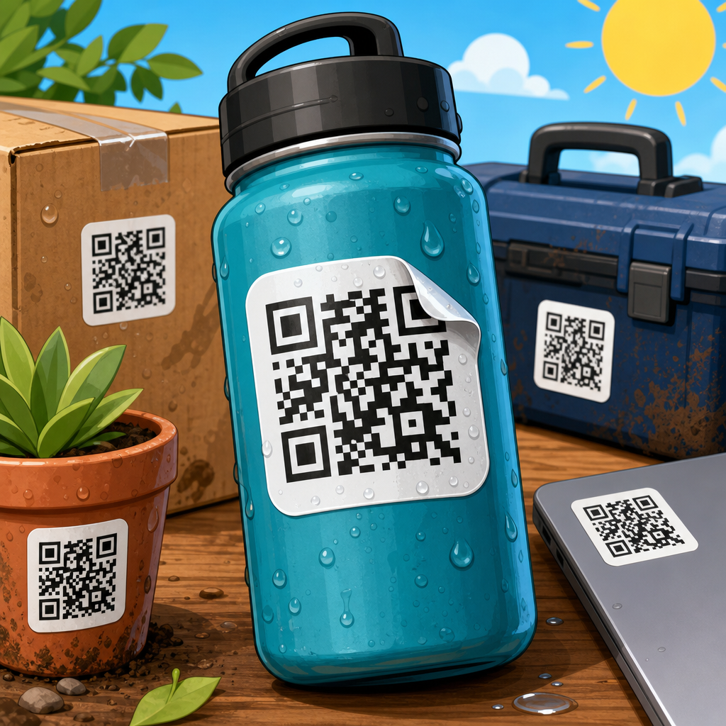
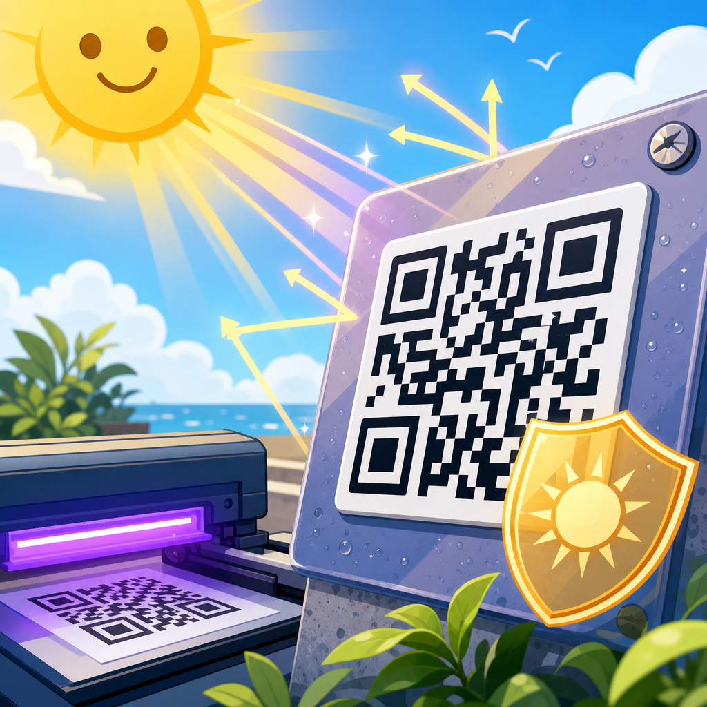
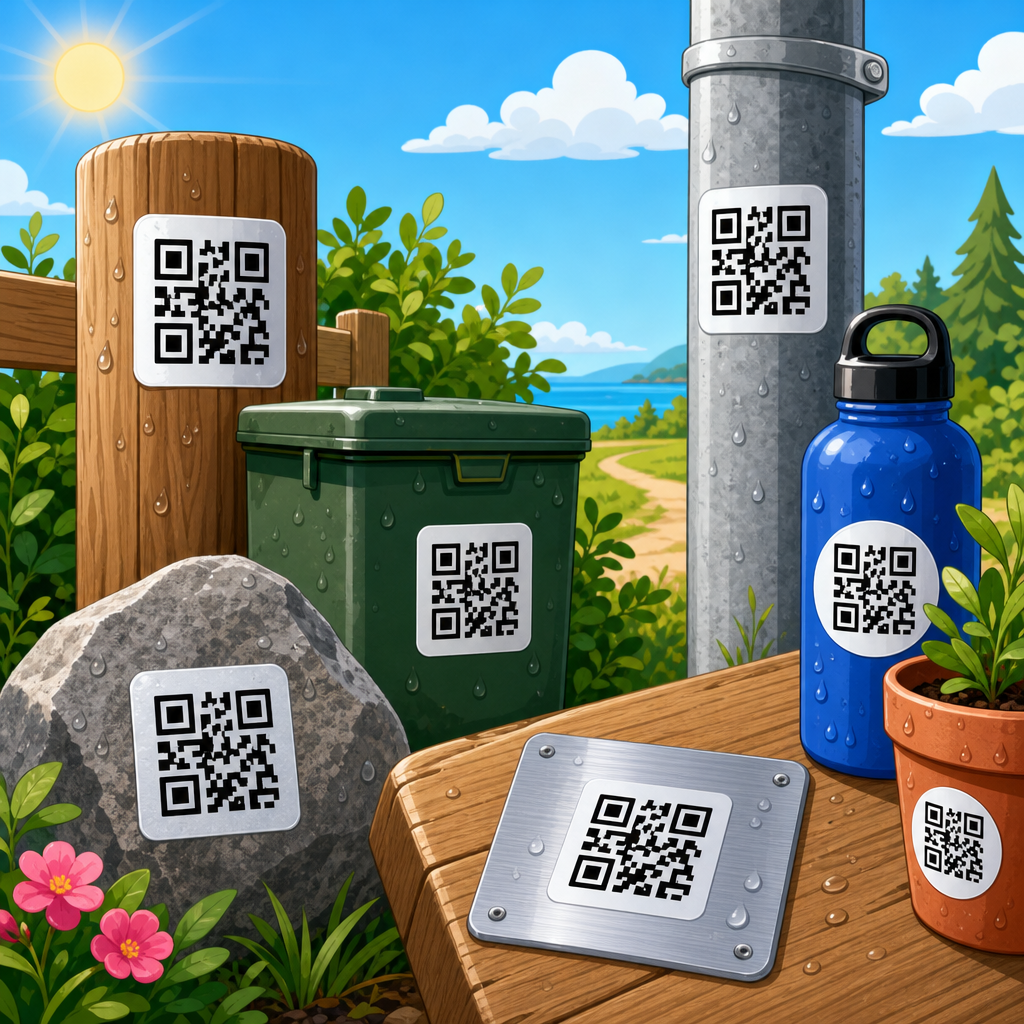
Surface shape matters too. Flat is easiest. Curved surfaces such as bottles, tubes, and cans can distort the code if it wraps too far around the container. In those cases, increase the size slightly and keep the QR code on the flattest panel possible. On rough surfaces, like corrugated cardboard or painted equipment, thicker label materials and stronger adhesives help maintain clean contact. Outdoor stickers need UV-resistant inks or laminates, but test laminates carefully because some glossy protective films increase reflections and reduce scan speed.
Design Rules That Make QR Code Stickers Easier to Scan
The best QR code sticker design follows a few strict rules. First, preserve high contrast. Black on white remains the safest combination. Dark blue on white can work, but pale colors, gradients, and reversed white-on-black treatments are less reliable. Second, keep the quiet zone clear. Do not place borders, illustrations, or tiny text tight against the code. Third, use short destination URLs or dynamic redirects to reduce data density. Fourth, add plain-language instructions such as “Scan to view menu” or “Scan for setup guide.” Users scan more often when the benefit is explicit.
Logo customization needs restraint. Most modern QR generators allow a logo in the center, rounded modules, or custom eyes, but every visual modification reduces tolerance. If branding is important, compensate by enlarging the code, limiting the amount of embedded data, and choosing at least medium error correction. Then test on multiple devices. I have seen branded codes pass internal review on flagship phones and fail on mid-range Android devices that customers actually use. A successful design must survive average hardware, not just premium cameras.
Placement also shapes results. Put the sticker where people can approach it naturally and hold the phone steady. Avoid locations too low, too high, behind glass, or near reflective lighting. If a QR sticker is part of a larger printed piece, leave breathing room around it and ensure neighboring elements do not visually compete. In retail, placing a code beside a price block or product benefit often outperforms placing it at the bottom of the display because users understand why they should scan in that moment.
Testing, Compliance, and Common Sizing Mistakes
Before any print run, test the QR sticker at actual size on the actual material whenever possible. On screen testing is not enough. Print samples, apply them to the real surface, and test under the lighting conditions users will encounter. Use both iPhone and Android devices, newer and older models, with different camera apps. Check first-scan success, time to focus, and whether the landing page loads quickly enough to reward the effort. A code that technically scans after three attempts is still a failed design.
Standards organizations such as ISO have defined QR symbol specifications, and professional barcode verifiers can measure print quality, modulation, and contrast. For routine marketing stickers, phone-based field testing is usually sufficient, but in manufacturing, healthcare, or asset management, formal verification adds confidence. If the sticker supports a workflow, not just promotion, reliability standards should be higher. The cost of reprinting labels is usually lower than the operational cost of unreadable codes.
The most common sizing mistakes are predictable: making the code too small, crowding the quiet zone, embedding too much data, printing on reflective stock, and assuming a code that scans on one phone will scan everywhere. Another mistake is forgetting the landing experience. If a user scans a perfectly sized sticker and reaches a slow, non-mobile page, the design still failed. Good QR code sticker design connects physical size, print execution, and destination usability into one system. Audit all three before ordering volume.
The best size for QR code stickers is the size that scans instantly in the context where people actually use it. For most close-range applications, start with a QR code around 1 inch square, protect the quiet zone, keep the data load light, and print with strong contrast on a low-glare material. Increase size when viewing distance, customization, curved surfaces, or harsh environments add risk. When in doubt, go larger. Small savings in label space are rarely worth lower scan reliability.
As a hub for QR code sticker design, this guide points to the decisions that matter most across the entire workflow: symbol structure, print quality, material choice, placement, and testing. If you get those five areas right, you will avoid most real-world scan failures. That is the main benefit of sizing correctly: better response rates, fewer user errors, and labels that keep working long after they are applied.
Use these recommendations as your baseline, then test your exact sticker at production size before committing to a run. A few sample prints and device checks can prevent expensive mistakes and produce QR stickers that perform the way they should.
Frequently Asked Questions
What is the best size for QR code stickers in most real-world situations?
For most everyday uses, a QR code sticker should be at least 1 x 1 inch (about 2.5 x 2.5 cm), and in many cases 1.25 to 1.5 inches square is a safer starting point. That range works well for packaging, product labels, countertop displays, folders, mailers, and other hand-held items where people scan from a short distance. The reason this size performs reliably is that it gives each module—the small square elements inside the code—enough printed space to remain distinct, even after normal printing variation, coating, or minor wear.
That said, there is no single “best” size that works for every sticker. The right dimensions depend on how much data the QR code contains, how far away people will scan it, what printing method is used, and what kind of surface the sticker is applied to. A simple QR code that points to a short URL can often scan well at smaller sizes than a dense code containing a long URL, tracking parameters, or other embedded information. As the data load increases, the symbol becomes more complex, which means the printed code usually needs to be larger to maintain readability.
It is also important to remember that the sticker size is not the same thing as the QR symbol size. The code itself needs a quiet zone—a clear blank margin around all four sides, typically at least four modules wide. Without that border, scanners may struggle to identify the code cleanly against the background. In practice, if a sticker is advertised as 1 inch square, the actual QR symbol inside it may need to be smaller so the required margin can fit. That is why professionally designed QR code stickers usually balance symbol size, white space, and any supporting text or branding rather than making the code fill the entire sticker.
If you want a practical rule of thumb, start with 1.25 inches square for general indoor use and increase from there when the scanning distance is longer, the environment is less controlled, or the code is printed on difficult materials. Testing a printed sample with multiple phones under normal lighting is the most reliable way to confirm that your chosen size is truly the best for your application.
How do scan distance and viewing conditions affect the ideal QR code sticker size?
Scan distance is one of the biggest factors in determining the right QR code sticker size. A common guideline is that the minimum QR code size should be roughly one-tenth of the intended scanning distance. For example, if users will scan from about 10 inches away, a 1-inch code may be acceptable. If they will scan from around 20 inches away, a 2-inch code is usually more appropriate. This is not a hard law, but it is a highly useful planning benchmark because it aligns the code’s physical size with the camera’s ability to resolve the modules clearly.
In real-world settings, viewing conditions often matter just as much as distance. A code scanned in bright, even indoor lighting from a flat surface can be smaller than one placed on a curved bottle, a textured shipping box, or a glossy window with glare. If users are likely to scan while walking, standing in a store aisle, or reaching across a counter, larger stickers improve the chance of an instant read. The faster you expect the interaction to happen, the more generous you should be with size.
Angle also plays a role. A QR code mounted at eye level on a flat sign is easier to read than the same code placed low on a shelf, wrapped around a container, or stuck on a surface that reflects overhead light. Outdoor environments add even more variables, including sunlight, shadows, dirt, moisture, and surface wear. In those cases, going larger is usually the correct decision because it adds tolerance against imperfect conditions and aging.
The safest approach is to size QR code stickers for how they will actually be used, not how they look on a design mockup. If someone has to step close, tilt the phone repeatedly, or wait several seconds for the camera to focus, the sticker is effectively too small for its environment. Good QR code sizing should feel effortless. People should be able to point, scan, and move on without needing to think about it.
Can a QR code sticker be too small even if the design looks sharp on screen?
Yes, absolutely. A QR code can look perfectly crisp on a computer screen and still fail when printed too small. Screen previews are deceptive because they do not show the physical limitations of print production, ink spread, material texture, adhesive label stock, lamination, or the camera behavior of different smartphones. What matters is not whether the code appears visually neat in a digital layout, but whether each module prints with enough size and contrast to remain distinguishable in the final sticker.
This is where module size becomes critical. The QR code is made up of individual square modules, and each one must be large enough to survive the realities of printing. If the code contains a lot of data, the number of modules increases, which means the squares become smaller unless the overall symbol is enlarged. On a tiny sticker, those modules can become so fine that they blur together, especially on absorbent paper, textured vinyl, low-resolution printers, or glossy materials that introduce reflection. Once the modules lose definition, scan performance drops quickly.
Another common problem is forgetting the quiet zone. Designers sometimes shrink the code to fit branding elements, text, borders, or decorative backgrounds. Even if the code itself is technically high resolution, removing or crowding the clear margin around it can make scanning unreliable. Similarly, adding logos inside the center of the QR code or using weak color contrast may look attractive but reduce the code’s tolerance for small-scale printing errors.
If you are considering a small QR code sticker—especially anything under 1 inch square—testing is essential. Print actual samples at final size, on the final material, using the final printer or production method. Then scan them with both iPhone and Android devices under realistic conditions. A QR code is only “sharp” if it scans quickly and consistently in the physical world. Visual cleanliness alone is not enough.
What other factors besides width and height determine the best QR code sticker size?
The best QR code sticker size depends on much more than the outer dimensions of the label. One of the most important factors is data density. A QR code that contains a short, clean URL can be printed smaller than a code with a long destination link, UTM parameters, vCard information, Wi-Fi credentials, or other complex content. The more information encoded, the denser the matrix becomes, and the more physical size is usually required to preserve scan reliability.
Error correction is another major consideration. QR codes can be generated with different error correction levels, which help the code remain readable if part of it is damaged, obscured, or printed imperfectly. Higher error correction improves resilience, but it also increases the complexity of the symbol. That often means a larger printed size is needed. This tradeoff becomes especially relevant for stickers used outdoors, on products that may be scratched, or in environments where dirt, abrasion, or moisture are likely.
Material and surface also matter. A matte white sticker applied to a smooth, flat panel usually performs much better than a clear sticker on glass, a metallic label, or a code wrapped around a narrow cylindrical container. Curved surfaces can distort the code, while reflective and transparent materials can reduce contrast and make edge detection harder for smartphone cameras. If the sticker will be exposed to heat, chemicals, UV light, or repeated handling, the printed code may degrade over time, so choosing a larger size adds a valuable safety margin.
Printing method and resolution should not be overlooked. Digital printers, thermal printers, offset presses, and desktop label printers all reproduce fine detail differently. A size that works beautifully on one production setup may underperform on another. Finally, surrounding design elements influence readability. Borders, background patterns, nearby text, and color choices can all interfere with scanning if the code is too tightly integrated into the artwork. In short, the best size is the one that accounts for symbol complexity, quiet zone, material, print quality, placement, and user behavior—not just the sticker’s width and height.
How can I choose the right QR code sticker size and test it before printing in bulk?
The most reliable way to choose the right QR code sticker size is to begin with the use case, not the layout. Ask where the sticker will be placed, how far away people will scan it, what device they are likely to use, and whether the environment is controlled or challenging. Then generate a QR code with the shortest practical URL or dynamic link possible, because reducing data density often allows better performance at smaller sizes. From there, build the design so the code has a proper quiet zone, strong contrast, and no unnecessary visual clutter.
As a practical starting point, create prototypes at several sizes rather than betting everything on one dimension. For example, if you are unsure, print versions at 1 inch, 1.25 inches, 1.5 inches, and 2 inches square. Produce them on the actual sticker material whenever possible, because paper proofs and final vinyl labels can behave differently. Apply those samples to the real surface—box, bottle, window, product package, sign, or equipment panel—and test them in normal lighting,