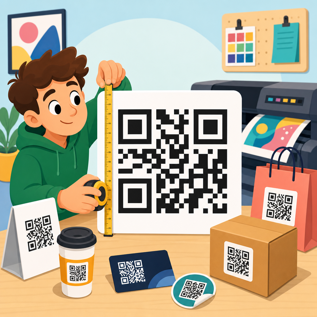
How big should a QR code be for printing? In practice, the right size depends on scan distance, print method, surface, error correction, and how the code is designed inside a sticker layout. After testing QR code sticker design across product labels, packaging seals, event badges, window decals, shelf talkers, and outdoor signs, I can say there is no single universal dimension. There is, however, a reliable way to size printed QR codes so they scan quickly without wasting label space. For most stickers handled at arm’s length, a printed QR code of at least 0.8 x 0.8 inches, or about 20 x 20 mm, is a safe starting point. For smaller packaging, 0.6 inches can work if contrast is strong and the destination URL is encoded efficiently. For posters and signs viewed farther away, size should increase in proportion to scanning distance.
A QR code is a two-dimensional matrix barcode made of small square modules arranged on a grid. Scanners do not read the overall square first; they detect contrast, finder patterns, module spacing, and the quiet zone around the symbol. That is why size is not just about width and height. A tiny code with too many encoded characters, a decorative frame, or a cramped quiet zone often fails, while a slightly larger code with simpler data scans instantly. In QR code sticker design, the printed code also competes with adhesive materials, finishes, curvature, and placement, all of which influence usability.
This matters because stickers are usually small, applied to imperfect surfaces, and scanned in uncontrolled conditions. People scan while walking through a store, standing in sunlight, or holding a product in one hand. If your QR code is undersized, blurred, glossy, stretched, or crowded by graphics, conversion drops immediately. If it is oversized, it may dominate packaging and increase print cost. The goal of this hub is to explain the correct print size, the formula behind it, the design rules that protect scan performance, and the material and placement choices that make QR code stickers work consistently in the real world.
The sizing rule that works in print
The most practical rule is simple: minimum QR code size should be about one-tenth of the expected scanning distance. If a user scans from 10 inches away, the code should be roughly 1 inch wide. If the code will be scanned from 20 inches away on a countertop sign, aim for about 2 inches. This rule is not perfect, but it aligns well with field testing because phone cameras need enough module detail to resolve the pattern quickly. On packaging and stickers, most scans happen from 6 to 14 inches, which is why codes between 0.8 and 1.2 inches often perform best.
The second rule is to size by module, not just by outer dimensions. Every QR code is built from modules, and each printed module must be large enough for the printer and the camera to distinguish clean edges. For standard commercial printing, I rarely go below 0.4 mm per module for high-quality digital or offset jobs, and I prefer 0.5 mm or larger when the sticker may be laminated, curved, or exposed to wear. A code with 33 modules per side plus a 4-module quiet zone on all sides needs significantly more physical space than a simpler code with fewer modules. As data density rises, the same overall size becomes harder to scan.
Quiet zone is non-negotiable. The blank margin around the QR code should be at least four modules wide on each side. Many sticker failures happen because the code itself is technically large enough, but text, borders, die-cut shapes, or decorative backgrounds intrude into that margin. Scanners use the quiet zone to isolate the symbol from surrounding artwork. If you ignore it, increasing the code size alone will not solve the problem.
Recommended QR code sizes for common sticker uses
Different applications need different starting dimensions because scan distance, motion, and lighting all change user behavior. A cosmetics jar label scanned in a bathroom mirror situation is not the same as a box label in a warehouse or a QR code sticker on a café window. The table below summarizes dimensions I use as a baseline before testing prototypes.
| Sticker use case | Typical scan distance | Recommended minimum QR size | Preferred size for reliability |
|---|---|---|---|
| Product label held in hand | 6 to 10 inches | 0.7 inch / 18 mm | 0.8 to 1.0 inch / 20 to 25 mm |
| Bottle or jar sticker on curved surface | 6 to 12 inches | 0.8 inch / 20 mm | 1.0 inch / 25 mm |
| Mailer seal or shipping insert sticker | 8 to 14 inches | 0.8 inch / 20 mm | 1.0 to 1.2 inches / 25 to 30 mm |
| Event badge or handout sticker | 10 to 18 inches | 1.0 inch / 25 mm | 1.2 to 1.5 inches / 30 to 38 mm |
| Store window decal | 18 to 36 inches | 2.0 inches / 50 mm | 3.0 inches / 76 mm or more |
| Poster or wall graphic sticker | 24 to 48 inches | 2.5 inches / 64 mm | 3.0 to 4.0 inches / 76 to 102 mm |
These recommendations assume high contrast, proper quiet zone, and a clean destination such as a short URL or dynamic QR code. If you add a logo, use a stylized pattern, print on textured stock, or expect low light, move to the preferred range rather than the minimum. In my experience, a 25 mm code is the safest everyday baseline for QR code sticker design on packaging.
Why data density changes the size you need
Not all QR codes of the same printed size are equally scannable. The amount and type of data encoded directly affect symbol complexity. A short dynamic URL may produce a lower-version code with fewer modules, while a long URL with tracking parameters, UTM tags, and product-specific query strings can force a denser grid. Denser codes need larger print sizes because each module becomes physically smaller.
This is why I strongly prefer dynamic QR codes for stickers. Instead of encoding a long destination, the symbol points to a short redirect URL managed in a QR platform such as Bitly, QR Code Generator Pro, Beaconstac, Uniqode, or Flowcode. That keeps the matrix simpler and easier to print. It also allows destination changes after printing, which matters when stickers remain in circulation for months or years. Static codes can work for permanent assets, but on small labels they often become unnecessarily dense.
Error correction level also affects density. QR codes support levels L, M, Q, and H, allowing approximately 7 percent, 15 percent, 25 percent, and 30 percent damage recovery. Designers often assume higher is always better, especially when adding logos. In reality, higher error correction increases module count and may reduce scan reliability if the printed code is too small. For most sticker applications, level M or Q is the right balance. Use H only when the design truly requires logo intrusion or when abrasion risk justifies the tradeoff.
Print quality, materials, and surface conditions
Print method matters as much as dimensions. Offset and high-resolution digital presses usually hold sharp module edges well, but low-end thermal transfer, desktop inkjet, or poorly calibrated label printers can cause dot gain, feathering, or banding. A QR code that looks acceptable on screen may lose definition when printed on coated paper, polypropylene, vinyl, or textured kraft stock. When I review proofs, I look closely at square edge integrity, not just overall darkness. Soft corners and ink spread can make neighboring modules visually merge.
Sticker material changes the outcome too. Gloss lamination often reflects overhead lights and creates glare, especially on curved bottles and refrigerated packaging. Matte lamination reduces reflections and usually improves scan consistency. Clear stickers can work, but only when applied over a light, uniform background with strong contrast. Metallic foils, holographic finishes, embossed stocks, and dark transparent films frequently compromise readability unless a solid white underprint is used beneath the code and quiet zone.
Curved surfaces deserve special caution. A code wrapped around a narrow bottle or jar distorts the square geometry and compresses modules near the edges. On cylindrical packaging, keep the QR code on the flattest panel possible and increase size beyond the bare minimum. I have seen a 20 mm code fail on a lip balm tube yet scan perfectly at 25 mm on a flatter carton. Surface wear matters too: freezer labels, outdoor decals, and warehouse stickers can scratch, fade, or collect dirt. In those cases, use durable materials, UV-stable inks, and moderate error correction rather than shrinking the symbol to fit a cramped design.
Designing QR code stickers that actually get scanned
Good QR code sticker design is not just technical compliance. The sticker must also tell people why they should scan. A plain code with no context usually underperforms, especially in retail. Add a concise call to action near the code, such as “Scan for setup,” “Watch the demo,” “See ingredients,” or “Register warranty.” The copy should match user intent and the placement. A customer holding a supplement bottle wants dosage, sourcing, or verification details, not a generic homepage.
Visual customization should stay disciplined. Brand-colored QR codes can work if contrast remains strong, with a dark foreground on a light background. Black on white is still the most reliable standard. Avoid reversing the code to white on black unless testing proves it works across devices. Rounded modules, logos, decorative eyes, and frames can be acceptable, but each modification should be tested on actual printed samples, not only inside a generator preview. The more stylized the code, the larger it should be.
Placement affects behavior as much as scanability. Put the sticker where a person can physically aim a phone without awkward rotation, glare, or obstruction. On packaging, avoid seams, corners, cap closures, and highly curved edges. On windows, account for both indoor and outdoor lighting. On mailers, keep the code away from folds and shipping labels. For event stickers, position it at chest level or above on signage so users do not need to crouch. Every extra bit of friction reduces scan rate.
Testing methods, analytics, and common sizing mistakes
The best way to decide how big a QR code should be for printing is to test the smallest size that fits your layout, then increase until scans become consistently effortless. I run tests with both iPhone and Android devices, older camera hardware as well as current models, and varied lighting conditions including office light, daylight, and low light. I also test first scan speed, not only eventual success. If users need to hunt for focus, the code is too small, too dense, too glossy, or too poorly placed.
Analytics close the loop. Dynamic QR platforms can report scans by date, device, and location, helping you compare sticker variants. If one package line receives fewer scans, the issue may be size, placement, call to action, or destination relevance. I have seen scan rates improve simply by enlarging a code from 18 mm to 25 mm and moving it away from a reflective bottle shoulder. Small physical changes often have measurable performance impact.
Common mistakes repeat across projects. The first is designing from desktop mockups instead of printed prototypes. The second is letting marketing add a long URL, logo, and heavy styling while keeping the original tiny footprint. The third is ignoring the quiet zone. The fourth is placing the code on glossy, curved, or dark materials without compensation. The fifth is linking to a poor mobile page. A perfectly printed code still fails the business goal if it opens a slow, unoptimized destination.
The answer to how big a QR code should be for printing is straightforward once you account for distance, data density, and real production conditions. For most QR code sticker design projects, start at 20 mm for close-range scanning and move to 25 mm when space allows. Increase size for longer scan distances, curved surfaces, glossy finishes, stylized designs, and dense data. Preserve a four-module quiet zone, use strong contrast, and choose materials that do not introduce glare or distortion. When in doubt, simplify the encoded data with a dynamic URL and print a larger symbol instead of forcing complexity into a tiny square.
As the hub for QR Code Sticker Design, this guide sets the foundation for every related decision: label layout, material selection, print method, placement, testing, and performance tracking. The strongest results come from treating the QR code as a functional interface element, not a decorative afterthought. Size it for how people actually scan, test it on the final sticker stock, and support it with a clear call to action. If you are planning a sticker, label, or decal now, print sample sizes side by side and scan them in real conditions before approving production.
Frequently Asked Questions
What is the best QR code size for printing in most real-world situations?
There is no single perfect size for every printed QR code, but there are practical ranges that work reliably in everyday use. For close-range scanning on product labels, packaging stickers, business cards, and small inserts, a QR code around 0.8 x 0.8 inches to 1.2 x 1.2 inches is often a strong starting point. Many printers and designers use 1 x 1 inch as a safe baseline for short scan distances because it gives smartphone cameras enough visible detail without taking up unnecessary space. If the code will be scanned from farther away, the printed size should increase accordingly. A common rule of thumb is that the scanning distance should be roughly 10 times the width of the QR code, so a 1-inch code is best when scanned from about 10 inches away, while a 3-inch code may be needed for a scan distance closer to 30 inches.
That said, size alone does not determine whether a QR code will scan well. The amount of encoded data, the level of error correction, print sharpness, contrast, and the surface material all affect performance. A small QR code with a very short URL and clean black-on-white contrast may scan better than a larger code that has too much data, poor printing, or a heavily customized design. In practice, the best approach is to start with a baseline size suited to the expected scan distance, then test the code on the actual material and in the final layout. That testing step matters because a code that works on a screen or a desktop proof can fail once it is printed on glossy packaging, textured labels, or curved containers. Reliable print QR sizing is always a combination of distance, data density, and production conditions.
How does scan distance affect how big a printed QR code should be?
Scan distance is one of the most important factors in determining QR code size. The farther away a person will stand when scanning, the larger the code needs to be. This is because a smartphone camera must clearly capture the code’s square modules, the quiet zone around it, and the three position markers in the corners. If the code is too small relative to viewing distance, the camera cannot resolve the pattern fast enough, and users may experience delayed scans or complete scan failure. The widely used sizing guideline is the 10:1 ratio: the ideal scanning distance is approximately 10 times the printed width of the QR code. While this is not a hard law, it is a dependable planning rule for print design.
For example, a QR code on a product label scanned at arm’s length can often be around 1 inch wide. A code on a poster or window decal meant to be scanned from several feet away may need to be 2 to 4 inches wide or more. On shelf talkers, trade show signage, and event displays, the distance varies depending on how shoppers or attendees approach the piece, so sizing should account for realistic user behavior rather than just layout convenience. Outdoor signs may require much larger codes because lighting, glare, and movement reduce scanning precision. In practical terms, if you expect people to scan quickly while walking past, standing in a store aisle, or looking through glass, it is wise to size up rather than down. Larger printed QR codes generally improve speed, user confidence, and conversion rates as long as the surrounding design remains clear and uncluttered.
Can a QR code be too small to scan reliably when printed on labels or stickers?
Yes, absolutely. One of the most common printing mistakes is making the QR code too small in order to save space in a sticker or label layout. When a code becomes too small, the tiny square modules start to merge, soften, or fill in during printing, especially on lower-resolution print methods or absorbent materials. This is particularly risky on thermal labels, flexographic printing, small product decals, and any application where ink spread or dot gain can reduce edge clarity. Even if the code looks acceptable to the human eye, it may still be difficult for a phone camera to interpret quickly. That leads to hesitation, repositioning, and user frustration.
As a general practical floor, many designers avoid going below about 0.75 inches square for printed QR codes unless the data is extremely minimal and print quality is excellent. Some applications can work slightly smaller, but the margin for error becomes narrow. Once you add a logo, increase error correction, place the code on a curved bottle, print on textured stock, or reduce contrast, that minimum safe size rises. The quiet zone also matters here. A QR code needs clean empty space around all four sides, and if the surrounding sticker artwork crowds the edges, the effective scannable area becomes smaller than the nominal printed dimension. If space is limited, it is usually better to shorten the encoded URL, simplify the design, and preserve a readable size than to squeeze the code down and hope it still works. In print, reliability should always win over compactness.
Do print material, surface type, and finish change the ideal QR code size?
Yes, and often more than people expect. The same QR code can scan perfectly on one material and poorly on another even when the printed dimensions are identical. Smooth matte paper usually performs very well because it preserves contrast and minimizes glare. Glossy labels, laminated stickers, metallic packaging, clear decals on glass, and textured substrates are more challenging because reflections, distortion, and uneven ink coverage interfere with camera recognition. Curved surfaces add another layer of difficulty. When a QR code wraps around a bottle, jar, tube, or rounded container, the geometry of the code changes in the camera view, which can reduce scan speed or require a larger size to compensate.
Print process matters too. High-resolution digital printing can hold small module detail better than lower-precision methods, while certain inks and materials may bleed or soften edges. Outdoor signage introduces weather exposure, faded contrast, and viewing-angle problems, so larger sizing is typically the safer choice. Window decals can be affected by reflections from sunlight or indoor lighting, and shelf talkers may be viewed from awkward angles in busy retail environments. Because of these variables, the ideal QR code size should not be chosen in isolation from the production method and substrate. A code that is theoretically large enough may still underperform if printed on a poor surface. The safest workflow is to choose a conservative size, maintain strong contrast, avoid reflective interference where possible, and test the final printed piece in real lighting conditions using multiple phones. In many cases, increasing the QR code just slightly can dramatically improve scan consistency on difficult materials.
How do design choices like logos, colors, error correction, and sticker layout affect QR code print size?
Design decisions have a direct effect on how large a printed QR code should be. A plain black-and-white code with a short destination URL is the easiest type to print and scan at smaller sizes. As soon as you begin customizing it, the code usually needs more space to remain reliable. Adding a logo in the center removes some data area, which means the code must depend more heavily on error correction. Increasing error correction helps preserve scanability when parts of the code are obscured or stylized, but it also makes the data pattern denser. Denser patterns create smaller modules, and smaller modules generally require a larger overall printed size to remain sharp and readable. The same principle applies when using custom shapes, decorative frames, reversed colors, or nonstandard contrast combinations.
Sticker layout is especially important because QR codes do not exist in a vacuum. They sit next to product names, regulatory text, barcodes, brand graphics, cut lines, bleed areas, and sometimes curved edges or sealing folds. If nearby elements crowd the code, reduce its quiet zone, or visually compete with it, scanning performance can drop even if the nominal size seems acceptable. Dark backgrounds, busy patterns, and low-contrast color palettes often force the QR code to be made larger just to preserve usability. For branded stickers and labels, the best strategy is to keep the code visually simple, reserve adequate clear space around it, and scale it based on both scan distance and customization level. The more stylized and integrated the code becomes within the design, the more important it is to size generously and test thoroughly. A QR code that looks polished but scans inconsistently is not an effective print element, no matter how well it fits the layout.