Free QR code icon sets are one of the most practical downloadable assets for marketers, designers, product teams, and educators who need clear scannable prompts across digital and print touchpoints. In the broader category of QR code resources, templates, and tools, icon sets sit at the foundation because they solve a repeated design problem: how to signal “scan this” quickly, consistently, and in a way that matches a brand system. A QR code icon set usually includes vector and raster files, multiple visual styles, and ready-to-use treatments for web, packaging, signage, presentations, manuals, and social posts. When built well, these assets shorten production time, reduce inconsistency, and improve user recognition, especially when teams work across channels and vendors.
I have used QR code icon libraries in campaign rollouts, app onboarding screens, retail shelf talkers, restaurant tabletop signage, and event wayfinding, and the difference between a polished standardized set and a random collection of internet downloads is immediate. Standardized downloadable assets prevent the common mistakes that hurt scan rates: low contrast, undersized quiet zones, distorted symbols, and icons that imply a QR code without leaving space for the actual code or a clear instruction. This matters because a QR code is not only a graphic object. It is a functional gateway to content, payments, menus, downloads, authentication flows, customer support, and inventory systems. The icon around that gateway shapes whether people notice it, trust it, and understand what happens next.
This hub article covers free QR code icon sets as a downloadable asset category and explains how to evaluate, organize, customize, and deploy them. It also connects the practical design layer to the operational side: file formats, licensing, accessibility, print production, and team governance. If you manage a resource library, build brand toolkits, or publish internal templates, this page should help you decide what a complete QR code asset pack looks like and how to choose one that can scale. The goal is simple: make every scan prompt clearer, faster to produce, and easier to reuse across the entire QR code workflow.
What belongs in a complete free QR code icon set
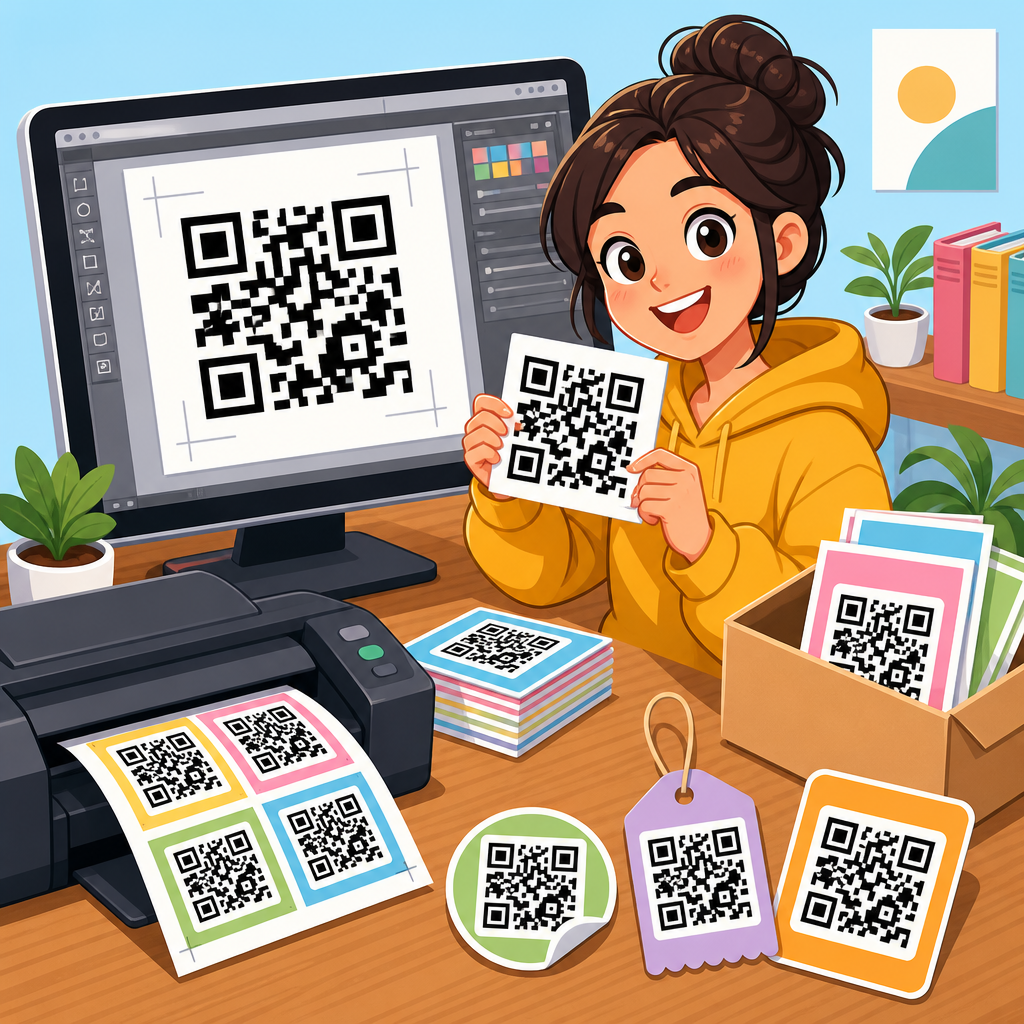
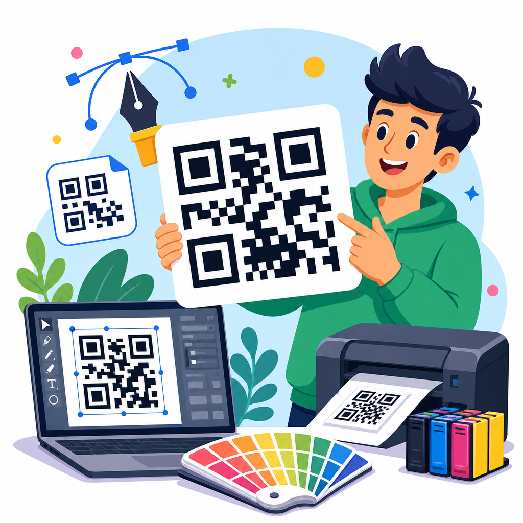
A complete free QR code icon set should include more than a stylized square with finder patterns. The minimum useful package usually contains SVG files for scaling, PNG files for quick placement, monochrome and reversed versions, horizontal and stacked lockups, and variants with supporting actions such as “Scan to view menu,” “Scan to pay,” “Scan to download,” or “Scan for details.” In practice, teams also need app-friendly sizes, favicon-like micro icons for interfaces, and larger badge-style treatments for posters and packaging. The most useful downloadable assets are modular, meaning you can separate the icon, label, frame, and background treatment rather than being forced into one fixed composition.
Good sets also reflect production reality. For print, I look for vector outlines with clean paths that export well to PDF, EPS, and AI workflows. For digital publishing, I prefer optimized SVGs that preserve sharp edges and keep file size small. A useful pack often includes spacing guidance, minimum-size recommendations, and examples of contrast-safe combinations. Some of the strongest sets bundle templates in Figma, Adobe Illustrator, Canva, PowerPoint, or Google Slides so non-designers can still use approved layouts. Those templates turn a static download into an operational resource because they help preserve consistency when dozens of people are placing codes in different contexts.
There is also a difference between an icon set and a QR code generator output. A generator creates the code itself, often with tracking parameters or dynamic redirection. An icon set provides the surrounding visual language: badges, labels, directional prompts, containers, and accompanying symbols such as smartphone outlines, arrows, NFC indicators, or download marks. When teams confuse these two asset types, they end up relying on last-minute ad hoc design decisions. The better approach is to pair a trusted generator with a preapproved icon library and document how they work together.
How free downloadable assets support brand consistency and faster production
Free QR code icon sets save time because they remove repetitive layout work from every project. In one retail rollout I supported, stores needed QR prompts for shelf signage, window decals, product cards, and training sheets. Before a shared asset pack existed, each region improvised its own version. Some used tiny unlabeled codes, others added bright arrows, and a few embedded the logo directly over the code without testing readability. Once we centralized the downloadable assets, scan prompts became consistent, print proofs moved faster, and support tickets dropped because vendors had clearer specifications.
Brand consistency matters for trust. People are more likely to scan when the code appears integrated into the same design language as the surrounding brand. That does not mean overdecorating the code itself. It means using approved typography, spacing, color pairings, and call-to-action language around the code. A free icon set becomes especially valuable when it includes neutral variants and branded variants. Neutral variants help on marketplaces, distributor pages, or co-branded materials where the primary brand treatment may not fit. Branded variants help owned channels where recognition drives action.
Operational speed is another benefit. Downloadable assets give marketers and non-designers a starting point that reduces bottlenecks. A field sales manager who needs a one-page leave-behind can open a template, swap the destination URL, and export a compliant handout without waiting for a full design cycle. This is why the best resource hubs treat QR code assets as reusable infrastructure rather than one-off graphics. The set should support repeat use in onboarding, events, support documentation, product packaging, and internal operations just as well as in campaigns.
File formats, licensing, and quality checks before you download
Not all free assets are equally usable. Before adding a QR code icon set to your library, check the file formats first. SVG is essential because it scales without blurring and is easy to recolor in most design systems. PNG is useful for quick deployment in documents or content management systems that do not handle vectors well. PDF or EPS can help with legacy print vendors. If a set is available only as a screenshot-sized PNG, it is not a serious production asset.
Licensing deserves equal attention. “Free” can mean free for personal use, free with attribution, free for editorial use only, or free for commercial use. Teams should read the license text, archive it alongside the files, and note whether modification is allowed. In enterprise environments, unclear licensing creates real risk because assets often travel across agencies, resellers, and franchise operators. I recommend storing source links, version dates, and license summaries inside your digital asset management system or brand portal so there is a clear record.
Quality checks are straightforward but important. Open the vector files and inspect stroke consistency, corner handling, alignment, and path cleanliness. Test the icons on dark and light backgrounds. Verify that labels remain legible at realistic sizes. If the set includes actual sample QR codes, scan them to confirm they resolve correctly and still work after export. I also check whether the pack includes enough whitespace around the code area. Many decorative badges look attractive in a gallery but squeeze the code into a cramped shape that becomes unreliable once printed small.
Common QR code icon styles and the best use cases for each
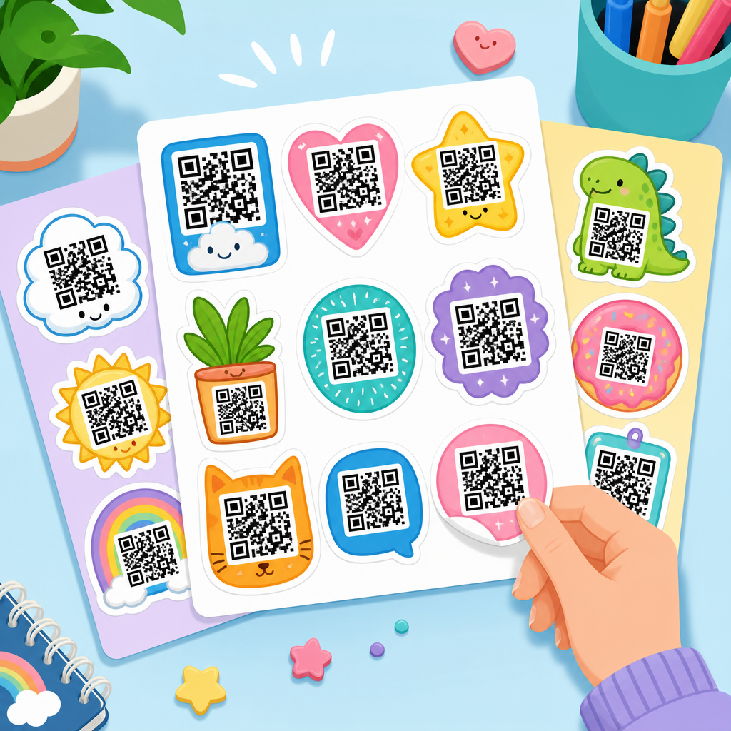
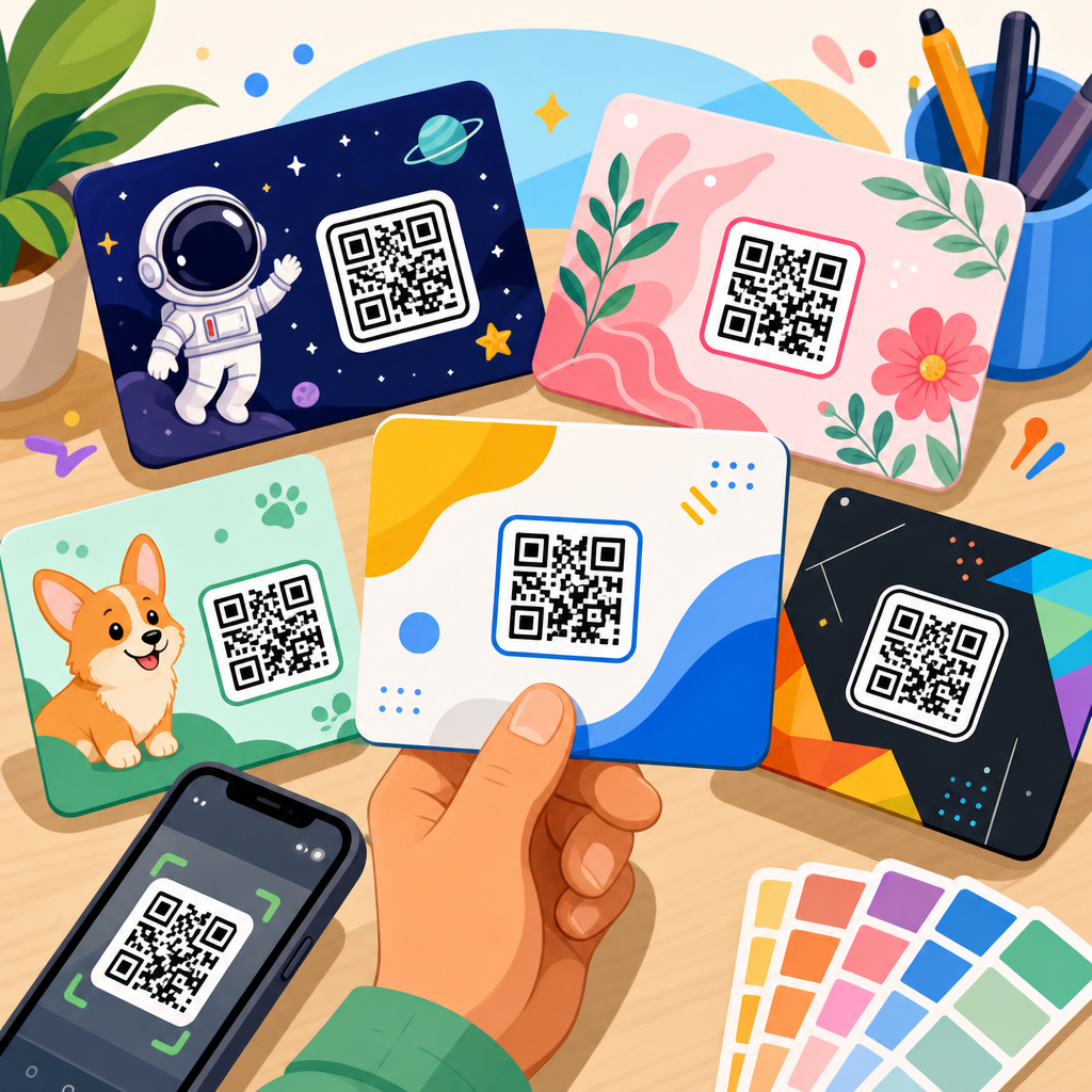
Different icon styles solve different communication problems. Minimal line icons work well inside apps, dashboards, settings pages, and compact documentation where users already understand QR scanning. Bold badges with a contained call to action are stronger for public-facing print where the design must compete with noise and distance. Rounded icons often suit hospitality and lifestyle brands, while geometric or industrial treatments fit manufacturing, logistics, and enterprise software. The right choice depends on viewing distance, available space, brand tone, and whether the audience needs explanation.
In my experience, the most effective public-use styles combine three ingredients: a recognizable QR symbol, a short action phrase, and sufficient contrast. For example, event signage performs better with “Scan for schedule” than with an unlabeled code, while product packaging often benefits from “Scan for setup guide” or “Scan for warranty registration.” Action-specific treatments clarify user intent and set expectations about the destination. That reduces hesitation, which is one of the main causes of unscanned QR codes even when the code itself is technically sound.
| Icon style | Best use case | Main advantage | Watch-out |
|---|---|---|---|
| Minimal outline | Apps, interfaces, manuals | Clean at small sizes | Can be too subtle in public spaces |
| Badge with CTA | Posters, packaging, menus | Explains the next action clearly | Needs careful spacing to avoid crowding |
| Branded lockup | Owned marketing channels | Supports recognition and consistency | Can become overdesigned if logos dominate |
| Directional sign style | Events, retail, wayfinding | Visible from farther away | Requires high contrast and larger sizing |
This is why downloadable asset hubs should categorize icon sets by use case, not only by appearance. Teams searching for “free QR code icon sets” are often really searching for “a printable scan badge for packaging,” “a vector scan icon for Figma,” or “a menu QR sign template.” A useful hub labels resources in those terms and helps users find the asset type that fits the real task.
Accessibility, print performance, and scan reliability
Accessibility starts with clarity. A QR icon treatment should never rely on color alone to communicate function. The phrase near the code should state the action plainly, and contrast should meet accepted readability standards. For digital materials, alt text should describe the destination or purpose, not just say “QR code.” For example, “QR code linking to product setup video” is more informative than a generic label. In physical spaces, placement matters too. A code mounted too low, too high, or behind reflective surfaces can fail even if the graphic is technically correct.
Print performance is where many free downloads succeed visually but fail operationally. Codes need a quiet zone, sufficient module size, sharp reproduction, and a substrate that does not add glare or texture interference. On corrugated packaging, for instance, very small codes can lose definition along fold lines. On glossy tabletop signage, overhead lighting may create reflections that block scans. I usually advise testing the exact output on the actual material, from the expected scanning distance, with both iPhone and Android devices, before approving a large run.
Reliability also depends on the destination experience. A QR icon set may prompt the scan, but the landing page must load quickly, display well on mobile, and match the promise in the call to action. If the badge says “Scan for assembly guide” and the link opens a desktop PDF behind a login, the design has not solved the user problem. The most effective downloadable assets are paired with usage guidance that covers not just appearance, but end-to-end scanning conditions and post-scan experience.
How to organize a hub for QR code downloadable assets
As a sub-pillar hub under QR code resources, templates, and tools, this topic works best when organized around asset intent. Start with core icon sets, then branch into templates, print-ready signs, presentation assets, packaging badges, and social overlays. Each child article should answer a specific need, such as free QR code icons for Figma, printable QR code sign templates, QR code menu assets, or vector badges for product packaging. This structure helps readers navigate quickly and helps teams maintain a cleaner internal taxonomy for files and updates.
A strong hub page should also define metadata standards for downloadable assets. Recommended fields include file type, software compatibility, primary use case, orientation, color modes, minimum size guidance, and license terms. If you run a resource center, those fields make filters more useful and reduce support questions. They also make it easier to update assets over time. When I have managed design libraries, the packs that survived longest were the ones with naming conventions, version history, preview thumbnails, and short implementation notes.
Finally, connect the hub to related operational resources. Readers who download free QR code icon sets often also need QR code testing checklists, campaign tracking templates, dynamic versus static code guidance, print specification sheets, and destination page best practices. Linking these supporting resources turns a simple download page into a decision-making center. That is what a sub-pillar hub should do: not just list assets, but help teams choose, implement, and govern them well.
Best practices for customizing free QR code icon sets without breaking them
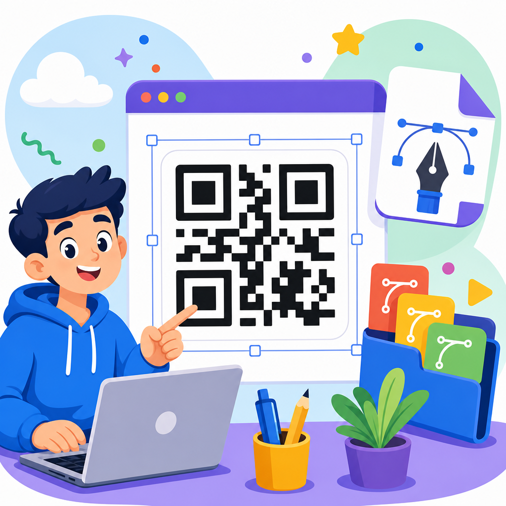
Customization is usually necessary, but it should happen within limits. Change surrounding colors, typography, labels, and container shapes more freely than the code itself. If you use branded QR codes, keep error correction, contrast, and finder pattern visibility within established best practices. Avoid stretching, rotating, or clipping live codes into decorative masks. Do not place busy imagery directly behind them. The icon set should provide approved framing devices so teams can adapt the presentation while preserving scan integrity.
I recommend creating a short usage standard that covers minimum dimensions, safe color pairs, approved call-to-action phrases, logo placement rules, and testing requirements. Include examples of incorrect use such as low contrast, tiny placement, reversed-out labels that disappear on color backgrounds, or icons that mimic a QR code but are not actually scannable. These examples save time because people often learn faster from visible mistakes than from abstract rules. If your organization uses Figma libraries or Adobe Creative Cloud Libraries, publish the assets there so updates flow more consistently.
When selecting free QR code icon sets, choose those that are flexible enough for adaptation but disciplined enough to maintain clarity. The best downloadable assets reduce design effort, improve consistency, and support reliable scanning across web, print, packaging, events, and support content. Build your hub around that standard, keep licensing and file quality documented, and test every real-world output before broad release. If you are expanding your QR code resource center, start by auditing your current scan prompts, replace inconsistent graphics with a vetted icon library, and give every team a simpler path from code creation to confident scan.
Frequently Asked Questions
What is included in a free QR code icon set?
A free QR code icon set typically includes a range of files designed to help teams quickly add clear “scan this” prompts to websites, apps, packaging, signage, presentations, and printed materials. In most cases, you can expect vector formats such as SVG, AI, or EPS for unlimited scaling without quality loss, along with raster files like PNG in multiple sizes for fast everyday use. Many sets also include monochrome and full-color variations, light and dark versions, outlined and filled styles, and different shapes that fit common interface systems.
Higher-quality icon sets may also include transparent backgrounds, social-ready export sizes, editable source files, and usage notes that explain how to maintain legibility across different layouts. Some are built specifically for UI design systems and come with consistent stroke widths, corner radii, and spacing rules so they match the rest of a brand’s icon library. Others are optimized for print and include high-resolution assets for posters, product packaging, event displays, menus, brochures, or classroom materials. The best free sets save time because they reduce the need to redraw QR-related symbols from scratch while still giving you enough flexibility to fit your brand and channel requirements.
Why are QR code icon sets useful if I already have a QR code generator?
A QR code generator creates the actual scannable code, but a QR code icon set solves a different design problem: communicating to users that they should scan something and helping that call to action feel intentional, branded, and easy to recognize. In real-world design work, the code itself is only part of the experience. People still need visual cues that tell them where to point their camera, what action to take, and what they can expect after scanning. That is where icons become especially valuable.
For example, a marketing team might generate dozens of QR codes for product pages, campaign landing pages, event check-ins, app downloads, and support resources. If each one is dropped into a layout without a consistent icon, label, or scan prompt, the user experience can feel uneven. A well-designed icon set creates visual consistency across all those touchpoints. It helps product teams standardize scan prompts in mobile interfaces, allows educators to add recognizable QR indicators to worksheets or classroom displays, and gives designers reusable assets that fit neatly into templates. In short, a generator gives you function, while an icon set improves communication, consistency, and usability.
How do I choose the best free QR code icon set for branding and design consistency?
The best free QR code icon set is the one that works naturally inside your existing design system. Start by checking whether the icon style matches your brand language. If your visual identity uses rounded icons, soft corners, and minimal line weights, a heavy industrial-style QR icon may look out of place. If your system relies on sharp, geometric symbols, an overly playful icon set could weaken consistency. Look closely at stroke thickness, spacing, shape construction, and whether the set includes both outlined and solid versions so you can use it across different layouts.
File flexibility matters just as much as visual style. A strong set should include editable vector files so you can adjust size, color, and placement without losing quality. It should also work well in both digital and print environments, since QR prompts are often used across websites, product labels, retail displays, classroom handouts, slide decks, and social media graphics. Another important factor is clarity at small sizes. Some icons look polished in large mockups but lose meaning when reduced for app screens or compact labels. Finally, review the licensing terms carefully. Even if the icon set is free, you should confirm whether it allows commercial use, modification, redistribution inside templates, or use in client work. The most useful free icon set is not just attractive; it is adaptable, legally clear, and easy to scale across repeated use cases.
Can free QR code icons be customized without affecting scan usability?
Yes, free QR code icons can usually be customized, but it is important to understand the difference between customizing the icon prompt and modifying the actual QR code itself. The icon prompt, such as a small QR symbol, scan badge, or “Scan Me” graphic, is primarily a communication element. You can often change its color, size, label text, surrounding shape, and placement to align with your brand as long as it remains recognizable and legible. This kind of customization does not affect scan performance because it is not the scannable code.
When working with the actual QR code, however, customization should be handled carefully. Adjustments such as changing colors, embedding a logo, rounding modules, or adding a branded frame can impact readability if contrast becomes too weak or if the quiet zone is compromised. A good workflow is to use the icon set to frame and support the code visually while preserving technical best practices for the QR itself. Maintain strong contrast, leave sufficient clear space around the code, and test scans on multiple devices before publishing. In practical terms, this means you can make the overall experience feel branded and polished without sacrificing usability, as long as your design team treats the icon asset and the machine-readable code as related but separate components.
Where can free QR code icon sets be used most effectively?
Free QR code icon sets are effective anywhere users need a fast visual signal that a code can be scanned for more information, access, or action. In digital environments, they work well on landing pages, mobile apps, onboarding flows, help centers, product dashboards, and download pages where users may need to open a link on another device. In marketing, they are especially useful in email graphics, paid ad creatives, event promotions, digital brochures, and social posts that direct people to registration forms, coupons, video content, or app installs.
In print, their value becomes even more obvious. Packaging, shelf talkers, restaurant menus, trade show signage, business cards, instruction manuals, classroom resources, museum labels, and real estate materials all benefit from a clear scan prompt. The icon acts as a visual bridge between static media and digital action, helping people understand instantly that more content is available through their phone. The most effective uses combine the icon with a concise call to action such as “Scan for setup instructions,” “Scan to view the menu,” or “Scan to claim your offer.” That pairing increases clarity and often improves response rates because users know both what to do and why it is worth doing. In other words, QR code icon sets are not just decorative assets; they are functional design tools that strengthen wayfinding, engagement, and conversion across channels.