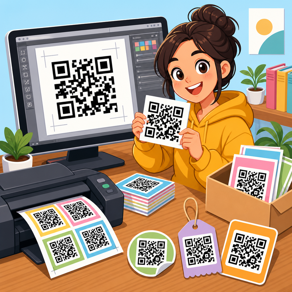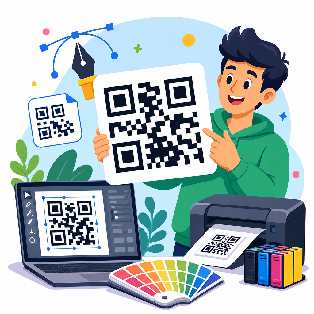
Creative QR code design examples that work balance visual identity with technical reliability, turning a plain scannable square into a branded asset that people actually notice and use. A QR code, short for Quick Response code, is a two-dimensional barcode that stores information such as a URL, menu, payment link, app download, Wi-Fi credential, or event check-in token. In practice, the best QR code design examples are not the flashiest ones. They are the designs that scan quickly across different phone cameras, distances, lighting conditions, and print surfaces while still matching the brand around them.
This matters because QR codes now sit at the intersection of packaging, retail, restaurants, events, direct mail, out-of-home advertising, and product education. Since smartphone camera apps made scanning native, adoption has moved from niche campaigns to routine customer behavior. I have seen the difference firsthand in packaging rollouts and venue signage: the generic black-and-white code may function, but a thoughtfully designed QR code typically earns higher attention, stronger trust, and more scans when placement, contrast, and messaging are handled correctly. Design affects whether users notice the code, understand why to scan it, and feel confident enough to try.
For a hub page on QR Code Design Examples, the key idea is simple. Good design is not decoration added after generation; it is a set of decisions about shape, color, logo use, quiet zone, error correction, material, and call-to-action. Those decisions influence scan success and campaign results. This article covers the QR code design examples that consistently work, why they work, the mistakes that break performance, and how to choose the right pattern for packaging, posters, menus, business cards, labels, and digital screens. If you need one resource to guide future QR code projects, start here.
What makes a creative QR code design actually work
A working QR code design meets three requirements at the same time: discoverability, clarity, and scannability. Discoverability means people can spot it quickly in its environment. Clarity means they know what will happen when they scan. Scannability means the code can still be read by common camera hardware and decoding software, even when printed small, placed on curved packaging, or seen under glare. Most failed creative QR code examples ignore at least one of those factors.
The technical foundation starts with contrast, size, quiet zone, and error correction. Contrast should be strong, with a dark foreground on a light background whenever possible. The quiet zone, the empty margin around the code, should remain clear of graphics and text. Error correction lets a QR code survive some visual modification or damage, but it is not permission to overdesign. In production, I treat high error correction as insurance, not a design strategy. If a logo covers too much of the center, the modules become rounded beyond recognition, or background textures interfere with the finder patterns, scan rates drop fast.
The strategic layer is just as important. A creative QR code succeeds when the surrounding message reduces hesitation. “Scan to view assembly video” outperforms “Scan me” because it answers the user’s first question. The landing page must also match the promise. When a package code leads directly to the exact tutorial, warranty page, or flavor story the shopper expects, the design feels useful rather than gimmicky. That alignment is what makes the examples below durable across industries.
Branded QR code design examples for packaging and retail
Packaging is one of the strongest use cases for creative QR code design because the code lives next to a product that already has an identity, color system, and customer promise. Effective packaging QR code design examples usually integrate the code into a label block, side panel, neck tag, hang card, or resealable pouch area with a clear call-to-action. For consumer packaged goods, the best outcomes often come from linking to recipes, ingredient sourcing, how-to videos, loyalty registration, refill instructions, or limited-time promotions tied to a dynamic URL.
One packaging approach that works is the framed QR code. Instead of floating the code on busy artwork, the designer places it inside a white or light-colored panel with a short headline such as “Scan for care instructions” or “Scan for brewing guide.” The frame protects contrast and quiet zone while allowing surrounding brand elements to stay expressive. Another reliable example is a logo-centered QR code used on premium packaging. This can work well for beauty, beverages, and specialty food if the logo remains small, the finder patterns stay standard, and multiple print proofs are tested on the actual substrate.
Retail shelf conditions add complexity. Gloss coatings, shrink sleeves, metallic inks, and curved bottles can all interfere with scanning. I have had the best results by moving codes away from seams and high-reflection areas, increasing module size slightly beyond the minimum, and testing with both iPhone and Android devices at realistic shelf angles. Packaging teams often focus on aesthetics first, but on-shelf usability determines whether the code contributes to conversion, post-purchase support, or repeat sales.
Restaurant, menu, and hospitality QR code design examples
Restaurant QR code design examples became common through digital menus, but the strongest implementations go beyond replacing paper. A well-designed table tent QR code can link to ordering, allergen information, loyalty enrollment, private event booking, or multilingual menus. In hospitality, a room placard code can open Wi-Fi access, spa booking, property maps, or late checkout requests. The design challenge is that these codes are used in varied lighting and at short distances, often by guests who want immediate results.
For menus, readability outranks novelty. High-contrast black on white or a dark brand color on cream usually scans more reliably than pastel-on-pattern combinations. Tabletop placement matters too. Acrylic holders can introduce glare, while laminated inserts can scratch over time. A better example is a matte-printed code on a stable stand with a direct instruction such as “Scan to order and pay.” In bars and cafes, circular badges around the code often work because they create a visual anchor without intruding on the quiet zone.
Hotels and resorts benefit from situational QR code design. A poolside sign can use icons and a large code for food ordering, while an in-room card can add a subtle logo and concierge message. In each case, the destination should be optimized for mobile speed and low-friction action. The code design works only when the full guest journey works.
Event, poster, and out-of-home QR code design examples
Posters, billboards, conference signage, and trade show graphics require a different design logic because viewing distance is greater and scan time is shorter. Event QR code design examples that work typically use larger code sizes, simpler customization, and explicit value. “Scan to get the agenda” or “Scan to join the giveaway” gives the passerby a reason. On a city poster, “Scan me” is too weak. At a booth, “Scan for the case study and pricing” can qualify serious buyers quickly.
Distance changes sizing. A code that scans perfectly on a flyer may fail on a transit poster if it is too small relative to where people stand. Environmental conditions matter as well: sunlight, motion, oblique angles, and crowd flow all reduce practical scanability. For out-of-home placements, I recommend conservative styling, a generous quiet zone, and a shortened dynamic link managed through a reputable QR platform such as Bitly, QR Code Generator Pro, Beaconstac, Flowcode, or Uniqode. Dynamic codes are especially useful at events because the destination can change from registration to slides, then to a post-event survey without reprinting the sign.
| Use case | Design approach | Why it works |
|---|---|---|
| Product packaging | Framed code with short CTA and small centered logo | Protects contrast while reinforcing brand identity |
| Restaurant table tent | High-contrast code on matte surface with order prompt | Reduces glare and tells guests exactly what happens next |
| Event poster | Large code with plain styling and benefit-led copy | Improves scans at distance and under time pressure |
| Business card | Minimal code linked to vCard or portfolio landing page | Creates easy follow-up without cluttering the card |
| Digital screen | Static contrast-safe code with generous margins | Avoids moiré effects and supports varied camera quality |
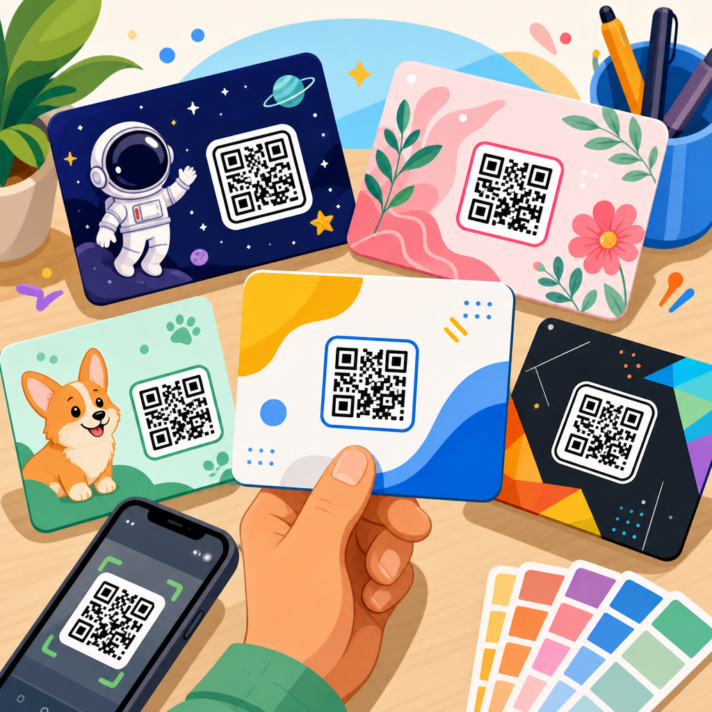
Business card, resume, and portfolio QR code design examples
Personal branding uses some of the most creative QR code design examples, but it is also where overdesign often causes failure. On a business card, the code should support one clear next step: save contact details, open a portfolio, book a call, or view a reel. Because cards are physically small, the QR code itself must stay simple. Rounded corners, brand colors, and a modest logo can work, but intricate shapes and low contrast usually do not.
Resume QR codes are effective when they point to a curated page rather than a generic homepage. A recruiter scanning from paper wants a fast path to relevant work samples, certifications, or a one-minute introduction video. In interviews and hiring events, I have seen candidates benefit most from a clean code in the header or footer paired with concise copy such as “Portfolio and case studies.” The design feels intentional, not ornamental.
For creators, photographers, consultants, and architects, portfolio QR code design examples often succeed when the code sits within a strong editorial layout. White space helps. So does restraint. If the card already carries a bold type system or image, the QR code should act as a utility element, not fight for attention. The same principle applies to brochures, proposals, and leave-behinds where the code links to updated work that would be cumbersome to print.
Digital screen, social, and email QR code design examples
Not all QR codes live in print. Many brands now place them on presentation slides, livestream graphics, retail displays, smart TV ads, webinar decks, and social posts. Digital QR code design examples work best when screen-related issues are accounted for: pixel density, animation, brightness, and competing motion. A code shown during a keynote slide should be large, static, and visible long enough for attendees to open the camera app and scan. Fast transitions destroy performance.
On social media, QR codes are useful for cross-device actions, especially in stories, carousels, and offline-to-online promos. However, if the user is already on a phone, an embedded QR code may force awkward behavior with a second device. Better examples include a QR code in a downloadable event graphic meant for printing, or in a booth display promoted through social. Email signatures and newsletters can also include QR codes, but only when the audience is likely to view the message on desktop and act via phone, such as scanning to add an event to a mobile wallet or connect to an app.
Screen environments also make color gradients tempting. Use them carefully. Compression artifacts, low brightness, and patterned backgrounds can reduce decode reliability. For digital campaigns, test the exact exported asset, not just the source file.
Design rules, testing methods, and common mistakes to avoid
The most useful QR code design examples share a disciplined production process. Start with the destination. Then generate a dynamic code when future edits or analytics matter. Choose a reliable platform that supports scan tracking, UTM parameters, and format export for print and digital. Use standard finder patterns, preserve the quiet zone, maintain strong contrast, and size the code for the viewing distance and material. If adding a logo, keep it small and centered. If changing module shapes, do so moderately.
Testing should happen in context. Print on the real stock. View the code under store lighting. Try older phones as well as current models. Test from expected distances and angles. Scan with native camera apps and common third-party apps. If a code will appear on packaging, test after finishing processes such as varnish or embossing. If it appears on a screen, test the final display hardware at realistic brightness. ISO/IEC 18004 provides the baseline specification for QR Code symbology, and serious teams should treat that standard as mandatory background, not optional reading.
Common mistakes are predictable: tiny codes, weak contrast, cluttered backgrounds, insufficient margins, too much logo coverage, and vague calls-to-action. Another mistake is sending every scan to the homepage. Users scan for a reason, and relevance determines whether the interaction feels helpful. Creative QR code design works when utility leads and styling supports it.
Creative QR code design examples that work all follow the same principle: make the code easy to notice, easy to trust, and easy to scan. Whether you are designing for packaging, restaurants, events, business cards, or digital screens, the strongest results come from balancing brand expression with technical discipline. Contrast, quiet zone, size, and testing are nonnegotiable. Clear copy around the code increases intent. A relevant destination turns a scan into a useful experience instead of a dead-end click.
As the hub for QR Code Design Examples within QR Code Resources, Templates & Tools, this page should guide every related project you publish next, from packaging templates and menu QR best practices to poster sizing, business card layouts, and dynamic code tracking. Use the examples here as decision patterns, not just inspiration. When a design choice improves both scan reliability and user confidence, keep it. When it only looks clever, reconsider it.
If you are building or refreshing a QR campaign, audit your current codes against the examples and rules in this guide, test them in real conditions, and update the destination experience before rollout. Better QR code design produces better scans, better engagement, and fewer missed opportunities.
Frequently Asked Questions
What makes a creative QR code design actually work?
A creative QR code works when it keeps the core job of the code intact: fast, reliable scanning. The strongest examples combine branding elements such as custom colors, logos, frame text, or subtle shape adjustments without interfering with the code’s readability. In other words, good design supports function rather than competing with it. A QR code may look visually impressive, but if users have to try multiple times to scan it, the design has failed where it matters most.
In practical terms, successful QR code design depends on a few fundamentals. The code needs strong contrast between foreground and background, enough quiet space around the edges, and a data load that is not unnecessarily heavy. It should also be tested at its real display size, on the material where it will appear, and under realistic lighting conditions. Creative QR code design examples that work usually feel intentional and branded, but they still preserve the recognizable structure scanners expect. That balance is what turns a QR code from a decorative graphic into a useful branded asset.
How far can you customize a QR code before it stops scanning reliably?
You can customize a QR code quite a bit, but there is a clear limit. Colors, rounded modules, embedded logos, branded frames, and mild pattern stylization are all common customizations that can perform well when handled carefully. Problems start when designers reduce contrast too much, distort the finder patterns, remove too many data modules, crowd the code with artwork, or place it on busy backgrounds. These choices may look creative on screen but often create friction in real-world scanning.
A good rule is to preserve the essential anatomy of the QR code while enhancing the presentation around it. Keep the finder patterns easily recognizable, use dark-on-light contrast whenever possible, and leave enough empty margin around the code so camera apps can isolate it. If you add a logo in the center, make sure the QR code’s error correction level can support that change without sacrificing reliability. Most importantly, test across multiple devices, including older phones and different camera apps. The best creative designs are not the ones that push customization the furthest; they are the ones that personalize the code while remaining consistently usable.
Are branded QR codes more effective than standard black-and-white ones?
Branded QR codes can be more effective, but only when the branding improves trust, recognition, and visibility without hurting scan performance. A standard black-and-white QR code is often the most technically straightforward option, and it remains highly reliable. However, branded versions can stand out more in crowded spaces, fit naturally into packaging or signage, and signal legitimacy to users who might otherwise hesitate to scan an unfamiliar code. When done well, branding can increase both attention and confidence.
That said, effectiveness should be measured by outcomes, not appearance alone. If a branded QR code earns more scans because it looks polished and clearly connected to a known business, it is doing its job. But if the custom styling makes it harder to scan, then the branding is working against performance. The most effective examples typically use modest customization: a brand color palette with sufficient contrast, a small logo, and a clear call to action such as “Scan to View Menu” or “Scan to Get Offer.” Those additions help users understand what the code is for and why they should engage with it, which is often more important than visual flair by itself.
Where do creative QR code designs perform best in real-world marketing?
Creative QR code designs perform best in places where visual competition is high and user attention is limited. Packaging, retail displays, restaurant tables, event signage, business cards, product inserts, posters, direct mail, and storefront windows are all strong use cases. In these environments, a plain QR code can be overlooked, while a thoughtfully branded version has a better chance of being noticed and understood. The design matters even more when the code supports a clear next step, such as claiming a discount, viewing a menu, downloading an app, joining Wi-Fi, or checking into an event.
The strongest real-world examples also match the context of use. A QR code on a billboard must be much larger and simpler than one printed on a product tag. A code used in dim lighting, glossy materials, or outdoor conditions needs extra attention to contrast, size, and placement. Creative design works best when it supports the user’s environment rather than ignoring it. That is why high-performing QR code campaigns usually pair good visual design with practical decisions about placement, surface material, scanning distance, and the clarity of the call to action.
What are the most common mistakes to avoid when designing a creative QR code?
The most common mistake is prioritizing style over functionality. Designers sometimes make the code too artistic by reducing contrast, using color combinations that blend together, placing the code over a patterned image, or altering the structural markers too aggressively. Another frequent issue is making the code too small for the intended use. A QR code that scans perfectly on a desktop mockup may fail completely when printed on packaging or viewed from a distance. Skipping real-device testing is another major problem, especially when the audience may use a mix of Android phones, iPhones, and older camera hardware.
Other mistakes include linking to low-quality landing pages, failing to explain what happens after the scan, and using static codes when flexibility is needed. A QR code can be beautifully designed, but if it sends users to a slow, unoptimized page, the experience still falls apart. The best practice is to think end to end: the code should be easy to notice, easy to scan, and worth scanning. That means maintaining contrast, respecting quiet space, sizing the code appropriately, using a short and mobile-friendly destination, and testing under real conditions before launch. In the best creative QR code design examples, the user experience remains smooth from first glance to final destination.