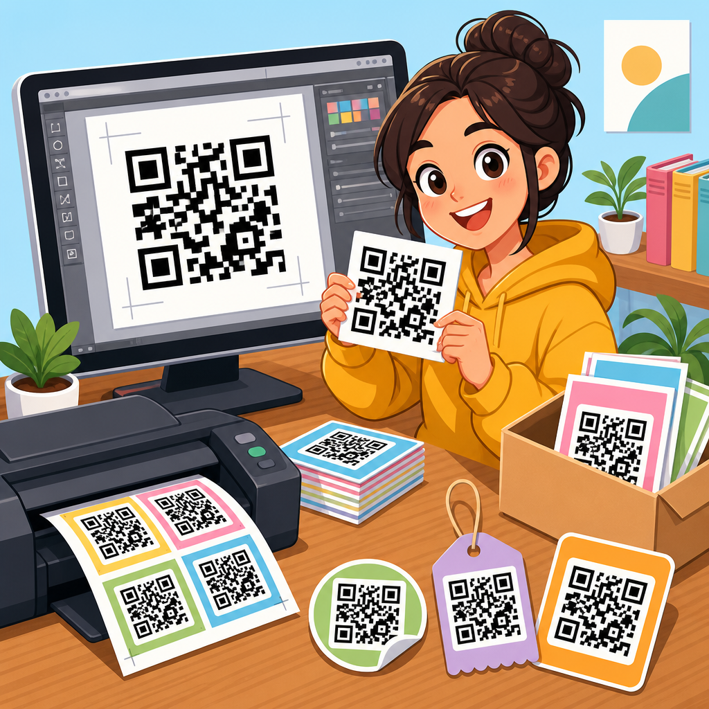
Best QR code design examples for businesses show how a small square can become a branded, trackable, conversion-focused touchpoint instead of a generic utility. A QR code is a scannable matrix barcode that opens a destination such as a website, menu, payment page, app download, video, form, or vCard when a smartphone camera reads it. For businesses, QR code design means more than changing black modules to brand colors. It includes contrast, quiet zone spacing, error correction level, call to action, placement, destination choice, testing, and measurement. I have helped teams deploy codes on packaging, storefronts, trade show booths, invoices, restaurant tables, and direct mail, and the pattern is consistent: the best-performing examples balance aesthetics with instant scan reliability. That matters because every failed scan costs attention, trust, and often revenue. Well-designed business QR codes also create operational benefits. They reduce friction, connect offline media to digital experiences, and provide measurable campaign data through dynamic redirects and analytics. In a crowded market, the businesses that win with QR code design do not treat the code as clip art. They treat it as a conversion asset with creative rules, technical standards, and a clear role in the customer journey.
What makes a business QR code design effective
An effective business QR code design is recognizable, readable, and relevant to the moment it appears. Recognizable means the code looks intentional and on-brand without becoming visually confusing. Readable means the phone camera can scan it quickly across common devices, lighting conditions, and distances. Relevant means the destination and message match user intent. If a customer scans a code on product packaging, they expect setup help, ingredients, warranty registration, authenticity verification, or reorder options, not a generic homepage.
In practice, the strongest designs follow several rules. Maintain high contrast between foreground and background. Keep the quiet zone, the empty margin around the code, intact. Use an appropriate physical size based on scanning distance; a common rule is about one centimeter of code size for every ten centimeters of scan distance. Choose dynamic QR codes when campaigns may change, because the visible code stays the same while the redirect updates. Add a direct call to action such as “Scan to view menu,” “Scan for setup video,” or “Scan to claim discount.” Businesses often forget this step, yet clear instruction consistently improves scan rates because it removes uncertainty about what happens next.
Another critical factor is destination experience. A beautifully designed code cannot overcome a slow landing page, broken redirect, or mobile form with too many fields. The scan completes only when the user reaches the goal. That is why high-performing examples always pair design with mobile UX, analytics tagging, and testing across iPhone and Android camera apps.
Best QR code design examples by business use case
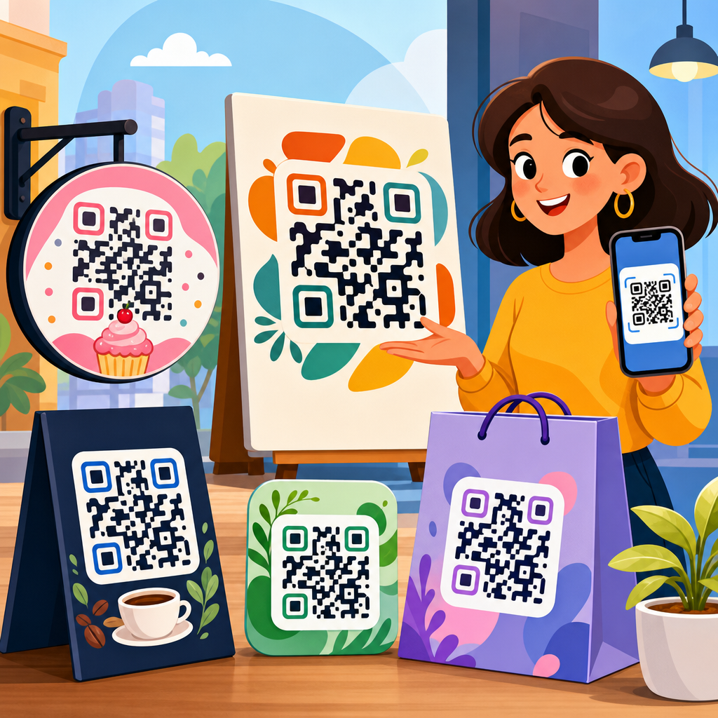
The best QR code design examples for businesses are tied to a specific job. Restaurants use QR codes for menus, table ordering, reviews, and loyalty signups. Retail brands place them on packaging to unlock tutorials, recipes, care instructions, or product authentication. Real estate teams use window signage and brochures to deliver listing pages, virtual tours, mortgage calculators, and lead forms. Event marketers use badges, posters, and booth graphics to share agendas, maps, speaker bios, and instant follow-up pages. Service businesses add codes to invoices, vehicles, and appointment cards for payments, referrals, and booking.
One example I have seen work repeatedly is the restaurant menu code that pairs a short call to action with a subtle frame in brand colors and a plain-language fallback URL beneath it. This combination serves first-time users, improves trust, and protects usability if a scan fails. Another strong example is consumer packaged goods labeling. A coffee brand can print a QR code near the brewing instructions that opens an origin story, roast profile, and brew guide by grind type. That design succeeds because the placement matches curiosity at the exact moment of use.
Retail point-of-sale displays offer another proven pattern. A cosmetics brand can place a QR code next to a tester unit with “Scan to see shade on skin tones” and send users to a short mobile gallery. The code is not decorative; it solves a purchase barrier. In B2B settings, a trade show code can route to a lead capture page with a prefilled campaign parameter, allowing the sales team to separate booth traffic from email or paid social. Good design always starts with the question: what problem does this scan remove right now?
Branding choices that improve appearance without hurting scans
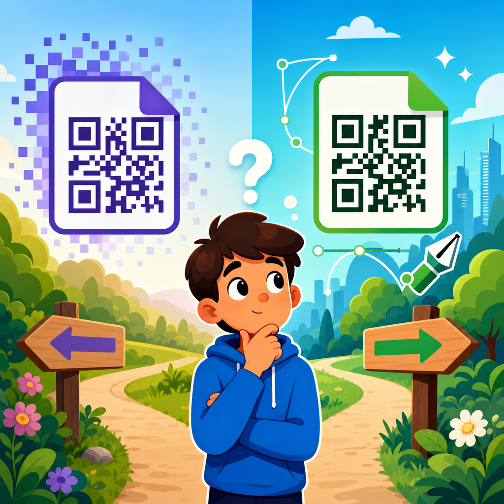
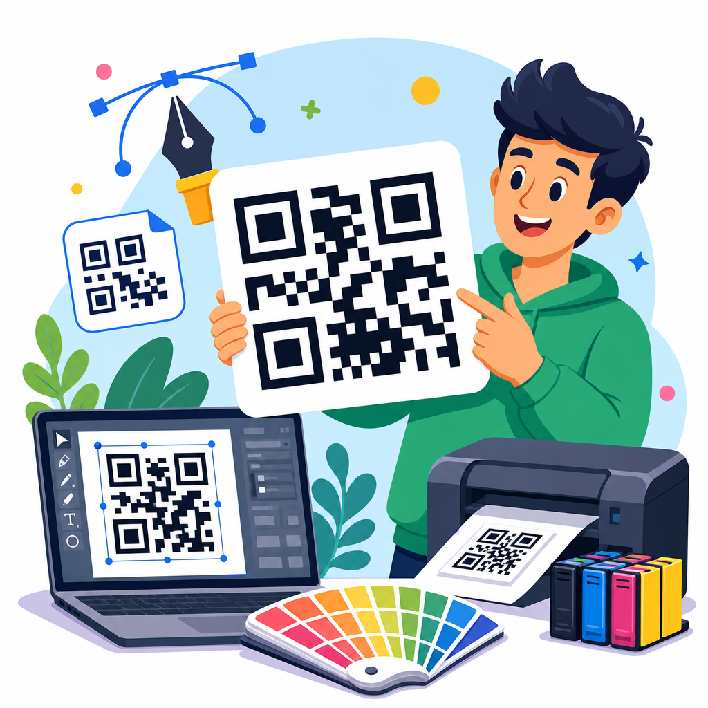
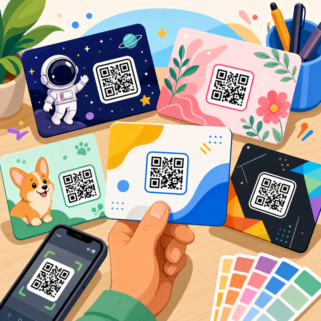
Branding a QR code safely means customizing only the elements that do not compromise machine readability. Most modern generators allow changes to eye frames, module shape, color, and center logo. The safest route is modest customization. Keep the core pattern dark and the background light. Avoid metallic inks, busy textures, gradients with low contrast, and transparent overlays. If you add a logo, increase error correction to a higher level and verify scans from different angles and distances. ISO/IEC 18004 governs QR code specifications, and while many branded treatments can still scan, the standard’s practical lesson is simple: function comes first.
Frame design is one of the easiest wins. A circular sticker or bordered square around the code can carry a call to action and make the asset feel integrated into packaging or signage. Eye shapes can be rounded or slightly stylized, but they should remain distinct. Brand colors work best when they are adapted for contrast rather than copied blindly from a style guide. For example, a pale yellow brand accent may look attractive but often fails in bright lighting. A deeper mustard on white may preserve both identity and readability.
I recommend treating logo insertion cautiously. Many businesses want a large center logo because competitors use one. In testing, oversized logos are a common source of failure, especially on low-quality print runs or curved surfaces such as bottles. A smaller logo with generous clear space around the finder patterns performs better. The goal is not to make the code look unfamiliar. The goal is to make it instantly recognizable as your brand while still scanning on the first try.
Design standards, sizing, and placement rules businesses should follow
Most scan failures come from preventable production issues, not from the concept itself. Businesses should standardize QR code sizing, materials, and placement before launching campaigns at scale. The code must be large enough for the viewing distance and environment. On business cards, twenty to twenty-five millimeters is usually the practical minimum. On posters viewed from several feet away, the code needs to be substantially larger. Surfaces matter too. Matte print generally scans more reliably than glossy stock under overhead lights because glare interferes with detection.
Placement should align with natural sight lines and decision points. On a storefront, position the code near the entrance or window display where people already pause. On a product box, place it near instructions or key benefits, not on a seam or curved edge. On vehicles, avoid panel gaps and reflective contours. In direct mail, keep the code away from folds and make the benefit obvious in the headline. Accessibility matters as well. Use readable supporting text, avoid tiny instructions, and never rely on color alone to communicate the purpose of the scan.
| Use case | Recommended design approach | Common mistake | Better alternative |
|---|---|---|---|
| Restaurant menu | High-contrast code with framed “Scan to view menu” CTA | Code printed too small on a crowded table tent | Larger code, shorter text, matte finish, fallback URL |
| Product packaging | Code near instructions or authenticity label | Placing code on curved edge or over patterned artwork | Flat panel placement with quiet zone preserved |
| Trade show booth | Large code linked to lead form or demo booking page | Sending scans to homepage | Dedicated campaign landing page with UTM tags |
| Invoice or receipt | Payment or reorder code with concise instruction | No explanation of what opens after scanning | “Scan to pay securely” or “Scan to reorder” |
Testing should be formal, not informal. Scan from multiple devices, under bright and dim light, on mobile data and Wi-Fi, and after printing final proofs. Businesses that document these checks prevent expensive reprints and avoid field failures that no amount of branding can fix.
Examples of high-converting QR code destinations
The destination behind a QR code determines whether the scan creates business value. The best examples send users to a page built for immediate action, not a general navigation hub. For restaurants, that may be a fast-loading digital menu with categories, dietary filters, and table ordering. For retail, it may be a product detail page featuring how-to video, reviews, inventory, and one-click reorder. For healthcare practices, a code on appointment reminders can lead directly to intake forms, directions, telehealth access, or secure bill pay. In each case, the destination reduces effort at the moment the user is most likely to act.
Dynamic QR codes are especially useful here because they support campaign changes without replacing printed materials. Platforms such as Bitly, QR Code Generator Pro, Flowcode, Beaconstac, and Uniqode let businesses edit destinations, add UTM parameters, and review scan analytics by time, device, and sometimes location. That data reveals which placements and messages work. If a retail shelf talker earns scans but few purchases, the issue may be the landing page, not the code. If a direct mail code has a high conversion rate, the business can confidently repeat that offer format.
Strong destinations also respect security and trust. Use a recognizable domain, HTTPS, and concise copy above the fold. If the code opens a form, ask only for essential information. If it opens a payment page, make the security cues obvious. People scan quickly, but they evaluate credibility just as quickly. The best business QR code design examples connect a reliable visual asset to a destination built to complete one clear action.
How to measure performance and improve QR code campaigns
Businesses should judge QR code design by outcomes, not aesthetics alone. Useful metrics include scans, unique users, scan-to-visit rate, bounce rate, completion rate, revenue per scan, and assisted conversions. In omnichannel campaigns, compare placements. A poster in a transit station may generate many scans but few purchases, while packaging inserts may generate fewer scans with much higher reorder rates. Both can be valuable if measured correctly.
Set up campaign tracking before launch. Use tagged URLs, event tracking in Google Analytics 4, and a dashboard that distinguishes unique scans from repeat scans. If privacy rules or regional regulations apply, work with compliant consent language and data handling practices. A/B testing is possible even offline. You can test different calls to action, code placements, or destination pages by assigning separate dynamic URLs. In one packaging program I worked on, changing the CTA from “Learn more” to “Scan for setup in 60 seconds” significantly improved engagement because it promised a specific payoff and time commitment.
Optimization often comes from small changes. Increase code size slightly, remove background clutter, shorten the form, or align the landing page headline with the printed message. Also monitor operational details such as redirect speed and uptime. A QR campaign is part print, part product, and part analytics system. Treating it with that discipline turns design examples into repeatable business results.
The best QR code design examples for businesses combine branding, usability, and measurable intent. They are easy to scan, clear about the benefit, placed where customer attention already exists, and connected to a destination built for one immediate action. Across packaging, menus, direct mail, retail displays, events, invoices, and storefronts, the highest-performing codes follow the same principles: strong contrast, preserved quiet zones, practical sizing, thoughtful placement, concise calls to action, and rigorous testing. Customization works when it supports recognition without weakening readability. Analytics matter because they show whether the code is creating leads, sales, payments, bookings, or support resolution rather than just curiosity.
As the hub for QR code design examples, this topic should guide every related decision, from visual styling and print production to landing page structure and campaign reporting. Businesses that approach QR codes strategically create smoother customer journeys and gain a reliable bridge between offline attention and digital conversion. Start with one high-intent use case, build a dynamic code, test it on real devices, and measure what happens after the scan. Then expand from the examples that prove their value.
Frequently Asked Questions
What makes a business QR code design effective instead of just visually attractive?
An effective business QR code design balances branding with scan performance. Many companies focus first on making the code look stylish, but the best QR code design examples show that appearance only matters if the code scans quickly and reliably. A strong design starts with high contrast between the foreground and background, a clear quiet zone around the edges, and a size that matches the scanning distance. It also needs the right error correction level so the code can still work if part of it is covered by a logo, printed on textured packaging, or exposed to wear in a physical environment.
Beyond technical function, effective QR code design also supports conversion. That means the code should be placed in a logical context, paired with a clear call to action, and connected to a destination that matches user intent. For example, a restaurant QR code should lead directly to a mobile-friendly menu, not a cluttered homepage. A retail display code might perform best when it opens a product page, coupon, or customer review experience. The most successful business examples treat the QR code as a complete touchpoint that includes design, placement, destination, and measurable outcome, rather than as a decorative square added at the end of a campaign.
How can businesses customize a QR code with brand colors and logos without hurting scanability?
Businesses can absolutely customize QR codes, but they need to do it within technical limits. The safest approach is to preserve strong contrast, keep the code pattern crisp, and avoid visual effects that interfere with smartphone recognition. Dark foreground modules on a light background remain the most dependable option. Brand colors can work well as long as the contrast stays high enough for scanners to distinguish the code from its background. Pastel-on-white, metallic finishes, low-opacity colors, and busy image fills often cause scan failures, especially in poor lighting or on lower-quality phone cameras.
Adding a logo to the center is common and can strengthen brand recognition, but it should be done carefully. The logo should not cover too much of the code, and the QR should be generated with an appropriate error correction level to compensate for the obscured area. The quiet zone around the code should remain fully intact, even when decorative frames or branded backgrounds are used. It is also important to test the code across multiple devices, camera apps, operating systems, and real-world conditions such as glare, distance, and curved surfaces. The best branded QR code examples feel customized and polished, but they still scan instantly because the underlying structure has not been sacrificed for style.
Where should businesses place QR codes for the best results?
Placement has a huge impact on performance because even a perfectly designed QR code can fail if people cannot easily notice it, reach it, or scan it comfortably. The best placement depends on the use case. On product packaging, the code should be visible without forcing the customer to rotate the product too much or scan over folds, seams, or glossy distortions. In restaurants, table tents, menu boards, and takeout packaging often work well because customers naturally look there during decision-making moments. In retail, shelf talkers, window signage, point-of-sale displays, and fitting room prompts can be effective when the QR code supports an immediate action such as viewing sizes, redeeming an offer, or reading product details.
Good placement also means accounting for viewing distance, lighting, and user flow. A poster seen from several feet away needs a larger QR code than one printed on a business card. A code placed behind reflective glass or in a dim hallway may underperform even if the design itself is solid. Businesses should also think strategically about timing and intent. A QR code near checkout might be ideal for payments, loyalty enrollment, or upsells, while a code on direct mail may work better for booking appointments or tracking campaign response. The strongest examples place the QR code where it naturally supports the next step in the customer journey, not where there happened to be empty space in the layout.
What are the most common QR code design mistakes businesses should avoid?
One of the most common mistakes is treating the QR code like a purely visual branding element and ignoring the technical rules that make it scannable. Low contrast, missing quiet zones, tiny print size, over-stylized shapes, and busy backgrounds are frequent problems. Another issue is placing the code in an inconvenient or physically distorted location, such as across a package seam, on a curved bottle without testing, or in an area with heavy glare. Some businesses also use static destination links without thinking through future updates, which can limit flexibility if the campaign needs to change later.
Another major mistake is sending users to a poor destination experience. Even if the QR code scans perfectly, it will underperform if it opens a desktop-only page, a generic homepage, a slow-loading form, or content unrelated to the promise made in the call to action. Weak instruction is another issue. People are much more likely to scan when they know exactly what they will get, such as “Scan to view the menu,” “Scan to pay,” or “Scan for 15% off.” Finally, many businesses fail to test and track. The best QR code design examples are not just attractive and functional; they are measured. Businesses should monitor scans, conversions, device behavior, and campaign performance so they can improve design, placement, and messaging over time.
How do businesses measure whether a QR code design is actually working?
Businesses should evaluate QR code performance using both technical and marketing metrics. At the most basic level, tracking should show how many scans occurred, when they happened, where they happened if location data is available, and what devices people used. Dynamic QR codes are especially useful because they allow businesses to update destinations and collect performance data without reprinting the code. This makes it possible to compare placements, campaigns, and calls to action over time. For example, a company can test whether a package insert QR code performs better when it offers a setup guide versus a discount for a repeat purchase.
Scan count alone is not enough, though. The real question is whether the code drives meaningful business outcomes. Depending on the campaign, that may mean purchases, bookings, form submissions, app downloads, menu views, payment completions, coupon redemptions, or contact saves through a vCard. Businesses should also look at bounce rate, landing page speed, mobile usability, and completion rate after the scan. If a code gets plenty of scans but few conversions, the issue may be the destination or the call to action rather than the code design itself. The strongest QR code strategies connect design, context, analytics, and optimization so the business can prove the QR code is not just being scanned, but actually influencing revenue, engagement, and customer behavior.