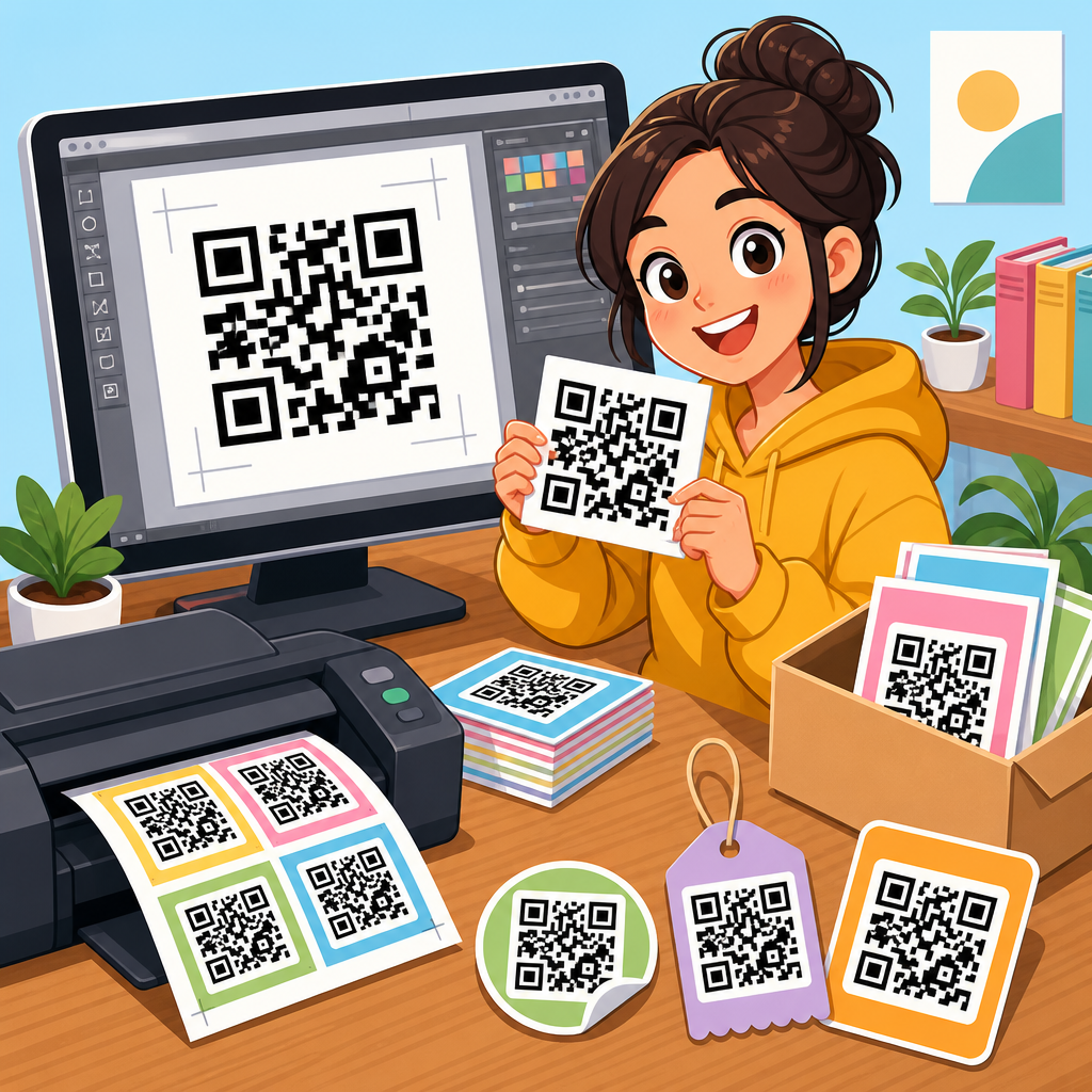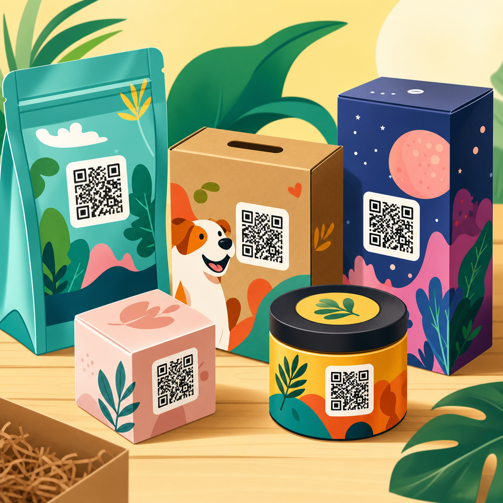
QR code packaging design examples show how a small scannable graphic can turn a box, label, pouch, bottle, or mailer into an interactive product experience. In packaging, a QR code is a two-dimensional barcode that stores a URL, file, app action, or product identifier readable by smartphone cameras. Good packaging design is not only about placing the code on a surface. It is about matching scan intent, print quality, brand aesthetics, material constraints, compliance needs, and post-purchase goals. I have worked on packaging rollouts where the same code performed very differently on corrugated shipping cartons, matte cosmetic boxes, and curved beverage cans, so the design details matter. Brands use QR codes on packaging to deliver product education, authentication, loyalty offers, assembly help, traceability, ingredient transparency, and campaign content without overcrowding the label. This matters because packaging space is limited, regulations are expanding, and customers increasingly expect instant digital access at the shelf and at home. The best QR code packaging design examples prove a simple rule: when the code clearly signals value and scans easily in real conditions, engagement rises and packaging works harder.
What makes a QR code packaging design effective
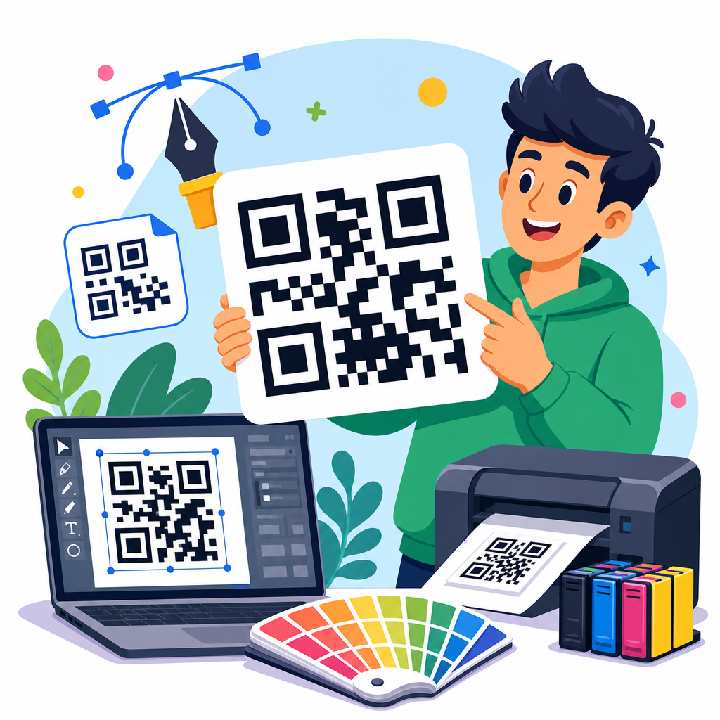
An effective QR code on packaging does three jobs at once: it scans reliably, fits the visual system of the pack, and leads to a destination that justifies the user’s effort. In practice, that means respecting technical standards while designing for human behavior. The code needs sufficient size, contrast, quiet zone, and error correction. ISO/IEC 18004 defines QR code structure, and printers typically validate legibility using verification tools such as those from Zebra, Cognex, or Axicon. On consumer packaging, I usually recommend starting around 20 x 20 mm for simple URLs, then testing on the actual substrate, because uncoated paperboard, metallic inks, varnishes, and shrink sleeves all affect scan performance.
The visual design should support recognition, not fight it. Many failed examples use low contrast, over-stylized modules, or busy backgrounds that look premium on a mood board but frustrate shoppers. The destination matters equally. If a code opens a generic homepage, scan rates drop. If it opens a mobile landing page with a clear promise such as “See ingredients,” “Watch setup,” or “Verify authenticity,” customers understand the benefit immediately. Effective QR code packaging design examples therefore combine a visible call to action, a fast mobile page, and a meaningful use case connected to the product in hand.
Retail packaging examples that drive product discovery
On shelf-ready retail packaging, QR codes work best when they reduce uncertainty before purchase. Skincare boxes often use them to explain active ingredients, compatibility, and routine order. Food brands use them to show sourcing, nutrition detail, recipes, or allergen information that does not fit neatly on pack. Consumer electronics brands place codes on cartons to compare models, demonstrate setup, or surface warranty terms. In each case, the scan answers a specific pre-purchase question that might otherwise block conversion.
A strong example is a coffee bag that pairs a QR code with origin storytelling. Instead of sending users to a general brand site, the code opens a page for that roast only: farm region, processing method, tasting notes, brew ratios, and harvest date. This adds trust and perceived quality. Another practical example is a pet food pouch with a code linked to feeding calculators by breed, age, and weight. That is more useful than static feeding charts and creates a reason to scan repeatedly after purchase. These examples succeed because the code is tied to a decision the buyer is already making.
Examples by packaging goal and best-fit execution
Different packaging goals require different QR code design choices. A serialized authentication code on a medicine carton should not look or function like a campaign code on a snack multipack. Teams that treat all QR codes the same usually miss value or create compliance risk. The table below summarizes common packaging objectives and the most effective execution patterns I have seen in production.
| Packaging goal | Best QR code placement | Recommended destination | Key design note |
|---|---|---|---|
| Ingredient transparency | Side panel near nutrition or INCI list | Mobile product detail page | Use plain CTA such as “See full ingredients” |
| Authentication | Tamper seal, neck label, or inner flap | Verification page with batch data | Prefer unique serialized codes over one static code |
| How-to guidance | Opening panel or front lower corner | Short setup video or step guide | Keep scan visible after unboxing if repeat use matters |
| Loyalty enrollment | Inside lid or carton insert | Fast sign-up form with incentive | Reduce form fields to improve completion |
| Traceability | Back panel or shipping label | Lot, date, origin, and supply chain record | Dynamic links simplify updates across SKUs |
Food, beverage, beauty, and pharma packaging design examples
Category context changes the right design approach. In food packaging, shoppers often want sourcing, allergens, recipes, and sustainability information. A frozen meal box can use a QR code beside the cooking panel to open appliance-specific instructions and dietary details in multiple languages. Beverage packaging faces surface and size challenges. On cans, codes need careful placement away from seams and high-gloss highlights; on wine labels, they often work best on the back label with food pairings, vineyard notes, and authenticity checks.
Beauty packaging benefits from education and reorder journeys. A serum carton can link to patch-test guidance, regimen order, before-and-after usage timelines, and shade or skin-type matching. Because beauty packaging often uses premium finishes, designers must test foil stamping, spot UV, and dark substrates aggressively. In pharmaceuticals and supplements, the stakes are higher. Codes may connect to patient information leaflets, dosage videos, adverse event reporting, or anti-counterfeit verification. In regulated sectors, legal review, accessibility, and market-specific compliance cannot be an afterthought. The most successful examples respect category norms while using the code to remove friction, not add novelty for its own sake.
Design principles: size, contrast, material, and placement
Reliable QR code packaging design starts with physical realities. Size is the first variable. A common field rule is a scan distance ratio of roughly 10:1, meaning a 2 cm code is comfortable at about 20 cm scanning distance, though modern phone cameras vary. Contrast should be high, ideally dark modules on a light background. Reversed white-on-black codes can work, but only after testing. Quiet zone, the blank margin around the code, is essential; crowding the code with copy, dielines, or icons causes avoidable failures.
Material and print process are equally important. Flexographic printing on corrugate can spread dots and soften edges. Digital printing handles versioning well but can introduce color inconsistency across runs. Curved containers distort modules if the code is too large for the radius. Matte varnish often scans better than high-gloss because it reduces glare. Placement should follow the user journey. Put instructional codes near opening moments, authenticity codes near seals, and reorder or loyalty codes where they remain visible after use. Packaging prototypes should be tested under store lighting, warehouse handling, and consumer camera conditions, not just in studio proofs.
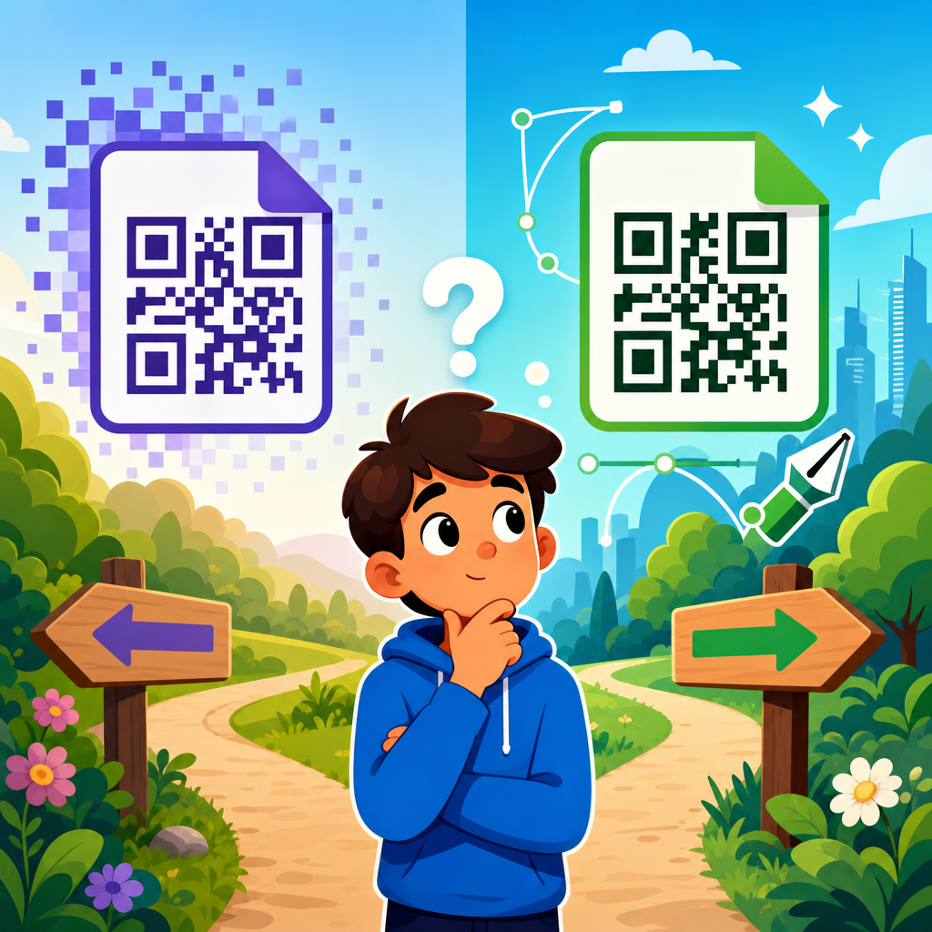
Static versus dynamic codes on packaging
One of the most important packaging decisions is whether to use a static or dynamic QR code. A static code points permanently to one destination. It is simple, low-cost, and useful for evergreen content such as a universal care guide or brand about page. A dynamic code uses a short redirect URL managed through a QR platform, allowing the destination to change without reprinting packaging. For multi-SKU programs, campaigns, regional content, and analytics, dynamic codes are the practical choice.
In live packaging programs, dynamic codes usually win because packaging outlasts campaigns. I have seen brands print a holiday offer on tens of thousands of units and then keep unsold stock in market for months. With a static code, the experience goes stale. With a dynamic code, the landing page can switch from promotion to product education after the campaign ends. Dynamic systems also support scan analytics, A/B testing, device targeting, and compliance updates. The tradeoff is platform dependency and governance. Redirect domains, uptime, privacy disclosures, and naming conventions need operational ownership. For authentication, dynamic plus serialization provides the strongest control.
Creative QR code packaging design examples without sacrificing usability
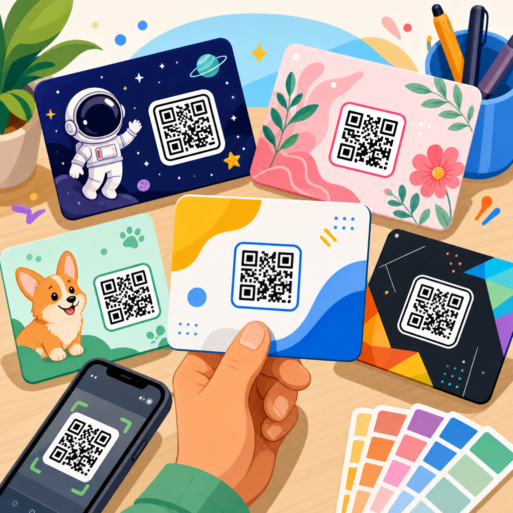
Creative QR codes can strengthen branding if the customization stays within scannable limits. The safest enhancements are color alignment, branded frames, short calls to action, and simple center logos that do not cover too many modules. For example, a tea brand can use deep green modules with a cream background and a leaf icon in the center, while maintaining strong contrast and adequate error correction. A toy box can frame the code with “Scan to see it built” and use brand colors without altering the code geometry.
The risky moves are gradients, transparent overlays, heavy illustration inside the matrix, or embedding the code in photography where edges disappear. I have also seen codes warped into circles or product silhouettes that passed internal review but failed in stores. If a brand wants a stylized result, the verification process must be stricter than for a plain black code. Always test older phones, low-light scans, cracked screens, and different camera apps. Creativity is valuable only when the code remains instantly recognizable and dependable. The best examples look branded from a distance and scan on the first try up close.
Measurement, testing, and governance for packaging QR programs
Packaging QR codes should be managed as a product system, not a one-time artwork element. Success starts with a measurable objective: increase recipe engagement, reduce support calls, lift loyalty sign-ups, improve authentication checks, or expand product detail access. Once the goal is clear, teams can track scans, unique users, bounce rate, completion of the intended action, geography, time of day, and repeat usage. Tools such as Bitly Enterprise, QR Code Generator PRO, Scanova, Beaconstac, and custom analytics stacks can support dynamic routing and performance reporting.
Testing should cover prepress, production, and field use. Verify every variant after color correction, substrate choice, and finishing. Run scans from multiple devices and distances. Check pages for load speed, mobile usability, and accessibility, including readable text, captions on video, and language support where relevant. Governance is where mature programs separate from ad hoc ones. Define who owns the redirect domain, landing page updates, UTM taxonomy, data retention, and retirement of expired content. For global brands, create packaging QR standards by category and region. Consistency reduces errors, shortens approval cycles, and protects brand trust over time.
Common mistakes to avoid in QR code packaging design
The most common mistake is giving people no reason to scan. “Scan me” is weak. “Scan for brewing guide,” “Verify this bottle,” or “Watch setup in 60 seconds” performs better because it promises a concrete outcome. Another frequent error is linking to a desktop page, app store homepage, or cluttered site navigation instead of a mobile-first destination tailored to the product. Broken redirects and expired campaign pages are also common and damaging because they signal neglect.
Design mistakes include placing codes over seams, folds, curves, reflective foil, or transparent windows. Tiny codes may pass artwork review yet fail in the aisle. Some teams reduce contrast to fit a visual palette, forgetting that function is part of brand experience. Operational mistakes matter too: reusing one code across incompatible SKUs, failing to localize content, or neglecting privacy disclosures when scan analytics are collected. The best safeguard is a packaging QR checklist covering CTA, landing page relevance, scan testing, substrate verification, analytics setup, and ownership after launch.
QR code packaging design examples are most useful when they show a repeatable principle, not just a clever execution. The pattern is clear across retail, food, beauty, electronics, and regulated products: the highest-performing codes answer an immediate customer question, scan effortlessly on the real package, and lead to a mobile experience built for that exact moment. Good packaging QR design is therefore part industrial design, part information architecture, and part lifecycle management. It requires attention to size, contrast, quiet zone, material, placement, and destination quality, plus a plan for measurement and updates.
As a hub within QR Code Resources, Templates & Tools, this topic connects naturally to deeper guides on QR code size, packaging templates, dynamic versus static codes, scan testing, landing page strategy, and analytics implementation. If you are designing packaging now, start with one product line, define a single user benefit, test the code on the final substrate, and launch with a clear CTA and measurable goal. Then expand from proven examples. Done well, a QR code transforms packaging from a static label into a durable digital touchpoint that keeps working long after the product leaves the shelf.
Frequently Asked Questions
What makes a QR code packaging design effective instead of just decorative?
An effective QR code packaging design does more than add a scannable square to a box or label. It connects the code’s purpose to the customer’s moment of interaction. In other words, the design should answer a simple question: why would someone scan this right now? On packaging, that reason might be to verify authenticity, view instructions, unlock recipes, register a product, join a loyalty program, access sustainability details, or watch a product demo. The strongest examples align the scan destination with the product category, the customer journey, and the available package space.
Good execution also depends on usability. The code must be easy to find, large enough to scan, printed with sufficient contrast, and placed on a surface that remains readable after folding, sealing, chilling, or shipping. Effective designs often include a brief call to action such as “Scan for setup,” “See ingredients,” or “Watch how it works,” because customers are more likely to scan when they know the benefit. Visually, the code should feel integrated with the brand rather than randomly attached. That can mean using brand-consistent framing, nearby icons, supporting copy, or thoughtful placement on a panel where the customer naturally looks. The best packaging examples balance performance, aesthetics, and usefulness, turning the QR code into a functional part of the brand experience rather than a decorative afterthought.
Where should a QR code be placed on packaging for the best scan results?
The best placement depends on package format, material, and when the customer is expected to scan. On a carton or box, a flat panel with minimal distortion is usually ideal, such as the side panel, back panel, or top flap if it remains visible at shelf level. On bottles and curved containers, placement becomes more sensitive because heavy curvature can make scanning less reliable, especially with small labels. In those cases, designers often reserve a flatter section of the label or increase the code size to preserve readability. Flexible pouches, sachets, and mailers add another challenge because wrinkles, seams, and reflective finishes can interfere with smartphone cameras, so the QR code should sit away from folds, gussets, zippers, and crimped edges.
It is also important to think about scan context. A code meant for retail decision-making should be visible before purchase, while a code for onboarding, warranties, refill programs, or post-purchase education can be placed inside the package, under a flap, or near the opening experience. In some cases, brands use more than one code with different purposes, but each should be clearly labeled to avoid confusion. Designers should also leave adequate quiet space around the code, avoid placing it over busy graphics, and test visibility under realistic conditions such as store lighting, refrigerated display glare, and warehouse handling. The best packaging design examples treat placement as a strategic decision tied to customer behavior, not merely a matter of fitting the code wherever there is leftover space.
How can brands make QR codes look good on packaging without hurting scan performance?
Brands can absolutely make QR codes feel more visually aligned with their packaging, but the key is customizing responsibly. The safest approach is to style the surrounding design rather than aggressively altering the code itself. For example, a brand can use a well-designed frame, add a concise call to action, incorporate matching typography, and position the code within a visual zone that complements the label or carton layout. Many successful packaging examples also include a branded landing page, which helps extend the design experience beyond the physical package even if the printed code remains relatively simple.
When modifying the code itself, restraint matters. Changing colors, embedding logos, rounding modules, or using custom shapes can work if contrast remains strong and the underlying code retains enough error correction for reliable scanning. Dark code elements on a light, matte background usually perform best. Metallic inks, glossy varnishes, low-contrast color combinations, and complex imagery behind the code often reduce scan success. A beautiful package means little if customers cannot use the code quickly with a standard smartphone camera. For that reason, brands should test across iPhone and Android devices, under different lighting conditions, and on actual production materials rather than only reviewing digital proofs. The most successful examples show that brand expression and technical reliability are not opposites; they simply need to be designed together from the beginning.
What are common mistakes to avoid in QR code packaging design?
One of the biggest mistakes is creating a QR code with no clear user value. If the destination is generic, outdated, or irrelevant to the packaging moment, scan rates will be low no matter how attractive the design looks. Another common error is poor print execution, including codes that are too small, low contrast, placed on reflective surfaces, or distorted by curves, folds, and seams. Some brands also forget to include a call to action, leaving customers unsure why they should scan. Others send users to non-mobile-friendly pages, long loading experiences, or content that requires too many steps before delivering any real benefit.
There are also operational and compliance issues to watch. Static codes can become limiting if URLs change later, while poorly managed dynamic codes may break if the campaign expires or the account is not maintained. In regulated industries such as food, supplements, cosmetics, alcohol, or pharmaceuticals, linking to claims or product information that conflicts with labeling rules can create legal risk. Another overlooked mistake is failing to test the code after final printing, especially when coatings, substrates, color shifts, and package assembly alter readability. Good packaging design examples avoid these pitfalls by treating QR codes as part of a broader system that includes content strategy, print production, product information governance, and ongoing performance monitoring. The goal is not simply to generate a code, but to deliver a dependable and useful scan experience at scale.
What are some strong use cases and examples for QR codes on boxes, labels, pouches, bottles, and mailers?
QR code packaging design examples vary widely by format because each package supports different customer goals. On boxes, brands often use QR codes for setup videos, assembly guides, extended manuals, gaming tie-ins, product registration, or subscription replenishment. This works especially well for electronics, home goods, toys, and appliances where printed instructions can be reduced and digital support can be richer. On labels, QR codes are commonly used to provide ingredient transparency, sourcing information, batch details, care instructions, or authenticity checks. Beauty, wellness, food, and beverage brands often benefit here because the package surface is limited, but customers increasingly want deeper product information before or after purchase.
On pouches, QR codes are especially effective for recipes, reuse ideas, refill education, sustainability messaging, and loyalty programs, provided the code is placed on a stable, non-wrinkled section. On bottles, examples include cocktail recipes, skin-care routines, product tutorials, refill subscriptions, and smart reordering flows. Mailers and shipping packaging open another layer of opportunity because they meet customers at delivery, a high-attention moment. Brands use QR codes there for welcome videos, unboxing content, review requests, referral programs, returns instructions, and cross-sell recommendations. The most successful examples share a common principle: the QR code supports a meaningful next step that fits the product, the package, and the stage of the customer relationship. When that alignment is strong, packaging becomes an interactive media channel rather than just a container.