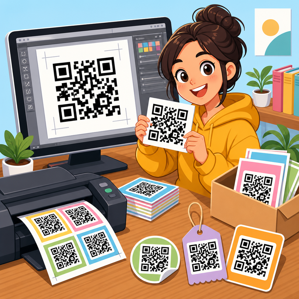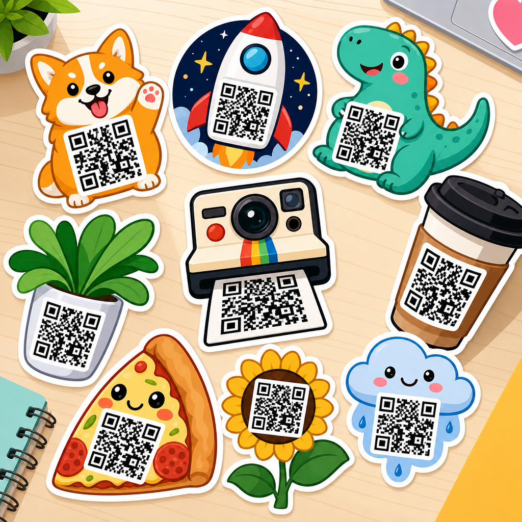
Best QR code sticker design examples show how a small printed square can become a high-performing bridge between physical spaces and digital actions. A QR code sticker is an adhesive label that combines a scannable matrix barcode with supporting design elements such as branding, color, shape, copy, iconography, and placement strategy. In practice, the best examples do more than look attractive. They scan quickly, explain what happens after the scan, fit the environment where they appear, and support a measurable business goal such as ordering, payments, reviews, registrations, authentication, or product education.
I have designed and audited QR campaigns for retail counters, event signage, packaging inserts, warehouse labels, and restaurant tables, and one pattern appears every time: success depends less on novelty than on disciplined design choices. A stylish sticker that scans poorly fails. A plain sticker with excellent contrast, clear instructions, and the right landing page often wins. That balance matters because people decide within seconds whether to trust, notice, and scan what is in front of them. If the sticker is confusing, badly placed, or visually noisy, the opportunity is lost.
For teams building a resource hub around QR code design examples, sticker design deserves special attention because stickers are flexible, low-cost, and easy to deploy across surfaces that traditional signage cannot reach. Businesses use them on windows, takeout bags, laptop lids, shelves, mirrors, equipment, helmets, product boxes, and vehicles. Unlike static printed URLs, QR stickers can connect users directly to mobile-first destinations with campaign tracking. Dynamic QR codes also allow marketers to change the destination later without replacing the sticker, which is crucial for menus, promotions, app installs, and seasonal offers.
Good QR code sticker design follows several non-negotiable rules. The code needs a quiet zone, strong contrast, sufficient print size, and error correction suited to the environment. The sticker should include a concise call to action, a trust signal such as a logo or domain, and a landing page aligned with user intent. Materials matter too. Laminated vinyl, weatherproof adhesives, tamper-evident stocks, and matte finishes can dramatically improve durability and scan reliability. When these fundamentals are in place, design examples become useful models rather than decorative inspiration.
What the best QR code sticker designs always include
The strongest QR code sticker designs share a core structure: a readable code, a clear promise, visible branding, and context-aware placement. Readability starts with technical setup. A QR code should maintain a clean quiet zone around all sides, avoid low-contrast color combinations, and be tested across multiple phones in both bright and dim conditions. I generally treat black on white as the benchmark and only deviate when brand colors still preserve strong luminance contrast. Rounded modules, gradients, and custom frames can work, but only after scan testing confirms they do not compromise recognition.
Clarity is the second requirement. People need to know why they should scan. “Scan to view menu,” “Scan for setup guide,” or “Tap into today’s discount” performs better than a bare code with no explanation. In client tests on retail shelf talkers, adding a six-word instruction consistently increased scans because it reduced uncertainty. The message should also match the destination. If the sticker says “scan for warranty,” the landing page should open directly to warranty registration, not a generic homepage that forces extra taps.
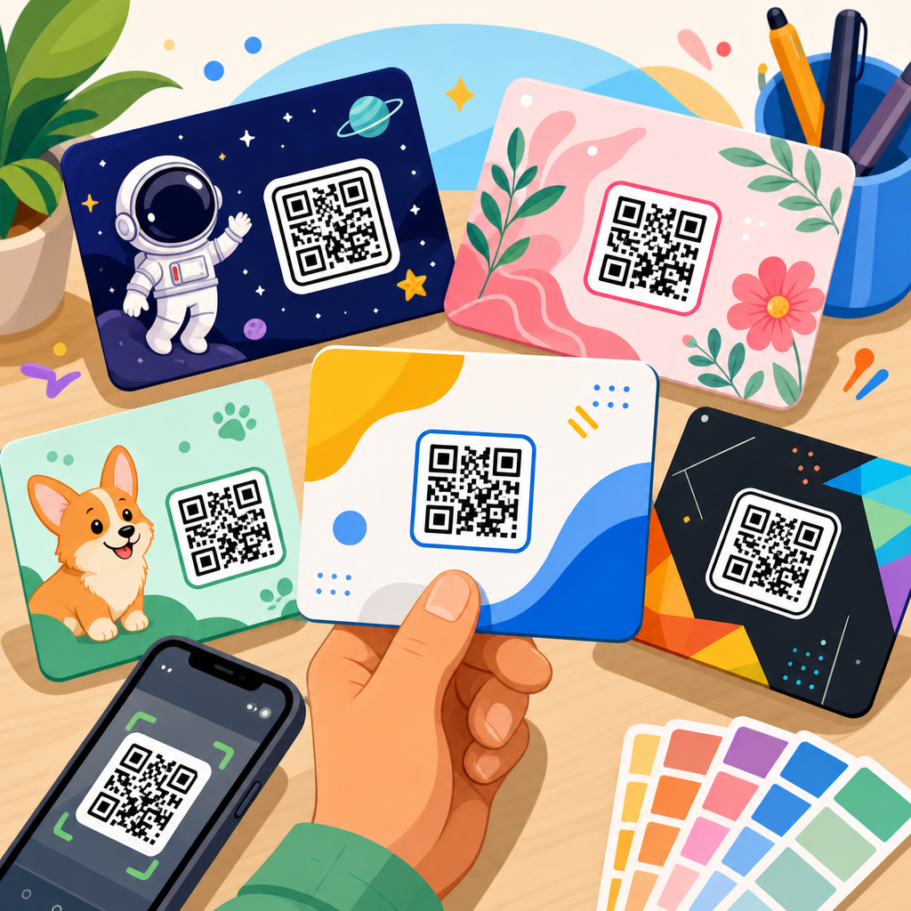
Branding builds trust. Adding a logo, short brand name, or recognizable visual system helps users feel safe scanning, especially in public places where QR phishing concerns are real. Branded frames from tools like QR Code Generator Pro, Bitly Codes, Beaconstac, or Flowcode can improve confidence when used carefully. The key is restraint. Oversized logos, busy backgrounds, or decorative borders often steal space from the code itself. The best examples integrate branding without weakening the primary function: fast, reliable scanning.
Placement and material complete the picture. A sticker designed for a refrigerated drink cooler needs moisture resistance and glare control. One designed for a bike share dock needs UV resistance and stronger adhesive. A sticker on a restaurant table should remain scannable from a seated angle and survive repeated cleaning with chemicals. These are not minor production details. They directly affect performance, maintenance cost, and customer experience.
Best QR code sticker design examples by use case
The most useful QR code design examples are grouped by job to be done. In restaurants, the best sticker designs use large codes, short commands, and a high-contrast frame that reads at arm’s length. A table tent sticker that says “Scan to order and pay” works because the user instantly understands the value. In salons and clinics, appointment rebooking stickers near checkout often pair a code with a plain-language benefit such as “Book your next visit in 30 seconds.” This reduces staff workload while serving a clear customer need.
Retail environments benefit from shelf-edge and packaging stickers. A cosmetics brand, for example, can place a QR sticker on shelf displays linking to shade-matching videos, ingredient explainers, and reviews. The best designs in this category use a compact code plus a benefit-led label like “See how it looks on skin tones.” For electronics, unboxing stickers can link to setup guides, firmware instructions, or accessory bundles. These examples work because they remove friction at a moment of high intent.
Events offer another strong category. Entry stickers can speed check-in by linking to mobile tickets, maps, and schedules. Booth stickers at trade shows often perform best when they answer a specific attendee question: “Scan for pricing,” “Scan for demo video,” or “Scan to compare models.” In museums and public spaces, interpretive stickers succeed when they are subtle but unmistakable, often using a short title, icon, and multilingual support. Here the sticker design must respect the environment while remaining discoverable.
Industrial and operational settings use QR stickers differently. Asset labels on equipment can link to maintenance logs, SOPs, safety checklists, or spare parts catalogs. In warehouses, durable polyester or anodized aluminum tags with QR labels improve traceability and reduce lookup time. The best designs in these environments prioritize rugged materials, simple black-and-white codes, and human-readable backup text. Beauty is secondary; accuracy and uptime are the real design goals.
Design patterns that improve scan rate and user trust
Several design patterns repeatedly improve QR sticker performance. First, surround the code with purpose, not clutter. A simple frame with directional wording draws the eye better than excessive decoration. Second, include a direct benefit statement. “Get care instructions” outperforms “Learn more” because it is specific. Third, present the destination as trustworthy. Showing a brand name, support URL, or secure action such as “official menu” reassures users who are wary of malicious codes.
Fourth, size the code for distance. A practical rule used in print production is that the scanning distance should be roughly ten times the code width. A 1-inch code suits close-range use; larger surfaces need proportionally larger codes. Fifth, protect the finish. Glossy lamination looks premium but can create reflections that interfere with scanning under spotlights or sunlight. Matte lamination usually performs better on windows, counters, and packaging exposed to bright light.
Sixth, plan the mobile journey beyond the scan. Many failed QR stickers are not print problems at all; they route users to slow, non-mobile pages. The best examples connect to a fast page with a single next step, analytics tags, and concise copy. Seventh, test under realistic conditions. I typically print sample stickers at final size, place them on the intended surface, and test with iPhone and Android devices using native camera apps. This catches issues that desktop previews miss, especially warped surfaces, glare, and viewing angles.
| Use case | Effective sticker design | Common mistake | Best material choice |
|---|---|---|---|
| Restaurant menu | Large code, “Scan to view menu,” matte finish | Tiny code under glossy laminate | Waterproof matte vinyl |
| Retail product education | Benefit-led label with branded frame | Sending users to homepage | Removable shelf-safe adhesive |
| Event check-in | High contrast, fast action wording, eye-level placement | Overdesigned code with weak contrast | Durable laminated vinyl |
| Equipment maintenance | Plain code, asset ID, backup text | Decorative styling that reduces readability | Industrial polyester or metal tag |
Color, shape, branding, and print production choices
Color customization is one of the most requested features in QR code sticker design examples, but it should be handled conservatively. Dark foreground on a light background remains the safest option. Navy on white, dark green on cream, or charcoal on pale gray can work well. Yellow on white, pastel gradients, metallic inks, and transparent backgrounds usually cause problems. If a brand palette is light, use that color in the sticker border or call-to-action text rather than in the code modules.
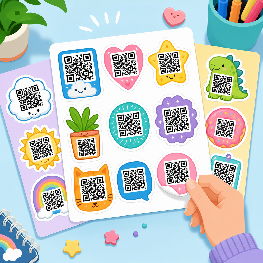
Shape can improve discoverability when applied to the sticker, not necessarily the code. Circular, die-cut, rounded-rectangle, and badge-style stickers help the asset feel intentional and on-brand. The code itself, however, should remain structurally conventional unless extensive testing proves otherwise. Some generators offer fancy dot patterns, logo cutouts, and artistic module styles. These are acceptable only when error correction, module spacing, and print fidelity remain strong. In my experience, decorative codes are best reserved for campaigns with controlled viewing conditions rather than harsh operational environments.
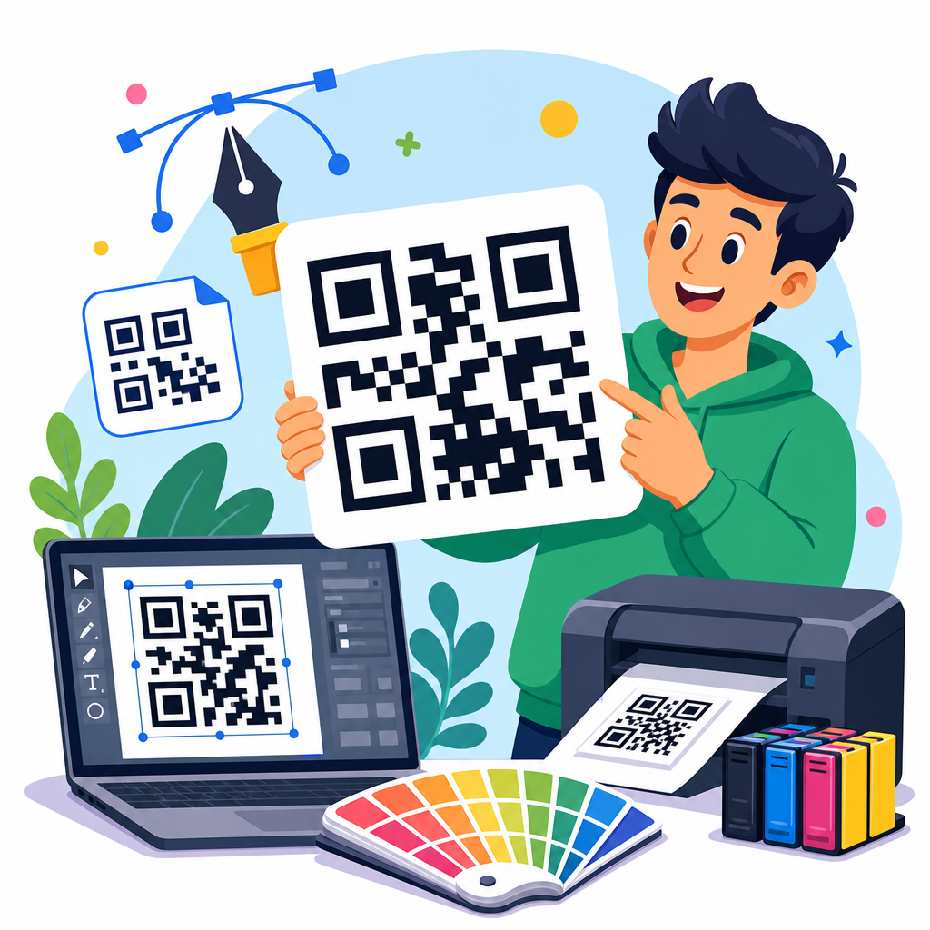
Print production decisions often separate average stickers from excellent ones. Vector export formats such as SVG or EPS preserve edge sharpness better than low-resolution raster images. Quiet zone trimming must be avoided during prepress. Adhesive choice should match the surface: removable for temporary windows, permanent for equipment, low-tack for painted walls, and freezer-grade for cold storage. Outdoor applications may require UV inks and weather-resistant overlaminates. If anti-tamper protection matters, destructible vinyl or void-label stock can reveal interference.
Measurement should be built in from the start. Dynamic QR codes paired with UTM parameters, first-party analytics, or platform reporting show which sticker placements actually work. A coffee chain can compare scans from storefront windows versus counter decals. A software company can track onboarding sticker scans by device packaging batch. Those insights inform future design iterations, proving that the best QR code sticker design examples are not just visually successful; they are operationally measurable.
How to build a QR code sticker design system that scales
A scalable approach starts with templates, not one-off artwork. Create a small set of approved sticker layouts for common intents: buy, book, learn, verify, review, and contact support. Standardize minimum code size, quiet zone, contrast rules, logo placement, and call-to-action length. This reduces production errors when multiple teams or franchise locations create stickers independently. It also preserves recognition across touchpoints, which is important when QR codes appear on packaging, in-store signage, and post-purchase materials.
Next, map each template to a destination standard. Ordering stickers should open to a streamlined menu or cart. Support stickers should land on a mobile help page with search, chat, or quick issue categories. Review stickers should prefill the appropriate platform where policy allows, without forcing sign-in loops or misleading incentives. Governance matters here. Teams need naming conventions, expiration rules for campaign destinations, and regular audits to prevent broken links or outdated promotions from lingering in the field.
This hub topic connects naturally to related subtopics such as QR code templates, dynamic versus static QR tools, packaging QR code ideas, restaurant QR implementation, event QR workflows, and QR analytics reporting. When building a library of examples, document what was designed, where it was placed, what materials were used, and how performance was measured. That operational detail turns a gallery into a true resource center.
The best QR code sticker design examples combine technical accuracy, persuasive messaging, durable materials, and a landing page that fulfills user intent immediately. That is why the strongest stickers look simple: every element has a job. The code must scan quickly. The copy must answer why to scan. The branding must reassure. The material must survive the environment. The destination must complete the task without friction.
Across restaurants, retail, events, packaging, and industrial operations, the same principles hold. Strong contrast beats decoration. Specific calls to action beat generic prompts. Matte finishes often beat gloss. Dynamic codes outperform static ones when destinations may change. Testing in real conditions beats assumptions made on a design mockup. When teams treat stickers as conversion tools rather than tiny posters, scan rate and customer satisfaction both improve.
If you are building your own QR Code Design Examples library under a broader QR Code Resources, Templates & Tools hub, start by collecting examples by use case, documenting print specs, and recording performance data. Then turn those findings into reusable sticker templates your team can deploy consistently. Audit every sticker before launch, test it on real devices, and keep refining based on scan analytics. Done well, a QR sticker is one of the simplest, cheapest, and most effective bridges between the physical world and digital action. Start with one high-intent use case, design it rigorously, and build your hub from proven examples.
Frequently Asked Questions
What makes a QR code sticker design truly effective?
An effective QR code sticker design does much more than display a scannable code. The best examples combine fast scan performance, visual clarity, strong branding, and a clear value proposition for the user. In other words, people should be able to notice the sticker quickly, understand what it is, know why they should scan it, and complete the scan without friction. That means the QR code itself needs enough contrast, proper sizing, and a quiet zone around it so phone cameras can read it reliably under real-world conditions.
Great QR code sticker designs also include supporting elements that remove uncertainty. A short call to action such as “Scan to view the menu,” “Scan for setup instructions,” or “Scan to claim your discount” tells users exactly what happens next. This matters because people are far more likely to scan when the outcome is obvious and useful. The strongest examples are also visually aligned with the brand through color, typography, icons, and logo placement, but never at the expense of usability. If a design looks stylish but scans poorly, it fails its primary purpose.
Placement strategy is another defining factor. A sticker on packaging, a storefront window, a product display, or a tabletop should be designed for the distance, lighting, and context in which it will be scanned. Effective designs are context-aware, meaning they fit naturally into the environment while still standing out enough to be noticed. When all of these pieces work together, the sticker becomes a high-performing bridge between a physical touchpoint and a digital action.
What are some of the best QR code sticker design examples for different business uses?
The best QR code sticker design examples are usually the ones tailored to a specific use case rather than built from a one-size-fits-all template. For restaurants and cafes, for example, a strong design often includes a clean code, a recognizable food or drink icon, and concise copy like “Scan for menu” or “Order here.” These stickers typically work best with bold contrast and simple layouts because customers may be scanning quickly while standing, waiting, or seated in low-light environments.
Retail businesses often use QR code stickers on shelves, windows, packaging, or product tags. In these cases, the best designs help shoppers move from in-store browsing to digital engagement. A window sticker might say “Scan to shop our full collection,” while a packaging sticker could offer “Scan for tutorials, care instructions, or warranty registration.” These examples perform well because they match the customer journey and provide immediate, relevant value at the moment of interaction.
For events, museums, offices, and real estate, the most effective examples usually emphasize simplicity and trust. Event stickers can direct attendees to schedules, maps, or check-in pages. Museum stickers can offer audio guides or exhibit details. Office stickers may link to guest Wi-Fi or visitor instructions. Real estate stickers often invite users to take virtual tours or view listings. In each case, the best designs clearly communicate the benefit, reflect the setting, and make scanning feel like a natural next step rather than an extra task.
How should a QR code sticker balance branding with scanability?
Balancing branding with scanability is one of the most important parts of successful QR code sticker design. A sticker should absolutely feel like an extension of the brand, but branding must support function rather than overpower it. The safest approach is to keep the QR code highly readable first, then introduce brand elements through surrounding layout choices such as background color, border shape, headline copy, iconography, and logo placement. This lets the design feel distinctive without interfering with the technical requirements of scanning.
Brands often want to customize the code itself using colors, embedded logos, or stylized modules, and that can work well when handled carefully. However, contrast is critical. A dark code on a light background is still the most dependable option, especially in varied lighting conditions. The code also needs enough clear space around it, and any logo placed inside the code should be small enough that error correction can compensate without reducing reliability. The more decorative the code becomes, the more important it is to test it thoroughly across different devices and camera qualities.
The best branded examples typically use restrained customization. Instead of trying to make the code overly artistic, they create a well-designed sticker around the code. A strong headline, a brand-consistent color palette, and a trustworthy visual style can do most of the branding work while preserving a fast, frustration-free scan experience. That balance is what separates polished, professional QR code stickers from designs that look impressive at first glance but underperform in practice.
Where should QR code stickers be placed for the best results?
Placement has a major impact on whether a QR code sticker gets noticed and scanned. Even an excellent design can fail if it is placed too high, too low, too far away, or in poor lighting. The best placement depends on user behavior in the specific environment. If people are standing and moving, such as in a store entrance or on a product display, the sticker should be at a comfortable eye or hand level and large enough to scan from a short distance. If the sticker is on a table, counter, or package, the design can be smaller because users will interact with it up close.
Good placement also considers the moment of intent. The best QR code sticker examples appear where the digital action makes immediate sense. On restaurant tables, people expect menu access. On packaging, they are open to product details, setup instructions, or support. On windows, they may want store hours, promotions, or browsing options outside business hours. In these situations, the sticker succeeds because it meets a need at exactly the right time. It is not just visible; it is relevant.
Environmental conditions matter too. Stickers placed outdoors need materials and finishes that can handle sun, moisture, and wear without reducing readability. Glossy surfaces can create glare, so matte finishes are often a better choice. Curved or uneven surfaces can distort a code, making flat placement preferable whenever possible. The highest-performing placements reduce physical obstacles, align with user intent, and make scanning feel effortless.
What should businesses avoid when designing QR code stickers?
Businesses should avoid treating QR code stickers as purely decorative pieces. The most common mistake is prioritizing style over function, such as using low-contrast color combinations, shrinking the code too much, removing the quiet zone, or placing the sticker on reflective or awkward surfaces. These decisions may seem minor during design, but they often lead to failed scans and lost engagement. If users have to try more than once, many simply give up.
Another major mistake is failing to explain the purpose of the scan. A QR code without context creates hesitation. People want to know what they will get before they scan, whether that is a menu, video, offer, registration page, instructions, or contact information. The best stickers remove ambiguity with short, direct language and often include a small supporting visual cue. Businesses should also avoid linking to poor mobile experiences. If the destination page is slow, confusing, or not optimized for phones, the sticker may drive traffic but still fail to convert.
It is also important not to ignore testing and maintenance. A QR code sticker should be tested across multiple phones, operating systems, and lighting conditions before mass printing or installation. If the code points to a campaign page, that page should remain active and current. Broken links, outdated offers, and expired landing pages damage trust and reduce the value of the sticker program. The best-performing QR code stickers are built with both design discipline and operational follow-through, ensuring they continue to work long after they are printed and placed.