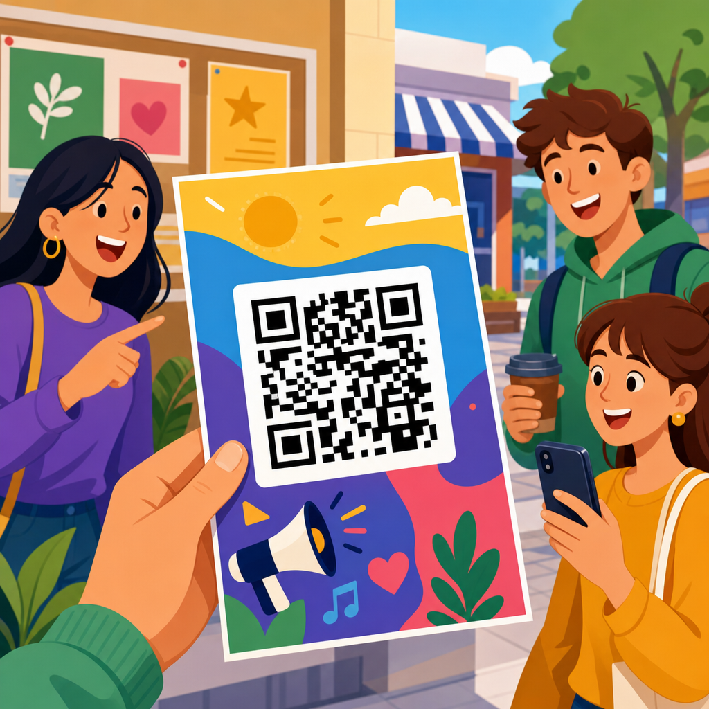
QR code flyer examples that drive engagement work because they connect printed attention to digital action in one scan. A flyer has only seconds to earn interest, so the QR code must do more than sit in a corner as decoration. It needs a clear purpose, a strong value exchange, and a design that makes scanning easy on any phone. In practical terms, that means pairing visual hierarchy, concise copy, and a destination that matches the user’s intent.
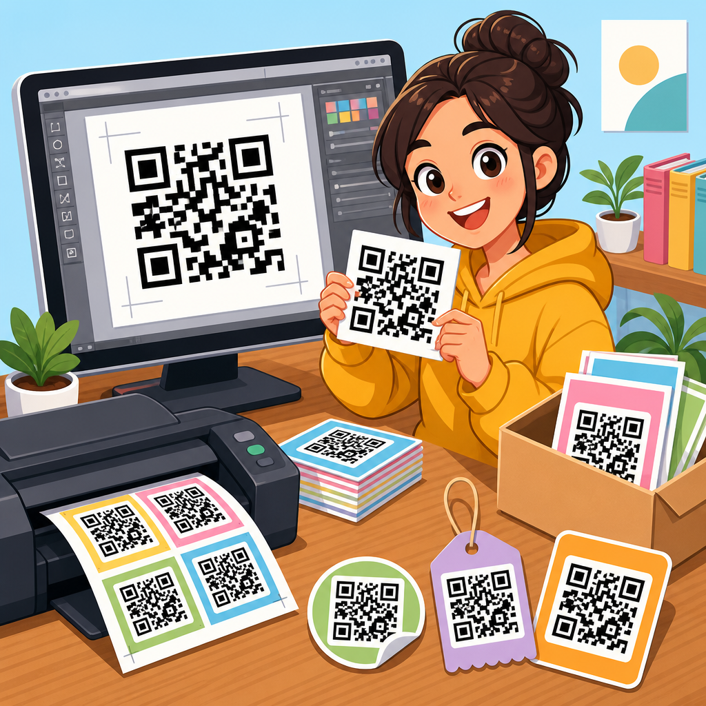
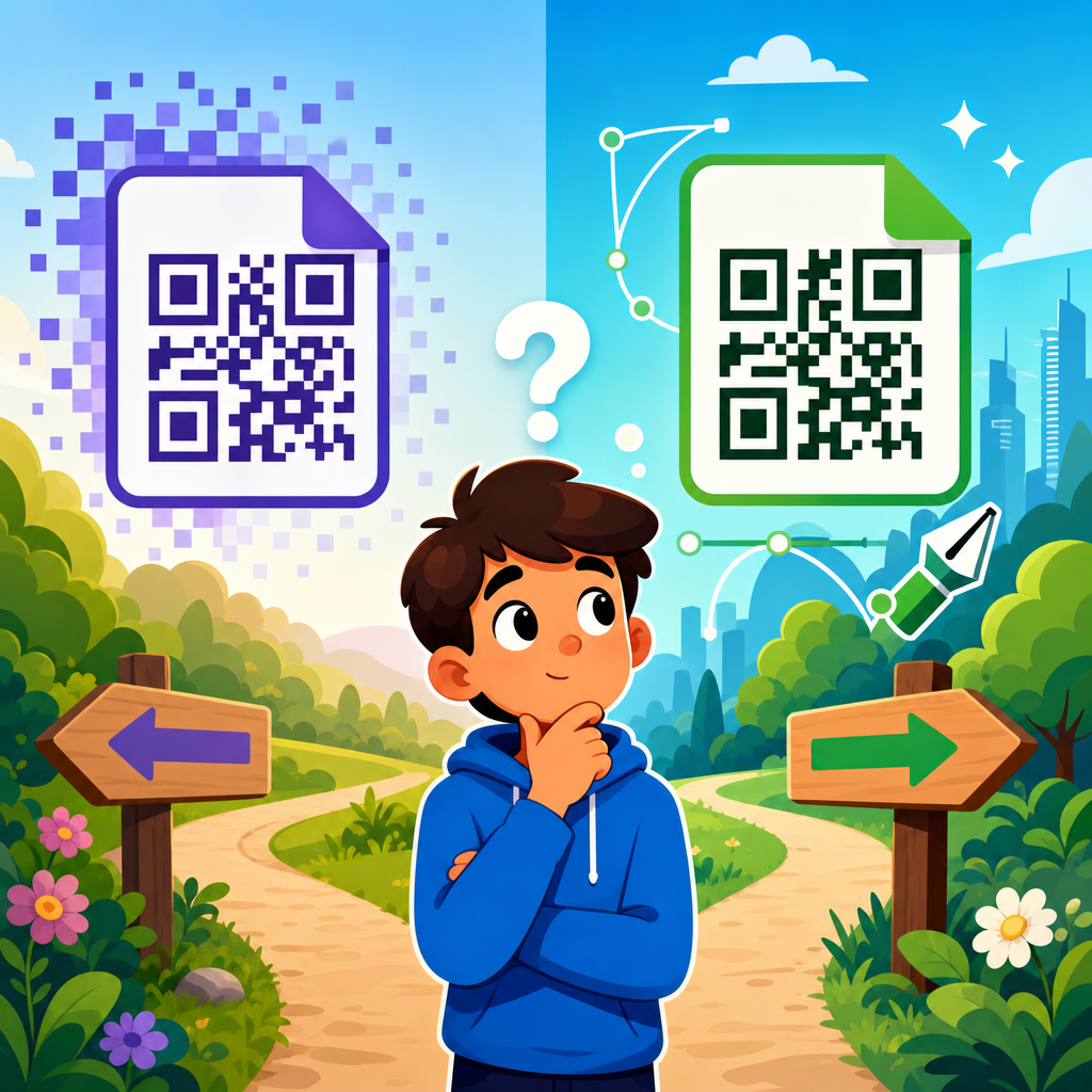
When marketers talk about QR code flyer design, they usually mean the combination of layout, call to action, scanability, branding, and landing page fit. Dynamic QR codes are especially useful because they let teams change the destination without reprinting the flyer, track scans by time and location, and run A/B tests across campaigns. Static QR codes still have a place for permanent information, but most engagement-focused flyers benefit from dynamic management and analytics. I have used both in retail, events, and local service campaigns, and the difference is usually not the code itself but the thinking around the offer behind it.
This matters because flyers remain inexpensive, local, and versatile, while smartphones have made scanning routine. Restaurants use flyers to push menu views and loyalty signups. Real estate agents use them for virtual tours. Gyms use them for free-pass offers. Schools use them for registration forms. In each case, the flyer succeeds when the next step is obvious and friction is low. The best QR code flyer examples are not flashy first; they are useful first, then visually polished. That is the standard this guide uses as a hub for QR code design examples across industries and use cases.
A high-performing flyer answers four questions immediately: What is this? Why should I care? What happens if I scan? Can I trust it? If any of those answers are weak, engagement drops. Good flyer design therefore combines direct messaging, brand consistency, proper QR code sizing, contrast, error correction, and mobile-friendly landing pages. ISO/IEC 18004 governs QR code symbology, but in day-to-day campaign work, the practical rules are simpler: preserve the quiet zone, avoid distortion, test under realistic lighting, and never sacrifice readability for decoration. Those basics create the foundation for every example that follows.
What Makes a QR Code Flyer Convert
A QR code flyer converts when the printed message and the digital outcome feel like one continuous experience. The headline must name the benefit, not just the business. “Scan for 20% off your first class” will outperform “Welcome to our studio” on a gym flyer because it tells people exactly what they gain. The subheadline should reduce uncertainty by explaining the result of scanning, such as booking a tour, viewing a menu, claiming a coupon, or downloading an event schedule. This is where most weak flyers fail: they ask for a scan without stating the reward.
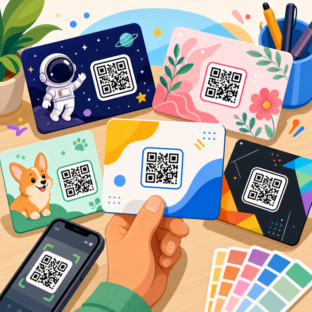
Placement also matters. In testing, I have seen middle-lower placement outperform tiny bottom-corner codes because users visually complete the headline and offer before taking action. A QR code should be large enough to scan from the intended distance. For handouts, around 0.8 to 1.2 inches square is often workable, while posters and window flyers need larger sizes. Contrast should be high, ideally dark code on a light background. Branded colors can work, but low-contrast combinations such as pastel-on-white routinely reduce scan success.
The landing page must match the promise on the flyer exactly. If the flyer says “Scan to book a free estimate,” the code should open a booking page, not a generic homepage. This message match improves conversion and makes tracking meaningful. Use UTM parameters with analytics platforms such as Google Analytics 4, and connect scan data from your QR platform to downstream actions like form submissions, coupon redemptions, or calls. Engagement is not just scans. It is scans that become measurable business outcomes.
QR Code Flyer Design Examples by Goal
The most useful way to review QR code flyer examples is by campaign goal. A restaurant flyer often aims for menu views, reservations, or coupon claims. A service business may want estimate requests. An event flyer may prioritize ticket sales or schedule downloads. In every case, the layout should center one primary action. Too many flyers attempt to drive to Instagram, YouTube, a booking page, a PDF, and a review site at once. That creates decision fatigue. One flyer, one main conversion goal, one supporting secondary path at most.
For lead generation, a strong example is a home services flyer that offers “Scan for a same-day quote” with the code placed beside a photo of the finished result, not the service crew. People respond to outcomes. For retail, one of the best-performing patterns is “Scan to unlock today’s in-store deal,” especially when paired with a deadline. For education, a school enrollment flyer can work well with “Scan to register for the parent information session” because it asks for a lower-commitment step before a full application. For nonprofit outreach, “Scan to see how your donation helps locally” works when the landing page contains a brief impact story and a clean donation form.
Design examples also differ by traffic source. Door-drop flyers can be more offer-driven because they interrupt the household routine. In-store flyers can focus on utility, such as product details, assembly instructions, or loyalty rewards. Event handouts should prioritize speed: large code, short CTA, no clutter. Real estate flyers benefit from rich media, including short-form property videos, 3D tours, and neighborhood maps. The code on a property sheet should never lead to a desktop-only listing page; that remains one of the most common and costly errors.
Industry Examples That Consistently Drive Engagement
Across industries, the strongest QR code flyer design examples share the same structure: clear benefit, prominent code, trust signal, and mobile-optimized destination. The details change by audience. A cafe flyer near an office building might feature “Scan to preorder lunch and skip the line,” backed by a photo of the most popular combo meal and a pickup time note. A fitness studio flyer distributed in apartment lobbies might use “Scan for a free first class” and include class types so the offer feels specific, not generic.
Healthcare and dental offices often see better response when flyers emphasize convenience rather than promotion. “Scan to book your annual cleaning” or “Scan to complete new patient forms before your visit” reduces friction and reassures users about what comes next. In local government or community services, flyers for recycling schedules, permit applications, or event calendars perform best when the code is framed as a time-saver. People scan when they expect immediate utility. They ignore codes that feel vague or promotional without context.
B2B examples deserve attention too. Trade show flyers can drive post-event engagement with “Scan for the case study and pricing sheet,” which is often stronger than asking for a meeting on the spot. Recruitment flyers for warehouses, retail chains, and hospitality employers work when the code leads to a short mobile application, not a corporate career portal with ten filters and multiple redirects. In short, engagement rises when the QR code flyer respects the environment, the audience’s patience, and the exact job the flyer needs to do.
Core Design Rules for Scanability and Trust
Good QR code flyer design is constrained by physics, phone cameras, and user skepticism. A code needs a proper quiet zone, usually four modules around the symbol, so scanners can distinguish it from surrounding elements. Error correction levels matter when logos are embedded or when the flyer may be damaged; higher correction can preserve readability, but it also increases code density. Dense codes become harder to scan at small sizes, so shorten URLs or use dynamic codes to keep the pattern simpler.
Trust signals are equally important. Add a plain-language CTA near the code, and if helpful, show the destination domain in text. This reduces hesitation, especially among older audiences or in professional settings. Avoid placing QR codes over busy photography, metallic inks, folded edges, or glossy areas that catch glare. I also recommend testing with both iPhone and Android cameras, because edge cases still appear with low light, older devices, and customized color palettes.
| Flyer element | Best practice | Why it improves engagement |
|---|---|---|
| Headline | State the benefit in 6 to 10 words | Users understand the value before deciding to scan |
| QR code size | Match size to viewing distance and format | Larger, easier codes reduce failed scans |
| CTA text | Use action plus outcome | “Scan to book” beats “Scan me” because it is specific |
| Contrast | Dark on light with clear quiet zone | Improves camera recognition in varied lighting |
| Landing page | Send directly to the promised action | Message match increases conversion after the scan |
| Tracking | Use dynamic codes and campaign tags | Shows which flyer versions produce real results |
Accessibility should be part of the design process, not an afterthought. Use readable type sizes, concise instructions, and enough white space for users with visual processing challenges. If the flyer is important for public access, include a short fallback URL beneath the code. That will not replace the QR experience for most users, but it protects usability when scanning is inconvenient or impossible.
Building the Landing Experience Behind the Flyer
The flyer gets the scan, but the landing page closes the action. This is why many campaigns with attractive QR code flyers still underperform. The destination is too slow, too generic, or too demanding. Keep the page tightly aligned with the flyer. If the flyer promotes a coupon, show the coupon immediately. If it offers a property tour, open the tour or the lead form for scheduling it. If it advertises an event, surface date, location, and ticket button above the fold.
Mobile performance is nonnegotiable. Compress images, avoid intrusive pop-ups, and minimize form fields. A local service flyer asking for name, email, phone, address, service type, preferred time, and budget will lose users. Start with the minimum information needed to continue the conversation. Platforms such as Unbounce, Instapage, HubSpot, and native QR landing page builders can work well if they are configured for speed and message match. Google PageSpeed Insights and Lighthouse remain practical tools for checking whether the page is likely to frustrate visitors.
Think carefully about proof and reassurance. If the flyer asks for a purchase, quote request, or booking, the landing page should include reviews, credentials, examples, or guarantees near the action area. For example, a plumbing flyer can improve lead quality by pairing the booking CTA with “licensed and insured” and a short response-time promise. The scan is an expression of intent. The page should reward that intent quickly.
Measurement, Testing, and Hub-Level Content Strategy
To improve QR code flyer performance over time, measure beyond top-line scans. Track unique scans, repeat scans, bounce rate, form completion, coupon redemption, calls, revenue, and assisted conversions. Segment by distribution channel: handout, direct mail, in-store display, packaging insert, or community board. I have seen the same design produce very different outcomes depending on context. A flyer near a point of decision, such as a store shelf or event entrance, usually beats the same flyer delivered cold.
Testing should focus on variables with real influence: offer wording, CTA phrasing, code placement, headline specificity, and landing page destination. Do not test five things at once if the volume is low. Run controlled versions and keep a change log. Tools such as Bitly, Beaconstac, QR Code Generator, Flowcode, and analytics dashboards inside CRM platforms can provide useful attribution, though no tool substitutes for disciplined campaign structure. Naming conventions matter more than people expect.
As a hub page under QR Code Resources, Templates and Tools, this topic should also connect readers to deeper content: restaurant QR flyer templates, real estate flyer examples, event poster QR design, QR code sizing guidelines, dynamic versus static QR codes, and QR landing page optimization. That structure helps users move from inspiration to implementation. It also reflects how teams actually work. First they need examples. Then they need templates, technical standards, and testing methods. A useful hub anticipates that progression and makes the next step obvious.
QR code flyer examples that drive engagement are built on clarity, utility, and follow-through. The flyer must present one compelling action, make scanning effortless, and send users to a destination that fulfills the promise immediately. Across restaurants, retail, events, real estate, education, healthcare, and local services, the winning pattern stays consistent: benefit-led headline, strong call to action, readable code, trustworthy presentation, and mobile-first landing page. When those pieces align, printed marketing becomes measurable, adaptable, and far more effective than a static handout.
The biggest mistake is treating the QR code as the strategy. It is only the bridge. Engagement comes from the offer, the context, and the experience after the scan. That is why design choices such as contrast, placement, code size, and quiet zone matter just as much as analytics, page speed, and conversion flow. Small improvements in any of these areas can produce meaningful gains in scan rate and downstream results, especially for local campaigns where every lead or visit has visible value.
Use this hub as your starting point for QR code design examples, then move into the template and technical guides that fit your use case. Review your current flyers against the principles here, test one stronger CTA, and connect the code to a page built for mobile conversion. If you make the next step obvious and useful, people will scan, engage, and act.
Frequently Asked Questions
What makes a QR code flyer actually drive engagement instead of being ignored?
A QR code flyer drives engagement when the code is tied to a specific user benefit, not just added as a visual extra. People scan when they immediately understand what they will get in return, such as a discount, event registration, product demo, menu, giveaway entry, portfolio, or short how-to video. The strongest QR code flyer examples make that value obvious in the headline, supporting copy, and call to action. Instead of showing a generic code with no context, they say something direct like “Scan to claim 15% off,” “Scan to see available units,” or “Scan to watch the full demo.” That kind of clarity reduces hesitation and gives the scan a purpose.
Design also plays a major role. The flyer should guide attention in a clear order: headline first, offer second, QR code third, and action prompt fourth. If the code is too small, buried in clutter, or placed in a low-contrast area, people may notice it but still not scan it. Good flyer design supports quick decision-making by using concise copy, strong spacing, visible contrast, and a code large enough to scan easily at normal viewing distance. The landing experience matters just as much. If the flyer promises one thing and the destination delivers something else, engagement drops fast. The best-performing QR code flyers create a seamless path from printed message to digital action, with no confusion between the initial promise and the destination page.
Where should the QR code be placed on a flyer for the best scan rate?
The best placement depends on the flyer format and reading flow, but in most cases the QR code should appear where it is easy to find after the main value proposition has been understood. A common mistake is placing the code in a corner with little visual support, as if its presence alone will do the work. In reality, people usually scan after they have read enough to decide the offer is worth their time. That means the code should sit near the primary call to action, often in the middle-lower or right-lower area of the layout, where it feels like the next logical step rather than an isolated graphic element.
Visibility is more important than novelty. The code needs breathing room, high contrast, and enough size to scan comfortably from a realistic distance. If the flyer will be viewed on a bulletin board, storefront window, trade show table, or handed out in person, placement should reflect that context. For example, a poster-style flyer viewed while standing should use a larger code and stronger CTA placement than a postcard-sized handout. It is also smart to avoid putting the code too close to folds, edges, glossy glare zones, or busy imagery that can interfere with scanning. The highest-engagement flyer examples treat the QR code as a key conversion element and design around it intentionally, rather than tucking it into leftover space.
What should a QR code on a flyer link to in order to increase conversions?
The destination should match the exact intent created by the flyer. If the flyer promotes a sale, the QR code should lead directly to the sale page. If it advertises an event, it should open registration details immediately. If it teases a restaurant special, it should go to the menu or ordering page, not the homepage. One of the biggest reasons flyer scans fail to convert is that users are forced to search after scanning. Every extra click, delay, or mismatch weakens momentum. Strong QR code flyer examples succeed because the scan feels like a continuation of the message, not the start of a scavenger hunt.
High-converting destinations are typically mobile-first, fast-loading, and built around one primary action. That could be booking, buying, signing up, watching, calling, downloading, or redeeming. It also helps when the page mirrors the flyer’s wording, offer, and visual tone so users know they landed in the right place. Depending on the campaign, useful destinations include landing pages, coupon pages, lead forms, digital brochures, app download screens, social proof pages, maps, menus, product comparison pages, or exclusive content hubs. The core principle is relevance. The best destination is not the one with the most information; it is the one that completes the promise made on the flyer with the fewest possible steps.
How can you design a QR code flyer so it is easy to scan on any phone?
Scanability starts with technical basics. The QR code needs to be high resolution, printed clearly, and large enough for the environment where the flyer will be seen. A tiny code may work on a desk handout but fail on a wall poster. Contrast is equally important. Dark code on a light background is usually the safest choice, while low-contrast color combinations, heavy textures, or image overlays can create scanning issues. There should also be enough quiet space around the code so phone cameras can isolate it quickly. Even attractive branding choices should never compromise the code’s readability.
Usability goes beyond the code itself. The flyer should tell people exactly what to do and why. A short instruction like “Scan with your phone camera” can help less tech-comfortable audiences, while a strong CTA explains the benefit of scanning. Testing is essential. Marketers should test the printed flyer under real conditions, including different lighting, angles, distances, and phone models. It is also wise to use a short, mobile-optimized destination URL behind the code and confirm that the landing page loads quickly on cellular data. The most effective flyer examples combine good print production, smart layout, and a frictionless mobile destination so the user can move from interest to action in seconds.
How do you measure whether a QR code flyer campaign is performing well?
Performance should be measured across the full journey, not just by counting scans. A high scan total may look promising, but it does not always mean the flyer is driving meaningful engagement. The more useful metrics depend on the campaign goal. For lead generation, that might be form completions, booked consultations, or email sign-ups. For retail, it could be coupon redemptions, add-to-cart activity, or completed purchases. For events, registrations and attendance matter more than raw scan volume. The best way to evaluate performance is to define the primary conversion before printing the flyer, then build tracking around that specific action.
Using dynamic QR codes, campaign-specific landing pages, analytics tags, and conversion tracking makes it easier to connect offline distribution to digital outcomes. It is also helpful to compare variations in offer, headline, CTA, placement, and destination page. For example, one flyer might say “Scan to save 20% today,” while another says “Scan to unlock your exclusive offer.” Testing those differences can reveal what motivates the audience most. Marketers should also consider context-based insights such as where flyers were placed, what time period performed best, and whether certain locations drove stronger conversion quality. The strongest QR code flyer strategies are iterative. They treat each campaign as a source of behavioral data, then use that insight to improve future flyer design, messaging, and landing page alignment.