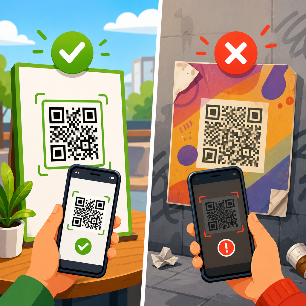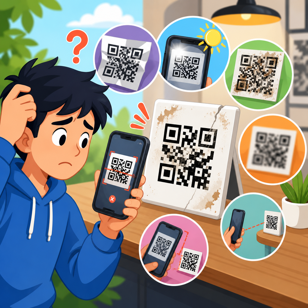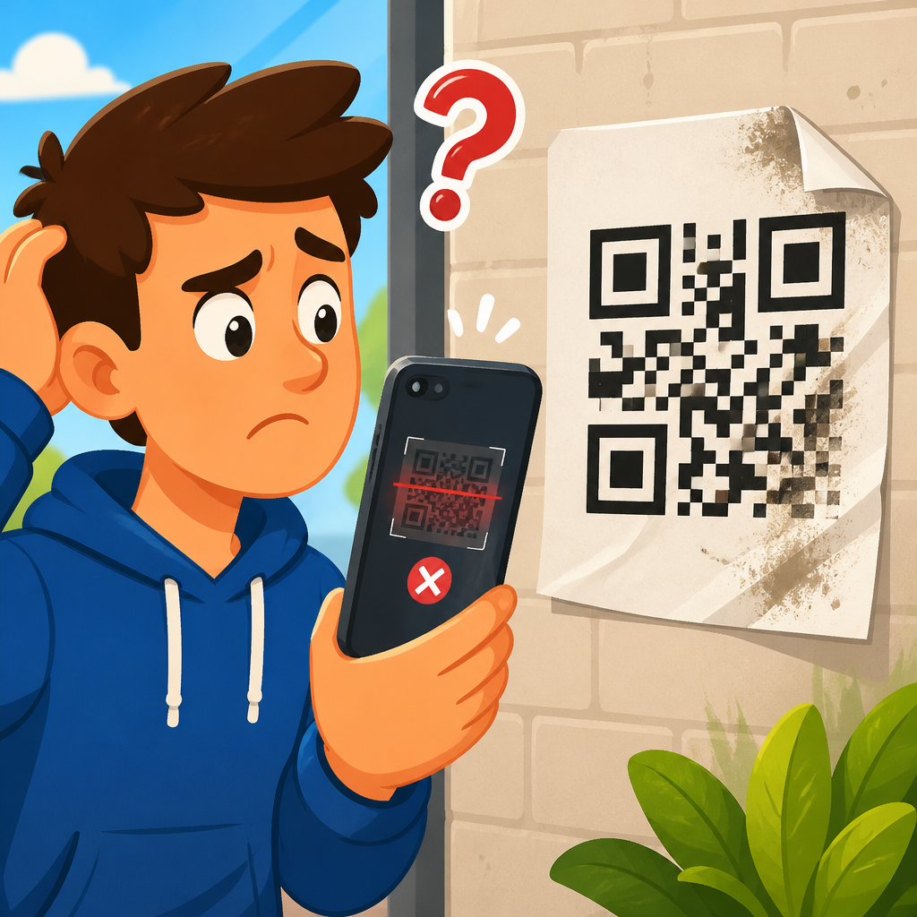
Printed QR codes fail for predictable physical reasons: poor contrast, distorted geometry, inadequate quiet zone, low print resolution, unsuitable materials, and bad placement. In QR Code Troubleshooting & Support, printing mistakes deserve their own hub because a code that works perfectly on screen can become unreadable the moment ink, paper, laminate, or packaging changes its optical properties. I have tested codes on flyers, corrugated boxes, menus, labels, direct-mail pieces, and retail displays, and the pattern is consistent: most scan failures are not caused by the QR generator, but by production decisions made after the code file is approved.
A printed QR code is a machine-readable matrix barcode made of square modules arranged on a grid, with finder patterns in three corners and timing patterns that help a scanner detect orientation and scale. A scanner, whether inside a smartphone camera app or a dedicated handheld imager, must separate dark modules from light background, locate the code boundary, estimate perspective, and decode the payload with error correction. When printing undermines any of those steps, the code appears “broken” even though the underlying data is fine. That matters because failed scans waste paid media, reduce conversions, frustrate customers, and can derail operational workflows such as ticketing, inventory handling, table ordering, authentication, or warranty registration.
This hub explains why printed QR codes don’t scan by focusing on printing mistakes from design proof through final placement. It covers the most common failure points, gives practical thresholds, and helps you decide whether the fix belongs with the designer, print provider, packaging engineer, or marketer. If you need a quick diagnostic, start with four questions: Is the code large enough for the intended distance? Does it have a clean white quiet zone at least four modules wide? Is the contrast genuinely high under real lighting? Has any printing or finishing process warped, blurred, obscured, or stylized the module grid? Answer those honestly and you will solve a large share of print-related scan issues before the job reaches customers.
Size, distance, and the myth that any QR code can be shrunk
The most common print mistake is making the QR code too small for the expected scanning distance. A phone camera does not decode based on the code’s absolute dimensions alone; it needs enough camera pixels per module to distinguish the grid cleanly. In practice, tiny codes on shelf tags, bottle neck labels, business cards with dense URLs, or posters meant to be scanned from several feet away often fail because the module size becomes microscopic. As a rule, minimum print size should be based on both data density and use case. A simple URL encoded in a low version can work at around 0.8 to 1 inch square in favorable conditions, but that is not a universal safe size.
A reliable field guideline is the 10:1 scan-distance ratio: for every 10 units of viewing distance, provide at least 1 unit of code width. If people will scan from 20 inches away, aim for roughly a 2-inch code. If the code sits on a transit shelter and users scan from 6 feet away, it must be dramatically larger. This is especially important when the code encodes long links, UTM parameters, vCards, or Wi-Fi credentials, because more data increases symbol version and shrinks individual modules. In production reviews, I often see teams approve a code by printing it on office paper and scanning it from a desk, then place that same tiny code on packaging where consumers scan one-handed under store lighting. The context changed; the code size did not.
Resizing errors also happen during layout. Designers may scale a placed vector code non-uniformly, crop too close, or export it inside a raster composition at 150 dpi. Any of those choices reduce module clarity. For packaging, labels, and signage, a vector source such as SVG, EPS, or press-ready PDF is safer than a raster PNG, because vectors preserve edge sharpness regardless of scale. If raster is unavoidable, use high resolution at final size, not after enlargement. A blurred or anti-aliased edge can turn a crisp module boundary into a fuzzy transition that a scanner struggles to threshold correctly.
Contrast, color, and lighting: why stylish codes often fail
For dependable scanning, dark modules on a light, matte background remain the standard. Cameras decode contrast, not brand intent. Many printed QR codes fail because the designer uses low-contrast combinations such as mid-blue on black, pale gray on white, metallic silver on cream, or a photographic background behind the symbol. Some combinations appear readable to the human eye but collapse under auto-exposure, motion blur, or low light. Smartphone cameras frequently convert the live preview into luminance values before decoding, so the critical question is not whether the colors feel different, but whether their brightness values separate clearly.
Reverse codes, with light modules on a dark background, can work in some cases, but they are less forgiving in print because highlights bloom and dark fields show scuffs, glare, and ink spread. Brand gradients are riskier still. I have seen restaurant table tents use deep green modules fading into lighter green to match visual identity; the code passed one designer’s phone test near a window, then failed under warm indoor lighting at dinner service. The same principle affects colored stock and kraft packaging. Unbleached paper lowers background reflectance, while textured or recycled material introduces visual noise that competes with the module grid.
Gloss coatings and laminates create another hidden contrast problem: specular reflection. Under direct overhead lights, a glossy surface can blow out parts of the code into bright hotspots. The code has enough nominal contrast in the file, but the camera sees glare instead. This is common on laminated menus, product pouches, cosmetic cartons, and window decals. Matte varnish over the code area, or a dedicated uncoated label zone, usually fixes it. If glossy finishing is non-negotiable, test the code at multiple angles and with several phone models, because some cameras handle reflections better than others.
Quiet zone, placement, and surrounding graphics that confuse scanners
The quiet zone is the blank margin around the QR code, and it is not optional decoration space. ISO/IEC 18004 specifies a four-module quiet zone around the symbol, and in real print conditions I often recommend preserving even more, especially on textured substrates or busy layouts. When logos, border lines, background patterns, cut lines, coupon frames, or tiny legal copy intrude into that margin, scanners can misidentify the code boundary or waste processing time on false edges. The code may scan on a high-end phone after several attempts, but that is still a production failure.
Placement matters just as much as margin. Codes printed too close to folds, seams, perforations, bottle curves, can edges, zipper pouches, shrink sleeves, or corrugation ridges become geometrically distorted. A scanner expects square modules aligned on a regular plane. Wrap a code around a tight cylinder and the module widths vary across the visible face. Place it over a package corner and the camera must solve an avoidable perspective problem. Put it near a tear strip or tamper seal and the code may be partially destroyed at first use. Good placement keeps the symbol on the flattest, cleanest, least reflective surface available and away from functional package features that alter shape or visibility.
Real-world examples make this clear. On a mailer, the safest location is usually a flat panel with generous white space, not a flap edge. On a shipping carton, avoid areas likely to be scuffed by conveyors or covered by warehouse labels. On a menu, keep the code away from the spine where curvature increases. On apparel hangtags, leave space so hole punches and string attachments never intersect the quiet zone. A QR code should be treated like a barcode with stricter environmental needs, not like a decorative stamp that can be tucked into leftover layout space.
Resolution, dot gain, and press behavior: what changes between file and paper
Even when the artwork is correct, press conditions can break a QR code. Offset, flexographic, digital toner, direct thermal, thermal transfer, inkjet, and screen printing all reproduce edges differently. Dot gain, sometimes called tone value increase, makes printed dark areas grow beyond their intended boundaries. In QR codes, that growth can close tiny white gaps, thicken timing patterns, and deform alignment features. On absorbent paper stocks and porous corrugated surfaces, ink spread is more pronounced. On flexo labels, plate pressure and anilox selection can exaggerate edge gain. On thermal labels, heat settings can over-darken the symbol and fuse adjacent modules.
Resolution also determines whether small modules stay distinct. A code rendered from a low-resolution screenshot may look square on screen yet print with stair-stepped edges and merged details. This is why original artwork should come from the generator as vector or from a high-resolution export matched to final print size. Prepress teams should avoid resampling, compression artifacts, and transparency effects that rasterize the code unexpectedly. If the workflow uses Adobe Illustrator, InDesign, or Acrobat, inspect the output in overprint preview and final separations. If the code enters a variable data print stream, confirm that the RIP preserves sharp edges for every record, not just the sample proof.
The table below summarizes how common print issues translate into scanning failures and what typically fixes them.
| Printing issue | What the scanner sees | Typical fix |
|---|---|---|
| Code printed too small | Modules lack enough pixels to separate cleanly | Increase final size and reduce encoded data if possible |
| Insufficient quiet zone | Boundary blends into nearby text or graphics | Maintain at least four modules of clear margin |
| Low contrast colors | Dark and light areas collapse into similar luminance | Use dark-on-light combinations with strong brightness difference |
| Gloss or laminate glare | Bright reflections wash out parts of the symbol | Use matte finish or uncoated scan window |
| Ink spread or dot gain | White gaps close and module geometry deforms | Increase module size and calibrate press settings |
| Curved or folded placement | Grid becomes warped or perspective is extreme | Move code to a flat panel away from edges and seams |
| Raster enlargement | Edges blur or pixelate after scaling | Place vector artwork or regenerate at final size |
| Damage from handling | Key patterns are obscured, scratched, or torn | Relocate and protect the code with durable materials |
Materials, finishes, and environmental wear
Substrate choice can turn a compliant design into a field failure. Uncoated paper fibers feather edges. Recycled stock can include speckling that competes with small modules. Corrugated cardboard introduces ridges and valleys that break optical consistency. Transparent labels on glass may reveal the product behind them, reducing background uniformity. Metallic films reflect light unpredictably. Fabric tags flex and wrinkle. Outdoor signage fades under UV exposure. Every material changes how the code appears to the camera over time, not just on day one.
Durability matters most when the code must survive handling, moisture, abrasion, chemicals, refrigeration, or sunlight. Warehouse labels get scraped. Return labels crease. Plant tags get wet. Event wristbands twist. Takeout packaging absorbs oil and steam. In these cases, the issue is not merely print quality but lifecycle readability. A QR code that scans in the print room but fails after three days in transit is still a printing problem because substrate and finish were part of the specification. Choosing synthetic labels, protective topcoats, UV-stable inks, or larger symbols often solves failures that teams mistakenly attribute to phone compatibility.
Another overlooked factor is contamination. Fingerprints, dust, condensation, frost, and shrink-wrap wrinkles can all obstruct scanning. On refrigerated beverages, for example, condensation droplets act like miniature lenses and reflective points over the code area. On frozen packaging, frost can erase contrast entirely. The practical response is to reserve a protected scan zone, avoid placing codes where hands naturally grip the item, and test after environmental conditioning, not just immediately after print.
Proofing, testing, and workflow controls that prevent reprints
The most effective way to prevent print-related scan failures is a disciplined proofing process. Test with final materials, final finishes, final size, and realistic lighting. Scan with both iPhone and Android devices, because camera hardware and decoding software differ. Check at the intended distance, with average users, not only trained staff. If the code leads to a landing page, test network speed and page rendering too; people often interpret a slow page as a failed scan. For regulated or operational uses, keep a record of the symbol source, encoded payload, size, substrate, printer, and test results. That audit trail makes troubleshooting faster when a field issue appears.
Good workflow also means controlling the data itself. Dynamic short URLs usually create less dense symbols than long static links loaded with parameters. Error correction should be chosen for actual risk, not maximized blindly. Higher error correction can improve resilience to small logo cutouts or minor damage, but it also increases density and may force a larger print size. This tradeoff should be evaluated before artwork approval. In campaigns, I routinely recommend generating the cleanest possible destination URL, setting the symbol in vector format, preserving generous quiet zone, and writing explicit production notes such as “do not rasterize,” “no varnish over code,” and “maintain minimum size at final trim.”
This printing mistakes hub should guide every related support article you create next: minimum QR code size charts, glossy versus matte finishes, QR codes on curved surfaces, packaging and label placement, low-contrast color failures, thermal printer issues, and prepress checklist templates. The core lesson is simple. Printed QR codes do not scan because physical production changes the symbol in ways cameras cannot forgive. Protect contrast, preserve geometry, respect quiet zone, match size to distance, and test on the real substrate before full production. If you manage those variables, scan rates improve, waste falls, and customers reach the intended destination on the first try. Review your current printed codes, document the weak points, and fix the highest-risk jobs before the next reprint.
Frequently Asked Questions
Why does a QR code scan on a screen but fail after it is printed?
A QR code can work perfectly on a phone or computer display and still become unreadable once it is printed because printing changes the code’s physical and optical characteristics. On-screen, the code is usually shown with strong contrast, sharp square modules, and a clean background. In print, those same modules can soften, spread, fade, or break apart depending on the printer, ink, paper coating, laminate, and finishing process. Even slight dot gain, where ink expands beyond its intended edges, can distort the geometry enough to make scanning less reliable.
Another common issue is that printed pieces introduce real-world variables that screens do not. Curved packaging, textured cardboard, glossy labels, folded mailers, and low-quality stock can all reduce readability. Light reflection can wash out dark areas, while absorbent materials can reduce edge definition. If the code is placed across a crease, seam, or corrugation, scanners may struggle to detect its alignment patterns correctly. That is why a QR code should always be tested in its final printed form, on the actual material, at the actual size, and under realistic lighting conditions rather than approved only from a digital proof.
What print design mistakes most often make QR codes unreadable?
The most frequent printing mistakes are poor contrast, distorted shape, missing quiet zone, and insufficient resolution. QR codes scan best when there is a strong difference between the dark modules and the light background, typically dark-on-light. If a designer uses low-contrast color combinations such as gray on black, pastel on white, metallic ink on gloss, or brand colors that look attractive but do not separate clearly, scan performance drops quickly. Cameras need clear distinction to identify the code structure, and subtle color choices often fail in normal lighting.
Geometry problems are just as damaging. Stretching a QR code wider or taller to fit a layout can break the square proportions that scanners expect. Adding decorative effects such as shadows, outlines, gradients, rounded module shapes, or excessive logo coverage can also interfere with recognition. The quiet zone, which is the empty margin around the code, is another major failure point. If text, borders, images, or background patterns sit too close to the symbol, the scanner may not be able to isolate it from surrounding design elements. Finally, low-resolution export settings can blur edges and merge modules together, especially when the code is printed small. A clean, properly sized, high-resolution or vector QR code with adequate white space is almost always more dependable than a heavily stylized one.
How much contrast and white space does a printed QR code need to scan reliably?
For dependable scanning, a printed QR code should have very strong contrast and a clearly visible quiet zone on all four sides. In practical terms, the safest choice is a black or very dark code on a white or very light background. While some colored QR codes can scan well, the priority is luminance contrast, not just whether the colors look different to the human eye. A combination that appears distinct in a design program may still fail when viewed by a phone camera under dim light, glare, or motion. Gloss coatings, transparent substrates, and reflective packaging can make this worse by reducing the apparent difference between foreground and background.
The quiet zone is equally important. This is the blank area around the code that helps a scanner detect where the symbol begins and ends. If nearby graphics, text, borders, patterns, or die lines crowd this area, the code may become difficult to isolate. A general rule is to preserve a margin at least four modules wide around the entire QR code, though more is often better in busy print layouts. On items such as menus, labels, direct mail, and retail packaging, generous white space improves first-scan performance and reduces user frustration. If a printed QR code is not scanning consistently, restoring stronger contrast and adding more clear space are two of the fastest and most effective fixes.
Does print size, resolution, or material affect whether a QR code scans?
Yes, all three matter a great deal. Size affects whether a phone camera can resolve the individual modules clearly enough from a realistic scanning distance. A code that is technically valid may still be too small for the context in which it is used. For example, a tiny code on a product label may be difficult to scan if shoppers are standing, moving, or trying to capture it through store lighting. As data density increases, the modules get smaller, so complex QR codes generally require larger print sizes than simple ones. Choosing the smallest possible code is a common mistake, especially on space-constrained packaging and labels.
Resolution is critical because QR codes rely on clean edges and consistent module shapes. Raster files exported too small or printed with insufficient quality can appear fuzzy, jagged, or filled in. Vector artwork is usually the safest option for print because it preserves sharp geometry at any size. Material also plays a major role. Uncoated paper can absorb ink and soften detail, corrugated cardboard can interrupt the pattern, glossy laminate can create glare, and flexible packaging can wrinkle or curve the symbol. Even transparent or metallic surfaces can confuse scanners by lowering effective contrast. When evaluating a printed QR code, it is essential to consider not just the file itself, but the full production chain: artwork format, print process, substrate, finish, and final viewing conditions.
Where should a printed QR code be placed, and how should it be tested before production?
Placement has a direct impact on scan success. A QR code should be positioned on a flat, visible area where a user can comfortably aim a phone camera without obstruction. It should not sit over folds, perforations, seams, curves, corners, or textured areas that break up the symbol. On boxes and corrugated packaging, avoid edges and heavily ribbed surfaces. On menus, flyers, and direct-mail pieces, do not place the code too close to trim lines, busy artwork, or competing calls to action. Good placement also considers user behavior: people need enough room to hold a phone steady, enough light to see the code, and enough confidence that scanning it will be worth the effort.
Testing should always happen on the final printed sample, not just a digital mockup or press proof. Print the code at actual size on the intended substrate with the real finishes, then test it using multiple phones, both iPhone and Android if possible, under different lighting conditions. Scan from realistic distances and angles, and test whether the code still works when the item is held in the way a customer would naturally hold it. If the code appears on packaging, evaluate it on assembled packaging, not a flat pre-production sheet. This process often reveals issues such as glare, distortion, inadequate size, or background interference that were invisible during design. The most reliable printed QR campaigns are the ones that treat testing as part of production, not as an afterthought.