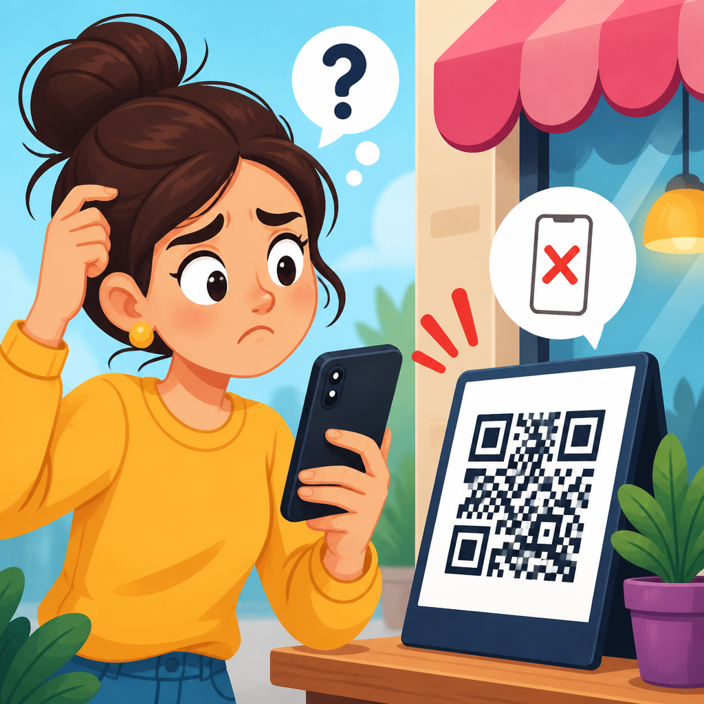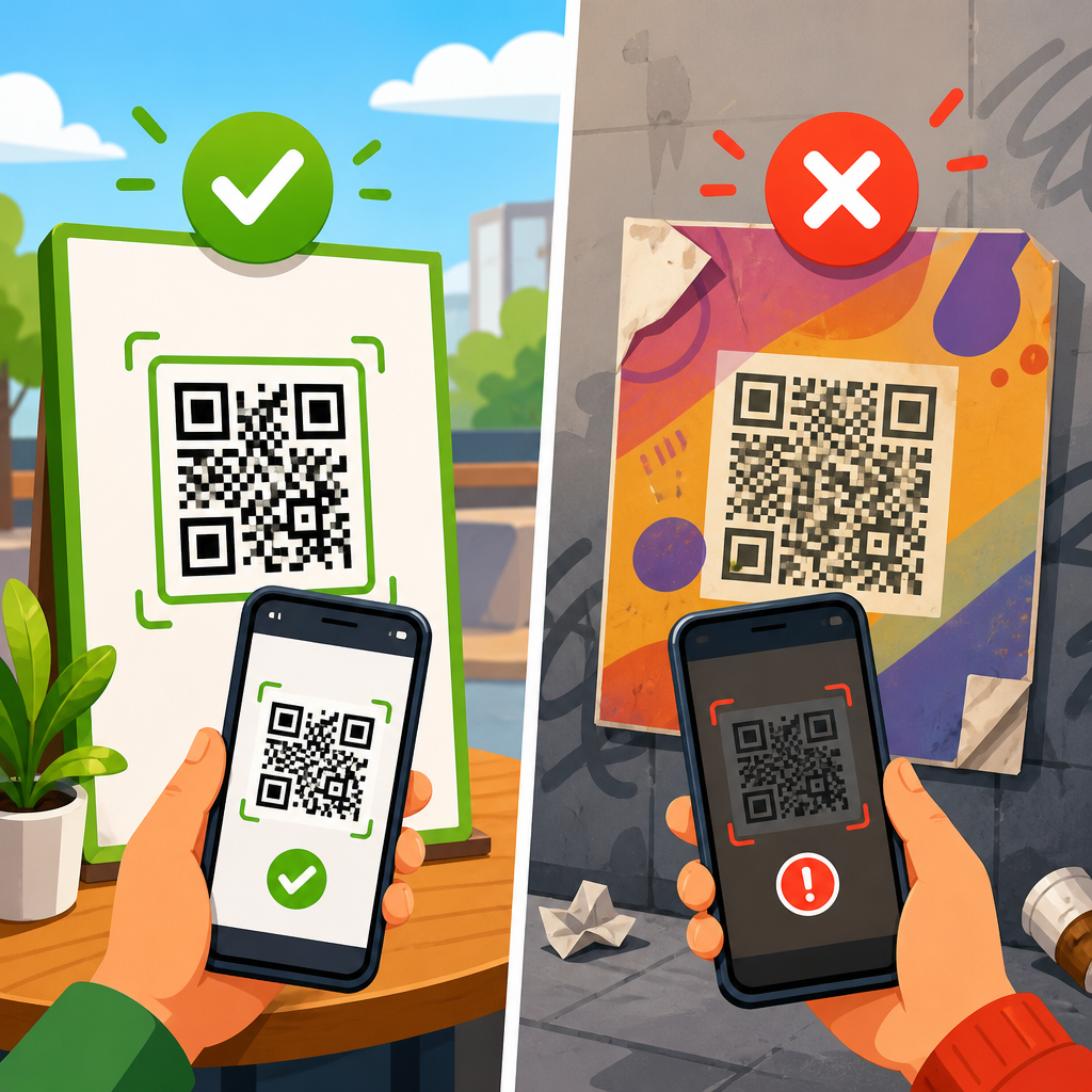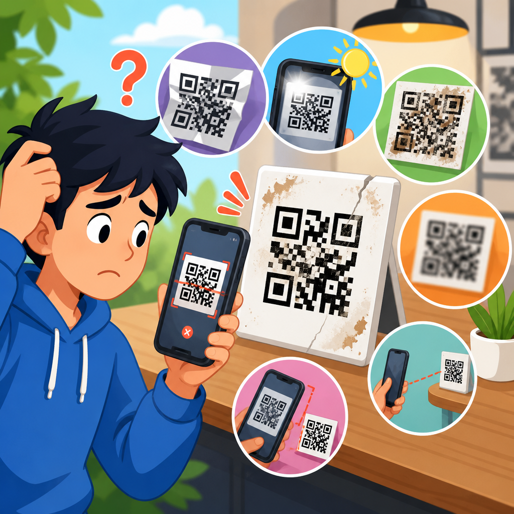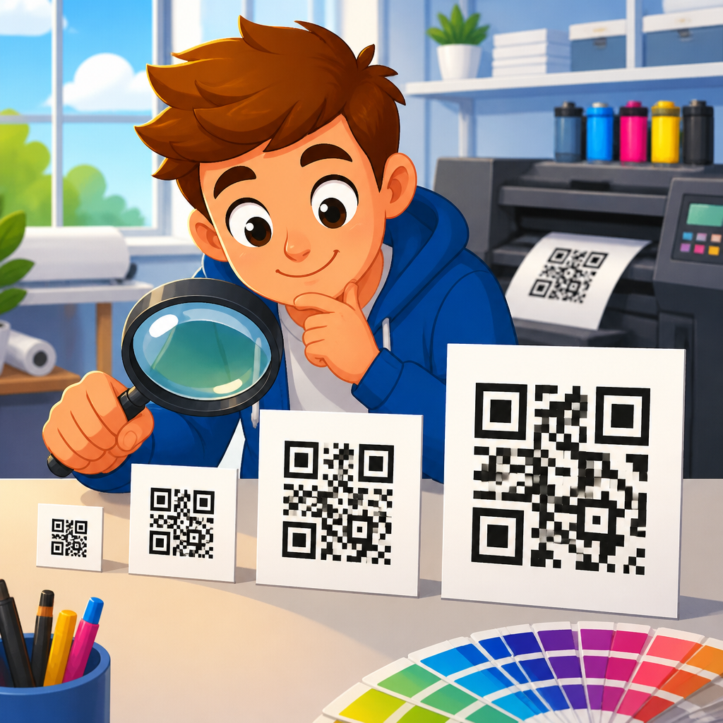
QR code printing size determines whether a code scans instantly, scans only at close range, or fails completely, which is why it sits at the center of every practical conversation about printing mistakes. In print production, “size” does not mean width alone. It includes the physical dimensions of the symbol, the size of each module, the amount of surrounding quiet zone, the contrast between foreground and background, and the expected scanning distance. After years of reviewing packaging proofs, retail signage, event badges, menus, mailers, and equipment labels, I have found that most failed printed QR codes are not caused by the data itself. They fail because the printed code is too small for the viewing distance, the quiet zone is compromised, the surface distorts the modules, or the chosen error correction level is asked to compensate for a poor physical design.
This matters because a printed QR code has one job: convert attention into action with no friction. If a customer must tilt a box under bright light, step closer to a poster, or try three different scanning apps, response rates fall sharply. A code on a medicine carton, asset tag, invoice, or restaurant table also carries operational risk when it cannot be read consistently. For a troubleshooting hub focused on printing mistakes, size is the anchor topic because it influences nearly every other print variable, from bleed and ink spread to substrate choice and placement. Get size right and many downstream problems disappear. Get it wrong and even a technically valid code becomes unreliable in the real world.
The practical rule is simple: the minimum printed size must match the content density and the likely scan distance. A short URL encoded in a low-complexity QR code can remain compact and still scan well. A long URL with campaign parameters, vCard data, Wi-Fi credentials, or a PDF link creates a denser matrix with smaller modules, so the printed code must grow. As a baseline, many printers and packaging teams start around 0.8 by 0.8 inches for a short URL in controlled conditions, then increase from there. For signs viewed from farther away, a common planning formula is roughly one unit of code width for every ten units of viewing distance. That is a starting heuristic, not a guarantee. Real reliability comes from proofing the exact artwork at final size on the actual material, then testing it with multiple phones under normal lighting before the job goes live.
Why printed QR code size fails in production
Most printing mistakes begin before the file reaches the press. Teams often treat a QR code like any other graphic element and scale it late in the layout process to fit available space. That is risky because scanners do not read the outer square; they read the individual modules. When a designer shrinks the symbol to satisfy a crowded label or flyer, each module may become too small to survive print gain, low-resolution output, textured stock, or lamination glare. On thermal labels and corrugated packaging, I have seen crisp on-screen codes become muddy blocks after printing because the smallest squares filled in. The code looked acceptable to the eye yet failed on common phone cameras.
Another frequent issue is overestimating error correction. QR codes support four levels, commonly labeled L, M, Q, and H, allowing some damage or obstruction while preserving readability. This feature is useful when a logo is centered inside the code or when the symbol may suffer wear, but it does not rescue undersized printing. Higher correction increases data redundancy, which also increases density. In other words, adding more correction can make modules smaller if the physical size stays fixed. Teams sometimes choose a high correction level, add a logo, then keep the same compact print area. The result is a code that is theoretically robust but physically harder to read.
Placement compounds size problems. A perfectly sized code can still fail if printed on a bottle seam, folded carton edge, curved cup, metallic pouch, or glossy menu under overhead lighting. Distortion changes module geometry, while reflections reduce the contrast that scanner algorithms need to distinguish dark from light cells. When troubleshooting, I always separate data design issues from print environment issues. If the same code scans from a flat laser print but not from the finished product, the problem is often not encoding. It is print execution: size, quiet zone, contrast, substrate, finish, or placement.
Minimum size, module size, and scanning distance
The most useful way to think about QR code printing size is through module size. A QR code is a grid. Each tiny square in that grid is a module, and scanners must detect those modules clearly. As data increases, the version number rises and the grid becomes larger, from 21 by 21 modules in Version 1 upward. If you keep the same physical dimensions while the version increases, each module gets smaller. That is why two codes printed at one inch square can behave very differently. The shorter URL may scan instantly because the modules are large enough, while the longer encoded string may not because the modules are too fine for the print method.
In practice, many specialists target a printed module size around 0.4 millimeters or larger for dependable consumer scanning, then increase that threshold for difficult surfaces or long-distance use. For industrial direct part marking, standards and equipment differ, but the same principle holds: module size must suit both the marking process and the scanner optics. A warehouse label viewed at arm’s length can tolerate a smaller overall symbol than a trade show banner scanned from several feet away. The widely used planning rule of ten to one helps explain this. If users will scan from ten inches away, the code should be about one inch wide. If users will scan from fifty inches away, the code should be about five inches wide. It is not a strict law, but it is an effective first filter against under-sizing.
Distance also changes user behavior. At close range, people can move the phone until focus locks and exposure settles. At a busy transit stop or storefront window, they may have only a moment. Larger codes improve first-pass success because cameras detect finder patterns sooner and frame the symbol with less hunting. This matters for response rates. Marketers sometimes focus on aesthetics and make poster codes too small to preserve whitespace, then wonder why engagement trails expectations. Operations teams see the same pattern when equipment labels are legible up close but impractical during fast workflows. A QR code should be sized for effortless scanning, not merely possible scanning.
How content density changes print requirements
Data choice has a direct effect on printable size. Short, clean URLs produce simpler symbols. Long URLs with tracking parameters, redirects, and appended campaign IDs create denser codes that demand more print area. Dynamic QR platforms help because they usually encode a short redirect URL instead of the final destination, reducing matrix complexity and preserving larger modules. That alone can solve many printing mistakes. When I audit underperforming direct mail pieces, one recurring fix is replacing a long destination URL with a dynamic short link and re-exporting the code at the same physical size. Scan reliability often improves immediately because the module geometry becomes more forgiving.
Encoding mode matters too. Numeric data is the most efficient, followed by alphanumeric, while byte mode is less compact for common text strings. Most teams do not need to manage this manually because generator tools handle it, but they should understand the consequence: not all content produces equally printable symbols. vCards, calendar events, app deep links, and Wi-Fi credentials can create surprisingly dense QR codes. If such content must be embedded directly, the printed size should increase and proofing becomes mandatory. For consumer campaigns, directing users to a landing page is usually better than embedding large payloads. It reduces density, enables analytics, and allows destination updates without reprinting physical materials.
Quiet zone is part of size as well. A QR code needs clear margin around all sides, typically four modules minimum. Designers often encroach on that space with decorative borders, background patterns, coupon cut lines, or nearby text. Scanners may then misread where the code begins and ends. On packaging, the quiet zone is sometimes sacrificed to legal copy or nutrition panels. That is a classic printing mistake because the symbol may still look centered and sharp, yet scan rates drop. The quiet zone is not optional white decoration. It is an active reading requirement.
Common printing mistakes and how to prevent them
Below are the printing mistakes that most often turn a technically valid QR code into a weak or failed print asset. They appear across business cards, labels, posters, menus, manuals, packaging, and point-of-sale displays, and they usually combine rather than occur alone.
| Mistake | What happens | Practical fix |
|---|---|---|
| Code printed too small | Modules blur or merge, especially on absorbent stock or thermal printers | Increase physical size and verify module size on final output |
| Long URL or dense payload | Higher version creates a tighter grid at the same dimensions | Use a shorter dynamic link or enlarge the code |
| Insufficient quiet zone | Scanner cannot isolate the symbol from nearby graphics or text | Keep at least four modules of clear margin on all sides |
| Low contrast or inverted styling | Camera struggles to distinguish modules from background | Use dark foreground on light matte background whenever possible |
| Gloss, curvature, or seam placement | Reflections and distortion interrupt finder patterns and module edges | Move to a flat area, avoid seams, test under expected lighting |
| Raster scaling | Resized bitmap introduces softness and uneven edges | Export vector artwork or generate at final size with high resolution |
Prevention starts with the production workflow. Generate the QR code from the final destination, preserve it as vector artwork such as SVG, EPS, or PDF, and place it in layout at the intended print size from the start. Avoid repeated scaling. Confirm quiet zone in the artwork itself so later edits do not crowd it. Print proofs on the exact device and material when possible, because office laser output can hide problems that appear on flexographic packaging, thermal transfer labels, or UV-coated cards. Test with both iPhone and Android devices, because camera processing differs. If the code is part of a campaign, test in realistic conditions: indoor glare, window reflections, arm’s-length scanning, and motion.
Design, material, and press choices that influence size
Printing technology changes the minimum safe size. Offset and digital presses can reproduce fine detail well on suitable stock, but uncoated paper may still absorb ink and soften edges. Flexographic printing on corrugated board can spread ink more noticeably, requiring larger modules and more conservative design. Thermal printers used for shipping and inventory labels vary widely by resolution, often 203, 300, or 600 dpi. At 203 dpi, very small modules are vulnerable because each square is built from a limited number of dots. A code that scans from a 300 dpi sample may fail at 203 dpi unless enlarged. That is why print specs should be tied to the actual output device, not assumed from the design file alone.
Material and finish also matter. Matte white stock is the easiest environment for reliable scanning because it supports contrast without strong reflections. Clear labels, metallic films, holographic surfaces, and dark packaging demand more care. White underprint layers, opaque panels, or printed containers behind the code may be necessary to restore contrast. On curved bottles or cans, a larger code may be required so the central read area remains relatively flat when viewed by the camera. For outdoor signage, sunlight, weathering, and viewing angle argue for bigger symbols and stronger contrast. If durability coatings, embossing, or varnish are applied, ask for post-finish proofs. I have seen a code scan well before coating and fail after a glossy varnish introduced hotspot glare under retail lighting.
Brand customization deserves restraint. Rounded modules, gradients, cutout logos, and nonstandard colors can work when size is generous and testing is rigorous, but each stylistic change consumes readability margin. In troubleshooting, custom styling is often the hidden reason a code needs to be larger than expected. If space is limited, choose function over decoration. A plain black code on a white background nearly always outperforms stylized alternatives at smaller sizes.
Testing standards for a troubleshooting hub page
A useful support process answers three questions: Will the code scan at the intended distance, under expected lighting, and on the final substrate? Build testing around those variables. Start with a flat proof at actual size. Scan it with the native camera app on multiple recent phones and at least one mid-range device with an average camera, because not every user has flagship hardware. Then test production samples from the real press run, not just prepress proofs. Record failures by distance, angle, and light source. If the code struggles, adjust one variable at a time: shorten the data, enlarge the symbol, improve contrast, restore quiet zone, or move the placement.
Where compliance or high-volume operations matter, use recognized verification methods. ISO/IEC 18004 defines the QR Code symbology, while barcode verification practices such as ISO/IEC 15415 are commonly used to assess two-dimensional print quality. Verification does not replace field testing with phones, but it reveals issues like modulation, reflectance, axial nonuniformity, and grid defects that human review misses. For brands managing many printed touchpoints, a simple specification sheet prevents repeated mistakes: minimum size by use case, approved color combinations, quiet-zone rules, prohibited placements, supported print methods, and proofing steps. That documentation turns one solved problem into a repeatable process.
The key takeaway is straightforward. QR code printing size is not a cosmetic choice; it is the foundation of scan reliability. When teams match physical size to data density, scanning distance, material, and print process, most printing mistakes disappear before production. Use short dynamic URLs, preserve adequate quiet zones, favor high contrast, export vector artwork, and test on final materials with real devices. If your current codes scan inconsistently, start by reviewing size and module clarity first. Then build a print specification that your designers, marketers, and production partners can follow on every job.
Frequently Asked Questions
What is the minimum printable size for a QR code that still scans reliably?
There is no one-size-fits-all minimum, because reliable scanning depends on more than the overall width of the QR code. In practice, the true question is whether each individual module, or square cell, remains large and sharp enough to be read by a phone camera under normal conditions. A small code can scan well if it contains little data, has strong contrast, includes a proper quiet zone, and is printed cleanly. A larger code can still fail if the modules blur together, the margins are crowded, or the background interferes with detection.
A useful rule is to think in terms of scanning distance as well as physical size. Codes intended for close-range use, such as product labels, business cards, or brochures held in the hand, can be smaller than codes placed on posters, signs, or packaging viewed from farther away. As distance increases, the QR code must grow so the camera can still distinguish the module pattern quickly. That is why a code that scans instantly at six inches may struggle at arm’s length, and a code that works on a carton proof at a desk may fail once placed on a shelf in a store.
Data density also matters. The more information encoded in the symbol, the more modules it contains, and the smaller each module becomes at any given print size. That means a short URL usually allows a more forgiving size than a long URL, a vCard, or a heavily encoded tracking string. From a print-production standpoint, it is safer to reduce data length whenever possible and then test the final artwork at full size on the actual substrate. The most dependable answer is not a generic measurement but a print-and-scan verification under real viewing conditions.
Why do some small QR codes scan fine on screen but fail when printed?
Digital display and print behave very differently. On a screen, a QR code is rendered with crisp edges, consistent contrast, and no ink spread, toner noise, paper texture, or registration shift. A phone scanning a screen often benefits from backlighting and a perfectly defined symbol. Once that same code moves into print, the physical world introduces variables that reduce clarity. Fine modules can soften, dark areas can fill in, light areas can close up, and the quiet zone can become visually contaminated by nearby graphics, folds, varnishes, or package seams.
Print resolution is only part of the issue. The substrate itself can change scanning performance dramatically. Uncoated stock, corrugated board, textured labels, flexible packaging films, and low-quality office prints all affect edge definition. A QR code that looks acceptable to the human eye may still be difficult for a camera to decode because the module grid is no longer clean enough. Even glare from a glossy finish or metallic background can interfere with contrast and force users to reposition their phones repeatedly.
Another common reason is that designers judge size by the overall square rather than by module size. If the code contains a lot of data, shrinking it for print may reduce the modules below a practical threshold, even if the full symbol still seems visibly recognizable. That is why on-screen approval is never enough. For printed QR codes, especially small ones, full-size physical testing is essential. Scan under normal lighting, from the expected distance, using multiple phones, before assuming the artwork is production-ready.
How does scanning distance affect the right QR code size?
Scanning distance is one of the most important and most overlooked factors in QR code printing. A code meant to be scanned from a few inches away can be much smaller than one intended to be read from several feet away. The farther the user stands from the symbol, the larger the QR code must be so the camera can capture enough detail to identify the finder patterns, separate the modules, and decode the content without delay. If the code is too small for the intended distance, scanning becomes slow, inconsistent, or impossible.
This matters because real-world usage is often different from studio testing. A QR code on product packaging may be scanned while the item is held in the hand, but a code on a retail shelf sign, menu board, trade show display, window cling, or warehouse placard may need to scan from much farther away. In those environments, users do not always step closer. They expect their camera to work from where they are standing. If the code was sized only for visual placement and not for practical use, performance suffers immediately.
A simple way to approach sizing is to start with user behavior. Ask how close a person can realistically get, whether the object moves, whether lighting is controlled, and whether the scan needs to happen quickly. Then choose a size that gives the code enough visual presence at that distance. In professional print review, this is why the “best” QR code size is not judged in isolation. It is judged in context: where the code is placed, how it is encountered, and how much friction the user will tolerate before giving up.
Does the quiet zone matter as much as the QR code size itself?
Yes, absolutely. The quiet zone is the blank space surrounding the QR code, and it plays a critical role in helping scanners distinguish the symbol from nearby design elements. Even a correctly sized QR code can fail if that buffer area is too small, interrupted, or cluttered by text, borders, patterns, or background imagery. In many printing problems, the issue is not that the code itself is too small, but that the surrounding space has been compromised during layout or production.
From a scanner’s perspective, the quiet zone is part of what makes the QR code recognizable as a complete symbol. Without enough clear separation, the camera may have trouble locating the edges of the code or may misread nearby shapes as part of the data pattern. This becomes even more important as the code gets smaller. When module size is already tight, any visual interference around the perimeter increases the likelihood of failed or delayed scans. A decorative frame, a tight crop, or a background image bleeding into the margin can be enough to cause trouble.
In practical print terms, the quiet zone should be treated as non-negotiable space, not optional white area that can be sacrificed to fit the layout. It needs to remain clear in final production, not just in the original design file. That means checking dielines, folds, trims, embossing, varnish effects, and neighboring elements that may encroach on the code after output. A properly sized QR code with a strong quiet zone will almost always outperform a slightly larger code that is visually crowded.
What printing mistakes make a properly sized QR code stop working?
Several common production mistakes can undermine a QR code even when the chosen size seems reasonable. One of the biggest is poor contrast. Dark code on a light background usually performs best, while low-contrast combinations, gradients, transparent effects, or busy photographic backgrounds make scanning less dependable. Another frequent problem is dot gain or ink spread, where printed modules grow slightly and begin to close up the spaces that define the code. When this happens on a dense or small QR code, the symbol can become unreadable very quickly.
Distortion is another major risk. Stretching the code out of proportion, placing it on curved packaging, printing it across folds, or allowing the substrate to wrinkle can all interfere with the geometry the scanner expects. Similarly, reverse printing, reflective materials, metallic inks, gloss coatings, and poor registration can reduce edge clarity or create glare. Even if the dimensions are technically correct, the code may become difficult to scan in normal use because the camera cannot resolve the pattern consistently.
The most reliable prevention strategy is to treat QR codes as functional elements, not decorative graphics. Keep them high contrast, preserve the quiet zone, avoid unnecessary styling, and test the final printed piece under realistic conditions. Use the actual material, final finish, and intended placement whenever possible. In professional review, the difference between a code that works perfectly and one that frustrates users is often not a dramatic design error but a small production compromise that seemed harmless at proof stage. QR code performance is the result of the entire print system working together, not size alone.