QR code placement in retail stores determines whether shoppers scan, ignore, or actively avoid the code, because location affects visibility, trust, timing, and ease of use. A QR code is a scannable two-dimensional barcode that opens a digital destination such as a product page, coupon, loyalty signup, installation guide, payment screen, or customer service form. In stores, placement means more than choosing a wall or shelf. It includes height, angle, lighting, surrounding copy, traffic flow, material durability, and whether the code appears at the exact moment a shopper needs more information. I have tested retail QR deployments on shelf talkers, checkout counters, fitting room signs, endcaps, packaging, window decals, and temporary floor displays, and the pattern is consistent: the best-designed code fails when placed at the wrong touchpoint, while an ordinary code performs well when it answers a clear shopper question in the right physical context.
That is why QR code placement matters for both customer experience and store performance. Good placement reduces friction, supports self-service, expands limited shelf space with digital detail, and turns passive signage into measurable engagement. Poor placement creates glare, crowding, privacy concerns, and low scan rates that teams mistakenly blame on the code itself. Retailers also need placement standards because each zone of the store serves a different intent. The entrance is about discovery, shelves are about comparison, fitting rooms are about confidence, checkout is about conversion, and post-purchase areas are about support and loyalty. A hub article on QR code placement should therefore map the store by shopper intent, explain what to place where, and show how placement choices connect to design, printing, analytics, and maintenance across the broader QR Code Design, Printing & Materials topic.
Store entrance and window placement: capture interest before the shopper commits
The entrance and front window are ideal for QR codes that answer broad, high-intent questions: What is on promotion today, what brands are available, what are your hours, and is there a loyalty incentive worth coming inside for? Window QR codes work best when they are large enough to scan from a natural stopping distance and positioned away from harsh reflections. In practice, I avoid placing a code directly against sunlit glass without testing morning and afternoon glare, because backlighting and reflections can make even high-contrast printing unreadable. For most storefront use, the code should sit near eye level or slightly below, with a short line of instructional copy such as “Scan for weekly offers” or “Scan to browse in-stock sizes.”
Placement at the entry should respect traffic flow. A code that requires someone to stop in the center of the doorway creates congestion and lowers engagement. Better positions include the pull side of the door, a side window panel, or a freestanding sign just inside the entrance where customers can pause without blocking others. This zone is especially effective for campaigns tied to curbside pickup, app downloads, event registration, and digital catalogs. Grocery chains often use entry signage to link to weekly ads, while apparel stores use it for lookbooks and size availability. The key is relevance: shoppers have not yet committed to a specific product, so entrance QR codes should support orientation and incentive, not detailed product education.
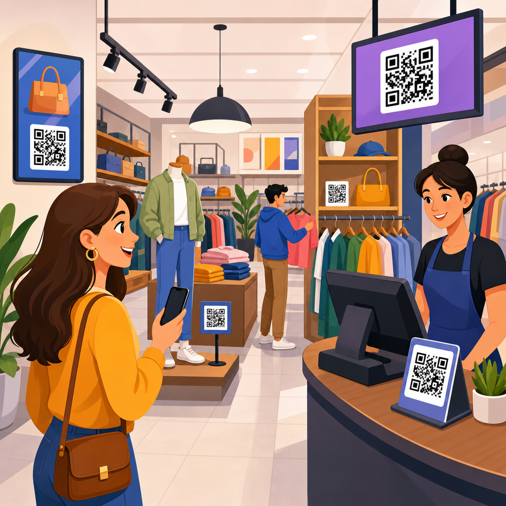
Shelf edge, product display, and endcap placement: help shoppers compare and decide
The highest-value QR code placement in most retail stores is near the product itself, because this is where information gaps slow conversion. Shelf-edge labels, wobblers, shelf talkers, and endcap signs can connect shoppers to ingredients, specifications, how-to videos, compatibility charts, customer reviews, or real-time inventory details. In electronics, a code beside headphones can open battery life, codec support, and warranty terms. In home improvement, a code near power tools can launch side-by-side comparison pages and safety instructions. In beauty, a shelf code can connect to shade finders and ingredient transparency. These are practical uses because they answer the exact questions shoppers ask while comparing options.
Placement rules on shelves are precise. The code should be associated with a single product or tightly grouped family, not a cluttered multi-brand section unless the landing page clearly resolves the choice. Codes placed too low on bottom shelves are hard to scan without bending, while codes above the shopper’s line of sight force awkward arm extension and poor camera framing. I have seen the strongest results when the code is mounted between waist and chest height, angled slightly toward the aisle, and paired with plain-language copy that describes the benefit of scanning. Endcaps deserve special mention because they combine visibility and intent. A promotional endcap with a QR code can carry richer storytelling than printed signage alone, but the code must not compete with too many visual elements. One call to action beats three.
| Store zone | Best use for QR code placement | Common mistake | Recommended fix |
|---|---|---|---|
| Entrance or window | Weekly offers, store map, hours, loyalty signup | Glare on glass or blocking the doorway | Test lighting and move the sign to a side panel or stand |
| Shelf edge | Specs, ingredients, reviews, product comparison | Code linked to too many items in one bay | Assign one code per product family with clear labeling |
| Endcap | Promotions, demos, bundled offers, explainer video | Too many calls to action on one display | Use one primary benefit statement and one landing page |
| Fitting room | Size guide, alternate colors, styling suggestions | Poor connectivity or weak privacy framing | Improve signal and explain what data is or is not collected |
| Checkout | Payments, loyalty enrollment, digital receipts | Creating delay during peak traffic | Use cashier-led prompts and backup printed instructions |
Fitting rooms, service counters, and high-assistance zones: reduce friction and support confidence
Some of the most effective retail QR code placement happens in zones where customers hesitate, wait, or need reassurance. Fitting rooms are a strong example. A code placed on the mirror edge or side wall can open size charts, alternate colors, styling suggestions, care instructions, or a request-for-assistance form. In apparel, that reduces walkouts caused by missing sizes. In footwear, a code can show fit guidance by brand, which matters because sizing varies widely across manufacturers. The code should never be hidden behind hooks, placed where steam or frequent cleaning degrades print quality, or positioned so close to the mirror edge that camera autofocus struggles. One well-printed sign inside each fitting room typically performs better than multiple small stickers.
Service counters and consultation areas also benefit from thoughtful placement. At beauty counters, skincare kiosks, pharmacy windows, and electronics help desks, QR codes can link to consultation intake forms, appointment booking, product routines, manuals, and return policies. Here the placement goal is trust. Shoppers are more willing to scan when the code appears on branded signage that looks official, includes a short explanation, and matches the conversation happening with staff. I have also found that QR codes near repair or pickup counters work well for status updates and support articles, because they shorten wait times and reduce repetitive questions. In these high-assistance zones, the code should complement staff guidance rather than replace it; the best deployments give customers control without making the store feel impersonal.
Checkout, point of sale, and queue placement: convert interest without slowing the line
Checkout is one of the most common places to place QR codes, but it is often the most poorly executed. The checkout area can support mobile payment, digital receipts, loyalty enrollment, product protection plans, survey links, and impulse-offer redemptions. However, every placement at point of sale must be judged against a single operational question: does it speed the transaction or create delay? If a customer has to unlock a phone, decide between multiple offers, read tiny text, and ask the cashier what to do, the code is harming throughput. That is why checkout QR codes should be task-specific, highly visible, and introduced at natural pauses, such as while the basket is being scanned or while payment is processing.
Queue placement deserves separate planning because waiting customers have time but limited attention. A code on queue rails or lane signs can promote loyalty signup, gift card balance checks, refill subscriptions, or educational content for adjacent impulse products. Supermarkets and mass retailers often use this zone for app downloads or digital coupons, while specialty retailers may direct shoppers to care tips or classes. The physical details matter: signs should face the line of sight, not the cashier station; print should remain readable from one to two cart lengths away; and the landing page should load fast on mobile networks. During pilots, I recommend tracking scan rate by lane and time of day, because queue behavior differs sharply between weekday convenience trips and weekend browsing traffic.
Placement standards: height, distance, lighting, materials, and analytics
Reliable QR code placement requires technical standards, not guesswork. First, size must match scan distance. As a practical rule, the farther the shopper stands, the larger the printed code needs to be; tiny codes on posters rarely perform because customers naturally scan from farther away than designers expect. Second, contrast must stay high. Dark modules on a light background remain the safest choice for retail. Third, protect the quiet zone, the empty margin around the code, because crowded graphics and borders can interfere with recognition. Fourth, consider angle and lighting. Gloss laminate, polished acrylic, curved surfaces, and direct spotlights often introduce reflections that reduce readability. Matte finishes, rigid mounting, and slight forward tilt usually improve results.
Material choice is part of placement because the retail environment is physically demanding. Shelf-edge strips need abrasion resistance. Floor-adjacent displays need cleaning-safe substrates. Window decals need adhesives and inks suited to heat and UV exposure. Temporary promotional signs can use economical short-run materials, but permanent fixtures benefit from more durable printing and consistent brand framing. Analytics complete the placement strategy. Dynamic QR codes let teams update destinations without reprinting and measure scans by location, date, and campaign. The best retail programs create naming conventions for every code, audit placements regularly, test destinations on both iPhone and Android, and remove dead or low-value codes quickly. If a code does not solve a shopper problem in that exact location, it should move, change, or disappear.
Where to place QR codes in retail stores comes down to matching location with shopper intent, then supporting that decision with practical production standards. Entrance and window codes should attract and orient. Shelf-edge and endcap codes should answer comparison questions at the moment of choice. Fitting rooms and service areas should reduce uncertainty and improve assistance. Checkout and queue placements should simplify tasks without slowing operations. Across every zone, success depends on the same fundamentals: clear benefit-led copy, the right height and distance, low glare, durable materials, fast mobile landing pages, and measurable tracking.
As the hub for QR code placement, this topic connects directly to design, print production, substrate selection, adhesive performance, scan testing, and campaign analytics. Placement is not a finishing detail added after artwork is approved. It is a strategic retail decision that shapes customer behavior and determines whether the code creates value. Review your store by zone, identify the questions shoppers ask in each location, and place QR codes only where they answer those questions better than print alone. Then test, measure, and refine. That disciplined approach will produce higher scan rates, better in-store experiences, and stronger returns from every QR code you print.
Frequently Asked Questions
Where should QR codes be placed in a retail store for the highest scan rate?
The best-performing QR code placements are usually the ones that match shopper intent in the moment. In practical terms, that means placing codes where customers are already stopping, comparing, waiting, or making a decision. Product shelves, endcaps, fitting room areas, checkout counters, service desks, window displays, and queue lines are often strong locations because they naturally create a pause. A QR code works best when it appears at the exact point where a shopper wants more information, a discount, a size guide, a product demo, a review, or a faster path to purchase. If the code is too early in the journey, shoppers may ignore it because they are still browsing. If it appears too late, they may feel they no longer need it.
Physical visibility also matters just as much as strategic timing. Codes should be placed at a comfortable scanning height, usually around chest to eye level for standing adults, and angled so phones can read them without awkward body movement. Avoid low placements near the floor, high placements above sight lines, or areas with glare from store lighting or sunlight. The surrounding copy should clearly tell shoppers what they get when they scan, such as “See reviews,” “Get 10% off,” or “Check available colors.” That small instruction can dramatically improve scan rates because it removes uncertainty. In most retail environments, the highest scan rate comes from codes that are visible, easy to approach, clearly labeled, and tied directly to a shopper’s immediate need.
What are the most common QR code placement mistakes retailers should avoid?
One of the biggest mistakes is treating QR code placement as a design afterthought instead of a customer experience decision. Retailers sometimes put codes wherever there is empty space rather than where shoppers can comfortably notice and use them. Common examples include placing them on reflective surfaces, curved packaging, dark backgrounds, moving doors, narrow aisle edges, or areas blocked by merchandise. These placements reduce scan success and frustrate customers. Another frequent mistake is using a code without context. If shoppers do not understand why they should scan, many simply will not. A QR code by itself is not a message; it needs nearby copy that explains the value.
Retailers also often overlook traffic flow and dwell time. If a shopper has to stop in a busy aisle, block others, or twist around to scan, the code becomes inconvenient and easy to skip. Similarly, placing a code in areas where customers are moving quickly, such as store entrances or transitional walkways, can lower engagement unless the message is extremely simple and compelling. Technical mistakes matter too. Codes that are too small, low contrast, poorly printed, or linked to slow, non-mobile-friendly pages hurt performance even if the physical placement seems reasonable. Finally, failing to build trust is a major issue. Shoppers are more likely to scan when the code appears professionally presented, branded, and connected to a clear outcome. A random-looking code with no explanation can feel suspicious, which causes people to ignore it entirely.
How does shopper behavior influence the best place to put a QR code in a store?
Shopper behavior is one of the most important factors in QR code placement because people do not move through stores randomly. They pause at specific decision points, and those moments are where QR codes are most effective. For example, a customer comparing two products may be willing to scan for reviews, ingredients, assembly instructions, or warranty details. Someone waiting in line may be open to scanning for loyalty signup, app download, or future offers. A shopper in the fitting room may want size availability, style recommendations, or alternate colors. In each case, the best placement is the one that aligns with what the customer is already thinking about doing.
This is why traffic flow, dwell time, and physical comfort should guide placement decisions. Areas with natural slowing or stopping points create better scanning opportunities than areas built for quick movement. Retailers should think about whether customers have one hand free, whether they can step aside without causing congestion, and whether the code can be scanned without bending, reaching, or turning awkwardly. It is also useful to consider emotional state. A curious shopper may welcome a code that helps with discovery, while a hurried shopper may only respond to something that saves time or money right away. Good placement respects real in-store behavior. Instead of asking, “Where can we fit a QR code?” the better question is, “Where is the shopper most likely to want digital help at this exact moment?”
Should QR codes be placed at checkout, on shelves, or in window displays?
Each of these placements can work well, but they serve different purposes and should not be treated as interchangeable. Shelf-level QR codes are often best for product education and decision support. They help shoppers who are actively comparing items and want immediate access to reviews, specifications, how-to content, compatibility details, or promotional offers. Checkout-area QR codes are effective when the goal is speed, convenience, or post-purchase engagement. They can drive digital receipts, loyalty enrollment, app adoption, feedback forms, warranty registration, or future discounts. Because customers are already waiting or finalizing a purchase, checkout can be a strong place for simple next-step actions.
Window display QR codes work differently because they must attract attention from outside the main shopping flow. They are useful for after-hours browsing, campaign promotions, featured collections, event signups, store maps, or “shop this display” experiences. However, they need especially strong visibility, concise messaging, and easy mobile access because the shopper may be standing farther away, dealing with glare, or moving past quickly. In most stores, the best approach is not choosing only one location but matching each location to a specific customer objective. Shelves help with consideration, checkout supports conversion and retention, and window displays extend engagement before or after entry. The strongest retail strategy usually uses more than one placement type, with each code designed for the context around it.
How can retailers test and improve QR code placement over time?
The most reliable way to improve placement is to treat QR codes like any other performance-driven retail asset and test them systematically. Start by defining the goal for each code, such as increasing product page visits, coupon redemptions, loyalty signups, payment completions, or support requests. Then compare placements by store zone, height, signage format, surrounding copy, and time of day. For example, a retailer might test the same offer on a shelf talker versus an endcap sign, or compare a code placed beside pricing information with one placed near a product benefit statement. Unique tracking links or campaign parameters help measure which placement actually drives scans and downstream actions, not just visibility.
Observation is just as valuable as analytics. Retailers should watch how shoppers approach the code, whether they notice it, whether they hesitate, and whether the physical space makes scanning easy or awkward. If customers seem interested but do not scan, the issue may be copy, trust, lighting, or accessibility rather than the offer itself. It is also smart to review mobile landing page performance, because a well-placed code can still underperform if the destination is slow, confusing, or poorly optimized for phones. Over time, retailers should refine placement based on both scan data and real in-store behavior. The goal is continuous improvement: better visibility, clearer value, easier access, and stronger alignment with the shopper’s decision-making moment. When QR code placement is tested this way, it becomes a measurable part of the store experience rather than a guess.


