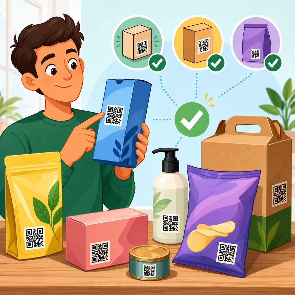
QR code placement on packaging determines whether a scan feels effortless or fails at the exact moment a customer is ready to engage. Placement is not just a design choice; it is a functional decision that affects scan rate, customer trust, regulatory compliance, print performance, and post-purchase conversions. In packaging work, I have seen brands invest heavily in beautiful code styling, serialized campaigns, and landing pages, then lose measurable response because the symbol was tucked into a seam, wrapped over a curve, or printed where glare from a glossy varnish blocked the camera. Good placement turns a QR code from decoration into infrastructure.
A QR code is a two-dimensional matrix barcode that stores data such as a URL, product identifier, authentication token, or batch record. Packaging refers to the primary pack, secondary box, label, sleeve, pouch, bottle, carton, shipper, or flexible film that carries the product. Placement means the exact location, orientation, surrounding space, and physical context of the code on that package. It includes practical variables like panel selection, height from the base, proximity to folds, clear zone protection, print process distortion, and the user’s ability to hold the pack steady while scanning. These details matter because phone cameras do not scan symbols in abstract conditions; they scan real objects held in imperfect lighting, often one-handed, in stores, kitchens, warehouses, or on doorsteps.
Why does QR code placement matter so much now? Packaging has become a digital entry point. Brands use QR codes to deliver traceability, recycling instructions, loyalty enrollment, assembly videos, multilingual labels, and anti-counterfeit verification. Retailers use them for reordering and product data. Regulators increasingly expect digital access to information, especially when label space is limited. At the same time, packaging formats are more diverse, from shrink sleeves and stand-up pouches to textured glass and metallized films, all of which create scan challenges. A placement decision made early in package development can improve readability, raise engagement, and reduce costly reprints. A poor decision can undermine every downstream packaging QR code strategy, no matter how strong the campaign behind it is.
Choose a panel people can actually scan
The best QR code placement starts with selecting a surface that stays flat enough, visible enough, and stable enough during scanning. On cartons, the preferred location is usually a broad side or back panel rather than a narrow edge, top flap, or bottom panel. On bottles and jars, a label area with the lowest curvature is usually better than a shoulder or taper. On pouches, avoid the gusset and any area that changes shape as product settles. The rule is simple: put the code where the package geometry supports the symbol instead of fighting it.
In practice, this means identifying the panel most likely to be seen when the product is in its real buying or usage environment. A cereal carton can support a large code on the back because shoppers and users naturally rotate the pack. A beverage bottle is different; many people scan while holding it, so a code hidden in a narrow wrap seam performs poorly. For cosmetics, the underside of a carton may look clean in design review, but it forces a shopper to pick up and flip the pack, creating friction and lower scan intent. If the package sits in a shelf tray, any lower-front placement may be partially blocked. Placement must be evaluated in the fixture, not just on the dieline.
The fastest way to assess panel choice is a live scan test with printed mockups. I usually test from common user distances: about 8 to 16 inches for hand-held scanning and farther for larger shipper codes. If a person needs to tilt the package repeatedly, hunt for focus, or move around reflections, the panel is wrong or the surrounding design is too busy. QR code placement should support a single natural motion. That is what drives actual usage.
Avoid folds, seams, curves, closures, and finish effects
Most scan failures on packaging are caused less by the code itself than by the material conditions around it. Place a QR code too close to a carton fold and the modules distort. Put it over a glue seam and part of the symbol can vanish. Wrap it around a bottle and the camera reads a compressed shape. Print it across a zipper track on a pouch and the closure interrupts the finder patterns. Even when a scanner eventually succeeds, the user experience feels unreliable, which lowers repeat engagement.
Finish and substrate choices also affect placement. Gloss coatings, metallic inks, holographic films, textured papers, and transparent labels can reduce contrast or create glare. A code that scans perfectly in a controlled office may fail under bright store lighting or direct sunlight through a kitchen window. I have had the best results when the code is kept on a matte, opaque, high-contrast patch with a protected quiet zone. If premium finishing is non-negotiable, reserve one untreated area specifically for the symbol and test the final production sample, not just the artwork proof.
Flexible packaging needs extra caution because the scanning surface changes as the pack empties or creases. A coffee bag might present a flat front panel at fill, then wrinkle after first opening. A frozen food pouch may develop condensation that adds glare. In these cases, QR code placement should anticipate the package through its full lifecycle, not only at the factory. Durable scan performance comes from choosing the least dynamic area on the structure.
Protect readability with size, clear space, and orientation
Placement is inseparable from code construction. The symbol needs enough physical size for the intended scan distance and enough clear space around it to separate the code from nearby graphics. As a practical baseline, I avoid tiny promotional codes unless the product is held close and lighting is predictable. The more data encoded, the denser the symbol becomes, which often means placement must allow a larger printed area. Short URLs and dynamic QR platforms help because they reduce complexity and preserve readability on small packs.
The quiet zone matters just as much as code size. This blank margin around the symbol helps camera software identify the code edges. On packaging, designers often erode that space by placing icons, ingredient text, decorative patterns, or die-cut windows too near the code. That is a placement failure, even if the code artwork itself is technically correct. Keep the surrounding area visually calm. The code should not compete with nutrition tables, legal copy, or background photography.
Orientation deserves attention too. Modern scanners can read QR codes from multiple angles, but human behavior still matters. If text and call-to-action read horizontally while the code is rotated awkwardly, users hesitate and rotate the product more than necessary. On shelf-facing cartons, upright orientation relative to the main reading direction usually works best. On cylindrical packs, vertical placement along the least curved axis can outperform horizontal placement, because less of the symbol wraps around the form. Test both orientations before locking the layout.
Match placement to the user moment and business goal
Effective QR code placement depends on why the code exists. A code intended for in-store product education should sit where a shopper can see it without opening the package or blocking required information. A code for setup instructions belongs where the user naturally looks after purchase, often near opening features, quick-start text, or inside the lid. A code for authentication may need to be partially concealed or paired with tamper evidence so consumers know the item was not previously scanned. A code for recycling instructions should appear where a person notices it during disposal, not buried under a sleeve they remove and discard.
This is where packaging teams often benefit from mapping scan scenarios. Ask who scans, when, where, with which hand, and under what lighting. A warehouse worker scanning a corrugated case needs a different placement strategy than a consumer scanning a skincare box. For omnichannel products, one code may need to serve shelf, home, and logistics use cases. If those needs conflict, use separate codes with clear roles rather than forcing one symbol to do everything poorly.
| Use case | Best placement approach | Main risk to avoid |
|---|---|---|
| In-store product info | Visible side or back panel above shelf obstruction line | Bottom placement hidden by trays or shelf lips |
| Setup or how-to content | Near opening area, insert, or quick-start panel | Code buried under seals or secondary wrap |
| Authentication | Secure label zone with tamper-evident context | Easy copying from exposed outer pack |
| Recycling guidance | Panel noticed during disposal or pack breakdown | Placement on removable component only |
| Case or warehouse scanning | Large flat shipper face readable at handling distance | Edge placement damaged by stacking and straps |
When placement follows the user moment, scan rates improve because the package answers a need at exactly the right time. That is the difference between a code that merely exists and a code that gets used.
Account for print process, material behavior, and production tolerances
Packaging QR code placement must survive real production. Offset, flexographic, digital, gravure, and screen processes each create different risks. Flexo on film can gain dot and soften edges. Shrink sleeves distort after application and heat tunnel exposure. Corrugated print can lose crispness on rough surfaces. Embossing, varnish registration, and die-cut movement can all encroach on the quiet zone. The right placement gives production enough tolerance to keep the code readable across the run, not just on the approved first sample.
I recommend reviewing placement directly on the structural dieline and print specification sheet. Mark exclusion zones around score lines, cut lines, perforations, tear strips, and sealing areas. For curved containers, request an unwrapped distortion preview. For sleeves, ask suppliers for compensation guidance because artwork that looks square on screen may not remain square on the container. For labels on squeezable tubes or bottles, account for panel shift during application. Small registration drift can ruin a code placed too close to a boundary.
Verification should be part of the approval process. Use a recognized barcode verifier where possible and supplement it with phone testing across iOS and Android devices. Test under warm retail lighting, daylight, and low light. Test after abrasion, refrigeration, and moisture exposure if the product will face those conditions. Packaging is a harsh environment, and QR code placement has to be robust enough for it.
Build the page as a hub for related placement decisions
Because QR code placement touches structure, design, print, and user experience, this topic works best as a hub that connects to deeper guidance. Teams usually need adjacent answers: ideal QR code size by scan distance, quiet zone rules, color contrast requirements, placement on bottles, placement on flexible packaging, sleeve distortion, varnish and lamination effects, and testing methods before launch. A strong hub page defines the core principles, then points readers to those specialized topics so they can solve packaging-specific problems without guessing.
That hub role matters internally as well. Packaging engineers, brand designers, prepress operators, and marketing managers often approach QR code placement from different priorities. One group wants visual balance, another wants manufacturing safety, another wants measurable scans. A central guidance page aligns those priorities around a shared standard: choose a scannable panel, protect the symbol from structural interference, preserve contrast and quiet zone, and place the code where the user’s task occurs. Once that standard is documented, subpages can address exceptions for cartons, labels, tubes, pouches, corrugated shippers, and regulated products.
In my experience, companies get the best results when they treat placement as a packaging specification, not a late-stage art adjustment. Add it to design checklists, printer briefs, and quality control signoff. That single process change prevents most avoidable failures.
QR code placement on packaging works best when physical reality leads the decision. Choose a panel that stays visible and flat enough to scan. Keep the symbol away from folds, seams, closures, extreme curves, and reflective finishes. Preserve adequate size, contrast, and quiet zone so camera software can recognize the code quickly. Most importantly, place the code where the user naturally needs it, whether that moment happens on shelf, during setup, in the warehouse, or at disposal.
The main benefit of good placement is reliability. Reliable scans improve engagement, reduce frustration, support compliance, and protect the investment made in packaging design and digital content. Brands do not need gimmicks to achieve that. They need disciplined panel selection, production-aware artwork, and testing on real packs in real conditions. When those basics are handled well, even a simple black-and-white QR code can outperform a visually impressive code placed in the wrong spot.
If you are building or updating packaging standards, start by auditing every current code on live products. Note where scans feel effortless and where they fail. Then create placement rules by format, material, and use case, and link those rules to your broader QR code design, printing, and materials guidance. That is how packaging QR code placement becomes consistent, measurable, and effective across your full product line.
Frequently Asked Questions
Where is the best place to put a QR code on packaging?
The best placement is wherever the code can be seen, reached, and scanned without the customer having to rotate the package awkwardly or search for it. In most cases, that means a flat, visible panel that naturally faces the shopper during handling or after opening. On boxes, side panels or back panels often work well if they are not crowded by mandatory copy. On pouches, labels, and flexible packaging, the ideal area is usually a smooth section away from seals, folds, gussets, and high-curvature zones. The main rule is simple: place the QR code where the user’s camera can capture it quickly under normal lighting and normal hand positioning. If the package design forces the code into a corner, near an edge, or over a textured or reflective finish, scan performance can drop significantly.
Good placement also depends on when you want the scan to happen. If the goal is pre-purchase engagement in a retail aisle, the code should be on a visible exterior surface that shoppers can access without opening or disturbing the product. If the goal is post-purchase support, registration, recipes, refill instructions, loyalty enrollment, or authentication, placing the code where it is easy to find after purchase can be more effective. In practice, brands often get the strongest results by treating placement as a functional user journey decision rather than a purely visual one. A beautiful code hidden in a low-visibility area will usually underperform a simpler code placed where the customer expects to interact.
What packaging surfaces should be avoided when placing a QR code?
QR codes should generally be kept off surfaces that distort the symbol, reduce contrast, or make camera focus inconsistent. Problem areas include tight curves on bottles and jars, crimped edges on pouches, seams, folds, perforations, tamper bands, shrink sleeves that wrinkle during application, and any zone likely to be scuffed in transport. Reflective foils, metallic inks, glossy laminates, and highly textured substrates can also interfere with scanning because they create glare, visual noise, and uneven image capture. If a phone camera cannot clearly distinguish the dark and light modules of the code in real-world conditions, scan reliability suffers.
Another common mistake is placing the code too close to other graphic elements, legal copy, nutrition information, or decorative patterns. A QR code needs visual separation from surrounding content so the camera can detect it cleanly. This includes maintaining adequate quiet zone space around the symbol. Avoid printing the code across package folds, over transparent windows, on very small labels, or in areas likely to be bent during shelf stocking and consumer handling. Even if the code technically scans during a studio proof, packaging is used in messy real environments, so placement should account for glare, motion, wrinkling, and wear. In short, choose a stable, flat, high-contrast area that survives production and use, not just a space that looks available in the layout file.
How big should a QR code be on packaging for reliable scanning?
QR code size depends on scanning distance, data density, print quality, and packaging format, but on packaging, larger is usually safer within reason. A code that looks acceptable on screen can fail in print if it is reduced too much or printed on challenging materials. In general, the code should be large enough that a typical smartphone camera can detect and resolve it instantly at the expected scanning distance. If shoppers will scan it while holding the product in their hand, the code can often be smaller than one intended to be scanned from a shelf or display. However, when packaging involves curvature, gloss, or fine print conditions, increasing the code size gives the symbol more resilience.
Size decisions should never be made in isolation. A compact code with too much encoded data becomes dense and harder to scan, especially on small packages. That is why many packaging teams use dynamic QR codes that point to a short redirect URL rather than embedding more data than necessary. Error correction, styling choices, ink spread, substrate behavior, and print process all affect the final result as well. The smartest approach is to prototype the actual production size, print it on the real material, and test it using multiple phone models under normal lighting. If there is any doubt, increase the size and simplify the code treatment. Reliable scanning almost always outperforms marginal design gains from making the symbol smaller.
How does QR code placement affect customer trust and conversion rates?
Placement influences more than technical scan success; it also shapes whether people feel confident enough to scan at all. A QR code tucked into an obscure location can look accidental, suspicious, or low priority. A code placed thoughtfully near a short call to action feels intentional and trustworthy. Customers are more likely to engage when they understand what the scan will do, why it is useful, and whether it relates to the moment they are in. For example, a code near usage instructions, authenticity messaging, rewards copy, or recipe inspiration makes contextual sense and usually generates better engagement than a code dropped into leftover design space with no explanation.
Conversions improve when placement reduces friction. If the package must be turned upside down, unfolded, or opened before scanning, many users abandon the interaction. If the code is visible, easy to frame, and paired with concise benefit-driven text such as “Scan for setup,” “Scan to verify authenticity,” or “Scan for care instructions,” response typically rises because the customer sees immediate value. Placement also affects perceived legitimacy. On regulated products or premium goods, a clean, deliberate location can reinforce credibility, while a cramped or poorly integrated code can undermine confidence. The most successful packaging programs combine scan-friendly placement, clear user intent, and a landing experience that fulfills the promise made on-pack. That alignment is what turns scans into meaningful post-purchase actions.
What should brands test before finalizing QR code placement on packaging?
Before approving production, brands should test the exact QR code in real packaging conditions, not just as a digital proof or desktop printout. That means checking the code on the actual substrate, with the actual print process, finishes, varnishes, inks, curvature, and final package assembly. A code that scans perfectly on a flat prepress sample may fail once it is wrapped around a bottle, printed on flexible film, or covered with a gloss coating. Testing should include multiple package units from production-quality samples because print variation can change edge definition, contrast, and overall readability. It is also important to verify that the quiet zone remains intact and that nearby artwork does not interfere with detection.
Brands should also test real user behavior. Try scanning in store-like lighting, at home, and in motion. Use different smartphone models and camera quality levels. Test the package as shoppers actually hold it, not just laid flat on a table. Confirm whether the code is still easy to access after the product is opened, refrigerated, squeezed, or otherwise used. If the code supports regulated information, traceability, authentication, or customer service, make sure placement does not conflict with mandatory labeling or create confusion around compliance content. Finally, measure the outcome beyond scan rate alone. A good placement should support the entire journey: discoverability, successful scan, trust, landing page load, and desired conversion. That full-funnel view is how brands avoid the all-too-common problem of investing in the QR experience but losing results because the symbol was placed where customers simply do not want to scan.


