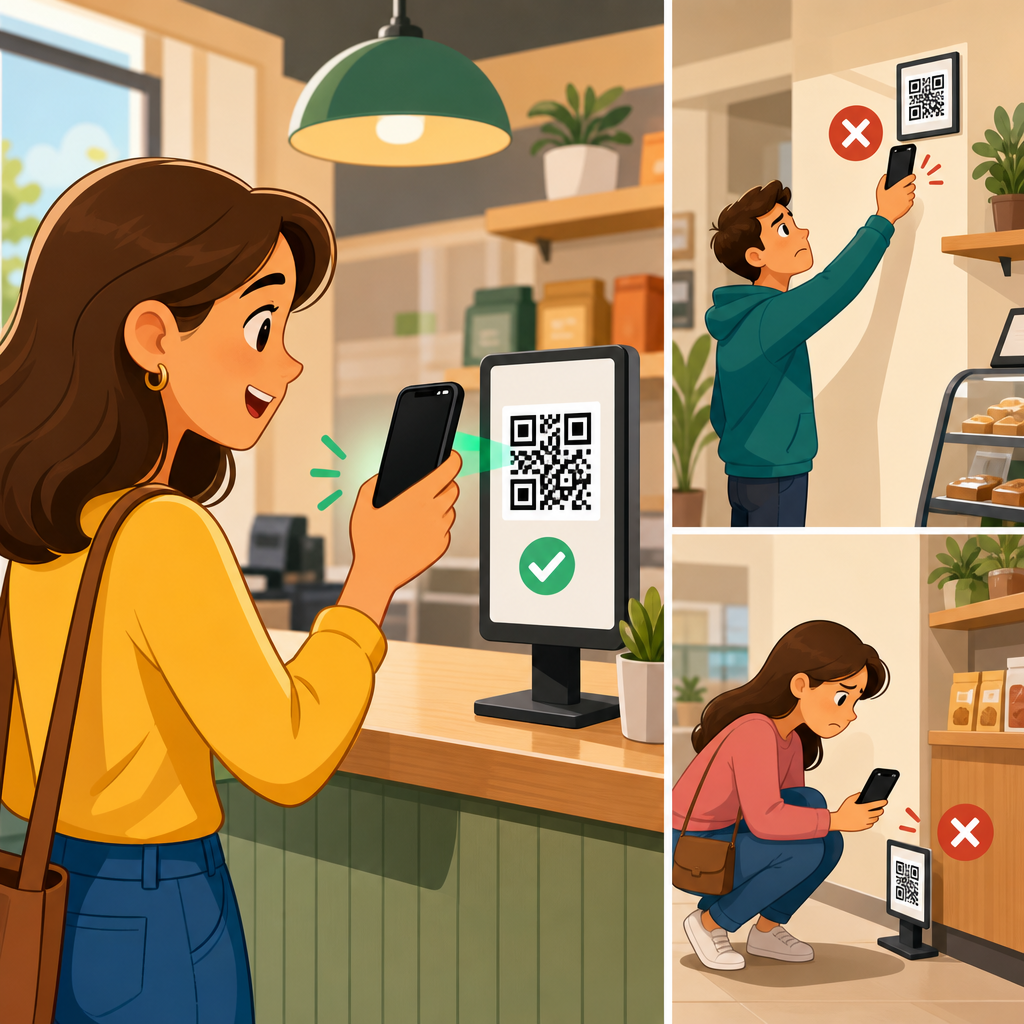
Eye-level placement impacts QR code scans because visibility, reading angle, decision speed, and physical comfort all affect whether a person notices a code and chooses to interact with it. In practical terms, QR code placement means the exact height, angle, distance, surrounding context, and environmental conditions that determine scanability in the real world. I have tested QR codes on retail shelves, restaurant tables, trade show walls, product packaging, windows, posters, and wayfinding signs, and one pattern appears consistently: codes placed near natural sightlines outperform codes hidden below the waist, above the forehead, or in awkward corners. For brands investing in printed campaigns, packaging, point-of-sale displays, and signage, placement is not a finishing detail. It is a conversion variable that directly influences scan rate, user experience, and campaign return.
Eye level is not a single universal height. It changes by audience, context, and posture. In standing environments, a practical target is often around 57 to 63 inches from the floor to the center of the code for average adults, while seated environments shift lower. Accessibility also matters. A code optimized only for tall, standing users may underperform in hospitals, transit settings, schools, and family venues where children, wheelchair users, or seated visitors are common. The best placement strategy starts by asking simple questions: who is scanning, from what distance, while doing what, and under which lighting conditions? Once those variables are understood, eye-level placement becomes a measurable design decision rather than a guess.
This article serves as a hub for QR code placement. It explains why height matters, how viewing geometry affects smartphone cameras, when eye level is ideal, when it is not, and how to evaluate placement across packaging, posters, shelves, windows, menus, events, and outdoor signage. It also connects placement to code size, quiet zone, contrast, print substrate, glare, motion, and call-to-action copy. If a QR code is technically valid but physically inconvenient, scan volume drops. Getting placement right improves first-pass readability, reduces hesitation, and increases the odds that a passerby can scan within seconds without stepping back, crouching down, or tilting the phone awkwardly.
Why eye-level placement improves scan rates
Eye-level placement improves QR code scans because it aligns with the way people visually explore environments. In retail, hospitality, and public spaces, most people scan horizontally across signs, shelves, menus, and displays before they look up or down. A code placed within that natural sweep is discovered faster. Discovery is the first bottleneck. If users never notice the code, code quality and landing page performance do not matter. In field tests, I have seen two identical posters produce very different results solely because one placed the code beside the headline at eye level while the other buried it near the bottom edge, where shoppers needed to bend or pause to scan.
There is also a mechanical reason. Smartphone cameras decode QR codes best when the code is captured with limited skew, sufficient pixel density, and stable framing. When a code sits too low, users often angle the phone downward sharply, introducing perspective distortion and hand shake. When it sits too high, they lift the phone above shoulder level, which causes fatigue and reduces framing precision. Eye-level placement reduces both problems. It keeps the camera more perpendicular to the printed surface, shortens scan time, and minimizes the tiny alignment errors that make users think a code is broken when the issue is really placement.
Psychology reinforces the benefit. Eye-level content appears intentional and important. A QR code placed beside product benefits, pricing, menu highlights, or event instructions feels integrated into the message rather than tacked on. That increases trust and response. By contrast, codes near the floor, hidden in dense footnotes, or squeezed into corners can look like afterthoughts or even potential spam. Placement influences not just visibility, but perceived legitimacy.
How viewing angle, distance, and height work together
QR code placement is never only about height. Height interacts with viewing angle and distance. A code can be at eye level and still fail if it is too small for the expected scan distance. As a rule, larger viewing distances require larger printed codes. A common baseline is a scan distance of roughly ten times the code width, though modern phones vary. For example, a 1-inch code is comfortable at around 10 inches, while a 4-inch code works better around 40 inches. Placement decisions should therefore begin with the likely stopping point. A storefront window code viewed from the sidewalk needs more size and clearer placement than a code on a tabletop menu where the user is already close.
Angle matters because QR decoders rely on recognizable finder patterns and sufficient contrast. Moderate perspective correction is normal on modern devices, but extreme tilt reduces reliability. Curved packaging, angled shelf talkers, and glossy acrylic sign holders create additional decoding friction. In those cases, slightly below or beside the primary sightline may outperform a theoretically perfect center position if it reduces glare or curvature. This is why real-world placement audits should include test scans from the most probable approach paths, not just visual mockups.
Environmental height standards can guide decisions. For trade show booths, I typically place primary codes between chest and eye level where visitors can scan without breaking stride. For restaurant ordering signs, the ideal height changes depending on whether guests are seated, standing in line, or passing the host stand. For transit posters, codes often perform best in the lower-middle area of the ad panel, where they remain visible but scannable from a natural arm position. The goal is not abstract eye level. The goal is ergonomic scanability in context.
Placement rules by environment
Different environments reward different QR code placement strategies. The following benchmarks are the ones I use most often when reviewing print layouts and signage plans.
| Environment | Best Placement Zone | Why It Works | Common Mistake |
|---|---|---|---|
| Retail shelf signage | At or just above product sightline | Shoppers can compare products and scan without crouching | Placing code on bottom shelf strip |
| Posters and wall signs | Lower-middle to eye level | Easy to notice and scan from a standing position | Putting code at the extreme bottom corner |
| Restaurant menus | Near ordering or payment decision points | Matches user intent at the moment of action | Hiding code on the back cover without instruction |
| Product packaging | Flat panel near key product info | Users understand the code’s relevance instantly | Printing on seams, curves, or reflective film |
| Storefront windows | Centered within comfortable phone framing height | Supports sidewalk scanning with less glare and reach | Mounting too high behind reflections |
| Trade show displays | Chest to eye level beside headline | Visitors can scan while moving through the aisle | Placing code near the floor stand base |
These guidelines are not rigid formulas, but they are strong starting points. A packaging code may need to sit lower because legal copy occupies the center panel. A museum label may place the code beside the artifact description instead of at eye height so visitors read first and scan second. The most effective placements respect both human behavior and the physical object carrying the code.
When eye level is not the best placement
Eye-level placement is powerful, but it is not always the optimal answer. Seated use cases are the most obvious exception. On table tents, printed bills, counter cards, tray liners, and in-room hotel materials, users are already looking down. Raising the code to standing eye level would create friction rather than remove it. In these cases, the correct placement is the natural reading zone of the seated activity. The same logic applies to product packaging that consumers handle in their hands. If the pack is lifted and rotated during consideration, the code should live on a flat, visible panel that survives shelf presentation and in-hand scanning.
Glare is another reason to break the eye-level rule. Storefront glass, laminated posters, metalized labels, and acrylic frames can create bright reflections exactly where a person expects to scan. Moving the code slightly lower, changing its angle, or relocating it to a matte insert often improves performance more than keeping it centered. Outdoor signage introduces sunlight, shadow, weathering, and pedestrian flow. A billboard-style eye-level assumption means little if people can only approach from one side or if the afternoon sun washes out the code during peak traffic.
Audience composition matters too. In family venues, schools, and public institutions, a scan target designed around average adult eye height may exclude many users. Inclusive placement may involve multiple codes, repeated codes, or a primary code placed where both standing adults and shorter users can reach a comfortable scan angle. Good placement solves for the real audience, not a generic one.
Design factors that support better placement
Placement works only when paired with strong QR code design and print execution. The code needs a proper quiet zone, high contrast, and enough physical size for the expected distance. Dark code on a light background remains the safest option. Reversed white-on-dark codes can work, but they reduce tolerance on poor cameras and low-light scans. Decorative patterns, low contrast brand colors, and busy photographic backgrounds often fail first when placement is less than ideal. In other words, weak design choices make bad placement worse.
Copy placement is equally important. A QR code scans more often when nearby text states what happens after the scan. Clear prompts such as “See ingredients,” “Get setup instructions,” “View the menu,” or “Claim your event guide” convert better than a bare code with no explanation. I have repeatedly seen scan rates rise after moving the call to action above the code and aligning both elements within the user’s reading flow. The placement of the instruction is part of the placement of the code.
Material choice can either protect or undermine scanability. Matte paper, uncoated labels, and low-glare laminates are easier to scan than glossy finishes under mixed lighting. Corrugated packaging introduces texture that can distort small modules. Flexible pouches create wrinkles. Curved bottles can warp square geometry. For these substrates, a larger code and a flatter panel are safer than relying on perfect printing alone. A technically correct file can still fail once ink spread, glare, curvature, and poor placement combine.
How to test and optimize QR code placement
The fastest way to improve QR code placement is controlled field testing. Print two or three placement variants, keep the landing page identical, and compare scan rate by location or version. Dynamic QR codes make this straightforward because each printed variant can route to the same destination while capturing separate analytics. In retail pilots, I often compare a code beside the price sign, one on the shelf blade, and one on the product display header. Results usually reveal not only which position gets more scans, but which attracts higher-intent users who spend longer on the destination page or complete a purchase.
Testing should include multiple phone models, lighting conditions, and user heights. Scan from the expected approach distance. Check whether the user has to stop, step back, crouch, rotate the package, or shield glare with a hand. Time to successful scan is a useful metric because it captures friction before abandonment. If a code takes more than a few seconds to scan in a busy environment, many people will quit. Also review where the code sits relative to traffic flow. A perfect eye-level code loses value if people must stand in a doorway or block a queue to use it.
Analytics should be read carefully. Low scans do not always mean low interest; sometimes they indicate poor placement or weak discoverability. High impressions paired with low engagement often point to a visibility problem, while scan attempts that fail in observation sessions usually reveal angle, glare, or size issues. Use analytics, but verify them with live testing. Placement is a physical UX problem, and physical UX must be observed.
Building a stronger QR code placement strategy across channels
As a hub topic, QR code placement connects to every other decision in print and environmental design. Size, contrast, materials, finishing, copy, destination relevance, and tracking all influence whether eye-level placement delivers its full value. The practical rule is simple: place the code where the intended user can notice it, understand its purpose, and scan it comfortably in one motion. For many standing scenarios, that means eye level or slightly below. For seated, handheld, reflective, curved, or accessibility-sensitive scenarios, the correct answer may differ. Good placement is situational, but never accidental.
The most reliable teams treat placement as part of campaign planning, not post-production cleanup. They map user approach paths, define scan moments, choose substrates that preserve contrast, and test real prototypes before full print runs. That process reduces wasted impressions and raises conversion from physical media that would otherwise be hard to measure. If you want more QR code scans, start by auditing every code you have in the field: Is it visible at first glance, easy to reach with a camera, free from glare, supported by clear copy, and sized for the actual distance? Fix those fundamentals, and scan performance usually improves quickly.
Frequently Asked Questions
Why does eye-level placement usually increase QR code scans?
Eye-level placement improves QR code performance because it reduces friction at every stage of the scanning decision. People are far more likely to notice a code when it naturally falls within their line of sight, especially in busy environments where attention is limited and visual competition is high. When a QR code is placed too low, too high, or at an awkward angle, the user has to physically adjust by bending, reaching, stepping back, tilting their phone, or repositioning their body. Every one of those small inconveniences lowers the likelihood of engagement.
From a practical standpoint, eye-level positioning supports faster recognition, easier framing through a phone camera, and better reading angles for the device. It also creates a more intuitive interaction because users can understand what the code is for without feeling like they are making an unusual effort. In retail aisles, restaurants, trade show booths, product displays, windows, posters, and directional signage, the codes that tend to get scanned most often are the ones placed where people already look. That is why eye-level placement is not just a design preference. It is a usability strategy that improves visibility, comfort, and response rate at the same time.
What counts as “eye level” for QR code placement in real-world settings?
“Eye level” is not a single fixed height. It depends on the environment, the audience, and whether the person is standing, seated, walking, browsing, or waiting. In general, eye level means placing the QR code where the average viewer can see it without needing to noticeably look up or down. For standing audiences, that often means a placement zone roughly around the upper torso to face area. For seated users, such as in restaurants or waiting rooms, the ideal viewing zone is lower because the user’s natural line of sight changes with posture and table height.
Context matters just as much as height. A QR code on a trade show wall may perform best slightly below direct eye level so it can be scanned comfortably from a short standing distance. A code on product packaging needs to be visible while the product is held in the hand or viewed on a shelf. A window sign should account for whether people are approaching from the sidewalk, inside a store, or from a parking area. Wayfinding signs may need codes placed where they can be noticed quickly while in motion. The key point is that eye-level placement is really about natural viewing behavior. It means matching the code’s location to the user’s body position, movement, and likely scanning distance so the interaction feels effortless.
Is eye-level placement more important than QR code size, contrast, and distance?
Eye-level placement is extremely important, but it does not work in isolation. A QR code can be at the perfect height and still underperform if it is too small, poorly lit, distorted, low contrast, or positioned at a bad angle. Scanability is the result of several factors working together: visibility, code size, camera readability, distance, lighting, surrounding design, and the user’s willingness to stop and engage. Eye level helps solve the first major barrier, which is getting the code noticed and making it physically convenient to scan. But once the user sees it, the technical design still has to support a successful scan.
In testing across shelves, tables, posters, packaging, windows, and event displays, the strongest results usually come from combining eye-level placement with clear contrast, enough white space around the code, an appropriate physical size for the expected scanning distance, and a nearby call to action that explains the benefit of scanning. For example, a code placed at eye level on a poster may still fail if the user has to stand too far away to capture it. Likewise, a large code on a shelf may still be ignored if it is near the floor where few people look. The best way to think about this is that eye-level placement improves human behavior, while size and contrast improve machine readability. You need both.
How do angle, physical comfort, and environment affect scans even when a QR code is near eye level?
Height alone does not guarantee performance because scanning is also affected by the code’s angle relative to the viewer and the phone camera. A QR code placed near eye level but on a sharply slanted surface, curved package, glossy window, or reflective sign may still be difficult to read. If users have to twist their wrist, avoid glare, crouch to align the camera, or stand in an inconvenient spot, scan rates often decline. Physical comfort matters more than many marketers expect because people make extremely fast decisions about whether an interaction feels worth the effort.
Environmental conditions also shape outcomes. Bright sunlight can create glare on windows and laminated signs. Dim interiors can reduce camera recognition. Crowded aisles may prevent people from stepping back enough to frame the code. Busy visual backgrounds can hide the code even when it is technically visible. Motion-heavy spaces, such as entrances, corridors, and wayfinding zones, give users less time to process signage, so the code must be easier to spot and easier to understand immediately. In real-world deployment, the highest-performing placements are usually those that combine eye-level visibility with a front-facing angle, good lighting, low reflection, enough approach space, and a calm visual setting that helps the QR code stand out.
What is the best way to test whether eye-level QR code placement is working?
The best approach is to test placement in the real environment rather than relying only on design assumptions. Start by identifying the exact user scenario: are people standing still, walking past, sitting at a table, browsing products, waiting in line, or navigating a space? Then test QR code placements at different heights, angles, and distances within that setting. Even small adjustments can change scan behavior significantly. A code moved from knee height to chest height, or rotated from an angled surface to a flat one, can often produce a noticeable lift in engagement.
Use dynamic QR codes when possible so you can compare scan volume across locations, placements, and formats without changing the destination. Track not only total scans, but also when and where they happen, what device types are used, and whether users complete the intended action after scanning. Pair analytics with simple observation. Watch whether people notice the code, hesitate, reposition themselves, or abandon the scan attempt. In environments like retail shelves, restaurant tables, trade show walls, packaging, windows, posters, and wayfinding signs, the most useful insights often come from seeing exactly where friction occurs. Effective testing is not just about counting scans. It is about understanding how visibility, reading angle, decision speed, and physical comfort influence behavior in the moment. That is what allows you to refine placement for stronger real-world results.


