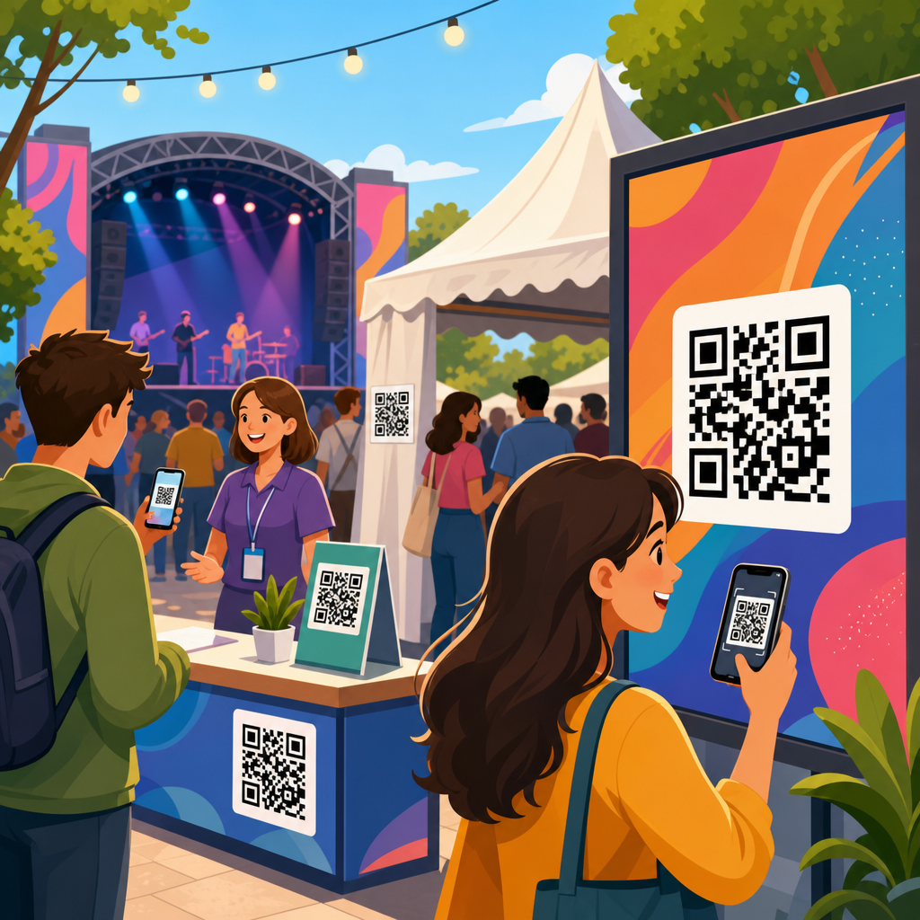
QR code placement for events and signage determines whether a scan happens in seconds or never happens at all. Placement is the practical discipline of choosing the right location, height, size, angle, surrounding design, material, and call to action so a code can be noticed, understood, and scanned under real conditions. In event environments, that means accounting for moving crowds, temporary fixtures, changing light, and short attention spans. In permanent signage, it means planning for weather, glare, viewing distance, accessibility, and maintenance over months or years.
I have seen beautifully branded QR campaigns fail because the code sat too high on a banner, too close to a reflective window, or beside copy that never explained why anyone should scan. I have also seen simple black-on-white codes produce excellent results because they were placed at eye level, sized for the expected distance, and paired with a clear prompt such as “Scan for menu,” “Scan to register,” or “Scan for exhibitor map.” Placement matters because scanning is a physical behavior. People need to spot the code, understand the benefit, approach it safely, and use a phone camera without awkward body movement or visual interference.
This hub article explains QR code placement across event signage, retail signage, wayfinding, booths, posters, table tents, windows, walls, packaging tie-ins, and outdoor displays. It covers the fundamentals that affect performance, including viewing distance, line of sight, print contrast, material finish, dwell time, traffic flow, and accessibility. It also addresses operational details that are often ignored, such as how staff test placements before launch, how dynamic QR codes support updates, and how analytics reveal whether a location is truly working. If you want scans that translate into registrations, check-ins, menu views, payments, downloads, or leads, placement is the lever that turns a QR code from decoration into infrastructure.
What good QR code placement actually means
Good QR code placement means the code is visible, reachable, legible, and relevant in the moment the user encounters it. Visibility starts with line of sight. If attendees must tilt their heads, crouch, step into traffic, or stand directly beneath a hanging sign to scan, the placement is weak even if the print quality is perfect. Reachability refers to the physical ease of using a phone camera from a comfortable position. Legibility covers technical requirements such as code size, quiet zone, contrast ratio, and distortion-free printing. Relevance means the code appears where the user naturally needs the next action: on an entry sign for check-in, at a booth for product sheets, or at a table for menus and payment.
In practice, I plan placement by mapping three variables first: how far away people will first notice the sign, how long they will stand near it, and what they expect to do there. A directional sign in a corridor gets a fast glance and little dwell time, so the code should support a simple action, such as opening a map or schedule, and sit lower than the headline so a phone can capture it quickly. A trade show booth wall allows more dwell time, so the code can lead to a spec sheet, demo booking page, or lead form, provided the booth layout leaves enough space for people to pause without blocking traffic.
Good placement also respects intent. If the goal is immediate action, put the code where the decision occurs. A venue parking sign can link to event entry instructions before visitors reach a confusing fork. A sponsor banner can deliver poor scan rates if users have no reason to stop, while the same code on a counter card beside a giveaway can perform strongly because the value is obvious and the user is already engaged. The best placements align physical context with digital reward.
Core placement rules for events, booths, and temporary signage
At events, codes should usually sit between chest and eye level for standing adults, roughly in the range that allows a natural phone hold and stable framing. Very low placement is missed in crowds and can be inaccessible for some users. Very high placement forces people to step back and aim upward, which reduces scan success and creates congestion. For tabletop applications such as menus, donation prompts, or quick surveys, the code should face the user directly or at a slight angle, not lie flat under harsh overhead light.
Distance drives size. A common field rule is about one inch of QR code width for every ten inches of scanning distance, though modern phone cameras vary and complex codes need more room. For event signage, I treat that as a minimum starting point, not a guarantee. A code on a pull-up banner meant to be scanned from three to five feet away should be materially larger than a code on a business card. If the encoded destination uses a long static URL and the pattern is dense, enlarge it further or switch to a dynamic code to simplify the matrix.
Temporary environments add risk factors that permanent signage may not face every day: wrinkled vinyl, poorly tensioned fabric, scuffed foam board, gaffer tape near edges, and lighting that changes from setup to show hours. Matte finishes outperform glossy finishes in most event halls because they reduce reflections from spotlights and skylights. Codes should not be placed across seams, folds, grommets, transparent acrylic edges, or textured substrates that break the square modules. On floor graphics, scans can work, but only when foot traffic allows users to stop safely and the code is large, high contrast, and not distorted by anti-slip lamination.
| Placement scenario | Recommended approach | Common failure |
|---|---|---|
| Entrance signage | Place at eye level with a short action prompt for check-in or event info | Code too high on header truss, impossible to scan in queue |
| Trade show booth wall | Use a large matte code near product messaging and staff handoff point | Code hidden behind visitors or placed beside irrelevant branding |
| Table tent or counter card | Angle toward user, pair with one clear action such as menu or payment | Flat glossy print causing overhead glare |
| Window signage | Mount at comfortable height, test from both sides, avoid reflections | Dark tint and exterior light washing out contrast |
| Outdoor poster | Increase size, use weather-resistant matte laminate, keep away from edges | Small code exposed to sun, rain, and warping |
Placement by sign type: posters, windows, walls, tables, and wayfinding
Posters work best when the QR code sits in the lower half but not at the very bottom edge, where folds, holders, and visual clutter reduce attention. The headline should state the payoff in plain language. “Scan to see speakers” outperforms a generic “Learn more” because it answers the immediate question. On transit-style posters or venue boards viewed from several feet away, use a larger code with ample quiet zone and keep surrounding graphic elements from mimicking the code’s geometry.
Window signage requires extra care because reflections and transparency can undermine contrast. I often recommend printing on opaque vinyl or using a white backer layer so the code reads consistently from the intended side. If the code faces the street, test at the exact time of day when sun glare is strongest. If it faces inward for visitors already near the door, make sure handles, mullions, and decals do not interrupt the scan path. A code placed on a door must still be scannable when the door swings or when a crowd gathers at the entrance.
Wall graphics and murals can deliver excellent scans when the code is integrated without sacrificing readability. The mistake is forcing the code into a decorative corner or embedding it in busy artwork. Keep a clean buffer around the symbol and preserve strong contrast. For wayfinding, placement should coincide with decision points: elevator banks, corridor intersections, registration desks, and outside breakout rooms. A code linking to maps or schedules is most effective exactly where visitors hesitate. If users need several seconds to orient themselves, that pause creates ideal dwell time for scanning.
Table signage supports some of the highest-intent uses because users are already stationary. Restaurants, conference lounges, donor tables, and sponsor booths rely on this format for menus, forms, catalogues, and payment. Here, stability matters more than scale. Use rigid stock or holders that keep the sign upright, maintain a moderate viewing angle, and avoid placing the code behind condiment bottles, merch, or giveaway bowls. The cleaner the immediate environment, the faster the scan.
Environmental factors: lighting, materials, crowd flow, and accessibility
Lighting is one of the most underestimated variables in QR code placement. Cameras need enough contrast to distinguish modules clearly, and reflective surfaces can erase that contrast in a single bright hotspot. Matte paper, matte laminate, painted metal with low sheen, and non-glare acrylic usually scan better than glossy coated stocks. For backlit signage, test the exact production setup because illumination can bleed through thin materials and soften edge definition. Outdoor signs must survive changing weather while preserving contrast, especially in direct sun where faded inks and surface haze quickly reduce performance.
Material choice is inseparable from placement. Corrugated plastic can work outdoors for short runs, but fluting, warping, and fastening points can create distortion if the code is too close to edges. Fabric graphics look polished at events, yet stretch can alter module geometry if the file is not sized generously and tensioned correctly. Adhesive vinyl on textured walls or brick is risky because surface irregularities break the clean squares that scanners expect. Whenever possible, place codes on smooth, flat sections of the sign system and reserve textured or decorative areas for supporting graphics.
Crowd flow determines whether a code is practically usable. A code in the center of a queue barrier may seem visible, but if people cannot step aside to scan, results suffer. Likewise, a code on a narrow corridor sign may create bottlenecks if the call to action requires a pause. In busy venues, the best placements sit just outside the heaviest traffic line while remaining visible from it. This allows users to peel off, scan, and rejoin movement without blocking others. Event planners should walk the route as attendees will, not as exhibitors do during setup.
Accessibility should be built into placement decisions from the start. Not every user can raise a phone comfortably overhead, bend low, or stand in bright sunlight while reading tiny instructions. Place codes at a range that suits most adults and consider duplicate placements where needed, such as one on a wall and another on a counter. Pair the code with a readable short URL or NFC alternative when possible. Clear labeling, adequate font size, and straightforward instructions help users with cognitive or visual challenges understand the action and trust the destination.
Testing, analytics, and maintaining placement over time
The most reliable QR code placement process includes preflight testing, live-event observation, and post-launch analysis. Before production, test the code on the intended material at final size using multiple phones, both iPhone and Android, from the actual expected distance. Test in the venue or a similar lighting environment whenever possible. During setup, verify that furniture, stanchions, floral arrangements, merch racks, or retractable barriers have not obstructed the sign. I have seen strong placements ruined on event day by last-minute décor and sponsor add-ons.
Live observation reveals problems analytics alone cannot. Watch whether visitors notice the sign, whether they hesitate, whether they need to reposition, and whether staff are redirecting them verbally. These behaviors indicate placement friction. If many users ask where to scan, the sign likely lacks prominence. If they approach, try, and give up, the issue is usually size, glare, angle, or crowd interference. Small adjustments, moving a tabletop sign six inches forward or lowering a poster to a more natural scan height, can meaningfully improve scan-through rate.
Analytics complete the picture. Dynamic QR code platforms such as Bitly, QR Code Generator Pro, Beaconstac, and Flowcode can report scans by time, location, and device pattern, while linked landing pages in Google Analytics 4 show engagement after the scan. If one sign location generates impressions but few scans, placement is likely at fault. If scans are healthy but conversions are poor, the landing experience may be the weak point. A hub strategy works best when each subtopic page, such as sizing, materials, or testing, is linked from placement guidance so teams can diagnose the real cause quickly.
Maintenance matters for long-term signage. Sun exposure, abrasion, vandalism, cleaning chemicals, and seasonal grime can degrade a once-perfect code. Schedule inspection, especially for outdoor, retail, and venue installations. Replace damaged signs before failure becomes visible to users. Keep destination links current, and use dynamic redirects when campaigns change. The lasting benefit of strong QR code placement is simple: fewer missed scans, smoother user journeys, and better outcomes from every printed surface. Audit your current signs, test them in real conditions, and improve the placements that ask users to work too hard.
Frequently Asked Questions
What is the most important factor in QR code placement for events and signage?
The most important factor is scanability in real-world conditions. A QR code can be perfectly designed and still fail if people cannot comfortably notice it, approach it, and scan it within a few seconds. That means placement should always be evaluated from the viewer’s perspective rather than from the designer’s layout. Ask simple practical questions: Will people be walking past quickly or standing still? Are they likely to be close to the code or several feet away? Is the code mounted at a natural viewing height? Is glare, shadow, or visual clutter making it harder to see? At events, these issues become even more important because crowds move unpredictably, lighting changes throughout the day, and attention is limited. On permanent signage, environmental durability, viewing distance, and the physical surface all affect performance.
Strong placement usually combines several decisions working together: enough size for the intended scanning distance, a clear call to action, high contrast, minimal obstructions, and a location that matches user behavior. For example, placing a code at the exit of a trade show booth may work well for brochure downloads, while placing one too low on a banner near people’s feet will often be ignored. The best placements feel effortless. People should understand what the code is for, be able to frame it easily with their phone, and complete the scan without awkward body position or waiting for the crowd to clear. In short, the right placement is the one that reduces friction at every step.
How high and how large should a QR code be on event displays or signs?
Height and size should be determined by how far away the audience is and how they will interact with the sign. For close-range scanning, such as tabletop displays, registration counters, product stands, or posters in a lobby, the code should typically be placed around chest to eye level so people can scan without bending down or raising their phones overhead. A comfortable zone is often somewhere in the approximate range of 3.5 to 5 feet from the ground, depending on the display type and audience. If the QR code is meant to be scanned while people are walking by, placing it too high or too low can reduce response because it forces an unnatural scanning angle. In crowded event settings, eye-level or slightly below eye-level usually performs best because it remains visible even when people are moving around.
Size matters just as much. A small code may look tidy in a design mockup but become useless on the show floor or outdoors. As a practical rule, the farther away the intended user is, the larger the code needs to be. Codes on flyers or table tents can be relatively modest, while codes on wall graphics, wayfinding signs, storefront windows, or venue entrances should be much larger to support easy scanning from a comfortable standing distance. It is also important to preserve adequate quiet space around the code so phone cameras can detect it cleanly. If a code is surrounded by dense text, decorative graphics, or edge-to-edge design elements, its effective usability drops. The safest approach is to test printed samples at actual size, in the actual environment, using multiple phones before final production.
Where should QR codes be placed at events to get the most scans?
The best event placements align with moments when attendees naturally pause, wait, or seek information. High-performing locations often include registration desks, entry points, booth counters, product demonstration areas, session check-in stations, menu boards, directional signs, badge pickup areas, and post-presentation slides. These are places where people are already primed to take an action, whether that means downloading an agenda, joining a giveaway, viewing product specs, accessing Wi-Fi details, or saving contact information. A QR code placed in a dead zone with no context will usually underperform, while the same code placed at a decision point can generate strong engagement.
Timing and traffic flow also matter. In busy environments, avoid placing codes where people have to stop in the middle of a stream of foot traffic, block a queue, or twist around to scan from an awkward angle. If attendees feel rushed or physically constrained, they are less likely to complete the interaction. Instead, place codes slightly off the main flow where there is room to pause. Booth side panels, queue-line signage, waiting areas, and seating zones can be especially effective because people have a moment to engage. It also helps to match the call to action to the location. A code near a stage might invite people to download presentation materials, while a code near a product display might offer specs, pricing, or a demo request. Relevance increases scans as much as visibility does.
How do lighting, materials, and weather affect QR code placement on permanent signage?
These factors can make or break performance over time. Lighting affects whether a phone camera can quickly distinguish the code from its background. Harsh glare on glossy surfaces, deep shadow under awnings, backlighting through windows, and inconsistent night lighting can all reduce scan success. For that reason, matte finishes are often safer than reflective materials, especially outdoors or in bright indoor spaces with overhead lighting. Contrast should remain strong across the day, not just at the moment the sign is installed. A code that looks crisp at noon may become difficult to scan at dusk if the sign is poorly lit. If the sign will be viewed at night, placement should account for dedicated illumination or ambient light levels, not assume phones will compensate for poor visibility.
Weather and surface durability are equally important for permanent signage. Outdoor QR codes face rain, sun exposure, dirt, abrasion, temperature swings, and material fading. If the printed code warps, cracks, peels, or loses contrast, scan reliability will drop. Placement should therefore avoid areas prone to pooling water, constant direct reflection, heavy grime, or physical wear from touch and impact. Curved, textured, or uneven mounting surfaces can also distort the code and interfere with camera recognition. Flat, durable, weather-resistant surfaces are ideal. In exterior environments, it is smart to think beyond installation day and consider maintenance: can the code be cleaned easily, inspected regularly, and replaced without remaking the entire sign? Long-term performance depends on durability as much as initial design quality.
What mistakes should be avoided when placing QR codes on signs, posters, and displays?
The most common mistake is treating the QR code as a decorative add-on instead of a functional interaction point. When placement is driven only by layout aesthetics, the code often ends up too small, too low, too high, too close to other visual elements, or positioned where people cannot comfortably stop and scan. Another major mistake is failing to give users a reason to act. Even a well-placed code can be ignored if there is no clear call to action explaining what the scan delivers. “Scan for event schedule,” “Scan to view menu,” or “Scan to get directions” performs far better than showing a code with no explanation. Users want clarity before they commit to scanning.
Other frequent errors include placing the code on reflective glass, curved banners, unstable temporary fixtures, or heavily patterned backgrounds; using low contrast colors; shrinking the quiet zone; and skipping live testing. At events, people also underestimate the impact of crowding, line formation, and short attention spans. A code may seem visible during setup but disappear once the venue fills. On permanent signage, teams often overlook seasonal sun angle, nighttime visibility, vandalism risk, and simple wear and tear. The best way to avoid these mistakes is to test the code where it will actually live, with real devices, from realistic distances, under normal operating conditions. Good placement is rarely accidental. It comes from practical testing, careful observation, and designing for human behavior rather than idealized conditions.


