QR code placement in restaurants determines whether guests scan instantly, ignore the code completely, or become frustrated enough to ask staff for help. In practical terms, placement means the exact physical location, height, angle, distance, lighting context, and surrounding design treatment that affect scan success. A restaurant QR code can link to menus, payment pages, loyalty programs, allergen details, reviews, Wi-Fi, ordering systems, or feedback forms, but none of those functions matter if the code is hard to notice or difficult to scan. I have tested QR deployments in cafés, fast-casual counters, hotel dining rooms, and full-service restaurants, and the pattern is consistent: a well-designed code underperforms when it is placed in glare, hidden under condiments, printed too small, or presented at the wrong moment in the guest journey.
Restaurants care about QR code placement because it affects labor efficiency, table turn times, upsell conversion, order accuracy, and guest satisfaction. A host stand code can reduce check-in friction, a table tent can accelerate menu access, and a takeout bag code can create repeat visits after the meal. Placement also shapes accessibility. Guests may be standing, seated, carrying bags, holding children, or using older phones with weaker camera autofocus. The best restaurant QR code placement strategy accounts for all of that. This article serves as the hub for QR Code Placement within the broader QR Code Design, Printing and Materials topic, so it covers the core decisions, the most effective locations, technical constraints, common mistakes, and the measurement approach restaurants should use to improve scan rates over time.
Map QR code placement to the guest journey
The most effective way to decide where to place QR codes in restaurants is to map them to guest intent at each stage of the visit. Before arrival, guests want directions, reservations, waitlist access, parking details, and hours. At entry, they want check-in, queue updates, and quick menu browsing. At the table, they want menus, allergen information, ordering, payment, and loyalty enrollment. After the meal, they may be willing to leave a review, join a rewards program, or reorder for takeout. Each intent should have a dedicated placement and a dedicated destination page. One code should not try to solve every problem.
For example, I usually recommend an exterior window decal near eye level for hours, reservations, or pickup instructions; a host stand sign for waitlist or menu access; a table tent or menu holder insert for dine-in ordering; a countertop sign at the register for payment and rewards; and packaging inserts for reorder prompts after the guest leaves. This sequence matches natural pauses in the experience. It also reduces staff explanations because the code appears precisely when the guest needs that action. Placement strategy is stronger when restaurants think in moments rather than in surfaces.
Context matters as much as location. A QR code at the table may be ignored if every guest already received printed menus. The same code can perform well if it promises “See photos, allergens, and seasonal specials” because that gives the diner a clear benefit beyond what is on paper. Likewise, a payment QR near the register works only when the signage clarifies the next step, such as “Scan to pay at your table” or “Join rewards in 10 seconds.” Good placement combines visibility, timing, and purpose. If any one of those three is missing, scan rates usually drop.
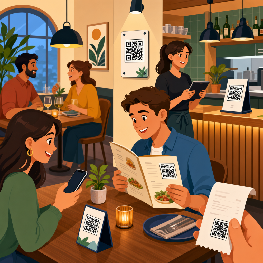
Best physical locations inside and outside the restaurant
Several restaurant QR code locations consistently perform well because they align with how people move and where they naturally pause. Exterior windows work for after-hours access, reservations, digital menus, and pickup instructions, especially in dense urban areas where guests often decide while standing outside. Host stands are effective for waitlist registration, menu previews, and event sign-ups because guests are already looking for direction. Tabletops and table tents remain the strongest location for menu access, self-ordering, and payment in dine-in settings. Counter cards work well in cafés and quick-service restaurants where guests order while standing.
Wall placement is more variable. A wall-mounted QR code can succeed in queue lanes, pickup shelves, or waiting areas, but only if it sits at a comfortable scanning height, usually around chest to eye level, with enough open space for someone to stand back and frame the code. Doors are often poor placement zones because they move, reflect light, and create traffic pressure. Codes placed under glass can still work, but glare reduces reliability. Bathroom mirrors are tempting for promotional codes, yet they usually produce lower-quality interactions unless the offer is highly relevant, such as joining a loyalty club or accessing a feedback form after service recovery.
The table below summarizes strong and weak QR code placement options based on scan convenience, dwell time, and intent clarity.
| Location | Best Use | Main Advantage | Primary Risk |
|---|---|---|---|
| Exterior window | Hours, reservations, pickup info | Captures guests before entry | Sun glare and weather exposure |
| Host stand | Waitlist, menu preview | High intent, natural pause point | Staff or décor can block visibility |
| Table tent | Menu, ordering, payment | Longest dwell time | Gets moved, stained, or hidden |
| Counter card | Rewards, payment, receipts | Works during checkout flow | Competes with other signage |
| Takeout packaging | Reorders, feedback, loyalty | Extends engagement after visit | Late scan timing, lower urgency |
Restaurants should also separate operational and promotional placements. A code used to open the core menu should appear in the most obvious and redundant locations, while promotional codes can sit on receipts, packaging, or secondary signage. Keeping these roles distinct prevents clutter and lowers decision fatigue. When every surface has a different QR code, guests stop trusting them.
Technical rules that make placement actually work
Placement decisions should be grounded in scanning mechanics, not guesswork. A code must be large enough for the expected viewing distance. A practical rule is a minimum scanning distance ratio of roughly ten to one, meaning a 1-inch code is comfortable at about 10 inches away. On restaurant tables, I prefer at least 1.25 inches for simple links and larger for glossy print, lower lighting, or older customer demographics. For wall signs viewed from several feet away, size must increase quickly. A tiny code on a poster is one of the most common restaurant mistakes.
Contrast is equally important. Dark code on a light matte background remains the safest option. In branded environments, restaurants often invert colors or place codes over photos, wood grain, or textured paper. That may look refined, but it lowers scan reliability. Quiet zones matter too. Every QR code needs clear empty space around it so camera software can distinguish the code from surrounding graphics. If a designer pushes text or borders too close, scan times increase. Error correction helps with minor wear, but it is not a substitute for good placement or clean printing.
Lighting, angle, and material finish strongly affect scan success. Overhead spotlights can create hot reflections on laminated menus or acrylic table signs. Curved bottles, wrinkled stickers, and folded paper sleeves distort the square pattern enough to confuse some cameras. Matte finishes usually outperform gloss in restaurant conditions. If a code sits under sneeze guards, under glass tabletops, or behind clear protective covers, test it during actual service, not under office lighting. I have seen codes pass a desktop test and fail at dinner because candlelight, shadow, and fingerprint smudges changed the result completely.
Destination quality also belongs in placement strategy. If guests scan a code at the entrance, the linked page must load fast on mobile data, display correctly on small screens, and answer the immediate need without extra taps. A perfect placement that opens a slow PDF menu is still a poor experience. Use dynamic QR codes when possible so destinations can be updated without reprinting materials, and add analytics parameters to understand which placements generate real engagement instead of raw scans alone.
Placement by restaurant type and service model
Different restaurant formats need different QR code placement patterns. In quick-service restaurants, guests are often standing, making decisions fast, and looking upward toward menu boards or downward at the payment terminal. That means counter cards, queue-line signage, and pickup shelf labels usually outperform table placements. In fast-casual environments with self-seating, entrance signage and tabletop codes are both important because guests may browse first, then order from a table. In full-service restaurants, table placement carries the most weight, but hosts, bar tops, and check presenters can support the experience without making the dining room feel over-instrumented.
Bars, breweries, and cafés often benefit from compact placements near the point of pause: bar rails, coaster holders, pastry cases, and takeaway cup sleeves. These environments have faster turns and shorter dwell times, so the code must be visible immediately and promise one clear action. Hotels and multi-concept venues need stronger wayfinding. A code in a lobby café may need to separate breakfast ordering from room charge information, while a rooftop bar may use window or elevator signage to show menus before guests even reach the venue. In food halls, stall-front QR codes are especially useful because guests compare options while walking.
Drive-thru, curbside, and pickup operations introduce another set of constraints. Exterior placement must account for sun, moisture, and vehicle viewing angles. For curbside, a parking sign QR can confirm arrival or identify space numbers, but only if it is visible from the driver seat and legible through a windshield camera angle. For takeout shelves, package-top labels or shelf-edge signs can route guests to order status pages, reheating instructions, or loyalty enrollment. In each case, restaurant QR code placement should reduce a bottleneck. If it does not save time, improve clarity, or generate follow-up value, it may not deserve the space.
Common placement mistakes and how to test improvement
The biggest QR code placement mistake in restaurants is treating the code like decoration instead of a functional interface. When a code is shrunk to fit a branding concept, buried in a busy layout, or positioned where guests cannot comfortably stand, scan performance suffers. Another frequent error is choosing only one placement. Redundancy matters. Guests should encounter the menu code at least twice in dine-in environments, typically at the host stand and on the table, because not everyone notices the first prompt. A third mistake is using the same landing page everywhere, which makes it impossible to learn which location is producing value.
Testing should be straightforward and disciplined. Start by assigning a unique dynamic code or tracking parameter to each placement zone: exterior, host stand, table tent, register, receipt, and packaging. Then measure scans, completed actions, and downstream behavior such as orders started, payments completed, reward enrollments, or repeat purchases. In one café project, moving a loyalty QR code from the pastry case side panel to the payment counter increased scans because guests had both hands free only after ordering. In another case, raising a pickup instruction code from knee height on a door to eye level on a window reduced staff interruptions within a week.
Restaurants should also test environmental variables. Print the same code on matte and gloss stock. Compare table tents with flat stickers. Evaluate daylight and evening performance separately. Ask staff to note when guests hesitate or ask where to scan. These observations are operational data, not anecdotes. Accessibility checks are essential as well. Make sure seated guests do not need to twist to scan, standing guests do not block traffic, and visually busy placements still include a clear instruction label. The best restaurant QR code placement program is iterative: observe, measure, reposition, and retest on a regular schedule.
Where to place QR codes in restaurants is ultimately a question of matching purpose, visibility, and timing with the real behavior of guests. The strongest placements sit where diners naturally pause, hold the phone comfortably, and understand exactly what happens after the scan. Exterior windows help before entry, host stands guide arrival, table tents support menu access and payment, counters capture checkout intent, and packaging extends the relationship beyond the dining room. Technical details such as size, contrast, matte materials, quiet zones, and mobile-friendly destinations are not optional extras; they determine whether a code works under actual restaurant conditions.
Restaurants that treat QR code placement as a system rather than a one-time print decision get better results. They assign each code a specific job, place it in the right moment of the guest journey, and measure performance by location. They also recognize tradeoffs: too many codes create clutter, glossy finishes create glare, and beautiful branding can undermine scan reliability if it overrides usability. If you are building out your QR Code Placement strategy as part of a larger QR Code Design, Printing and Materials program, start by auditing every current code in the venue, removing weak placements, and testing two or three high-intent locations first. Better placement leads to more scans, smoother service, and a stronger guest experience.
Frequently Asked Questions
Where should QR codes be placed in a restaurant for the highest scan rate?
The best QR code placement is wherever guests naturally pause, look, and make decisions without needing to search for it. In most restaurants, that means table tents, the top third of the menu holder, the front-facing edge of the table, check presenters, host stand signage, pickup shelves, bar tops, and entry signage near eye level. A QR code works best when it appears exactly where the next action makes sense. If the code opens a digital menu, it should be visible as soon as guests are seated. If it starts payment, it should be placed where the bill arrives. If it links to pickup orders, it should be near the pickup area rather than buried elsewhere in the dining room.
Physical usability matters just as much as visibility. Codes should be easy to scan from a normal seated or standing position without guests needing to lean across the table, rotate the code, move condiments, or pick up a heavy display. Ideally, the code faces the user directly or at a slight angle, is well lit, and sits within comfortable phone camera range. For table use, that usually means placing the code where a seated guest can scan it from roughly arm’s length. For wall or counter placements, keeping the code near eye level or slightly below tends to improve scan success because it matches natural viewing behavior.
Restaurants also get better results when they avoid relying on only one placement. A single code on a front door may help arriving guests, but it does nothing once they are seated. A code only on the receipt may be too late if the goal was to reduce ordering friction. The strongest approach is to match placement to the customer journey: entrance for waitlist or ordering instructions, table for menu and ordering, register for payment and loyalty, and exit point for reviews or feedback. Good placement is not just about exposure; it is about putting the right code in the right location at the exact moment a guest is most likely to use it.
What height, angle, and distance make a restaurant QR code easiest to scan?
The easiest QR codes to scan are positioned so a guest can point a phone at them comfortably, without awkward wrist angles, glare, or extreme zooming. At tables, codes should generally be upright or slightly tilted toward the guest instead of lying flat under overhead lights. Flat placement often creates reflections, especially on laminated surfaces, which can interfere with phone cameras. A slight stand-up angle or vertical display usually improves readability because it reduces glare and presents the code more directly to the lens.
Height depends on where the code is used. For seated diners, the code should sit within the normal line of sight on the table or menu holder, not low on a table leg or far above the booth. For standing guests at a counter, host stand, or pickup shelf, the code should usually be placed around chest to eye level so it can be scanned quickly without bending down. For window signage, the code should be large enough and positioned where guests outside or in line can approach it without blocking traffic. If the guest must stand too close or too far away to capture the whole code cleanly, scan rates drop quickly.
Distance is especially important because many restaurants print codes too small for real-world conditions. A code that works perfectly at a desk may fail in a dim dining room or from across a table. Guests should be able to scan from a natural distance with minimal effort, ideally without needing to step around furniture or move personal items. The surrounding design should leave enough white space so the code is visually isolated and instantly recognizable. In practical terms, successful placement means testing the code with different phones, from realistic guest positions, under actual restaurant lighting. If staff have to explain how to stand or where to point the camera, the placement is not optimized.
Why do some restaurant QR codes get ignored even when they are clearly visible?
Visibility alone does not guarantee action. Many QR codes are ignored because they are visible but poorly contextualized. Guests need to know what the code does and why scanning it helps them. A black-and-white square sitting on a table without any instruction can easily be dismissed as decoration, advertising, or something intended for staff. Clear supporting text such as “Scan to view menu,” “Scan to pay,” or “Scan for allergen info” gives the code purpose. When the benefit is immediate and obvious, scan rates increase significantly.
Design clutter is another major reason codes get overlooked. If the code is buried inside dense promotions, surrounded by too many graphics, printed over busy backgrounds, or mixed with multiple calls to action, guests may not process it quickly enough to act. Restaurants are busy environments, and most diners make decisions in seconds. A QR code should stand out visually, but it should also feel trustworthy and easy. If guests are unsure whether it leads to the official menu, a payment page, or a random third-party site, many will simply avoid it.
Placement can also create subtle psychological resistance. If scanning requires extra effort, guests often give up before trying. Examples include codes behind condiment bottles, under acrylic with glare, on unstable table tents, near dirty surfaces, or in areas where guests feel rushed or in the way. Poor timing matters too. A loyalty signup code shown before a guest has even ordered may be ignored, while the same code on a receipt or payment screen could perform much better. The lesson is simple: guests scan when the code is useful, credible, easy to spot, and effortless to access at the exact right moment.
How can restaurants place QR codes without frustrating guests or increasing staff questions?
The key is to make QR code use intuitive rather than mandatory-feeling, confusing, or physically inconvenient. Frustration usually starts when a guest sees a code but does not understand what happens next. That is why every placement should include a short instruction and a clear outcome. Instead of presenting only the code, explain the benefit in plain language: “Scan to order and pay,” “Scan for wine list,” or “Scan for allergy and ingredient details.” This reduces hesitation and prevents guests from needing to call staff over just to ask what the code is for.
Restaurants should also avoid forcing one code to do everything unless the landing page is extremely simple. If a guest scans a table code expecting a menu but lands on a page with ordering, loyalty, promotions, app downloads, and feedback options all competing for attention, confusion rises immediately. Matching the code’s location to a single primary purpose keeps the experience clean. A table code can focus on menu or ordering, a check presenter code can focus on payment or tipping, and an exit sign can invite reviews or loyalty enrollment. Purpose-driven placement reduces decision overload.
Operational testing is just as important as design. Staff should regularly scan each code with different phone types, from customer positions, during daytime and evening service. Lighting changes, damaged print surfaces, condensation, scratches, and shifting table items can all affect performance. It also helps to train staff on simple backup language so they can assist guests quickly if needed. A well-placed code should reduce interruptions, not create them. When guests can immediately see the code, understand the benefit, and complete the scan without awkward movement or guesswork, staff questions drop and the overall dining experience feels much smoother.
Should restaurants use different QR code placements for menus, payments, loyalty, and reviews?
Yes, because each function belongs to a different stage of the guest experience, and placement should reflect that behavior. A menu QR code performs best at the point of seating or where guests first decide what to order. A payment QR code belongs at the end of the meal, typically on the receipt, check presenter, or tabletop area where the bill is delivered. A loyalty QR code often works better near the register, on packaging, or after payment when the guest has already received value and is more open to joining a program. A review QR code is usually most effective near the exit, on takeaway packaging, or post-transaction rather than during the meal itself.
Using one identical code everywhere can weaken performance because it ignores context. Guests do not want to hunt through a landing page to find the action they need in that moment. A diner trying to browse lunch options should not have to navigate past loyalty prompts or feedback requests. Likewise, someone ready to pay should not land on a homepage designed for general browsing. Distinct placements allow the restaurant to guide behavior more naturally and reduce friction at each stage.
That said, consistency still matters. The visual treatment of each code should feel branded and official so guests trust that every code belongs to the restaurant. Use consistent design cues, labels, and formatting, but assign each code a specific role tied to a physical location. This approach improves scan intent, lowers confusion, and makes the restaurant’s digital tools feel like part of a well-planned service system rather than a collection of random signs. In other words, the most effective QR strategy is not simply “put up a code.” It is to place each code where the guest already expects the next step to happen.


