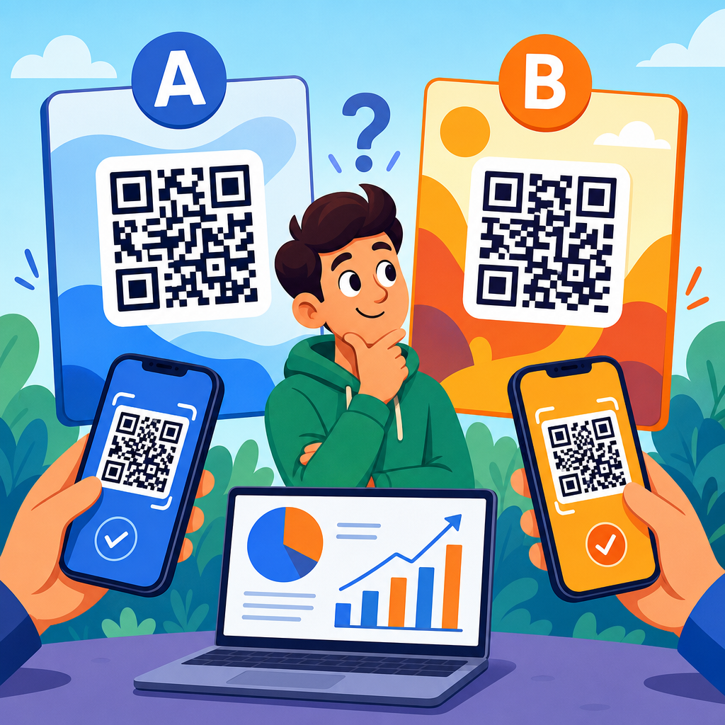
QR code UX is the practice of designing the scan experience so a person moves from noticing a code to completing a desired action with as little friction as possible. In marketing, that action might be a purchase, form fill, app download, coupon redemption, menu view, event check-in, or product registration. Conversion optimization applies the same discipline used on landing pages and checkout flows to the entire QR journey: placement, context, motivation, scanability, page speed, message match, and post-click clarity. When teams treat a QR code as just a black-and-white graphic, results are usually mediocre. When they treat it as a conversion interface, performance improves.
I have worked on QR campaigns for retail packaging, restaurant tabletop ordering, direct mail, trade show signage, and field service labels, and the same pattern appears every time: the code itself is rarely the core problem. Poor surrounding design is. Users ask basic questions before they scan. What will happen? Is it safe? Is this worth my time? Will it work in bad light, from a moving train, through a shop window, or on a crumpled flyer? Good QR code UX answers those questions before the camera opens and keeps answering them after the landing page loads.
This matters because smartphone scanning is now normalized, but user patience is still limited. The native camera app made scanning easy on iPhone and Android, yet ease of scanning does not guarantee intent. A code on a poster competes with distractions, time pressure, signal quality, and trust concerns. A code on packaging competes with shelf noise and tiny print. A code on printed direct mail has one chance to earn attention. Every missed scan or abandoned landing page is wasted media spend, wasted print real estate, and lost attribution. Better QR code UX protects that investment.
At a practical level, high-converting QR experiences depend on three connected layers. First is discoverability: people must notice the code and understand why it is there. Second is scan success: the symbol must be large enough, contrasted enough, and positioned well enough to decode instantly. Third is destination performance: the page or app experience must match the promise made near the code and make completion obvious. If any layer breaks, conversion drops. That is why this topic belongs at the center of QR code marketing strategy, not at the edge of graphic production.
Start with user intent, not the code
The most important design decision is not color, frame shape, or logo placement. It is the job the user is trying to get done in that moment. A person standing in a store aisle wants fast product details, reviews, ingredients, sizing help, or a discount. A diner at a table wants a menu that loads instantly and is readable in low light. A conference attendee wants a schedule, map, or lead capture flow that does not require account creation. If the destination ignores context, the code may scan successfully and still fail commercially.
I usually begin by mapping a simple chain: trigger, motivation, friction, and reward. Trigger is where the code appears: packaging, poster, receipt, shelf tag, display, badge, mailer, invoice, window decal, or equipment label. Motivation is the reason to scan: save money, get proof, shorten a process, unlock content, verify authenticity, or continue a journey. Friction includes glare, weak connectivity, long URLs, forced app downloads, and confusing forms. Reward is the visible outcome. This model keeps teams focused on conversion behavior instead of decorative choices.
Clear calls to action consistently lift scan rates. “Scan me” is weak because it describes the action, not the benefit. “Scan for 15% off today,” “Scan to see it in your room,” and “Scan for installation video” perform better because they answer the user’s first question immediately. Specificity beats cleverness. On packaging, adding one line of explanatory microcopy can transform performance because users understand the value exchange before they commit. In retail tests, I have seen a benefit-led call to action outperform a generic one even when the code graphic stayed identical.
Message match must continue on the destination page. If the printed code promises a coupon, the landing page should show the coupon above the fold. If the sign promises a menu, the user should land directly on the menu, not the homepage. This sounds obvious, but many QR campaigns still route to broad navigation pages that force users to hunt. That extra cognitive load kills conversions. Strong QR code UX removes decisions, shortens paths, and preserves the promise from print or physical space through completion.
Design the code and its environment for reliable scanning
Scanability is a usability issue before it is a branding issue. A QR code needs sufficient size, contrast, quiet zone, and surface stability to decode quickly across different cameras and lighting conditions. ISO/IEC 18004 defines the symbol structure, but practical deployment decisions matter just as much. As a rule, use dark modules on a light background, preserve the required quiet zone around the symbol, and avoid shrinking the code to satisfy layout preferences. Stylization is acceptable only after baseline readability is proven on multiple devices.
Distance determines size. A common field rule is roughly one inch of code size for every ten inches of scanning distance, though testing always beats formulas. A code on product packaging can be smaller than one on a transit poster because the user stands closer. A code on a highway billboard is usually pointless for drivers and unsafe by design, even if technically large enough. Placement also affects success. Avoid curved surfaces, reflective laminates, busy textures, deep shadows, and fold lines. These are not aesthetic concerns alone; they directly reduce decoding speed.
Error correction allows a code to remain readable when part of it is obscured, but marketers often misuse this feature by inserting oversized logos or heavy styling that pushes beyond safe limits. Higher error correction can help in dusty industrial settings or on labels likely to suffer wear, yet it also increases symbol density, which can hurt small-format readability. The right choice depends on use case. In field service, durability may justify denser symbols. In direct mail, simplicity usually wins because pristine print conditions allow cleaner, faster scans.
| Design factor | Best practice | Why it improves conversions |
|---|---|---|
| Call to action | State the benefit clearly | Raises scan intent before effort begins |
| Code size | Match size to likely scan distance | Reduces failed scans and user frustration |
| Contrast | Dark code on light background | Improves decoding across devices and lighting |
| Quiet zone | Keep clear space around the symbol | Prevents camera recognition errors |
| Landing page | Deliver the promised content immediately | Cuts abandonment after the scan |
| Page speed | Optimize for mobile load time | Protects conversions on weak networks |
The environment around the code matters as much as the symbol. Give the code visual breathing room. Pair it with a short headline, a concise instruction, and, where appropriate, a trust cue such as a brand name or secure domain preview. If a scan requires internet access in a location with poor reception, say so or provide fallback text. In museums and transit hubs, I often recommend adding a short vanity URL below the code. This helps users whose camera tools are restricted and reassures people who want an alternate path.
Build landing experiences that convert on mobile
Once the scan succeeds, the landing experience determines whether intent becomes action. QR traffic is overwhelmingly mobile, so the destination must be designed for one hand, variable bandwidth, and interrupted attention. Core Web Vitals are relevant here because slow, shifting pages create immediate distrust. Compress images, avoid unnecessary scripts, and keep the first screen focused on the promised outcome. For restaurants, that means category navigation and legible menu text. For coupons, it means the offer, expiry, and redemption steps. For lead generation, it means a form that asks only for essential fields.
Every extra tap costs conversions. Deep-link users directly to the relevant page, category, product, or prefilled form. If a code appears on a product package, route to that exact SKU page, not the category index. If a code is used for post-purchase support, open the setup video or serial-number registration flow directly. Progressive disclosure works better than long pages. Show the main action first, then secondary details such as FAQs, technical specifications, or terms. On mobile screens, hierarchy is strategy.
Trust is especially important because a QR code hides the destination until after the scan. Use branded domains, HTTPS, familiar visual identity, and concise privacy language near forms. If a download is required, explain why. If location permissions improve the experience, request them only when the user sees the benefit. Dark patterns backfire here. Forcing app installs, pop-up overload, and aggressive email capture can destroy response rates across an entire campaign because users remember the bad experience and stop scanning future codes from the same brand.
Accessibility should be built in, not added later. Text must be readable without pinch zoom. Buttons need adequate touch targets. Color should not carry meaning alone. Videos should include captions. PDFs are a common QR destination, but they often create poor mobile experiences, especially when menus, forms, or instructions are embedded in desktop-formatted files. In most cases, a responsive web page converts better than a PDF because it loads faster, adapts to screen size, and supports analytics, testing, and iterative improvement.
Measure the full funnel and test systematically
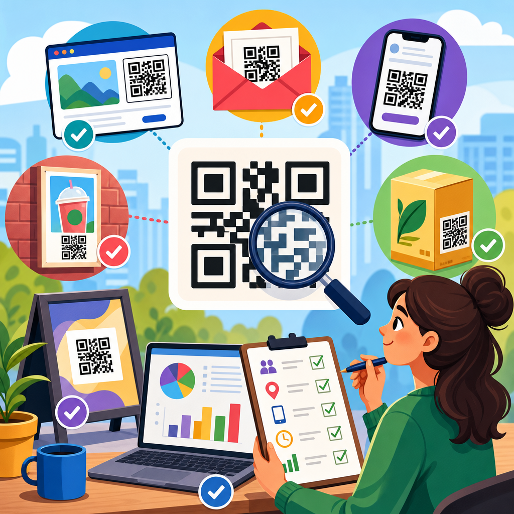
Good QR code UX is measurable. At minimum, track impressions where possible, scans, unique visitors, bounce rate, conversion rate, assisted conversions, and downstream outcomes such as revenue, bookings, or redeemed offers. Dynamic QR codes make this easier because the destination can change without reprinting the symbol and scan events can be logged by date, device, and location. Platforms such as Bitly, Beaconstac, Flowcode, QR Code Generator PRO, and enterprise campaign tools support dynamic routing, though governance and data ownership should be reviewed before rollout.
Testing should cover both physical and digital variables. On the physical side, compare placement, size, surrounding copy, material finish, and distance. On the digital side, test headlines, offer framing, form length, social proof, and checkout friction. The strongest teams run preflight tests in realistic conditions: low light, cracked screens, older phones, spotty connectivity, and glare. I have seen a beautiful code fail on glossy packaging under supermarket lighting while a simpler matte version converted significantly better. Lab perfection is not field performance.
Attribution requires care. A scan is not the same as a conversion, and some users will complete later on another device. Use UTM parameters, first-party analytics, CRM integration, and, where relevant, coupon codes or POS reconciliation to connect online and offline actions. For in-store campaigns, compare sales lift in locations with and without QR prompts. For direct mail, holdout groups can separate the effect of the QR experience from the effect of the offer itself. Without this discipline, teams may optimize for scans while missing revenue.
Privacy and compliance cannot be an afterthought. If the destination collects personal data, follow applicable rules such as GDPR or CCPA and make consent flows understandable. If a code appears on medical, financial, or regulated product materials, legal review should cover both the printed claim and the destination content because the user experiences them as one unit. Conversion optimization is not about squeezing users harder; it is about reducing unnecessary friction while maintaining clarity, consent, and brand trust over time.
Use QR code UX strategically across channels
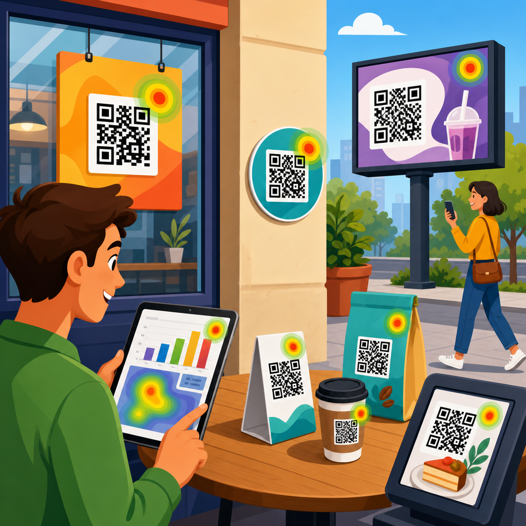
Different channels demand different UX choices. On packaging, the best QR codes extend the shelf experience with reviews, how-to content, ingredient transparency, warranties, and replenishment. On direct mail, urgency and personalization matter more, so a strong offer and a short path to redemption are critical. In out-of-home advertising, brevity is everything because attention windows are short. At events, badge scans and booth codes should support instant value exchange, such as session decks, giveaways, or meeting booking, rather than generic homepage visits.
A hub strategy helps teams scale. Instead of creating isolated scans that all lead to miscellaneous pages, build a connected ecosystem around conversion goals: offers, product education, social proof, support, loyalty, and post-purchase retention. Internal pathways between those pages matter because users do not always convert on the first visit. Someone who scans packaging for ingredients today may return later for recipes, subscriptions, or referrals. Treat QR destinations as part of a broader journey architecture, not as disposable campaign microsites.
The strongest programs also maintain operational discipline. Use naming conventions, redirect governance, expiration policies, and performance dashboards. Print teams, marketers, developers, retail operations, and legal should share a launch checklist that covers scan tests, analytics validation, page speed, fallback URLs, and content ownership. This prevents a common failure mode: the code scans, but the page is outdated, broken, or inconsistent with the printed promise. In conversion work, reliability is a competitive advantage because users reward the brands that make action feel easy.
QR code UX improves conversions when every step, from noticing the symbol to completing the action, is designed around user intent. The core principles are straightforward: offer a clear reason to scan, make scanning effortless in real conditions, send people to a fast mobile destination that matches the promise, and measure outcomes beyond the scan itself. Brands that follow these principles waste less media, learn faster, and create better experiences across packaging, print, retail, events, and service environments.
As the hub for conversion optimization within QR code marketing and strategy, this topic connects to related work on landing pages, analytics, offer design, retail execution, and lifecycle messaging. The practical lesson is simple: a QR code is not a shortcut around UX. It is UX compressed into a tiny space. Audit your current codes, rewrite weak calls to action, test them in the environments where customers actually use them, and fix the landing pages they reveal. Better scans are useful. Better conversions are the goal.
Frequently Asked Questions
What does QR code UX mean, and why does it matter for conversions?
QR code UX refers to the full user experience from the moment someone notices a QR code to the moment they complete the intended action after scanning it. That action could be buying a product, downloading an app, viewing a restaurant menu, checking in to an event, redeeming an offer, or submitting a lead form. In practice, good QR code UX is about reducing friction at every stage of that journey. A person should immediately understand what the code is for, feel motivated to scan it, have no trouble getting their phone camera to recognize it, and land on a page that delivers exactly what was promised.
This matters for conversions because QR codes do not succeed on novelty alone. If the code is poorly placed, too small, lacking context, or linked to a slow or confusing mobile page, people drop off before they ever reach the conversion point. Strong QR code UX applies conversion optimization principles to the entire flow, not just the destination page. It considers visibility, trust, relevance, page speed, message match, accessibility, and intent. When those elements work together, scan rates improve, engagement increases, and more users complete the desired action. In other words, better QR code UX turns a passive visual prompt into a reliable conversion path.
What are the most important design elements that make a QR code easier to scan and more effective?
The most important elements are size, contrast, quiet space, placement, and context. A QR code should be large enough to scan comfortably from the expected viewing distance, printed clearly, and surrounded by sufficient blank space so smartphone cameras can detect it quickly. High contrast, such as a dark code on a light background, is typically the safest option. Overly stylized designs, low-contrast color combinations, glossy materials, or visual clutter around the code can all reduce scan reliability, especially in real-world environments with glare, shadows, motion, or poor lighting.
Placement also has a major impact on effectiveness. The code should appear where people naturally pause long enough to notice it and act on it, such as packaging panels, table tents, posters, receipts, direct mail pieces, shelf displays, storefronts, or event signage. If users need to bend awkwardly, stand too far away, or scan while walking, conversion rates usually suffer. The surrounding messaging is just as important as the code itself. People need a clear reason to scan, such as “View the menu,” “Get 20% off,” “Register your product,” or “See installation instructions.” A short call to action, paired with a concise value proposition, removes uncertainty and gives the scan a purpose. The best-performing QR experiences combine technical scanability with strong intent-setting copy.
How can businesses improve the landing page experience after someone scans a QR code?
The landing page should feel like a continuation of the promise made next to the QR code. If the code says “Claim your coupon,” the page should immediately show the coupon. If it says “Download the app,” users should land on the correct app store or a device-aware download page. If it says “Check in to the event,” the user should not need to navigate through a generic homepage to find the check-in form. This is the principle of message match: the wording, offer, and intent at the scan point should align perfectly with what appears after the scan. When there is a mismatch, users lose confidence and abandon the journey.
Mobile performance is equally critical. QR scans happen on phones, often in the middle of another activity, so pages need to load fast, render cleanly, and minimize unnecessary friction. That means compressed images, streamlined scripts, responsive layouts, large tap targets, readable text, and forms that ask only for essential information. If the page demands too many steps, requires account creation before delivering value, or buries the main action below distracting content, conversions will decline. Effective QR landing pages are focused, fast, and singular in purpose. They make it obvious what the user should do next and remove anything that delays that action.
What kinds of calls to action and messaging typically increase QR code scan rates?
The highest-performing QR calls to action are specific, benefit-led, and immediate. Generic prompts such as “Scan here” may describe the action, but they do not explain why someone should bother. More effective messaging tells users exactly what they will get and why it is worth their time, such as “Scan to get your discount,” “Scan to watch the demo,” “Scan to reorder in seconds,” or “Scan to access the full menu.” This works because it reduces ambiguity and helps people evaluate the reward before they commit to the scan.
Trust signals can also improve response. In some contexts, users hesitate because they are unsure where the code leads or whether it is safe. Brief supporting text like “Secure checkout,” “No app required,” “Takes less than 1 minute,” or “Instant access” can lower resistance. The best messaging also reflects user intent and environment. Someone scanning a code on product packaging may want setup help, warranty registration, reviews, or refills. Someone scanning on in-store signage may be looking for pricing, inventory, a promotion, or product details. Matching the message to that moment is often the difference between curiosity and action. Strong QR messaging does not just invite a scan; it frames a clear next step with a compelling payoff.
How should marketers measure and optimize QR code performance for better conversion rates?
Marketers should evaluate QR performance as a complete funnel rather than a single interaction. The first useful metric is scan volume, but scans alone do not reveal whether the experience is working. It is more important to track what happens after the scan: landing page views, bounce rate, time to load, click-through rate, form completion rate, coupon redemption rate, purchases, registrations, and other conversion events tied to the campaign goal. Segmenting by location, placement, creative version, device type, and traffic source context can reveal why one QR code outperforms another, even when they promote the same offer.
Optimization should focus on testing both the offline prompt and the digital destination. On the offline side, test placement, size, surrounding copy, incentive strength, and visual hierarchy. On the mobile side, test page speed, headline clarity, CTA text, form length, and whether users should land on a dedicated page rather than a general website section. Dynamic QR codes are especially valuable because they allow destination updates and more flexible tracking without reprinting the code. Over time, the strongest QR programs are built through continuous iteration: identify where friction occurs, simplify that step, and measure the downstream effect. When marketers treat QR codes as conversion journeys instead of static images, they can systematically improve results.