How to optimize QR code landing pages starts with understanding a simple truth: scanning is a low-friction action, but converting after the scan is not automatic. A QR code landing page is the destination a user reaches after scanning a code with a phone camera, and conversion optimization is the practice of increasing the percentage of visitors who complete a desired action, such as buying, booking, subscribing, downloading, or requesting a quote. In QR code marketing and strategy, that destination page carries almost all of the business value. I have audited campaigns where creative design, print placement, and scan volume looked strong, yet results stayed weak because the page loaded slowly, asked for too much too soon, or failed to match the promise made beside the code.
This matters because QR traffic is intent-rich but impatient. Users scan from packaging, menus, posters, direct mail, retail shelves, event signage, and product manuals, usually while standing, walking, or multitasking. They are on mobile, often on cellular, and they expect immediate relevance. If the page does not answer the obvious next question within seconds, the scan becomes a bounce. Optimizing QR code landing pages therefore means aligning message, context, speed, usability, trust, and measurement so the post-scan experience feels like one continuous interaction. When that continuity is in place, conversion rates improve, paid and printed media waste drops, and campaign insights become usable across the broader QR Code Marketing & Strategy program.
The best-performing pages share a few traits. They are purpose-built for one audience and one outcome, not generic homepages. They preserve scent between the physical call to action and the mobile destination. They reduce taps, shorten forms, use strong visual hierarchy, and make trust cues visible before the user has to hunt for them. They also respect technical realities: camera apps append parameters, redirects can break attribution, and location-specific campaigns often need dynamic content. This hub article explains the full conversion optimization framework for QR landing pages so you can improve scan-to-action performance systematically rather than relying on guesswork.
Start with scan context and message match
Every high-converting QR code landing page begins before the scan. The user sees a code in a specific environment and forms an expectation from nearby copy, design, and placement. A code on restaurant table tents creates a different mindset than a code on pharmaceutical packaging or a booth banner at a trade show. When I map underperforming campaigns, the first issue is often message mismatch: the sign promises a menu, discount, setup guide, contest entry, or instant demo, but the page opens to a broad site section that forces the user to navigate. The fix is straightforward. Build dedicated landing pages tied to the exact promise made in the physical context.
Message match should cover headline, offer, imagery, and next step. If the QR call to action says “Scan for 20% off today,” the landing page headline should repeat the discount and clarify redemption. If it says “Watch installation in 60 seconds,” the video should be above the fold, not buried after product text. This is especially important for local and time-sensitive campaigns. A code on in-store signage should detect or ask for store context only when necessary, while a code on event materials should recognize event-specific parameters and preserve them through conversion. Good optimization feels obvious to the user because the page confirms they are in the right place immediately.
Design for mobile speed, clarity, and one primary action
QR visitors are almost always mobile visitors, so mobile-first is not a slogan here; it is the baseline requirement. The page should load fast on mid-range devices over inconsistent networks. Compress images, defer nonessential scripts, minimize redirects, and use modern formats such as WebP where appropriate. Core Web Vitals still matter because slow rendering and layout shifts disrupt trust and completion. In practical terms, aim for a lightweight page with a stable layout, a large readable headline, visible CTA, and enough contrast to be usable outdoors. Many scans happen under glare, in motion, or with one hand, so tiny links and dense text directly hurt conversions.
One primary action should dominate the page. QR scans usually come from focused intent, and multiple competing buttons dilute that intent. A retail shelf talker may send users to “Buy now,” a product package to “Activate warranty,” and a flyer to “Book a consultation.” Secondary options can exist, but visually subordinate them. Keep important content above the fold: value proposition, short supporting copy, CTA, trust cues, and if relevant, price or incentive. I have seen pages lift conversions simply by replacing a carousel with one static hero, shortening copy to what matters on first screen, and making the button sticky for long pages. Clarity consistently beats creativity when attention is compressed.
Reduce friction in forms, checkout, and post-scan flows
Most conversion losses happen after interest is established. The user arrives, understands the offer, then hits friction. Long forms are common offenders. On mobile, every extra field carries a cost in time, error risk, and abandonment. Ask only for what is needed for the immediate step. If you need more data later, progressive profiling is the better approach. For lead generation, name and email may be enough to deliver a guide, demo link, or coupon. For service booking, use smart defaults, autofill, and native input types for phone, email, date, and number fields. If payment is required, support digital wallets such as Apple Pay and Google Pay because they materially reduce mobile checkout abandonment.
Flow design also matters. A code that promises “register in 30 seconds” should not force account creation before value is delivered. Offer guest checkout when possible. For app download campaigns, deep link intelligently: send users with the app installed to the in-app destination and everyone else to the appropriate app store or a fallback web experience. For support and onboarding use cases, QR landing pages can shorten problem resolution by linking directly to model-specific instructions, replacement-part ordering, or chat. The principle is the same in each case: eliminate unnecessary decisions, preserve momentum, and confirm success with a clear thank-you or completion state that explains what happens next.
Build trust fast with proof, transparency, and brand continuity
Scanning a code is a trust act. Users cannot inspect the destination before they open it, so the landing page must reassure them immediately. Brand continuity is the first layer: use recognizable logos, colors, and naming that match the printed asset or packaging. The second layer is transparency. State what the user gets, whether any data is required, and what will happen after they submit. Hidden conditions, surprise fees, or forced sign-ups destroy post-scan confidence. For regulated categories such as healthcare, finance, and alcohol, clear disclosures and compliant consent language are not optional; they are part of conversion optimization because trust and compliance support completion.
Proof should be placed where hesitation naturally occurs. Testimonials, review counts, security badges, return policies, partner logos, and warranty terms all reduce perceived risk when they are specific and credible. For ecommerce, show shipping timelines, inventory status, and accepted payment methods before checkout. For B2B lead capture, include recognizable customer logos or a concise case study metric near the form. For events, display venue, date, and attendance details beside registration. The best trust signals answer the user’s next concern without forcing extra research. On QR landing pages, that matters more than on desktop because people are making faster judgments and have less patience to investigate claims.
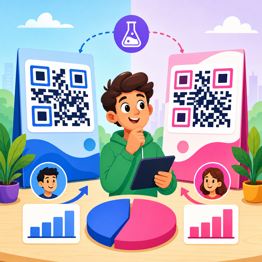
Personalize content with dynamic QR routing and campaign segmentation
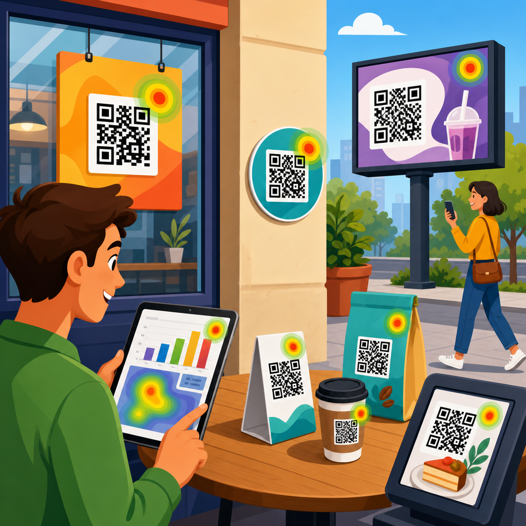
Conversion optimization improves sharply when the same QR code can deliver context-aware experiences. Dynamic QR codes make this possible by allowing the destination URL to be changed or parameterized without reprinting the code. In practice, this lets marketers route users by location, device type, language, time of day, product SKU, campaign source, or inventory status. A single package insert can open different setup instructions based on the serial number path. A restaurant table code can detect language preferences. A retail poster can send users to the nearest store page with local stock information. The page feels more relevant because it is more relevant.
Segmentation should still remain disciplined. Personalization is useful only when it simplifies the path to conversion. I recommend defining a small set of landing page variants tied to clear use cases rather than creating dozens of barely differentiated pages that fragment data. Track variant performance by offer, placement, audience, and device conditions. If a campaign spans print, out-of-home, packaging, and in-store displays, use UTM parameters and a consistent naming convention so scans can be compared cleanly in analytics tools. Google Analytics 4, Adobe Analytics, and server-side event tracking can all support this, but the measurement model must be planned before launch or attribution gaps will cloud optimization decisions.
Measure the right metrics and run disciplined experiments
Scan count is not enough. The metrics that matter are landing page view rate after scan, bounce rate, engagement rate, CTA click-through rate, form start rate, form completion rate, checkout completion rate, revenue per scan, and assisted conversions. For offline placements, also track scan-to-store-visit or scan-to-redemption where possible. Benchmarks vary by industry and intent, but patterns are stable: pages with faster load times, tighter message match, and fewer fields usually outperform broader mobile destinations. Because QR campaigns bridge physical and digital channels, testing should include both creative and destination variables, not just button color.
| Element to test | Why it affects conversion | Example |
|---|---|---|
| Headline match | Confirms the promise made near the code | “Scan for menu” versus “Explore our restaurant” |
| CTA wording | Clarifies the next step and value | “Claim discount” versus “Submit” |
| Form length | Reduces mobile friction | 3 required fields versus 8 |
| Page speed | Prevents abandonment on cellular networks | 1.8-second load versus 4.5-second load |
| Offer format | Changes motivation and urgency | Percent discount versus bonus item |
When running experiments, keep sample quality in mind. A poster in a train station may drive very different behavior than a code on packaging inside the home, even if the page is identical. Compare like with like, and document environmental factors such as placement height, lighting, incentive language, and audience intent. I also recommend checking technical logs during tests. Redirect errors, broken deep links, duplicate events, and cookie consent interruptions can create false negatives that look like conversion issues but are actually implementation faults.
Connect this hub to the broader conversion optimization program
A strong QR code landing page does not stand alone. It connects to a broader conversion optimization discipline that includes offer design, audience research, analytics governance, creative testing, and lifecycle follow-up. If a user scans from direct mail and does not convert, retargeting and email capture workflows should be ready. If a customer scans from packaging after purchase, the KPI may be activation, review generation, accessory attach, or support deflection rather than immediate revenue. This is why hub-level planning matters. The same principles apply across subtopics: mobile usability, clear value exchange, friction reduction, trust, and accurate measurement.
As the central guide within Conversion Optimization for QR Code Marketing & Strategy, this page should support deeper articles on topics such as QR code CTA copy, mobile form design, dynamic QR campaigns, coupon redemption flows, app deep linking, analytics setup, and post-purchase onboarding. Internal links between those resources strengthen discoverability and help teams move from principles to implementation. In practice, the most successful programs review QR landing pages monthly, segment results by placement, and treat every physical touchpoint as a testable acquisition source. Optimize the destination with the same rigor used for paid landing pages, and each scan becomes more valuable. Start by auditing your top three QR campaigns, fixing message match, speed, and friction first, then test the next improvement with clean measurement.
Frequently Asked Questions
What makes a QR code landing page different from a regular landing page?
A QR code landing page is different because the visitor arrives from a physical-world trigger and is almost always using a mobile device in a very specific moment. They may have scanned a code on packaging, signage, direct mail, a menu, a product insert, or an event display. That context matters. Unlike a standard landing page that might be reached from search, email, or paid ads, a QR landing page should immediately match the expectation created by the code’s placement and call to action. If someone scans a code that promises a discount, a product demo, a quick registration, or setup instructions, the destination page should deliver that exact experience without delay or confusion.
This is why optimization for QR code landing pages starts with message continuity and mobile usability. The page should load fast, display correctly on small screens, and make the next step obvious within seconds. Visitors should not have to pinch and zoom, hunt for information, or navigate through multiple menus. The highest-performing QR landing pages reduce friction by focusing on a single goal, such as purchasing, booking, subscribing, downloading, or requesting a quote. In practical terms, that means using concise copy, prominent calls to action, simplified forms, and a design that respects the user’s limited time and attention. A regular landing page can sometimes tolerate more exploration. A QR code landing page usually cannot.
How can I increase conversions after someone scans a QR code?
To increase conversions after the scan, focus on reducing the gap between curiosity and action. The scan itself is easy, but the conversion only happens when the landing page feels relevant, trustworthy, and effortless to use. Start by aligning the page with the exact promise made near the QR code. If the code says “Get 10% off,” the first thing users should see is the offer and how to claim it. If it says “Book your appointment,” the page should open directly to the booking experience, not a generic homepage. Relevance is one of the strongest conversion drivers because it reassures users they landed in the right place.
From there, improve the fundamentals. Make the page load quickly on mobile networks, keep the design clean, and place the primary call to action above the fold. Remove unnecessary navigation and competing links that distract from the main goal. If a form is required, ask only for the information you truly need. Every extra field lowers completion rates. Add trust signals such as reviews, security indicators, guarantees, recognizable brand elements, or short explanations of what happens next. Strong conversion optimization also involves testing. Compare different headlines, button text, offers, form lengths, page layouts, and incentives. Track scan-to-visit behavior, bounce rate, click-through rate, and final conversion rate so you can see where users drop off. In most cases, small improvements in clarity, speed, and focus can significantly increase the percentage of visitors who complete the desired action.
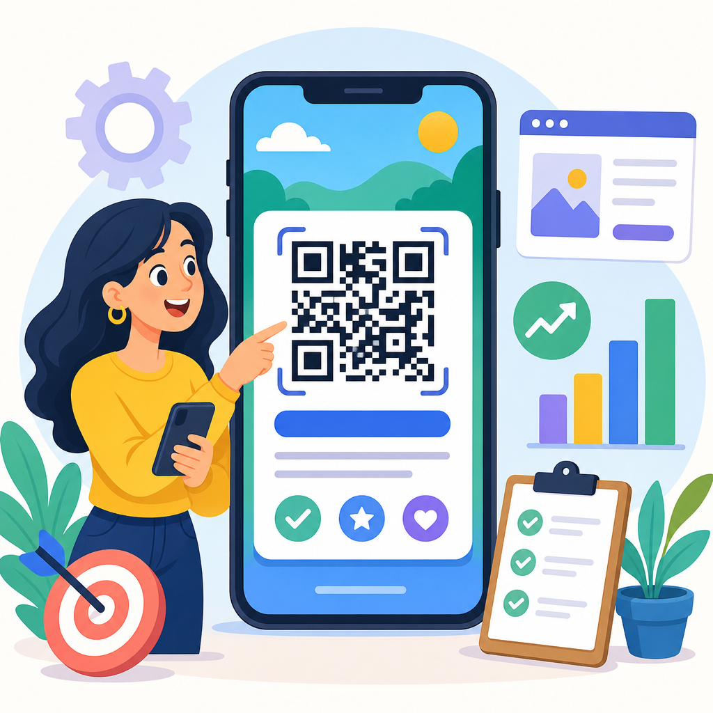
What should be included on a high-converting QR code landing page?
A high-converting QR code landing page should include only the elements that help the user understand the offer and complete the next step quickly. The essentials usually begin with a clear headline that confirms why the visitor is there, followed by a brief supporting explanation that reinforces the value. A strong call to action should be visible immediately, using direct language such as “Buy Now,” “Download the Guide,” “Claim Offer,” “Book Today,” or “Request a Quote.” The page should also include visual hierarchy that guides attention naturally, with enough contrast and spacing to make buttons, forms, and key messages easy to use on a phone screen.
Beyond those basics, include content that supports confidence and decision-making. That may mean product images, a short explainer video, key benefits in bullet form, social proof, testimonials, pricing transparency, shipping details, FAQs, or trust badges. If the landing page is tied to a local or real-world action, practical information can be especially important, such as store hours, maps, appointment availability, event details, or redemption instructions. Keep forms short and mobile-friendly, use autofill where possible, and ensure buttons are large enough for thumb tapping. If appropriate, add tracking parameters and analytics so performance can be measured accurately. The most effective QR landing pages are not overloaded with content; they are intentionally structured to answer the user’s immediate question, remove hesitation, and make the conversion path obvious.
Why is mobile optimization so important for QR code landing pages?
Mobile optimization is critical because QR code traffic is overwhelmingly mobile by nature. Most users scan with a smartphone camera and expect the destination to work seamlessly on that same device. If the page loads slowly, displays awkwardly, uses tiny text, or requires too much typing, users will abandon it quickly. The context of a QR scan also increases the need for speed and simplicity. People may be standing in a store aisle, walking through an event, reading a flyer, sitting in a restaurant, or opening product packaging. They are not always in a patient, research-heavy mindset. Your page has to meet them where they are and help them act with minimal effort.
Strong mobile optimization includes fast page speed, responsive design, compressed images, readable typography, tap-friendly buttons, and streamlined layouts that prioritize one clear objective. It also means avoiding pop-ups that cover the screen, reducing form friction, and making use of mobile-specific conveniences such as click-to-call, map integration, mobile wallets, autofill, and one-tap actions where relevant. Testing should happen on multiple devices, operating systems, browsers, and connection speeds, not just on a desktop preview. When marketers overlook mobile execution, they often blame the QR code campaign for poor results, when the real issue is the post-scan experience. In QR code strategy, the landing page is not a secondary asset. It is a core part of the campaign and one of the main determinants of conversion performance.
How do I measure whether my QR code landing page is performing well?
Measuring performance starts with defining the conversion goal before the campaign launches. That goal could be a purchase, booking, email signup, app download, quote request, coupon redemption, phone call, or another meaningful action. Once the goal is clear, track the full journey from scan to outcome. Useful metrics often include total scans, unique visitors, landing page views, bounce rate, time on page, button clicks, form starts, form completions, conversion rate, and cost per conversion if the campaign is tied to paid distribution. It is also helpful to compare performance by location, placement, audience segment, device type, and time period so you can identify which QR code touchpoints are driving the best results.
For deeper optimization, use dynamic QR codes, campaign-specific URLs, UTM parameters, and event tracking in your analytics platform. This allows you to separate traffic sources and understand which printed assets, products, stores, or channels are working best. Heatmaps, session recordings, and form analytics can reveal where users hesitate or drop off. If the page gets scans but few conversions, the issue may be poor message match, weak calls to action, too much friction, or insufficient trust. If scans are low, the problem may be with the QR code placement, visibility, incentive, or surrounding copy. The key is to evaluate the landing page as part of a complete conversion system rather than in isolation. Strong QR code marketing combines a compelling reason to scan, a seamless mobile destination, and a disciplined testing process that turns user behavior into measurable improvement.