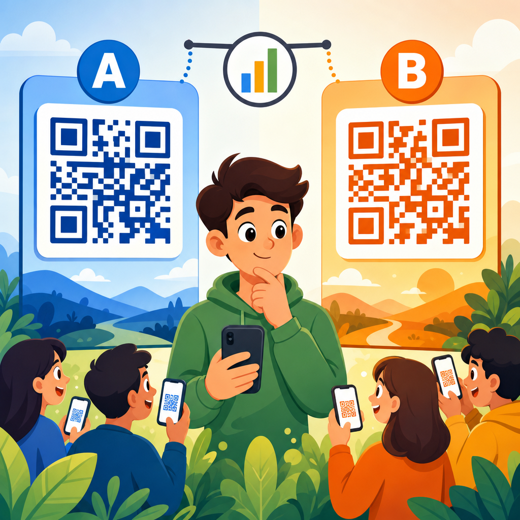
A/B testing QR code designs is the fastest reliable way to learn which codes get scanned, which placements convert, and which creative choices quietly suppress performance in real campaigns. In QR code marketing, an A/B test compares two controlled variations of a code, landing page, call to action, or surrounding design to determine which version produces a better measurable outcome. The outcome may be scan rate, unique visitors, form completions, coupon redemptions, app installs, or offline-to-online revenue. I have run QR code tests on packaging, direct mail, retail signage, trade show displays, and restaurant table tents, and the same lesson appears every time: teams often debate colors and shapes when the real lift comes from context, clarity, and post-scan experience.
This matters because QR codes sit at the intersection of physical media and digital behavior. A poster may get strong foot traffic but weak scans if the code is too small, poorly contrasted, or paired with vague copy. A beautifully branded code can still fail if the linked page loads slowly on mobile or asks for too much information. Conversely, a plain black-and-white code with a direct value proposition can outperform a stylized version by a wide margin. Since printing, packaging, and out-of-home inventory cost real money, guessing is expensive. Testing replaces guesswork with evidence and turns QR codes into an accountable performance channel.
As a hub topic, A/B testing QR codes includes more than visual comparison. It covers hypothesis design, test structure, sample size, scan tracking, environmental variables, and interpretation. The goal is not to find a universally best QR code design, because there is no single winner across every audience or medium. The goal is to identify what works best for a specific campaign under specific conditions and then build repeatable standards for future executions.
What to test in a QR code campaign
The most productive QR code tests isolate one meaningful variable at a time. Start with the factors most likely to change user behavior: size, contrast, surrounding call to action, placement height, incentive, destination page, and brand treatment. In many campaigns, copy near the code affects scan volume more than the code artwork itself. For example, “Scan to view the menu” usually beats “Learn more” in restaurant settings because the user knows exactly what happens next. On retail shelf talkers, “Scan for reviews” often outperforms generic product discovery language because it reduces uncertainty at the point of decision.
Design variables still matter. Quiet-zone margin, module contrast, embedded logos, rounded corners, frame labels, and error correction level can all influence readability. I have seen stylized codes with central logos scan well in studio tests but fail under store lighting because the contrast ratio dropped too far. Practical testing means evaluating designs in the real environment, on the actual substrate, from realistic distances, using common smartphone cameras. iPhone and Android devices generally scan robustly today, but glossy finishes, curved packaging, and low-light conditions still create avoidable friction.
Destination variables are equally important. If Version A and Version B use different landing pages, you are no longer testing only QR design; you are testing the full conversion path. That can be useful, but it must be labeled correctly. Distinguish between scan-rate tests, click-through tests after scan, and downstream conversion tests. This separation helps marketers understand whether the issue is discoverability, readability, or offer relevance.
How to structure a valid A/B test
A valid A/B test starts with a hypothesis written in operational terms. Instead of saying, “Let’s test a better QR code,” define the expected behavior change: “Adding a framed instruction that says ‘Scan for 15% off today’ will increase scan rate on in-store signage because the incentive is immediate and specific.” Then choose a primary metric. If the campaign objective is awareness, scans per thousand impressions may be the right measure. If the objective is revenue, use completed purchases or qualified leads per scan.
Control exposure as tightly as possible. In print direct mail, randomize recipients so each version reaches similar households. In stores, rotate creative by location pairs with similar traffic patterns rather than placing Version A in flagship stores and Version B in low-volume stores. For event booths, alternate time blocks or duplicate placements so staffing patterns do not bias the result. The strongest tests reduce confounding factors before the first scan happens.
Use dynamic QR codes with unique tracking parameters for each variant. That allows version-level reporting without changing the visible destination URL. Tools such as Bitly, QR Code Generator PRO, Beaconstac, Flowcode, and Google Analytics 4 can track scans, sessions, engagement, and conversions. If you connect scans to CRM events in HubSpot or Salesforce, you can compare lead quality rather than raw scan volume alone. That matters because a version producing fewer scans may still yield more sales-qualified opportunities.
Timing matters. Run tests long enough to capture weekday and weekend behavior when relevant. Avoid ending a test after a short early lead. Statistical significance is helpful, but business significance matters too. A two percent lift may be statistically detectable in a large campaign yet not worth reprinting inventory. On the other hand, a ten percent gain in scans on high-margin packaging can justify a global redesign.
Design elements that usually influence scan performance most
Marketers often ask what works best: black and white, branded colors, square modules, circular dots, logo in the center, or a decorative frame. The answer is straightforward. High contrast, sufficient size, clear quiet zone, and explicit instruction outperform decorative complexity in most environments. If a design choice reduces readability even slightly, it can erase any branding benefit. ISO/IEC 18004 provides the technical foundation for QR code symbol structure, but field performance depends on practical execution around that structure.
Size should be matched to scanning distance. A common rule of thumb is a scanning distance ratio around 10:1, meaning a code viewed from 10 feet should be roughly 1 foot wide, though campaign conditions may require adjustments. For hand-held materials such as flyers or packaging, codes under about 0.8 inches can become unreliable depending on print quality and camera focus. On posters, I usually test size increases before any styling changes because bigger, cleaner codes frequently produce the easiest gains.
Frame text around the QR code often lifts scans because it explains value. Labels such as “Scan to order,” “Scan for installation video,” or “Scan to claim your sample” reduce hesitation. Users do not fear QR codes themselves as much as they dislike ambiguity. A framed code with a promised outcome beats an unframed code floating on a layout in many categories, especially healthcare, B2B events, education, and retail endcaps.
| Element tested | Version A | Version B | What usually wins | Why |
|---|---|---|---|---|
| Color treatment | Black on white | Brand colors with lower contrast | Higher contrast | Camera detection is faster and more reliable |
| Call to action | Learn more | Scan for 20% off today | Specific benefit | Users understand the immediate value |
| Code style | Standard square modules | Decorative dots with logo | Simpler style | Readability usually beats novelty |
| Placement | Bottom corner | Eye-level near decision point | Decision-point placement | It appears when intent is highest |
| Landing page | Homepage | Dedicated mobile page | Dedicated page | Lower friction after the scan |
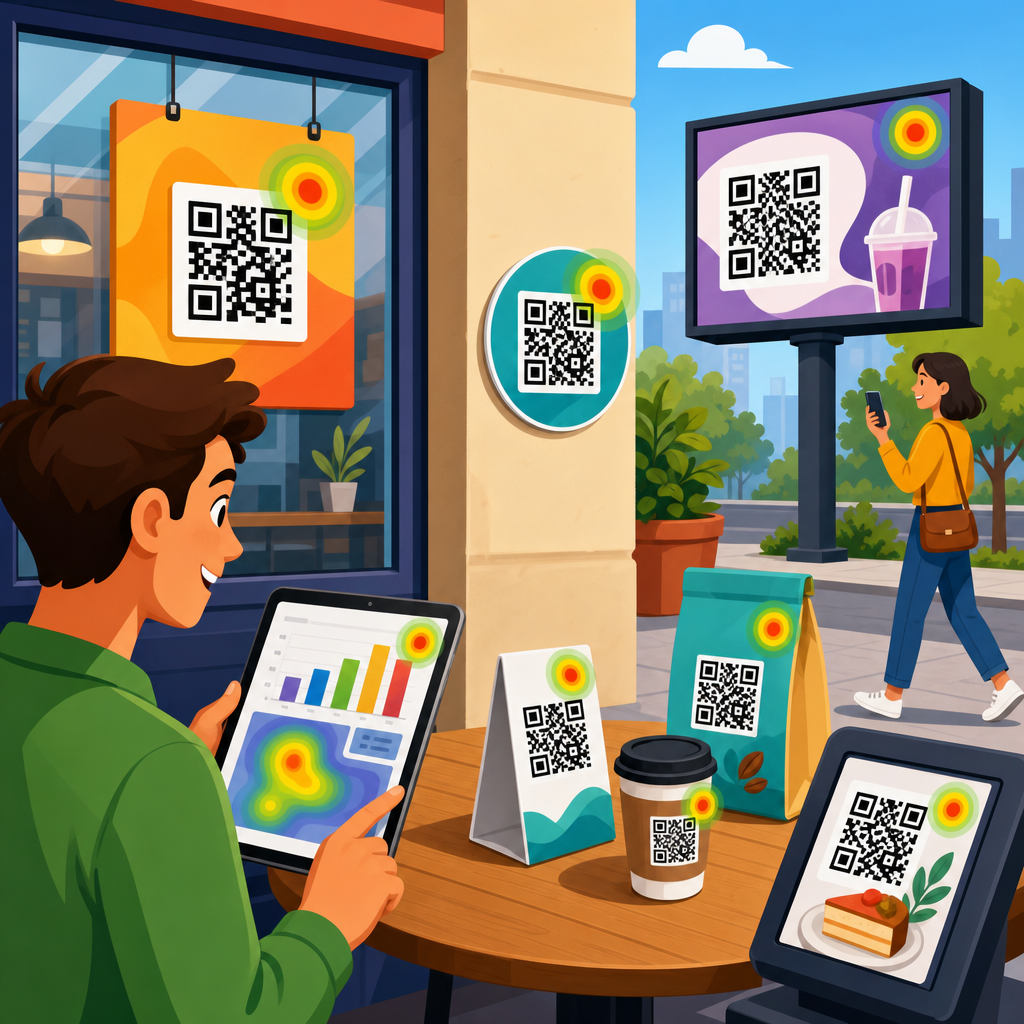
Tracking scans, conversions, and offline context
Good QR code testing depends on measurement discipline. A scan is not the same as a session, because some scan events occur without a completed page load. A session is not the same as a conversion, because users may bounce due to weak mobile UX, poor page speed, or mismatched expectations. I recommend building a measurement stack that captures four layers: exposure estimate, scan count, on-site engagement, and business outcome. Exposure may come from store traffic counters, circulation data, event attendance, or packaging units distributed. Scan count comes from the QR platform. Engagement and outcome come from analytics and CRM systems.
Use UTM parameters consistently so each QR variant is distinguishable in reporting. In Google Analytics 4, create exploration reports for source, medium, campaign, and landing page, then compare engaged sessions, scroll depth, key events, and conversion rate by variant. If you use server-side redirects, preserve campaign parameters through to the destination. For store-level campaigns, append location identifiers to the QR redirect so you can compare scan behavior across branches, regions, or fixture types.
Offline context explains surprising results. A code on a refrigerated case may underperform because shoppers move quickly and do not want to stop. A code on product packaging may overperform after purchase when the user is at home and more willing to watch setup instructions. Event signage can drive a rush of scans during breaks and almost none during keynote sessions. These patterns are not noise; they reveal intent windows. The best analysis combines quantified performance with observations from the environment where the code appears.
Common testing mistakes and how to avoid them
The most common mistake is changing too many variables at once. If one version uses a larger code, stronger incentive, different placement, and new landing page, you cannot tell which change caused the lift. Another mistake is testing unreadable stylization because it “looks on-brand.” Brand consistency matters, but a QR code is a functional interface first. I have had designers produce attractive inverted codes on dark packaging that passed desktop scanner apps yet failed on older Android cameras in stores. Always test with real devices before rollout.
A second category of errors comes from weak samples. If one variant appears only in a premium location, the result is biased. If the test runs during a holiday promotion for one region and a normal week for another, the data is not comparable. If the team declares victory after 40 scans, the result is likely unstable. Use pretest benchmarks when possible so you know expected scan volume and can estimate how long a test should run.
Another mistake is optimizing for scans alone. A sensational call to action can boost scans but reduce trust if the destination does not fulfill the promise. For example, “Scan for a free gift” may increase traffic, but if the page requires a long registration flow, qualified conversions may drop. The right winner depends on the campaign objective and downstream economics, not vanity metrics.
What works best by channel and use case
The best QR code design differs by medium because user intent changes. On packaging, codes tied to utility perform well: setup guides, ingredients, warranty registration, refill ordering, and authenticity checks. On direct mail, urgency and exclusivity tend to help: limited-time offers, personalized landing pages, or appointment booking. In retail signage, social proof and savings are strong drivers: reviews, comparison charts, and digital coupons. For B2B trade shows, the best-performing codes usually promise practical value, such as a product sheet, demo booking, ROI calculator, or post-event slide deck.
Healthcare and public sector campaigns need even more clarity. Users are often cautious about privacy, eligibility, and next steps. In these contexts, straightforward black-on-white codes with plain-language instructions consistently outperform heavily branded treatments. Education campaigns benefit from labeling the exact outcome, such as “Scan to apply,” “Scan for scholarship deadlines,” or “Scan for course catalog.” Hospitality campaigns often see stronger results when the code replaces friction at a live moment, such as mobile check-in, menu access, or local recommendations.
Across channels, the strongest pattern is alignment between context, promise, and destination. The code should appear where the user naturally has a question, the nearby text should answer why scanning helps, and the landing page should complete that task with minimal friction. When those three elements align, even an unremarkable-looking QR code can outperform a beautifully illustrated one.
Building a repeatable optimization program
The highest-performing teams treat A/B testing QR codes as an ongoing operating process, not a one-time creative exercise. Start with a baseline library documenting dimensions, contrast ratios, frame copy, placement rules, minimum quiet zone, redirect standards, and approved analytics parameters. Then create a test roadmap ranked by expected impact. In most organizations, I prioritize call to action, destination relevance, placement, and size before decorative styling because those factors usually move the metrics most.
Document every test in a simple protocol: hypothesis, variants, audience, environment, run dates, primary metric, secondary metrics, result, and decision. Over time, patterns emerge. You may learn that your retail audience responds strongly to savings language, while your installed-base customers scan more for support content than for upsell offers. That knowledge compounds. It improves future packaging briefs, event signage, shelf talkers, and email-to-print integrations across the broader QR code marketing strategy.
The practical takeaway is simple: what works best is usually the design that is easiest to notice, easiest to understand, easiest to scan, and easiest to act on after the scan. Test those layers in order. If you manage QR codes as measurable user interfaces instead of decorative add-ons, performance improves quickly and predictably. Audit your current QR placements, set one clear hypothesis, launch a controlled A/B test, and use the result to build a smarter standard for every campaign that follows.
Frequently Asked Questions
What should you test first when running an A/B test on QR code designs?
The best place to start is with the variables most likely to influence scan behavior immediately: size, placement, contrast, call to action, and the surrounding visual context. In most campaigns, these factors affect performance far more than subtle design tweaks. For example, a larger QR code placed at natural eye level with a clear instruction such as “Scan to get 15% off” will usually outperform a smaller code tucked into a busy corner with no explanation. A/B testing works best when you isolate one meaningful change at a time so you can confidently connect any lift or decline in results to that specific variable.
Start with a clear objective before you build the test. If your goal is increasing scan rate, compare two code presentations that differ in placement or CTA language. If your goal is improving downstream conversions, keep the code itself consistent and test the landing page experience after the scan. It is also important to distinguish between testing the QR code graphic and testing the full scan environment. A code may be technically readable, but poor surrounding design, weak incentives, or cluttered layouts can suppress scans. In practice, the most valuable early tests usually focus on the complete user decision moment: what people see, why they should scan, and how easy the scan feels.
Do branded or customized QR codes perform better than standard black-and-white QR codes?
Branded QR codes can perform better, but only when customization supports trust and usability rather than interfering with scanability. A standard black-and-white code remains the benchmark because it is highly recognizable and usually very easy for smartphone cameras to read. However, in real marketing environments, a thoughtfully branded code can attract more attention, reinforce legitimacy, and fit more naturally into the surrounding creative. That can lead to stronger engagement, especially on packaging, direct mail, posters, and retail signage where visual competition is high.
The key issue is balance. If branding introduces low contrast, distorts the module pattern, crowds the quiet zone, or adds decorative elements that make the code harder to scan, performance often drops. This is exactly why A/B testing is so useful. Instead of assuming a colorful code with a logo will outperform a standard one, test both versions under the same conditions and measure scan rate, unique scans, and conversion quality after the scan. In many cases, the winning design is not the most visually creative one, but the version that signals credibility quickly while preserving clean contrast and reliable readability. The best-performing customized QR codes usually keep the underlying structure simple, maintain strong color separation, and pair the code with a direct value-oriented CTA.
How do you know whether a QR code test is measuring scans or actual campaign success?
This depends on the metric you choose before launching the test. Scan volume alone is useful, but it does not always reflect business impact. One version may generate more scans because it is more noticeable, while another may generate fewer scans but produce stronger conversions because the audience is more qualified or the message is clearer. That is why effective A/B testing in QR code marketing should track both top-of-funnel and bottom-of-funnel outcomes. Common top-level metrics include total scans, unique scans, scan-through rate by impression, and device behavior. More outcome-focused metrics include form fills, purchases, coupon redemptions, app installs, appointment bookings, or other offline-to-online actions tied to the campaign goal.
The strongest testing setups connect QR code interactions to analytics systems that can attribute what happens after the scan. Dynamic QR codes are especially useful because they allow marketers to route users through trackable URLs, segment traffic by variant, and compare post-scan behavior without changing the printed asset structure too much. If your article or campaign is trying to answer “what works best,” the honest answer should come from the full customer journey, not just the first interaction. A design that gets scanned more often but delivers poor landing page engagement is not necessarily the better design. The winning version is the one that improves the metric that matters most to the campaign.
How long should a QR code A/B test run before you choose a winner?
A QR code A/B test should run long enough to collect a meaningful amount of data across normal audience conditions, but not so long that the campaign loses momentum or the results get distorted by unrelated changes. There is no universal number of days because duration depends on traffic volume, placement type, and the size of the performance difference between the two versions. A high-traffic retail display may produce enough scan activity in a few days, while a direct mail piece or event handout may need several weeks to show a reliable pattern. The goal is not simply to wait a fixed amount of time but to gather enough comparable observations to distinguish real performance differences from random variation.
It is also important to avoid ending the test too early based on a temporary spike. Time-of-day patterns, weekday versus weekend behavior, store traffic, weather, audience segment mix, and campaign timing can all influence scan behavior. If one version is shown during stronger traffic periods than the other, the test may be biased. Wherever possible, run both variants simultaneously under similar conditions and review not just raw scans but conversion performance as well. A sound winner is one that performs consistently across a representative sample, not just one that had an early lead. For more advanced campaigns, marketers often use statistical significance thresholds, but even basic tests benefit from patience, clean tracking, and consistent distribution conditions.
What common mistakes make QR code A/B test results unreliable?
The most common problem is testing too many variables at once. If version A uses a different code color, different placement, different CTA, and a different landing page than version B, you may see a performance gap but have no idea what caused it. Reliable A/B testing depends on control. Change one meaningful variable at a time whenever possible, and keep the audience, placement conditions, timing, and offer consistent. Another frequent mistake is focusing only on whether the code scans, rather than whether the campaign converts. A technically readable QR code can still underperform if the message is vague, the incentive is weak, or the landing experience is slow and confusing.
Other major issues include poor sample size, uneven traffic allocation, weak tracking, and ignoring environmental context. A poster in a well-lit entrance and a flyer stuffed into a bag do not create equivalent scanning opportunities. Testing them as if they are comparable can produce misleading conclusions. Marketers also underestimate how much quiet zone spacing, print quality, contrast, and viewing distance affect scan behavior in the real world. Finally, some teams declare victory based on vanity metrics without checking downstream actions. A trustworthy QR code test controls the environment as much as possible, defines success in advance, tracks post-scan outcomes, and interprets results in context. When done properly, A/B testing reveals not just which design gets attention, but which one produces measurable business results.