A QR code placement checklist is a practical framework for deciding where a code should appear, how large it should be, what surrounds it, and whether people can realistically scan it in the moment you expect. I have reviewed QR campaigns on packaging, storefront windows, direct mail, restaurant tables, trade show displays, posters, and product manuals, and the same pattern repeats: the code itself is rarely the only problem. Most failures come from poor placement, weak context, glare, distance, competing design elements, or sending users to a destination that does not match the environment in which they scanned.
For marketers, designers, print teams, and operations managers, placement matters because QR codes bridge physical and digital journeys. A code on a shelf talker may need to convert a rushed shopper. A code on equipment labeling may need to deliver support documents instantly. A code on event signage may need to handle hundreds of scans in poor lighting. In every case, the placement decision affects scan rate, user trust, accessibility, and campaign measurement. A good QR code checklist reduces avoidable friction before anything is printed, mounted, mailed, or installed.
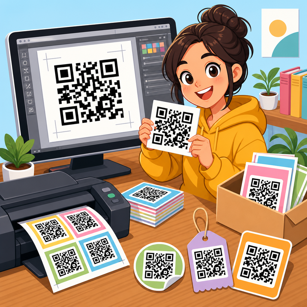
This hub article covers the full scope of QR code checklists, with placement as the main focus. It defines the core checks, explains how to adapt them by surface and use case, and highlights the questions every team should answer before launch. If you manage QR code resources, templates, and tools, this is the checklist page that connects strategy to execution. Use it to standardize reviews, train stakeholders, and create internal quality control that prevents costly reprints and underperforming campaigns.
What a QR code placement checklist should include
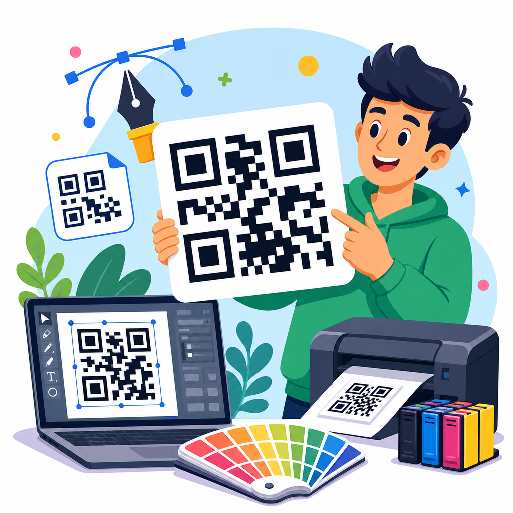
A QR code placement checklist is not just a design approval form. It is a pre-launch review that confirms scanability, context, environment, compliance, and tracking. In practice, I group placement checks into six categories: purpose, visibility, physical conditions, user flow, technical reliability, and maintenance. Purpose comes first because placement should support a specific action, such as claiming an offer, opening installation instructions, downloading an app, or verifying authenticity. If the intended action is unclear, placement decisions become arbitrary.
Visibility covers line of sight, contrast, quiet zone protection, and distance. A QR code cannot be tucked into a crowded corner and expected to perform. Physical conditions include surface material, lighting, curvature, reflections, motion, weather exposure, and expected wear. User flow asks whether a person can stop, aim a phone, and complete the action safely and comfortably. Technical reliability includes destination speed, mobile optimization, URL stability, and analytics. Maintenance means deciding who owns updates if the landing page changes, if the code is dynamic, or if signage is replaced later.
The best checklist also separates mandatory checks from recommended improvements. Mandatory items include sufficient size, clear contrast, unbroken quiet zone, mobile-friendly destination, and placement in a location where scanning is physically possible. Recommended items might include adding a short instruction, a call to action, a backup short URL, or UTM tagging for campaign attribution. This distinction helps teams move faster while still protecting performance.
Placement rules that affect scanability most
If you want the shortest answer to what makes QR code placement work, it is this: make the code easy to notice, easy to frame, and easy to trust. The highest-impact rules are usually size, contrast, angle, and surrounding clutter. Size should relate to scanning distance. A common field guideline is roughly one inch of code width for every ten inches of scanning distance, though testing always beats rules of thumb. A code scanned at arm’s length on packaging can be small; a code on a wall poster or menu board must be much larger.
Contrast should be strong, ideally dark modules on a light background. Reversed designs, gradients, patterned fills, and brand-heavy customizations often look attractive in proofs but fail in real environments. The quiet zone, the empty margin around the code, must remain clear. Designers frequently violate this by placing text, icons, borders, or background graphics too close. Angle matters because phones need a clean view. Codes mounted too low, too high, or on sharply curved surfaces force awkward framing and reduce scan success.
Clutter is the silent killer. When multiple offers, logos, and instructions compete for attention, users do not know why to scan. A QR code should sit near the relevant message, not detached from it. “Scan to view assembly video” performs better than a code floating near unrelated brand copy. Placement is effective when the purpose is obvious at a glance.
Environment checklist by surface, distance, and lighting
Environment changes everything. I have seen the same code perform well on matte carton packaging and badly on glossy acrylic simply because reflections blocked the camera. Start by evaluating the surface: flat matte surfaces are easiest; glossy, metallic, transparent, curved, or textured surfaces need extra care. On windows, consider what happens in daylight, at night, and with interior reflections. On bottles or cans, think about label curvature and whether the code distorts around the edge. On fabric or corrugated materials, printing quality becomes part of placement because edges can soften.
Distance and dwell time are equally important. A person standing still at a trade show booth can scan a code mounted at chest height with little trouble. A commuter passing a transit ad has only seconds, so the code must be larger, cleaner, and paired with a concise reason to scan. Lighting must be tested in the actual location, not only in the design file. Restaurant tabletop codes may perform differently under warm ambient light than under office fluorescents. Outdoor placements should be checked for shadow, seasonal sun angle, and rain exposure.
| Placement scenario | Main risk | Best practice |
|---|---|---|
| Product packaging | Curved surfaces and small print area | Place on the flattest panel, keep strong contrast, test at hand distance |
| Storefront window | Glare and reflections | Mount at eye level, avoid direct reflective zones, test day and night |
| Poster or signage | Insufficient size for distance | Scale for expected viewing distance and simplify nearby design elements |
| Direct mail | Low motivation to scan | Place near the offer headline and state the benefit clearly |
| Table tents or menus | Low light and spills | Use matte finish, keep code elevated from edges, laminate carefully |
| Equipment labels | Wear, dirt, and harsh conditions | Use durable materials, redundant access paths, and periodic inspection |
For permanent or semi-permanent installations, add a wear test to the checklist. If the code will face cleaning chemicals, abrasion, heat, or sunlight, the material specification is part of placement. A technically valid code on the wrong substrate is still a failed deployment.
Context, calls to action, and user intent
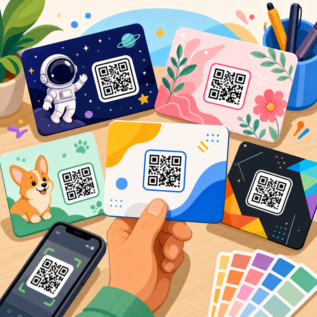
People do not scan QR codes just because they exist. They scan when the value proposition is immediate and credible. That is why every placement checklist should ask three plain questions: What does the user get, how long will it take, and why should they trust this code? Context answers those questions before the camera opens. On packaging, “Scan for setup video” is better than “Learn more.” On retail displays, “Scan for today’s in-stock colors” sets a clear expectation. On event badges, “Scan to save contact card” outperforms generic networking prompts.
The call to action should sit close to the code and use simple language. If there is a cost, login requirement, app download, or geographic limitation, disclose it. Hidden friction damages trust and suppresses future scans. In regulated sectors such as healthcare, finance, or industrial safety, context also needs legal and operational review. A code linking to instructions must point to the current approved version, not to a stale marketing page. That is a placement issue because the physical label invites a user to rely on what appears behind it.
User intent also changes by channel. Someone scanning from product packaging often wants support, authenticity, ingredients, warranty registration, or inspiration. Someone scanning from out-of-home media may want a quick offer, map, or event detail. A strong checklist ensures placement matches intent rather than forcing every QR code to serve the same generic destination.
Testing, tracking, and governance before launch
No QR code should go live without real-device testing. I recommend checking on both iPhone and Android, using native camera apps first, then testing common third-party scanning behavior if the audience justifies it. Verify scan speed, landing page load time, redirects, and whether the page remains usable on cellular data. Test from expected distances and angles, under actual lighting, and with a variety of cases or screen protectors in normal use. If the code will be seen internationally, review language routing and region-specific destination behavior.
Tracking should be built before production. Dynamic QR codes are usually better for campaigns because they allow destination changes and measurement without reprinting the asset. Use UTM parameters or equivalent analytics tagging, but keep governance tight. Naming conventions, campaign taxonomy, and ownership fields should be standardized so reports stay readable over time. I have seen teams lose attribution because one code was tagged by channel, another by region, and a third not at all. A checklist prevents those avoidable data gaps.
Governance is the last layer and often the most neglected. Decide who approves placement, who owns the linked content, how often permanent installations are audited, and what happens if a destination is retired. Include a backup path where appropriate, such as a short URL printed under the code for accessibility and continuity. The operational question is simple: if someone scans six months from now, will the experience still work exactly as promised?
How this hub supports the broader QR code checklist workflow
As a hub within QR Code Resources, Templates and Tools, this page should anchor your internal and external checklist content. Placement is the central decision because it touches design, print production, field operations, analytics, and user experience at once. From here, related checklist articles can branch into packaging reviews, event signage reviews, direct mail reviews, menu and tabletop reviews, trade show booth reviews, storefront window reviews, and post-launch audit checklists. Each supporting page should inherit the same core logic explained here: define the purpose, verify scan conditions, match context to intent, test the destination, and assign ownership.
That structure is useful because teams rarely need one massive checklist in daily work. They need a hub that establishes standards, then specialized templates for each format. A retail marketing team may need a shelf display checklist. A customer success team may need a product insert checklist. A facilities team may need a permanent signage checklist. When the hub article defines shared placement principles, every downstream template becomes more consistent and easier to maintain.
The main benefit of a QR code placement checklist is simple: it turns guesswork into repeatable quality control. Better placement improves scan rate, reduces user frustration, protects campaign measurement, and lowers the chance of expensive reprints or broken links in the field. If you are building a QR code program, start with this hub, turn its criteria into a review template, and make placement approval a required step before any code is published.
Frequently Asked Questions
What should a QR code placement checklist include before anything is printed or installed?
A strong QR code placement checklist should start with real-world scanning conditions, not just the design file. First, confirm the purpose of the code. A QR code meant for a quick menu view on a restaurant table should be placed differently than one meant for product registration inside a manual or lead capture on a trade show wall. Once the goal is clear, check the basic placement factors: viewing distance, expected scanning angle, lighting, glare, surrounding clutter, and whether the code is likely to be seen at the exact moment someone would want to use it.
Next, review size in relation to distance. A code that looks sharp on screen can still fail in practice if it is too small for the environment. Then evaluate contrast and background. The code should stand out clearly from what surrounds it, with enough quiet space around the edges so phone cameras can isolate it quickly. After that, assess surface and material issues. Glossy labels, glass storefronts, curved packaging, folded mailers, and reflective laminates often create scan problems even when the code itself is technically correct.
A complete checklist should also include context and instruction. People scan more often when they understand what they will get, such as “View installation guide,” “See ingredients,” or “Claim your offer.” Finally, test the code in the actual setting, with multiple phones, from the likely user position, under realistic lighting. In most weak campaigns, the code file is not the failure point. The placement, environment, and lack of situational testing are what cause the missed scans.
How large should a QR code be for different placements like packaging, posters, tables, or storefront windows?
QR code size should always be determined by scanning distance and user behavior, not by a generic template. A code on product packaging may only need to work from arm’s length, while a code on a poster, window, or trade show display may need to be scanned from several feet away. A practical rule is that as viewing distance increases, the code must scale up enough for the camera to detect the modules cleanly without forcing the user to move uncomfortably close. If people must step into traffic, block a sidewalk, or lean over a display to scan, the placement is already working against the campaign.
For close-range uses such as restaurant tables, product inserts, manuals, and direct mail, the code can be smaller, but it still needs to be easy to spot and frame quickly. Tiny codes often fail not because they are impossible to scan, but because they demand more effort than users are willing to give. On packaging, also consider where the package will be when scanned. A code may be technically visible on a side panel, but if it sits near a crease, curve, seal, or crimped edge, effective usability drops fast.
For medium- to long-range placements like posters, endcaps, event signage, and storefront windows, larger is almost always safer. But size alone does not solve everything. A large code placed too high, behind glare, or among heavy visual distractions can still underperform. The best approach is to estimate the likely scan distance, size the code generously for that distance, and then test it with real phones in the real environment. If people need multiple attempts, the code likely needs to be larger, lower, clearer, or all three.
Why do QR codes often fail even when the code itself is generated correctly?
The most common reason QR codes fail is that the image file is fine, but the placement ignores human behavior and environmental conditions. A code can be perfectly generated and still perform poorly if it is placed where people do not naturally pause, where lighting creates glare, where reflections interfere with focus, or where the code is surrounded by competing visual elements. This is especially common on glossy packaging, storefront glass, laminated menus, and posters behind protective coverings.
Another frequent issue is unrealistic scanning context. Marketers often assume that if a code is visible, it is usable. In practice, users need enough time, space, and motivation to scan. A code on a fast-moving transit ad, a high window, a crowded trade show backdrop, or a shelf edge with little standing room may be visible but not practical. Likewise, if the call to action is vague or absent, many people simply will not bother. Placement is not just about where the code fits visually. It is about whether the user can and will scan it in that exact moment.
Technical design choices can also contribute to failure when combined with poor placement. Low contrast, over-stylized designs, missing quiet space, dark backgrounds, curved surfaces, or printing issues can all reduce scan reliability. But these problems become much worse when the code is also too small, too reflective, or too distant. That is why an effective checklist looks beyond the code graphic itself. Real success comes from aligning code design, physical placement, environmental conditions, and user intent into one coherent experience.
Where should a QR code be placed to improve the chances that people actually scan it?
The best QR code placement is where user intent naturally peaks. In other words, place the code where a person already wants the next step. On packaging, that might be near setup instructions, recipe ideas, care details, authenticity verification, or warranty registration. On restaurant tables, it should be where diners are already looking when they are ready to browse a menu or pay. On direct mail, it should sit near the core offer, not buried in a corner as an afterthought. The more the code matches the user’s immediate need, the more likely it is to be scanned.
Physical ergonomics matter just as much. A code should be easy to approach, easy to frame with a phone camera, and free from awkward body positioning. Avoid placing codes too high, too low, around sharp curves, near seams, behind glare-prone materials, or in locations where people have to stop in inconvenient spots. Storefront windows are a good example. A code may look attractive at eye level, but if outdoor reflections obscure it during peak daylight hours, performance can suffer. Posters and trade show graphics face similar issues when the code is positioned where foot traffic cannot pause comfortably.
Good placement also means good visual support. Give the code enough isolation from text blocks, images, borders, and decorative elements so it stands out immediately. Add a clear prompt explaining why to scan, and if useful, mention what happens next. People respond better when the benefit is specific and immediate. In short, the ideal placement is not merely the place with open space in the layout. It is the place where visibility, accessibility, timing, and motivation all come together.
How can you test QR code placement before launching a campaign across print, packaging, or signage?
The most reliable way to test QR code placement is to simulate the exact conditions in which people will encounter it. Start by printing or mocking up the code at full size on the intended material whenever possible. Then test it from the expected scanning distance and angle using different smartphones, both newer and older. Check performance under bright light, low light, overhead light, and any conditions likely to create glare or reflections. A code that scans perfectly in an office can fail quickly on a glossy box under retail lighting or on a storefront window in afternoon sun.
You should also test user flow, not just raw scanability. Ask whether a person notices the code quickly, understands why it is there, and can scan it without repositioning awkwardly. On a poster, can someone stop and scan without blocking others? On a restaurant table, is the code readable among plates, glasses, and shadows? On direct mail, does the fold, trim, or nearby design interfere? On packaging, does the curve, crimp, or shelf position make scanning harder than expected? These practical details are often where campaigns succeed or fail.
Finally, test the full destination experience after the scan. A well-placed QR code still underperforms if the landing page loads slowly, is not mobile-friendly, or does not match the promise made beside the code. Review the entire chain: noticeability, approachability, scan speed, landing-page relevance, and user completion. If possible, do short observational tests with people who were not involved in the design. Their hesitation points will reveal weaknesses quickly. The goal of a placement checklist is not only to confirm that a QR code can scan, but to verify that it works smoothly in the real moment it is intended to be used.