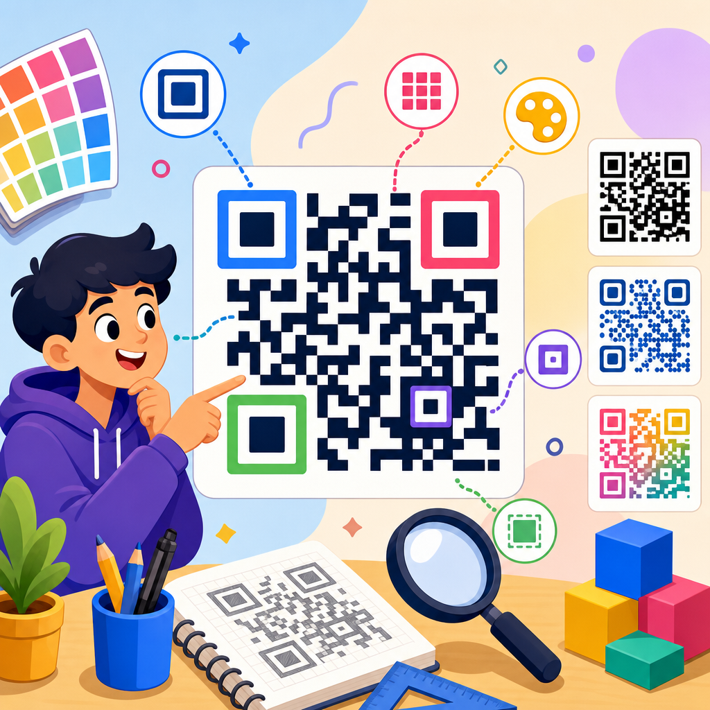
QR code design terms can sound technical, but once you understand the vocabulary, creating reliable, scannable, on-brand codes becomes far easier. In this glossary and reference guide, I will explain the terms professionals use when planning, testing, printing, and managing QR codes so you can make better decisions whether you are designing a restaurant menu, product label, event badge, packaging insert, poster, or digital ad. A QR code is a two-dimensional matrix barcode that stores data in square modules arranged in a grid and read by camera-based scanners. Design, in this context, includes both visual presentation and technical construction: how the code is encoded, how much data it holds, how much error correction it uses, what contrast it needs, how large it must print, and how surrounding artwork affects scan performance. These terms matter because small design mistakes cause real business problems. I have seen beautifully branded codes fail on glossy packaging because the quiet zone was too tight, and I have seen plain black-and-white codes outperform custom ones because the production team respected contrast, sizing, and testing standards. If this page is your hub for glossary and reference content under QR Code Resources, Templates & Tools, treat it as the foundation. Learn the language here, then use that vocabulary to evaluate generators, templates, printing methods, and campaign analytics with confidence and precision.
Core QR Code Structure Terms
The first group of terms describes the physical anatomy of a QR code. A module is the smallest square dot in the grid, and all sizing starts here. When a code is said to be 29 by 29 or 33 by 33, that means it contains that number of modules across and down. Finder patterns are the three large square markers in the corners that help a scanner locate and orient the code quickly. Alignment patterns are smaller reference squares used in larger versions to correct distortion, especially when codes are printed on curved surfaces such as bottles or flexible pouches. Timing patterns are alternating modules between the finder patterns that help define the grid. The quiet zone is the clear margin around the code, typically at least four modules wide, and it is one of the most commonly violated requirements in marketing artwork.
Version is another essential term. QR code versions range from 1 to 40, with each higher version increasing the grid size and data capacity. Version 1 uses a 21 by 21 grid, while Version 40 reaches 177 by 177. In practice, higher versions allow more characters but also create denser codes that require larger print sizes for dependable scanning. Format information stores details such as error correction level and mask pattern, while version information appears on larger codes to identify the structure. Mask pattern refers to one of several predefined methods used to distribute dark and light modules more evenly, reducing scanner confusion from problematic visual patterns. These are not decorative choices. They are structural controls that directly affect readability.
Data Encoding and Content Terms
Encoding terms explain what the QR code is actually storing and how efficiently that data is represented. Data capacity refers to how much information the code can hold, but capacity depends on content type, error correction level, and version. Numeric mode is the most efficient because it stores digits only. Alphanumeric mode supports numbers, uppercase letters, and a limited set of symbols. Byte mode is more flexible and commonly used for URLs, while Kanji mode is optimized for certain character sets. The payload is the actual data embedded in the code, such as a website address, plain text, Wi-Fi credentials, vCard contact information, a payment string, or an app deep link.
Static QR code and dynamic QR code are among the most important content terms. A static code contains fixed information that cannot be changed after creation. A dynamic code usually points to a short URL or redirect service, allowing the destination to be updated later without changing the printed symbol. Dynamic codes also support analytics, including scans by date, location, device type, and campaign source, depending on the platform. When marketers ask whether they can update a restaurant menu, swap a product landing page, or pause a campaign after printing thousands of labels, dynamic capability is the term that matters. URL shortening, redirect rules, UTM parameters, and link management all sit close to this part of the glossary because they determine how the destination behaves after the scan.
Error Correction, Redundancy, and Scan Reliability
Error correction is the term that most often gets misunderstood in custom QR code design. QR codes use Reed-Solomon error correction, which allows scanners to recover data even when parts of the symbol are obscured or damaged. The standard levels are L, M, Q, and H. Level L restores about 7 percent of data, M about 15 percent, Q about 25 percent, and H about 30 percent. Higher error correction makes a code more tolerant of scratches, poor printing, folds, or logo overlays, but it also increases density. That tradeoff is central to design decisions. On a business card or retail shelf tag, H may be worth the extra density if branding elements cover part of the center. On a tiny medical label, lower density may matter more than decorative flexibility.
Redundancy is related but not identical. It describes the extra recoverable information built into the code through error correction. Scan reliability, meanwhile, is the practical outcome: whether the code reads quickly across lighting conditions, camera qualities, angles, and distances. Decode rate is the percentage of successful scans in testing, and first-pass scan rate measures how often the code works immediately without user adjustment. In my experience, teams often overestimate the value of visual customization and underestimate these reliability metrics. A QR code that takes three attempts creates friction, and friction reduces conversions. For packaging, signage, and outdoor media, durability, surface glare, and environmental wear should always be evaluated alongside error correction level.
Design, Branding, and Visual Customization Terms
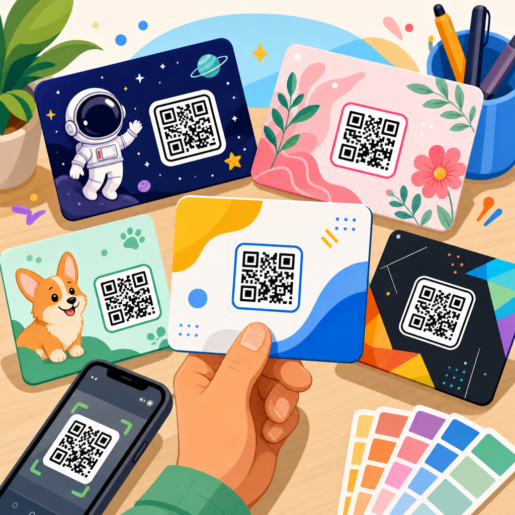
Design vocabulary covers the choices that make a QR code match a brand without undermining function. Color contrast refers to the luminance difference between dark modules and the background. The safest combination remains dark foreground on a light background. Inverted codes, such as white modules on black, can work with modern smartphones but still fail more often in mixed conditions and with some scanning apps. A logo overlay places a mark in the center of the code, usually relying on higher error correction to preserve readability. Frame and call to action describe the border and prompt around the code, such as “Scan to view menu” or “Scan for setup guide,” which improve user confidence and scan intent.
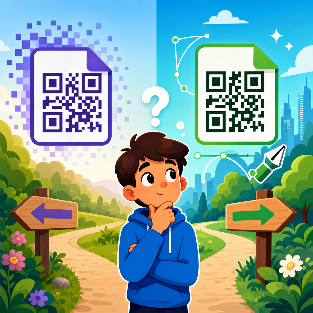
Rounded modules, custom eyes, gradients, and patterned fills are common styling features in modern generators. They can perform well when used conservatively, but every embellishment reduces the visual simplicity that scanners prefer. Brand consistency matters, yet scanability is the primary design requirement. Bleed, safe area, and trim become relevant when QR codes appear in printed pieces because a code positioned too close to an edge may lose its quiet zone during finishing. Vector format is the preferred production term for print because SVG, EPS, and PDF scale cleanly without pixelation. Raster formats such as PNG can work for digital use or small prints, but low-resolution exports often introduce softness that harms sharp module edges. When in doubt, generate a vector master and test final output at actual size.
Print, Placement, and Production Specifications
Production terms determine whether a QR code survives the move from screen to physical object. Minimum size is the smallest printed dimension that still scans reliably, and it depends on module count, viewing distance, and camera quality. A common field rule is that scan distance should be roughly ten times the code width, but that is only a starting point. A dense code on corrugated cardboard may need to be larger than the same code on a smooth matte card. X-dimension refers to the width of a single module, a term borrowed from barcode standards and useful when specifying print quality. Print resolution, dot gain, substrate, lamination, and finish all influence edge clarity and contrast.
Placement matters as much as size. Curved surfaces can distort the grid, especially when the code wraps around narrow bottles or tubes. Seams, folds, perforations, and embossing can break modules or quiet zones. Reflective foil, holographic stock, and glossy varnish create glare that reduces scan performance under overhead lighting. For direct mail and posters, line of sight and user ergonomics matter too. A code placed too high, too low, or near visual clutter gets fewer scans even if it is technically readable. The practical solution is to proof the code on the final material, in the final environment, with multiple devices. That last step catches more failures than any design mockup ever will.
Testing, Analytics, and Management Reference Terms
Testing and measurement terms connect design quality to campaign performance. Scan test means verifying the code across different phones, operating systems, and lighting conditions before release. Device compatibility is especially important when your audience includes older Android phones, enterprise scanning apps, or embedded camera software with weaker decoding. Landing page speed affects the post-scan experience; a perfect code that opens a slow mobile page still loses users. Redirect latency, SSL security, and mobile responsiveness should be reviewed together. If you manage dynamic codes, dashboard, batch generation, expiration rules, access controls, and edit history become useful operational terms because QR code programs often scale across teams and regions.
For quick reference, the table below summarizes the design terms that most often affect outcomes in real campaigns.
| Term | What it means | Why it matters |
|---|---|---|
| Quiet zone | Clear margin around the code | Without enough space, scanners may not isolate the symbol |
| Error correction | Data recovery level from L to H | Supports damage tolerance and limited logo overlays |
| Version | Grid size from 21×21 to 177×177 | Higher versions hold more data but require more print space |
| Contrast | Difference between dark modules and light background | Low contrast is a leading cause of scan failure |
| Dynamic code | Editable destination through a managed redirect | Enables updates, tracking, and campaign control after printing |
| Vector file | Scalable artwork such as SVG or EPS | Preserves sharp edges for professional printing |
Analytics terms also deserve clear definitions. Unique scans count distinct users or devices depending on the platform methodology, while total scans include repeat activity. Geolocation data is usually inferred from IP address and should be treated as approximate, not exact foot traffic proof. Conversion rate tracks how many scanners completed the intended action, such as ordering, registering, downloading, or purchasing. Attribution is the broader discipline of connecting scans to channels, campaigns, and revenue. In a mature setup, QR code naming conventions, campaign tagging, and dashboard governance are not administrative details; they are the backbone of usable reporting. If teams cannot tell which code version, placement, or creative treatment drove results, they cannot improve the next campaign efficiently.
Understanding QR code design terms gives you a working language for every stage of a project, from concept and content selection to print production, testing, and optimization. The key lesson is simple: a QR code is not just a black square that links somewhere. It is a technical object with structural rules, data constraints, visual tradeoffs, and measurable performance outcomes. When you know terms like module, quiet zone, version, byte mode, error correction, vector format, and dynamic redirect, you can spot weak designs before they reach customers and ask smarter questions of agencies, printers, and software vendors. You can also connect design decisions to business results, whether the goal is more menu views, easier product onboarding, higher event attendance, faster payments, or better packaging engagement.
As the hub page for glossary and reference guides within QR Code Resources, Templates & Tools, this article should serve as your baseline document. Return to it whenever you need a plain-language definition or a reminder of how one technical choice affects scanability, branding, and reporting. Then go deeper into related guides on templates, sizing charts, dynamic QR code platforms, print checklists, and testing workflows. The biggest benefit of mastering this terminology is consistency: your codes become easier to produce, easier to scan, and easier to measure across every channel. Use this glossary as your reference point, audit your current QR codes against these terms, and update any design that looks good but scans poorly.
Frequently Asked Questions
What are the most important QR code design terms beginners should understand first?
If you are new to QR codes, a few core terms will make everything else easier to understand. The first is module, which refers to the small square dots that make up the QR code grid. The size and clarity of these modules directly affect scan reliability. Next is the quiet zone, the empty margin around the code. This blank space is essential because scanners use it to distinguish the QR code from surrounding graphics, text, or packaging elements. Another key term is error correction, which describes how much damage, distortion, or obstruction the code can tolerate while still remaining scannable. Higher error correction can be useful when adding a logo or printing on less predictable surfaces, but it also increases the density of the code.
You should also understand the difference between static and dynamic QR codes. A static QR code points directly to fixed data and usually cannot be changed once created, while a dynamic QR code uses a short redirect URL that can be updated later, often with tracking and management features. Other useful terms include contrast, which is the visual difference between dark modules and the lighter background, and scan distance, which refers to how far away a user can reliably scan the code based on its physical size and placement. Once you know these terms, you can make smarter decisions about styling, printing, testing, and long-term QR code performance.
What does error correction mean in QR code design, and why does it matter?
Error correction is one of the most important technical concepts in QR code design because it determines how resilient a code is when real-world conditions are less than perfect. QR codes can still scan even if part of the symbol is scratched, folded, smudged, covered by a logo, or printed on textured material. This is possible because built-in error correction helps reconstruct missing or damaged data. In practice, this means a well-designed code can survive handling, weather exposure, packaging wear, or minor design customizations without becoming unusable.
QR codes are typically generated using four standard error correction levels: L, M, Q, and H. These represent increasing levels of recovery capability, with higher levels allowing more of the code to be damaged while still scanning. However, there is a tradeoff. As error correction increases, the code usually becomes denser because more data is devoted to redundancy. Denser codes may require larger print sizes or better camera conditions to scan easily. That is why designers should not automatically choose the highest setting for every use case. For example, a clean, high-contrast QR code printed large on a poster may not need heavy error correction, while a branded code on product packaging or a curved label may benefit from it. Understanding this term helps you balance style, durability, and scanning convenience.
What is a quiet zone, and how much space should surround a QR code?
The quiet zone is the blank, unobstructed margin around a QR code, and it is far more important than many people realize. Scanners rely on this empty border to identify where the code begins and ends. If text, borders, patterns, icons, product photography, or other visual elements crowd the code too closely, the scanner may struggle to isolate the symbol correctly. Even a beautifully designed QR code can fail if the quiet zone is ignored, especially in busy layouts such as packaging, menus, posters, flyers, and signage.
As a general rule, the quiet zone should be at least four modules wide on all sides of the QR code. Since a module is the smallest square in the code grid, the exact physical size of that margin depends on the overall dimensions of the code. In practical terms, this means you should always leave a clearly visible buffer around the symbol and avoid decorating directly against its edges. If you add a background color block behind the QR code, make sure the quiet zone remains clean and high-contrast. If you place the code on a patterned package or a photo-heavy ad, isolate it with enough plain space so the scanner can recognize it instantly. The quiet zone is not optional decoration space; it is a functional part of the code’s scanability.
How do color, contrast, and branding choices affect QR code scannability?
Color and branding are often where design goals and technical requirements meet. A QR code does not have to be plain black and white to work well, but it does need strong contrast. In most cases, dark foreground modules on a light background produce the most reliable results. Problems usually happen when designers reverse that relationship, use colors that are too similar in brightness, apply gradients that reduce edge clarity, or place the code over an image that interferes with module definition. Scanners are looking for structure, contrast, and consistency, not just visual appeal.
Branding can absolutely be incorporated, but it needs to be done carefully. Adding a logo in the center of a QR code is common, especially when supported by appropriate error correction, yet the logo should not cover too much of the data area. Rounded modules, custom corner shapes, and brand colors can also work well if the code is still tested thoroughly across multiple devices and lighting conditions. A good rule is to treat visual customization as an enhancement, not a replacement for functionality. If a branded QR code looks impressive but fails on older phones, glossy packaging, or low-light environments, it is not doing its job. The best branded QR codes are unmistakably on-brand while still preserving contrast, quiet zone, size, and structural integrity.
Why are QR code size, placement, and testing so important before printing or publishing?
Size and placement have a direct effect on whether people can scan a QR code quickly and without frustration. A code that is too small may look fine on screen but become difficult to scan once printed on a label, menu, badge, or insert. Likewise, a code placed on a curved bottle, reflective wrapper, dark glass, folded carton, or low-visibility corner may suffer in the real world even if the file itself is technically correct. The ideal size depends on scan distance, surrounding environment, and the device being used. As a practical guideline, the farther away someone will scan from, the larger the QR code should be. A code on a business card can be relatively small, while one on a storefront window or event sign should be much larger.
Testing is what turns assumptions into confidence. Before final production, a QR code should be tested on multiple phone models, under different lighting conditions, from realistic user distances, and on the actual material whenever possible. If the code is going on packaging, test it on the final substrate. If it will appear in a digital ad, test it on different screen resolutions and brightness settings. If it links to a landing page, test the destination experience as well, including load speed and mobile usability. In professional workflows, QR code testing is not just about whether the symbol scans once. It is about whether it scans easily, consistently, and in the context where real users will encounter it. That is why terms like print size, scan distance, placement, substrate, and live testing are so important in QR code design.