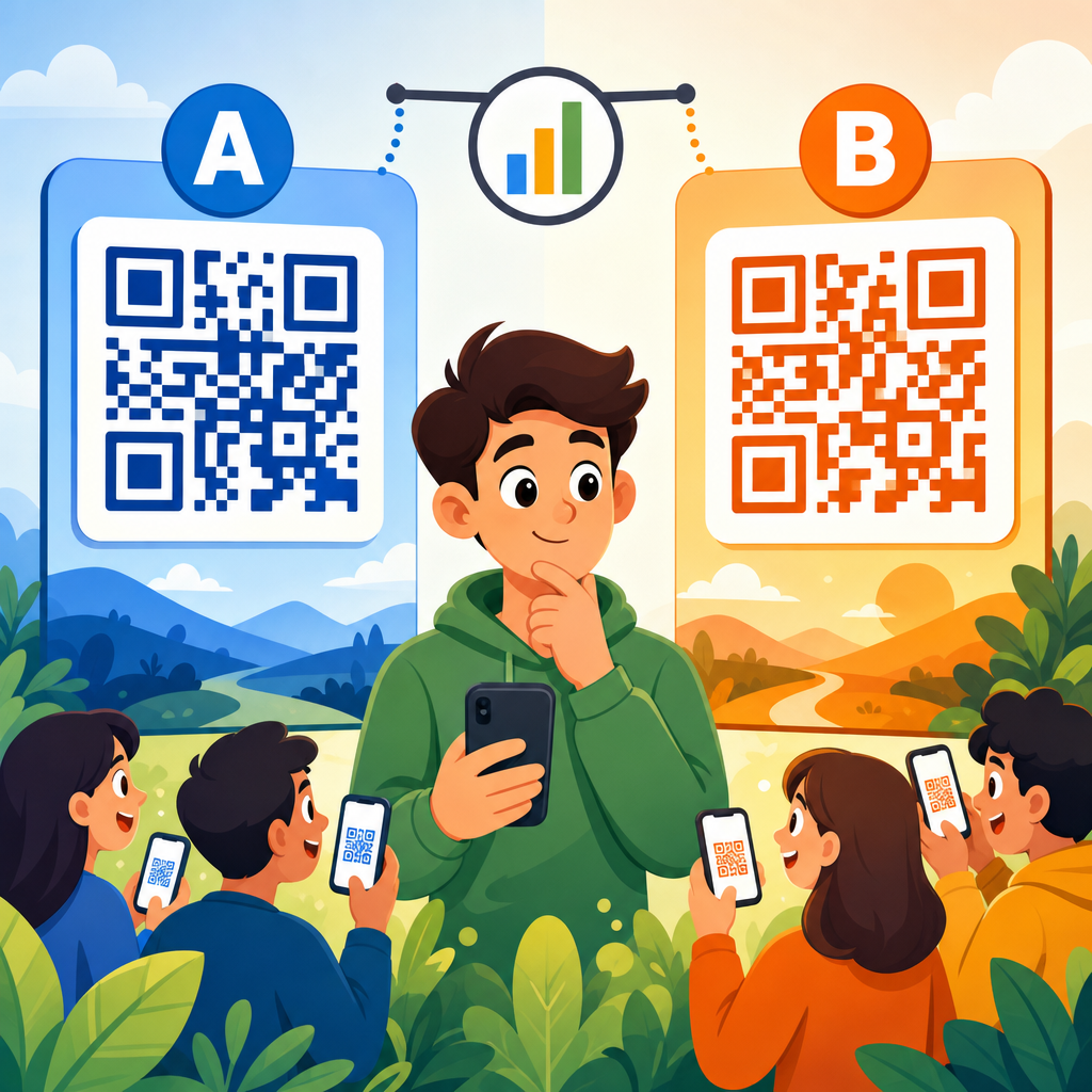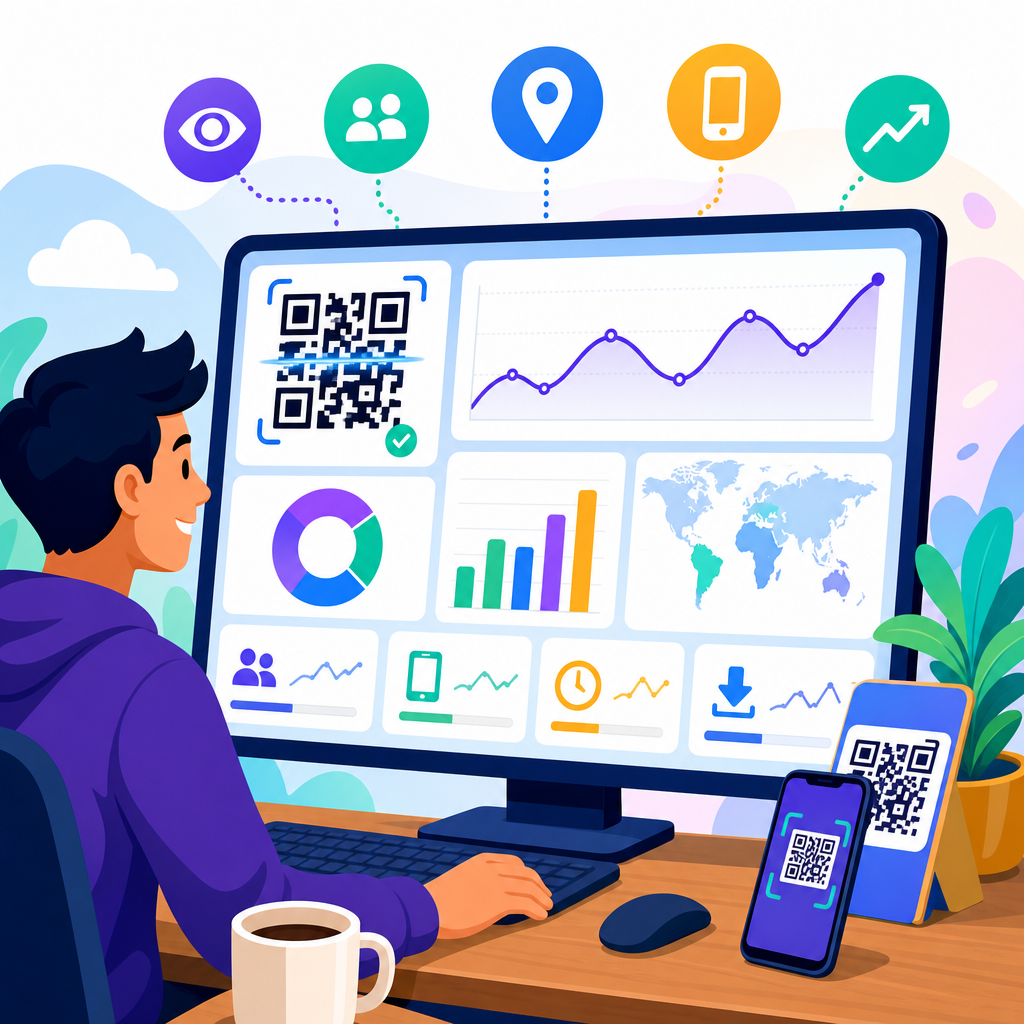
A QR code analytics dashboard turns scans into decisions. Instead of treating a code as a static square printed on packaging, posters, menus, or mailers, marketers can measure where scans happen, when they happen, which devices people use, and whether those scans lead to meaningful outcomes such as signups, purchases, bookings, or downloads. In practice, the dashboard is the control center for QR code tracking and analytics because it connects campaign activity in the physical world with user behavior in digital channels.
QR code analytics usually refers to the reporting layer attached to dynamic QR codes, redirect links, landing pages, and downstream conversion events. A scan is only the first interaction. Good measurement also tracks sessions, unique users, bounce rate, time on page, form completion, assisted conversions, and revenue. I have seen teams celebrate scan volume while missing the fact that half their traffic landed on a page that loaded slowly on older phones and produced almost no conversions. A useful dashboard prevents that mistake by showing both top-of-funnel attention and bottom-of-funnel performance in one place.
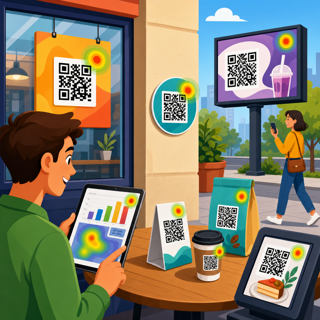
This matters because QR codes are now embedded across retail, restaurants, events, direct mail, out-of-home advertising, product packaging, and B2B sales collateral. Each placement has a cost, and each scan reflects real-world intent. If a shelf talker in one region drives repeat orders while the same code on a flyer produces traffic but no sales, the business needs to know quickly. A strong QR code analytics dashboard helps teams allocate budget, improve creative, diagnose friction, prove campaign ROI, and build smarter tests. For a sub-pillar focused on tracking and analytics, the central question is simple: what should you measure so that every scan can be evaluated in business terms, not vanity terms?
Start with the core QR code metrics
The first layer of any QR code analytics dashboard should answer direct, practical questions: How many times was the code scanned? How many of those scans were unique? When did they happen? Where did they happen? What devices were used? These are foundational because they reveal reach, frequency, and usage context. Total scans show volume. Unique scans estimate audience size. Repeat scans can indicate strong interest, confusion, or team members repeatedly testing the code. Time-based patterns reveal campaign spikes, daypart performance, and the impact of launches, events, or in-store traffic.
Location data is especially useful when the same campaign is deployed across multiple geographies. In retail rollouts, I prefer seeing scan data by store, city, region, and country, depending on scale. That makes it easier to identify operational differences, such as one location placing signage at eye level while another leaves it near checkout clutter. Device and operating system breakdowns matter because mobile experience issues are often platform specific. If Android users bounce at a much higher rate than iPhone users, the landing page, browser behavior, or app deep link may be the problem rather than the code itself.
Dynamic versus static QR codes also affects what can be tracked. Static QR codes typically point directly to a fixed URL and offer little native reporting beyond whatever the destination site collects. Dynamic QR codes route through a managed redirect, which enables scan logging, destination changes, and campaign-level attribution. For serious QR code tracking and analytics, dynamic codes are the standard. They allow marketers to preserve printed assets while updating destination URLs, adding UTM parameters, or segmenting traffic over time without reprinting materials.
Measure engagement after the scan, not just the scan itself
Scan counts are important, but they do not tell you whether the experience worked. The second layer of a QR code analytics dashboard should focus on post-scan engagement. At minimum, track landing page sessions, engaged sessions, bounce rate, average engagement time, pages per session, scroll depth, and click-through rate to the next action. These metrics indicate whether the promise made by the QR code placement matched the content users saw after scanning.
For example, a restaurant table tent might generate high scan volume for a seasonal menu. If visitors spend less than ten seconds on the page and rarely click to order, the dashboard is signaling a mismatch. The offer might be unclear, the page may not be mobile friendly, or the QR code may be placed where users scan out of curiosity rather than purchase intent. In contrast, an event badge QR code linking to a speaker resources page may produce fewer scans but much higher engagement time and download rate. That is often a healthier signal because the action is more qualified.
Instrument these engagement metrics with a web analytics platform such as Google Analytics 4, Adobe Analytics, or Matomo. In GA4, I usually define custom events for button clicks, coupon reveals, PDF downloads, map opens, app store taps, and outbound clicks. Those event definitions make QR traffic comparable to other acquisition channels. Once those events are flowing, the dashboard can show not only who scanned but what they actually did next.
Track conversions and revenue with clear attribution rules
The most valuable QR code analytics dashboards connect scans to conversions. A conversion can be a lead form submission, appointment booking, product purchase, loyalty signup, coupon redemption, phone call, app install, or content download. The key is to define primary and secondary conversions before launch. Primary conversions are the business outcomes that justify budget. Secondary conversions show buying intent or audience quality when a direct sale is not realistic from the first scan.
Attribution rules matter because QR campaigns often assist a later conversion rather than close it immediately. A customer may scan packaging, read reviews, leave, and return days later through branded search. If your dashboard uses only last-click reporting, QR may look weaker than it really is. I recommend viewing results through multiple lenses: direct conversion rate from scan to action, assisted conversions in the analytics platform, and revenue by campaign where CRM or ecommerce data is available. This gives a more accurate picture of incrementality.
For ecommerce, the most actionable conversion metrics are add-to-cart rate, checkout start rate, purchase conversion rate, average order value, and revenue per scan. For lead generation, focus on form completion rate, qualified lead rate, meeting booked rate, and cost per qualified lead if media or print spend is attached. Offline conversion capture is also possible. A QR-linked coupon code redeemed in store, a point-of-sale promo, or a scanned event pass can be tied back to the originating code when systems are configured properly.
Build a dashboard that separates campaign, placement, and audience insights
A strong dashboard structure prevents analysts from mixing unlike data. I have had the best results when QR code tracking and analytics is organized in three layers: campaign performance, placement performance, and audience behavior. Campaign performance answers whether the overall initiative worked. Placement performance shows which physical touchpoints generated the best scan and conversion efficiency. Audience behavior explains how different user segments interacted after the scan.
Campaign views should include scans, unique scans, sessions, conversions, conversion rate, revenue, and return on ad spend or return on campaign spend where relevant. Placement views should compare individual assets such as packaging inserts, shelf tags, trade show booths, direct mail cards, window decals, and receipts. Audience views can segment by device type, geography, new versus returning user, daypart, and language. This layered model keeps the dashboard useful for executives, channel managers, and analysts at the same time.
| Dashboard view | Primary metrics | Best use case |
|---|---|---|
| Campaign | Total scans, unique scans, conversions, revenue, ROI | Judge overall business impact |
| Placement | Scans per asset, conversion rate, cost per scan, cost per conversion | Optimize print and in-store execution |
| Audience | Device, location, engagement time, repeat visits, segment conversion | Improve user experience and targeting |
| Technical | Page speed, redirect errors, broken links, deep-link success rate | Identify implementation problems fast |
This structure also supports internal linking and reporting consistency across the wider QR Code Marketing and Strategy topic. As the hub for Tracking and Analytics, it should connect naturally to deeper articles on UTM strategy, dynamic QR code setup, offline attribution, landing page optimization, and QR conversion rate improvement. That way, each supporting page can drill into one measurement discipline without losing the overall framework.
Use naming conventions, UTM parameters, and governance from day one
Most QR reporting problems begin before the first scan. If campaign names are inconsistent, UTM parameters are missing, or duplicate codes point to the same destination without labels, the dashboard becomes unreliable. Governance is not glamorous, but it is essential. Every QR code should have a naming convention that identifies brand, campaign, channel, placement, audience, geography, date, and version where needed. A retail example might be brand_summerpromo_shelftalker_storeeast_v2. That level of specificity saves enormous cleanup later.
UTM tagging should be standardized as well. Source, medium, and campaign must be applied consistently so that traffic lands in analytics platforms with usable dimensions. I usually keep source tied to the physical environment, medium tied to QR, and campaign tied to the broader initiative. Content can identify the exact placement or creative variant. Term is optional unless there is a meaningful classification need. The point is not rigid theory; it is accurate, repeatable reporting.
Governance also includes access control, QA, redirect testing, and expiration handling. Before any print run, test codes on multiple devices, browsers, and lighting conditions. Confirm that deep links fall back correctly if the target app is not installed. Monitor HTTP status codes and redirect latency. Broken destinations and slow mobile pages destroy campaign performance and can skew dashboards by making a high-intent audience look weak. Good analytics depends on disciplined implementation.
Include technical health metrics that explain performance swings
Technical diagnostics deserve a dedicated section in the dashboard because QR experiences fail in ways that standard marketing reports often hide. Track redirect response time, destination page load speed, mobile Core Web Vitals, HTTP errors, app deep-link success rate, and scan-to-load completion rate if your tooling supports it. When a campaign suddenly loses conversions, these indicators often explain the drop faster than audience data can.
A common example is a printed code that performs well in prelaunch testing but sends users to a landing page later modified with heavier scripts, oversized images, or cookie consent tools that delay interaction. Scan counts stay healthy, yet conversions collapse because users abandon before the call to action becomes usable. Another issue appears in app campaigns. A QR code that should open product content in the app may fail for users without the current app version, sending them to a generic web page instead. Without deep-link reporting, the dashboard would understate the real source of friction.
Technical monitoring is especially important for high-volume environments such as stadium signage, transit posters, and product packaging. Those placements can generate large spikes in short windows. If infrastructure, redirects, or content delivery networks are not prepared, the campaign may fail precisely when demand peaks. Analytics should reveal that risk early, not after the print budget is already spent.
Turn QR dashboard data into optimization decisions
The final purpose of QR code tracking and analytics is action. Every metric on the dashboard should support a decision about creative, placement, targeting, or user experience. If one poster design gets more scans but another produces more revenue per scan, the second asset may deserve wider distribution. If scans surge during commuting hours but conversion rate falls, the landing page may need a faster path for distracted mobile users. If repeat scans are high on packaging, customers may be returning for instructions, reorder options, or support content, which suggests opportunities beyond the original campaign goal.
Testing should be systematic. Compare CTA language, code size, placement height, surrounding copy, color contrast, incentive type, and destination page design. In stores, small layout changes can have measurable effects. In direct mail, envelope messaging often changes scan propensity more than the QR code artwork itself. At events, booth staff behavior can influence whether attendees scan at all. The dashboard should therefore be reviewed alongside field observations, sales feedback, and customer service signals, not in isolation.
Reporting cadence matters too. Daily monitoring is appropriate during launches or high-spend campaigns. Weekly reviews work for steady-state programs such as packaging or in-store signage. Monthly trend analysis helps identify seasonality, geographic lift, and long-term asset fatigue. Over time, the dashboard becomes more than a report. It becomes a learning system that tells you where QR codes create attention, where they create intent, and where they create measurable business value.
A QR code analytics dashboard is most useful when it tracks the full chain from scan to outcome. Start with core metrics such as total scans, unique scans, time, location, and device. Add post-scan engagement measures to confirm that the destination experience matches user intent. Then connect scans to conversions, revenue, and assisted impact so campaign value is visible in business terms. Support those reports with disciplined naming conventions, UTM governance, and technical health monitoring.
For teams building a hub around Tracking and Analytics within QR Code Marketing and Strategy, the priority is clarity. Separate campaign, placement, audience, and technical views so each stakeholder can see what matters. Favor dynamic QR codes, instrument custom events, and define attribution rules before launch. Use the dashboard to compare placements, diagnose friction, and guide testing decisions rather than simply reporting scan volume. That is how QR code tracking and analytics moves from novelty to a dependable performance channel.
If you are auditing your current setup, begin with one question: can you explain which QR placements drive qualified actions and why? If the answer is no, rebuild the dashboard around the metrics in this guide and make every future code measurable from day one.
Frequently Asked Questions
1. What are the most important metrics to track in a QR code analytics dashboard?
The most important metrics are the ones that connect scan activity to real business outcomes. Start with total scans, unique scans, and repeat scans so you can understand overall reach and whether people are returning to the same code more than once. Then look at time-based trends, such as scans by hour, day, or campaign period, because timing often reveals when interest is strongest and whether a promotion, event, or product launch is driving engagement. Location data is also essential, since it shows where scans are happening geographically and can help you compare performance across stores, cities, print placements, packaging runs, or out-of-home ads.
Device and operating system data matter because they tell you how people are accessing the destination after scanning. If a large share of scans comes from mobile devices with certain screen sizes or operating systems, that may affect how you design landing pages, forms, and checkout experiences. Traffic source context is another valuable layer, especially when dynamic QR codes are tied to specific channels like direct mail, menus, product packaging, trade show booths, or in-store signage. This helps you compare one physical touchpoint against another instead of lumping all scans together.
Most importantly, track conversion metrics beyond the scan itself. A QR code scan is useful, but it is not the finish line. You should measure actions such as signups, purchases, reservations, app downloads, coupon redemptions, or form submissions. When your dashboard combines top-of-funnel metrics like scan volume with bottom-of-funnel metrics like conversion rate and revenue, it becomes much easier to judge campaign quality instead of just activity. A high scan count with weak conversions may signal a mismatch between the QR code promise and the landing page experience, while a lower scan count with strong conversions may indicate a highly qualified audience.
2. Why is it important to separate total scans from unique scans in QR code reporting?
Total scans and unique scans tell different stories, and both are necessary for accurate reporting. Total scans reflect all scan activity, including repeated interactions from the same person or device. This metric helps you understand overall engagement volume and can be especially useful for campaigns where repeat use is expected, such as restaurant menus, event schedules, loyalty programs, or product instructions. If total scans are rising, it may indicate strong ongoing usage, increased visibility, or growing interest over time.
Unique scans, on the other hand, are designed to estimate how many distinct users interacted with the QR code. This gives you a better sense of audience reach. If a poster generates 1,000 total scans but only 300 unique scans, that suggests a significant amount of repeat behavior. That is not automatically good or bad. It simply means people are coming back, and your interpretation should depend on campaign goals. For a one-time offer, heavy repeat scanning might mean users are confused or not finding what they expected. For a recurring-use experience, it may signal strong utility and retention.
Separating these metrics prevents misleading conclusions. If you only track total scans, you may overestimate how many people your campaign reached. If you only track unique scans, you may miss important signs of repeated engagement and customer interest. The ratio between total and unique scans can also reveal behavior patterns. A very low repeat rate may suggest the experience is one-and-done, while a very high repeat rate may point to loyalty, dependence on the content, or friction that causes users to scan again. A strong QR code analytics dashboard should make it easy to compare both metrics side by side and tie them back to campaign intent.
3. How can location and time-based scan data improve QR code campaign performance?
Location and time-based scan data are some of the most actionable insights in a QR code analytics dashboard because they help explain not just how much engagement happened, but where and when it happened. Geographic data can show whether a campaign is performing better in certain neighborhoods, cities, regions, or store locations. For example, if the same QR code campaign appears on packaging in multiple retail markets, scan patterns may reveal that one area has stronger interest, better product-market fit, or stronger in-store placement. That can inform future budget allocation, distribution strategy, and creative decisions.
Time-based reporting is equally valuable because consumer behavior changes throughout the day, week, season, and campaign lifecycle. A restaurant may find that menu QR scans spike around lunch and dinner. An event organizer may see registrations jump immediately after posters are placed or after speakers are announced. A retailer may discover that scans increase on weekends or after a direct mail piece lands in homes. These patterns can influence staffing, ad timing, promotional windows, and even when to update landing page content. If you know exactly when people are most likely to scan, you can align your follow-up offers and messaging to meet them at the right moment.
Combined, location and time data help marketers test and optimize physical-world placements with much more precision. Instead of assuming all posters, shelf tags, or mailers perform the same, you can compare them by region, venue, time frame, or campaign phase. That makes your dashboard far more than a reporting tool. It becomes a decision-making system that helps you identify underperforming placements, replicate high-performing ones, and continuously improve campaign efficiency based on real-world scan behavior.
4. What role do conversions play in a QR code analytics dashboard?
Conversions are what turn QR code analytics from interesting data into meaningful performance measurement. A scan tells you someone responded to the code. A conversion tells you whether that response created value. Depending on the campaign, a conversion could be a purchase, lead form submission, appointment booking, app install, document download, coupon redemption, or newsletter signup. Without conversion tracking, it is difficult to know whether a QR code campaign is successful or simply attracting curiosity.
This is why the best QR code analytics dashboards do more than count scans. They connect scans to downstream actions. For example, if a code on product packaging leads to a special offer page, you should be able to measure how many scanners actually claim the offer or complete a purchase. If a code on a trade show banner leads to a lead capture form, the dashboard should reveal not only how many people scanned but also how many qualified leads were generated. That connection between engagement and outcome is what allows marketers to calculate conversion rate, cost efficiency, and return on campaign investment.
Conversion data also improves optimization. If one QR code placement gets fewer scans but generates more purchases, it may be outperforming a higher-volume placement that produces little revenue. That insight can shift how you define success. Instead of favoring the code with the biggest raw numbers, you start prioritizing the code with the strongest business impact. Over time, conversion tracking helps refine messaging, landing page design, targeting, and placement strategy. In short, scans measure attention, but conversions measure effectiveness, and a strong dashboard should always track both.
5. How do marketers use a QR code analytics dashboard to make better campaign decisions?
Marketers use a QR code analytics dashboard to move from guesswork to evidence-based decision-making. In traditional print or physical campaigns, it was often difficult to know which placements actually drove response. A QR code changes that by creating a measurable bridge between offline touchpoints and digital behavior. The dashboard becomes the central place to monitor how each code performs across formats such as packaging, flyers, menus, posters, direct mail, retail displays, and event materials. By reviewing scan volume, unique users, location trends, device data, and conversions together, marketers can identify what is working and what needs adjustment.
In practical terms, this means a dashboard can inform decisions about creative, placement, timing, and budget. If one poster location consistently outperforms others, that placement style can be replicated elsewhere. If scans are high but conversions are weak, the issue may be the landing page, offer clarity, or post-scan user experience rather than the code itself. If certain devices show poor conversion performance, the mobile experience may need improvement. If scans spike at specific hours or in specific cities, marketers can align promotions, staffing, and inventory around those patterns. Each insight leads to a more informed next step.
Over time, the dashboard also supports testing and continuous improvement. Marketers can compare different QR code destinations, campaign messages, packaging designs, or calls to action to see which version drives stronger results. Instead of treating QR codes as static tools, they can manage them as measurable campaign assets. That is the real value of QR code tracking and analytics: not just seeing data, but using that data to improve reach, engagement, and conversion performance across physical and digital channels.