Minimalist QR code design templates help brands present scannable codes that look intentional, modern, and easy to trust. In practice, a minimalist template is a repeatable layout for placing a QR code within print or digital creative using restrained color, clean spacing, limited typography, and a clear call to action. I have built QR assets for packaging, retail displays, menus, trade show signage, and app onboarding screens, and the same pattern appears every time: the highest-performing designs are usually the simplest. This matters because QR codes succeed or fail in a second. A viewer sees the code, decides whether it feels legitimate, understands what will happen after scanning, and then points a camera. If any step feels cluttered, confusing, or risky, scan rates drop. A good minimalist template removes hesitation without making the code look generic. It protects scan reliability, keeps brand identity intact, and speeds production for teams that need dozens of variations across campaigns, stores, products, or regions. As a hub page for QR code templates, this guide covers the design rules, layout options, file choices, testing standards, and use cases that matter most when creating minimalist QR code design templates at scale.
What minimalist QR code design templates include
A minimalist QR code template is not just a plain black square on white background. It is a system made of functional parts: the QR symbol itself, a quiet zone around the symbol, supporting text, optional brand marks, placement rules, and export settings. The quiet zone is essential. ISO/IEC 18004, the standard behind QR code structure, requires clear space around the code so scanners can detect boundaries correctly. In design terms, that means your template must reserve breathing room before you think about adding logos, borders, shadows, or background textures. Minimalist templates take that requirement seriously and turn it into a visual advantage.
Most strong templates also answer three user questions directly: what is this, why should I scan it, and what happens next. A small line such as “Scan to view menu,” “Scan for setup guide,” or “Scan to verify warranty” increases confidence because it reduces ambiguity. In campaigns I have audited, adding a plain-language action line consistently improves engagement more than cosmetic styling changes. Minimalism works best when it clarifies intent, not when it strips away useful context.
Template systems are especially valuable for sub-pillar content because they connect many QR code template needs under one approach. The same minimalist foundation can support restaurant table tents, product labels, real estate flyers, event badges, brochure inserts, and landing page modules. When teams document dimensions, contrast ratios, CTA patterns, and logo limits once, they avoid redesigning from scratch each time.
Core design principles that keep QR codes scannable
Scannability comes before aesthetics. The best minimalist QR code design templates begin with contrast, size, and error correction. Dark foreground on a light background remains the safest choice. Reversing that relationship can work, but only after testing on common smartphone cameras under mixed lighting. Low-contrast combinations such as pale gray on cream often fail in retail and outdoor environments where glare reduces edge detection.
Size depends on distance. A useful rule for print is a scanning distance ratio of roughly 10:1, meaning a code intended to be scanned from 10 inches should be about 1 inch wide. For posters viewed from several feet away, the code must scale accordingly. I typically set a minimum print size of 0.8 to 1 inch for close-range materials like packaging and table cards, then increase based on placement and audience movement. For digital use, pixel density matters less than rendered clarity and surrounding whitespace.
Error correction levels matter when templates include logos or styling. QR codes support four common levels: L, M, Q, and H. Higher error correction allows part of the symbol to be obscured while remaining readable, but it also increases visual density. Minimalist designs usually benefit from M or Q because they preserve scan resilience without making the code appear overly busy. Use H only when the logo treatment or production environment justifies it.
Rounded modules, custom eyes, and brand color overlays can look clean, but they reduce margin for error. If you customize shape language, test across iPhone and Android camera apps, lower-end devices, and third-party scanners. A code that works perfectly in studio light may fail behind glass, on textured paper, or on matte labels wrapped around curved packaging.
Template layouts for print, packaging, and digital screens
Minimalist QR code design templates usually fall into a few reliable layout categories. The first is the centered card: code in the middle, short CTA above or below, and optional support text beneath. This works well for menus, countertop signage, and product inserts because the viewer’s eye lands directly on the action. The second is the corner anchor: code positioned in a bottom corner with a slim caption block. This is common in brochures, posters, and annual reports where the code supports rather than dominates the main message.
Packaging templates need stricter discipline. A QR code near a fold, seam, crimp, or bottle curve will underperform no matter how elegant the design appears on screen. I keep packaging codes on the flattest practical panel, away from reflective finishes and mandatory legal copy. On small boxes, a minimalist template may place the code on a side panel with a simple icon and two-line instruction rather than forcing it into the front display panel. That tradeoff usually improves actual scans.
Digital templates are different because screens introduce moire effects, brightness variation, and responsive layouts. On web pages, a minimalist module often includes the code, a backup short URL, and a concise benefit statement. For in-app or email usage, avoid tiny placements that require pinch zoom. If the user is viewing content on the same phone they would use to scan, provide an alternate tap target instead of relying on the QR alone.
| Template type | Best use case | Key design rule | Common mistake |
|---|---|---|---|
| Centered card | Menus, table tents, inserts | Keep one clear CTA near code | Adding too much secondary copy |
| Corner anchor | Flyers, brochures, posters | Protect quiet zone from nearby graphics | Placing code too close to trim or fold |
| Packaging panel | Boxes, labels, cartons | Use flat, non-reflective area | Printing on curves or glossy seams |
| Digital module | Web pages, slides, email | Pair with fallback link | Showing code too small on mobile |
Color, typography, and brand restraint
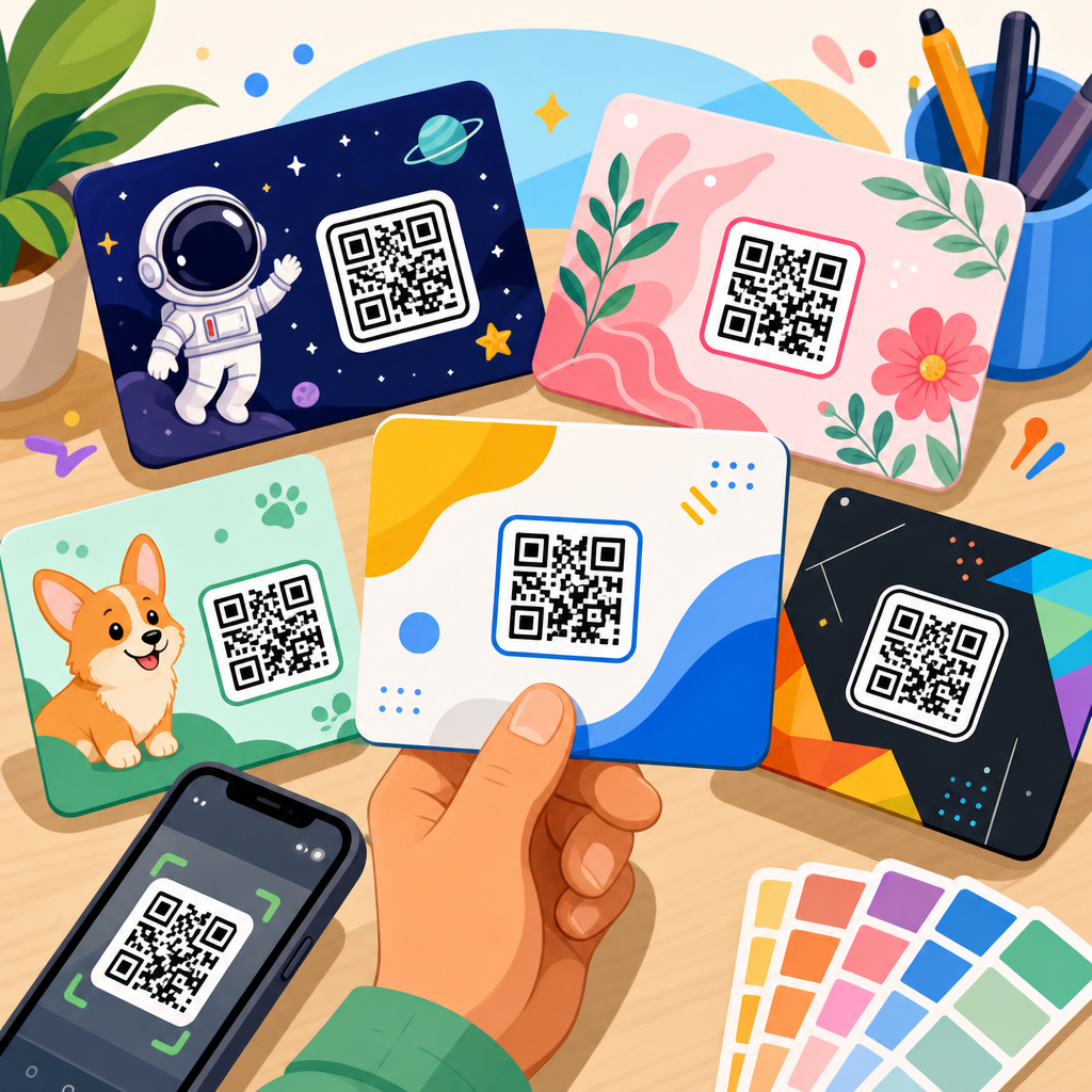
Minimalism does not mean abandoning brand identity. It means using brand elements with restraint so the QR remains the most functional object on the canvas. Start with a limited palette. One dark brand color for the code, one light neutral background, and one accent color for the CTA is enough in most cases. If a brand requires multiple colors, confine them to the surrounding layout rather than the QR modules themselves.
Typography should be plain and legible. Sans-serif families such as Inter, Helvetica, Source Sans, or Avenir tend to complement minimalist QR templates because they read cleanly at small sizes and do not compete with the code geometry. Keep CTA copy short. “Scan to order,” “Scan for specs,” and “Scan to register” work because they explain the outcome quickly. Decorative headlines above a QR code often distract more than they persuade.
Logo insertion is where many minimalist designs become fragile. A small center logo can work when error correction is increased and the mark does not cover finder patterns or critical data areas. Still, a cleaner method is often to place the logo adjacent to the code instead of inside it. That preserves scan strength while keeping branding obvious. In retail, I have repeatedly seen adjacent-brand templates outperform heavily customized code art because customers trust what they can read at a glance.
Building a reusable template system for teams
If this page is the hub for QR code templates, the operational lesson is simple: templates should be reusable, documented, and governed. Start by defining a small library of approved formats rather than allowing every department to improvise. For example, establish templates for A4 flyers, shelf talkers, square social graphics, product packaging panels, presentation slides, and email footers. Each format should specify minimum code size, quiet zone, approved CTA lengths, logo placement, and export type.
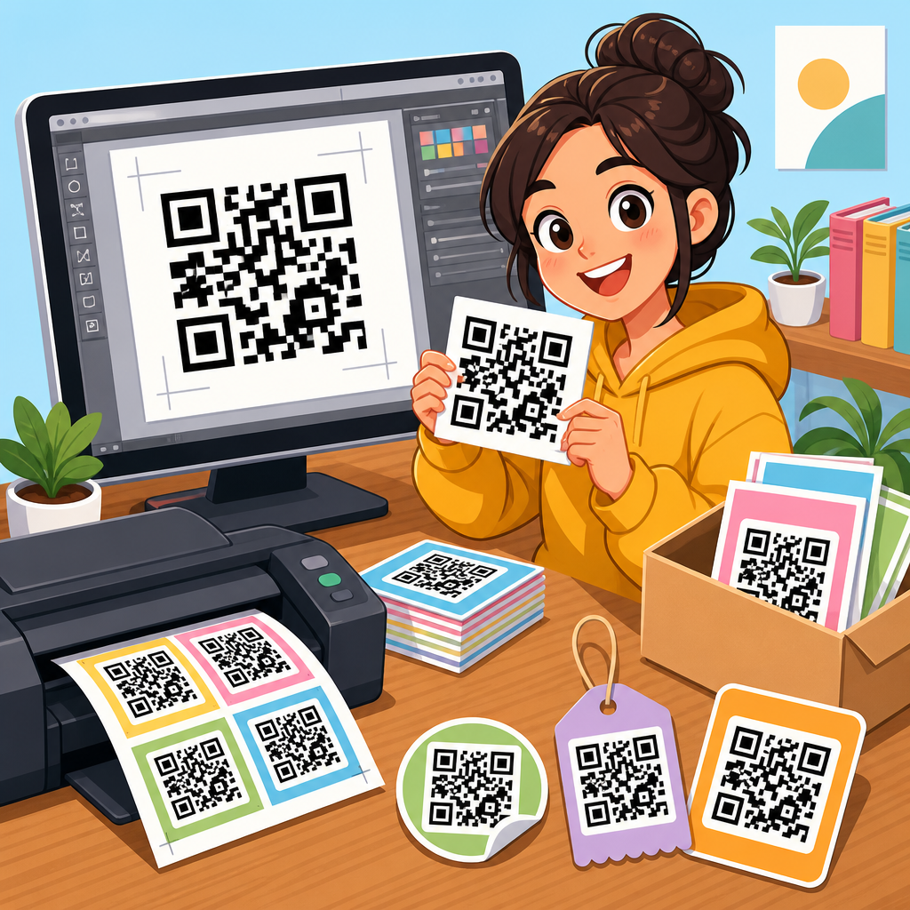
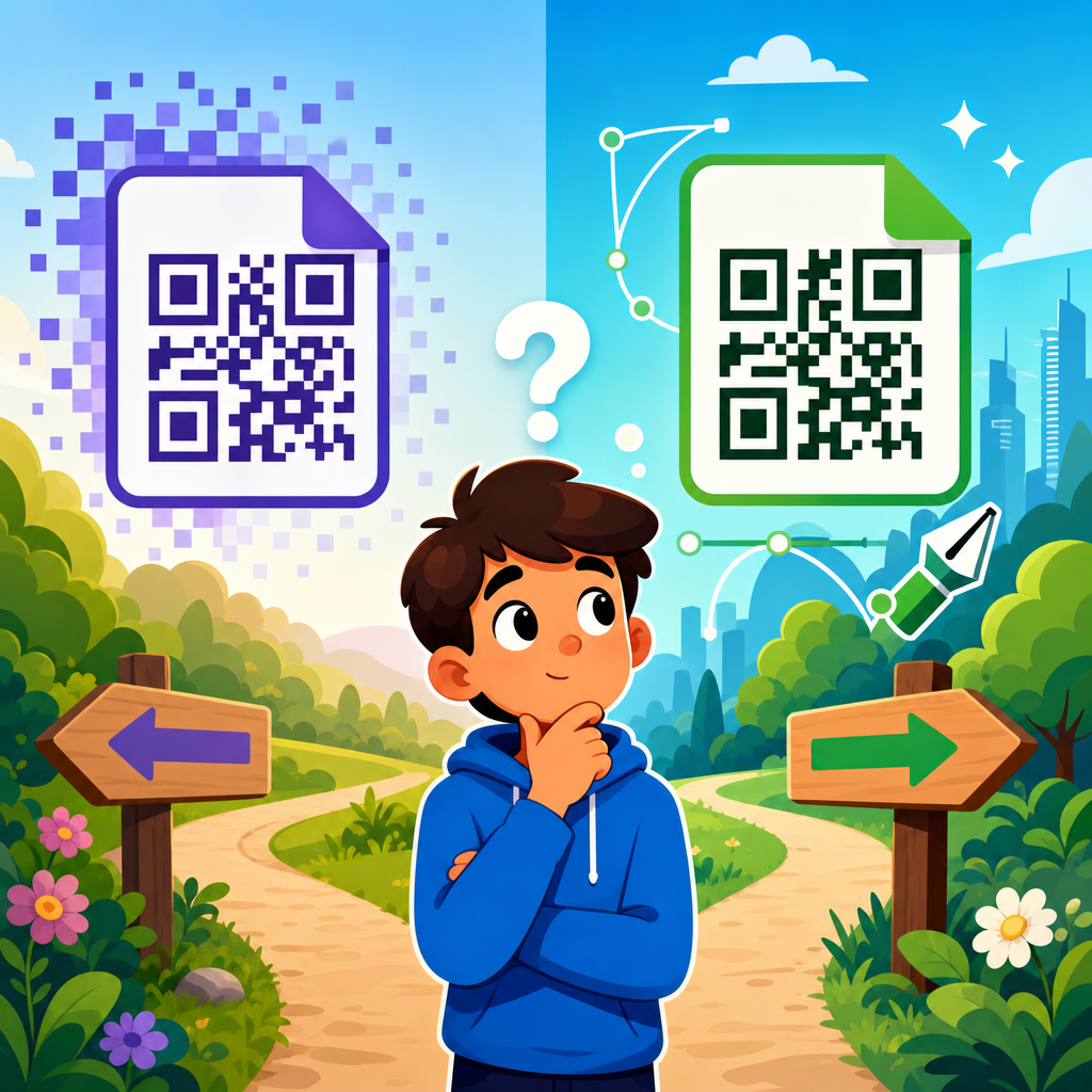
Design tools like Figma, Adobe Illustrator, and Canva can all support template systems, but vector-first workflows are safest for print. I prefer generating the QR in SVG, placing it into a locked component, and then exposing only the fields that marketing teams actually need to edit, such as headline, CTA, destination label, or campaign identifier. This reduces accidental distortion. Never stretch a QR code non-proportionally, and never place it inside masks that trim the quiet zone.
Dynamic QR code platforms add another layer of flexibility. Services such as Bitly, Flowcode, QR Code Generator Pro, Beaconstac, and Uniqode allow editable destinations and scan analytics without reprinting the symbol. For template governance, dynamic codes are valuable because the design can remain constant while the destination changes by market, product line, or season. The tradeoff is dependency on a managed redirect infrastructure, so teams should document ownership, expiration policies, and fallback behavior.
Testing, analytics, and compliance checks
A minimalist template is only finished after testing in real conditions. My baseline process includes print proofs at actual size, scans under bright and dim light, checks on glossy and matte substrates, and tests from the intended user distance. For packaging, I also test after application to the final container because curvature and seam placement change performance. For digital, I test screenshots, embedded placements, and different display brightness levels.
Analytics should measure more than total scans. Useful metrics include unique scans, scan-to-landing-page conversion rate, device type, time of day, geography, and bounce rate after scan. A code that earns many scans but few downstream actions usually has a mismatch between CTA promise and landing page experience. Minimalist templates help here because they force message clarity; if the CTA says “Scan for installation guide,” the landing page should open directly to the guide, not a generic homepage.
Compliance matters in regulated industries. Healthcare, finance, and alcohol packaging often require reviewed disclosures, approved destinations, or restrictions on data collection. If the QR code points to terms, product safety details, or age-gated content, the template should include clear supporting language and route through compliant landing pages. Accessibility also belongs in the checklist. A nearby short URL helps users on non-scanning devices, and strong contrast supports low-vision users.
Common template mistakes and how to avoid them
The most common mistake is treating the QR code as decoration. When designers add drop shadows, busy gradients, patterned backgrounds, or tiny captions, they reduce both trust and readability. Another frequent problem is weak context. A bare code with no instruction performs worse than a simple template that states the value. People do not like scanning mystery links, especially in public spaces where phishing awareness is high.
Teams also underestimate production variables. Offset gain can thicken modules, reflective laminate can create hotspots, and cheap thermal printing can blur edges. That is why minimalist templates should specify substrate assumptions and printer tolerances, not just on-screen appearance. Finally, avoid destination sprawl. If every code in a campaign leads to a different page style, users feel lost. A consistent post-scan experience is part of the template, even if it lives beyond the printed square.
Minimalist QR code design templates work because they combine visual discipline with technical reliability. They give teams a practical framework for producing scannable, brand-consistent QR assets across print, packaging, and digital channels without reinventing the layout every time. The core rules are stable: preserve the quiet zone, maintain strong contrast, size for scanning distance, use concise action-oriented copy, and test in the environment where the code will actually appear. From there, build a reusable template library with defined logo rules, export standards, and analytics ownership.
As the central resource for QR code templates, this hub should guide every related implementation, from restaurant menu codes and product packaging labels to brochure inserts, event signage, and web modules. Minimalism is not about making QR codes plain for the sake of style. It is about reducing friction so the user understands the benefit and the camera can read the symbol instantly. If you are refining your QR code resources, start by auditing your current designs against the principles in this guide, standardize the layouts that perform best, and create a template system your whole team can use confidently.
Frequently Asked Questions
What is a minimalist QR code design template, and why does it work so well?
A minimalist QR code design template is a repeatable visual layout that presents a QR code in a clean, intentional, and highly usable way. Instead of treating the code like an afterthought, the template gives it a structured home within packaging, signage, menus, retail displays, onboarding screens, or other creative assets. In most cases, that means restrained colors, generous white space, a limited type system, a clear hierarchy, and a short call to action that tells people exactly what happens when they scan.
It works well because QR codes perform best when they are easy to notice, easy to understand, and easy to trust. Minimal design removes friction. When the surrounding layout is uncluttered, the eye can quickly find the code and process the next step. A user should not have to decode the design before they can scan the QR code. Clean spacing, simple visual framing, and direct copy create confidence, which is especially important in public environments where people make quick decisions.
From a brand perspective, minimalist templates also improve consistency. Teams can reuse the same layout rules across multiple touchpoints without redesigning the QR experience from scratch every time. That consistency helps the code look like part of the brand system rather than a random technical element. In practice, the highest-performing designs are usually not the most decorative ones. They are the ones that make the action obvious, preserve scan reliability, and fit naturally into the visual identity.
What design elements should every minimalist QR code template include?
Every strong minimalist QR code template should include a few essential parts: the QR code itself, enough quiet space around it, a clear call to action, supporting context, and brand styling that does not interfere with scanning. The QR code must remain the focal point, and it should be placed where the user can identify it immediately. Quiet space is critical because scanners need a clean margin around the code to read it accurately. That empty area is not wasted space. It is part of the function.
The call to action is equally important. People are far more likely to scan when they know what they will get. “Scan to view the menu,” “Scan to download the app,” or “Scan for product details” performs better than leaving the code unexplained. Supporting context can include a small label, a short benefit statement, or a line that sets expectations, such as whether the scan opens a website, coupon, video, registration form, or onboarding step.
Typography should be limited and highly legible. One or two simple fonts are usually enough. Color should be restrained, with strong contrast between the code and its background. Branding can be present through color, logo placement, iconography, or layout structure, but the design should never compromise readability. If a logo is added within the code, it needs to be done carefully and tested thoroughly. A minimalist template should feel polished, but function always comes first. The goal is not just visual simplicity. It is efficient communication.
How can brands make a QR code look modern without hurting scan performance?
The safest way to make a QR code look modern is to style the environment around the code more than the code itself. Minimalist design succeeds because it modernizes presentation through layout, spacing, typography, and brand tone rather than through aggressive manipulation of the QR pattern. A clean card layout, soft neutral background, understated accent color, and concise copy can make a basic black-and-white QR code feel premium and current.
If a brand wants to customize the code directly, it should do so conservatively. Maintain strong contrast, preserve the core structure of the modules, keep the position markers clearly visible, and avoid overly light colors or busy backgrounds. Rounded modules, subtle brand colors, and small embedded logos can work, but only when tested across different phones, lighting conditions, print sizes, and viewing distances. Many scan failures come from trying to make the code too artistic.
Modern design also comes from confidence and restraint. A code surrounded by too many badges, arrows, decorative textures, or competing messages often feels less premium, not more. In real-world uses such as packaging, trade show graphics, restaurant menus, or app onboarding screens, the best-performing pieces usually share the same characteristics: one primary action, one obvious code, simple supporting text, and enough breathing room that the scan feels effortless. A modern QR experience is not about novelty. It is about clarity that reflects brand quality.
Where are minimalist QR code templates most effective in print and digital design?
Minimalist QR code templates are especially effective anywhere people need to complete a quick action with minimal confusion. In print, they work extremely well on product packaging, shelf talkers, retail displays, postcards, event signage, menus, brochures, and trade show materials. These environments often involve limited attention and physical movement, so the design has to communicate instantly. A clean template helps the code stand out, tells users what they are scanning for, and avoids clutter that can compete with the action.
On packaging, a minimalist template can guide users to instructions, authentication pages, product registration, reviews, or replenishment flows. In retail, it can connect shoppers to size charts, promotions, or deeper product content without overwhelming the display. On menus, the approach is especially useful because people need fast comprehension. A simple label, readable code, and calm layout help users trust the interaction immediately.
In digital contexts, minimalist QR code templates are valuable on onboarding screens, presentation slides, email graphics, paid social creative, conference displays, and in-app cross-device experiences. For example, a desktop onboarding page may ask users to scan a code with their phone to continue setup. In that moment, visual simplicity matters because users are already managing multiple devices and attention points. Across both print and digital, the template is most effective when it reduces ambiguity. Users should instantly understand what to do, why to do it, and what happens next.
What are the most common mistakes to avoid when creating minimalist QR code templates?
The biggest mistake is confusing minimalism with under-explaining. A clean design should still provide enough context for users to act confidently. If a QR code appears alone with no call to action or explanation, many people will ignore it. Minimalist does not mean vague. It means focused. Every template should answer the user’s basic question: “Why should I scan this?”
Another frequent mistake is reducing the size too much or placing the code in a visually noisy environment. Minimalist layouts rely on spacing and contrast, so if the code is cramped into a corner, printed too small, or layered over photography, scanning becomes harder. Low contrast, glossy print surfaces, awkward placement, and insufficient quiet space are all practical issues that hurt results. A beautiful template that fails under normal lighting or average viewing distance is not a good template.
Brands also run into trouble when they over-customize the code. Light pastel codes, heavy gradients, decorative frames that crowd the edges, or logos that obscure too much of the pattern can all reduce reliability. Another common issue is trying to fit too much messaging around the code, which weakens visual hierarchy. If the user sees five competing instructions, the scan no longer feels simple.
Finally, many teams skip testing. A minimalist QR code template should be tested on multiple devices, in real placement conditions, and at actual production size. What works on a design mockup may behave differently on corrugated packaging, backlit signage, laminated menus, or mobile screens. The most effective templates are not just aesthetically clean. They are validated in the environments where people actually use them.