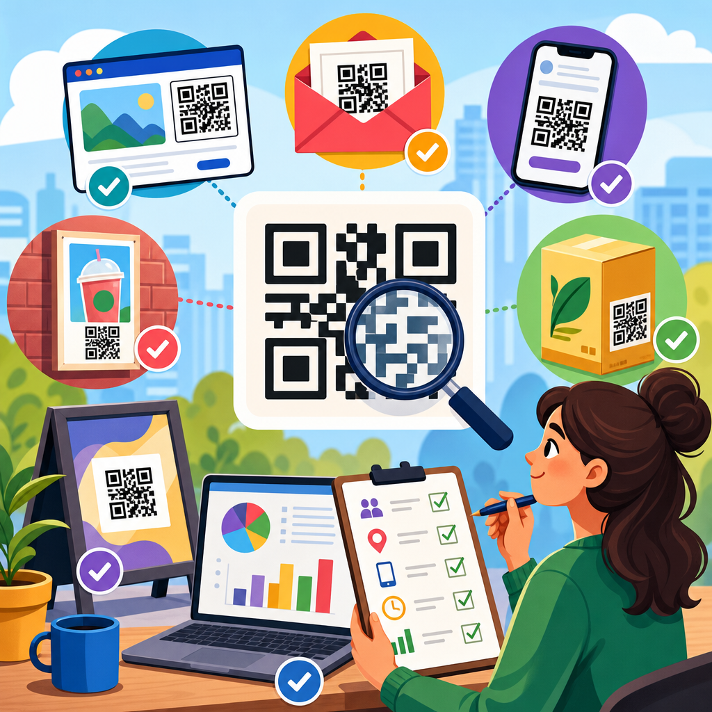
QR codes can generate immediate intent, but intent vanishes quickly when the post-scan experience adds friction. Knowing how to reduce drop-off after QR code scans is essential for any team using packaging, print, menus, event signage, direct mail, or retail displays to drive measurable action. In practical terms, drop-off is the percentage of people who scan but fail to complete the next desired step, such as viewing a page, submitting a form, redeeming an offer, downloading an app, booking a demo, or making a purchase. Conversion optimization is the discipline of removing barriers between that scan and that outcome. When I audit QR campaigns, I usually find that the code itself is not the problem; the landing page, message match, device experience, and analytics setup are.
A strong QR strategy treats the scan as the start of a mobile session, not the finish line. That distinction matters because scanner context is unstable. People scan while standing in stores, walking through transit stations, sitting in restaurants, or watching presentations. They may be on weak cellular connections, using older phones, dealing with glare, noise, interruptions, or limited time. Every extra second of load time, every unnecessary field, and every mismatch between what the code promised and what the destination delivers increases abandonment. Industry research from Google has repeatedly shown that mobile users are highly sensitive to speed and usability, and the same pattern appears in QR performance data across ecommerce, hospitality, healthcare, and events.
This article serves as a hub for conversion optimization within QR code marketing strategy. It explains the core causes of post-scan drop-off, the metrics that reveal them, and the design choices that improve completion rates. It also connects the scan journey to message hierarchy, mobile UX, analytics, trust signals, and testing methodology. If your team wants more than scan volume, these are the systems that turn QR interactions into reliable business results.
Map the full post-scan journey before changing the code
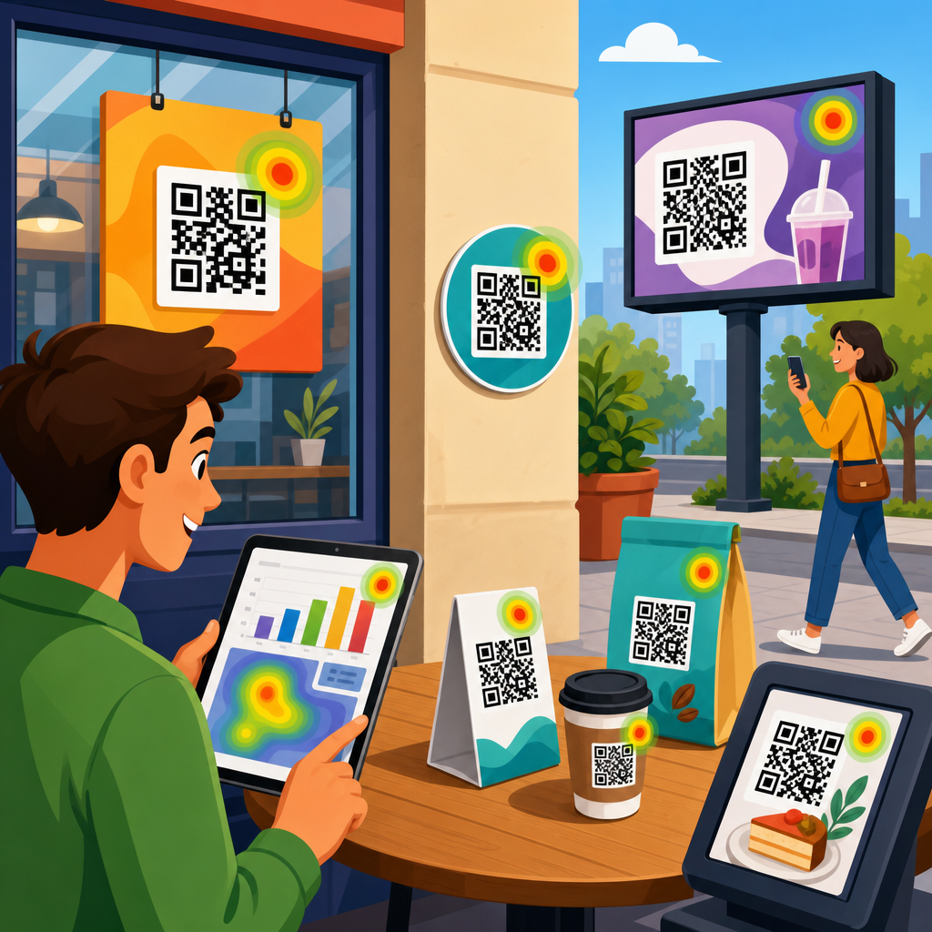
The fastest way to reduce drop-off after QR code scans is to map the entire journey from scan trigger to conversion event. Start with five checkpoints: the scan context, the redirect, the landing page load, the action flow, and the confirmation state. In my work, teams often optimize only one layer, usually the landing page, while missing redirect latency, broken deep links, poor Wi-Fi environments, or unclear calls to action on the physical asset itself. A QR code on a product shelf, for example, competes with shelf clutter and shopper urgency. A QR code on packaging may be scanned at home, where the user has more time but less purchase intent. Context changes the right conversion path.
Document what users expect at the moment they scan. If the code says “See ingredients,” sending traffic to a category page is a message mismatch. If the code says “Claim 20% off,” the discount must appear immediately, not after multiple taps. If the intended action is app installation, consider whether mobile web can complete the task instead; pushing users into an app store creates major leakage unless the app is already central to the value proposition. The best-performing QR campaigns usually present one primary action, one supporting proof point, and one obvious next step. Complexity is the enemy of momentum.
Journey mapping should include technical details. Check whether the QR destination uses a 301 or 302 redirect, whether there are multiple hops through campaign tools, whether scripts block rendering, and whether cookie banners obscure the page on small screens. Use GA4, server logs, Tag Manager, and session replay tools like Microsoft Clarity or Hotjar to identify where users hesitate or disappear. The goal is not simply to diagnose a bad page. It is to identify every point where intent decays after the scan.
Improve speed, mobile usability, and message match
Most post-scan abandonment comes from three issues: slow loading, weak mobile usability, and poor alignment between the call to scan and the destination. Speed is nonnegotiable because QR scans are overwhelmingly mobile. A page that loads in one to two seconds consistently outperforms one that takes four or five. Use compressed images, modern formats like WebP, lazy loading where appropriate, minimized JavaScript, and a content delivery network. Core Web Vitals matter here: Largest Contentful Paint should be fast, Interaction to Next Paint should remain responsive, and Cumulative Layout Shift should stay low enough that buttons do not move while a user tries to tap.
Mobile usability needs the same discipline. Buttons must be thumb-friendly, forms must use the correct input types, and copy must be readable without pinching or zooming. Avoid intrusive pop-ups, heavy carousels, tiny close icons, and overdesigned animations that delay access to the main action. If a coupon code is part of the offer, auto-apply it or display it clearly above the fold. If the scan is meant to open a video, do not hide it beneath long brand copy. The first screen should answer a simple question immediately: was this scan worth it?
Message match is equally important. The landing page headline should repeat the value promised on the physical asset using nearly the same language. A restaurant table tent that says “View today’s lunch specials” should land on a page with “Today’s Lunch Specials” at the top, not the home page. An event badge QR code that says “Download the slide deck” should open the deck or a page with a direct download button, not a resource library. Consistency lowers cognitive load and reassures users that they reached the right place.
| Optimization area | Common problem | Practical fix | Expected impact |
|---|---|---|---|
| Load speed | Heavy scripts and images delay first view | Compress assets, reduce redirects, use CDN | More sessions reach the call to action |
| Message match | QR promise differs from landing page headline | Mirror offer language on first screen | Lower bounce and higher trust |
| Form design | Too many fields on mobile | Cut fields, enable autofill, use progressive profiling | Higher completion rate |
| Checkout or redemption | Users must search for product or code | Preload cart, auto-apply offer, deep link to item | Fewer exits before purchase |
| Trust | Destination looks unfamiliar or risky | Show brand cues, HTTPS, policy links, support info | More users proceed |
Reduce friction in forms, checkout flows, and app paths
Once the page loads, the next priority is friction removal. Every extra step after a QR code scan costs conversions because users did not arrive with the patience they might have on desktop search. Keep forms short and only request data that directly supports the next action. For lead generation, name and email often outperform longer forms in initial conversion rate, while additional qualification can happen later through progressive profiling in a CRM or marketing automation platform. If you need location, appointment type, or product preference, use dropdowns, radio buttons, or prefilled values instead of open text fields whenever possible.
Checkout and redemption flows deserve special attention. If a QR code on packaging promotes a refill subscription, deep link directly to the product page with the right variant selected. If a flyer offers a limited-time discount, attach the coupon parameter to the URL and auto-apply it at checkout. On restaurant menus, let the QR code open the exact menu section, not a generic homepage. In B2B settings, a conference booth QR code should open a short meeting-booking page that uses calendar availability and autofill, not a full corporate site navigation maze.
App paths are often where teams lose the most users. If the action can happen on the mobile web, let it happen there. Requiring an app download before delivering basic value introduces a high abandonment threshold. When an app is necessary, use deferred deep linking tools such as Branch or AppsFlyer so users who install the app still land in the intended content after setup. Also provide a browser fallback for users who decline installation. In healthcare, finance, and account-based experiences, authentication may be required, but even then the path can be simplified with magic links, passkeys, or one-time codes rather than full password creation during the initial scan session.
Build trust fast with clarity, branding, and proof
Trust is a conversion variable, not a branding afterthought. Many users have learned to be cautious with QR codes because of phishing warnings and unfamiliar redirects. The post-scan page must quickly confirm legitimacy. Use consistent brand elements from the physical asset to the digital destination: same logo, same color system, same offer language, and a recognizable domain. HTTPS is mandatory, but visible reassurance matters too. Include concise privacy language near forms, clear pricing if payment is involved, and obvious contact options if the action has risk or commitment.
Social proof and operational proof work especially well after scans because users are making fast judgments. If a QR code offers a product demo, show customer logos, review counts, or a short testimonial near the call to action. If the scan leads to a reservation flow, display availability transparency and cancellation terms. If the page collects lead information, state what happens next and how quickly a response will arrive. Ambiguity increases hesitation. Clarity reduces it.
Accessibility also influences trust and completion. Use sufficient contrast, readable font sizes, descriptive button labels, and semantic structure that works with screen readers. In regulated sectors, include the disclosures required by law, but keep the primary action visually clear. Trust does not mean loading the page with badges and legal text. It means answering the user’s hidden questions quickly: Is this safe, is this the right place, what do I get, and what happens if I continue?
Measure the right metrics and test systematically
You cannot fix drop-off reliably without instrumentation that separates scan volume from meaningful outcomes. At minimum, track scans, landing page views, engaged sessions, CTA clicks, form starts, form completions, add-to-cart events, purchases, downloads, bookings, or whatever conversion event matters in that journey. Use UTM parameters for campaign attribution, but also preserve source context such as placement, asset type, store, event, package version, or sales rep. Dynamic QR platforms like Bitly, QR Code Generator PRO, Flowcode, and Beaconstac can help manage destinations and metadata, but the data becomes powerful only when connected to GA4, your CRM, and ecommerce or lead systems.
Segmentation reveals where optimization matters most. Compare drop-off by device type, operating system, network quality, location, time of day, and physical placement. A retail endcap may drive many scans but poor conversion if shoppers are in browse mode. A product insert may drive fewer scans but far better purchase or subscription rates because the user already owns the product. I have seen campaigns improve simply by changing the destination by context: one QR code for in-store education, another for post-purchase registration, another for loyalty enrollment. Same brand, different intent, different flow.
Testing should follow a disciplined sequence. Start with the highest-impact variables: destination relevance, first-screen headline, page speed, CTA prominence, number of form fields, and auto-applied offers. Then test trust elements, media type, and page length. Run tests long enough to reach directional confidence and avoid changing multiple major variables at once unless you are doing structured multivariate work. In many QR campaigns, the biggest win is not a new design. It is removing one unnecessary step that no one questioned before.
Create a conversion optimization hub for ongoing improvement
Because this page sits within QR Code Marketing and Strategy, treat conversion optimization as an operating system, not a one-time fix. Build supporting articles and internal resources around the topics that most influence post-scan performance: QR landing page best practices, how to track QR code conversions in GA4, dynamic versus static QR codes, mobile form optimization, deep linking for apps, offer design, retail signage placement, and post-purchase QR journeys. A true hub helps teams standardize definitions, metrics, templates, and review processes so each new campaign starts from proven patterns instead of guesswork.
Operationally, create a repeatable checklist before launch. Confirm the destination loads quickly on cellular, the CTA is visible without scrolling, analytics fire correctly, redirects resolve cleanly, forms are short, the offer matches the physical prompt, and the confirmation page sets the next expectation. Then review performance weekly, not just at campaign end. QR traffic often exposes issues that desktop teams miss because the environment is less forgiving and user intent is more fragile.
Reducing drop-off after QR code scans comes down to respecting mobile context, aligning promise with delivery, and measuring each step with precision. The code gets attention, but the experience earns conversion. If you want better results from QR campaigns, audit one live journey today, remove the biggest friction point, and let the data guide the next improvement.
Frequently Asked Questions
What causes people to drop off after scanning a QR code?
Drop-off after a QR code scan usually happens when the post-scan experience does not match the speed and intent of the scan itself. A person scans because they expect an immediate, simple next step, but many campaigns send them to a slow-loading page, a generic homepage, a confusing mobile layout, or a form that asks for too much information too soon. Even a few seconds of delay can reduce engagement because QR code traffic is often highly impulsive. People may be standing in a store aisle, walking through an event, browsing a menu, or sorting through direct mail, so attention is limited and easy to lose.
Another common issue is message mismatch. If the QR code promises a discount, registration, product details, or instant access to something specific, the landing page must deliver exactly that. When the scan leads to irrelevant content or forces the user to search for what they expected, abandonment rises quickly. Poor trust signals can also hurt performance. If the destination page looks outdated, asks for personal information immediately, or lacks clear branding, users may hesitate to continue. In most cases, reducing drop-off starts with removing friction at every step: improve load speed, match the destination to the CTA on the code, simplify navigation, and make the next action obvious within seconds.
How can I optimize the landing page to reduce QR code scan abandonment?
The landing page should be designed specifically for mobile-first, high-intent traffic. That means one page, one goal, and one clear action. Instead of sending users to a general website page, create a dedicated destination aligned with the reason they scanned. If the QR code is on packaging, give them product details, usage instructions, warranty registration, or a promotional offer immediately. If it is on event signage, make the page focus on registration, agenda access, booth engagement, or lead capture without extra distractions. The more directly the page reflects the user’s expectation, the lower the chance of drop-off.
Technical performance matters just as much as messaging. The page should load fast on mobile networks, avoid heavy pop-ups, use readable text, and place the primary call to action above the fold. Keep the page visually simple, use strong headings, and make buttons large enough for touch interaction. If a form is required, ask only for the minimum information needed to complete the action. Reducing a form from six fields to two or three can significantly improve completion rates. It also helps to reinforce trust with recognizable branding, short explanatory copy, privacy reassurance, and proof elements such as ratings, testimonials, or redemption details. A strong post-scan landing page feels immediate, relevant, and easy to complete in under a minute.
What are the best ways to make the next step after a QR code scan feel effortless?
The best way to make the next step effortless is to reduce decision-making. After a scan, users should not have to choose between multiple competing paths. Give them a single primary action based on the context of the QR code placement. For example, on restaurant tables, the obvious next step may be viewing the menu or ordering. On retail displays, it may be claiming an offer or watching a quick product demo. On direct mail, it may be scheduling an appointment or checking a personalized quote. Clarity beats complexity every time.
It also helps to remove unnecessary obstacles from the journey. If you want a user to book a demo, let them book directly instead of making them read three pages first. If the goal is app downloads, link straight to the correct app store or use a smart page that detects device type automatically. If the action is redeeming an offer, show the offer instantly and explain exactly how to claim it. Microcopy can make a major difference here. Short phrases like “Takes 30 seconds,” “No login required,” or “Show this screen at checkout” reduce uncertainty and encourage follow-through. Effortless experiences are built by anticipating hesitation and removing it before it appears.
How do tracking and testing help improve QR code conversion rates?
Tracking and testing are essential because they reveal where users are dropping off and which improvements actually increase completion rates. Many teams stop at counting scans, but scans alone do not measure success. To reduce drop-off after QR code scans, you need visibility into the entire post-scan funnel: landing page views, button clicks, form starts, form completions, purchases, bookings, downloads, or redemptions. With that data, you can identify whether the issue is poor code placement, weak landing page relevance, slow page speed, or friction in the conversion step itself.
Testing allows you to improve performance systematically rather than relying on assumptions. You can compare different calls to action, page headlines, offer formats, button text, form lengths, or page layouts. You can also test by placement context, since a QR code on packaging may perform differently than one on in-store signage or event materials. Dynamic QR codes are especially useful because they let you change destination URLs, route traffic by campaign, and gather analytics without reprinting the code. The most effective optimization process is continuous: measure behavior, identify friction points, test a simpler or more relevant experience, and refine based on conversion outcomes rather than scan volume alone.
What should businesses prioritize first if they want to reduce drop-off quickly?
If a business wants quick wins, the first priority should be aligning the QR code’s promise with a fast, mobile-optimized destination page. This is where the biggest gains often happen. Start by reviewing the exact message near the QR code and asking whether the landing page delivers that value instantly. If there is any gap between expectation and arrival experience, fix that first. Next, improve mobile speed and remove anything that delays action, such as intrusive overlays, cluttered navigation, or overly long forms. These changes can often produce immediate improvements without requiring a complete campaign redesign.
After that, focus on simplifying the conversion path. Make the desired action visible right away, reduce required inputs, and add reassuring details that build trust. For example, if users are expected to submit contact information, explain what they will get and when. If they are redeeming an offer, make the instructions explicit. If they are booking or downloading, minimize the number of screens involved. Finally, make sure performance is being measured properly so you can confirm which changes reduce abandonment. In practice, businesses that move fastest are the ones that treat the post-scan experience like a conversion funnel, not just a link destination. When every element is built to respect user intent and urgency, drop-off rates typically fall and measurable action rises.