QR code sticker design sits at the intersection of branding, print production, and mobile usability, and getting it right means more than dropping a black-and-white square onto adhesive paper. A QR code sticker is a printed scannable code applied to packaging, windows, equipment, mailers, posters, or products, usually with a call to action that directs someone to a digital destination such as a menu, landing page, review form, payment screen, or app download. Eye-catching, in this context, does not mean decorative at the expense of function. It means visually noticeable, easy to understand, and reliably scannable in real conditions: glare, curved surfaces, distance, motion, weak lighting, and mixed phone cameras.
I have worked on QR sticker rollouts for retail counters, event signage, and product labels, and the same pattern appears every time: the best-looking sticker is the one people notice instantly and scan successfully on the first try. That requires design discipline. Size, contrast, quiet zone, adhesive choice, substrate, finish, code type, testing method, and placement all affect performance. This matters because a QR code sticker often acts as the shortest path between offline attention and online action. When it fails, response drops sharply. When it works, it can lift review rates, coupon redemptions, contactless payments, and product engagement with very little space or cost.
As the hub page for QR code sticker design, this guide covers the full decision set: choosing the right code setup, designing for visibility, selecting materials and finishes, preparing files for print, and testing before large production runs. It also connects the practical concerns that usually live in separate conversations. A designer may focus on brand fit, while a printer worries about bleed and resolution, and an operations manager worries about weather, tamper resistance, or installation speed. Successful sticker programs account for all three from the start.
Start with scan intent, destination, and code strategy
The first decision is not color or shape. It is what the sticker should make someone do. A QR code that opens a lunch menu has different design needs from one used for warranty registration, Wi-Fi access, inventory tracking, or equipment instructions. Define the action, the destination, and the environment before you design anything. If the goal is quick public scanning, use a short, mobile-optimized landing page with a clear next step. If the sticker will stay in service for months or years, use a dynamic QR code so the destination can change without reprinting the sticker.
Static codes permanently encode the final URL or content. They are fine for fixed destinations with no expected edits. Dynamic codes route through a short link and allow updates, analytics, device-aware redirects, and campaign management. In commercial settings, dynamic codes usually justify their small ongoing cost because they protect print investment. If a restaurant changes its menu URL, or a manufacturer moves support content, the sticker can stay in place. The code image remains the same while the destination updates behind it.
Error correction is another strategic choice. QR codes support four common levels: L, M, Q, and H. Higher levels recover more data if part of the code is damaged, obscured, or stylized, but they also make the pattern denser. For stickers likely to face scratches, condensation, or rounded placement, I usually start at level Q and test from there. Over-customizing a dense code can backfire, especially when the URL is long. Keep the encoded string as short as possible, use a branded short domain when appropriate, and avoid unnecessary tracking parameters in the visible code itself.
A good call to action is part of code strategy. “Scan me” is weak because it describes the mechanism, not the benefit. “Scan to see ingredients,” “Scan for setup video,” “Scan to claim 10% off,” or “Scan to pay” consistently outperform generic labels because they answer the user’s immediate question: why should I bother? The strongest stickers make the value obvious before the phone comes out.
Design principles that make QR code stickers stand out without hurting readability
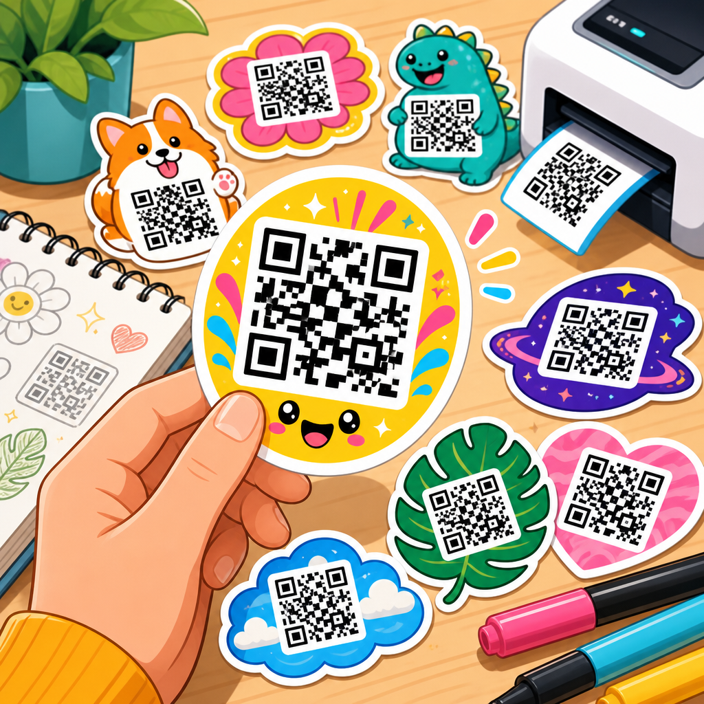
Eye-catching QR code sticker design depends on hierarchy, contrast, and clarity. The code should not be the only visual element. Most successful stickers include four layers: a headline or call to action, the QR code itself, a brand cue such as logo or color field, and optional support text like a URL, short instruction, or trust signal. That arrangement gives people enough context to feel confident scanning while letting the code remain the focal utility element.
Contrast is non-negotiable. Dark code modules on a light background remain the safest option because most smartphone cameras and decoding libraries expect strong luminance separation. Black on white is still the benchmark. Dark navy on cream, deep green on white, or charcoal on pale yellow can also work, but pastel-on-pastel combinations fail often. In testing, matte finishes usually scan more reliably than glossy ones under overhead lights because glare can wash out modules and finder patterns.
Keep the quiet zone intact. The quiet zone is the blank margin around the QR code, typically at least four modules wide. Designers often shrink or decorate this area, then wonder why scans become inconsistent. Do not place borders, patterns, icons, or copy too close to the code. The scanner needs visual separation to detect the symbol cleanly. Likewise, avoid warping the code into extreme shapes. Rounded module styles and subtle framing can work, but the three finder squares must remain prominent and undistorted.
Branding should support recognition, not overpower function. A small centered logo can work when error correction and size are sufficient, but oversized logos reduce tolerance and create support issues once stickers get scratched or dirty. If you want a more distinctive look, customize the surrounding sticker shape, headline, and color block first. In practice, those elements create more visual appeal than aggressive code styling.
Choose sticker materials and finishes based on where the code will live
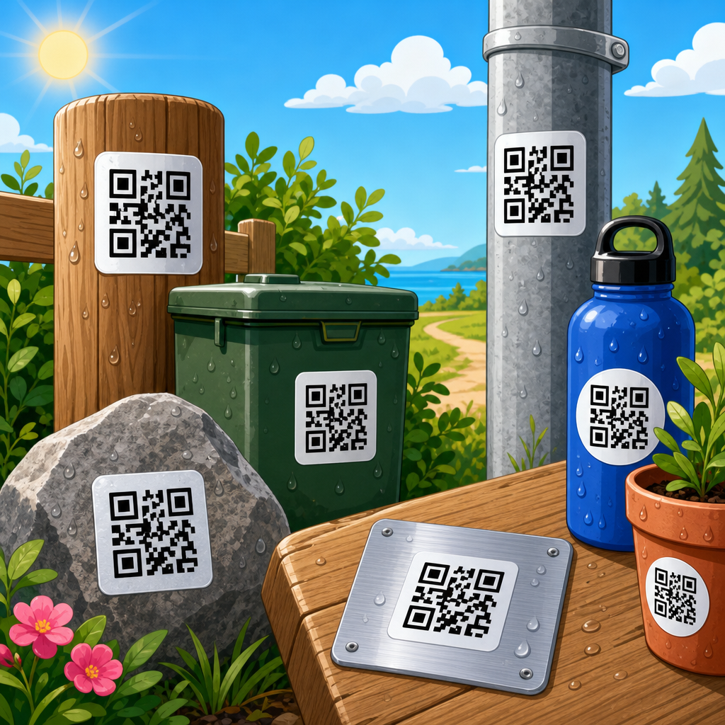
Material selection determines durability, print sharpness, and perceived quality. Paper stickers are cost-effective for short-term indoor use such as event handouts, packaging inserts, or temporary promotions. They print well and are easy to write on, but they tear, absorb moisture, and fade quickly outdoors. For most business applications, polypropylene or vinyl offers a better balance of flexibility, water resistance, and durability. Polyester is useful when you need extra dimensional stability, chemical resistance, or a premium label feel.
Adhesive matters just as much as the face stock. Permanent acrylic adhesives work for glass, metal, plastics, and packaging when long hold is important. Removable adhesives are better for temporary window promotions or surfaces that cannot be damaged. On low-surface-energy plastics, freezers, or textured powder-coated equipment, standard adhesives can fail. In those cases, use an adhesive specified for difficult substrates and test after full dwell time, not just immediately after application.
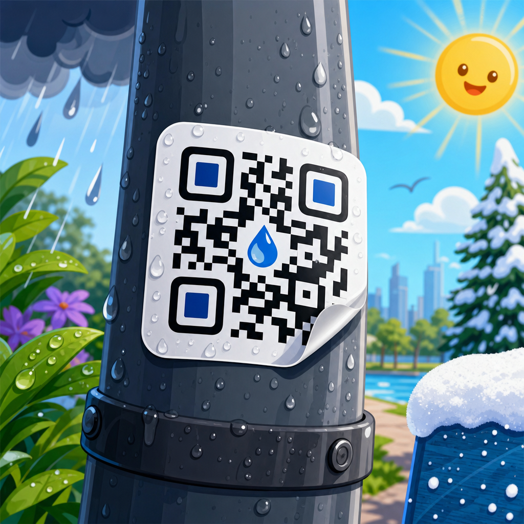
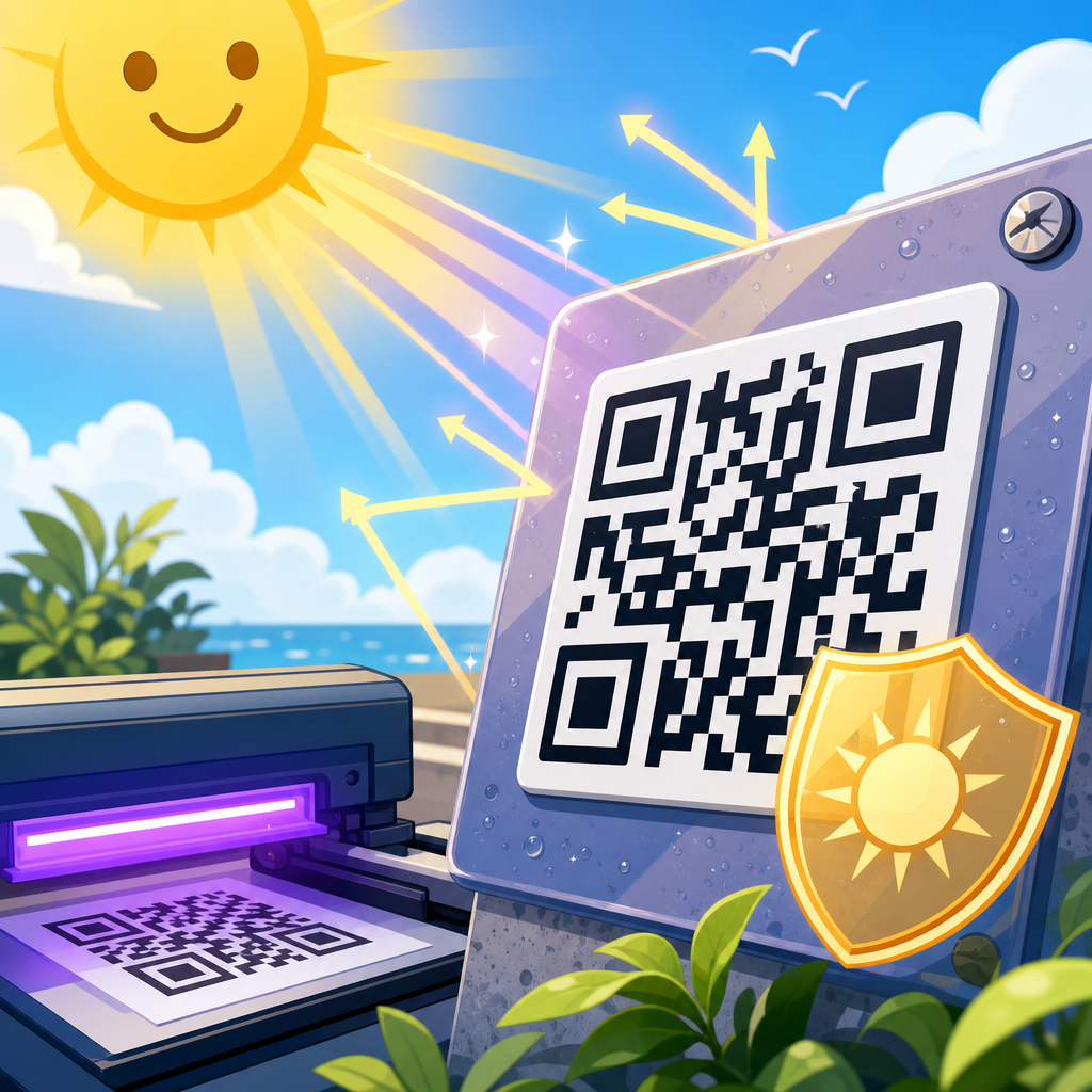
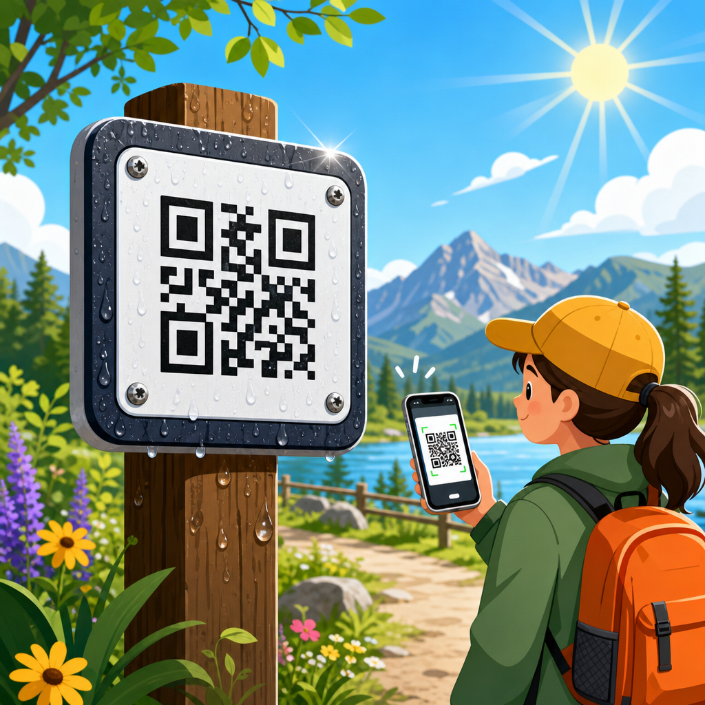
Lamination and finish affect both looks and scanning. Matte lamination reduces glare and fingerprints, making it the default choice for most QR code sticker design projects. Gloss lamination can increase color vibrancy but introduces reflection, especially on curved or window-mounted stickers. UV coatings help outdoors, but if the sticker sits in direct sun, ask for outdoor-rated inks and laminate, not just a coating. Thermal transfer or resin printing may be better for industrial labels exposed to solvents or abrasion.
| Use case | Recommended material | Best finish | Notes |
|---|---|---|---|
| Retail packaging | Paper or polypropylene | Matte | Good for product info, promos, and reviews |
| Storefront windows | Vinyl | Matte or low-gloss | Test glare and visibility from multiple angles |
| Outdoor equipment | Polyester or heavy-duty vinyl | UV matte laminate | Use high error correction and durable adhesive |
| Food service tables | Polypropylene | Matte laminate | Needs wipe resistance and fast scan at short range |
| Temporary event badges | Paper | Uncoated or matte | Low cost, short lifespan, easy variable printing |
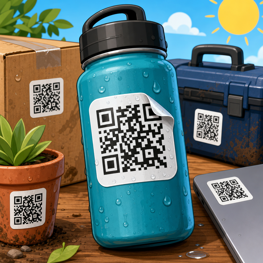
If the sticker will be exposed to water, abrasion, oil, cleaning chemicals, or UV light, specify those conditions in plain language when ordering. “Outdoor durable” is too vague. A label printer can recommend constructions more accurately when you describe the actual environment: refrigerated warehouse, hand-washed bottle, gym mirror, factory floor, delivery tote, or car window.
Set the right size, placement, and print specifications
Most scanning problems blamed on design are really size or placement problems. For close-range use, such as packaging or countertop stickers, 1 x 1 inch can work for simple codes with strong contrast and modern phones. For general consumer use, 1.2 to 1.5 inches is a safer minimum. If the sticker will be scanned from farther away, increase the size quickly. A practical rule is a scan distance ratio of about 10:1, meaning a 2-inch code is comfortable at roughly 20 inches. For posters, windows, or walls, size based on actual viewing distance, not available artwork space.
Print resolution should be high enough to keep module edges crisp. Vector artwork is ideal. Export to PDF, SVG, or EPS when the printer supports it, and avoid rasterizing the code unnecessarily. If you must use raster art, keep it at 300 dpi at final size at minimum, and higher for small labels. Blurry module edges, ink spread, or low-quality desktop printing can make codes unreadable even when they look acceptable on screen.
Placement changes behavior. Put the sticker where people naturally pause and can hold a phone steady. On product packaging, avoid seams, corners, and curved areas that distort the code. On windows, position the code where reflections are limited and where users are not forced into traffic or awkward body angles. On equipment, place it near the point of need: next to the control panel for a setup guide, near the serial plate for registration, or by a service compartment for maintenance videos. Context increases scan rate because the sticker appears exactly when the question arises.
Include a fallback path when possible. A short vanity URL below the code helps users whose cameras are blocked by policy, damaged, or unfamiliar with scanning. For accessibility, keep support text readable and make the action understandable without tiny type. Good QR sticker design serves the widest real audience, not only ideal users with perfect lighting and the latest phone.
Test like the sticker will fail, then refine before production
The most reliable way to make eye-catching QR code stickers is to prototype, test, and only then print at scale. I test on both iPhone and Android, with native camera apps and at least one third-party scanner, because decoding behavior varies. Test under bright light, low light, glare, motion, and with the sticker applied to the actual surface. A code that scans perfectly from a flat proof sheet may fail once wrapped around a bottle or placed behind reflective glass.
Run a simple checklist. Scan from expected distance. Scan with older phones. Scan after the sticker is smudged. Scan when the surface is slightly curved. Scan after exposure to sun or refrigeration if those conditions apply. Track time-to-scan, not just yes-or-no success. If people need three seconds of hunting before the camera locks on, the design still needs work. Friction kills response rates.
Use analytics to improve results after launch. Dynamic QR platforms such as Bitly, QR Code Generator Pro, Beaconstac, and Uniqode can show scans by device, time, and location. Pair that data with conversion events on the destination page. If scans are high but completions are low, the sticker is doing its job and the landing page needs attention. If scans are low, revisit placement, call to action, contrast, or size. This is why QR code sticker design should be treated as an iterative system, not a one-time graphic asset.
As a hub for the broader QR Code Design, Printing & Materials topic, this page should guide your next steps clearly. If you are choosing substrate and adhesive, move next into printing materials. If you are validating finish, color, and contrast, continue into print testing. If your question is mainly about artwork setup, file formats, bleed, and press readiness, go deeper into prepress preparation. The benefit of building the sticker correctly from the start is simple: more scans, fewer reprints, and a stronger connection between physical touchpoints and digital action. Start with the user’s intent, protect scanability in every design decision, and test in the real world before you commit to a full run.
Frequently Asked Questions
What makes a QR code sticker truly eye-catching without hurting scan performance?
An eye-catching QR code sticker balances visual appeal with instant usability. In practice, that means the design should attract attention through smart branding choices such as color, shape, typography, icon placement, and a strong call to action, while still preserving the technical features that make the code easy for phones to read. The biggest mistake is treating the QR code like a decorative graphic first and a functional tool second. If the code does not scan quickly, the sticker has failed no matter how good it looks.
To keep that balance, start with contrast. Dark modules on a light background remain the most reliable setup, even when using brand colors. Add visual interest around the code rather than inside the most sensitive areas. Maintain the quiet zone, which is the blank space around the code, because scanners rely on it to detect the edges. If you customize the pattern, logo, or frame, test it on multiple devices and under different lighting conditions. A sticker can also become more eye-catching by what surrounds the code: a bold headline, a short benefit-driven message, directional cues, and placement in a clean, uncluttered layout all help draw the eye without compromising readability.
In short, eye-catching does not mean overly complex. It means noticeable, on-brand, and instantly understandable. The best QR code stickers communicate what the code does, why someone should scan it, and make that action feel effortless.
What size should a QR code sticker be for reliable scanning on packaging, windows, posters, or products?
The right size depends on viewing distance, placement surface, and how quickly you expect someone to scan it. For close-range uses like product packaging, business handouts, jars, mailers, or tabletop signage, a QR code around 0.8 to 1.2 inches square is often workable if the destination URL is short and the print quality is sharp. However, a safer minimum for many real-world applications is closer to 1.25 inches square, especially if the code includes design customization or will be viewed in less-than-ideal lighting. Going slightly larger usually improves scan speed and lowers frustration.
For mid-range environments such as retail windows, equipment labels, counter signs, and shelf displays, a larger code is usually better because users may be scanning while standing back, moving, or dealing with glare. Posters, event signage, and wall graphics should scale even further. A practical guideline is that the farther away the scanner stands, the larger the code should be, with the overall sticker design supporting readability through clear spacing and a visible call to action.
Material and surface also matter. A small code printed on textured paper, curved bottles, metallic packaging, or glossy windows may become harder to scan than the same code on a flat matte label. If the sticker will be applied outdoors or in environments with wear, dirt, or scratches, larger sizing adds resilience. Before final production, print prototypes at actual size and test them with both iPhone and Android devices from realistic scanning distances. Size decisions should be based on real use, not just what looks neat in a design file.
How can you customize a QR code sticker to match your brand while keeping it functional?
Branding a QR code sticker successfully starts with understanding which elements are safe to customize and which should remain conservative. You can often adapt colors, add a logo in the center, use rounded modules, build a branded frame, and pair the code with matching typography and iconography. These choices help the sticker feel like part of your packaging or campaign rather than an afterthought. However, every customization reduces some margin of scanning tolerance, so restraint is important.
Use brand colors with strong contrast, and avoid combinations that disappear under glare or low light. Deep navy on white can work well; pale beige on pastel yellow usually will not. If you add a center logo, keep it modest in size and rely on an appropriate error correction level so the code remains readable. Preserve the finder patterns, the three corner markers scanners use for orientation, and maintain a clean quiet zone around the code. A decorative border can make the sticker more noticeable, but it should not crowd the code or visually interfere with its edges.
Branding is also about messaging, not just appearance. A great QR code sticker clearly tells users what they get when they scan. “Scan to view the menu,” “Tap into setup instructions,” or “Scan for 10% off your next order” performs better than a code with no explanation. The surrounding layout should reinforce trust and intent. If people recognize your logo, understand the benefit, and can scan without delay, the sticker is doing its job. Customization should support that experience, not compete with it.
What printing materials and finishes work best for durable, high-quality QR code stickers?
The best material depends on where the sticker will be used, how long it needs to last, and what environmental conditions it will face. For indoor use on packaging, mailers, retail items, or short-term promotions, standard paper labels may be enough if cost is a priority. For more durability, polypropylene or vinyl stickers are often better choices because they resist moisture, tearing, and handling wear. If the sticker will be applied to bottles, food containers, equipment, windows, vehicles, or outdoor signage, waterproof and weather-resistant materials are usually worth the investment.
Finish matters almost as much as the base material. Matte finishes are often preferred for QR codes because they reduce glare and make scanning easier under bright lights or sunlight. Gloss can look vibrant and premium, but reflective shine may interfere with readability, especially on windows or curved surfaces. Lamination can increase durability, but it should be tested because some laminates create unwanted reflections or soften edge sharpness. Print resolution is also critical. QR codes need crisp edges and solid fills, so low-quality printing, ink spread, or soft detail can cause scan failures even if the design itself is technically correct.
Adhesive performance should not be overlooked. A beautifully printed QR code sticker is useless if it peels off textured packaging, wrinkles on curved surfaces, or fails in cold or humid conditions. Match the adhesive to the application, whether permanent, removable, freezer-grade, or outdoor-rated. And always test the final printed sample after cutting, finishing, and application. A code that scans perfectly on a flat proof sheet may behave differently once it is die-cut, applied to a surface, and exposed to real-world conditions.
What are the most common mistakes to avoid when designing QR code stickers?
The most common mistake is prioritizing style over scannability. Designers sometimes shrink the code too much, place it over busy backgrounds, remove the quiet zone, or use low-contrast brand colors that look elegant in print but fail in practice. Another frequent issue is linking the code to a poor destination, such as a slow mobile page, a non-mobile-friendly form, or a generic homepage that does not match the sticker’s promise. Even if the code scans, the user experience breaks down if the landing page is confusing or irrelevant.
Other problems include weak calls to action, bad placement, and lack of testing. A QR code with no context leaves people wondering why they should bother scanning. A sticker placed too low on a door, across a fold in packaging, on a highly curved surface, or behind reflective glass adds friction. Some businesses also forget to use dynamic QR codes when they need flexibility. A dynamic code allows the destination to be updated without reprinting the sticker, which is especially useful for menus, promotions, campaigns, review requests, and seasonal messaging.
The best way to avoid mistakes is to think through the full user journey. Ask where the sticker will appear, how far away the user will be, what lighting conditions exist, what motivates the scan, and what happens immediately afterward. Then test aggressively. Scan on different phones, in dim and bright environments, at different angles, and after the sticker has been applied to its actual surface. Great QR code stickers are not just attractive graphics. They are carefully engineered touchpoints between the physical world and a seamless digital action.