Designing QR code stickers for small spaces is a precision task that blends scannability, material science, layout discipline, and real-world user behavior. In the QR Code Design, Printing & Materials category, QR Code Sticker Design sits at the point where digital access meets physical constraints: packaging seams, shelf tags, business cards, bottle necks, cosmetic jars, device labels, and event badges all demand codes that work in fractions of an inch. A QR code sticker is an adhesive label that carries a machine-readable matrix barcode, usually linked to a URL, file, menu, review page, payment flow, app download, or product record. In small spaces, the challenge is not only fitting the code onto the surface, but preserving scan reliability after printing, handling, curvature, glare, and wear. I have tested QR stickers on paper labels, laminated polyester, vinyl, and tamper-evident stock, and the same rule always holds: a code that looks visually acceptable can still fail in use if its quiet zone, contrast, or module size is compromised.
That is why small-format QR code sticker design matters. A failed scan introduces friction exactly where brands want convenience, whether a diner is opening a menu, a customer is registering a product, or a technician is pulling service instructions from a cramped equipment tag. Good design solves for camera focus distance, lighting, print gain, adhesive choice, and content strategy at the same time. The best stickers are not merely smaller versions of larger labels; they are purpose-built assets with controlled data density, strong contrast, durable materials, and clear calls to action. This hub article explains how to design QR code stickers for tight placements, including ideal dimensions, content decisions, print specifications, surface considerations, testing methods, and common mistakes. If you need one reliable reference before creating labels for packaging, retail, hospitality, medical supplies, or industrial assets, start here and use it as the foundation for every small-space QR code project.
Start with scan physics, not artwork
The first decision in QR Code Sticker Design is not color, branding, or shape. It is the physical scan condition. Smartphone cameras read QR codes by identifying square modules, finder patterns, alignment patterns, and the empty border called the quiet zone. In a small sticker, each module must remain large enough for the camera sensor to distinguish at the expected scanning distance. As a practical baseline, I treat 0.4 millimeter modules as the lower edge for controlled indoor use and aim higher when surfaces are curved, glossy, or likely to be scanned quickly. For very small labels, the shortest path to reliability is reducing data complexity. A short dynamic URL often scans better than a long static URL because fewer encoded characters produce fewer modules and a less dense symbol.
Version, error correction, and print quality interact directly. QR versions range from 21 by 21 modules upward, and every increase adds density. Error correction levels L, M, Q, and H trade capacity for redundancy. Higher error correction helps when stickers may be scratched or partially obscured, but it also increases module count. In tight spaces, I usually start with level M or Q and only move to H when the environment justifies it, such as reusable containers, machinery, or outdoor products. You also need to preserve a quiet zone of at least four modules on all sides. Designers often trim this border to save space, but that shortcut is one of the fastest ways to reduce scan success. If space is limited, simplify the payload before shrinking the border.
Choose the right size, material, and finish for the placement
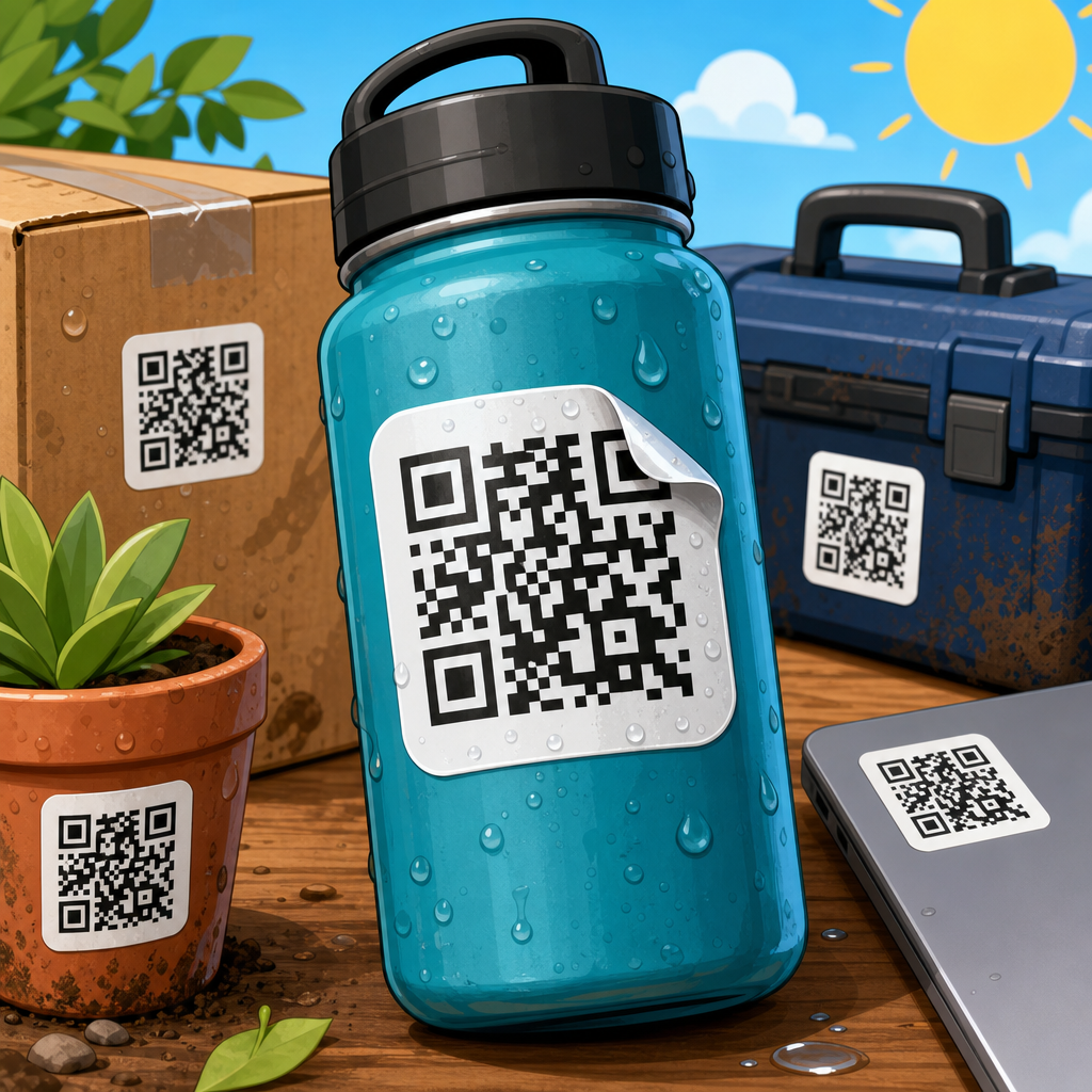
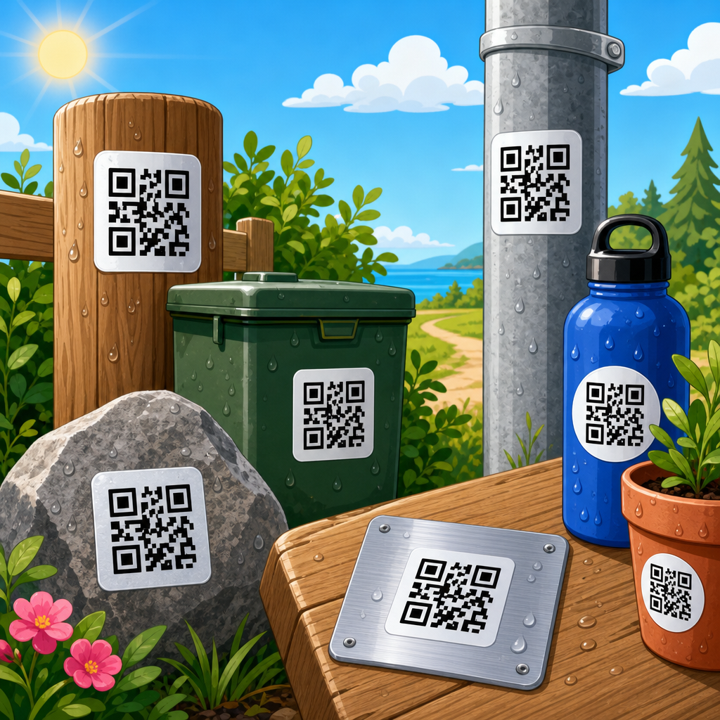
Sticker performance depends on where it will live. A QR code on a flat cardboard carton behaves differently from one on a lip balm tube or condiment bottle. For small spaces, I separate projects into flat, gently curved, and highly curved surfaces. Flat placements, such as mailers, shelf labels, or folders, can support smaller codes because the camera sees a consistent plane. Gently curved surfaces, such as jars or cans, need larger module sizes so distortion does not collapse the grid. Highly curved surfaces, like pen barrels or vial caps, are poor candidates for standard QR stickers unless the code wraps onto a flatter panel or a hang tag is added. In my experience, many failed small-space QR projects are really placement failures, not graphic failures.
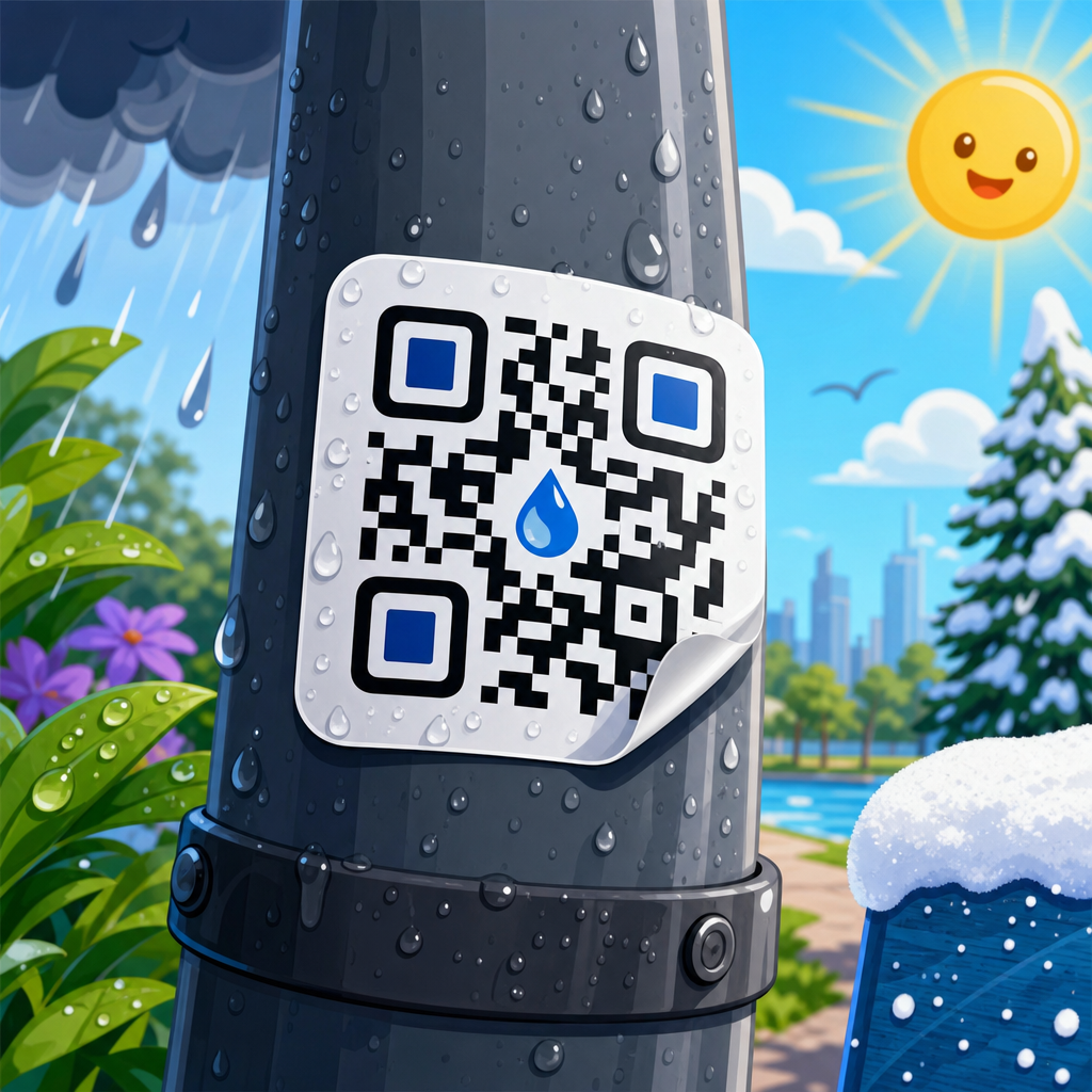
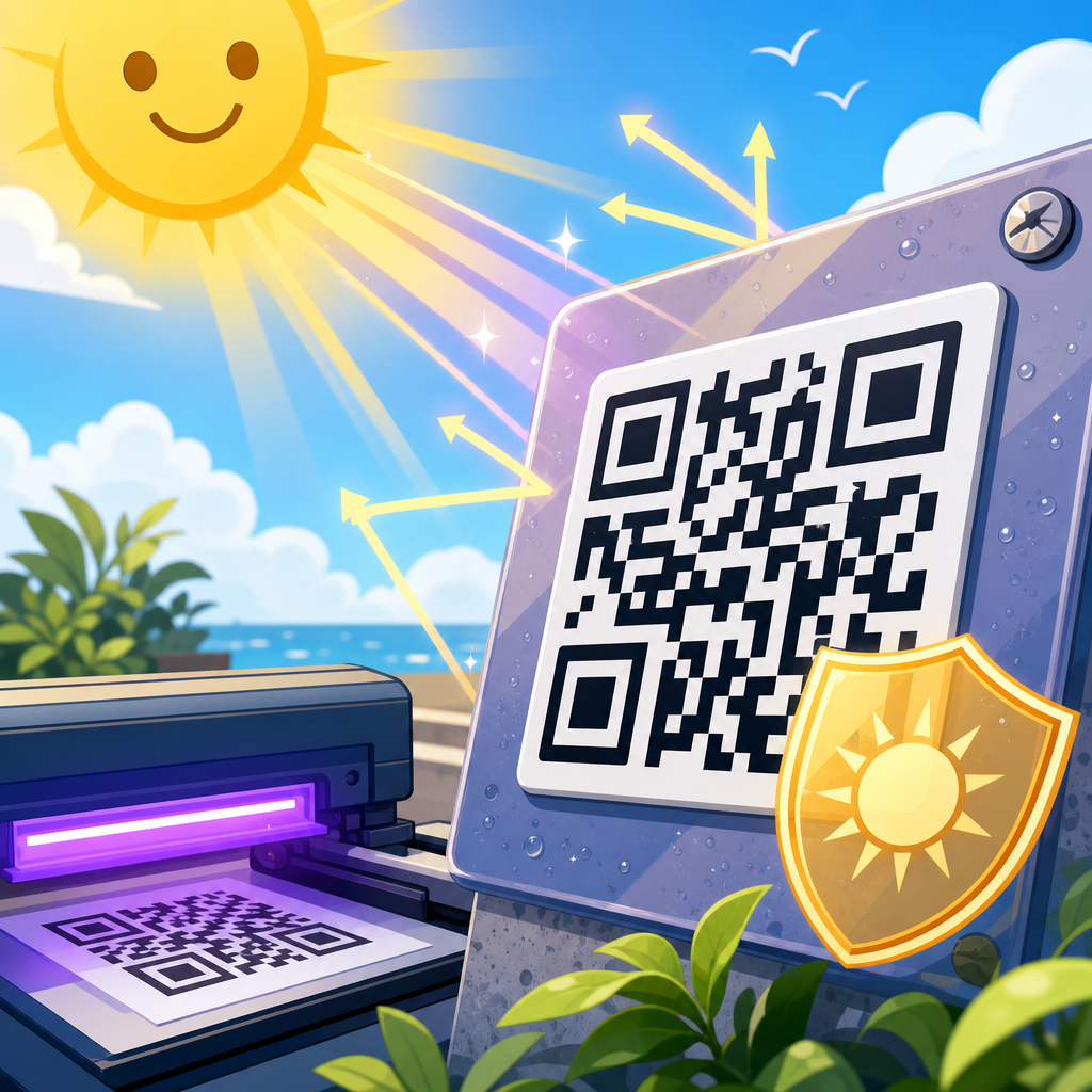
Material selection is equally important. Paper is economical and prints crisply, but it absorbs moisture, scuffs easily, and can swell under refrigeration or condensation. Polypropylene and polyester films are stronger choices for products exposed to water, oils, abrasion, or frequent handling. Vinyl works well for flexible or outdoor use, though some soft vinyl stocks can stretch enough to affect tiny module edges. Matte laminate usually improves scanning because it suppresses glare from overhead lighting and phone flash, while gloss can look premium but creates reflections that interfere with detection. Adhesive type matters too. Permanent acrylic adhesive works on most packaging; removable adhesive is useful for temporary promotions; freezer-grade adhesive is necessary for cold-chain applications. A well-designed QR code sticker can still fail if the label curls, silvering appears under the face stock, or condensation forms a reflective film over the symbol.
| Placement | Recommended starting size | Best material | Finish |
|---|---|---|---|
| Business card corner | 0.7 to 0.8 inch | Paper or polypropylene | Matte |
| Jar or bottle label | 0.8 to 1.0 inch | Polypropylene | Matte laminate |
| Equipment asset tag | 1.0 inch minimum | Polyester | Matte, abrasion resistant |
| Retail shelf tag | 0.75 to 1.0 inch | Paper or polypropylene | Matte |
| Outdoor promotional sticker | 1.0 inch minimum | Vinyl | UV matte laminate |
Control data density and destination strategy
What the code points to determines how small the sticker can be. The biggest optimization available in small-format QR Code Sticker Design is using dynamic QR codes with short redirect domains. Instead of encoding a long destination URL with UTM parameters, product IDs, and campaign tags, encode a short managed link and store the complexity behind the redirect. This reduces matrix density, makes the symbol easier to scan, and gives you the flexibility to update the destination later. For restaurant menus, product manuals, warranty registration, and event check-in, dynamic links are usually the right decision because they preserve future control without changing printed inventory.
Destination pages should match the scanning context. A tiny sticker on a product package should not drop users onto a cluttered homepage. It should open a mobile landing page with one primary action: view instructions, redeem offer, verify authenticity, or contact support. I have seen scan rates improve simply by aligning the CTA on the sticker with the first screen after the scan. If the sticker says “Watch setup video,” the landing page should load the video immediately, not force navigation through a category page. Also consider network conditions. Small-space QR stickers often appear in stores, warehouses, events, and transit environments where connectivity varies. Lightweight pages, compressed images, and fast hosting improve the actual experience after the scan, which is part of sticker performance even though it sits beyond print.
Design the code and surrounding label for clarity
A QR code sticker does not need decorative complexity to feel branded. In small spaces, restraint is a performance feature. Use a dark foreground on a light background, ideally near-black on white or a very light solid tint. Contrast ratio is more important than brand color fidelity. Reverse-out codes, gradients, metallic inks, translucent stocks, and patterned backgrounds all increase risk. Some generators allow custom eyes, logos in the center, and rounded modules, but every alteration consumes error correction budget. On larger labels these treatments can be safe; on tiny stickers they should be tested aggressively or skipped. My default recommendation is simple square modules, standard finder patterns, and no center logo below one inch unless testing proves otherwise.
The surrounding label design should help the user understand why to scan. Include a concise call to action near the code, such as “Scan for instructions,” “Scan to reorder,” or “Scan for menu.” This is especially important on small stickers because users cannot infer the destination from visual context alone. Typography should remain legible at arm’s length, usually with a minimum of 6 to 7 point type for print depending on font and substrate. Keep text outside the quiet zone, and avoid keylines or decorative frames that intrude into the border. If compliance copy, serial numbers, or multilingual instructions are required, separate them from the code with clear spacing. A crowded micro-label often fails not because the QR itself is wrong, but because adjacent graphics make the symbol harder for the camera and the user to parse quickly.
Prepare files correctly for print production
Production discipline determines whether a tested design survives the press. Export vector artwork whenever possible, especially for thermal transfer, flexographic, offset, or digital label printing workflows that can preserve crisp edges. Raster files should only be used at sufficiently high resolution, and for small QR stickers that generally means at least 300 dpi at final size, with 600 dpi preferred when symbols are tiny. Soft module edges, anti-aliasing, or accidental scaling in layout software can degrade readability. I always verify final output dimensions in millimeters, not just pixels on screen, because small-space jobs fail when a proof is approved visually without checking actual printed module size.
Print process matters. Digital toner and inkjet presses are convenient for variable data, but dot spread, substrate absorption, and registration must be monitored. Flexography can produce excellent labels at scale, yet plate gain can slightly thicken modules on absorbent stocks. Thermal printing is common for temporary labels and logistics applications, but direct thermal media can darken with heat and age poorly. Ask your printer for a hard proof on the final material, not a desktop mockup on office paper. Also define bleed, safe area, corner radius, and die line carefully. Rounded-corner stickers are fine, but the QR code itself should remain comfortably inside the trim, with the quiet zone untouched even if kiss-cut alignment shifts slightly during finishing.
Test in real conditions and measure success
The only trustworthy standard for a small QR code sticker is field testing. Scan the printed sticker with multiple phones, including older mid-range Android devices and recent iPhones, under bright retail lighting, warm indoor lighting, and low-angle glare. Test at the actual likely distance and angle, not just directly overhead on a desk. For packaging, apply labels to final containers before testing because curvature changes readability. For refrigerated goods, test after condensation forms. For industrial labels, test after abrasion, solvent exposure, or UV aging if relevant. If a code requires users to hunt for the right angle, it is too fragile for production.
Measurement should continue after launch. Dynamic QR platforms can report scans by time, geography, and device type, helping you identify whether a sticker placement is underperforming. Low scans do not always mean low interest; they may indicate poor visibility, weak calls to action, or difficult placement on the package. A/B testing can be useful even in print. For example, two shelf tag variants may use the same destination but different CTA language or sticker sizes. In one retail rollout I reviewed, changing “Learn more” to “Compare sizes” increased scans because the action matched an active shopper question. Reliable QR Code Sticker Design combines prepress testing with post-launch analytics, closing the loop between design assumptions and user behavior.
Avoid the small-space mistakes that cause most scan failures
The most common mistakes are predictable. Designers shrink a code after generating it, remove the quiet zone, place it over a colored photo, print it on glossy laminate, or encode too much information. Marketers sometimes insist on brand-color codes with low contrast, while packaging teams place stickers across folds, seams, or shoulders where distortion is unavoidable. Another frequent problem is using a perfectly scannable code that leads to a page not optimized for mobile, making the entire interaction feel broken. Small QR code stickers succeed when every decision protects usability, from payload length to adhesive performance.
For hub-level planning, keep a repeatable checklist: define the user task, choose a short dynamic destination, set minimum module size, preserve four-module quiet zones, select matte durable stock, request final-material proofs, test on the real surface, and monitor scans after release. That workflow scales across business cards, product packaging, warranty labels, promotional inserts, and asset tags. If you are building a broader QR Code Design, Printing & Materials program, QR Code Sticker Design is the discipline that turns theory into dependable scans in the toughest placements. Start with function, validate with print tests, and refine with analytics. When a sticker works instantly in a cramped space, customers notice the convenience, not the engineering behind it. That is the goal. Use this guide as your baseline, then apply the same rigor to every label you produce.
Frequently Asked Questions
What is the most important rule when designing QR code stickers for very small spaces?
The most important rule is simple: protect scannability before aesthetics. In small-format applications, every design choice has to support fast, reliable scanning under real-world conditions. That means keeping the code physically large enough for the intended scan distance, preserving strong contrast between the dark modules and the background, maintaining a proper quiet zone around the code, and avoiding visual effects that interfere with the pattern. On tiny labels, there is very little room for error. A QR code that looks attractive but forces users to tilt a package, move closer, or try multiple times is not doing its job.
For most small sticker uses, the best approach is to start with a clean, high-contrast code in black on white, use a dynamic QR code if possible to avoid dense data encoding, and keep the surrounding layout disciplined. The quiet zone, which is the empty margin around the QR code, should never be squeezed by nearby text, borders, folds, or graphics. If the sticker is going on curved surfaces like bottles, jars, or tubes, you also need to account for distortion, because even a technically correct QR code can become harder to scan once applied. In practice, successful small-space QR sticker design is less about decoration and more about respecting the mechanical needs of the symbol.
How small can a QR code sticker be and still scan reliably?
There is no single universal minimum size, because scan reliability depends on several variables working together: how much data is encoded, the print quality, the scanning distance, the phone camera quality, the lighting, the material finish, and whether the sticker is applied to a flat or curved surface. That said, as a practical guideline, many designers treat around 0.8 x 0.8 inches to 1 x 1 inch as a safer working range for small printed QR code stickers, while anything below that requires more careful testing and often tighter control over data density and print precision. Extremely small placements, such as on cosmetic jars, cable tags, or compact packaging panels, can still work, but only if the code is simplified and the production process is consistent.
A useful rule of thumb is to match code size to expected scan distance. The farther away a user will scan, the larger the code should be. Small codes on business cards may work because users can bring the card close to their phone, while shelf-edge tags or product labels scanned in stores may need more breathing room. If space is limited, reduce the amount of encoded information by using a short URL or dynamic QR code rather than embedding long strings of text. Lower-density QR codes have larger individual modules, and larger modules generally print and scan better at small sizes. The only reliable way to set a true minimum is to prototype the exact size, print it on the actual material, apply it to the real surface, and test it across multiple phones and lighting conditions.
Which materials and finishes work best for QR code stickers used in tight spaces?
The best material is the one that preserves sharp print detail, stays adhered to the surface, and does not introduce glare or distortion that interferes with scanning. For many small-space applications, matte materials are preferred because they reduce reflections from overhead lights, retail environments, and smartphone flash. Glossy stickers can look premium, but they often create bright hotspots that wash out parts of the code, especially on curved packaging or smooth plastic containers. In tiny formats, that glare can be enough to make a code inconsistent even when the print itself is technically accurate.
Material selection should also match the environment. Paper labels may be fine for temporary indoor use, such as event badges or short-term shelf markers, but they are less durable around moisture, oils, friction, or refrigeration. Polypropylene, polyester, and vinyl-based label stocks are often better for products, cosmetics, bottles, device labels, and other use cases where durability matters. The adhesive matters too. Small labels have limited contact area, so edge lift, bubbling, or wrinkling can quickly damage readability. If the label is going onto textured surfaces, cold environments, squeezable containers, or small-radius curves, choose an adhesive designed for that application. Lamination can add protection, but it should not soften contrast or add glare. In short, the ideal small QR sticker material balances print fidelity, surface compatibility, low reflectivity, and long-term physical stability.
How do I fit a QR code sticker into a crowded layout without hurting scan performance?
The key is to treat the QR code as a functional element with protected space, not as a graphic that can be compressed into whatever area remains. In a crowded layout, designers often make the mistake of reducing the code too far, placing text or icons too close to it, adding decorative borders that invade the quiet zone, or positioning the sticker across seams, corners, and curves. A better workflow is to reserve the QR area early in the design process and build the surrounding content around it. If the available panel is extremely small, simplify the overall label rather than forcing the QR code to compete with everything else.
Good layout discipline includes leaving a clear margin around the code, separating it from headlines, instructions, logos, and regulatory text, and placing it on the flattest, most stable portion of the object whenever possible. If users need prompting, a short call to action such as “Scan for details” can help, but it should sit outside the quiet zone and not crowd the symbol. You should also think about user handling. On a bottle neck, a code may technically fit, but the taper and curvature may reduce usability. On a business card, a code can fit neatly, but only if the rest of the card does not visually overpower it. The best small-space layouts are intentionally sparse where they need to be, because readability and scan confidence matter more than squeezing in one more design element.
What testing should I do before printing QR code stickers at scale for small products or labels?
Testing is essential, because small QR code stickers can fail for reasons that are not obvious on screen. Start by printing prototypes at the exact final size on the actual material or the closest possible substitute. Test them under the same conditions they will face in use: applied to the real package shape, exposed to the expected lighting, and scanned from the likely user distance. A code that scans perfectly from a flat desktop sample may behave very differently once wrapped around a small jar, placed near a metallic cap, or printed on a glossy label stock under retail lighting. This is why small-format QR projects should always include physical validation, not just digital proofs.
Use multiple smartphones, both newer and older models, and test with different camera apps if relevant. Check first-scan success rate, not just whether the code can eventually be read. You should also test after abrasion, moisture exposure, handling, and application stress if the sticker is part of consumer packaging or industrial labeling. Look for common failure points such as insufficient contrast, blurred module edges, ink spread, glare, curvature distortion, poor quiet zone preservation, and adhesive lift. If you are printing in volume, confirm that the print process can consistently reproduce the module detail at the target size across the full run. The goal is not merely to prove that the code works in ideal conditions, but to confirm that it remains easy and dependable in everyday use. That is what separates a printable QR code sticker from a truly successful one.