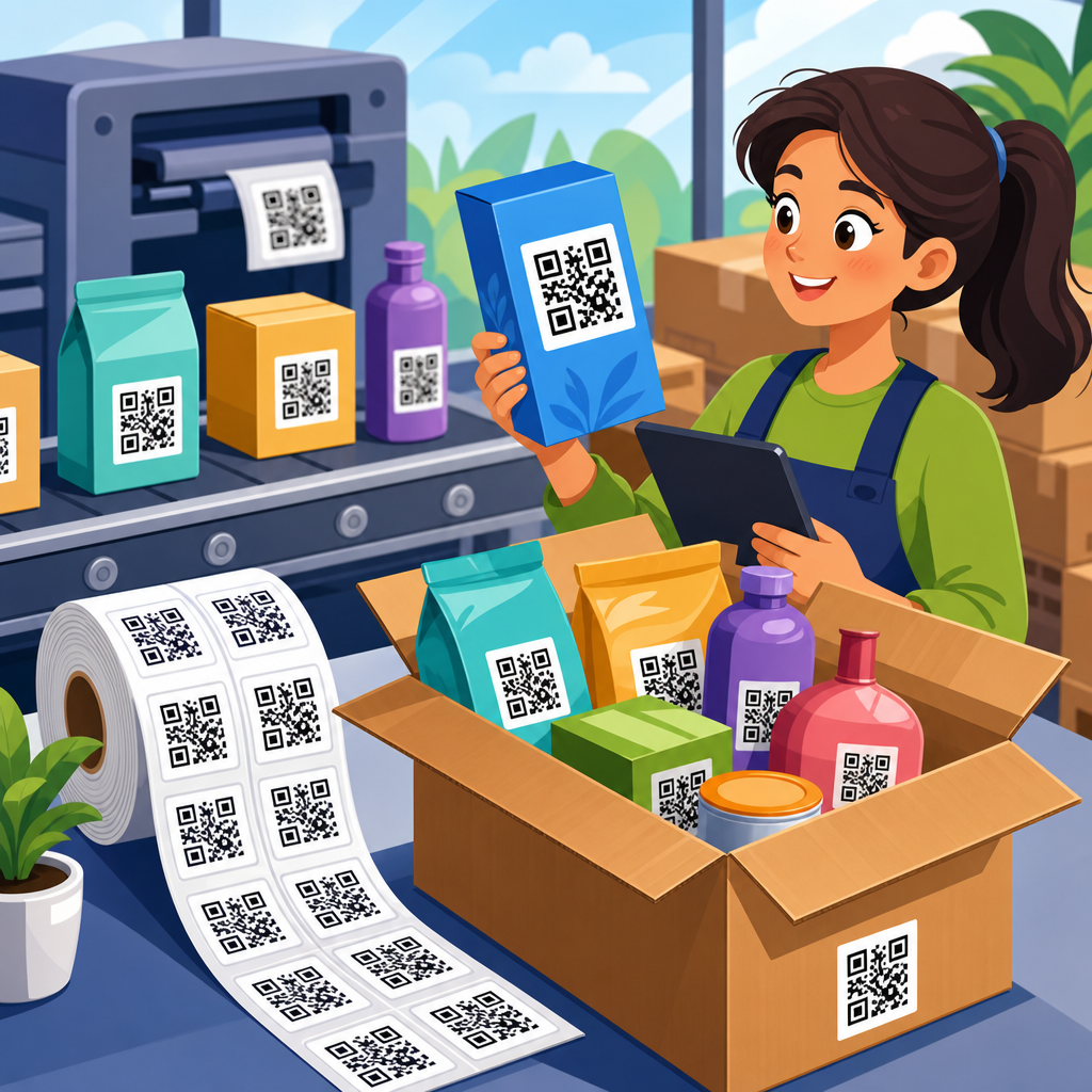
Branding a QR code for business means turning a plain black-and-white square into a scannable asset that clearly reflects your company’s identity, improves trust, and supports a specific marketing goal. In practice, that includes custom colors, logo placement, frame text, destination strategy, testing standards, and print specifications that preserve scan reliability. I have implemented branded QR campaigns for retail packaging, event signage, restaurant menus, and direct mail, and the pattern is consistent: when design choices support usability instead of fighting it, scan rates rise and customers hesitate less. This matters because QR codes often sit at the exact moment where offline attention becomes digital action. A code on a shelf talker can lead to product education. A code on a receipt can trigger loyalty enrollment. A code on a trade show banner can capture leads without friction.
To brand QR codes well, you need to understand the components that affect both appearance and performance. Static codes contain fixed information and cannot be changed after printing, while dynamic codes point to a short redirect URL that lets you update the destination, track scans, and manage campaigns over time. Error correction is the built-in redundancy that keeps codes readable when part of the pattern is obscured, including by a logo. Quiet zone refers to the blank margin around the code, which scanners need to detect boundaries. Contrast is the difference between dark modules and a lighter background; weak contrast is one of the fastest ways to break a design. For businesses, QR code design and customization is not decoration alone. It is a conversion tool, a brand signal, and a measurable bridge between physical media and analytics. Done correctly, branded QR codes create trust, improve campaign attribution, and make every print placement work harder.
Start with strategy, not styling
The best branded QR codes begin with a defined business purpose. Before choosing colors or adding a logo, decide what action you want a customer to take and where the code will appear. A QR code on product packaging has different constraints than one on a storefront window. Packaging codes are viewed up close, often under indoor lighting, and can support detailed destinations such as tutorials, care guides, or authenticity verification. Window decals may be scanned through glare, from awkward angles, and by people in motion, so they need larger sizing, stronger contrast, and a simple landing page. In campaigns I have run, performance improves when every code maps to one intent: buy, book, register, review, download, call, or learn.
Destination strategy is equally important. Sending all scans to your homepage wastes intent because it forces users to hunt for the promised next step. If a flyer says “See pricing,” the code should open the pricing page. If a table tent says “Join rewards,” the code should lead directly to the enrollment form. Dynamic QR platforms such as Bitly, QR Code Generator Pro, Beaconstac, Flowcode, and Scanova allow destination changes without reprinting assets, which is critical for seasonal promotions and A/B testing. They also support UTM parameters, so you can measure scans in Google Analytics 4 by source, medium, campaign, and content. A branded QR code is only as effective as the landing experience behind it, and the highest-performing businesses treat the code and destination as one conversion system.
Build visual branding without hurting scanability
Customization should reinforce recognition while respecting scanner tolerance. The safest starting point is to keep dark modules on a light background, preserve a generous quiet zone, and use a dynamic code with high error correction if you plan to embed a logo. Most reputable generators offer rounded modules, custom eyes, gradients, and frames, but not every option is practical. From direct testing across iPhone and Android camera apps, the designs that hold up best use solid fills instead of aggressive gradients, avoid low-contrast brand palettes, and keep logos centered and modest in size. As a rule, if branding choices make the pattern harder for a person to distinguish at arm’s length, scanners usually struggle too.
Color selection deserves discipline. Many brands want dark blue, forest green, or burgundy instead of black, and that often works well when paired with a white or very light background. Problems appear when companies reverse the scheme, place codes on busy photography, or use metallic inks that reflect light unevenly. A gold QR code on cream cardstock may look elegant in a mockup and fail in a real restaurant. Likewise, pastel modules on white packaging often disappear under retail lighting. If you use brand colors, test luminance contrast, not just hue. The code needs enough visual separation for the camera to isolate modules quickly. Frames with clear calls to action such as “Scan to order,” “Scan for menu,” or “Scan to book demo” also improve response because they remove ambiguity and tell users exactly what happens next.
Core design rules every business should follow
Businesses consistently avoid QR code failures when they apply a small set of nonnegotiable design standards. These standards come from how phone cameras identify finder patterns, read module density, and recover partially damaged symbols. ISO/IEC 18004 defines the QR code specification, but in everyday marketing work the practical checklist matters more than the formal document. When teams skip this checklist, problems show up in the field: tiny codes on brochures, logos that cover too much data area, and designs that pass on a designer’s phone but fail on older Android devices. The table below captures the rules I use before approving any branded code for print or digital publication.
| Design element | Best practice | Why it matters | Business example |
|---|---|---|---|
| Code type | Use dynamic QR codes for campaigns | Lets you change destinations and track scans after printing | A real estate sign keeps the same code while listing pages change |
| Size | Minimum about 2 x 2 cm for close scans; larger for distance | Small codes increase camera focus errors | A poster viewed from six feet away needs a much larger code than a product tag |
| Contrast | Dark modules on a light, solid background | Improves edge detection and reading speed | Navy on white works; pale gray on beige often fails |
| Quiet zone | Maintain a blank margin around the full code | Scanners need clear boundaries | A coupon layout should not crowd text or icons against the code |
| Logo overlay | Keep the logo small and centered with high error correction | Too much obstruction breaks readability | A coffee brand can place its mark in the middle if the code is tested thoroughly |
| Background | Avoid busy images, textures, and transparency | Visual noise confuses camera recognition | A menu code should sit in a clean white box, not over food photography |
| Call to action | Add frame text that states the benefit | Users scan more when the outcome is clear | “Scan for installation video” outperforms a code with no instruction |
| Testing | Test across devices, lighting, and print proofs | Real conditions expose failures early | A direct mail piece should be tested under warm indoor light and daylight |
Choose the right customization options for your brand
Not every brand needs every visual effect. In fact, simpler customization usually produces stronger business results because it balances recognition with speed. The highest-value elements are logo integration, brand color adaptation, a frame with a clear instruction, and a short branded link visible near the code when space allows. Shape changes such as rounded modules can work if the finder patterns remain recognizable and the generator uses standards-compliant rendering. More experimental approaches, including heavily illustrated codes or AI-styled patterns, should be treated cautiously for business-critical use because they can break under lower-quality cameras, poor lighting, or compressed exports.
Industry context should guide design choices. A luxury cosmetics brand may favor restrained customization with a centered logo, charcoal modules, and elegant packaging placement. A quick-service restaurant may benefit more from bolder framing and an explicit action, such as “Scan to order ahead.” A B2B software company using booth signage at a conference should prioritize large format, high contrast, and a destination page with a prefilled lead form or meeting scheduler. If your business operates across many locations, create a QR code style guide the same way you maintain a logo style guide. Define approved colors, minimum size, clear-space rules, CTA phrasing, file formats, and ownership of destination URLs. That keeps local teams from improvising risky designs that look on-brand but underperform.
Match the code to the placement and user context
Where a QR code appears changes how it should be designed and what it should do. For packaging, consider curvature, material finish, and how close consumers can get their phones. Glossy pouches, metallic labels, and embossed surfaces can introduce glare or distort the module grid. On print ads, remember that readers may scan while seated, with the page bending slightly. On outdoor signage, sunlight, shadows, and viewing distance matter more than subtle aesthetics. Restaurant tables add another variable: spills, scratches, and frequent cleaning can degrade a code over time. The answer is not generic design; it is context-aware design.
User context also affects destination design. Someone scanning from a warehouse label may need instant SKU details, reorder options, or service documentation. Someone scanning from a museum placard may expect a richer storytelling experience with audio or multilingual content. Mobile performance is essential in all cases. Landing pages should load fast, avoid intrusive pop-ups, and present the promised action at the top of the screen. I have seen well-designed codes underperform simply because they opened a desktop-style page with too many choices. If the physical touchpoint creates urgency, the mobile destination should reduce friction to a single next step. The code is the bridge, but the page determines whether the scan becomes revenue, a lead, or a satisfied customer.
Testing, tracking, and governance turn design into results
A branded QR code is not finished when the artwork is approved. It is finished when it has passed real-world testing, been linked to a measurable objective, and been assigned an owner. Testing should include multiple devices, native camera apps, different lighting conditions, and final production samples rather than design proofs alone. Print at actual size, not scaled mockups. Check scan speed, not just scan success. A code that eventually opens after three tries is still a poor customer experience. For larger organizations, maintain a simple preflight process: verify destination URL, redirect behavior, UTM tagging, CTA alignment, accessibility of the landing page, and file export quality in SVG or high-resolution PNG depending on use.
Tracking is where business value becomes visible. Dynamic QR platforms typically report total scans, unique scans, time, device type, and geography. Combined with GA4 events, CRM forms, or ecommerce tracking, you can evaluate cost per scan, lead quality, and downstream conversion rate. That lets you compare placements objectively. A trade show badge insert may generate fewer scans than booth signage but produce higher-value leads. A packaging code may drive repeat purchases better than a receipt code. Governance matters too. Expired landing pages, broken redirects, and unowned codes create silent campaign failures that can last for months. Assign each QR code a purpose, owner, destination, and review date. Businesses that manage QR codes like other digital assets consistently get better long-term performance.
Branding your QR codes for business is ultimately about making them recognizable, trustworthy, and easy to scan without compromising technical reliability. Start with the goal, choose dynamic codes when flexibility matters, keep contrast high, preserve the quiet zone, and use logos and colors with restraint. Match the design to the placement, align the landing page with the promise on the sign or package, and test in real conditions before launch. When those pieces work together, QR code design and customization becomes more than a cosmetic upgrade; it becomes a measurable part of your customer journey. If you are building out your QR Code Creation & Tools program, use this hub as your foundation, standardize your design rules, and audit every live code so each scan has the best chance to convert.
Frequently Asked Questions
What does it mean to brand a QR code for business?
Branding a QR code for business means designing the code so it aligns with your company’s visual identity while still scanning quickly and reliably. Instead of using a plain black-and-white QR code, you customize elements such as color, logo placement, frame style, and call-to-action text to make the code feel like a natural part of your packaging, signage, menu, mailer, or in-store display. The goal is not decoration for its own sake. A branded QR code should help people recognize your business immediately, trust the destination, and understand why they should scan.
In a practical business setting, branding also includes strategy. You need to decide where the code sends users, what action you want them to take, and how the code will appear in the real environment where it is used. A QR code on retail packaging may lead to product instructions or loyalty enrollment, while a QR code on event signage may connect to registration, schedules, or sponsor offers. The strongest branded QR campaigns combine visual consistency with a clear marketing purpose, so the code does more than look good—it supports conversion, engagement, and measurable business results.
How can I customize a QR code without hurting scan performance?
The safest way to customize a QR code is to treat scan reliability as the priority and branding as a layer built around it. You can usually change colors, add a logo, and include a branded frame, but you must preserve enough contrast and structural integrity for phone cameras to read the code. Dark foreground elements on a light background tend to perform best. If you reverse that relationship, use very low contrast, or place the code over a busy image, scan rates can drop fast. Likewise, if a logo is too large or placed carelessly in the center, it may block essential data modules and make the code unreadable.
Use a generator that supports error correction and test multiple versions before publishing. Keep quiet space around the code, avoid overly stylized shapes that distort the finder patterns, and resist the temptation to make the design too artistic. A branded QR code should still look unmistakably like a QR code at a glance. It is also smart to test with different phone models, lighting conditions, distances, and print sizes. In real campaigns, a code might be scanned from glossy packaging under store lights, from a restaurant table in dim conditions, or from a poster several feet away. Good customization improves trust and visibility, but only if the code remains easy to scan in the environments where customers actually encounter it.
What are the best colors, logos, and frame text to use on a branded QR code?
The best design choices are the ones that match your brand and still make the scanning action obvious. For colors, prioritize strong contrast over perfect brand color purity. If your company palette is light or pastel, it is often better to use a darker brand-accented tone for the code itself and keep the background very light. This preserves readability while maintaining a recognizable brand feel. Avoid metallic effects, gradients that reduce contrast, or color combinations that blend into the background. If the QR code will appear on printed materials, remember that colors can shift between screen and print, so proofing matters.
Logos can work extremely well when used carefully because they reinforce brand recognition and reassure users that the code is legitimate. The logo should be centered, clean, and small enough that it does not interfere with scanning. In many business use cases, a modest logo combined with higher error correction is the right balance. Frame text is just as important as the visual design because it tells people why they should scan. Generic wording like “Scan Me” is acceptable, but benefit-driven text performs better, such as “Scan for Menu,” “Scan for 10% Off,” “Scan to Register,” or “Scan for Product Details.” That short instruction turns the QR code from a passive graphic into a clear invitation. When color, logo, and frame text work together, the code looks branded, trustworthy, and purposeful rather than decorative.
Where should a business send branded QR code traffic?
The destination should match the customer’s context and your campaign objective. One of the most common mistakes businesses make is sending every QR code to the homepage. That usually adds friction. A person scanning from restaurant signage should land directly on a mobile-friendly menu, not a general website. Someone scanning a QR code on product packaging should get product-specific instructions, care details, ingredients, warranty registration, or a reorder page. In direct mail, the destination might be a personalized landing page, limited-time offer, appointment booking form, or coupon redemption page. The best destination feels like a natural continuation of the scan moment.
It is also important to think beyond the immediate click. Businesses should decide whether the purpose of the QR code is education, conversion, lead capture, review generation, app download, loyalty enrollment, or event engagement. Using dynamic QR codes can help because you can update the destination later without reprinting the code, which is especially useful for packaging, permanent signage, and campaigns that evolve over time. Whatever destination you choose, make sure it loads quickly, is optimized for mobile, uses clear branding, and has one primary next step. A branded QR code creates expectation; the landing experience needs to fulfill that expectation immediately or the business loses the momentum created by the scan.
What testing and print guidelines should businesses follow before launching branded QR codes?
Testing and print preparation are where successful branded QR campaigns are won or lost. Before launching, test the code on multiple devices, including both iPhone and Android phones, and try scanning in the conditions where the code will actually be used. Check performance in bright light, low light, from different angles, and at realistic distances. If the code will appear on a window, bottle, curved package, tabletop, flyer, or outdoor sign, test on that exact material or surface whenever possible. A QR code that scans perfectly on a desktop proof may perform very differently once printed on matte cardboard, glossy labels, or textured signage.
For print, size matters. The code must be large enough for the expected scanning distance, with sufficient white space around it so cameras can isolate it quickly. Avoid placing the code too close to folds, seams, edges, or cluttered design elements. Export the artwork in high resolution or vector format when possible so edges remain sharp. If the piece is going to press, confirm color accuracy, contrast, and final dimensions with a printed proof instead of relying only on digital previews. It is also wise to check the landing page URL, tracking setup, and analytics before rollout so you can measure results from day one. In business use, a branded QR code is not finished when the design is approved—it is finished when it scans reliably in the real world and supports the campaign goal consistently across every placement.