QR codes do not have to be black squares on a white background, and yes, you can customize QR code colors without breaking scannability if you follow a few nonnegotiable design rules. In QR code design, color customization means changing the foreground modules, background, eyes, gradients, frames, and branded elements while preserving the machine-readable contrast pattern scanners rely on. This matters because a QR code is both a functional data carrier and a visible brand asset. I have tested custom QR codes across retail packaging, restaurant menus, event signage, and mobile screens, and the pattern is consistent: well-designed color choices can improve brand fit and user trust, while poor choices cause scan failure, especially in low light, on glossy materials, or from older phone cameras. For businesses building a recognizable customer journey, QR code customization is not a cosmetic afterthought. It affects scan rate, print performance, accessibility, and campaign consistency across packaging, posters, websites, and in-store displays.
To understand what can be customized safely, start with how a QR code works. A QR code is a two-dimensional matrix barcode standardized under ISO/IEC 18004. It stores data in dark and light modules arranged around fixed finder patterns, alignment patterns, timing patterns, and a quiet zone. Scanners detect geometric structure first, then decode the encoded payload. Because decoding depends on contrast and pattern recognition rather than on black ink specifically, many color combinations work. The real requirement is not black on white; it is strong luminance contrast between dark modules and light background. That single principle explains why navy on cream often scans well, while yellow on white, pastel gradients, metallic foils, or reversed light-on-dark designs often fail. If you are asking whether customized QR code colors are possible for branded campaigns, the short answer is yes. If you are asking whether every color treatment is safe, the answer is no.
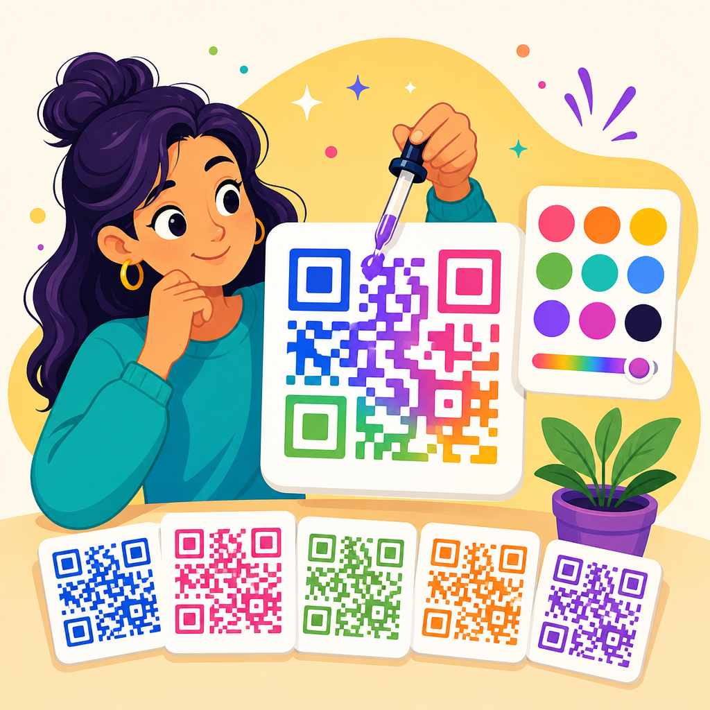
What parts of a QR code can you customize?
You can customize far more than the basic black modules. Most modern QR code generators let you change the foreground color, background color, finder eye color, module shape, corner style, frame, call-to-action text, and logo placement. Dynamic QR code platforms such as QR Code Generator Pro, Bitly, Flowcode, Beaconstac, and Uniqode all support branded styling, though their controls and export options vary. In production work, I usually separate customization into three levels: safe cosmetic changes, moderate structural changes, and high-risk aesthetic changes. Safe changes include dark blue modules on white, branded eye colors, or a frame saying “Scan to view menu.” Moderate changes include rounded modules, subtle gradients, and centered logos supported by higher error correction. High-risk changes include low-contrast palettes, transparent backgrounds placed over photography, heavy logo overlays, or decorative distortions that interfere with finder patterns and the quiet zone.
The most important rule is that core detection areas must remain clear. The three large finder patterns in the corners help scanners locate the code quickly. The quiet zone, usually at least four modules wide around the code, must stay free of text, borders, or nearby graphics. You can stylize eyes and modules, but if you make them too ornate, too thin, or too similar to the background, detection suffers. A practical example is food packaging: a coffee brand can use deep brown modules and cream background with a small centered logo, but if it places the code over a textured kraft-paper photo and trims the margin to save label space, scan reliability drops fast. Customization works best when branding adapts to the technical structure rather than fighting it.
Which color combinations scan best, and which should you avoid?
The best QR code color combinations pair a dark foreground with a very light background. Black on white remains the benchmark because nearly every scanner handles it under imperfect lighting. Good alternatives include dark blue on white, forest green on cream, maroon on pale beige, and dark purple on light gray. What matters most is luminance contrast, not hue difference alone. Two colors can look different to the human eye yet still appear too similar to a camera sensor. This is why red on black, orange on pink, or light gray on white often fails. Smartphone cameras compress images, apply exposure correction, and struggle with glare, all of which reduce usable contrast. In field testing, I have seen navy on ivory outperform bright red on white because the navy produced cleaner edges under mixed indoor lighting.
Some combinations are risky for technical reasons beyond basic contrast. Metallic inks reflect light unevenly. Neon colors can bloom on screens and print unpredictably. Transparent backgrounds become dangerous when the code sits on a busy image. Reversed designs, such as white modules on black, are better supported than they once were, but they are still less dependable across low-end scanners and embedded camera apps. Gradients can work if the darkest areas stay consistently dark and the background remains clean, but dramatic multi-color blends frequently create dead zones. For accessibility, do not assume everyone sees brand colors the same way. A simple validation method is to convert the design to grayscale. If the code still looks like dark shapes on a light field with obvious finder patterns, you are closer to a robust scan.
| Color treatment | Typical scan reliability | Best use case | Main risk |
|---|---|---|---|
| Black on white | Excellent | Universal print and screen use | Minimal brand expression |
| Dark brand color on white | Excellent to very good | Packaging, menus, brochures | Chosen brand shade may be too light |
| Dark color on light tinted background | Very good | Brand-consistent collateral | Tint may print darker than expected |
| Gradient foreground | Fair to good | Digital campaigns with testing | Uneven contrast across modules |
| Light color on dark background | Fair | Controlled digital environments | Older scanners may fail |
| Transparent background over image | Poor to fair | Only with solid backing panel | Background noise destroys readability |
How branding, logos, and shapes affect scannability
Branding is usually the reason businesses ask about custom QR code colors in the first place. They want the code to look native to their packaging, storefront, or campaign creative. That is reasonable, and often smart, because a QR code that matches the surrounding design can feel more trustworthy and intentional. In retail and hospitality, I have seen scan rates improve when the code is framed with clear instruction and uses the same palette as the rest of the asset. But the code still needs to behave like a machine-readable symbol. Adding a logo, changing square modules to circles, or stylizing the finder eyes can all work, yet each modification removes some redundancy from the pattern. That means you should compensate with stronger contrast, sufficient size, and higher error correction where appropriate.
Error correction is central here. QR codes support four levels: L, M, Q, and H, allowing roughly 7 percent, 15 percent, 25 percent, and 30 percent of data restoration respectively under ideal assumptions. Designers often choose H when placing a logo in the center because the logo obscures modules. That can work well, but high error correction also increases code density for the same payload, which means smaller modules and potentially harder scanning at distance. This tradeoff matters on business cards and product labels. If you shorten the destination URL with a dynamic QR code, you can keep the matrix simpler and preserve room for branding. The disciplined approach is to reduce encoded complexity first, then add logo and shape customization carefully rather than relying on error correction to rescue an overloaded design.
Print versus screen: why the same colored QR code performs differently
A colored QR code that scans perfectly on a designer’s monitor can fail after printing, and the reasons are usually physical. Print introduces dot gain, substrate texture, ink spread, glare, and color shift. Uncoated paper can soften edges. Gloss laminate can reflect overhead lights directly into the camera. Small labels force smaller module size. Outdoor signage adds distance, weather, and uneven illumination. For print, I usually export vector files such as SVG or EPS when the vendor supports them, preserve a generous quiet zone, and verify that the minimum module size suits viewing distance. A practical rule is that if people will scan from farther away, the code must be physically larger, regardless of color treatment. Dark green on cream may test well on screen but lose edge definition when printed too small on absorbent stock.
Screen-based QR codes have different constraints. OLED displays can render deep blacks and bright colors beautifully, but screen glare, brightness settings, motion, and screenshot compression affect scanning. Gradient or animated backgrounds near the code can confuse camera autofocus. If the code appears in an app, responsive layout matters; padding can collapse on small screens and accidentally trim the quiet zone. Colored QR codes for television or presentations need extra size because viewers scan from a distance and often at an angle. In these cases, plain high-contrast palettes outperform ambitious artistic treatments. The safest workflow is to test on multiple devices: iPhone and Android, flagship and midrange, native camera app and third-party scanner, bright daylight and dim indoor light. A QR code is only as good as its worst realistic scanning condition.
Best practices for designing a custom-colored QR code
If your goal is a branded QR code that still scans reliably, follow a disciplined design checklist. First, keep the foreground significantly darker than the background. Second, maintain a clean quiet zone with no visual clutter. Third, use a dynamic QR code when possible so the encoded payload stays short and easier to scan. Fourth, increase error correction if you add a logo, but do not use that as an excuse for aggressive obstruction. Fifth, test the exact final asset, not just the generator preview. Sixth, validate in grayscale and at realistic distances. Seventh, print a prototype on the real material before approving a production run. Eighth, add clear call-to-action text so users know why they should scan. “Scan to see warranty details” consistently outperforms a code with no instruction because user intent is explicit.
Tool choice also matters. Serious platforms provide scan analytics, dynamic editing, batch generation, UTM integration, and downloadable vector formats. Adobe Express and Canva are useful for layout, but the QR generation itself should come from a dependable engine that respects quiet zone and error correction. For enterprise use, brand teams often maintain approved templates by channel: packaging, POS signage, email footer, digital display, and direct mail. That approach prevents well-meaning designers from creating beautiful but fragile codes. From experience, the most successful organizations treat QR code design as part of a governed system, not a one-off graphic. They define acceptable color ranges, minimum sizes, logo clear space, and testing requirements. That is how customization becomes scalable instead of risky.
Common mistakes and how to test before launch
The most common mistake is prioritizing appearance over function. A close second is assuming that if one phone scans the code once, the design is approved. Real testing is broader. Check the code in bright and dim conditions, on older phones, through cracked screens, and from the expected scanning distance. Print it at final size, place it on the actual package or sign, and test after any finishing process such as lamination or embossing. Another frequent problem is forgetting destination quality. If the QR code leads to a slow, non-mobile-friendly landing page, a perfect scan still creates a poor user experience. For campaigns, connect scans to analytics using tagged URLs and monitor scan-through behavior by location, date, and asset version. Data often reveals that the issue is placement or instruction, not the code itself.
So, can you customize QR code colors? Absolutely, and in many cases you should. Custom colors can strengthen brand recognition, improve visual integration, and make a QR code feel intentional rather than generic. The benefit comes when design choices respect the technical realities of contrast, quiet zone, size, error correction, and testing. The safest formula is simple: dark foreground, light background, minimal interference with core patterns, and validation across real devices and materials. Start with a reliable generator, build within those boundaries, and test the exact final version before release. If you are creating a broader QR code design system, document approved palettes, logo rules, and minimum sizes so every future code stays both on-brand and easy to scan. That is the practical path to customization that works.
Frequently Asked Questions
Can you really change QR code colors without making the code unscannable?
Yes, you can customize QR code colors and still keep the code easy to scan, but the key is preserving strong contrast between the dark data elements and the lighter background. A QR code works because scanners detect a predictable pattern of modules, alignment markers, and quiet space, not because the code must be black and white specifically. That means you can use brand colors for the foreground, customize the eye patterns, add frames, or even apply gradients, as long as the code still presents a clear visual separation that cameras can read quickly.
In practice, the safest approach is to keep the modules significantly darker than the background. Dark blue on white, deep green on cream, or charcoal on a very light brand tint often work well. Problems start when brands choose low-contrast combinations such as pastel on white, metallic tones with glare, or background textures that interfere with edge detection. If your goal is a branded QR code that performs reliably across different phones, lighting conditions, and print surfaces, design freedom is absolutely possible, but function has to come first.
What color combinations work best for a custom QR code?
The best color combinations are those with high contrast, minimal visual noise, and a clear foreground-to-background relationship. Dark foreground on a light background remains the most dependable format because it aligns with how most QR scanners process image data. Strong performers typically include black on white, navy on white, dark green on pale beige, burgundy on light gray, and other combinations where the modules are visually dominant. These pairings support fast recognition by phone cameras and reduce scan failures in less-than-ideal conditions.
Some color choices are riskier even if they look attractive in a brand mockup. Light-on-light combinations, neon colors, reflective inks, and complex multicolor patterns can lower readability. Inverted schemes, such as a light code on a dark background, may work in some apps but are generally less reliable across devices and scanning environments. Gradients can also work, but they should stay smooth and maintain consistent contrast across the full symbol. If you are using a branded palette, it is smart to test the code on multiple phones, under indoor and outdoor lighting, and at the intended print or display size before publishing it widely.
How much can you customize a QR code beyond just changing the colors?
You can customize far more than the basic foreground and background colors. Modern QR code design often includes edited eye shapes, rounded or stylized modules, branded frames with a call to action, center logos, and controlled gradients. You can also adapt the background area, add a custom border, and make the code look more integrated with your packaging, signage, ad creative, or website design. These changes help transform the QR code from a purely functional element into a recognizable part of your brand experience.
That said, every visual enhancement should respect the structural rules scanners depend on. The position markers, timing patterns, quiet zone, and module grid still have to remain recognizable. If you insert a logo, you should use appropriate error correction and avoid covering too much of the data area. If you round corners or soften shapes, the modules still need enough definition for cameras to distinguish them. The best custom QR codes are not simply decorative; they are carefully designed to balance branding with machine readability. That balance is what allows a code to look polished without sacrificing performance.
What design rules are nonnegotiable when customizing QR code colors?
The most important nonnegotiable rule is contrast. A scanner must be able to separate the QR code modules from the background immediately, so the foreground should remain clearly darker than the background in most use cases. The second rule is to preserve the quiet zone, which is the empty margin around the code. If that margin is cluttered with graphics, text, or background patterns, many scanners will struggle to identify where the code begins and ends. The third rule is not to distort or obscure the core finder eyes and data structure beyond recognition.
Additional rules include maintaining adequate size for the intended scanning distance, using error correction intelligently when adding logos or artistic changes, and avoiding backgrounds that introduce shadows, texture, or interference. If you are printing the code, material and finish matter too. Glossy surfaces, dark packaging, or low-quality printing can reduce scan reliability even when the digital file looks perfect. The safest workflow is to generate the design, test it repeatedly on multiple devices, and confirm that it scans quickly under realistic conditions. When those fundamentals are respected, color customization becomes a practical branding tool instead of a usability risk.
Do branded QR codes improve marketing results, or are they just a visual upgrade?
Branded QR codes can absolutely improve marketing performance when they are designed well. A customized code often looks more trustworthy, more intentional, and more aligned with the surrounding campaign creative. That matters because users are more likely to scan something that appears legitimate and professionally integrated into the brand experience. A generic black-and-white code can still work, but a thoughtfully customized one can draw more attention, reinforce recognition, and make the call to action feel like part of the message rather than an afterthought.
The performance gain comes from both visibility and confidence. If the QR code uses familiar brand colors, a frame with clear instructions, and a clean layout, users understand what it is and why they should scan it. However, the visual upgrade only helps if the code remains easy to scan. A beautiful but unreliable code will hurt conversions quickly. The best results come from treating the QR code as both a technical asset and a brand asset: design it to stand out, keep the scan path frictionless, and test it thoroughly before launch. That combination is what turns customization into a meaningful marketing advantage rather than just decoration.