Choosing the best colors for QR codes that scan easily starts with one rule: scanners read contrast first, branding second. In practical terms, a QR code works when a camera can quickly separate the dark modules from the light background, detect the three position squares, and correct minor damage or distortion. Color choices affect every step of that process. If contrast is weak, if the background is busy, or if gradients blur the module edges, scan rates fall even when the code technically contains valid data.
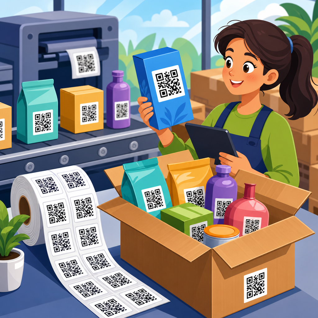
For businesses using QR codes on packaging, menus, posters, direct mail, product labels, trade show signage, invoices, and retail displays, color is not a cosmetic decision. It directly influences usability, completion rates, and campaign performance. I have tested branded QR codes across glossy labels, corrugated boxes, window vinyl, apparel tags, and mobile screens, and the pattern is consistent: simple high-contrast color combinations outperform clever but low-contrast designs almost every time. A code that looks beautiful but fails in poor lighting, at a distance, or on older phones costs conversions.
In QR code design and customization, “best colors” means combinations that preserve scan reliability while supporting brand identity. The safest standard is a dark foreground on a light background, usually black on white. But many other options can work well, including dark blue on white, dark green on cream, or deep maroon on pale beige, provided the luminance contrast remains strong. In this hub article, you will learn which colors scan best, which combinations often fail, how printing and screen display change results, and how to customize QR codes without hurting performance.
Why QR code scanners care more about contrast than hue
A QR code scanner does not interpret color the way a designer does. It evaluates lightness differences, edge definition, and geometric patterns. The camera captures an image, software converts it into a form where the modules can be distinguished, and the decoder identifies finder patterns, alignment patterns, timing patterns, quiet zone, and data cells. If the dark and light areas are too similar in brightness, the code may look fine to the eye but collapse into ambiguity for the scanner.
This is why contrast matters more than hue. A navy QR code on white usually scans well because the luminance gap is large. A bright red code on black often fails because both values are dark in grayscale. Likewise, pastel lavender on white may fit a brand palette but often lacks enough separation. The practical test is not “Do these colors look distinct?” but “Do they remain distinct when photographed under glare, motion blur, low exposure, and grayscale conversion?” That is the test scanning software effectively applies.
Industry guidance from major QR code generators and print vendors aligns on the same point: use a dark foreground and a light background. ISO/IEC 18004, the QR Code specification, does not prescribe brand colors, but the standard assumes symbol structure that must remain clearly detectable. In the field, I treat contrast as a nonnegotiable baseline and brand styling as the variable layered on top.
Best color combinations for QR codes that scan easily
The most reliable color combination is black on white. It delivers maximum contrast, survives poor lighting, reproduces well in offset and digital printing, and works across nearly all phones and scanning apps. If you need alternatives for branding, choose dark foreground colors with very light backgrounds. Good examples include dark navy on white, forest green on ivory, dark purple on pale gray, and charcoal on light yellow. These combinations preserve the visual logic scanners expect.
The combinations most likely to cause problems are light-on-light, dark-on-dark, metallic-on-metallic, and highly saturated pairings with similar luminance. Yellow on white, red on black, orange on pink, silver on gray, and pastel blue on cream are common failure points. Reverse QR codes, such as white modules on a black background, can work in some cases, especially on screens, but they are less dependable in print and should be tested extensively. Busy photographic backgrounds also reduce reliability because the scanner cannot easily isolate the code from surrounding visual noise.
| Foreground color | Background color | Scan reliability | Typical use case |
|---|---|---|---|
| Black | White | Excellent | Universal default for print and digital |
| Dark navy | White | Excellent | Corporate branding, brochures, packaging |
| Forest green | Ivory | Very good | Food packaging, sustainability campaigns |
| Charcoal | Light yellow | Very good | Retail signage, event handouts |
| White | Black | Fair to good | Screen-only designs with careful testing |
| Red | Black | Poor | Not recommended |
| Pastel blue | Cream | Poor | Not recommended |
If you need a practical rule, keep the foreground below roughly 40 percent lightness and the background above roughly 85 percent lightness. Designers using WCAG contrast tools can borrow the habit of checking relative contrast, even though QR scanning is not the same as text accessibility. The principle is useful: stronger light-dark separation improves machine readability.
How printing, materials, and lighting change QR code color performance
A color combination that scans on a designer’s laptop can fail after printing because ink, substrate, finish, and viewing conditions alter contrast. Gloss coatings create specular glare that washes out module edges. Uncoated kraft paper lowers apparent contrast because the background is darker than pure white. Transparent labels placed over colored products can shift both foreground and background values. Fabric labels stretch and distort the symbol. On curved bottles, the finder patterns can warp enough to challenge detection.
Printing method matters too. In flexographic packaging, ink spread can close small gaps between modules if the code is undersized. In thermal printing, low heat settings may produce grayish dark cells instead of dense black. UV inks can look vibrant but still reflect strangely under retail lighting. For outdoor signage, sunlight and shadows change exposure dramatically, so bold contrast is essential. I have seen dark green on tan perform acceptably in studio tests but fail on pallet labels in warehouse sodium lighting because the background lost brightness.
Material choice should guide color choice. On matte white paper, dark brand colors often work well. On foil pouches, use a solid white underprint beneath the entire code area, including the quiet zone. On glass or acrylic, avoid partial transparency behind the code. On digital displays, remember that OLED screens can render deep blacks sharply, but cracked protectors, low brightness, and reflections still reduce usability. Whenever codes will be photographed through windows or under angled light, increase contrast beyond what seems necessary in controlled conditions.
Design customization rules that protect scanability
Custom QR codes can support strong branding without sacrificing performance, but only if the core symbol structure remains intact. The safe approach is to customize color first, shape second, and embedded graphics last. Rounded modules, softened corners, and logo placement can work, yet each adjustment reduces tolerance. Error correction helps, but it is not a license to overdesign. Higher error correction levels such as Q or H allow some obstruction, though they also increase symbol density, which can make small printed codes harder to scan.
The quiet zone is one of the most overlooked parts of QR code design. This clear margin around the code should remain free of text, borders, patterns, and imagery. If a colored background bleeds into the quiet zone, scanners may struggle to isolate the code. Similarly, the three finder patterns should remain highly distinct. Decorative effects that alter these squares too aggressively cause failures more often than subtle changes to inner modules.
Gradients require caution. A dark-to-light gradient across the symbol can create regions where modules disappear into the background. If you use a gradient, keep the darkest and lightest points within a high-contrast range and avoid transitions that pass through midtones too close to the background value. Shadows, bevels, embossed effects, and low-opacity overlays are usually bad tradeoffs. In production, the best-performing customized codes still look visually simple. That is true on restaurant menus, product inserts, app download cards, and point-of-sale displays.
Testing methods, tools, and size guidelines for reliable scans
The best way to choose QR code colors is to test them under realistic conditions before rollout. Scan with both iPhone and Android devices, using the native camera and at least one third-party app. Test at different distances, in bright and dim light, on older midrange phones, and through common barriers such as glossy lamination or display reflections. If the code is for packaging, test after printing on the actual substrate, not only from a PDF proof.
Use dynamic QR code platforms and analytics tools to compare performance across design variations. Services such as QR Code Generator Pro, Bitly, Flowcode, Beaconstac, Uniqode, and Scanova allow campaign tracking, while design tools like Adobe Illustrator, Figma, Canva, and QR TIGER help produce branded assets. For verification, many teams rely on simple scan testing plus print proofs, but for larger programs I recommend adding grayscale previews, blur simulation, and camera testing from intended use distances. Those steps catch most color-related issues early.
Size and color interact. A low-contrast code needs to be larger to remain readable, but that is not an efficient fix. As a baseline, many print teams use at least 0.8 inch by 0.8 inch for close-range scans, and larger sizes for posters, shelf talkers, and signage viewed from several feet away. A common rule is a scanning distance of ten times the code width, though real performance varies by phone camera quality and environmental conditions. If your design uses anything other than a dark-on-light palette, increase size and test more aggressively.
Building a QR code design system for brand consistency
As a hub for QR code design and customization, this topic goes beyond picking one good color pair. Teams need a repeatable design system. In practice, that means defining approved foreground colors, approved background colors, minimum contrast thresholds, minimum sizes by channel, logo usage rules, quiet zone requirements, and print specifications. When brands centralize these decisions, scan reliability improves because local teams stop improvising with low-contrast palette combinations on the fly.
A useful system separates applications into categories: packaging, print collateral, signage, digital screens, and labels. Each category should have recommended color combinations and fallback options. For example, packaging may permit dark navy on white and black on kraft with a white patch behind the code; event signage may require black on white only; social graphics may allow reverse codes for dark mode posts after validation. This framework helps creative teams move faster while reducing preventable scan failures.
It also supports internal linking and content planning within a broader QR code creation and tools library. Detailed companion pages can cover QR code size guides, logo placement, error correction, print testing, dynamic versus static codes, menu QR code design, packaging QR code best practices, and troubleshooting scans that fail intermittently. Treat this page as the decision center: start with contrast, choose approved colors, validate on the final medium, and customize only within tested limits.
The best colors for QR codes that scan easily are dark foregrounds on light backgrounds, with black on white remaining the most dependable choice. Strong contrast, clean edges, an intact quiet zone, and realistic testing matter more than visual novelty. Brand-friendly options such as navy on white or forest green on ivory can work very well, but low-contrast palettes, busy backgrounds, metallic effects, and aggressive gradients reduce reliability fast.
For anyone managing QR code design and customization, the practical lesson is simple: optimize for the camera first and the brand palette second. A code that scans instantly under store lighting, on matte and glossy stock, and across different phones will outperform a prettier code that needs perfect conditions. Build approved color pairs, define production rules, and test every important use case on the actual material before launch.
If you are refining a broader QR code creation workflow, use this page as your hub and standard-setting reference. Start with high-contrast colors, document what passes, and expand into logo use, sizing, print methods, and campaign tracking from there. Better color decisions lead directly to better scan rates, cleaner user experiences, and stronger results from every QR code you publish today.
Frequently Asked Questions
What color combination makes a QR code scan the most reliably?
The most reliable QR code color combination is still a dark foreground on a light background. In real-world scanning, cameras and QR readers are not looking for “pretty” first—they are looking for clear separation between the code’s dark modules and the empty light space around them. Black on white remains the safest standard because it creates strong contrast, preserves sharp edges, and gives scanning software the clearest possible signal. Dark navy, deep charcoal, dark green, or other saturated dark colors can also work very well as long as the background stays very light and clean.
The reason this matters is technical as much as visual. A scanner must quickly identify the three position squares, distinguish individual modules, and compensate for glare, tilt, or imperfect printing. Strong contrast helps the software lock onto the pattern faster and with fewer errors. If the foreground color is too light, or the background is cream, gray, textured, or busy, the code may still look fine to a person but become harder for a camera to interpret consistently. For the highest scan reliability, use a very dark code color, a plain white or near-white background, and avoid anything that softens the module edges.
Can you use brand colors in a QR code without hurting scan performance?
Yes, but only if branding never comes at the expense of contrast. The best approach is to adapt brand colors rather than apply them literally. If your brand palette includes dark blue, forest green, burgundy, or another deep tone, those colors often work well for the QR pattern itself. If your brand uses pastels, neon tones, or light accent colors, those should usually be reserved for surrounding design elements instead of the modules that scanners need to read. A QR code is functional artwork: it can reflect the brand, but it still has to behave like a machine-readable symbol first.
A practical way to use brand color safely is to test the exact combination under realistic conditions. View the code on different phone screens, print it at its intended size, and scan it in bright light, low light, and at slight angles. Also keep the background simple and maintain the quiet zone—the empty margin around the code—because branding elements placed too close to the edges can interfere with detection. If a color-treated code scans even slightly slower than a standard black-on-white version, that is usually a sign the design has pushed too far. Good branded QR codes feel customized, but they still preserve dark modules, light negative space, and crisp visual structure.
Are inverted QR codes, such as white on black, harder to scan?
In many cases, yes. Inverted QR codes—light modules on a dark background—can sometimes scan, but they are generally less dependable than the standard dark-on-light format. Many modern scanners are better than older ones at handling inversion, yet reliability still varies depending on the phone camera, scanning app, lighting, and print quality. The issue is that QR readers have historically been optimized to detect dark data modules against a light field, so reversing that expectation can introduce inconsistency, especially in less-than-perfect conditions.
If you are considering a white-on-black QR code for aesthetic reasons, test aggressively before publishing it. What works on one flagship phone may fail on a mid-range device, a dim restaurant table, glossy packaging, or a poster seen through glare. The risk increases further if the design also uses gradients, overlays, or low-contrast edges. If dependable scanning is the top goal, stick with a dark code on a light background. If inversion is required by the design, make sure the contrast is still extreme, the code is large enough, the quiet zone is intact, and the destination is important enough to justify extra testing.
Do gradients, multicolor designs, or decorative backgrounds reduce QR code scan rates?
They often do. The biggest problem with gradients and decorative treatments is not simply “too much color,” but reduced edge clarity. QR scanners need to distinguish one module from the next with speed and precision. When a gradient moves from dark to medium tone across the code, some modules may become visually ambiguous, especially in poor lighting or on lower-quality screens and printers. The same issue happens when a patterned or photographic background sits behind the code. Even if the code looks stylish, the scanner may struggle to separate data from decoration.
Multicolor QR codes can work when handled carefully, but they should still follow a clear rule: every module needs to read as dark enough relative to a consistently light background. If one part of the code is dark blue and another fades into teal, purple, or a lighter tint, the lighter areas can become scanning weak points. Busy backgrounds are even riskier because they interfere with the code’s shape and the required empty space around it. If visual customization is important, the safest route is to keep the code area itself simple and move design flourishes outside the scanning region. A clean QR code framed by branded graphics usually performs better than a heavily stylized code trying to do both jobs at once.
How can you test whether a QR code color choice is actually easy to scan?
The best test is practical, repeated scanning in real usage conditions. Start by comparing your color version against a plain black-on-white version of the same code. If the branded or customized version scans even a little more slowly, that is meaningful. Test it on both iPhone and Android devices, using the native camera and at least one third-party scanner. Check performance in indoor lighting, direct sunlight, shadows, and glare. If the QR code will be printed, test the final printed piece rather than only the digital file, because ink density, paper finish, and size all affect readability.
You should also test distance, angle, and context. A code on packaging may be scanned one-handed from a curved surface. A poster may be scanned from several feet away. A restaurant table tent may be viewed in dim ambient light. In each case, color contrast becomes more important as conditions become less ideal. Look for hesitation, failed scans, or the need to reposition the phone—those are signs the design is too close to the edge. As a rule, if the code does not scan quickly and repeatedly for different users without explanation, the color treatment should be simplified. The easiest-to-scan QR codes are usually not the most experimental ones; they are the ones that preserve strong contrast, clean backgrounds, sharp module edges, and a generous quiet zone every time.