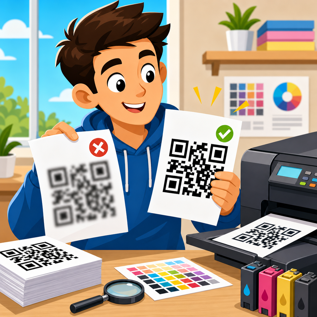
Blurry QR code prints waste campaigns, delay shipments, and frustrate customers because a code that looks acceptable on screen can fail the moment it reaches paper, packaging, labels, signs, or fabric. Printing QR codes successfully requires more than exporting an image and sending it to a printer. It depends on module size, resolution, contrast, substrate, press method, viewing distance, quiet zone, and how ink behaves after contact with the material. I have worked on QR codes for retail labels, corrugated cartons, direct mail, event signage, and product manuals, and the same pattern appears every time: blur problems start upstream in design decisions, not only at the printer. A printable QR code is a machine-readable symbol made from square modules arranged in a fixed grid. “Blurry” means those modules lose crisp edges, merge together, or fade into the background enough that a scanner cannot distinguish the pattern reliably. This matters because scan failure reduces response rates, breaks traceability, and can even stop warehouse operations where mobile devices rely on printed codes for inventory and authentication.
To avoid blurry QR code prints, you need to control the entire chain from code generation through prepress and production testing. The key terms are simple but essential. Module size is the width of one square in the code; every print recommendation ultimately comes back to this measurement. Quiet zone is the blank border around the code, typically at least four modules wide, which helps scanners locate the symbol. Error correction is the built-in redundancy level that lets a QR code remain readable when part of it is damaged, but it does not rescue a poorly printed symbol with soft edges throughout. Resolution refers to image detail, usually measured in pixels for digital files and dots per inch for print devices. Vector artwork uses mathematical paths and scales cleanly, while low-resolution raster files often become fuzzy when enlarged. When teams understand these fundamentals, blurry QR code prints become preventable rather than mysterious, and print performance becomes predictable across materials and formats.
Start with code structure, size, and file format
The first defense against blurry QR code prints is building the code correctly before anyone thinks about ink, toner, or media. In practice, I start by minimizing data density. A QR code encoding a short URL is easier to print sharply than one containing a long tracking string, paragraph of text, or multiple parameters. More data means more modules, and more modules mean each square gets smaller at the same final print size. Small modules are where blur becomes fatal. For most everyday printing, design around module dimensions first, then decide final artwork size. A code that will appear at 0.75 inch wide on a cosmetic label needs fewer modules than one intended for a warehouse placard scanned from several feet away. If you cannot reduce data density, increase the printed size rather than trusting scanners to compensate.
File format is the next common failure point. Use vector files such as SVG, EPS, or PDF whenever the workflow allows. Vectors preserve hard edges no matter how often artwork is resized in layout software. Raster exports like PNG can work for small digital uses, but they become risky in print when a designer enlarges them inside Adobe InDesign, Canva, Word, or a label platform. That enlargement interpolates pixels and softens boundaries between black and white modules. If a raster file is unavoidable, export at the exact final size at high effective resolution, then lock dimensions. I also avoid anti-aliasing on production artwork because softened edges may look visually smoother to people while making the code less distinct to cameras. Simplicity wins: pure black modules, clean white background, no transparency effects, no drop shadows, and no decorative textures touching the symbol.
Match print method to material and required scanning distance
Different printing processes create different edge quality, and this directly affects QR code clarity. Thermal transfer printers can produce excellent labels for logistics when ribbon, darkness, and speed are tuned, but direct thermal labels may lose contrast with heat exposure over time. Inkjet handles short runs and variable data well, yet absorbent stocks can wick liquid ink outward, rounding corners and causing module gain. Laser printers often generate sharp office prints, though low-end devices may produce toner scatter on rough papers. Flexographic printing is common on packaging and labels, but plate pressure and ink spread can enlarge small elements if the code is too dense. Offset printing generally delivers crisp detail on suitable stocks, though gains still need compensation during prepress. Screen printing on textured materials can be durable for signage, but thick ink deposit can clog fine modules if artwork is too small.
Scanning distance should influence every print decision. A simple working rule is that larger expected distance requires larger code size and larger individual modules. If a customer scans a restaurant table tent from twelve inches away, a small but clean code may work. If a worker scans a pallet label while standing back, the code needs more generous dimensions and stronger contrast. Material matters just as much as process. Coated paper can hold detail better than porous uncoated stock. Corrugated board introduces valleys, shadows, and uneven ink transfer. Fabric stretches, distorts, and folds. Curved bottles can warp a symbol visually if wrapped too tightly. In these situations, I increase quiet zone, simplify encoded content, and print larger than the theoretical minimum. The goal is not merely to print a readable QR code under ideal lab conditions, but to maintain scannability in real use where lighting, motion, fingerprints, and camera quality vary.
Use practical print specifications that preserve crisp edges
Most blurry QR code complaints trace to a few measurable specification errors. The table below summarizes the settings I rely on most often when preparing QR codes for print. These are not arbitrary preferences; they reflect scanner behavior, prepress reality, and the way inks and toners behave on press. When a code fails, one of these factors is usually outside tolerance.
| Factor | Recommended baseline | Why it prevents blur |
|---|---|---|
| File type | SVG, EPS, or press-ready PDF | Vector edges stay sharp at any scale |
| Raster resolution | 300 dpi minimum at final size; 600 dpi for tiny labels | Prevents pixelation and edge softening |
| Quiet zone | At least 4 modules on all sides | Helps scanners isolate the symbol |
| Color contrast | Dark code on light matte background | Improves camera detection in varied lighting |
| Minimum module size | About 0.4 mm for common close-range print uses | Reduces risk of dot gain closing gaps |
| Error correction | M or Q unless damage risk is unusually high | Avoids unnecessary density while retaining resilience |
| Finishing | Avoid gloss, embossing, or laminate glare over code | Preserves edge visibility for phone cameras |
These baselines need adjustment by application. For example, tiny pharmaceutical labels often demand 600 dpi thermal transfer output and strict verification because there is little room for error. Large-format posters can use much larger module sizes, making 300 dpi output more than adequate. Contrast deserves special attention. Black on white remains the most reliable combination because smartphone cameras and industrial imagers detect it consistently. Dark blue, dark green, or deep brown on a pale background can work, but pastel modules, metallic inks, and reversed light-on-dark designs often underperform. I routinely check codes under mixed lighting because a combination that looks sharp under studio light may fail under warehouse LEDs or direct sun reflecting off a laminate. If branding requires customization, preserve geometric clarity first and visual style second. A beautiful QR code that scans inconsistently is defective artwork, not successful design.
Control prepress, finishing, and production variables
Prepress decisions determine whether a theoretically good code survives manufacturing. In layout files, keep the QR code at 100 percent opacity and avoid trapping effects, overprint surprises, or transparency flattening that can alter edges during export. If the production workflow converts artwork through several systems, inspect the final press PDF rather than assuming the original generator file remained intact. I have seen RIP software resample placed images, flatten vectors poorly, and substitute rich black settings that increase ink coverage and spread on absorbent stock. Rich black may look dense on a brochure headline, but for QR modules it can worsen gain. A single solid black channel is often safer, depending on the press and substrate. Ask the printer how their workflow handles small square elements and whether they apply compensation curves for barcodes and 2D codes.
Finishing can ruin an otherwise perfect print. Gloss varnish and shiny laminate create reflections that wash out module boundaries for smartphone cameras, especially when users tilt the package under retail lighting. Textured coatings, embossing, foil, and spot UV crossing the code area can distort the pattern or generate glare. Die cuts too close to the quiet zone can interfere with recognition. On flexible packaging, heat shrink and stretching are major threats; a code printed beautifully before application may distort once wrapped around a curved container. The safest approach is to reserve a flat, matte, high-contrast panel dedicated to the code. Production checks should include real samples from the final line, not only digital proofs or flat sheets. Verify scans after trimming, laminating, labeling, folding, and packaging. Use common smartphone models plus at least one purpose-built scanner, because each device reveals different weaknesses.
Test with realistic conditions and verify quality systematically
Testing is where blurry QR code prints stop being guesswork. I recommend a staged process. First, scan the code on screen to confirm the encoded destination and basic generation quality. Second, print proofs at final size on the actual material or the nearest available substitute. Third, test under realistic conditions: expected lighting, expected distance, expected user device, and expected mounting surface. For consumer campaigns, that means trying several current iPhone and Android cameras, including midrange phones with weaker optics. For operations and warehousing, use the exact handheld or fixed-mount scanner model the site relies on. Observe not just whether the code eventually scans, but how quickly and from what angle. A code requiring repeated attempts is already too close to failure for production confidence.
Formal verification adds another layer. Many organizations use barcode verification equipment aligned with ISO/IEC standards to grade print quality, contrast, modulation, and defects. Not every small business needs a verifier, but any high-volume, regulated, or mission-critical application benefits from one. Named tools from Zebra, Cognex, Honeywell, and specialized verification vendors can expose print issues invisible to the naked eye. I also recommend maintaining a simple print log: file version, encoded URL, final dimensions, substrate, print method, press settings, finishing, and test outcomes. That record turns troubleshooting from opinion into evidence. If scans degrade later, the team can isolate whether the cause was artwork change, printer maintenance, stock substitution, or environmental exposure. Good QR printing is repeatable because it is documented. The companies that avoid blurry codes consistently are not lucky; they treat print quality as a controlled process with measurable checkpoints.
Common causes of blurry QR code prints and how to fix them
The most common cause is enlarging a low-resolution PNG after export. The fix is simple: regenerate as vector or export raster at final size and adequate resolution. Another frequent issue is excessive data density from long URLs and campaign parameters. Use a short redirect URL or dynamic QR platform so the printed code remains simpler. Small labels create pressure to shrink the code below safe module size; in those cases, redesign the label layout instead of sacrificing readability. Ink spread on uncoated paper or corrugate is another classic problem. Reduce density, increase code size, move to a coated stock if possible, or compensate in prepress. If glossy finishing causes scan failures, switch to matte coating or knock out finishing over the code panel.
I also see avoidable contrast mistakes: colored backgrounds, gradients, busy photography, and reversed white codes on dark packaging. These can scan in ideal circumstances but fail in everyday use. Place the code on a plain light panel with strong tonal separation. Quiet zone violations are similarly common when designers tuck a code against text, borders, or dielines. Restore the full margin. Finally, test after production, not before. A code that scans from a proof on a studio desk may fail after lamination, folding, outdoor exposure, or placement on a curved container. When in doubt, print larger, simplify the design, and choose readability over novelty.
Avoiding blurry QR code prints comes down to controlling details that many teams overlook until a campaign underperforms. Start with a clean, low-density code, export it in a vector format, protect the quiet zone, and size modules for the real scanning distance rather than the smallest possible footprint. Match the print process to the material, account for ink spread and surface glare, and reserve a flat, high-contrast area free of decorative effects. Then test actual production samples with the devices people will really use. These steps are practical, repeatable, and far cheaper than reprinting damaged labels, replacing signage, or losing scans in the field.
If you manage packaging, labels, direct mail, retail signage, or industrial identification, treat QR printing as a production discipline, not a last-minute graphic task. The payoff is immediate: faster scans, fewer support issues, better campaign attribution, and more reliable customer interactions. Use this guide as your hub for printing QR codes, then review your current artwork and print specs against these standards before the next job goes to press. A sharp QR code is not an accident; it is the result of deliberate design, material choice, and verification.
Frequently Asked Questions
What causes a QR code to look sharp on screen but print blurry in real life?
A QR code can appear perfectly crisp on a monitor and still fail in print because screens and presses render detail very differently. On screen, the code is displayed by pixels with clean edges, often at high contrast and with no ink spread. In print, every square module of the QR code must survive file export, RIP processing, plate or nozzle behavior, substrate absorption, drying, finishing, and real-world lighting. If the original file is too low resolution, if the code is scaled carelessly, or if a raster image is enlarged after export, the sharp edges of the modules soften quickly. Once those edges blur, scanners have a harder time distinguishing one module from the next.
Blur also happens when print conditions work against the design. Porous paper can let ink wick outward. Flexible packaging can distort during printing or sealing. Fabric can absorb and feather. Glossy surfaces can introduce glare that makes a technically well-printed code harder to scan. Even a slight loss of definition becomes a problem when the QR code is small, dense, or viewed at a distance. That is why a code that “looks fine” in a PDF proof may underperform once it is printed on labels, cartons, inserts, signage, or textiles.
The safest approach is to treat print QR codes as production elements, not just artwork. Build them with enough physical size, preserve a proper quiet zone, use strong contrast, and match the file format to the press method. In most workflows, vector artwork is the best starting point because it preserves edge definition when scaled. Then test on the actual material and actual printer whenever possible. That is where hidden blur issues usually show up.
What size should a QR code be to avoid blurry printing and scanning problems?
There is no single universal size, because the right dimensions depend on the amount of encoded data, the error correction level, the viewing distance, and the print process. A common mistake is asking only for the finished width and height. What really matters is module size, meaning the size of each individual square within the QR code. If those modules print too small, edge softness, dot gain, or slight press variation can make adjacent modules blend together. That is when scan reliability drops fast.
For many packaging and label applications, a practical baseline is to keep the printed code at least around 0.8 to 1 inch wide when conditions are not ideal, and often larger if the code contains more data. But that rule of thumb is only a starting point. A short URL creates fewer modules and can print more robustly at smaller sizes. A long URL, added tracking parameters, or higher error correction creates a denser symbol that needs more room. In other words, two QR codes at the same outer size can perform very differently depending on how much information they hold.
For distance-based uses such as posters, shelf talkers, window signs, warehouse placards, or outdoor graphics, the code must scale with the expected scan distance. If the user will scan from several feet away, the code needs to be significantly larger so the modules remain distinguishable to the phone camera. In production, I recommend evaluating module size first, simplifying the encoded content with a short redirect URL, and printing a test sheet at final size on the real substrate. That combination is far more reliable than choosing a generic dimension and hoping for the best.
Is vector better than PNG or JPG for printing QR codes?
Yes, in most professional print situations, vector is the preferred format for QR codes. A vector file such as SVG, EPS, or PDF preserves the geometry of the code as mathematical shapes rather than fixed pixels. That means the edges of the modules stay sharp when the code is resized for labels, cartons, point-of-sale displays, or signage. Since QR code readability depends heavily on clean module boundaries, vector helps protect the code from the softness that often appears when raster artwork is enlarged or reprocessed in a layout workflow.
PNG can still work very well if it is exported at the correct size and at sufficiently high resolution for the final print method, but it needs more care. If a PNG is generated too small and then scaled up in design software, the edges can interpolate and become fuzzy. JPG is usually the worst choice because it uses lossy compression, which can introduce artifacts around the module edges. Those artifacts may not be obvious to the eye, but scanners can struggle with them, especially when print gain or low contrast adds another layer of degradation.
That said, format alone does not solve every issue. A perfect vector QR code can still print poorly if the substrate absorbs ink aggressively, the quiet zone is too tight, the code is reversed out of a busy background, or the printed size is simply too small for the data load. The best practice is to generate the code in vector whenever possible, keep any raster versions high resolution and at final size, and avoid unnecessary transformations inside the design file. If you must hand off raster artwork, export it specifically for its intended output size and print process rather than relying on a generic asset.
How important are contrast and the quiet zone in preventing blurry or unscannable QR code prints?
They are absolutely critical. Many print failures that get described as “blurry” are actually a combination of weak contrast, crowded placement, and compromised edge definition. A QR code needs clear visual separation between dark modules and the lighter background. Black on white is still the most dependable combination because it gives scanners the strongest distinction under varied lighting conditions. Once contrast drops, any softness from ink spread or low resolution becomes much more damaging.
The quiet zone matters just as much. This is the blank margin around the code that tells a scanner where the symbol begins and ends. Without enough empty space, nearby text, borders, dielines, patterns, or product graphics can interfere with detection. Designers sometimes treat the quiet zone as optional padding and trim it down to save space on a label or package. In practice, that is one of the fastest ways to reduce scan reliability. Even a well-printed QR code can fail if surrounding artwork intrudes too closely.
For dependable results, keep the background simple, maintain strong tonal difference, and preserve a full quiet zone on all four sides. Avoid placing the code over textured photography, gradients, metallic inks, transparent films, or glossy varnished areas unless you have tested extensively. If branding requires color, make sure the dark modules remain genuinely dark and the background remains clearly light. Stylish customization is possible, but the print production realities should lead the decision, not just the mockup.
How can I test QR codes before a full print run to make sure they will not come out blurry?
The best testing method is to simulate the real production environment as closely as possible. That means printing the QR code at final size, on the actual substrate or a close equivalent, using the intended print method if available. A desktop laser proof may be useful for content checks, but it does not accurately predict how flexo, thermal transfer, inkjet, digital label presses, offset, screen print, or textile printing will affect edge sharpness. Production testing should include the final material, final finish, and final placement whenever possible.
Scan the printed samples with multiple phones, under different lighting conditions, and from the distance customers will realistically use. Test both iPhone and Android devices if you can. Try older cameras as well as newer ones. If the code will appear on curved packaging, wrapped bottles, hangtags, shipping labels, or folded cartons, test it in that physical condition, not only as a flat sheet. Also evaluate after lamination, varnish, sealing, or any finishing steps that could add glare or distortion. A code that scans in the prepress room can still fail on the packed product if finishing changes the surface behavior.
Finally, inspect the code itself, not just whether one phone happened to read it. Look for feathered edges, filled-in corners, broken modules, insufficient quiet zone, weak contrast, and placement too close to folds or seams. If scan performance is inconsistent, simplify the URL, increase the physical size, choose a more stable file format, or move the code to a more print-friendly area. Running these checks before a full campaign, shipment, or packaging launch is far less expensive than discovering later that thousands of printed pieces contain a QR code customers cannot use.


