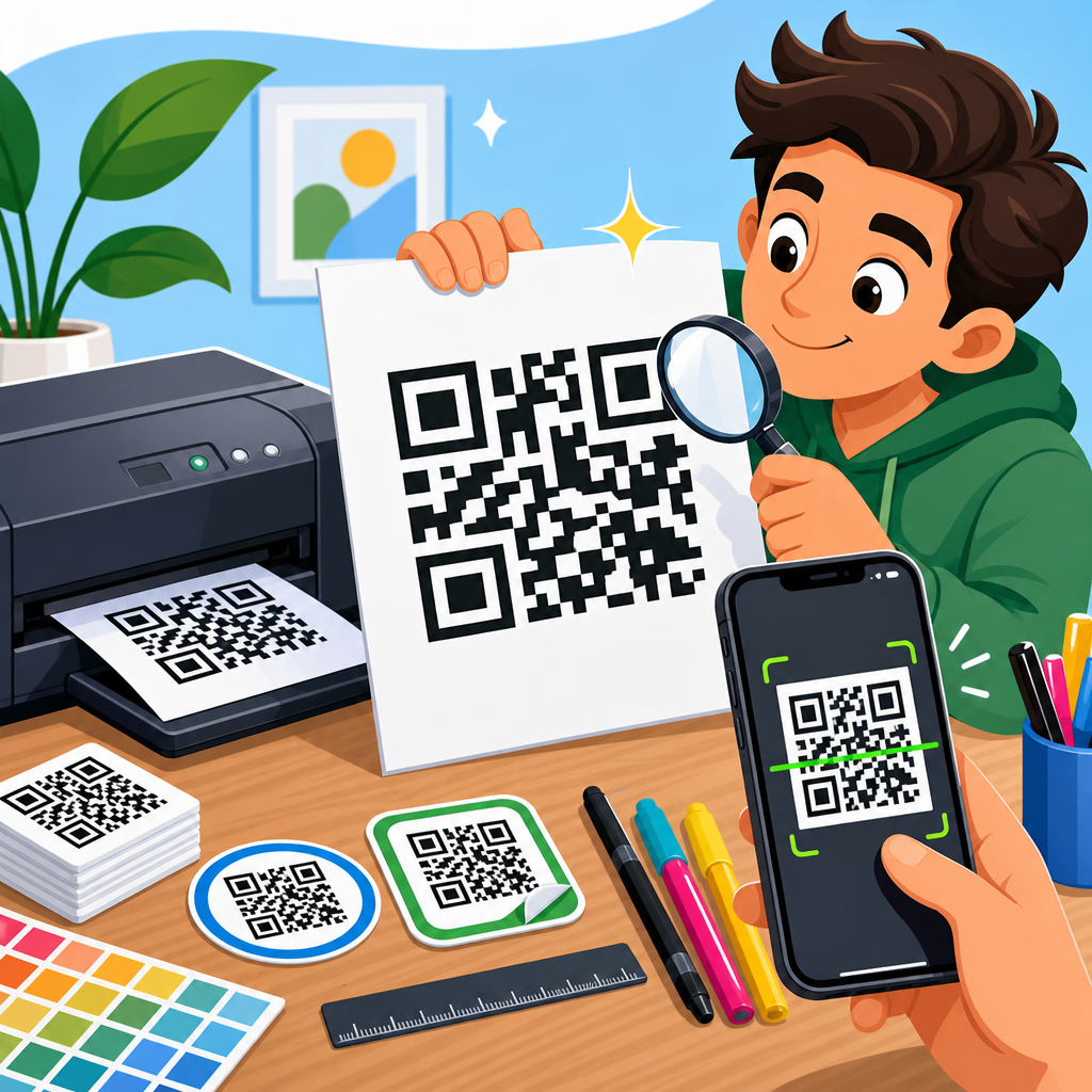
Printing QR codes well is not a cosmetic detail; it determines whether a code scans instantly, fails under poor lighting, survives shipping, or becomes useless the moment it is exposed to rain, abrasion, or low-resolution output. A high-quality QR code is a machine-readable symbol reproduced with enough contrast, edge clarity, quiet space, and physical durability that smartphone cameras and industrial scanners can decode it consistently across real-world conditions. In practice, printing QR codes means matching code design, data density, size, substrate, ink, finish, and placement to the scanning environment. This matters because even a perfectly generated code can become unscannable after bad scaling, glossy lamination, weak adhesive labels, or low-end office printing. I have tested QR codes on packaging, retail displays, menus, warehouse labels, event badges, and outdoor signage, and the pattern is consistent: print decisions affect scan rates more than most teams expect. This hub explains how to print high-quality QR codes, what specifications matter most, which materials and print methods work best, and how to avoid the production mistakes that cause scan failures and costly reprints.
Start With a Print-Ready QR Code File
The best printed result begins before anything reaches a printer. Generate the QR code at the final intended error correction level, data length, and output format. If the code will be printed at multiple sizes, use a vector format such as SVG, EPS, or PDF whenever possible, because vector files scale without introducing blur on module edges. Raster files like PNG can work well, but only when exported at sufficient resolution for the final print size. As a practical baseline, 300 DPI is the minimum for most commercial print work, while small labels and codes carrying dense data often benefit from 600 DPI or higher. Avoid screenshots, JPEG compression, and copied images pulled from presentation slides; all three soften edges and create artifacts that scanners interpret as noise.
Data density matters because denser QR codes contain smaller modules, and smaller modules are less forgiving in print. A short URL usually prints more reliably than a long string of text, serial data, or tracking parameters. When I prepare packaging artwork, I nearly always shorten the destination and keep campaign parameters server-side unless analytics absolutely require them. That simple step can reduce version size, increase module size, and make the printed code more robust. If content may change after print, use a dynamic QR code managed through a redirect platform, but export the graphic as a static print asset once the design is approved. The redirect can change later; the printed symbol should not.
Error correction is another key setting. QR codes support four levels: L, M, Q, and H. Higher levels restore more damaged data, but they also add modules, which can make the code denser. For clean indoor uses such as brochures or posters, level M is often a sensible balance. For labels that may scratch, crease, or get partially obscured, Q or H can be worth the added density if the print size is increased accordingly. There is no universal best setting; the correct choice depends on expected wear and final physical dimensions.
Choose the Right Size, Quiet Zone, and Contrast
If you want a simple rule for QR code printing, prioritize size, quiet zone, and contrast before worrying about styling. The quiet zone is the blank margin around the code, and it is essential because scanners use it to distinguish the symbol from surrounding graphics. The standard recommendation is a quiet zone at least four modules wide on all sides. In production, I prefer more when space allows, especially on busy packaging where nearby text, borders, or brand patterns can interfere with detection. Cutting into the quiet zone is one of the most common causes of avoidable scan problems.
Physical size should be based on scan distance and data density. A widely used field guideline is that the scanning distance should be roughly ten times the code width. A 1-inch code is comfortable at about 10 inches; a 4-inch code can work from several feet away. For close-use applications such as product labels, business cards, or table tents, many codes scan well at 0.8 to 1.2 inches square if the data payload is light and print quality is strong. For storefront windows, transit ads, and trade-show signage, larger is better because users scan from inconsistent angles and distances. If the code contains a long URL, vCard data, or other dense content, increase size beyond those minimums.
Contrast should be high and predictable. Dark modules on a light background remain the safest option, with black on white still the benchmark for maximum reliability. Many branded color combinations can work, but the luminance difference must remain strong enough for cameras to separate foreground from background quickly. Pale gray on pastel, metallic inks, gradients, and transparent backgrounds often underperform, especially in low light. In testing, matte black on uncoated white stock usually outscans decorative treatments because it minimizes glare and preserves crisp edges.
Select Printing Methods and Materials for the Use Case
The right print method depends on volume, substrate, durability needs, and required edge precision. Digital printing is flexible and cost-effective for short runs, variable data, and fast turnaround, which is why it is common for event materials, restaurant menus, inserts, and limited packaging. Offset printing excels in long runs and consistent color control, but the QR code must still be checked in proof because plate gain and paper absorption can subtly affect module edges. Thermal transfer is a strong choice for warehouse, laboratory, and logistics labels because it produces durable marks on synthetic stocks and resists smudging better than direct thermal in harsh environments. Inkjet can work, but low-end devices sometimes bleed on porous papers, shrinking the white channels between modules.
Material choice can help or hurt scan reliability. Paper stock, polypropylene, polyester, vinyl, aluminum plates, corrugated board, fabric tags, and acrylic signage all behave differently under ink, heat, moisture, and wear. On absorbent uncoated paper, small modules may spread slightly; compensate with larger size or careful proofing. On glossy labels, reflections can reduce readability under overhead lighting. For freezer labels, chemical drum labels, or outdoor asset tags, synthetic materials with matched adhesives and protective coatings are usually necessary. I have seen beautifully designed QR codes fail simply because a paper label wicked moisture, curled, and created glare wrinkles across the symbol.
| Use Case | Recommended Material | Preferred Print Method | Key Consideration |
|---|---|---|---|
| Product packaging | Coated paperboard or film label | Offset or digital | Check contrast after varnish or lamination |
| Warehouse labels | Polyester or polypropylene | Thermal transfer | Resist abrasion, moisture, and handling |
| Restaurant menus | Laminated card or rigid sign | Digital | Avoid glare under indoor lighting |
| Outdoor signage | Vinyl, aluminum, or weatherproof composite | UV digital or screen printing | Account for sun fade and scan distance |
| Event badges | Synthetic badge stock | Digital | Maintain readability despite bends and lanyards |
Avoid Finishing and Placement Mistakes
Finishing decisions regularly undermine otherwise solid QR code printing. Gloss lamination, spot UV, foil stamping, embossing, textured varnish, and overaggressive shrink-wrap distortion can all interfere with scans. The issue is not that finishes are always incompatible; it is that they change surface reflectivity and module geometry. If a code must live on premium packaging, keep the symbol itself matte whenever possible, or isolate it in a non-reflective white panel. Foils and metallic backgrounds may look attractive but often produce inconsistent results across different phones. Similarly, curved surfaces such as bottles and cans require extra care because curvature warps the square geometry, especially when the code wraps too far around the container.
Placement matters just as much as print quality. Do not put QR codes across folds, seals, perforations, zippers, can seams, or heavily textured areas. Avoid locations likely to be scuffed during transport or covered by retail shelving hardware. On shipping cartons, keep codes away from tape lines and corners. On posters and displays, position the code where a user can approach it without standing in traffic or casting a shadow over it. On menus and tabletop displays, leave enough margin around the symbol that fingers, condiment bottles, or acrylic holders do not block it. Real-world scanning is messy, and the physical environment should guide placement.
Another frequent problem is visual competition. A QR code printed over photography, gradients, or patterned brand backgrounds may still look high contrast on a monitor but fail in person. Keep the surrounding area visually quiet. If the design system is busy, place the code in a clean box with generous whitespace and a clear call to action. That protects the scanner’s detection process and improves human usability at the same time.
Test for Real Scanning Conditions Before Full Production
Never approve QR code printing from artwork review alone. Test physical proofs under the conditions users will actually face: different phones, older camera hardware, Android and iPhone devices, dim light, glare, motion, and typical scanning distance. I usually build a test matrix with at least one current flagship phone, one mid-range Android device, and one older phone with a weaker camera. If the code is intended for operational use, I also test with dedicated scanners such as Zebra or Honeywell devices because industrial imagers can behave differently from consumer phones. A code that scans on your desk in bright office light may fail on a store shelf, a loading dock, or a rainy outdoor sign.
Proofing should include size variation, substrate variation, and finishing variation. Print the same code at the intended size and one step smaller to see where performance drops off. Compare matte and gloss. If using labels, apply them to the actual product surface and scan after 24 hours, because adhesives, curvature, and condensation can change readability. For outdoor pieces, check scans in direct sun and shade. For retail packaging, test through the expected wrapping film. The goal is not just to prove that the code can scan once; it is to confirm that it scans quickly and repeatedly without user frustration.
Verification tools help standardize this process. Smartphone testing is necessary, but formal barcode verification adds objective measurement. Devices and software built around ISO/IEC 15415 for two-dimensional code print quality can grade symbol contrast, modulation, fixed pattern damage, axial non-uniformity, and grid non-uniformity. Most marketing teams will not buy a verifier, but packaging converters, label printers, and regulated industries often use them. If your QR code supports traceability, healthcare, manufacturing, or compliance workflows, objective verification is worth the investment.
Build a Reliable Workflow for Ongoing QR Code Printing
Consistent results come from process control, not one-off fixes. Create a print specification for every recurring QR code application: file format, size, quiet zone, minimum contrast, approved colors, substrate, finish, placement rules, and testing requirements. Store master assets centrally so teams do not recreate codes in presentation software or resize them manually in office apps. In my experience, production errors often come from version sprawl: one team exports a low-resolution PNG, another crops the margin, and a vendor stretches the image to fit a label. A documented workflow prevents those quiet failures.
This hub connects naturally to adjacent topics within QR Code Design, Printing & Materials. Once printing basics are in place, the next practical questions are usually how large a code should be, which label stock survives certain environments, how matte and gloss finishes compare, what adhesives work on difficult surfaces, and how to design branded codes without sacrificing scan performance. Those deeper articles should support this page, but the core principle remains stable across all of them: the printed QR code is a physical tool, not just a graphic element, so production choices must serve machine readability first.
When teams treat QR code printing as part of quality assurance, scan performance improves immediately. Start with a print-ready file, keep the data lean, preserve the quiet zone, size for real distance, choose materials that match the environment, avoid reflective or distorted finishes, and test physical proofs before scale. High-quality QR codes do not happen by accident; they are specified, printed, and verified with intent. If you are building packaging, signage, labels, or promotional materials, audit your current QR code printing process against these standards and tighten the weakest step first. That single change can prevent failed scans, protect campaign performance, and make every printed code easier to use.
Frequently Asked Questions
What makes a printed QR code high quality?
A high-quality printed QR code is one that scans quickly and reliably in the conditions where people will actually use it. That means the code must have strong contrast, sharp module edges, enough empty space around the symbol, and a physical size that matches the expected scanning distance. In most cases, the safest choice is black on a white or very light background, because scanners depend on clear luminance contrast far more than visual styling. If the dark modules look faded, the light background is tinted, or the edges blur into the surrounding design, scanning performance can drop noticeably.
Print quality also depends on preserving the QR code’s structure. The square modules must remain crisp and evenly formed, without distortion from stretching, compression, low-resolution export, or poor print registration. Just as important is the quiet zone, which is the blank margin around the code. Without enough clear space, scanners may struggle to distinguish the QR code from nearby text, borders, images, or packaging graphics. A code can look acceptable to the human eye and still fail because the scanner cannot isolate it properly.
Durability is another part of quality. A QR code that scans perfectly when first printed but smears, fades, scratches, or wrinkles during shipping or outdoor use is not truly high quality. The right material, ink, coating, and placement matter when the code will be exposed to moisture, abrasion, sunlight, curved surfaces, or repeated handling. In short, a high-quality QR code is not just visually neat; it is machine-readable, print-accurate, and resilient in real-world conditions.
What size should a QR code be for clear and reliable scanning?
There is no single universal size, because the ideal dimensions depend on scanning distance, data density, print surface, and the environment where the code will be used. As a practical starting point, many printed QR codes perform well at around 2 x 2 cm or larger for close-range smartphone scanning, such as on product inserts, menus, labels, or business cards. However, if the code contains more data, uses a higher version, or may be scanned under imperfect lighting or while the user is moving, increasing the size improves reliability.
A common rule of thumb is that the scanning distance should be roughly ten times the width of the QR code. For example, a 2.5 cm code is generally suited to scanning from about 25 cm away. If the code will be placed on posters, store windows, warehouse signage, or shipping cartons that users scan from farther back, the printed size should increase accordingly. Small codes with dense patterns are especially risky because the printer may not reproduce the tiny modules cleanly enough for consistent decoding.
It is also important to think beyond the code area itself and preserve the quiet zone around it. Making the symbol larger but crowding it with nearby graphics can still create problems. The most reliable approach is to test the final printed size on the actual material, with the actual printer, from the intended scanning distance, using multiple phones or scanners. In QR printing, “large enough” is not just about fitting the design; it is about giving the camera enough clean, high-contrast detail to decode instantly.
Why do resolution, file format, and printer settings matter when printing QR codes?
Resolution and file format directly affect edge clarity, which is critical for machine reading. QR codes are built from precise square modules, and when those modules are exported at low resolution, they can become soft, jagged, or uneven. That may not seem severe on a screen, but once printed, especially at small sizes, the code can lose the clean geometry scanners rely on. Vector formats such as SVG, EPS, or PDF are usually best because they preserve sharp edges at any size without pixelation. If you must use a raster file, it should be exported at sufficiently high resolution for the final print dimensions.
Printer settings matter because even a perfect source file can be degraded during output. Low-quality print modes may introduce ink spread, weak contrast, banding, or fuzzy edges. On some devices, automatic scaling or compression can subtly distort the code. Thermal printers, office printers, and commercial presses each behave differently, so settings should be selected with clarity and consistency in mind rather than speed or ink savings alone. If the code is small, fine output settings become even more important because tiny defects have a larger impact on readability.
The safest workflow is to generate the QR code in a high-quality source format, place it without stretching or warping, export the artwork using print-appropriate settings, and print a physical proof before full production. Avoid screenshots, copy-pasting from low-resolution previews, or re-saving the code multiple times in compressed formats. A QR code is a functional symbol, not just an image asset, so production choices that might be acceptable for decorative graphics can easily compromise scan performance.
How can I make sure a printed QR code scans well in real-world conditions?
Real-world scanning depends on more than the code itself. Lighting, glare, surface texture, curvature, motion, distance, camera quality, and even dirt or wear can influence results. To improve performance, start with high contrast and a matte or low-glare finish whenever possible. Glossy lamination, reflective packaging, metallic substrates, and transparent materials can introduce glare or reduce contrast, making it harder for smartphone cameras to capture the pattern. If the code must be printed on a challenging surface, increase its size and test under the actual lighting conditions users will encounter.
Placement is just as important. Avoid folds, seams, bottle shoulders, corners, and areas likely to wrinkle or scuff. Keep the code away from busy graphics and from places where it might be obscured by tape, labels, shrink wrap, or handling damage. For shipping or industrial applications, choose locations that remain flat and visible throughout transport and storage. If the code may be scanned quickly in a workflow environment, make it larger than the theoretical minimum and prioritize simplicity over aesthetic customization.
The best way to ensure reliability is structured testing. Print samples using the exact substrate, printer, and finishing process planned for production. Test with both iPhone and Android devices, under bright light, low light, and angled viewing conditions. If relevant, also test with dedicated handheld scanners. Try scanning at the intended distance and after rubbing, bending, or exposing the sample to moisture if the use case demands it. A QR code is only proven high quality when it works consistently outside the design file and in the conditions of actual use.
Can design customization, colors, or logos reduce QR code print quality?
Yes, customization can reduce scanning reliability if it interferes with contrast, module shape, finder patterns, or the quiet zone. Many branded QR codes look attractive on screen but become much less dependable once printed, especially at small sizes or on textured materials. The more you depart from a standard dark-on-light square pattern, the more carefully you need to test. Light colors, gradients, patterned backgrounds, soft edges, and heavily stylized modules can all make the code harder for cameras and scanners to interpret.
Logos placed in the center of a QR code can work, but only within limits. QR codes include error correction, which allows some damage or obstruction, but that does not mean the symbol can be freely redesigned. If a logo covers too much of the data area, if the code is already dense, or if the printed output is not crisp, scan performance may suffer sharply. Likewise, altering the finder patterns in the corners or removing the required blank margin around the code often causes avoidable failures. Good branding supports function rather than competing with it.
If customization is important, keep the fundamentals intact: use strong contrast, preserve the quiet zone, avoid excessive visual effects, and print the code larger than you otherwise would. Test the final printed version, not just the digital mockup. A customized QR code can still be high quality, but only when visual branding is balanced with technical readability. In most practical applications, especially packaging, logistics, and marketing materials used in varied environments, scan reliability should always take priority over decoration.


