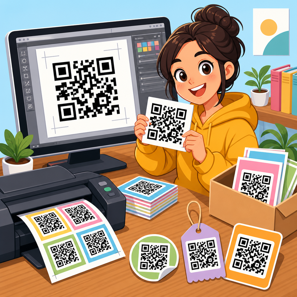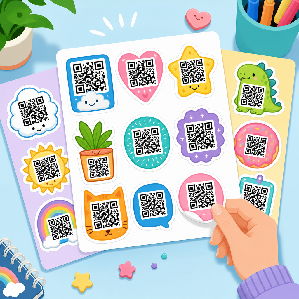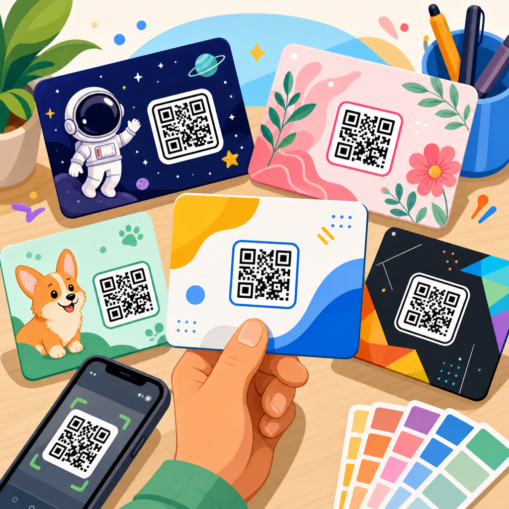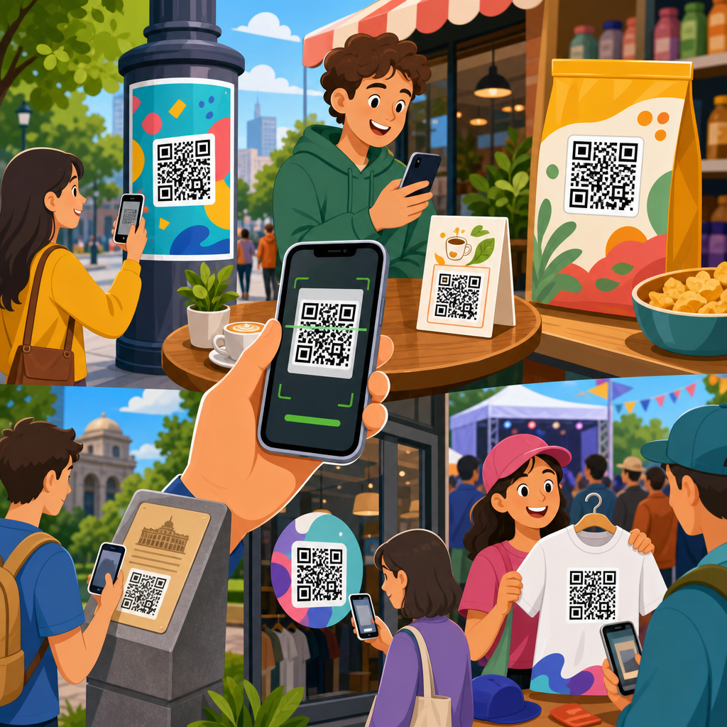
Real-world QR code campaign examples show how a simple square pattern can bridge print and digital, turn passive attention into measurable action, and make offline marketing far easier to track. In this context, QR code design examples are not just about colors or logos. They include the full user journey: where the code appears, what promise surrounds it, what destination opens after the scan, and how the result is measured. I have worked on QR code rollouts for retail promotions, event check-ins, restaurant ordering, and packaging campaigns, and the strongest lesson is consistent: a QR code performs well only when design, placement, and intent align. That is why this topic matters for brands building practical campaign assets under a broader QR Code Resources, Templates & Tools strategy. Good examples help teams move beyond novelty and toward repeatable execution. They also reduce common failures such as low contrast, weak calls to action, generic landing pages, and codes printed too small to scan reliably. For marketers, designers, operations teams, and local businesses, studying successful QR code campaign examples provides a shortcut to better conversion rates, stronger attribution, and smoother customer experiences across physical and digital touchpoints.
What strong QR code design examples have in common
The best QR code design examples share several nonnegotiable traits. First, the code remains scannable under real conditions. That means sufficient contrast, adequate quiet zone, and print dimensions that match viewing distance. A practical rule many teams use is at least 1 inch by 1 inch for close-range scanning, then scaling up for posters, storefront glass, and outdoor media. Second, the surrounding message tells users exactly what they get after scanning. “Scan to see the menu” converts better than “Scan me” because it reduces uncertainty. Third, the destination page is mobile-first, fast, and aligned with the campaign promise. If the sign offers a coupon, the scan should lead directly to that coupon rather than to a homepage. Fourth, the campaign uses trackable links, often through dynamic QR codes, UTM parameters, and analytics platforms such as Google Analytics 4 or Adobe Analytics. Finally, good examples reflect brand consistency without compromising readability. Logos, frames, and colors can improve recognition, but they must respect error correction limits and scanner behavior across different devices.
Retail promotion examples that connect store traffic to digital conversion
Retail is one of the clearest settings for real-world QR code campaign examples because the customer is already in a decision environment. One common design example is shelf talkers that link to product comparisons, reviews, or ingredient details. I have seen this work especially well for electronics, beauty, and specialty food, where customers want reassurance before buying. The strongest executions place the code beside a short benefit statement, such as “Scan for customer reviews and setup tips.” That removes friction and gives shoppers a reason to pause. Another retail model uses window signage after hours. A clothing boutique can place a large QR code on the storefront with the line “Shop best sellers now” and route scans to a mobile collection page. This turns closed-store foot traffic into ecommerce visits. Dynamic codes are useful here because the destination can change by season, inventory level, or promotion without reprinting signage.
Packaging inserts also provide reliable QR code design examples. A cosmetics brand might print a code inside the box that opens application tutorials, shade guides, or replenishment offers. The scan happens after purchase, which means the brand can use the interaction to reduce returns and increase repeat orders. Consumer packaged goods companies use similar tactics for recipes, sourcing stories, and loyalty enrollment. These campaigns succeed when the code is integrated into the product narrative rather than treated as decoration. On-pack placement, durable printing, and a short URL fallback all improve usability. In retail, the most effective metric is not scans alone. Teams should connect scans to add-to-cart rate, coupon redemption, store visit uplift, and repeat purchase behavior. That is how QR campaigns move from interesting experiments to accountable revenue channels.
Restaurant and hospitality examples focused on speed and convenience
Restaurants normalized QR codes for many consumers, but the best restaurant examples go well beyond replacing paper menus. A well-designed tabletop code can route to menus, allergen information, upsell modules, and mobile payment in one streamlined path. During deployments I have managed, scan volume increased noticeably when each table displayed a clear benefit statement such as “View menu and pay from your phone,” rather than a plain code without context. Hotels use similar patterns in rooms and lobbies. A bedside card can open room service, spa booking, or Wi-Fi access instructions. A lobby sign can route guests to local guides, digital concierge support, or event schedules. The design principle is the same: one context, one promised action, one mobile-ready destination.
Hospitality campaigns also show why placement matters as much as graphic treatment. Glossy surfaces, low light, table clutter, and curved objects can all hurt scan performance. That is why matte finishes, stable mounting, and high contrast are standard best practices. In quick-service restaurants, drive-through posters often use short-range assumptions that fail in cars. A code visible from several feet away must be significantly larger, and the landing page must load quickly on mobile networks. Payment-linked QR codes require extra care around trust signals. The customer should see the restaurant name, secure checkout indicators, and a straightforward order summary immediately after scanning. When these details are handled properly, QR campaigns can shorten queues, improve order accuracy, and increase average order value through contextual upsells.
Event, venue, and ticketing examples built for crowd flow
Events provide some of the most practical QR code campaign examples because success is easy to observe. If guests move smoothly from entrance to session room, the design worked. If lines form and staff must intervene, something failed. Ticketing QR codes often sit inside confirmation emails, mobile wallets, and printable passes, but event marketing also uses promotional codes on posters, social graphics, direct mail, and partner booths. A conference organizer might place a code on city signage that opens registration, speaker highlights, and venue directions. A trade show exhibitor can print a code on booth panels that routes to a lead capture form, product demo calendar, or downloadable spec sheet. The best design examples distinguish attendee intent. A registration code should not lead to a generic site navigation page; it should open the exact next step.
Wayfinding is another strong use case. Stadiums, museums, and festivals can place QR codes at entry points, maps, and exhibits. At museums, codes often unlock audio guides, multilingual descriptions, or accessibility options. At festivals, they can link to live schedules, weather alerts, or merch offers. In all of these cases, the visual system around the code matters. Use concise labels, recognizable icons, and enough white space that users can identify the code quickly even in crowded environments. Error correction is especially useful when codes may be partially obscured or worn, but over-stylizing can still create scan issues. Operationally, event teams should test across iPhone and Android devices, bright sun and indoor lighting, and both native camera apps and common third-party scanners. Reliable scanning under pressure is the true benchmark.
Packaging and product education examples that extend the shelf experience
Packaging is where QR code design examples become long-term brand assets. Once printed, the code may remain in homes for weeks or months, so the destination should be maintainable. A coffee roaster can link bags to brew guides, origin stories, and subscription offers. A furniture brand can route customers from assembly instructions to video walkthroughs and spare-part requests. A pharmaceutical or supplement package can provide detailed usage guidance, though regulated categories must align carefully with labeling rules and claims standards. The key design decision is whether the code serves pre-purchase research, post-purchase support, or both. Trying to satisfy every audience with one destination usually weakens performance.
Brands that do this well use dynamic QR infrastructure so the code remains useful even when campaigns change. Seasonal recipes can replace evergreen content, discontinued products can redirect to support pages, and regional packaging can open language-specific destinations. This flexibility is one reason GS1 has pushed wider discussion around next-generation barcode use cases in retail, especially for richer product data and traceability. While implementation varies, the strategic lesson is clear: packaging QR codes work best when they unlock information that would be impossible or inefficient to fit on the label alone. That makes the scan genuinely valuable, not just decorative.
| Campaign type | Best placement | Primary user intent | Recommended destination | Key metric |
|---|---|---|---|---|
| Retail shelf signage | Shelf edge or product display | Validate purchase | Reviews, comparisons, FAQs | Assisted conversion rate |
| Restaurant tabletop | Table tent or menu holder | Order faster | Menu, ordering, payment | Average order value |
| Event poster | Entrance, transit hub, booth wall | Register or learn schedule | Registration or agenda page | Completed registrations |
| Product packaging | Back panel or inside insert | Use product correctly | Tutorials, setup, support | Repeat purchase rate |
| Direct mail | Near headline and offer | Claim incentive | Personalized landing page | Redemption rate |
Direct mail, print, and out-of-home examples that revive offline media
Some of the most convincing real-world QR code campaign examples come from channels once considered difficult to measure. Direct mail is a strong case. A postcard with a personalized QR code can open a prefilled landing page, making it easier to book an appointment, redeem an offer, or view a local inventory page. Because the scan is tied to a mail segment, teams can compare response by region, audience, and creative version. Print ads in magazines can do something similar when the code unlocks a richer asset such as a calculator, product configurator, or video demo. The best print executions do not ask users to scan for information they could already infer from the ad. They offer something additive and immediate.
Out-of-home placements require stricter design discipline. Transit posters, billboards, and street furniture face distance, motion, glare, and limited dwell time. A QR code on a highway billboard is rarely practical, but a code in a subway platform, bus shelter, or elevator can perform very well because people are stationary. In those environments, larger modules, minimal styling, and simple offers consistently outperform visually busy designs. One campaign I reviewed for a local fitness chain used station posters with “Scan for a free 3-day pass” and a location-aware landing page. The conversion lift came not from the code itself but from relevance: nearby branch details appeared instantly, reducing the effort required to act. That is the pattern to replicate in print and outdoor media.
How to evaluate QR code campaign examples before launching your own
Studying QR code design examples is useful only if you can judge why one campaign worked and another failed. Start with four questions. What specific action does the scan ask the user to take? Is the value proposition visible before scanning? Will the destination load quickly and match the promise exactly? Can the team track outcomes beyond scan count? From there, review execution details. The code should have strong contrast, enough surrounding quiet space, and a tested size for the viewing environment. The destination should be mobile optimized, accessible, and free of unnecessary pop-ups. If authentication, payment, or form completion is involved, trust cues must appear immediately. Branded frames and custom colors are acceptable only after scannability is confirmed across devices.
It also helps to separate campaign goals by funnel stage. Awareness campaigns may optimize for scan-through rate. Consideration campaigns should emphasize content engagement, product detail views, or store locator usage. Conversion campaigns should track purchases, bookings, or redemptions. Retention campaigns should focus on support completion, subscription enrollment, or repeat purchase. This framework keeps teams from misreading results. A high-scan event poster that produces few registrations may have a landing-page problem, not a code problem. A low-scan package insert may simply be buried in the unboxing flow. The strongest QR programs use ongoing testing: alternate calls to action, different placements, shorter forms, and revised destinations. Over time, these improvements turn isolated QR code examples into a scalable operating playbook.
Real-world QR code campaign examples matter because they turn abstract design advice into practical decisions teams can apply immediately. Across retail, restaurants, events, packaging, direct mail, and out-of-home media, the pattern is consistent: successful QR codes are easy to scan, paired with a clear benefit, connected to a mobile-first destination, and measured against a business outcome that matters. Good QR code design examples are therefore not just visual inspiration. They are conversion systems shaped by context, user intent, and operational discipline. If you are building a hub within QR Code Resources, Templates & Tools, this is the standard to use when evaluating every supporting article, template, and asset.
The biggest advantage of learning from these examples is speed. You do not need to guess whether a code belongs on a shelf tag, package insert, event sign, or direct mail piece. You can map the use case, define the promised action, and design the destination accordingly. Keep the code readable, the message specific, the landing page focused, and the analytics connected. Then test in the real environment before full rollout. Use these examples as a benchmark, apply the same principles to your own campaigns, and start building QR experiences that are measurably useful for both customers and your business today.
Frequently Asked Questions
What makes a real-world QR code campaign successful instead of just visually interesting?
A successful QR code campaign does much more than place a branded code on a poster, package, sign, or event handout. In real-world use, the best campaigns connect four pieces clearly: placement, message, destination, and measurement. The placement has to match a moment when the audience is ready to act, such as while browsing a store shelf, waiting at an event booth, opening direct mail, or reading product packaging at home. The surrounding message must tell people exactly why they should scan, whether that means unlocking a discount, viewing a product demo, checking in, joining a giveaway, or getting exclusive content. Without that prompt, even a beautifully designed code can be ignored.
The destination matters just as much. If someone scans a code and lands on a generic homepage, the campaign usually loses momentum. Strong examples send users to a page built specifically for that audience and context. A retail promotion might open a product-specific landing page with a limited-time offer. An event QR code might go directly to registration, agenda details, speaker bios, or lead capture. A restaurant table tent might open a digital menu, loyalty sign-up, or reorder flow. The experience should feel immediate and relevant, not like the user has to hunt for the promised value.
Measurement is what turns a QR code from a novelty into a serious marketing tool. Effective campaigns use trackable URLs, analytics tagging, scan time reporting, conversion tracking, and sometimes location-based comparisons across placements. That makes it possible to see which poster, store, package, or booth generated the most engagement and what happened after the scan. In practice, the strongest real-world QR code campaign examples are not the ones with the most elaborate styling. They are the ones where the scan feels natural, the value is obvious, the landing experience is frictionless, and the results are measurable from first scan to final action.
Where do real-world QR code campaigns perform best in offline marketing?
QR code campaigns perform best anywhere offline attention can be turned into immediate digital action. Retail is one of the clearest examples. Codes on shelf talkers, endcaps, product packaging, window displays, and receipts can move customers from browsing to researching or buying. A shopper scanning a code in-store might watch a short product comparison video, claim a coupon, read reviews, or join a loyalty program. Because the action happens in the moment of interest, the scan often captures stronger intent than a later search would.
Events are another high-performing environment. QR codes can simplify attendee check-in, session sign-ups, exhibitor lead capture, contest participation, digital brochures, and post-event follow-up. At conferences and trade shows especially, they reduce friction for both organizers and visitors. Instead of asking attendees to type a long URL or manually exchange details, a scan can instantly connect them to the exact next step. This is one reason event campaigns are among the most practical and measurable QR code design examples in the real world.
Direct mail, out-of-home advertising, packaging, hospitality, and local service businesses also see strong results when the offer is clear and the destination is tailored. A postcard can link to a neighborhood-specific landing page. A billboard can drive people to a short mobile experience with a memorable incentive. Product packaging can support onboarding, warranties, tutorials, referrals, or replenishment. Restaurants, clinics, gyms, and real estate teams can use QR codes to streamline bookings, forms, menus, tours, and follow-up content. The common thread across these successful placements is timing. The code appears at a moment when scanning is easier than delaying, and the user gains something useful right away.
How should businesses design the user journey around a QR code, not just the code itself?
The most effective businesses treat the QR code as the entry point to a complete user journey rather than a standalone graphic. That journey starts before the scan. People need context, confidence, and a reason to act. The call to action should answer a simple question: “What do I get if I scan this right now?” Phrases like “Scan to see the demo,” “Scan for 15% off today,” “Scan to check in,” or “Scan to view available units” remove uncertainty. If the code appears in a public place, visual hierarchy also matters. The QR code should be large enough to scan easily, have sufficient contrast, and sit near concise copy that explains the benefit.
After the scan, the destination should reflect the promise with as little friction as possible. If the campaign offers a discount, the landing page should present the discount immediately, not bury it below generic navigation. If the code is used at an event, the mobile page should load quickly and make check-in or registration obvious. If it supports lead generation, the form should be short and reasonable for a phone user. One of the most common reasons QR campaigns underperform is that the post-scan experience asks too much from the user too soon.
Finally, the journey should include a measurable outcome and ideally a follow-up step. That might be a purchase, a form submission, a booked appointment, a saved offer, a loyalty sign-up, or a content view tied to remarketing. In strong real-world campaigns, each step is intentional. The code is visible and trustworthy, the message is specific, the landing page is optimized for mobile, and the next action is clearly defined. This full-funnel thinking is what separates basic QR code usage from campaigns that consistently produce trackable business results.
What are some common mistakes seen in QR code campaign examples, and how can they be avoided?
One of the biggest mistakes is sending every scan to the homepage. This breaks user momentum because it forces people to search for the offer or information they expected. A QR code should lead to a dedicated destination aligned with the context in which it appears. Another common mistake is using weak or vague copy around the code. If people do not know what they will get, many will not bother scanning. “Scan me” is far less effective than “Scan to get today’s coupon,” “Scan to view the menu,” or “Scan to reserve your seat.”
Poor physical execution is another frequent issue. Codes placed too high, too low, too far away, or on reflective, curved, or low-contrast surfaces can reduce scan rates significantly. In real-world environments, practical testing matters more than mockup aesthetics. A code may look fine in a design file but fail on a glossy window, a moving vehicle, or a dimly lit event hall. Size, contrast, quiet space around the code, and actual user scanning distance all affect performance. Businesses should test under real conditions before full rollout.
A third major problem is failing to measure what happens after the scan. Without campaign tagging, conversion tracking, and placement-level comparison, teams can see activity but not outcomes. That makes it difficult to improve results or justify future investment. Other avoidable mistakes include linking to pages that are not mobile-friendly, asking for too much information too early, using static codes when campaign flexibility is needed, and not planning for long-term maintenance of the destination link. The best way to avoid these issues is to approach the campaign as an end-to-end experience: define the goal, build a mobile-first destination, use clear calls to action, test the code in the real environment, and track results at every stage.
How can businesses measure the results of real-world QR code campaigns accurately?
Accurate measurement starts with clear campaign goals. A business should decide whether the QR code is meant to drive sales, lead capture, event check-ins, app downloads, video views, coupon redemptions, store visits, or customer support actions. Once that goal is defined, the destination link can be structured for tracking. This usually includes campaign parameters, platform analytics, unique URLs by placement, and event tracking for key actions after the scan. For example, a retailer might create separate QR destinations for in-store signage, packaging inserts, and window posters so scan and conversion performance can be compared directly.
Dynamic QR codes are especially useful because they allow destination changes and often provide centralized reporting. That makes it easier to monitor scan volume, device type, time of day, and location patterns without reprinting every asset. From there, businesses should connect scan data to meaningful downstream behavior. A scan alone is helpful, but a scan that leads to a product purchase, completed form, redeemed offer, or scheduled demo is far more valuable. In mature campaigns, analytics tools, CRM systems, e-commerce reporting, and event platforms can all work together to show not only how many people scanned, but what business outcome followed.
It is also important to evaluate performance by context, not just totals. A code on event signage may have a lower number of scans than one on packaging, but produce much higher-value leads. A direct mail QR code may drive fewer visits than a store display, but convert better because the audience is more qualified. Reviewing scan rate, landing page engagement, conversion rate, cost per result, and placement-specific performance gives a much more accurate picture than raw scan counts alone. The strongest real-world QR code campaign examples use this data to keep refining placement, messaging, incentives, and landing pages over time, turning offline media into a measurable and improvable acquisition channel.