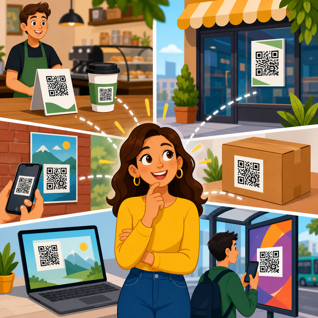
Where you place a QR code has more impact on scan rate than most teams realize, because placement determines whether people notice it, trust it, reach it comfortably, and have enough time and distance to scan. QR code placement refers to the physical or on-screen location of the code relative to the viewer, surrounding design elements, lighting, motion, and the action you want the user to take. In practice, I have seen beautifully designed codes underperform simply because they were mounted too high on a retail sign, buried in the bottom corner of packaging, or shown too briefly in a video ad. If your goal is maximum scans, placement is not a finishing detail. It is a performance variable.
This matters across every channel. On packaging, the wrong placement can reduce repeat purchases because customers cannot quickly access instructions, warranty registration, or promotions. In stores, placement affects whether a shopper scans before moving on to the next shelf. On posters and transit ads, the code must be visible from the natural stopping position, not from a theoretical viewing angle. On digital screens, placement must account for glare, cropping, and the short window users have to react. Good QR code placement aligns four factors at once: visibility, accessibility, context, and intent. Visibility means the code is easy to spot. Accessibility means people can physically and comfortably scan it. Context means the code appears where the next step makes sense. Intent means the placement supports a clear reason to scan.
Maximum scans happen when placement removes friction. The best placements sit where attention already goes, where the phone can be held steady, and where the user understands what happens next. A restaurant table tent, for example, works because diners are seated, have time, and can bring a phone close. A billboard on a high-speed roadway usually fails because drivers cannot safely scan, no matter how large the code is. This hub article explains how to choose QR code placement for packaging, print, signage, stores, events, vehicles, and screens. It also covers common mistakes, practical standards, and how to test placement decisions so the code performs reliably in the real world.
Start with scanning behavior, not design preference
The first rule of QR code placement is simple: place the code where scanning is natural for the user, not where it looks balanced to the designer. People scan when three conditions are met at the same time. They can see the code without effort, they can hold a phone at an appropriate angle and distance, and they understand the benefit of scanning. In field audits I have run for retail displays and event signage, the highest scan rates almost always came from placements at chest to waist height, near the primary message, with enough quiet space around the code to separate it from surrounding graphics. Those placements worked because they matched how people stand, look, and move.
Distance and dwell time are the most overlooked variables. A customer standing in front of a shelf has only a few seconds to decide whether to scan. A commuter passing a poster may have even less. That means placement must support fast recognition. If the code is hidden near legal text, placed on a fold, or interrupted by shadows and reflections, scan intent collapses. ISO/IEC 18004 defines the underlying QR code specification, but real-world performance depends on environmental conditions. Placement should therefore be planned alongside size, contrast, printing method, and call to action. A technically valid code can still be practically unscannable if it is placed in the wrong spot.
Trust also influences behavior. Users are more likely to scan when the code appears integrated into the experience rather than tacked on as an afterthought. A code beside product setup instructions feels useful. A code floating alone in the corner of a poster feels ambiguous. The strongest placements answer immediate user questions: What is this for? Why should I scan now? What do I get? On a package, that could mean placing the code near assembly guidance. On a storefront window, it could mean placing it beside store hours, menu access, or appointment booking. Placement works best when it supports user intent at the exact decision point.
Best QR code placement on packaging and printed materials
Packaging is one of the highest-value placements because the product is physically in the user’s hands. That creates ideal scan conditions, but only if the code is positioned on a flat, visible, easy-to-reach surface. For boxes, the best location is usually the back or side panel in the upper-middle area, away from seams, folds, and curved edges. For labels, place the code where fingers are unlikely to cover it during handling. On bottles and jars, avoid strong curvature because phone cameras struggle when modules distort around a rounded surface. If you must place a code on a curved package, increase size and test on actual production samples rather than proofs.
Printed marketing materials require placement based on reading flow. On flyers, brochures, and direct mail, the code should sit close to the primary offer or next step, not isolated at the bottom with contact details. Western reading patterns generally move left to right and top to bottom, so a code placed after the value proposition often performs better than one placed before it. For menus, catalogs, and manuals, repeat placement can outperform a single code if the document is long; users should not need to hunt for the scan point. In magazines and newspapers, gutter placement is risky because folds distort the pattern and shadows form during handling.
Material choice matters. Gloss lamination can create glare that reduces readability under retail lighting. Textured papers can break edge definition, especially for smaller codes. Metallic inks and transparent substrates introduce contrast problems. In production reviews, I treat placement and material as inseparable decisions. A code printed on matte stock at eye-friendly height near the relevant content will usually outperform a technically identical code printed on reflective stock in a corner. This is why packaging teams should review mockups in the actual use environment, including store shelves, kitchens, warehouses, or outdoor conditions, before final approval.
Where to place QR codes on posters, signs, displays, and in-store media
For posters and signs, maximum scans come from placements that match the average viewing position and the amount of time a person has to stop. Eye-level is a useful starting point, but not a universal rule. In stores, codes often perform better between roughly 90 and 140 centimeters from the floor because shoppers can scan comfortably while standing and holding a basket or bag. On trade show booths, codes near product demos or sample stations consistently beat codes mounted high on back walls. People scan where they pause, not where the brand mark looks most dramatic.
Context inside the environment changes placement choices. A window sign should place the QR code where reflections are minimal and where a person on the sidewalk can stand without blocking a doorway. A tabletop display should position the code on the front-facing panel, angled slightly upward if possible, so seated or standing users do not need to bend awkwardly. Endcaps and shelf talkers work best when the code is adjacent to the product claim that creates curiosity, such as ingredients, reviews, comparison charts, or loyalty rewards. If the code triggers a coupon, it should be reachable before checkout, not after the payment path has already started.
| Placement scenario | Recommended position | Why it works | Main risk to avoid |
|---|---|---|---|
| Retail shelf talker | Front-facing at hand-to-chest height beside product benefit | High visibility during product comparison | Placing below shelf lip where shadows hide the code |
| Poster in lobby | Center-lower area reachable from standing distance | Allows comfortable phone framing without stretching | Mounting too high for short users or wheelchair users |
| Product box | Flat side or back panel away from fold and seam | Stable surface improves scan reliability | Printing across corners or curved edges |
| Restaurant table tent | Front panel facing seated diner near ordering prompt | Long dwell time and easy phone access | Using glossy finish under overhead spotlights |
| Presentation slide | Large code in outer third with extended display time | Audience can see it and react before slide changes | Showing the code only briefly or near cropped margins |
Accessibility should be explicit in placement planning. If a code is mounted too high, too low, behind glass, or in a crowded corridor, a meaningful portion of your audience will not be able to scan it comfortably. Good placement supports different heights, mobility needs, and lighting conditions. That is not only good practice; it improves total scan volume. The easier the physical interaction, the broader the reachable audience.
Digital screen placement, motion environments, and timing
QR codes on screens behave differently from printed codes because the display itself introduces refresh rates, glare, compression artifacts, and framing constraints. For websites, landing pages, and kiosk screens, the code should not sit at the edge where browser chrome, app overlays, or responsive cropping may obscure it. Leave generous margins. If a code appears in a video, webinar, or presentation, it must stay on screen long enough for the viewer to notice it, open the camera, frame the shot, and confirm the prompt. In most live settings, a few seconds is not enough. Ten to fifteen seconds is a more practical minimum, and longer is often better when the audience is distant.
Screen brightness and contrast affect placement decisions. A code shown on a bright display in direct sunlight may wash out unless placed in a darker, stable region of the layout with strong contrast around it. On television or digital out-of-home screens, avoid rapid animation near the code because motion competes with the scanning task. If the code is in a carousel slide or social video, give it a dedicated frame or a static end card. I have seen campaigns improve scan-through significantly simply by moving the code from a crowded lower corner to a clean side panel on the final frame and keeping it visible for longer.
Distance matters even more on screens viewed from across a room. A conference slide may look clear on a laptop but fail from the back row. Place the code in a large, uncropped area, away from projectors’ dim edges and keystone distortion. For livestreams, avoid placing the code where platform overlays, captions, or player controls can cover it on mobile devices. Testing should include the actual distribution platform, because social apps and streaming tools often alter framing. Good digital placement accounts for the entire display chain, not just the original file.
Placement mistakes that reduce scans and how to test for performance
The most common QR code placement mistake is choosing a location for aesthetic symmetry rather than usability. Other frequent errors include placing codes on reflective materials, around package curves, behind glass, near busy patterns, too close to edges, or in areas blocked by fixtures and hands. Another major mistake is using unsafe environments. A code on a highway billboard may create awareness, but it is a poor direct-scan placement because viewers cannot safely complete the action. Likewise, a code on a moving bus is usually inferior to one at a sheltered stop where people can stand still and scan.
Testing placement should be structured, not informal. Print prototypes at production size, place them in the real environment, and test with multiple phones, including older devices and both major operating systems. Check scan performance in daylight, shade, and artificial light. Measure not only whether the code technically scans, but whether users notice it quickly and understand the purpose without explanation. In-store, observe approach paths and stopping points. On packaging, watch how people naturally hold the item. On screens, test from realistic viewing distances and with actual app overlays. If possible, run A/B tests using different placement variants tied to separate tracking URLs or campaign parameters.
Analytics should inform placement decisions over time. Scan count alone is useful, but scan rate relative to impressions or footfall is better. Pair location data with downstream metrics such as landing-page engagement, coupon redemption, registrations, or purchases. A code placed on the front of a package may get more scans, while a code near setup instructions may produce higher-quality visits because the user intent is stronger. Maximum scans are important, but the best placement often balances scan volume with conversion quality. The right next step is to audit every current QR code touchpoint, move each code closer to the user’s natural decision moment, and validate the change with real-world testing.
The strongest answer to where you should place a QR code for maximum scans is this: put it where people already look, where they can safely stop, and where scanning clearly helps them complete the next task. On packaging, that usually means a flat, visible panel away from folds and glare. On posters and signs, it means a comfortable standing height near the key message. In stores and events, it means the point of pause, not the point of decoration. On screens, it means a large, stable area with enough time to react. Every high-performing placement shares the same principle: reduce friction between interest and action.
Placement is also the organizing idea for the wider QR code design, printing, and materials workflow. Size, contrast, paper stock, lamination, substrate, lighting, and call to action all matter, but placement determines whether those strengths can actually be used by the viewer. That is why this topic works as a hub. Once you understand placement, you can make better decisions about print finishes, adhesive labels, packaging panels, sign mounting, screen layouts, and scan tracking. In my experience, teams that treat placement as a strategic choice rather than a final layout tweak see the fastest gains because they solve the biggest source of avoidable friction.
If you are improving an existing campaign or planning a new one, start with a simple review: where does the user stand, what do they see first, how long do they have, and what happens immediately after the scan? Answer those questions for every touchpoint before approving production. Then test in the real environment, not just on a monitor or proof sheet. Small placement changes can produce large scan gains. Make placement intentional, and your QR codes will work harder everywhere they appear.
Frequently Asked Questions
Where should you place a QR code to get the highest scan rate?
The best place for a QR code is wherever people can notice it quickly, understand why they should scan it, and access it without physical or visual friction. In practical terms, that usually means placing the code at eye level or slightly below, in a well-lit area, with enough open space around it so it does not compete with dense text, busy graphics, or other calls to action. A QR code performs best when it appears exactly where a person is already focused and has a natural pause point, such as on product packaging near key benefits, on in-store signage near a decision point, on a poster in a waiting area, or on a checkout screen after a transaction prompt.
Placement also needs to match the user’s context. If someone is walking past a sign, they need enough time and distance to notice the code, take out their phone, open the camera, and scan without feeling rushed. If someone is seated and reading printed material, the code can be placed closer to supporting copy because they have more time to engage. The highest scan rates usually come from placements that feel intentional and convenient rather than decorative. In other words, do not just add a QR code wherever there is empty space. Put it where the viewer has the clearest line of sight, a reason to act, and enough physical comfort to complete the scan.
How high or low should a QR code be placed for comfortable scanning?
A QR code should generally be placed within a natural viewing and reaching zone, which for most adult audiences means around chest to eye level. If the code is mounted too high, people may notice it but struggle to hold their phone at the correct angle, especially in crowded environments or under bright overhead light. If it is too low, many people will simply ignore it because bending down feels awkward, inconvenient, or inaccessible. Comfortable scanning matters more than many teams expect, because even a small amount of physical friction can sharply reduce scan volume.
The right height also depends on the environment and audience. In retail stores, trade show booths, restaurants, and lobbies, a code that sits roughly between 4 and 5 feet from the ground is often easiest for standing users. On tables, counters, and product displays, the code should be angled or positioned so people do not have to lean excessively or cast shadows over it while scanning. For public-facing placements, accessibility should be part of the decision as well. A code that only works for tall standing users leaves out wheelchair users, children, and anyone viewing from a seated position. The goal is to choose a location where most people can scan naturally, without stretching, crouching, twisting, or stepping into an unsafe or uncomfortable position.
What environmental factors make a QR code placement perform poorly?
Several environmental issues can quietly destroy scan performance even when the QR code itself is well designed. Poor lighting is one of the biggest problems. If a code sits in glare, shadow, direct sunlight, or reflective lamination, phone cameras may struggle to focus or detect the pattern cleanly. Motion is another major factor. A QR code on a moving vehicle, a digital billboard viewed from traffic, or a screen that changes too quickly often gives people too little time to scan. Distance matters too. If the code is placed too far away from the viewer, they may notice it but be unable to scan it reliably before moving on.
Visual clutter is equally important. Codes surrounded by loud graphics, multiple competing offers, or dense blocks of text are easier to overlook and harder to trust. Placement near folds, curves, corners, seams, or transparent materials can also distort the code or make it physically difficult to capture. In real-world campaigns, underperformance often comes from combinations of these issues rather than one dramatic mistake. A code might technically be visible, but if it is slightly too high, partially reflective, placed on a curved surface, and competing with five other design elements, scan rate will suffer. Strong placement reduces these forms of friction by giving the code clear visibility, stable viewing conditions, and enough time for the user to respond.
Should a QR code be placed near a call to action or can it stand on its own?
A QR code should almost always be placed near a clear call to action. While many people recognize QR codes, recognition alone does not create motivation. Users want to know what will happen when they scan, why it is worth their time, and whether the destination is trustworthy. A short, direct prompt such as “Scan to view the menu,” “Scan for pricing,” “Scan to claim your offer,” or “Scan to watch the demo” gives the code purpose and significantly improves response. Without that context, even a perfectly placed QR code may be ignored because people are unsure what they will get.
The placement of the call to action matters just as much as the wording. It should appear immediately next to or above the code so the eye connects the message and the action in one glance. Supporting copy can also help if the action involves commitment, such as signing up, purchasing, or downloading. In those cases, a line explaining the benefit, time required, or value proposition can increase trust and conversions. The strongest placements treat the QR code as part of a complete scan experience: the user sees the code, understands the benefit, feels confident about the outcome, and can scan easily from where they are standing or sitting. That combination consistently outperforms placements where the code is visually present but strategically isolated.
How can you test whether a QR code placement is actually effective?
The most reliable way to evaluate QR code placement is to test it in the real environment where people will encounter it. Start by observing whether someone can notice the code quickly, understand the call to action, and complete the scan without adjusting their body awkwardly or moving into a better-lit position. This kind of practical walkthrough often reveals issues that are invisible in design mockups, such as glare at certain hours, crowd blockage, poor viewing angles, or the code being too close to the ground. If possible, test with multiple people and devices, because scan comfort and camera performance vary more than many teams assume.
You should also compare placements using measurable outcomes. Track scan rate by location, format, height, and surrounding message. If one version is on a front window and another is near the register, or one appears at eye level while another sits lower on a display, the scan data will show which placement creates less friction. Dynamic QR codes are especially useful because they let you measure performance without reprinting the destination URL. Beyond raw scans, pay attention to scan quality indicators such as abandonment after scanning, time of day performance, and conversion rate from the landing page. A placement is not truly effective just because it gets noticed; it is effective when it attracts the right user, at the right moment, in a way that leads smoothly to the intended action.


