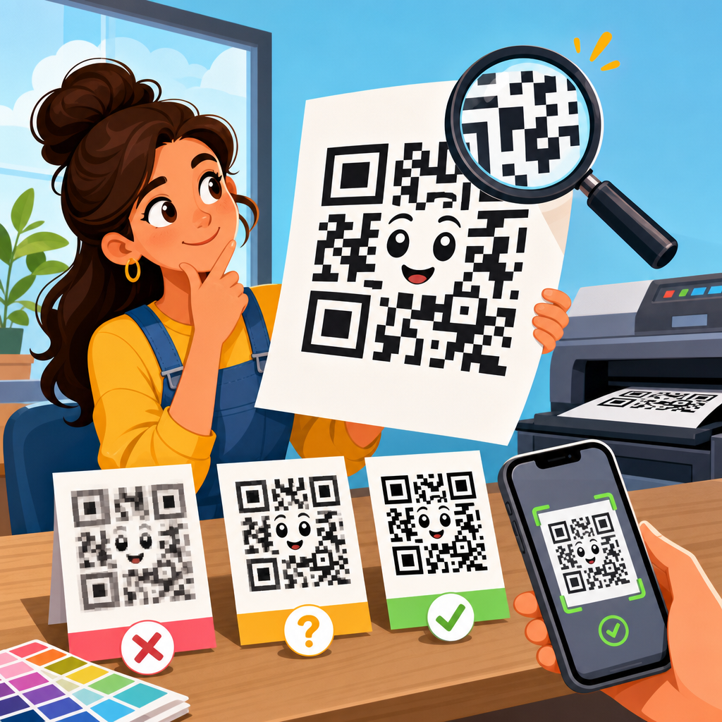
Choosing the right resolution for a printed QR code determines whether people scan it instantly or give up after two failed attempts. In print, resolution means how much detail the code retains on paper, label stock, packaging, signage, fabric, or other physical surfaces. It is tied to pixel dimensions for raster files, line sharpness for vector files, printer capability in dots per inch, viewing distance, material texture, contrast, and the physical size of the QR code itself. When people ask what resolution QR codes should be printed at, they usually want one practical answer. The accurate answer is this: whenever possible, print QR codes as vector artwork; when raster files are required, use at least 300 DPI at final print size, and increase beyond that for small codes, curved packaging, or low-quality substrates. That baseline matters because print defects compound quickly. A code that looks acceptable on a bright monitor can fail on corrugated cardboard, thermal labels, glossy bottles, or outdoor posters. I have seen campaigns lose scans because marketing teams exported a logo-heavy code from a design app at social-media dimensions, then stretched it for print. This hub explains how QR code resolution works, how print size and scanning distance affect results, what file formats to use, and how to prepare reliable artwork across common printing methods and materials.
Resolution basics: the practical rule for printing QR codes
The simplest rule is to match image detail to final output conditions, not to the size of the code on your screen. For professional printing, a QR code should ideally be supplied as SVG, EPS, or PDF, because vector files scale without losing edge definition. QR scanners read the contrast and geometry of small square modules, and vectors preserve those module edges better than PNG or JPEG. If a printer, label system, or e-commerce platform accepts only raster artwork, 300 DPI at final size is the minimum standard, 600 DPI is safer for small labels, and 1200 DPI may be warranted for micro-print applications, industrial marking, or highly dense codes carrying long URLs, vCards, or serialized data.
Why does DPI matter? A QR code is not judged by photographic smoothness; it is judged by whether each module prints as a clean square with enough separation from adjacent modules. Low-resolution raster codes create stair-stepped edges, blurred transitions, and merged modules. JPEG compression makes this worse by introducing artifacts around sharp boundaries. PNG is the preferred raster format because it is lossless. In commercial workflows, PDF/X files often preserve vector shapes and color management correctly, which reduces accidental conversion or softening during prepress. If your print vendor asks for “high resolution,” clarify whether they mean raster DPI, native vector art, or printer device resolution, because those are different things.
Print size, module size, and scan distance determine success
The most important print variable is not DPI alone. It is module size, meaning the printed size of the tiny squares that make up the QR code. A large QR code with oversized modules can scan perfectly even at moderate raster resolution, while a tiny code packed with many modules can fail despite being exported at 300 DPI. In practice, reliable scans depend on three linked factors: the amount of encoded data, the final physical dimensions of the symbol, and the distance from which users will scan it. The more data in the code, the more modules are required. More modules at the same overall size means each module becomes smaller and harder to print and read.
A useful field rule is that the scanning distance should be roughly ten times the width of the QR code. A 1-inch code is comfortable at about 10 inches away, while a 4-inch code works better from around 40 inches. That rule is not absolute, but it is reliable for planning posters, product packaging, restaurant tabletop cards, and shelf talkers. For close-range uses such as business cards, labels, and direct mail, I aim for at least 0.4 mm module size when possible, and I increase code size if error correction is high or a central logo is added. For posters, windows, and event signage, I prioritize overall code size and high contrast before worrying about extreme raster resolution.
| Use case | Typical scan distance | Recommended QR size | Recommended artwork |
|---|---|---|---|
| Business card | 6 to 12 inches | 0.8 to 1 inch | Vector preferred, 600 DPI raster minimum |
| Product label | 6 to 18 inches | 0.8 to 1.2 inches | Vector preferred, 300 to 600 DPI raster |
| Brochure or flyer | 12 to 24 inches | 1 to 1.5 inches | Vector or 300 DPI raster |
| Poster | 2 to 6 feet | 3 to 6 inches | Vector preferred, 300 DPI raster if needed |
| Storefront or event sign | 4 to 10 feet | 6 to 12 inches | Vector artwork strongly recommended |
Vector vs raster files: which format should you print?
For printed QR codes, vector almost always wins. SVG is excellent for web-to-print workflows and many design tools. EPS remains common in legacy print environments. PDF is often the safest handoff format because it can embed vector paths and maintain layout integrity. When I prepare QR assets for packaging teams, I usually deliver both an SVG master and a print-ready PDF, then a transparent PNG fallback sized exactly for approved applications. That prevents designers from scaling a low-resolution social asset into a press file later.
Raster files still have valid uses. Many label printers, office printers, online marketplaces, and template tools accept PNG more easily than vector. If you must use raster, export at the exact final print size and target DPI rather than scaling after export. Never use JPEG for QR codes in print unless there is absolutely no alternative. Compression can create halos and mushy edges that affect scanner interpretation, especially around finder patterns, timing patterns, and alignment patterns. Also avoid taking screenshots of QR codes. Screenshots are a common cause of soft, inconsistent output because the image may already be resampled before it reaches the layout file.
How printing methods and materials affect required resolution
The same QR file behaves differently on offset paper, thermal label stock, flexible film, corrugated board, and fabric. Printing method matters because dot gain, ink spread, substrate absorbency, and registration affect module clarity. In offset printing on coated paper, a vector QR code at adequate size usually reproduces sharply. On uncoated stocks, ink can spread slightly, reducing white space between modules. Flexographic packaging adds another challenge: plate distortion and substrate movement can soften edges, so designers often increase module size and preserve a generous quiet zone. Thermal transfer and direct thermal label printing can produce excellent machine-readable codes, but only if printer heads are clean and the artwork is not undersized.
Materials also change contrast. Black on white remains the safest choice because scanners rely on luminance contrast more than color preference. Dark blue on pale yellow may work; metallic silver on glossy white often does not. Transparent packaging requires careful backing because the environment behind the pack can interfere with contrast. Curved bottles can warp the symbol, especially if the code wraps around a tight radius. In those cases, increasing the physical size and reducing data density improves performance more than simply increasing export DPI. For outdoor signage, weathering, UV fade, laminate glare, and installation wrinkles matter as much as file resolution.
Quiet zone, contrast, and error correction matter as much as resolution
A QR code can be printed at excellent resolution and still fail if surrounding design choices are poor. Every code needs a quiet zone, the empty margin around the symbol that helps scanners isolate it from nearby graphics and text. The standard recommendation is a quiet zone at least four modules wide on all sides. Crowding the code with borders, decorative frames, or patterned backgrounds causes more real-world failures than most teams expect. I routinely reject artwork where a beautifully sharp code is placed over a brand texture or squeezed beside copy with almost no breathing room.
Error correction is another key setting. QR codes support four levels: L, M, Q, and H. Higher levels allow more damage or obstruction but increase the number of modules, making the pattern denser. Designers often choose H when adding a logo, yet forget that denser patterns need larger printed sizes to remain dependable. Resolution cannot rescue an overdesigned code that has low contrast, insufficient quiet zone, rounded modules that close up on press, or a logo that intrudes too far into the data area. Good printing starts with a robust symbol, not just a high-resolution export.
Recommended specifications for common printed QR code applications
For business cards, use a short dynamic URL to keep module count low, print the code at roughly 0.8 to 1 inch square, and supply vector art or a 600 DPI PNG at final size. For brochures, postcards, and menus, 1 to 1.5 inches with 300 DPI raster or vector is typically enough. For product labels, account for curvature, condensation, and small-format printing; 0.8 to 1.2 inches is common, but I increase size when labels are glossy or viewed under warehouse lighting. For retail packaging, test final printed samples under store conditions, because shelf glare can change results.
For posters and signs, prioritize distance and placement. A code intended for people standing several feet away should be several inches wide, with a short destination URL and strong contrast. For window graphics, avoid placing the code where reflections or heavy daylight washout are likely. For industrial labels and asset tags, verify scanner type as well as smartphone behavior, since dedicated imagers may have different tolerances. If you are printing on apparel, embroidery is usually unsuitable for functional QR codes because stitch spread distorts modules. Screen printing can work, but only at generous sizes and simple data payloads. The reliable workflow is always the same: generate a clean code, keep data short, preserve quiet zone, choose vector when possible, and test on the actual material before full production.
Common printing mistakes and a reliable prepress checklist
The most common mistake is scaling up a low-resolution file after it has been exported. The second is using a code with too much encoded data for the available print area. The third is treating the QR code like a decorative graphic instead of a machine-readable symbol. Other frequent problems include reversing light modules out of dark backgrounds with insufficient contrast, placing the code over photos, trimming into the quiet zone, exporting through presentation software, and flattening vector art into compressed images during proofing. These issues are easy to prevent with a straightforward checklist.
Before approving any printed QR code, confirm six things. First, the destination works and loads quickly on mobile networks. Second, the final symbol size fits the expected scan distance. Third, the artwork is vector or a PNG exported at the exact final size with adequate DPI. Fourth, the quiet zone is intact and no design elements intrude. Fifth, contrast is strong under real lighting conditions. Sixth, printed proofs scan across multiple phones, including older devices. I also recommend testing both iPhone and Android native camera apps because decoding behavior differs slightly. The cost of one prepress test sheet is trivial compared with reprinting packaging, signage, or thousands of mailers.
The right resolution for printed QR codes is best understood as a production standard, not a single magic number. If you can use vector artwork, do that every time. If you must use raster, start at 300 DPI at final print size, move to 600 DPI for smaller labels or denser symbols, and go higher only when the application truly demands it. Then remember the bigger truth: print size, module size, quiet zone, contrast, material, and scanning distance usually matter more than extreme DPI. A clean, short, high-contrast code printed at sensible dimensions will outperform a fancy, overloaded code exported at huge resolution.
For teams responsible for QR code design, printing, and materials, this page should serve as the hub for every production decision. Use it to set internal specs, brief designers, evaluate printer proofs, and standardize file handoff across packaging, marketing, and operations. The goal is simple: every person who sees the code should be able to scan it on the first try. Audit your current print workflow, replace weak raster assets with vector masters, and test every QR code on its final substrate before release.
Frequently Asked Questions
What resolution should a QR code be printed at for reliable scanning?
There is no single resolution that works for every printed QR code, because scan performance depends on both the file quality and the final physical size of the code. As a practical baseline, raster QR codes should usually be prepared at 300 DPI for standard print applications such as flyers, brochures, labels, product packaging, postcards, and inserts. If the code is very small, printed on textured stock, or used in a high-precision application, 600 DPI is often the safer choice. The real goal is to preserve crisp, clearly defined square modules so scanners can distinguish light and dark areas without blur, fill-in, or edge distortion.
In many cases, vector format is the best answer because it avoids resolution limits altogether. A vector QR code can scale up or down without becoming soft or pixelated, which makes it ideal for professional print workflows. Even then, printer capability, substrate, ink spread, contrast, and the amount of encoded data still matter. A tiny QR code packed with a long URL may fail even if the file itself is technically high resolution. For most print jobs, the most dependable approach is to use a vector file whenever possible, size the code appropriately for how far away it will be scanned, print with strong contrast, and test the final output on the actual material before going to production.
Is 300 DPI enough for printing a QR code, or do I need 600 DPI?
For many common print uses, 300 DPI is enough, provided the QR code is not being printed too small and the printer produces clean edges. A well-made QR code at 300 DPI often scans perfectly on business cards, mailers, menus, labels, and packaging when the physical dimensions are reasonable and the contrast is high. This is why 300 DPI is widely treated as the standard minimum for quality print. However, “enough” depends on how much detail the code contains. If the QR code has many modules because it stores a lot of data, those modules become smaller, and at smaller sizes a 300 DPI raster image may not hold the edges as sharply as needed.
That is where 600 DPI becomes valuable. Higher resolution helps preserve cleaner module boundaries, especially for small QR codes, industrial labels, pharmaceutical packaging, textured materials, and print processes where dot gain or ink spread can slightly distort the shape. If you are uncertain, choosing 600 DPI for raster output gives more production tolerance. Still, increasing DPI is not a substitute for proper design. A higher-resolution file will not fix poor contrast, over-stylized artwork, insufficient quiet zone, or a code that is physically too small for the intended scanning distance. If available, a vector file remains the preferred option because it removes the raster DPI limitation and gives printers the sharpest possible source artwork.
Does the physical size of the QR code matter more than its pixel resolution?
Yes, in many real-world printing situations, physical size matters just as much as file resolution, and often more. A QR code can have a high pixel count and still scan poorly if it is printed too small for the amount of data it contains or for the distance from which people are expected to scan it. Resolution determines whether the code stays sharp on paper or other material, but physical size determines whether a phone camera can clearly distinguish the code’s module pattern in the first place. That is why a small but high-resolution QR code is not automatically better than a larger code printed from a moderately sized but properly prepared file.
A good rule of thumb is to match the printed dimensions to the use case. A code on product packaging viewed from a few inches away can be much smaller than a code on a poster, window graphic, or sign meant to be scanned from several feet away. As size increases, scanners gain more visual information and usually perform better, even under less-than-perfect lighting or angle conditions. The best results come from balancing both variables: use a file with sufficient detail, print at professional resolution, and choose a final size that gives each module enough room to remain distinct after printing. In other words, sharpness gets the code onto the material correctly, while physical size helps people scan it quickly and successfully.
Why are vector QR codes usually better than PNG or JPG files for print?
Vector QR codes are usually better for print because they are built from mathematical shapes rather than a fixed grid of pixels. That means they can be scaled to different sizes without losing edge sharpness. Since QR codes rely on clean square modules and precise contrast transitions, preserving those edges is extremely important. With raster files such as PNG or JPG, enlarging the image can introduce softness or visible pixelation, especially if the original export dimensions were too small. JPG can be particularly risky because compression artifacts may distort the edges and interfere with scanning accuracy.
Vector formats such as SVG, EPS, or PDF are more reliable in professional print environments because they allow the printer or design software to render the code at the needed size with maximum precision. This is especially useful when the same QR code will appear on multiple assets, such as packaging, shelf displays, direct mail, and signage. Even so, vector is not a magic fix. If the code has low contrast, lacks enough quiet zone, is placed over a busy background, or is distorted during design, scan performance can still suffer. But when the question is specifically about print resolution, vector is generally the most future-proof and production-friendly format because it maintains the detail needed for dependable scanning across a wide range of sizes and print methods.
What other print factors affect QR code scan quality besides resolution?
Resolution is only one part of successful QR code printing. Printer capability matters because the device must reproduce the module edges cleanly without excessive bleed, feathering, or toner spread. Material matters too. Smooth coated paper usually holds detail better than rough cardboard, woven fabric, corrugated packaging, or porous label stock. Surface texture can break up the dark and light pattern, making the code harder for cameras to interpret. Contrast is critical as well. A dark code on a light background is still the safest option, while low-contrast color combinations, metallic finishes, glossy glare, and transparent surfaces can all reduce scan reliability.
The code’s design and placement also have a major impact. Every QR code needs adequate quiet zone, which is the empty margin around the code that helps scanners isolate it from nearby graphics and text. Over-customization, such as rounded modules, embedded logos, unusual colors, or decorative effects, can reduce scanning tolerance if done too aggressively. Viewing distance must be considered too, because a code intended for scanning at arm’s length can be far smaller than one placed on a wall or storefront. Finally, testing is essential. The smartest workflow is to print a sample on the actual substrate, at the actual size, using the intended print process, and then scan it with multiple phones under realistic lighting conditions. That final test often reveals issues that resolution alone cannot predict.


