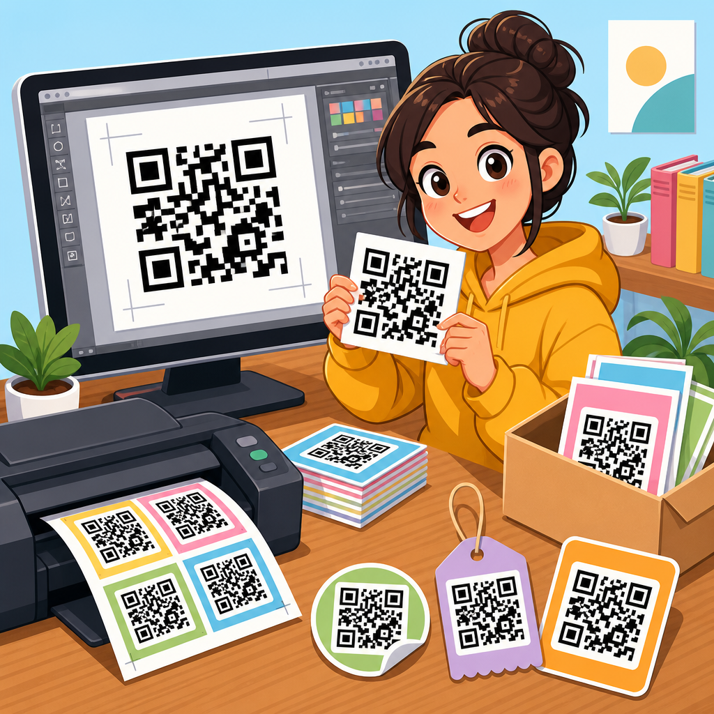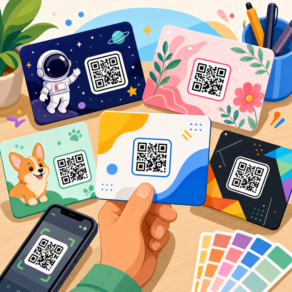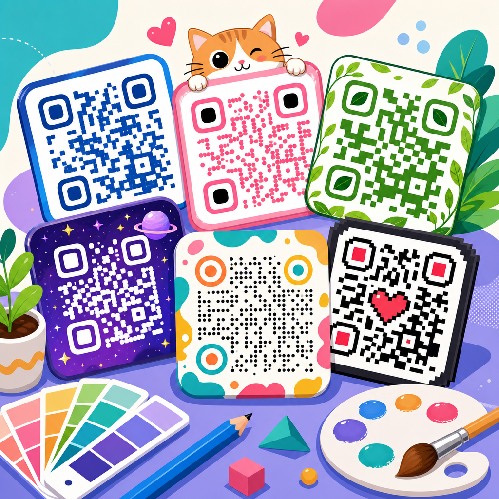
QR codes have moved from purely functional squares to brand assets, campaign triggers, and measurable conversion tools, which is why the strongest marketers now treat QR code design examples as strategic references rather than decorative inspiration. A QR code is a two-dimensional matrix barcode that stores data such as a URL, menu, payment request, contact card, app link, or file download. Design, in this context, means every visual and structural choice around that code: module shape, color contrast, quiet zone, logo placement, call to action, print material, landing page continuity, and scan environment. I have worked on retail packaging, event signage, restaurant menus, and direct mail campaigns where a small design change doubled scan rates, so the difference between a generic code and a well-designed one is not theoretical. It is measurable. This matters because smartphone scanning is now routine, but attention is scarce. People decide in seconds whether a code looks trustworthy, relevant, and worth opening. Good QR code design improves scan reliability, brand recall, and post-scan conversions at the same time. Poor design creates friction, especially when contrast is weak, logos crowd the finder patterns, or the destination page fails to match the promise beside the code. In a sub-pillar under QR Code Resources, Templates & Tools, this hub article covers the main QR code design trends, explains what makes examples effective, and gives practical standards you can use across packaging, print, storefronts, menus, business cards, and digital displays.
Branded QR codes are now the default for serious marketing use
The clearest trend in QR code design examples is the shift from plain black-and-white codes to branded systems that still preserve scan integrity. A branded QR code uses a company’s colors, logo, typography, and surrounding layout so the code looks like part of the campaign instead of an afterthought. In my experience, the best examples begin with a dynamic QR code generated in tools such as QR Code Generator Pro, Bitly Codes, Beaconstac, Scanova, or Flowcode, because dynamic codes allow URL changes, analytics, and A/B testing without reprinting the asset. That flexibility supports better design decisions over time.
Effective branded examples usually keep the finder patterns prominent, maintain a quiet zone of at least four modules, and use dark foreground elements on a lighter background. A coffee brand, for example, might place a cream-colored code on a kraft bag with a dark brown module pattern and a small bean icon in the center. That can work if error correction is set appropriately and the contrast ratio remains high enough for smartphone cameras. The code feels on-brand, but it still behaves like a machine-readable asset.
What should a branded QR code include? A concise call to action, a clear value exchange, and a destination page that visually matches the code. One of the strongest retail examples I have seen paired a QR code on shelf wobblers with “See how it works in 20 seconds.” The landing page opened to a vertical product demo video, not a homepage. The design trend is not merely aesthetic. It is about reducing cognitive distance between scan, expectation, and action.
Shape customization is growing, but readability remains the governing rule
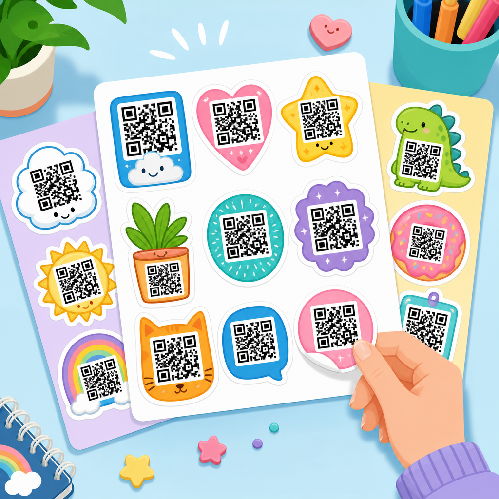
Another major trend in QR code design examples is shape customization. Designers now use rounded modules, circular frames, softened corners, and patterned data dots to make codes feel premium or playful. These treatments are common in beauty packaging, hospitality menus, event collateral, and creator merchandise. The reason they work is simple: many consumers still associate standard QR codes with utility, while custom shapes suggest intention and trust.
However, there are hard limits. QR codes are built on alignment patterns, timing patterns, finder patterns, and encoded data modules. Excessive styling can distort these structures and increase scan failure. I generally advise clients to customize one variable at a time, then test on both iPhone and Android devices at different distances and under uneven lighting. A code that scans perfectly on a desktop proof may fail on glossy packaging under supermarket LEDs.
A strong example is a salon loyalty card using rounded modules and a circular frame, but preserving square finder patterns in high contrast. A weaker example is a fashion flyer with low-contrast pastel dots and an oversized center logo that overlaps data areas. The first respects the code’s architecture. The second prioritizes novelty over usability. This is the core rule behind every durable QR code design trend: visual customization is only successful when the code remains instantly scannable.
Color gradients, muted palettes, and dark mode styling are everywhere
Color use has become much more sophisticated. Earlier QR campaigns relied on black modules on white backgrounds because that was safe. Today, many standout QR code design examples use gradients, muted earth tones, metallic-inspired palettes, and dark mode interfaces. The trend comes from broader brand design systems, especially in wellness, luxury retail, SaaS, and hospitality. A QR code should not look disconnected from the rest of the visual identity.
The technical requirement is contrast. Cameras detect the code by separating foreground from background, so visual elegance cannot erase luminance difference. Navy on cream usually works. Gold on white often does not. Neon gradients can be usable if the darkest areas carry the module edges and the background stays clean. Transparent backgrounds are risky unless the print surface is fully controlled. I have seen excellent proofs fail once they were placed over textured labels or reflective acrylic signs.
Dark mode styling deserves specific attention. Some brands use a dark background with lighter modules to match app interfaces or nighttime venues. This can succeed, but reverse-color QR codes are less forgiving in poor lighting. Testing is essential. If the code will appear on phone screens, menu tablets, or digital kiosks, check brightness settings, motion blur, and screen refresh behavior. Good examples are not just pretty. They are tested in the environment where scans actually happen.
Contextual framing now outperforms standalone placement
One of the biggest practical shifts in QR code design examples is contextual framing. A QR code by itself asks users to infer the benefit. A QR code embedded in a complete message answers the question, “Why should I scan this?” before the camera opens. In campaign audits, I repeatedly see stronger performance from codes paired with direct copy such as “Scan for ingredients,” “Scan to join the waitlist,” or “Scan to claim 10% off today.”
Contextual framing includes headline copy, directional cues, surrounding imagery, and placement at the decision point. On food packaging, that may mean putting the code near nutrition or recipe content. On real estate signage, it may sit beside “Take the virtual tour.” On an in-store display, it should appear where the shopper pauses, not near the floor where access is awkward. The design trend is toward integrated storytelling, not isolated utility.
Design examples in museums and events show this clearly. A code beside an exhibit label that says “Hear the curator explain this piece” performs better than an unlabeled code under a poster. The code becomes an invitation with a defined outcome. That clarity improves scan rate and also qualifies the user, because only interested visitors continue. Good framing therefore improves both top-of-funnel engagement and downstream conversion quality.
Print surface, size, and scan distance determine whether a design trend is usable
Many attractive QR code design examples fail because the designer considered the artwork but not the physical environment. Size, substrate, viewing angle, and scan distance matter as much as color or shape. A common rule is a 10:1 distance ratio: for every ten units of scanning distance, use at least one unit of code width. A QR code scanned from ten feet away should be about one foot wide. That is a practical starting point, not an absolute law, but it prevents many failures.
Glossy lamination, curved bottles, woven labels, and window glare all affect readability. I once had to redesign a cosmetic carton because a beautiful foil-stamped code reflected light too aggressively under retail shelving. The replacement used matte varnish around the code area and immediately improved scan consistency. This kind of adjustment is common in real projects. It is why the best QR code design examples are rooted in production knowledge, not only digital mockups.
| Use Case | Recommended Minimum Size | Key Design Consideration | Example |
|---|---|---|---|
| Business card | 0.8 x 0.8 inches | Keep destination short and CTA specific | “Save my contact details” linking to vCard |
| Product packaging | 0.8 to 1.2 inches | Avoid curved placement and reflective coatings | Recipe or authenticity verification page |
| Table tent menu | 1.2 x 1.2 inches | Test under low light and food spills | Digital menu with allergy filters |
| Storefront poster | 4 x 4 inches or larger | Design for quick scans through glass | Appointment booking or store hours |
| Trade show signage | 6 x 6 inches or larger | Support scanning in crowds from several feet away | Lead capture form with badge prefill |
The most useful QR Code Resources, Templates & Tools pages include printable templates for these formats because design success depends on real dimensions. If a trend cannot survive printing, glare, movement, and distance, it is not a trend worth copying.
Destination matching is the design trend that most teams overlook
When people search for QR code design examples, they often focus on the code itself. The most effective examples, however, extend beyond the square. The post-scan experience is part of the design system. If a premium wine label uses an elegant navy-and-gold code, the landing page should not open to a generic mobile homepage with tiny navigation and slow load time. The design promise must continue after the scan.
This is where high-performing campaigns separate themselves. A restaurant QR code should open instantly to a mobile menu, not a PDF that requires zooming. A fitness poster offering a trial pass should lead to a short-form landing page with one CTA, not a full site sitemap. UTM parameters, analytics dashboards, and conversion events should be configured before launch so teams can evaluate not just scans, but outcomes. In practice, I review scan-through rate, bounce rate, form completion, and assisted revenue when judging whether a QR design example is truly successful.
Consider two event badge examples. One links to a crowded company website. The other opens to a mobile profile card with headshot, title, calendar booking, and LinkedIn button. Both codes may scan, but only the second is designed for the user’s moment of intent. That is the current standard. Good QR code design includes the bridge between physical object and digital destination.
Industry-specific examples reveal how design trends should be applied
The best QR code design examples are always tailored to the industry. In restaurants, the winning trend is durable simplicity: high-contrast menu codes, easy-to-clean table signage, and a direct path to ordering, allergen notes, or payment. In retail packaging, storytelling dominates. Brands use QR codes to show sourcing videos, care instructions, loyalty enrollment, or authenticity checks. In healthcare, legibility and trust take priority, with larger codes, plain language, and HIPAA-conscious destinations that avoid unnecessary friction.
Real estate examples often use large-format signage with property-specific landing pages, virtual tours, financing calculators, and contact buttons. The design trend here is fast qualification. In education, campuses place QR codes on event posters, library shelves, and orientation materials to distribute maps, schedules, and sign-up forms. Museums use them for multilingual interpretation and audio guides. B2B events rely on lead capture, spec sheets, or demo bookings, which means badge scans and booth signage should be optimized for speed, not decoration.
As this hub for QR Code Design Examples expands, it should link readers to deeper guides on restaurant QR menus, packaging QR code templates, business card QR layouts, QR code CTA copy, and scan testing checklists. That internal structure mirrors how users think: first they want broad design trends, then they need examples by use case. The hub page earns its value by helping readers move from inspiration to implementation with fewer mistakes.
Top QR code design trends are not random style changes; they reflect a more mature understanding of how physical touchpoints drive digital action. The best QR code design examples combine brand fit, scan reliability, contextual messaging, production awareness, and post-scan continuity. Branded codes work because they look intentional. Customized shapes work when they respect finder patterns and contrast. Modern color palettes work when luminance remains strong. Contextual framing works because it answers the user’s first question before they ask it. Print and placement standards work because cameras and environments impose real constraints. And destination matching matters because the scan is only the midpoint of the user journey, not the finish line.
If you are building or refreshing QR assets under a broader QR Code Resources, Templates & Tools strategy, start by auditing existing codes in the field. Check whether they scan quickly, explain their value clearly, and open to mobile-first pages that complete the promise made in print. Then collect QR code design examples by channel: packaging, menus, direct mail, signage, events, and business cards. Test each design on multiple devices, in real lighting, and at actual viewing distances. What performs in a design file is not enough. What performs in context is what counts.
Use this hub as your starting point for better QR decisions, then build outward into templates, testing workflows, and industry-specific examples that match your campaigns. A well-designed QR code does more than look better. It earns more scans, builds more trust, and turns offline attention into measurable online results.
Frequently Asked Questions
What are the biggest QR code design trends brands are using right now?
The biggest QR code design trends center on making codes feel intentional, branded, and easy to scan across real-world and digital environments. Instead of relying on plain black-and-white squares, brands are using custom module shapes, softer corners, embedded logos, branded color palettes, and thoughtfully designed frames with clear calls to action. You will also see more QR code design examples that integrate the code directly into packaging, posters, menus, product labels, event signage, and social campaigns so it feels like part of the visual system rather than an afterthought.
Another major trend is designing QR codes as conversion tools, not just access points. That means the best examples are supported by context: a short prompt such as “Scan to shop,” “Scan for the menu,” or “Scan to watch the demo” gives users a reason to act immediately. Marketers are also pairing dynamic QR codes with campaign tracking so they can update destinations without reprinting materials and measure performance by placement, audience, or channel. In practice, the strongest trend is not decoration alone. It is the combination of brand consistency, user clarity, and reliable scan performance.
How can you customize a QR code without making it harder to scan?
The safest approach is to treat customization as a controlled design system, not unlimited artistic freedom. You can usually customize the color, module shape, corner markers, surrounding frame, and center logo while preserving functionality, but the code still needs enough contrast, proper spacing, and adequate quiet zone around it. The quiet zone is the empty margin around the QR code that scanners use to recognize the code boundaries. If that space is too tight or crowded with graphics, even an attractive code may fail in real-world conditions.
To keep performance high, use dark foreground elements against a lighter background, avoid overly low-contrast color combinations, and test every code on multiple devices before publishing. If you add a logo, keep it reasonably sized so it does not block too much data. If you switch from square modules to circles or rounded shapes, confirm that the code still scans quickly from different angles and distances. It is also smart to choose a QR generator that supports error correction and design validation. The most effective QR code design examples balance personality with discipline: they look custom, but they still follow the practical scanning rules that make them useful.
Why do branded QR code design examples usually perform better than generic ones?
Branded QR codes often perform better because they build trust and recognition at the exact moment a user is deciding whether to scan. A generic code may look anonymous or even suspicious, especially in crowded retail, event, or public environments. When a QR code matches the surrounding brand identity through color, logo placement, typography, and visual framing, people can more quickly connect it to a known business and understand its purpose. That reduction in hesitation can significantly improve scan rates.
Performance also improves when branding is paired with message clarity. A well-designed code framed by a short action prompt tells users what they will get in return for scanning, whether that is a discount, a menu, a product demo, a review page, or a mobile checkout experience. This makes the QR code feel like a guided next step rather than a random visual object. In other words, the strongest branded examples succeed because they combine familiarity, credibility, and conversion intent. They do not just look better; they communicate better.
What should businesses look for when reviewing QR code design examples for inspiration?
Businesses should look beyond surface aesthetics and evaluate whether each example solves a real marketing or user-experience problem. A good reference should show how the QR code fits its environment, supports the brand, and leads to a clear outcome. For example, on product packaging, the best designs may emphasize education, authenticity, or reorder convenience. In restaurants, the focus may be menu access, table ordering, or review collection. At events, the priority could be ticket verification, schedule downloads, lead capture, or post-event follow-up. The design only matters if it helps the code perform better in its intended context.
It is also important to study placement, size, contrast, framing, and call-to-action language in each example. Ask whether the code is easy to notice, whether users understand why they should scan it, and whether the landing experience matches the promise made on the printed material. Businesses should also favor examples that use dynamic QR codes and analytics, because that signals a more strategic mindset. The best inspiration is not simply the prettiest code. It is the example that demonstrates a smart connection between design, usability, and measurable business results.
Are dynamic QR codes better for modern design and marketing campaigns?
Yes, in most cases dynamic QR codes are the better option for modern campaigns because they offer flexibility, tracking, and long-term usability. A static QR code sends users to a fixed destination that cannot be changed after printing. A dynamic QR code, by contrast, lets you update the target URL or content without changing the printed code itself. That makes it ideal for packaging, out-of-home advertising, menus, brochures, direct mail, and any campaign asset that may need to evolve over time. From a design perspective, this means brands can invest more confidently in polished QR code layouts because the code remains useful even if the destination changes.
Dynamic QR codes also support better measurement. Marketers can track scans, compare placements, test calls to action, and see which campaign versions produce the most engagement or conversions. This turns the QR code from a simple access mechanism into a measurable conversion tool. In articles discussing top QR code design trends with examples, this is one of the most important strategic shifts to understand: the visual design may attract the scan, but dynamic functionality helps justify the campaign investment. When design and analytics work together, QR codes become stronger brand assets and smarter performance channels.