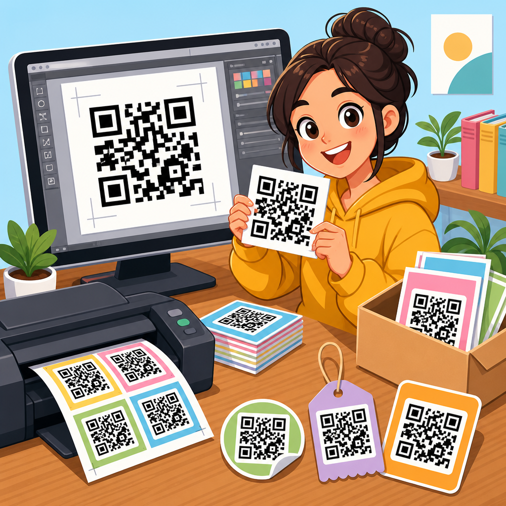
QR code print quality determines whether a code scans instantly, scans inconsistently, or fails at the exact moment a customer tries to use it. In practical terms, print quality means the combination of size, contrast, quiet zone, data density, material choice, and production accuracy that allows a smartphone camera or dedicated scanner to decode the symbol under real conditions. A QR code checklist is a structured set of verification steps used before approval, during production, and after installation to catch issues that software previews miss. I have used these checklists on packaging runs, restaurant menus, retail shelf talkers, trade show signage, and direct mail pieces, and the pattern is always the same: minor print decisions create major scan outcomes.
This matters because QR codes now sit at the intersection of physical media and digital conversion. A single printed code can drive product registration, app downloads, payment, warranty access, customer support, coupons, authentication, and event check-in. If the code fails, the user rarely retries more than once or twice. They abandon the task, and the business loses measurable traffic or revenue. Print quality also affects analytics accuracy. Teams often blame landing pages or campaign targeting when the real problem is a code printed too small on matte kraft stock or placed across a package seam. A strong hub article on QR code checklists should therefore do two jobs: define what to inspect and explain why each inspection point changes scan reliability in the field.
At a minimum, every QR code print quality checklist should verify five essentials: encoded destination, symbol size, error correction level, contrast, and quiet zone. From there, the checklist expands into substrate behavior, distortion risk, finishing effects, viewing distance, scanner environment, and post-print testing protocol. The goal is not perfection in abstract laboratory conditions. The goal is dependable performance with ordinary phones, imperfect lighting, moving users, and production tolerances that vary by printer, ink set, and material. When teams adopt a repeatable checklist, they reduce reprints, protect campaign performance, and create a reliable internal standard that can link to deeper articles on sizing, testing, placement, packaging, and troubleshooting across the broader QR Code Resources, Templates & Tools library.
Core technical checks every printed QR code must pass
The first checkpoint is content accuracy. Before anyone reviews print quality, confirm the code resolves to the correct destination, uses the intended URL structure, and does not include tracking errors, redirects that break on mobile, or expired links. Dynamic QR codes are usually safer for campaigns because the destination can be edited after printing, but they still require governance. I recommend scanning the proof with both iPhone and Android devices, on Wi-Fi and cellular, to confirm the final user path. If the printed asset is part of a regulated workflow such as medical instructions, product serialization, or payments, verify the exact payload format before press approval.
The second checkpoint is data density. A QR code storing a short URL is easier to print and scan than one storing a long string with multiple parameters. More encoded characters create more modules, and more modules demand larger print sizes to preserve edge definition. This is why URL shortening, campaign parameter discipline, and the use of dynamic links are print quality decisions, not merely analytics choices. Error correction level also matters. Higher error correction can improve recovery from minor damage, but it increases symbol complexity. In practice, level M or Q is often appropriate for general print, while H is useful when logos, abrasion, or partial obstruction are expected.
The third checkpoint is size relative to use distance. A common field rule is that scanning distance should be roughly ten times the code width. A 2 centimeter code is comfortable at around 20 centimeters, while a 20 centimeter code can be read from roughly 2 meters under good conditions. This is a guideline, not a guarantee, because lens quality, lighting, glare, and symbol density all influence results. On consumer packaging, I usually avoid going below about 15 to 20 millimeters square for standard smartphone use unless the payload is extremely short and the print process is tightly controlled. For posters, menus, and window graphics, larger is almost always safer than denser.
The fourth checkpoint is the quiet zone, the blank margin around the symbol. Industry guidance generally expects a border of four modules on all sides. Designers frequently violate this by placing text, borders, icons, or background textures too close to the code. The scanner does not see a decorative composition; it sees edges and contrast transitions. If the quiet zone is interrupted, detection slows or fails entirely. I have seen beautifully branded layouts underperform because a thin keyline or gradient shadow sat inside the quiet zone. A checklist should require explicit visual measurement of the margin, not a casual glance at the artwork.
The fifth checkpoint is contrast and polarity. Dark modules on a light background remain the most reliable option. Pure black on pure white is not mandatory, but the luminance difference must be strong. Low-contrast combinations such as mid-gray on kraft brown, neon inks on reflective silver, or pastel overlays on photographic imagery create inconsistent results across camera systems. Reversed codes, where light modules sit on dark backgrounds, sometimes work but should be treated as exceptions requiring expanded testing. Color choices should be validated by grayscale preview, because many scanners effectively depend on brightness contrast more than hue difference.
Prepress and production factors that affect scan reliability
Once the artwork passes basic technical checks, production variables become the real source of risk. Different print methods reproduce module edges differently. Offset lithography can hold detail well on coated stocks, flexography may spread ink on absorbent materials, digital toner can introduce edge artifacts on some papers, and thermal transfer labels depend heavily on ribbon and media pairing. In packaging, corrugate and uncoated board often soften corners and reduce contrast. A QR code that scans from a PDF on screen may fail after dot gain, substrate absorption, or registration shift. That is why a print quality checklist must include process-specific proofing, not just design review.
Material choice affects more than appearance. Gloss laminates and UV coatings can create glare hot spots that obscure modules under overhead lighting. Metallic foils and holographic films introduce specular reflections that confuse auto-exposure systems in phone cameras. Textured materials break up module continuity. Curved containers such as bottles and cans warp the grid, especially when the code wraps beyond the flattest viewing area. Seams, folds, perforations, zipper closures, and tear notches can destroy the finder patterns that scanners use for detection. I routinely mark a no-place zone around these structural features during packaging review because the safest code is the one not forced to survive avoidable distortion.
Branding changes should be controlled carefully. Adding a center logo, custom eyes, rounded modules, or decorative frames can be effective, but each modification consumes error tolerance. The safe approach is to simplify the payload, increase symbol size, and raise test rigor whenever visual customization is introduced. Do not assume a generator preview proves production safety. Many styled codes scan on flagship phones in a bright office and fail on older devices in stores. If a code supports a business-critical action such as payment or authentication, function should outrank visual novelty every time.
| Checklist item | What to verify | Common failure example | Practical fix |
|---|---|---|---|
| Encoded content | Correct URL or payload, mobile-safe destination, no broken redirect | Printed campaign uses a staging link | Lock final link before press and rescan proof |
| Minimum size | Code width fits expected scan distance and data density | 12 millimeter code on shelf tag with long URL | Use dynamic short link and enlarge symbol |
| Quiet zone | Four modules clear on all sides | Decorative border touches symbol edge | Restore blank margin and remove nearby graphics |
| Contrast | Dark on light with strong luminance separation | Green code on brown cardboard | Switch to black on white label panel |
| Surface and finish | No glare, distortion, or texture interference | Gloss varnish on window poster under spotlights | Use matte finish and test in installed lighting |
| Placement | Flat area, no seams, folds, curves, or truncation | Code crosses pouch zipper | Move to uninterrupted panel |
| Real-device testing | Multiple phones, distances, and light conditions | Only scanned from desktop proof | Test printed sample with current and older devices |
Resolution and file preparation also deserve checklist status. Vector artwork is preferred because it preserves hard edges at any size. If a raster file must be used, it should be exported at high resolution appropriate to final print dimensions; otherwise the modules blur or alias. Avoid scaling low-resolution codes inside layout applications. Keep the symbol proportionally square and never stretch it to fit a space. When sending files to vendors, specify that the code must remain unaltered by imposition, trapping, or color conversions that reduce contrast. These instructions sound small, but they prevent many last-minute production mistakes.
Field testing, environment checks, and acceptance standards
Testing should happen in the environment where the code will actually be used. A restaurant table tent should be checked under mixed indoor lighting, with reflections from laminated surfaces and the code viewed from a seated angle. A warehouse label should be tested under industrial lighting and from the expected working distance. A bus shelter poster should be evaluated in daylight, at night, and through glass reflections. For direct mail, test after folding, insertion, and handling. If the code appears on product packaging, scan it on filled, sealed units rather than flat press sheets. Real-world conditions expose issues that prepress teams otherwise miss.
Device diversity matters because camera hardware and scanning software vary significantly. Newer flagship phones can rescue borderline codes that older midrange devices cannot. Some camera apps detect codes instantly, while others need cleaner framing and stronger contrast. A robust checklist therefore calls for a defined test matrix: at least one recent iPhone, one recent Android flagship, one older Android device, and, when relevant, a dedicated handheld scanner. If the QR code serves retail operations, hospitality check-in, or manufacturing workflows, include the exact scanner models used by staff. Passing on one executive’s phone is not a quality standard.
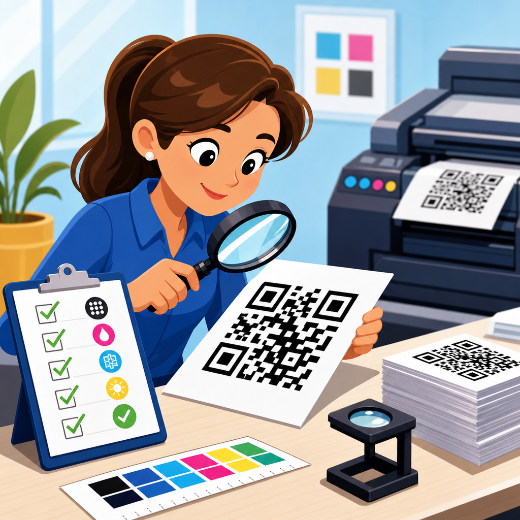
Teams with high-volume or high-risk use cases should consider formal symbol grading. Verification equipment built around recognized barcode standards can measure parameters such as contrast, modulation, axial non-uniformity, and grid accuracy. While many marketing teams rely on smartphone tests alone, packaging and industrial environments often benefit from verifier data because it identifies defects before products ship. Even without a verifier, you can set practical acceptance rules: the code must scan within two seconds, from the intended distance, across the approved device set, under specified lighting, with no more than one failed attempt in repeated trials. Written standards turn subjective approval into operational control.
Maintenance is the last field check that many organizations forget. Window decals fade, menu cards stain, labels scuff, and outdoor signs weather. Dynamic codes also depend on active destination management, SSL certificates, redirect health, and analytics continuity. For permanent installations, schedule periodic scan audits and inspect for physical wear, vandalism, or changed surroundings such as added glare from new lighting. For campaign materials, archive the approved file, destination settings, and test results so repeat orders do not restart from guesswork. A QR code checklist is strongest when it spans the entire lifecycle from creation to retirement.
How this checklist hub supports a broader QR code workflow
As a hub within QR Code Resources, Templates & Tools, this page should anchor the full checklist topic cluster. Teams rarely need only one answer. They need the print quality checklist, then related guidance on minimum QR code size charts, packaging placement rules, menu QR code testing, direct mail best practices, branded QR code design limits, troubleshooting scan failures, and preflight templates for vendors. Organizing those supporting articles around this hub improves consistency because every specialized checklist can inherit the same core principles: accurate payload, adequate size, protected quiet zone, strong contrast, suitable substrate, and realistic testing.
The operational benefit is speed with fewer errors. When designers, marketers, printers, and production managers work from one hub standard, approvals become clearer. A junior designer knows not to place a code over a gradient. A procurement manager knows to ask whether the laminate is matte or gloss. A packaging engineer knows to keep the symbol off the gusset and zipper. A campaign manager knows to use a dynamic short URL before final print. These are not abstract best practices; they are repeatable controls that prevent lost scans, wasted media spend, and expensive reprints.
The simplest next step is to turn this article into your internal master checklist. Adapt each section into a proofing form, vendor spec sheet, and final acceptance routine, then connect it to deeper QR code checklist resources for the formats you use most. When print quality becomes a documented process instead of a last-minute visual review, QR codes perform the way users expect: fast, reliable, and friction free.
Frequently Asked Questions
What factors have the biggest impact on QR code print quality?
The biggest factors are size, contrast, quiet zone, data density, substrate, and production consistency. Size matters because a QR code that is physically too small may look sharp to the eye but still fail when a phone camera tries to resolve the individual modules, especially in low light or at awkward scanning angles. Contrast is equally important. A dark code on a light background gives scanners the strongest signal, while low-contrast combinations such as gray on black, metallic on metallic, or pastel on pastel often create inconsistent results. The quiet zone, which is the blank space around the code, is essential because scanners use it to distinguish the code from surrounding graphics, text, and borders.
Data density also plays a major role. When too much information is packed into a small QR code, the modules become very small and less tolerant of print gain, ink spread, misregistration, and surface texture. Material choice influences readability because glossy finishes, transparent films, textured packaging, curved surfaces, and reflective coatings can introduce glare or distortion. Finally, production accuracy determines whether the approved artwork survives the real manufacturing process. A code that scans perfectly in a digital proof can become unreliable once printed on press if trimming shifts the quiet zone, ink fills in small spaces, or color variation reduces contrast. That is why print quality should be evaluated as a complete system rather than as a single design element.
How large should a printed QR code be to scan reliably?
There is no single universal size that works for every use case, because reliable scanning depends on viewing distance, data complexity, device quality, and environmental conditions. In general, a simple QR code used at close range can often scan well at a relatively modest size, but as the encoded content becomes longer, the module count increases and the code needs more physical space. A practical rule is that the intended scan distance should influence the final dimensions, with larger codes required for posters, signs, product displays, and any placement where the user will not be holding the camera just a few inches away.
For packaging, labels, menus, and print pieces handled at arm’s length, it is wise to choose a size that gives each module enough physical definition after printing, not just in the original artwork. That means accounting for dot gain, material absorption, lamination, and press variation. If the application involves curved bottles, flexible pouches, or folded cartons, you should also add margin for distortion. The safest approach is to test the exact printed size on the final material under real-world conditions using multiple phones and scanning apps. If scan performance is inconsistent, increasing size is often the fastest and most effective improvement. When building a QR code print quality checklist, size should always be verified alongside data density, not treated as an isolated measurement.
Why is the quiet zone around a QR code so important?
The quiet zone is the clear, empty margin surrounding the QR code, and it is one of the most commonly overlooked causes of scanning failure. Scanners depend on this blank border to identify where the symbol begins and ends. If text, decorative frames, product artwork, patterns, or other visual elements are placed too close to the code, the scanner may struggle to isolate the symbol correctly. That can lead to slow scanning, inconsistent scanning, or complete failure, even if the printed modules themselves are crisp and high contrast.
In production, the quiet zone often gets compromised by late-stage design changes, trimming tolerances, label repositioning, or attempts to make the code fit into a crowded layout. It can also disappear visually when placed over busy packaging graphics or transparent materials that reveal background content. A proper checklist should confirm that the quiet zone is present in the file, preserved in prepress, maintained through print and finishing, and still visible after application to the final product. In other words, the quiet zone should be treated as functional space, not optional whitespace. Protecting it is one of the simplest and most effective ways to improve scan reliability.
How does material and finish affect QR code performance after printing?
Material and finish can significantly change how a QR code behaves in the real world, even when the artwork itself is technically correct. Glossy coatings, varnishes, and laminated surfaces can create glare that interferes with a camera’s ability to detect contrast, especially under retail lighting, direct sunlight, or flash-assisted scanning. Textured papers, uncoated stocks, corrugated surfaces, and absorbent materials may soften edges or spread ink, which reduces module clarity. Flexible packaging can wrinkle or warp the code, while curved containers can distort the symbol depending on placement and viewing angle.
Transparent labels and films introduce another challenge because the effective background may change once the code is applied to a package. A code that appears readable on a proof sheet may lose contrast on a dark bottle, metallic pouch, or patterned container. Foils, embossed finishes, and specialty inks can also reduce scanner reliability if they reflect light unpredictably or obscure module boundaries. For that reason, a strong print quality checklist should include testing on the final production material, with the actual finish, adhesive, and placement method. It is not enough to approve a flat mockup. The code must be evaluated as customers will encounter it in practice.
What should be included in a QR code print quality checklist before approval and during production?
A thorough QR code print quality checklist should cover design validation, prepress verification, production controls, and post-print testing. Before approval, confirm that the destination link or encoded data is correct, active, and appropriate for the intended campaign or product lifecycle. Then verify the code type, error correction level, physical size, module clarity, contrast, and quiet zone. Check that the code is not over-customized with logos, decorative shapes, gradients, or inversions that reduce readability. Review the surrounding layout to ensure that neighboring text, borders, die lines, folds, seams, and perforations will not interfere with scanning.
During prepress and production, verify that scaling has not altered proportions, resolution remains sufficient, and no trapping, overprint, or color conversion issues have degraded the symbol. Press checks should confirm that ink spread, registration, cutting accuracy, and finishing steps are not closing gaps or shrinking the quiet zone. After printing, perform scan tests using multiple devices under different lighting conditions and from realistic user distances. If the code will be applied to packaging, test it after application, not just before. The best checklist is structured to catch failures at every stage: before approval, during manufacturing, and after installation or packing. That process reduces the risk of a code that appears acceptable in production but fails when a customer finally tries to scan it.