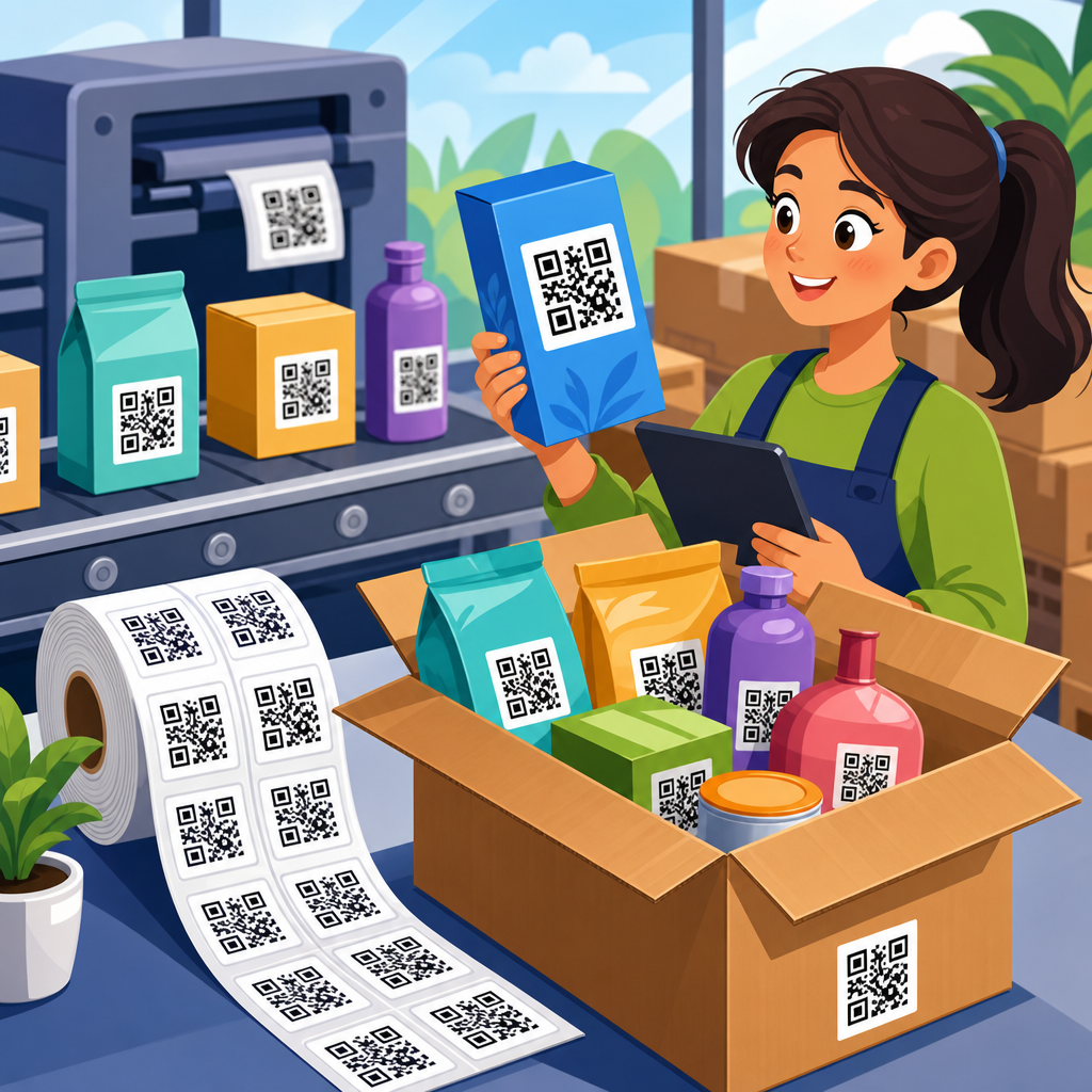
QR code contrast and visibility determine whether a code scans instantly or fails in front of a customer, and that makes them one of the most important parts of QR code design and customization. In practical terms, contrast means the difference in luminance between the dark modules and the light background, while visibility covers the full set of conditions that affect scanning, including size, quiet zone, glare, viewing angle, print quality, and the environment where the code appears. I have tested QR codes on packaging, menus, retail displays, warehouse labels, and event signage, and the pattern is consistent: most scan problems are not caused by the data inside the code but by design choices that reduce contrast or make the symbol hard for a camera to isolate. For any business building a QR code creation workflow, this topic matters because weak visibility lowers scan rates, frustrates users, and undermines measurement. A well-designed code supports branding without sacrificing function. A poorly designed code may look polished on screen but fail under fluorescent lights, on matte cardboard, or from three feet away on a moving phone camera.
The core rule is simple: QR codes are machine-readable symbols first and branded graphics second. A smartphone camera and decoding engine need to distinguish the finder patterns, alignment patterns, timing patterns, and data modules from the background quickly. High contrast gives the image-processing software a clean signal, while good visibility gives the user enough cues to frame the code correctly. This hub page explains the design and customization principles that protect scannability, the testing methods that catch failures before launch, and the tradeoffs involved when adding colors, logos, shapes, or decorative elements. It also connects the broader QR Code Creation & Tools topic to the specific decisions that designers, marketers, and print teams make every day.
Why contrast is the foundation of QR code performance
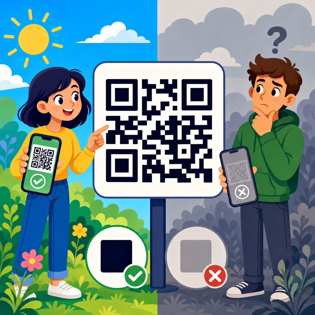
Contrast matters because QR decoding begins with detection. Before a phone opens a link, the camera app or scanner library must locate the three finder squares, measure perspective distortion, binarize the image, and separate dark from light regions. If the dark modules are not sufficiently darker than the background, thresholding becomes unreliable and the code may disappear into the design. In real projects, the highest-performing combination is still a very dark foreground on a very light background, usually black on white. ISO/IEC 18004, the core QR code standard, does not ban color, but it assumes the symbol remains clearly distinguishable. That is why experienced teams treat color as a secondary layer applied only after basic readability is secured.
Designers often ask whether brand colors can replace black and white. The answer is yes, within limits. Navy on white usually performs well. Deep green on cream may work if the luminance difference is strong. Yellow on white, light gray on pastel, or metallic silver on gloss almost always create problems. What matters more than hue is relative lightness. Many smartphone scanners convert frames to grayscale before processing, so two colors that look distinct to the eye can collapse into similar grayscale values. I have seen burgundy modules on black packaging pass desktop review and then fail on common Android devices because the grayscale separation was too narrow. If you want a branded code, evaluate contrast in grayscale, not just in color preview.
Color choices, background control, and common design mistakes
The safest color strategy is dark foreground, light background, solid fills, and no visual clutter behind the symbol. A QR code should sit on a clean field that preserves every module edge. Photographic backgrounds, gradients, textures, and patterned overlays reduce edge clarity and make it harder for the scanner to define the symbol boundary. One frequent mistake is placing a code over a product photo with a subtle white box at 70 percent opacity. On a calibrated monitor it may look clean; on printed material with ink spread, it loses separation. Another mistake is reversing the code to white modules on a dark background. Some modern scanners can read inverted codes, but support is inconsistent, and the failure rate rises when lighting is poor.
Brand customization should follow a hierarchy. First secure scannability with a standard square code, quiet zone, and strong contrast. Then test color variants. Then consider embedded logos or styled eyes. If the branded version performs even slightly worse than the plain control in common use conditions, keep the control. A QR code is not successful because it matches a palette deck; it is successful because users scan it on the first try. This is especially important for packaging and outdoor use, where print variables and ambient light already reduce margin for error.
| Design choice | Recommended approach | Risk if ignored |
|---|---|---|
| Foreground color | Use black or another very dark tone | Weak module detection in grayscale |
| Background color | Use white or a very light solid color | Low separation and failed thresholding |
| Background treatment | Place code on a clean, uncluttered field | Finder patterns blend into imagery |
| Gradients and effects | Avoid fades, shadows, bevels, and texture | Uneven edges and decoding errors |
| Inverted codes | Use only after extensive device testing | Inconsistent support across scanner apps |
| Logo placement | Keep small and compensate with error correction | Data loss and lower scan reliability |
Size, distance, quiet zone, and placement rules
Visibility depends on geometry as much as color. A code can have perfect contrast and still fail because it is too small for the scanning distance. A practical baseline is the 10:1 rule: for every 10 units of viewing distance, use at least 1 unit of code size. A 2 centimeter code is comfortable at about 20 centimeters, while a poster viewed from 2 meters often needs a code around 20 centimeters across. This rule is not absolute, but it is a dependable planning tool. Dense QR codes carrying long URLs, vCards, or tracking parameters need larger print sizes because the modules are smaller. Using a dynamic QR code with a short redirect URL reduces data density and usually improves scan tolerance.
The quiet zone is equally important. This is the empty margin around the QR code, and it should be at least four modules wide on all sides. Without it, scanners may not distinguish the symbol from nearby text, borders, icons, or packaging edges. I routinely see codes placed inside circles, frames, stickers, or callout boxes that clip the quiet zone. They may still scan in ideal studio light, but they become unreliable in stores and public spaces. Placement also matters. Avoid folds, seams, bottle curves, reflective laminates, and corners where perspective distortion increases. On restaurant tables, put the code where overhead glare does not fall directly across it. On labels, leave distance from other black graphics that can confuse detection.
Logos, custom shapes, and error correction without losing scannability
Customization works best when it respects the error budget of the symbol. QR codes include Reed-Solomon error correction, with common levels L, M, Q, and H. Higher levels allow more damage or obstruction, which is why they are often used when a logo is placed in the center. However, higher error correction also increases symbol complexity for the same payload, producing smaller modules that can become harder to print and scan. The right choice depends on content length, final size, and use conditions. In my experience, level M is a strong default for most marketing links, while Q or H can support moderate branding if the code is still printed large enough and tested thoroughly.
Logo insertion should be conservative. Keep the logo centered, avoid covering finder patterns, and maintain a clear boundary between the logo area and surrounding modules. Rounded modules, customized eyes, and softened corners can work, but extreme stylization weakens machine readability. Some generators create artistic codes that appear impressive in a mockup but perform poorly in native camera apps. That is why tool choice matters. Established platforms such as QR Code Generator, Beaconstac, Bitly, Canva, Adobe Express, and browser-based libraries like qrcode.js or Segno can produce branded codes, but the output still requires independent testing. The best-looking code is the one that survives print, motion blur, midrange phone cameras, and imperfect lighting.
Print production, materials, and lighting conditions
Many QR code failures begin after the design file leaves the screen. Print production changes edge sharpness, color density, and reflectivity. On uncoated paper, ink can spread and soften module boundaries. On corrugated cardboard, surface texture breaks straight edges. On glossy labels, specular highlights can wash out sections of the code. Thermal printers may create banding, especially at small sizes. For industrial labels and shipping workflows, this is why teams often prefer monochrome printing with oversized codes and strong error correction. A code that survives a warehouse scanner after abrasion and dust is designed differently from a code intended for an Instagram campaign card.
Lighting adds another layer. Direct sunlight can create harsh reflections on laminated surfaces. Warm restaurant lighting may reduce contrast on colored codes. Digital displays introduce moiré, pixel-grid interference, and brightness shifts, especially when a code is resized by presentation software. If a QR code will appear on screens, export it as a crisp vector or high-resolution image, maintain square proportions, and avoid animation near the symbol. For outdoor signage, test morning, midday, and evening conditions. I have seen codes on window decals fail during afternoon glare but work perfectly at night. Real visibility is always contextual, which is why field testing matters more than studio assumptions.
Testing methods, analytics, and hub topics for QR code design and customization
The most reliable way to improve scan performance is structured testing. Start with a plain black-on-white control. Then test branded variants against it across iPhone and Android native cameras, at different distances, and under bright, dim, and mixed lighting. Print prototypes at actual size on actual material. Measure first-scan success rate, average time to scan, and failure patterns such as hunting, blur, or incorrect framing. Use dynamic QR codes so you can update the destination without reprinting and track scans by date, device, campaign, or location. Analytics will not explain every failure, but sudden scan drop-offs often point to placement or visibility issues rather than message quality.
As the hub for QR Code Design & Customization, this page connects several related decisions. Color strategy determines luminance contrast. Size planning determines readable module dimensions. Logo usage relies on error correction and testing discipline. Print preparation affects edge integrity and quiet zone preservation. Placement strategy accounts for angle, glare, and user flow. Tool selection influences output quality, vector export, and dynamic management. Together, these topics define whether a QR code is merely decorative or truly functional. If you are building a broader QR code creation process, create a checklist for contrast ratio, minimum size, quiet zone, file format, material, and real-device validation before any code goes live.
QR code contrast and visibility tips are ultimately about removing friction. Strong contrast, clean backgrounds, appropriate size, protected quiet zones, disciplined customization, and real-world testing produce codes that scan quickly and consistently. The benefit is measurable: higher engagement, fewer user drop-offs, and better campaign data. Treat every QR code as a utility first and a design asset second. Start with a plain, standards-aligned version, test branded adaptations against it, and keep only the options that perform in real conditions. If you manage packaging, print, signage, menus, or digital campaigns, use this hub as your reference point for every QR Code Design & Customization decision, and review each code before launch with a phone in hand.
Frequently Asked Questions
Why is contrast so important for QR code scanning?
Contrast is one of the first things a scanner relies on to recognize a QR code correctly. In simple terms, a QR code works because the scanning device can clearly distinguish the dark modules from the light background. When that difference in luminance is strong, the camera can identify the pattern quickly, lock onto the finder squares, and decode the content with minimal effort. When contrast is weak, the code may still look acceptable to the human eye, but it can become difficult for phone cameras and scanning apps to interpret consistently.
High contrast usually means using a dark foreground on a very light background, with black on white still being the most reliable standard. Problems tend to appear when brands customize codes with pastel colors, gradients, metallic inks, transparent overlays, or dark backgrounds paired with slightly darker modules. These combinations reduce separation between the code elements and can lead to slow scans, failed scans, or inconsistent performance under different lighting conditions. A code that scans indoors may fail in sunlight or under retail lighting if the contrast margin is too narrow.
From a practical design standpoint, strong contrast improves usability, reduces friction, and protects campaign performance. If customers have to tilt their phone, move closer, or try multiple times, conversion drops quickly. That is why contrast should never be treated as a cosmetic detail. It is a functional requirement. If you want a QR code to scan instantly in real-world conditions, prioritizing clear dark-to-light separation is one of the most dependable decisions you can make.
What color combinations work best for QR code visibility?
The safest and most effective color combination is a dark code on a light background. Black on white remains the benchmark because it creates maximum clarity for scanners across print and digital environments. Other strong options include dark navy on white, dark green on cream, or deep charcoal on pale gray, as long as the foreground remains clearly darker than the background. The key principle is not just color difference, but luminance difference. Two colors can look distinct to people while still appearing too similar to a camera sensor.
Color choices that commonly create problems include light modules on dark backgrounds, low-contrast brand palettes, metallic finishes, neon colors, and complex gradients. Reversing a QR code, such as using white modules on black, can sometimes work with modern scanners, but it is generally less reliable and should be tested carefully before use at scale. Similarly, placing QR codes over photos, textures, or patterned surfaces often reduces visibility because the background interferes with edge detection and pattern recognition.
If brand alignment is important, customization should stay within proven scanning limits. Use a sufficiently dark foreground color, keep the background plain and bright, and avoid visual effects that soften the edges of the modules. Even when using branded colors, the code should still read as a machine-readable symbol first and a design element second. A good rule is simple: if the code does not immediately stand out from its background at a glance, the color pairing is probably too risky.
How do size, quiet zone, and print quality affect QR code visibility?
Visibility is not only about color contrast. Physical presentation plays an equally important role. Size determines whether a camera can capture enough detail to decode the symbol from a realistic scanning distance. If a QR code is too small, the modules become difficult to resolve, especially on lower-quality phone cameras or when the user is moving. As a general guideline, the farther away people are expected to scan, the larger the code should be. A code on product packaging can be relatively small because the user can hold it close, while a poster, sign, or menu board needs a much larger format.
The quiet zone is another critical factor that is often overlooked. This is the empty margin around the QR code that separates it from surrounding text, graphics, borders, or background elements. Scanners use this clear space to identify where the code begins and ends. If the quiet zone is too narrow or cluttered, the code may become harder to detect even if the modules themselves have excellent contrast. Maintaining a clean, uninterrupted margin around all sides of the symbol significantly improves reliability.
Print quality also has a direct impact on scan performance. Blurry edges, ink spread, low-resolution artwork, compression artifacts, and poor material surfaces can all distort the module pattern. Glossy coatings may introduce glare, while textured paper or curved packaging can warp the code. For dependable results, generate the code at high resolution, use sharp vector files when possible, and review printed samples at actual size. A technically correct QR code can still fail if the final printed version loses crispness, spacing, or edge definition.
Can lighting, glare, and placement make a high-contrast QR code hard to scan?
Yes, absolutely. A QR code can have excellent contrast on paper or on screen and still perform poorly if the environment interferes with visibility. Lighting changes how both the camera and the user perceive the code. Bright direct sunlight can wash out details, while dim environments can increase image noise and reduce the camera’s ability to isolate the module pattern. Reflective surfaces such as glass, laminated menus, glossy labels, or polished packaging can create hotspots that obscure key parts of the code.
Placement matters just as much. If the code is positioned at an awkward angle, too high on a wall, too low near the floor, wrapped around a curved bottle, or too close to folds and seams, the scanner may struggle to capture a clean image. Codes placed on moving surfaces, like vehicles or digital displays with animation nearby, can also be harder to scan. Even surrounding clutter can reduce effectiveness if the code competes visually with dense graphics, promotional callouts, or busy backgrounds.
The best approach is to design for the actual scanning environment, not just the ideal mockup. Consider whether people will scan indoors or outdoors, from arm’s length or across a room, under overhead lights or through a storefront window. Use matte finishes when possible, avoid placing codes where reflections are likely, and keep the symbol flat, accessible, and visually isolated. Real-world visibility is about context, and strong contrast works best when the environment supports it.
What are the best ways to test a QR code for contrast and visibility before publishing?
The most reliable way to test a QR code is to evaluate it under the same conditions in which real users will encounter it. Start by checking the code across multiple devices, including different phone brands, camera qualities, and operating systems. A code that scans instantly on a newer flagship phone may perform less consistently on older or budget devices. Test with the default camera app as well as common scanning apps, since decoding behavior can vary slightly.
Next, test the code at actual production size and on the final material whenever possible. On-screen proofs are useful, but they do not reveal issues such as ink spread, glare, low print sharpness, laminate reflections, or substrate texture. Review the code from realistic distances and angles, and try scanning in bright light, low light, and normal indoor conditions. If the code is intended for packaging, signage, posters, receipts, menus, or labels, test in those exact use cases rather than relying on a desktop preview.
It is also smart to test edge cases. Reduce the viewing angle, increase the distance, and see how quickly the code scans when the phone is handheld rather than perfectly aligned. Confirm that the quiet zone is intact, the call to action does not crowd the symbol, and the destination link works as expected. If you are using customized colors or branded styling, compare it against a plain black-on-white version to see whether performance changes. The goal is not just to prove that the code can scan once, but to confirm that it scans quickly, repeatedly, and comfortably in the real world.